COMPARISON: Watercolor vs Gouache / Atmospheric Perspective Paintings

COMPARISON: Watercolor vs Gouache / Atmospheric Perspective Paintings

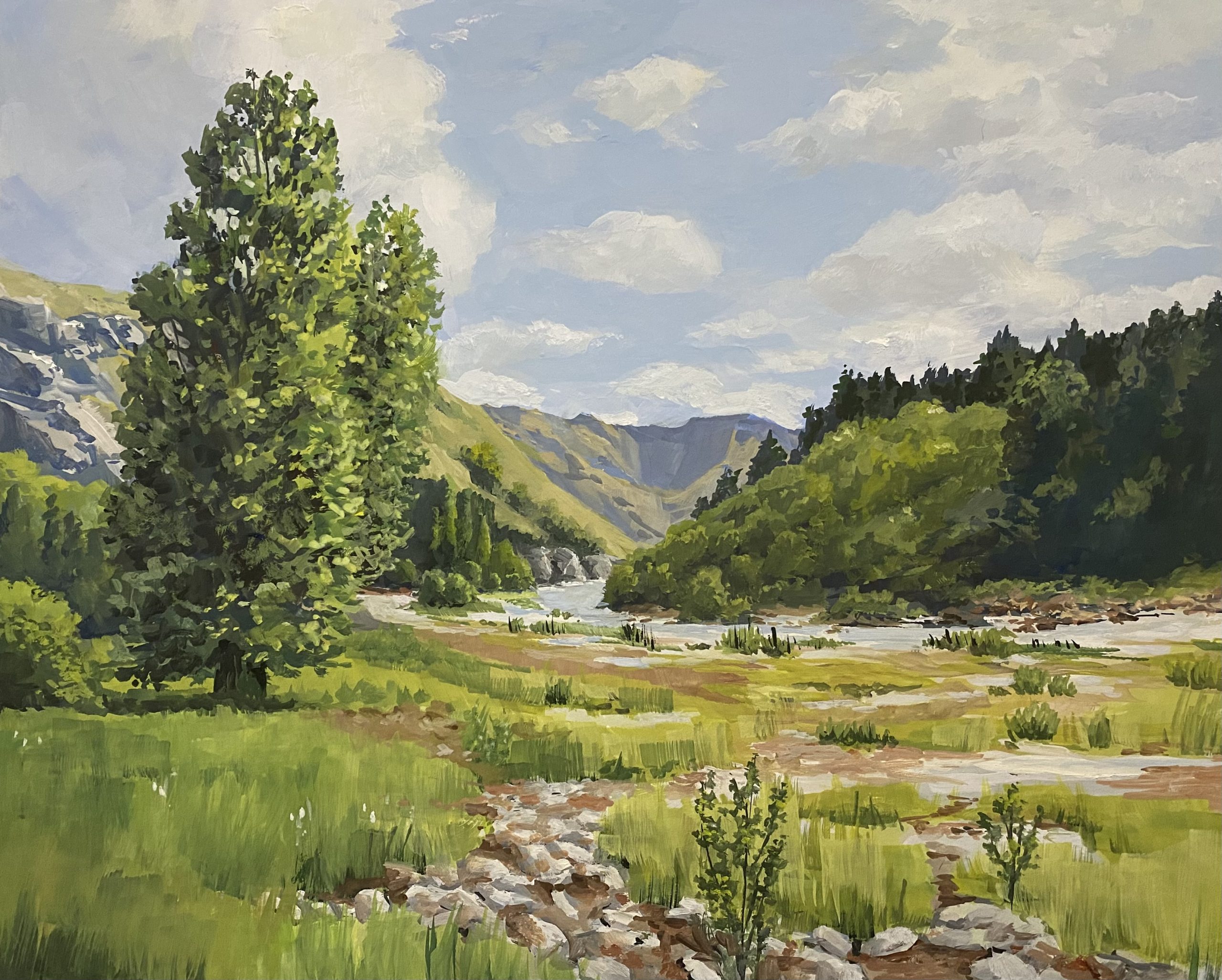
Cue the battle music and the smoke machines: IT’S A DUEL! It’s time for a head-to-head comparison between gouache and watercolor!! In the video I’ll be showing you the same painting in both, showing how to create an effect in one medium then in the other. 

Tutorial: Watercolor vs Gouache / Atmospheric Perspective Paintings

Watch the video below and scroll to the end to leave comments or questions — or click HERE to watch it on YouTube and leave comments over there. I read both dutifully!

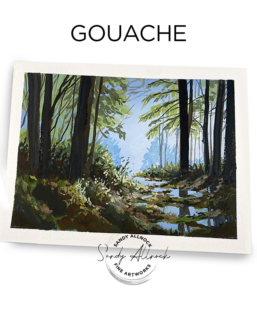
Atmospheric perspective in gouache

Creating the colors and values to depict (and even exxagerate) the depth in a scene in gouache requires mixing the colors. There’s no accidental mixing by colors moving around on their own – it’s all conscious desicsion-making.

Some of the big benefits of gouache are….

  1. It’s a slower process; water’s not causing panic as color flows.
  2. You can stop and take a break without having to worry that the paper will dry.
  3. You can paint over areas that didn’t work out.
Atmospheric perspective in watercolor

Since watercolor pigments move within the moisture on the paper, it’s easy to get a flow of color with softly blended edges. Thicker paint moves more slowly, wet mixes flood out into the area they’re dropped into. Less paint creates that desaturated, faraway look, and thicker mixtures are great for foreground detail.

Some of the big benefits of watercolor are….

  1. Quick flowing process; the watercolor took about 2/3 as long as the gouache painting.
  2. Soft edges easily can be created with wet-in-wet techniques.
  3. Detail can be added using my favorite needle (“inlaid liner” brush!

So which is better?

That’s all a subjective choice! I find there are some subjects that lend themselves better to one or another—and sometimes I don’t find out til I’ve tried it a few times. Ha! I love having the option to try the other water media if one doesn’t work. My gouache work is taking on a more loose, painterly, oil painter style, unlike many gouache artists who carefully exploit the “graphic” nature of shapes and color blocks that gouache can create.

Oil painting class

I’m in Samuel Earp’s Online School to learn gouache from studying the process that oil painters use. It’s really helping a lot already! While oils can get more blending than I can achieve with gouache (that may change as I explore techniques), I’m learning a ton about mixing colors for the right atmospheric perspective in landscapes.
Supplies

Some product may be provided by manufacturers for review and use. Compensated affiliate links are here at no cost to you. I appreciate your support of my work with your purchases! Full affiliate and product disclosure | My trusted partners in art

  1. WATERCOLOR:
    1. Daniel Smith Watercolors:
      1. French Ultramarine Blue
      2. Payne’s Blue Gray
      3. Transparent Red Oxide
      4. Green Apatite
    2. Arches Cold Press Pad
    3. Winsor Newton Kolinsky Sable Series 7 Round #8 
    4. Da Vinci Maestro Kolinsky Brush – Inlaid Liner (Needle), Size 8 
  2. GOUACHE:
    1. Daniel Smith Gouache:
      1. Ultramarine 
      2. Titanium White 
      3. Permanent Green Light 
      4. Hansa Yellow Deep
      5. Burnt Sienna 
      6. Lamp Black 
    2. Joybest airtight palette 
    3. Jack Richeson travel brush set –Blick –Amazon 
    4. Canson XL:  BLICK – AMZ

Subscribe to receive blog posts by email:

How to mix the perfect cat’s eye green hue

How to mix the perfect cat’s eye green hue

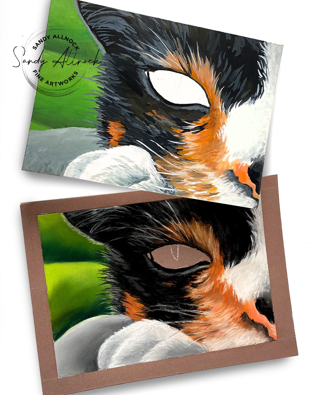
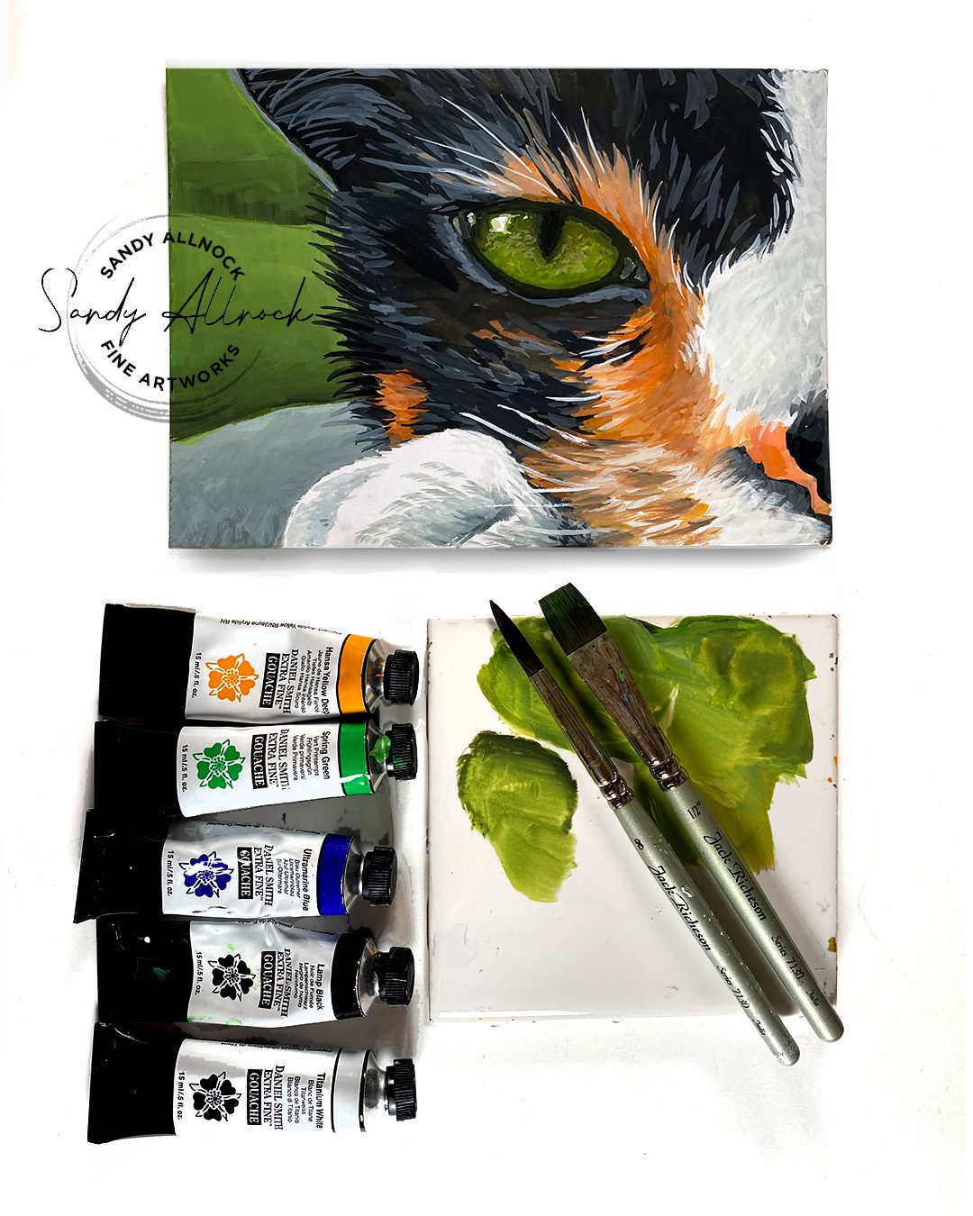
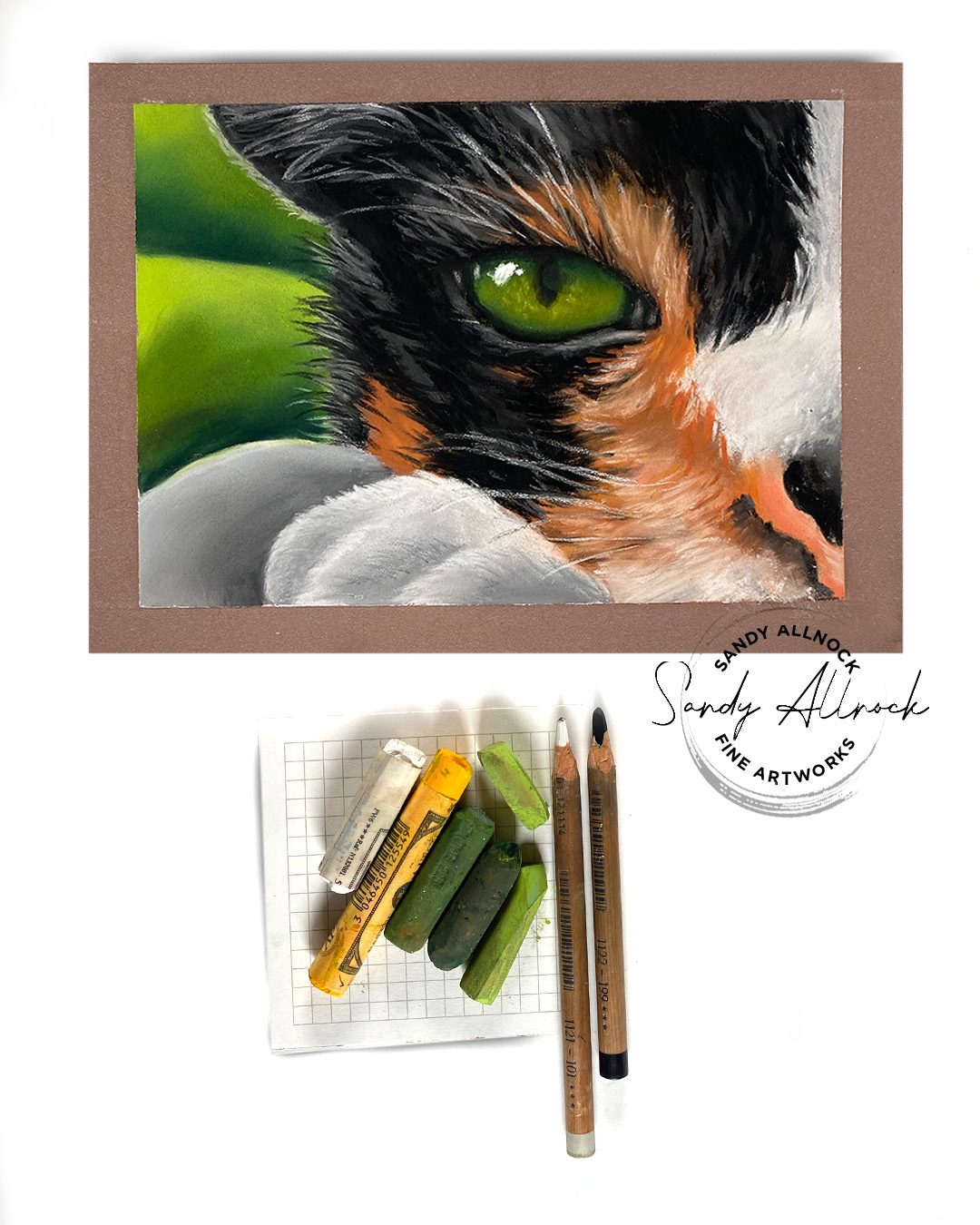
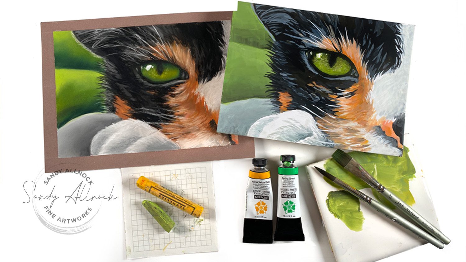
Ever need to mix the perfect green for a cat’s eye? (Or anything that’s an olive green?) With a little basic color theory, you can mix ANY color you want!

A little side story: while working on these two pieces I was on the phone with  my Mom. She was SO EXCITED that I launched my Commissions page finally! And excited that a bunch of applications came in right away too! And that there are a bunch of pieces that sold in the big SALE currently going on. I mean, seriously. This is a milestone. Mom doesn’t do computer stuff and watch my videos or anything. She was giving me advice on pastels. Celebrating a MILESTONE here. 🙂

If this photo doesn’t convince you that eyes are what makes a drawing work…nothing will!

Tutorial: How to mix the perfect cat’s eye green hue

Quick question: what do you think about the thumbnail? I’m not worried as much about what it looks like here embedded in the blog, but in the grid you see on YouTube. Would it catch your attention more than my usual?

Watch the video below and scroll to the end to leave comments or questions — or click HERE to watch it on YouTube and leave comments over there. I read both dutifully!

Mixing colors for wet media

Watercolor, gouache, acrylic, oil….anything that is mixed on a palette before being applied—mix them on the palette. A warm yellow will turn a cool green into an olive color, desaturating it.

Mixing colors for other media

If your media doesn’t get premixed on a palette – think alcohol markers, colored pencils, pastels – then mix ON the paper. Either apply and blend like shown with pastels, or layer them atop each other in glazes. 

Note: you can use this for watercolor too – if the color isn’t olive enough that you mixed in the palette, paint a thin wash of yellow on top of the green to glaze it.

What colors do  you struggle with mixing?

I’d love to help out – what color do you need to mix, and in what mediums? 

Supplies

Some product may be provided by manufacturers for review and use. Compensated affiliate links are here at no cost to you. I appreciate your support of my work with your purchases! Full affiliate and product disclosure | My trusted partners in art

  1. Pastel:
    1. Mom’s random pastels
    2. Clairefontaine pastel mat pads
    3. Faber Castell Pitt Pastel Pencils  (I’m looking for softer ones. Not sure on these)
  2. Gouache:
    1. Scrap board
    2. Daniel Smith Gouache 
    3. Joybest airtight palette 
    4. Jack Richeson travel brush set 

Subscribe to receive blog posts by email:

Favorite things for finishing a card image (and new classes!)

Favorite things for finishing a card image (and new classes!)

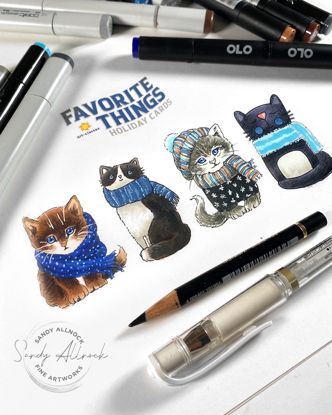
Have you begun your holiday cardmaking yet? I have a small handful done but I feel so far behind! Today I’ll give ou a couple tips that’ll take a simply-colored image and spice it up – and one tip will even make your coloring faster.

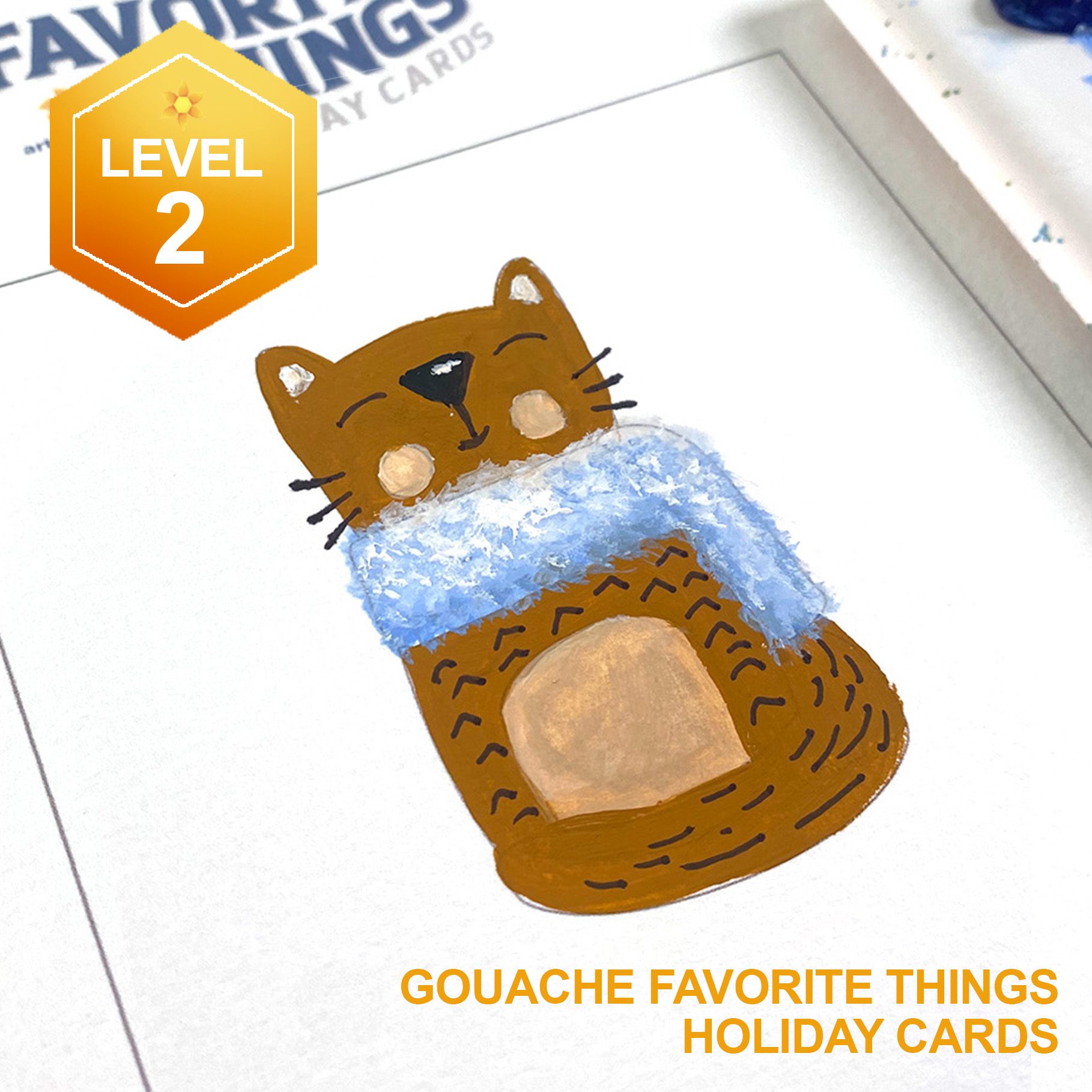
PLUS I’ve just released four brand new Level 2 classes—coloring images that’ll be unique ones for your holiday cards. Let’s get going!

Tutorial: Favorite things for finishing a card image (and new classes!)

Watch the video below and scroll to the end to leave comments or questions — or click HERE to watch it on YouTube and leave comments over there. I read both dutifully!

Four Tips, especially for new colorists

  1. Got some messy blending? Cover it up by adding a pattern on top! Either white snowflakes or polka dots, or even dark stripes or dots on an outfit would do the same. And if it’s a background, just add falling snow! No one will see the messy color beneath.
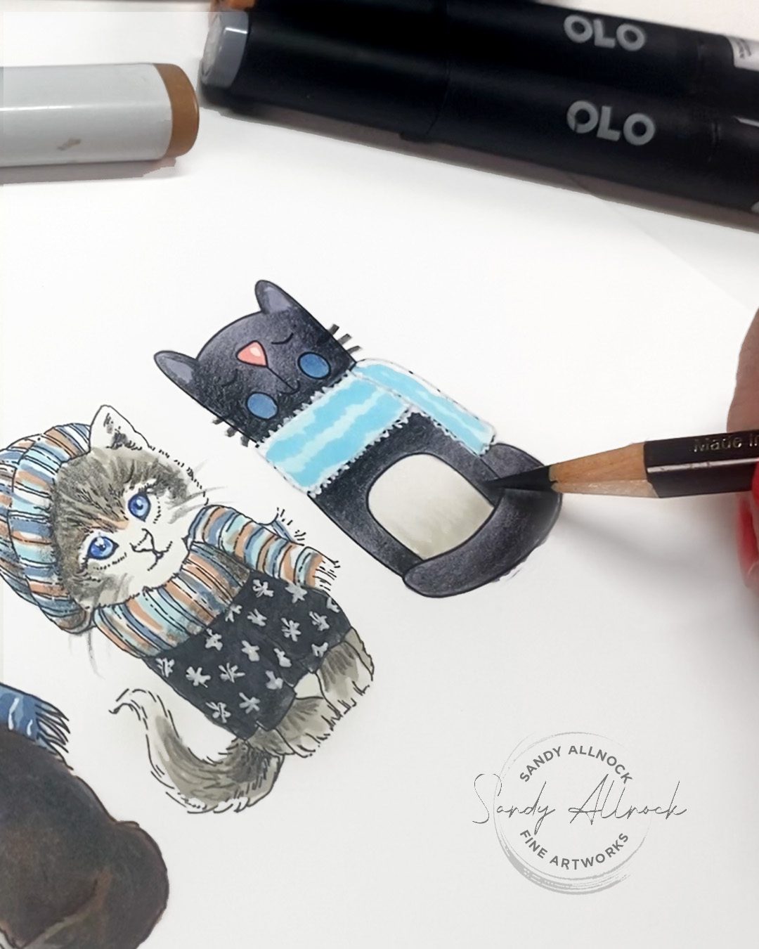
  2. EASY blending: Color an image with one flat alcohol marker color, then do colored pencil blending on top. It’s the best of both worlds: simple flat alcohol marker with no blending needed, then the pencil won’t be fighting white gaps caused by the paper texture. Win win!
  3. Add shading to white pen texture! Go over the shaded areas with the alcohol marker base tone of the object being shaded. That’ll dull down the pattern in shadow areas, making it look more supple like real fabric. Scribble the pen on scrap paper 
  4. Make the tiniest highlights on eyes by drawing the dot with a pen, then “shave” it down to a good size with a pencil!

New Classes & more

Click on the image below to get to the course you’re interested in – you can see all the images that’ll be in the lessons once you’re there! OR you can go to the brand spanking new HOLIDAY page, where these are all at the top, and all the other holiday/winter classes are all on one page! Tap on the image below:

Alcohol Marker

Colored Pencil

Gouache

Watercolor

A timely older tutorial…for winter

White pens are the bane of the existence of many…this might help!

WHEW!

Those who’ve followed along on Patreon and Artventure know this was a heroic effort to get all this together; and I’m excited that I also have next week’s videos scheduled. So after I take a couple days to just SLEEP, I’ll be spending time working on sample pieces and figuring out prices for the upcoming commission fiesta. Hooray!

Subscribe to receive blog posts by email:

Holiday gifts only artists can give

Holiday gifts only artists can give

Do you make your Christmas gifts each year? I know some do, but lots of those are making a quilt or painting something to frame, and I want to expand your thinking just a little bit this year.

With so many of my students joining sketching classes….I think we should normalize creating a custom sketchbook for our loved ones!

IMPORTANT NOTE BEFORE WE BEGIN:

In my last post I asked for class reviews as entries to win a free seat in the Gratitude Junk Journal class. Something weird is going on over on the website so I’m changing the plan since not everyone’s able to leave a review – go leave whatever you would have said about a class on THIS BLOG POST. Once I fix whatever is wrong I’ll email y’all and you can copy/paste it to put it on the site 🙂

Tutorial: Holiday gifts only artists can give

Watch the video below and scroll to the end to leave comments or questions — or click HERE to watch it on YouTube and leave comments over there. I read both dutifully!

Gift ideas

What you decide to give will depend entirely on you, the time you have, and the skill level you’re at. But here’s a few starters:

  1. Create a sketchbook of the recipient’s hobby or favorite thing — roses in their garden, team mascots they support, foods they love. It can be anything that shows them you know them well and cared enough to create something just for them! It can be a “short” sketchbook (57 not needed, ha!) – so be on the lookout for small sketchbooks to use for this project.
  2. Make a piece to frame, again of their hobby or favorite thing. Give a quilter a watercolor of a beautiful quilt. Create a drawing of a sunset view from their window. Sketch their dog or cat – or even all the dogs or cats they’ve ever had!
  3. Create a themed pair of sneakers (like I did here), or paint a tshirt, a mailbox, or some other object with their hobby or fave thing. Help them show off what they love to others!


Where will all 57 birdies be?

I’ll be sharing the birds over on my Substack – it’s free if you want to sign up!

Supplies

Some product may be provided by manufacturers for review and use. Compensated affiliate links are here at no cost to you. I appreciate your support of my work with your purchases! Full affiliate and product disclosure | My trusted partners in art

  1. GOUACHE
    1. Winsor and Newton Intro Gouache Set 10 colors: • Blick • Amazon 
    2. OR Daniel Smith Gouache 
  2. PALETTE: Joybest airtight palette
  3. BRUSHES: Jack Richeson travel brush set for gouache • Blick • Amazon 
  4. SKETCHBOOK: 3″x3″
  5. GOUACHE PROTECTION:
    1. Dorlands Wax Medium 4oz • Blick • Amazon
    2. Dorlands Wax Medium 16oz • Blick • Amazon

Subscribe to receive blog posts by email:

Tiffany Glass Stamp & Doodle: 3 ways

Tiffany Glass Stamp & Doodle: 3 ways

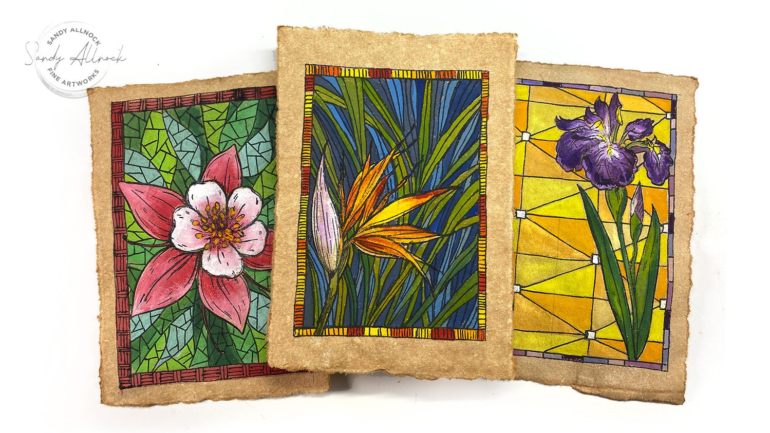
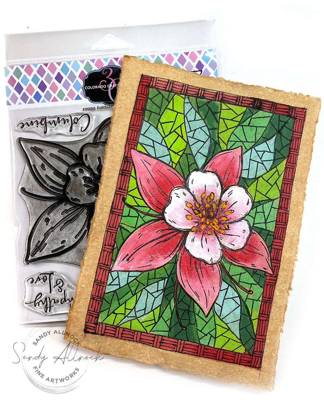
Have you heard of Tiffany Glass Stamp & Doodle technique? I bet not, because I just coined the term! 🙂 I’ve been thinking of the people of Hawaii for weeks, and created these tropical-themed designs with them in mind. The stamps were perfect for the idea!

It’s a bloghop day so be sure to enter to win – instructions are at the end of this post!

Tutorial: Tiffany Glass Stamp & Doodle: 3 ways

Watch the video below and scroll to the end to leave comments or questions — or click HERE to watch it on YouTube and leave comments over there. I read both dutifully!

The paper

I stumbled on this vintage watercolor paper online – every sheet is different, and I wondered what it would be like to paint on. Terrible for watercolor, but great for gouache! 

Technique 1: Pre-draw graphic

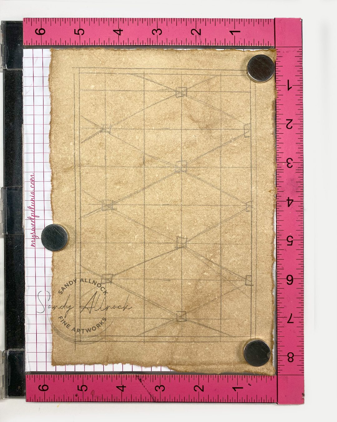
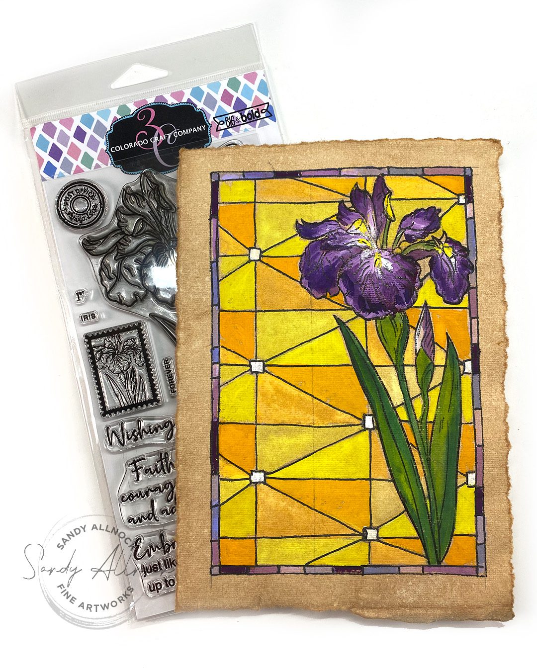
I created a grid, drew some angled lines, so I could create a bit of a pattern. The background color is the complement of the flower – yellows vs purples, so they really vibrate on the piece. Doing the doodles afterward is lots easier than doing the drawing part in pen first; getting the paint right up to the line without going over is too hard, but the lines later work great.

Technique #2: Ignore the graphics

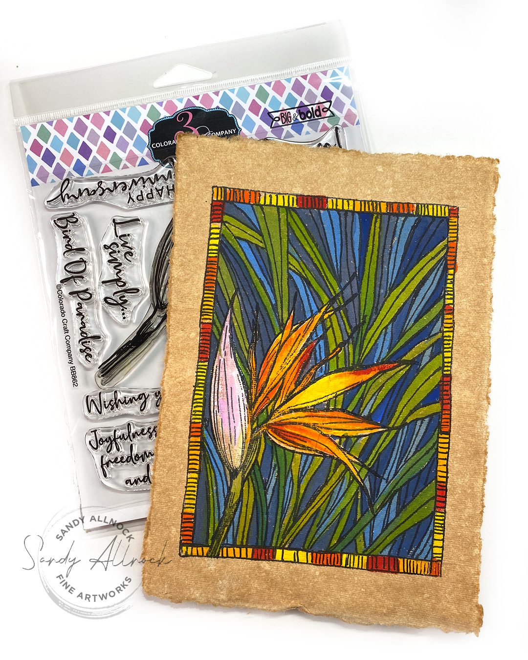
I started by drawing fronds in the background – but really didn’t like them by the time I painted the bird of paradise. With gouache I could just ignore the lines, and painted shapes that worked in the space available. Cool colors in the background and warm in the flower in the front.

Technique #3: Skip the graphics

This time I gave in – I hadn’t liked being controlled by the sketch so skipped it and just painted leaf shapes! I made the colors pastel cools, then doodled like mad all over. So much fun!

Use any medium for this technique!

I can easily see using other mediums and papers – get out your markers, paints, waterbased markers…..and go to town with a pen!

Bloghop

Not just one giveaway – there are two! You can comment up until Midnight (ET) August 31st; winners will be announced September 2nd.
  1. CCC  is giving away a free stamp set from comments on this blog post!
  2. If you use my link to make a purchase, you’ll be entered to win the entire release. ($270 Value)
Blogs to visit for more inspiration:
  1. Adrienne Kennedy 3C
  2. Amy Tsuruta 
  3. Caly Person
  4. Daniel West
  5. Donna Hitz
  6. Jenn Gross
  7. Jennifer Kotas
  8. Kassi Hulet
  9. Kelly Taylor 
  10. Michelle Lupton
  11. Nancy Sheads 
  12. Sandy Allnock <– you are here!


Instagram

  1. Adam Karle
  2. Jasleen Kaur
  3. Joe Sysavath
  4. Mansi Bhatia

Supplies

Some product may be provided by manufacturers for review and use. Compensated affiliate links are here at no cost to you. I appreciate your support of my work with your purchases! Full affiliate and product disclosure | My trusted partners in art

Subscribe to receive blog posts by email:

Using strong color: Stamping and Gouache

Using strong color: Stamping and Gouache

Welcome to a lesson on stamping and gouache together! I’m pairing the lesson with a celebration with Colorado Craft Company’s Christmas in July release – they always throw the best parties!

Gouache is opaque watercolor – it has some properties of watercolor, but also a few others! There are many techniques to use, and in my previous post, Getting Started with Gouache Painting, is one you might decide to visit to get tons more information!

(See the bloghop list as well as prize info at the end of this post!)

Tutorial: Using strong color: stamping and gouache!

Not all the cards are shown in process, but several are…..see notes below along with photos for tips from each card.

Watch the video below and scroll to the end to leave comments or questions — or click HERE to watch it on YouTube and leave comments over there. I read both dutifully!

Just Add Snow

Just Add Snow is a set with two images – I made two cards, one with an extremely simple background (a flood of color) and the other has clouds painted atop it. In the Gouache Jumpstart class, students will learn both clouds plus 2 different techniques to make birch bark.

Bird Perch Mini

Bird Perch Mini has the rabbit and bird as two stamps; the image on the package shows the bird standing on the rabbit’s ear, but I opted for top of the head to point toward the sentiment.

The bunny was stamped, then the background was painted on top of the edges of the stamp lines. As you saw in the video, a little bird is easy to paint atop a light background color. And the MISTI makes it so easy to restamp with each figure added to the scene!


Gift Exchange

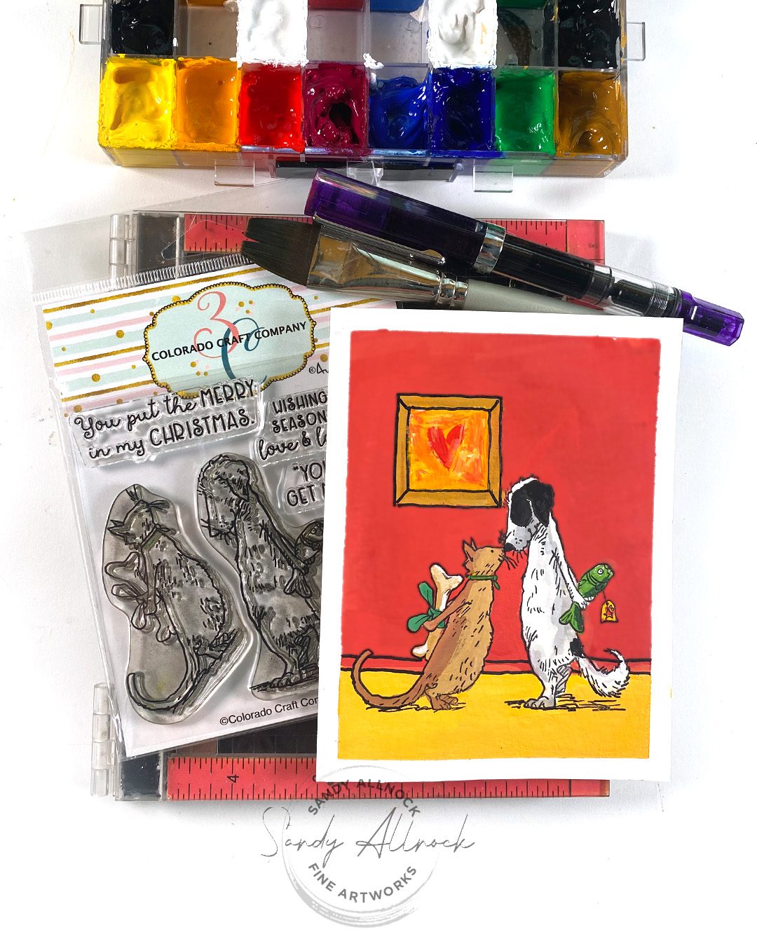
Gift Exchange is going to be a card for my sister’s cat from my dog! They haven’t met, but my sister fell in love with Vienna when she visited me recently, and Vienna loves kitties and is gentle with them. I think they’d be pals. 

Since I wanted the to be nose-to-nose, I had to have an alternate plan for stamping since I couldn’t do them together. I chose to paint the background around the dog stamp, then paint the cat on top, since it wouldn’t mean painting white on top of red.

Sneaky Mice

Sneaky Mice is a sweet little peekaboo mouse scene. I debated whether to put them in an indoor or outdoor setting; I liked outdoor, because it shows Santa visits the critters out in the wild, it’s not just sneaky mice stealing people’s stocking stuffers!

The moon shows what gouache looks like when color “lifts”; the white was painted atop the blue, and picked up some color. In this case I left it since it made it look more moon-like!

Mice Lights

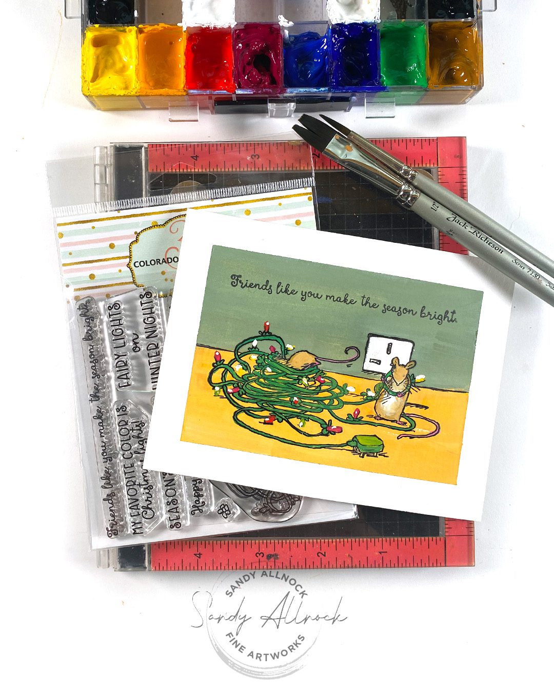
With a complex image like Mice Lights, painting the background right across the entire stamp was the approach I took. That meant the yellow is underneath all the tangle of wires, and painting them on top worked great.

Cozy Cat

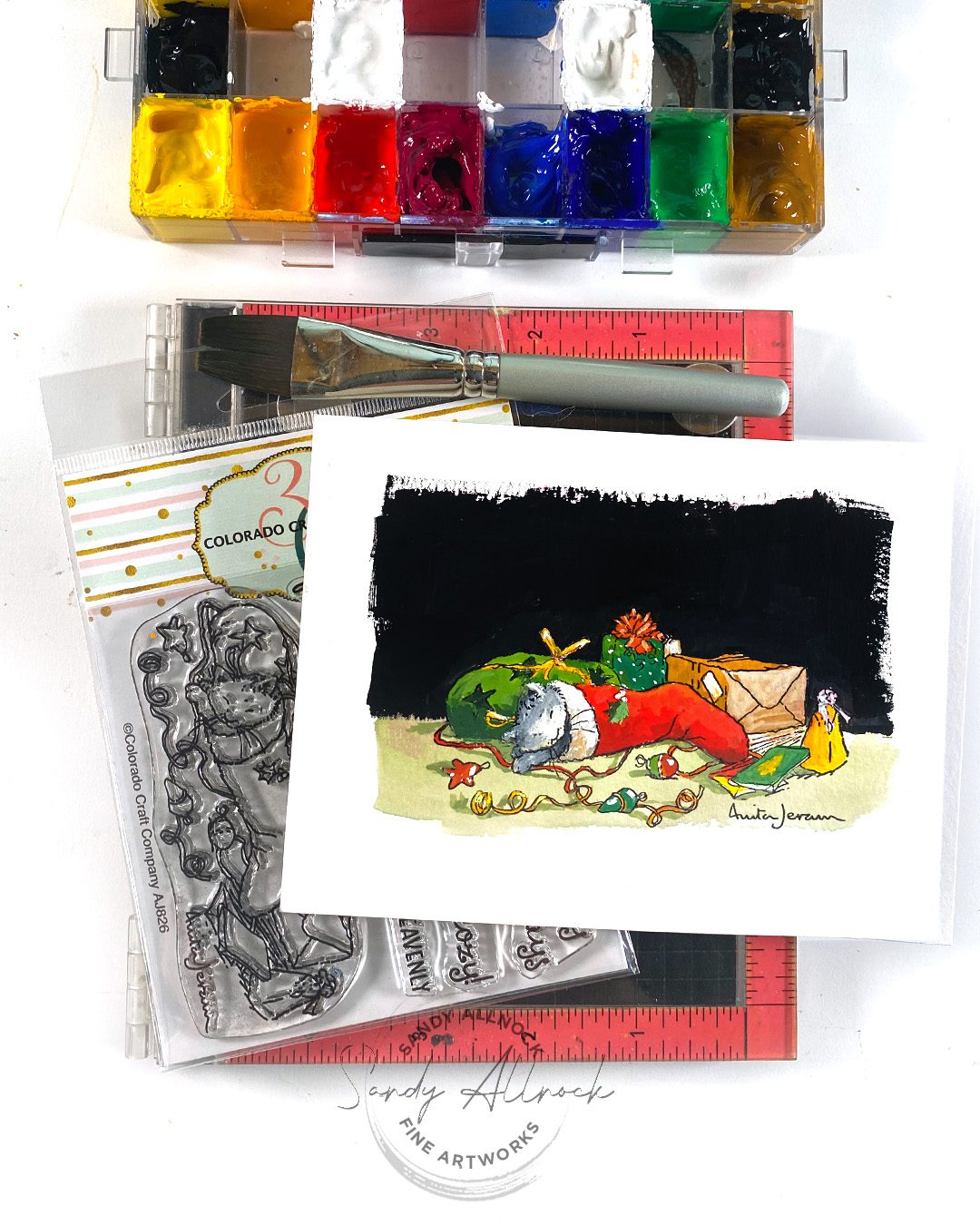
In this painting of Cozy Cat. gouache was helpful! I had painted the wall in the back a dusty rose color and decided the complex image was a little too messy for a light color – the eye needed help to “see” all the detail. I could paint the nice flat black right over it easily in gouache.

Meowy Christmas

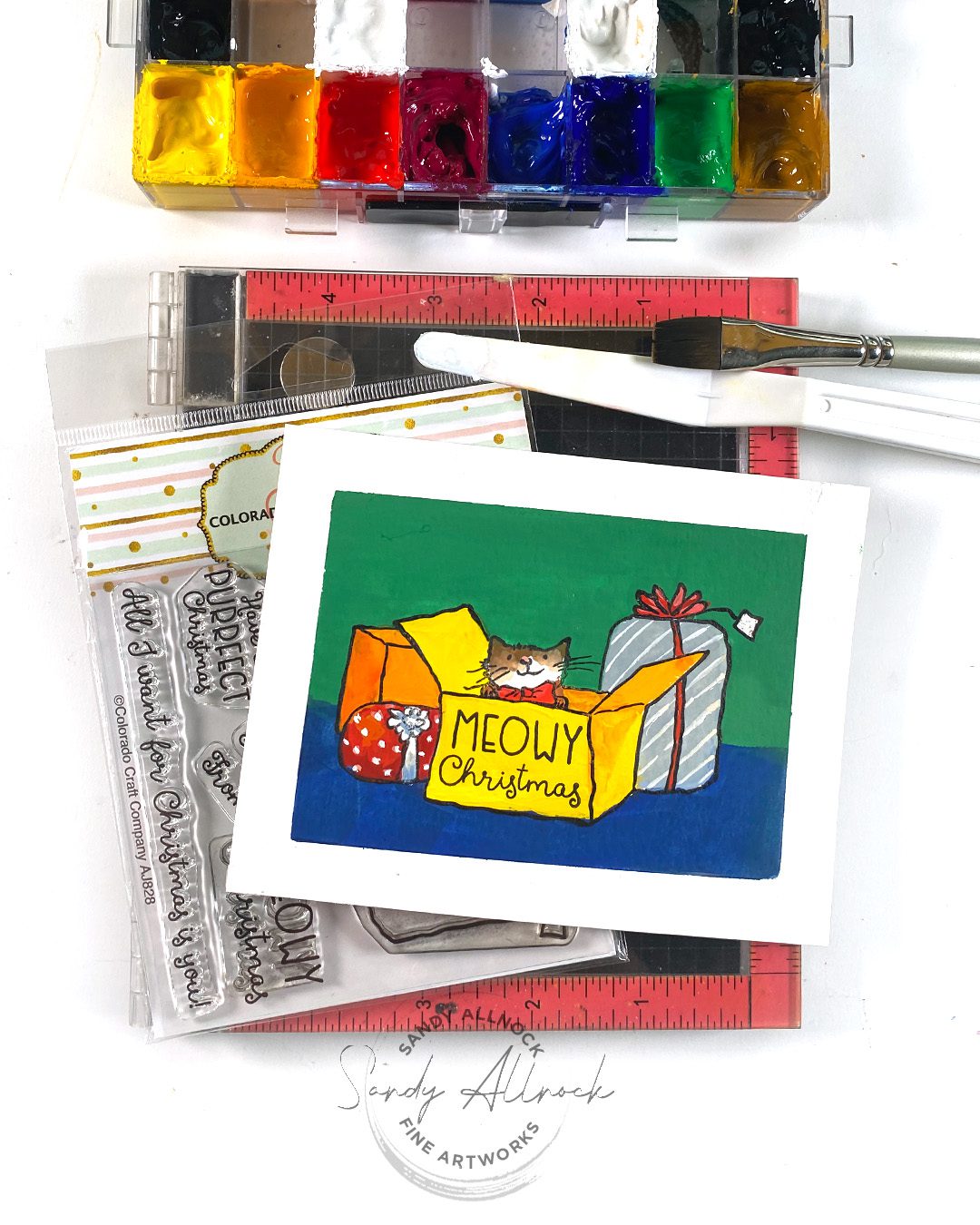
A simply drawn image like Meowy Christmas is easy to paint since it’s just shapes. But getting flat coverage takes practice! (Clearly I need more. ha!) Have some tiny brushes on hand for making patterns on giftwrap.

Peaceful Fox

I painted Peaceful Fox  in a much looser illustrative style. Starting with dark color to deepen the center of the tree and eliminating one figure under the tree, then using water to spread the color to the outside and giving it a watercolor feel. I could then get very loose and messy with the pine branches, especially since I was adding thick chunky snow. And a toothbrush makes wonderful fine snow!

Mice Ornaments

I bet you didn’t know mice decorate trees! Mice Ornaments  has two lil mice hugging a snowman ornament. I had painted this without knowing what I’d do for a scene; there was a lot of white and especially the snowman looked “weak” on a white background. That meant darkening it to increase contrast which worked well. I painted over the string on the snowman and tail on the little mouse, and could just paint them back in on top with gouache.

3 Kings

Last but not least the 3 Kings!

This went through stages – first painted by itself, not knowing the ‘scene’ that I would create. Since I’d stamped the star I knew it would be night and started increasing shadows, then it was still so busy against the bluish purple sky – so I put them inside a barn to give it a nice dramatic frame.

About that class!

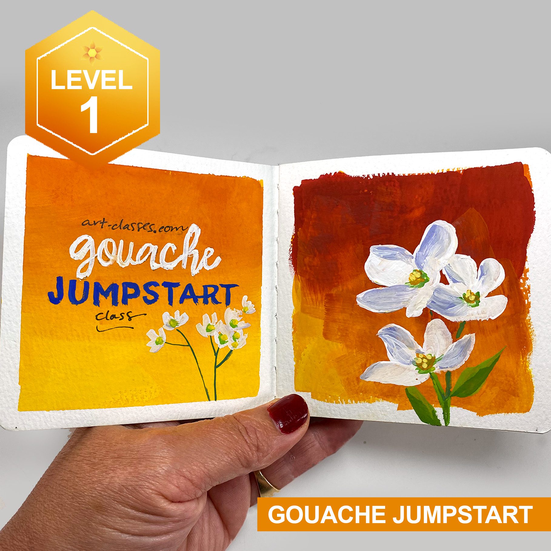
The new Gouache Jumpstart class teaches color theory for the first few lessons, then jumps into paintings…..you don’t need drawing skills! I made them nice and easy, and there’s photos in case you decide to trace them.

There is not any stamping in the course, however – this video today has been added to the PreClass lesson. So if you decide to try it later, that’ll be handy when you do for ideas on how you can maybe tackle stamping and gouache together!

Bloghop and giveaway!

There are 2 giveaways!!

CCC will give away one free clear stamp set from comments on my blog – they will choose the winner randomly and contact them.

If you use my affiliate link (any on this page) to make a purchase, you will be entered to win the entire release. . ($270 Value!!)

Bloghop links:

Adrienne Kennedy

Amy Tsuruta

Amy Young

Bibi Cameron

Daniel West

Donna Hitz

Erin Thompson

Jenn Shurkus

Jennifer Kotas

Jessica Frost-Ballas

Kassi Hulet

Kelly Griglione

Koren Wiskman

Nancy Sheads

Sandy Allnock

IG:
Adam Karle 
Jasleen Kaur
Joe Sysavath
Laura Inguz
Traci Jenkins

Supplies

Some product may be provided by manufacturers for review and use. Compensated affiliate links are here at no cost to you. I appreciate your support of my work with your purchases! Full affiliate and product disclosure | My trusted partners in art

  1. Colorado Craft Company Complete Bundle-Save 10%
  2. Colorado Craft Company Stamps Only Bundle-Save 5% 
  3. Colorado Craft Company Individual stamps (see website for dies)
    1. 3 Kings 
    2. Gift Exchange 
    3. Cozy Cat 
    4. Meowy Christmas 
    5. Peaceful Fox 
    6. Mice Ornaments 
    7. Mice Lights 
    8. Sneaky Mice 
    9. Big Gift Mini 
    10. Just Add Snow 
    11. Bird Perch Mini 
  4. GOUACHE:
    1. Winsor and Newton Intro Gouache Set 10 colors:  Blick • Amazon
    2. OR Daniel Smith Gouache –
    3. Hansa Yellow Medium 
    4. Hansa Yellow Deep 
    5. Pyrrol Scarlet 
    6. Quinacridone Magenta
    7. Ultramarine 
    8. Cobalt  
    9. Permanent Green Light  
    10. Yellow Ochre  
    11. Titanium White  
    12. Lamp Black 
  5. PALETTE: Joybest airtight palette
  6. BRUSHES: Jack Richeson travel brush set for gouache  Blick • Amazon
  7. GOUACHE PROTECTION:
    1. Dorlands Wax Medium 4oz Blick • Amazon
    2. 16oz Blick • Amazon

Subscribe to receive blog posts by email: