Getting Started with Gouache Painting

Getting Started with Gouache Painting

Welcome to the first step in getting started with gouache painting! I hope you’ll find a lot of helpful information here and in the link I’ll provide at the end…buckle up!

This post is divided into four sections following the video:

  1. What is gouache painting?
  2. What supplies are needed, and are they expensive?
  3. 7 tips that helped me improve with gouache
  4. More resources to learn (free ones plus a class!)
Tutorial: Getting Started with Gouache Painting

The video covers the content, but you’ll find the information written out below with photos – because the video is a bit of a firehose of info. LOL!

Watch the video below and scroll to the end to leave comments or questions — or click HERE to watch it on YouTube and leave comments over there. I read both dutifully!

What is gouache?

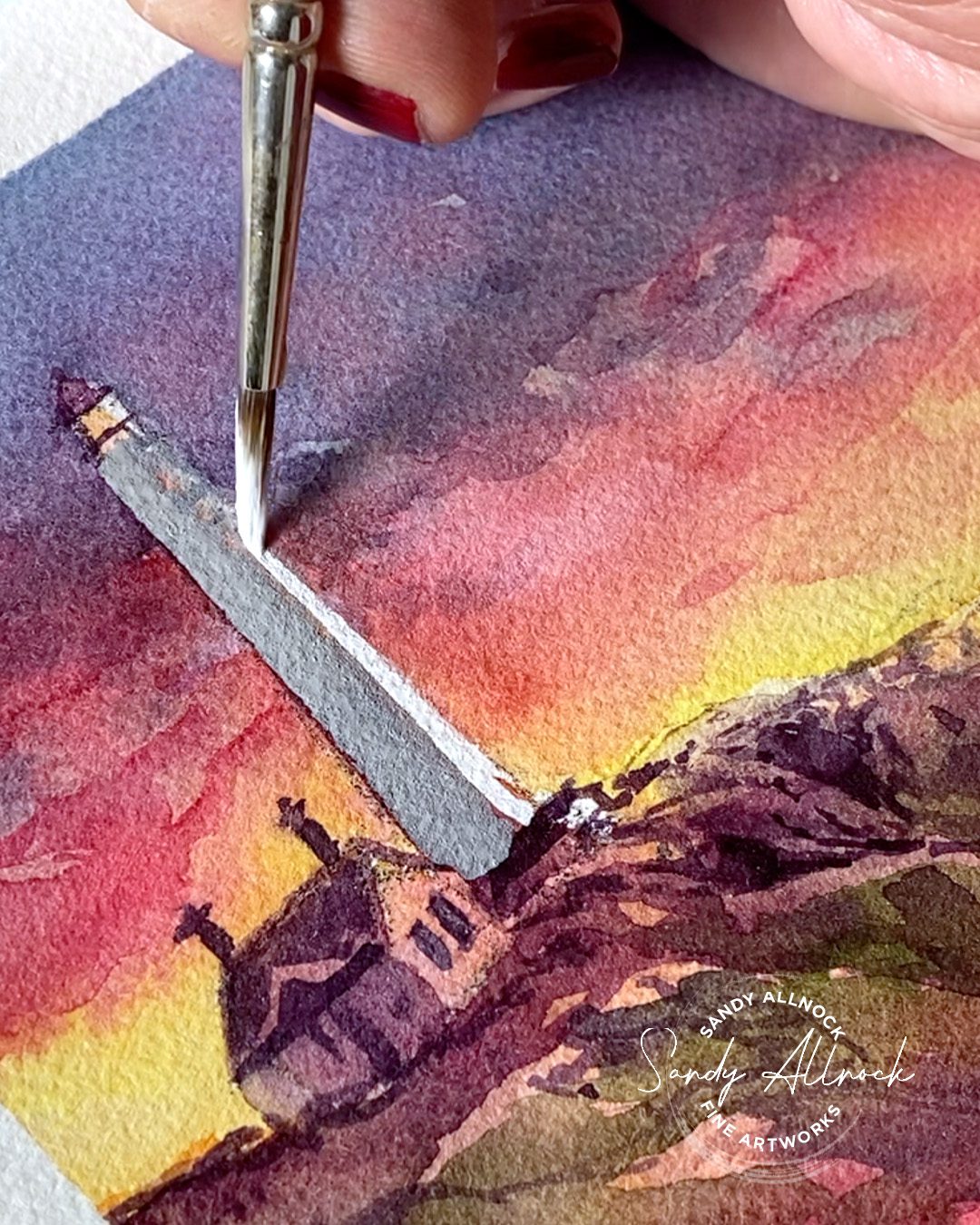
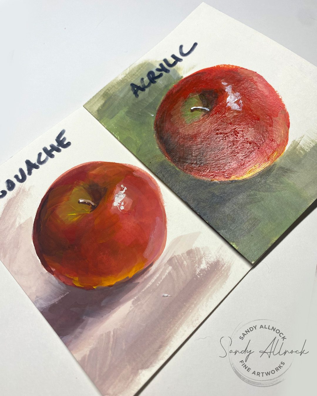
In a word, it’s opaque watercolor! Not just watercolor with an opaque or semi-opaque rating on the tube, but it’s thicker, creamier paint. For comparison, the lighthouse photo below shows how opaque it is on top of a watercolor painting; while some details can look good, lots of times gouache looks like a sticker because of its flat, matte appearance. The apples paintings show a matte gouache look vs the shiny appearance of an acrylic painting that also shows all the brushstrokes.
Styles of gouache painting

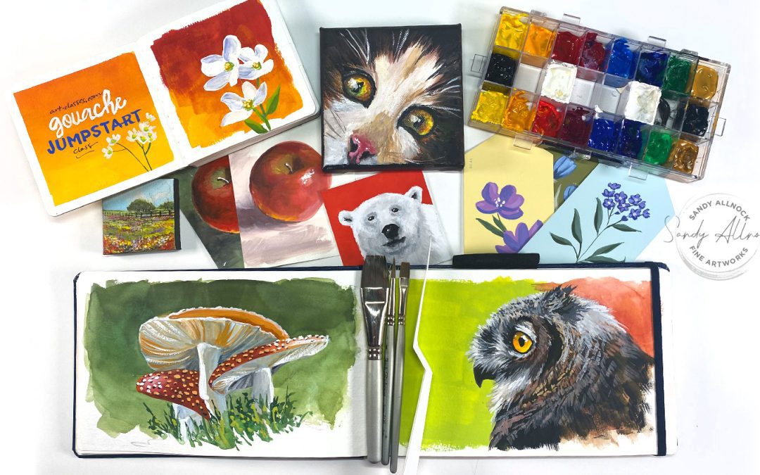
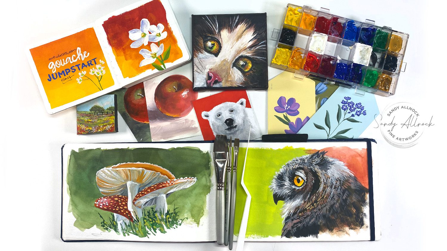
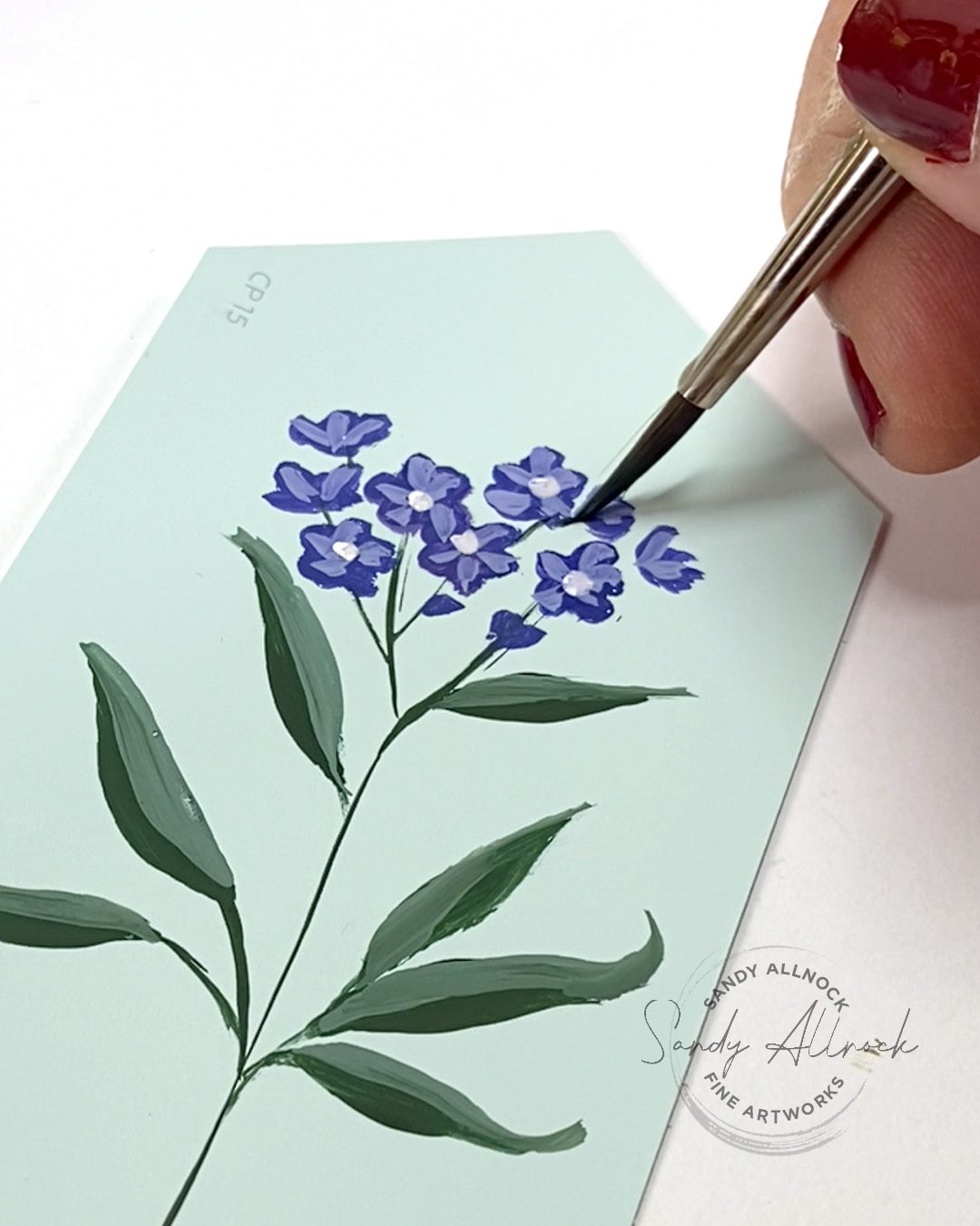
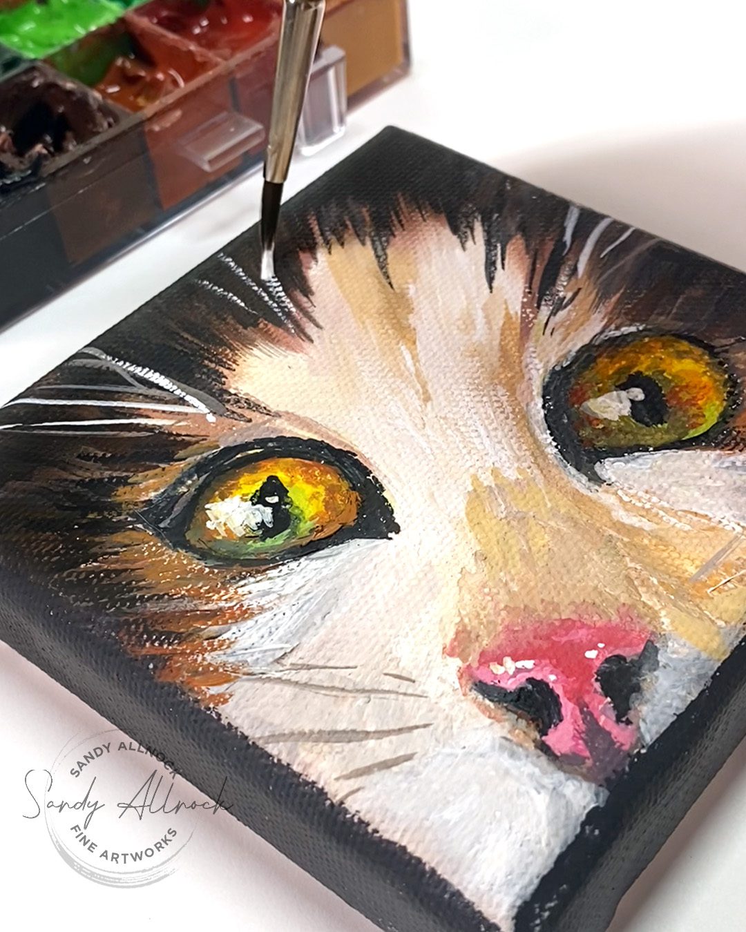
There are, of course, hundreds of ways to paint with any medium, but I find a lot fall into 2 main categories: poster or posterized, where the shapes in the picture are very graphical and simplified, and the other is more illustrative and expressive. The flowers below are painted on a color swatch from a local paint store, and the kitten is painted on a small canvas. These are not paper, but accept gouache once the first paint that goes on is nice and thick; watery pigment will just float weirdly on the surface.
What supplies are needed?


GOUACHE PAINT

The one expensive item is, of course the gouache itself. Single 15 ml tubes can run from around $11-$15 each. However – if you learn to mix colors yourself, you can get away with buying a lot less paint! I can make two good recommendations:

  1. The color collection in the Winsor and Newton Gouache set; it has 10 colors, including a warm and cool yellow, red, and blue, plus a green, yellow ochre, black, and white. It runs around $60-$65 – the drawback to WN is that the paint does dry out quicker in the palette than I’d hope, and they’re 14ml tubes instead of 15. However you can add water and stir paint, so getting it back to smooth isn’t all that hard; just put small amounts into your palette rather than filling it completely, so you have less paint to mess around with reconstituting.
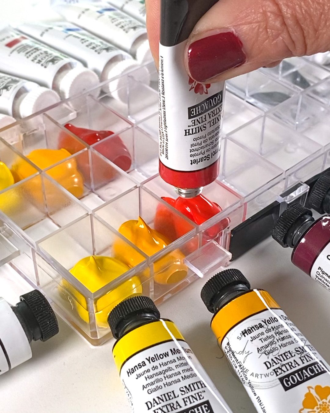
  2. Daniel Smith gouache is higher quality; I’ve had it in a palette for about 9 months and only periodically need to address any paints getting thicker. However, they’re nearly twice the cost as WN. (as I always say, we get what we pay for). I created a list of nearly-same colors as the WN set from the DS for the new class mentioned later in this post:
    –Hansa Yellow Medium

    –Hansa Yellow Deep
    –Pyrrol Scarlet
    –Quinacridone Magenta (the closest to a cool red, though it’s more violet)
    –Ultramarine
    –Cobalt (this color is neither warm nor cool, and is relarively close to Ultramarine)
    –Permanent Green Light (WN uses Medium, but the Light is just fine)
    –Yellow Ochre 
    –Titanium White
    –Lamp Black

PALETTE AND MIXING TILE

If you’d like to try a palette, I can highly recommend the Joybest airtight palette – but you can also just squeeze out a little paint as needed onto a mixing tile, and keep your paint tubes in a basket on your desk! I use a simple tile from the hardware store to mix colors on.
BRUSHES

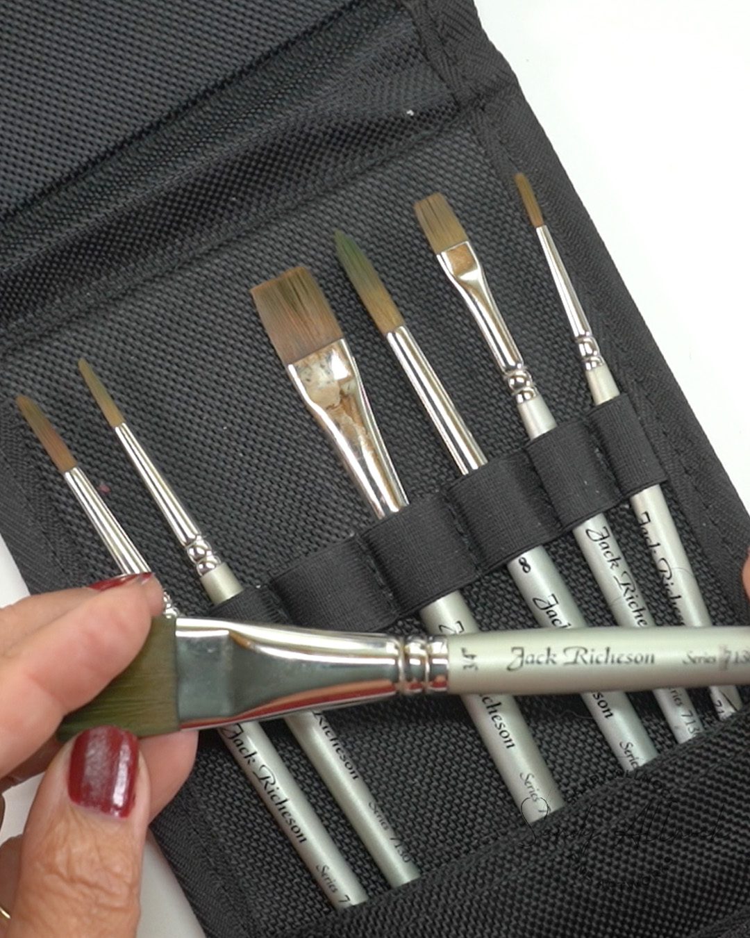
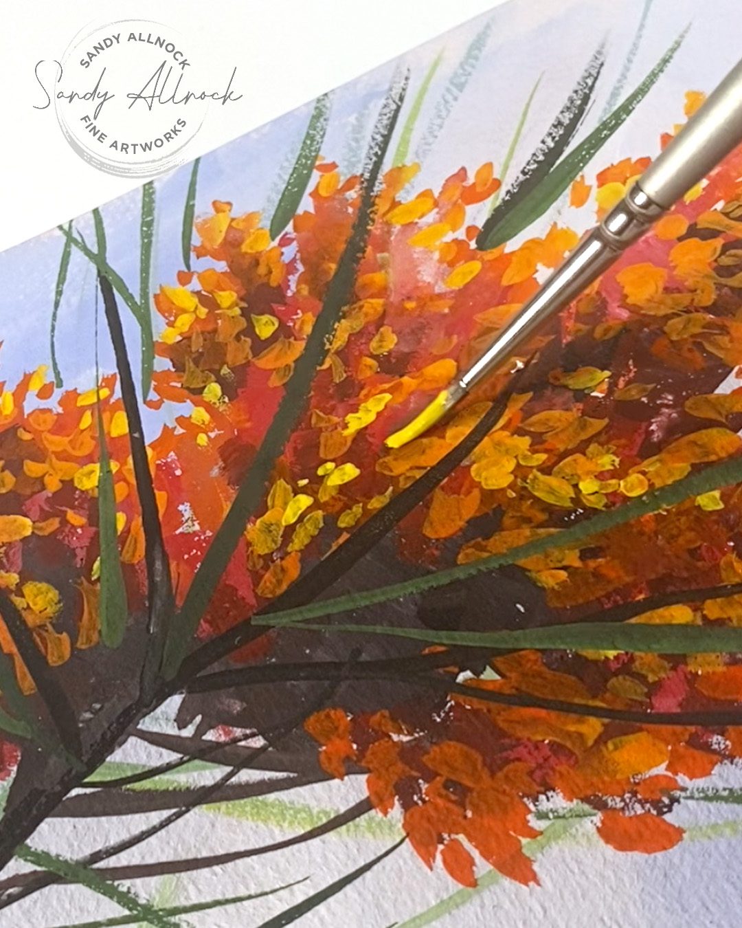
Here’s some good news: you don’t need pricey brushes! I did buy myself a Jack Richeson set, but honestly, when I started I just grabbed cheapo brushes from the drawer of materials I use with kiddos. Some had bristles falling out, etc, but it convinced me that you don’t need fancy ones. The set I have comes with a bunch of brush sizes and a case – flat 1/4, 1/2, 3/4, round 2 4 6 8 .
PAPERS

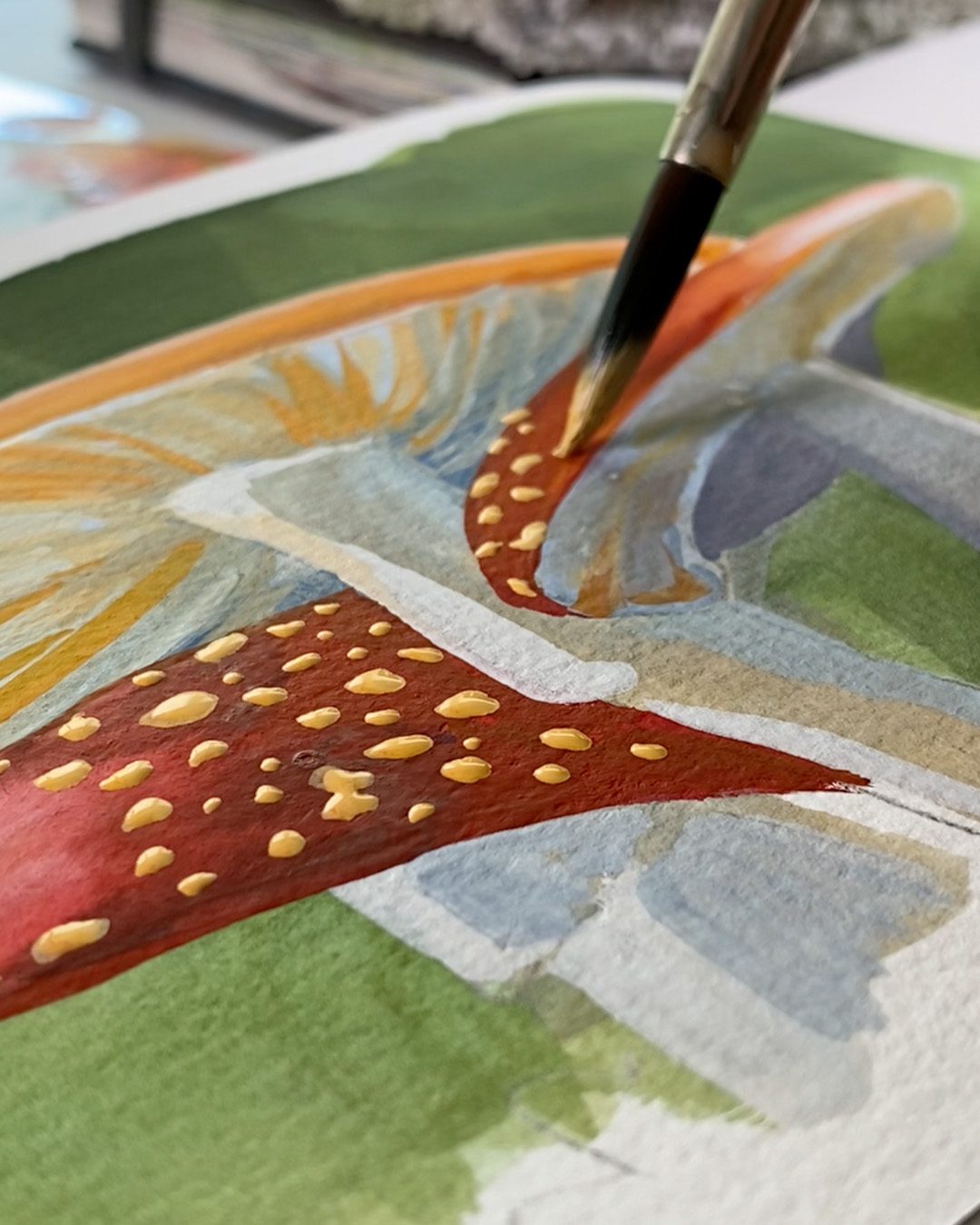
You can use any sketchbook that works for you, but the class you’ll see later in this post uses this inexpensive little sketchbook which is just under 3″; in this video you also saw Pentalic sketchbooks. Another good inespensive paper option would be Canson XL Pad:  BLICK – • AMZ   
7 tips that helped me improve with gouache


START SMALL

I found YT tutorials that were 8x10s and started out trying that but, oh man, did I have a lot of fails. And though I had received my first gouache as a gift from Daniel Smith (I’m an ambassador so occasionally receive product), I found myself going out to purchase more quickly, because I was blasting through it with all my circular file paintings.

But then I decided to just do postcards. A month’s worth, just to keep myself painting daily. And while I didn’t always succeed, and I was very very slow due to not knowing what I was doing, it was much better and I didn’t go through paint as fast as my first batch of paintings.

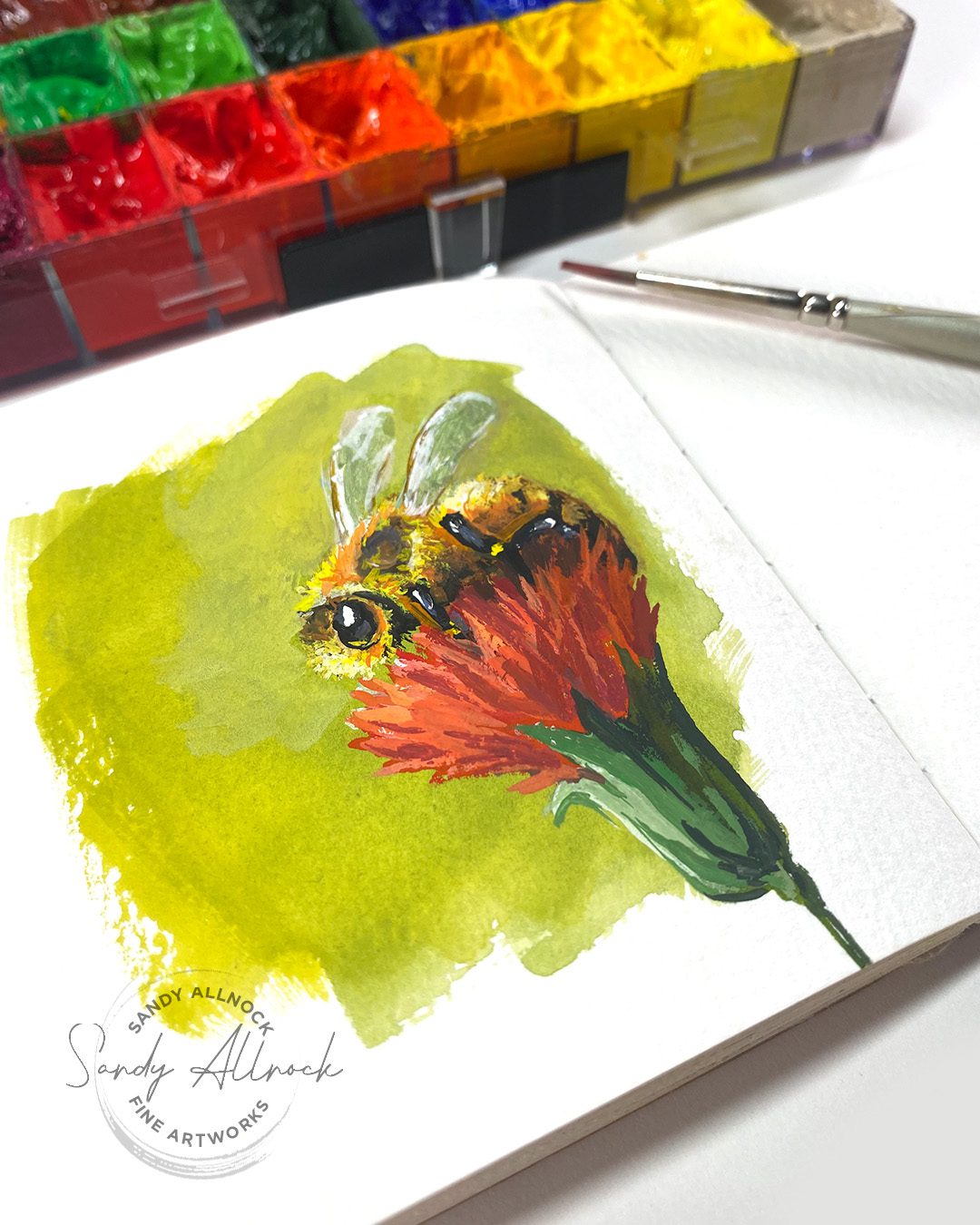
This little bee is painted in the 3″ x 3″ sketchbook that’s used in the class that you’ll see listed at the end of this post. He’s so cute! 
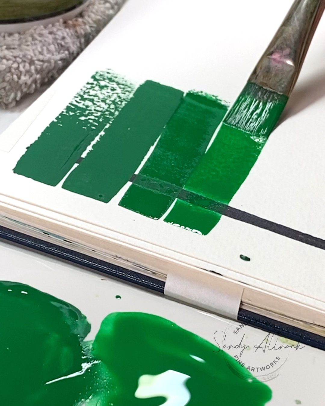
2. LEARN THE VARIOUS CONSISTENCIES

This was a biggie – I started off using gouache in a similar way as I used watercolor. Wrong! I didn’t even know how thick the paint should look on my mixing palette. Yeesh. I still struggle with it because my brain is watercolor-wired, but I’m getting better if I can just think a tiny bit and dab my brush off on a towel!
3. MAKE A PLAN: VALUE AND ORDER

I’ve had many a painting go south because I didn’t think through what would make sense. I’d heard people say dark to light, but found that sometimes it just didn’t make sense to do it that way. Then I heard people say back-to-front, and that tends to make more sense sometimes, but not always. So I find that each painting needs a bit of thinking and planning – so I look for which values I want to pop on the top, and where the darks within that portion of the subject might lie, and start to develop a plan.
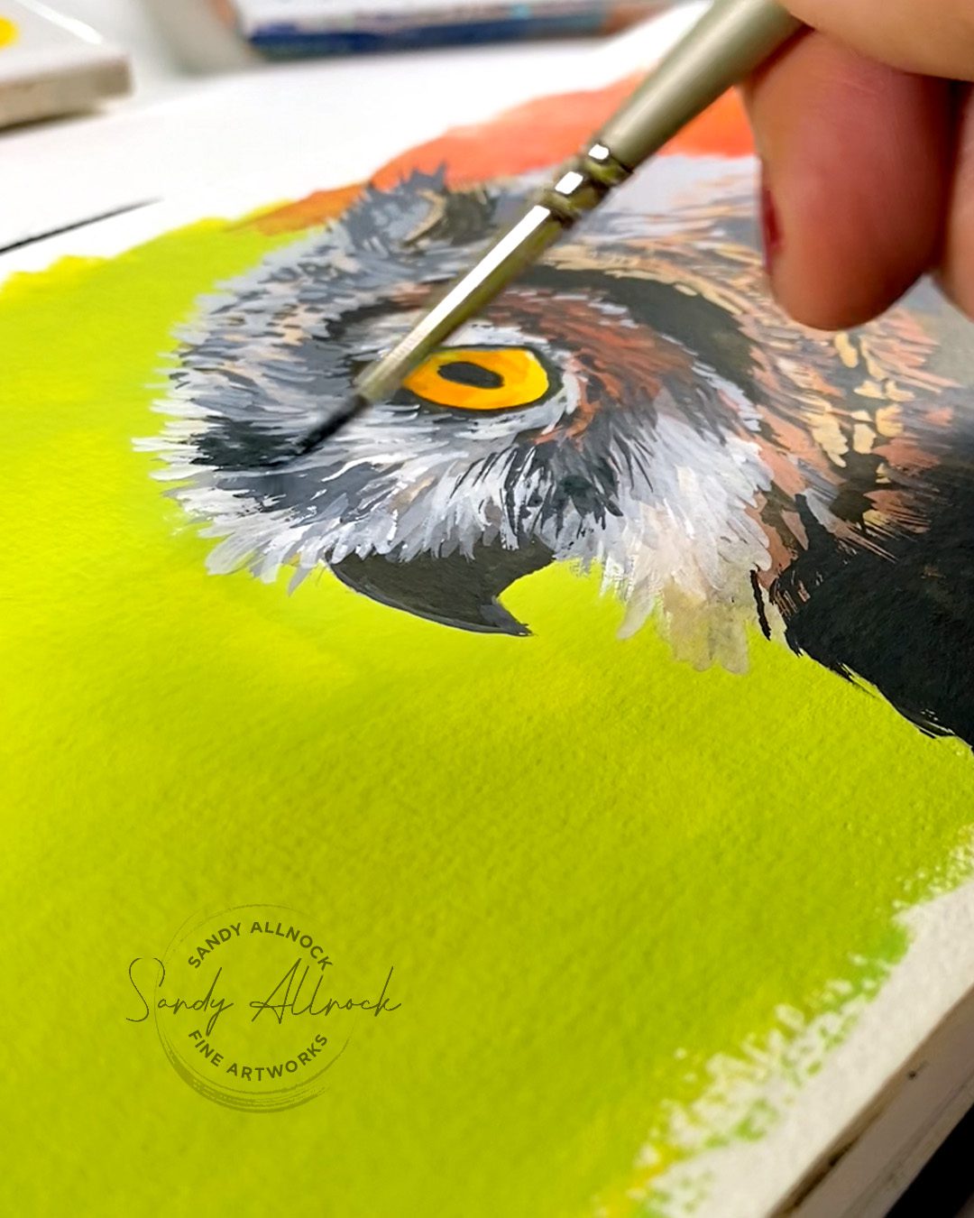
4. DON’T UNDERPAINT LIGHT AREAS

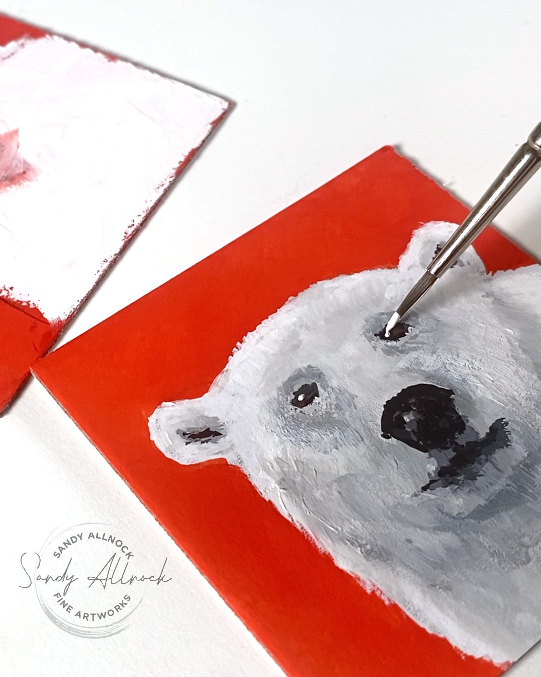
I was under a giant misconception; maybe it’s because I’m not great at mixing thick creamy paint. But I thought I should be able to paint ANYTHING on top of another layer. After all that’s what opacity means right?

Only sort of. 

I found that if a large section of the painting was to be a light color, then it was much better to just keep the background color out of it entirely. 
5. DON’T GET SWATCH HAPPY

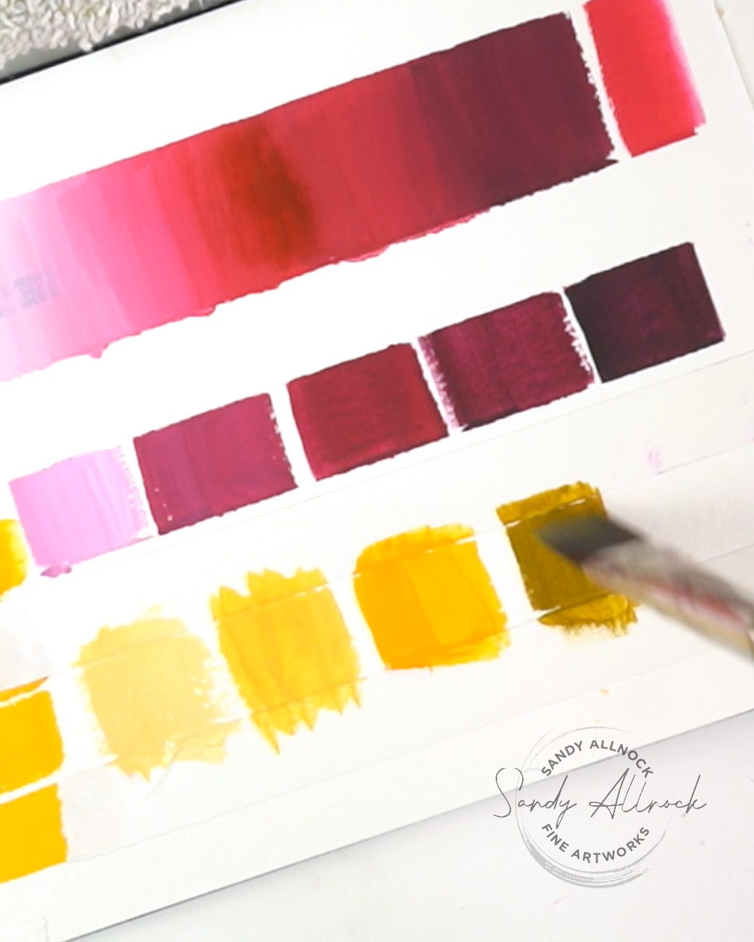
In watercolor, we make tons of swatch charts. Mixing charts with 10 variations on a mix. 24×24 boxes on big papers…..I’m not sure how many of us actually refer to them later, I know I rarely do!

But in gouache if you create that many charts, you’re using up so much gouache. Using this medium requires a lot more paint than we’re used to in watercolor – so be selective in the kinds of charts to create. I recommend a tint and shade chart for your palette of colors, and you can see a video about how to make it in the class listed below. 
6. DON’T ADD SO MUCH WATER

This is related to my previous struggles – being used to watercolor, it’s hard to think about how much water NOT to add, whereas when watercoloring I’m always pushing myself to use MORE so the paint flows. 

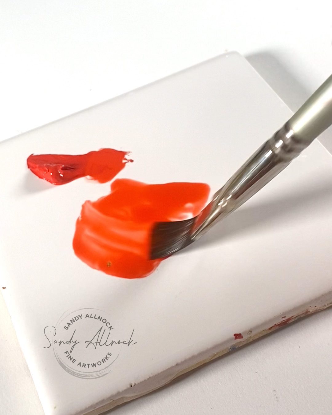
When bringing water to a mixing palette, start the puddle next to the blob of paint, not ON the blob – or else you can turn a whole blob into a puddle in the matter of 2 seconds, and getting it back to creamy is going to need a lot more paint to thicken it up. 

Also – bringing your brush back and forth from grabbing paint from the palette, rinsing it, then getting more paint from the palette…that process just keeps bringing more water to the mixing area, and expelling tons of pigment into the water. Both waste paint! Instead, use a palette knife to grab paint to put onto your mixing surface. Then your brush doesn’t have to do all the work.
7. PRESERVE YOUR GOUACHE PAINTINGS

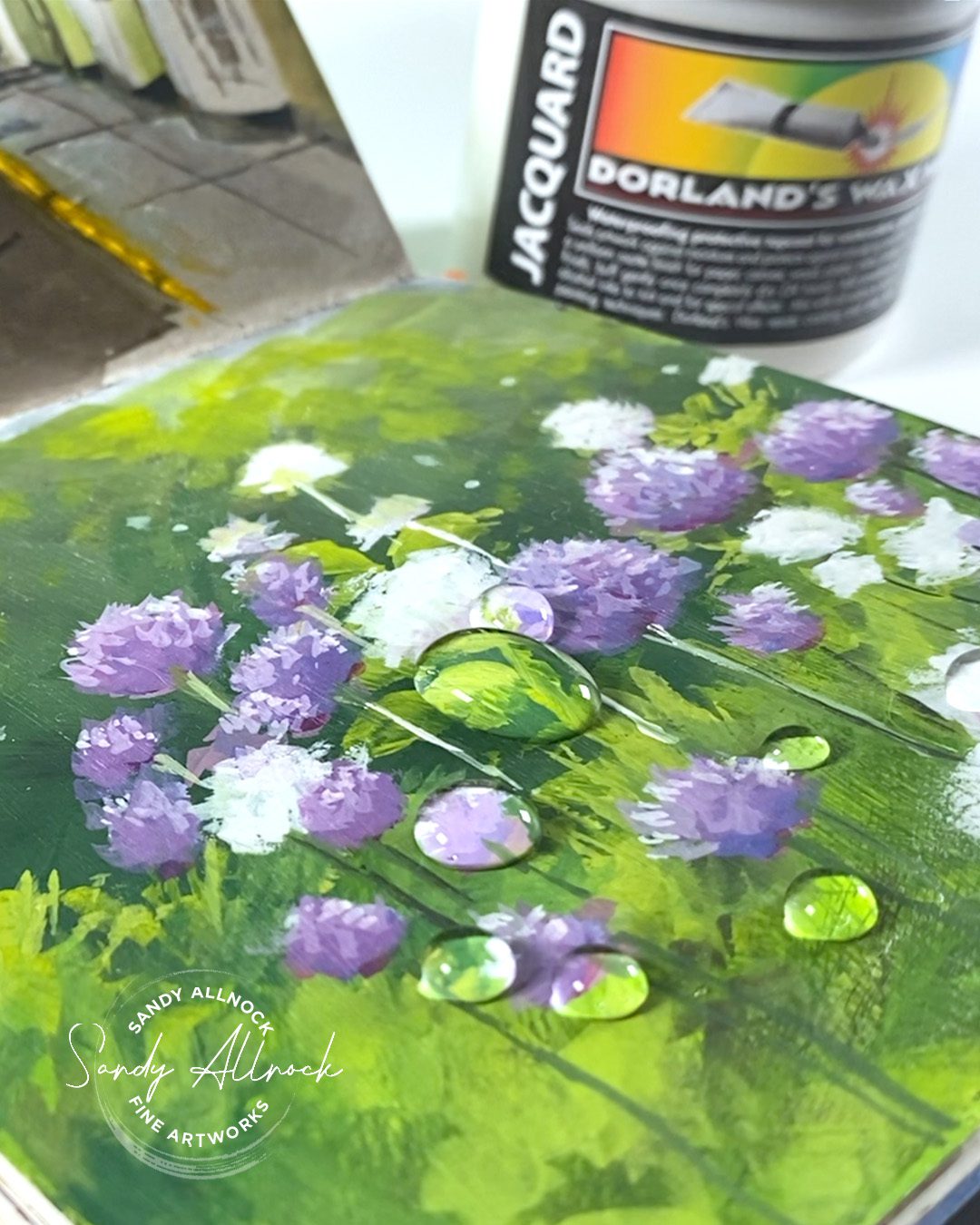
I’ve been buying and trying products for months, and found some that seemed to work at first but after a while they lost their mojo – dangit! But I’ve been happy with Dorlands Wax Medium; it’s been standing up to testing for a few months now, so I’m confident in making the recommendation. See a video about how to apply it in the class listed below.
Gouache Jumpstart Class + free resources

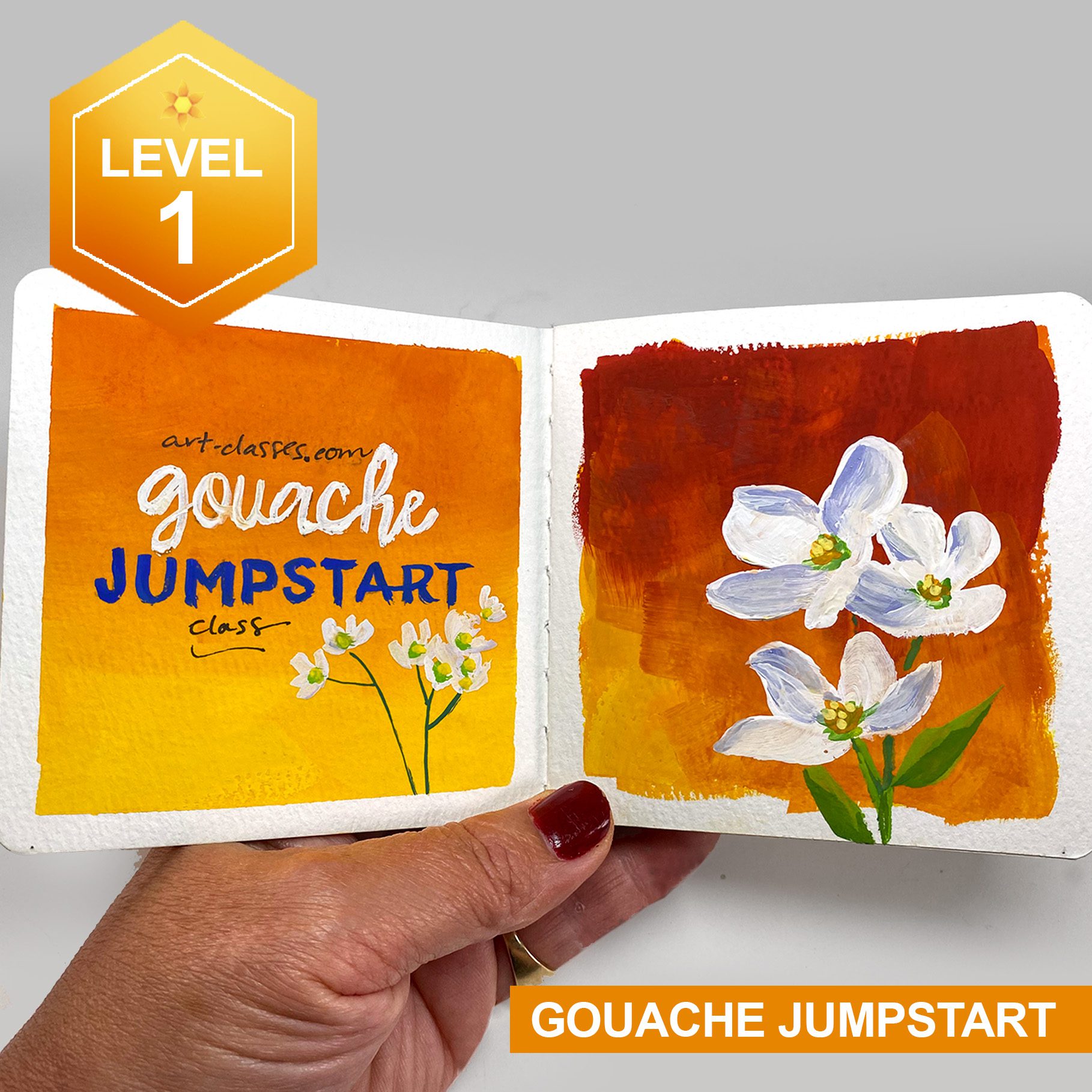
Announcing a new Gouache Jumpstart Level 1 Class! Yes, I finally got around to creating this one, and the class is available. You can find FIVE more gouache videos in the free Preclass lesson, so, yeah, go check those out. If you find it all helpful I’d love it if you took the class, it’ll be tons of fun!
What gouache questions remain?

I hope this was pretty comprehensive…did I leave something out? Leave a comment!

I’ll be posting a stamping video with gouache on Friday, so stay tuned for that discussion too.

Supplies

Some product may be provided by manufacturers for review and use. Compensated affiliate links are here at no cost to you. I appreciate your support of my work with your purchases! Full affiliate and product disclosure | My trusted partners in art

  1. GOUACHE::
    Winsor and Newton Intro Gouache Set 10 colors: • Blick
    • Amazon
    OR Daniel Smith Gouache
  2. PALETTE: Joybest airtight palette
  3. BRUSHES: Jack Richeson travel brush set for gouache • Blick • Amazon
  4. PAPER:
    Sketchbook or class, 3″x3″

    Sketchbooks, larger: Pentalic

    Paper Pad Canson XL: 9×12  BLICK
    • AMZ 
  5. GOUACHE PROTECTION:
    Dorlands Wax Medium:
    4oz • Blick
    • Amazon
    OR 16oz  Blick
    • Amazon

Subscribe to receive blog posts by email:

Garden Steps | Wash & Ink (Urban Sketching)

Garden Steps | Wash & Ink (Urban Sketching)

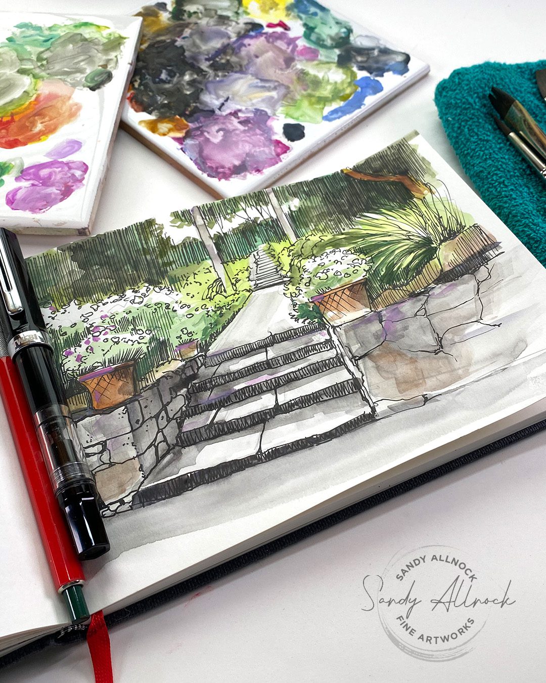
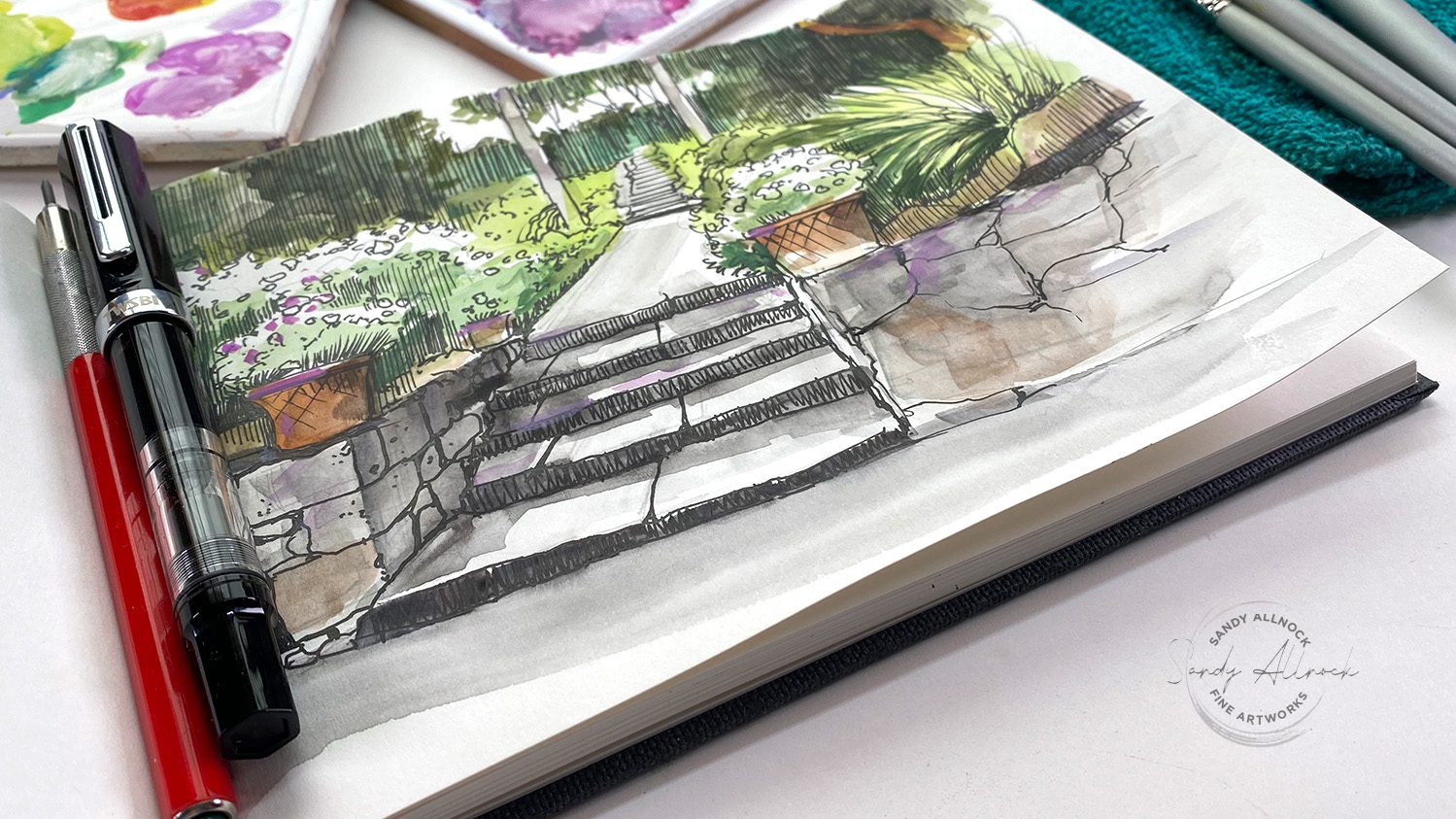
What is urban sketching? It is the practice of drawing what is around you, for instance, in your sketchbook. It does not necessarily mean that you draw cities, but instead you capture your own vision of the world where you live, and the places you visit.

This week I’m celebrating my birthday week with sketching! I’ll be combining pen and ink with gouache but you can do the same idea with watercolor – perhaps even more easily since watercolor is typically very transparent. (Gouache is opaque watercolor and can affect black lines.) I’m putting my TWSBI Eco to work!

Tutorial: Garden Steps | Wash & Ink (Urban Sketching)

If you’d also like to sketch this picture, you can download it for free from Paint My Photo, (You just need a free account there to download and use the photo.)

Watch the video below and scroll to the end to leave comments or questions — or click HERE to watch it on YouTube and leave comments over there. I read both dutifully!

Use leftover gouache or watercolor

Got a palette full of muck? That’s perfect for something like this! Typically colors found in nature are more desaturated than manmade bright paints; that means mixing the mush together will give you all kinds of great neutrals. 

That’s because read, blue, and yellow make neutrals of various types – so between everything on a typical mixing palette you’ve got at least a little of all that!

Decide what’s most important to you

When sitting out in the world around us – vs a photo that’s carefully cropped by the photographer – it’s easy to get overwhelmed. The world is full of STUFF! Picking what to keep and what to delete can be tough.

Decide what attracted you to that spot, or that photo. Put your time in there, and find graphical ways to treat other elements so you can simplify them. That can be done with line work but also with color!

Nervous about drawing in public?

Don’t be. The average person walking by will be truly impressed with you! I’ve made terrible drawings that shouldn’t see the light of day and had people ooh and ahh. Seriously – they WANT to compliment you! (I mean really, who walks around the world wanting to peek over an artist’s shoulder just so they can say, “Dang, that’s garbage!” NO ONE.)

Join a group!

Check to see if your town has an Urban Sketchers group. Any kind of drawing group! You’ll find there are people of all levels of experience – people you can learn from *and people who need you to help them.* Yes there will be people newer than you and they could use your encouragement and your presence! 

Supplies

Some product may be provided by manufacturers for review and use. Compensated affiliate links are here at no cost to you. I appreciate your support of my work with your purchases! Full affiliate and product disclosure | My trusted partners in art

Subscribe to receive blog posts by email:

New Gouache in the Studio, & Painting Sunflowers

New Gouache in the Studio, & Painting Sunflowers

This whole week has been a celebration of International Colour Day (see my last post with a Fibonacci spiral here) and today’ll be the topper with pretty sunflowers! I’ve got some new gouache in the studio and had to get them paletted and swatched, and have been practicing with a new brush set too.

Tutorial: New Gouache in the Studio & Painting Sunflowers

A quick peek at the brands that are now here in the studio…then a little painting with the Winsor & Newton set. Sunflowers! 

Watch the video below and scroll to the end to leave comments or questions — or click HERE to watch it on YouTube and leave comments over there. I read both dutifully!

Working with a mixing set

A mixing set like this one from Winsor and Newton offers fewer colors in general – and relies on at least a little color theory…or just a willingness to experiment! You don’t have to be elbow deep to try out mixing each of the warms and cools with each other – and warms WITH cools too. Don’t think that they have to stick with their temperature buddies!

Mixing browns is a little challenging; red blue and yellow make brown, and you can do that with 2 colors if one of them is made up of two colors….like red with green (Y+B) or blue with orange or brown (Y+R).

Brushes

James Gurney, a wonderful painter and teacher, recommended these Jack Richeson brushes. So far so good! I’m getting used to short-handle brushes, that’s not what I’m used to. But they work wonderfully; you want brushes that won’t secretly hold a bunch of water to add to your paint.

Winsor and Newton swatches

As promised….WN’s Introductory set has a cool and warm RYB, a black and a thie, and a green and yellow ochre. Great colors!

Holbein swatches

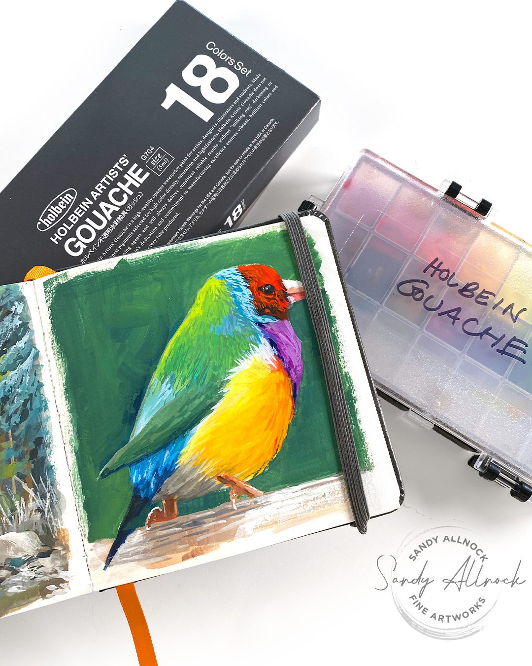
The 18 color set from Holbein is quite nice – I painted a couple things with it so far and didn’t like it as much as WN or DS but I need more experimenting to figure out just what is different here – maybe user error. LOL. 

Holbein sample

On a YouTube short yesterday I painted this sweet little bird – stay tuned for the end, there’s a little moral lesson for life that I learned from it!

Daniel Smith

Daniel Smith gouache wasn’t shwn in today’s video but I’m including this for comparison to the above. Their introductory set has a red yellow and blue, and a white, not even a black…but that’s it. if you can’t mix that red yellow and blue to make what you want, you need to buy some more colors. 

That Himi gouache

In the video I showed that awful gouache – please don’t get sucked in by it! And if you HAVE been painting with it, that’s great but – you’ll be super thrilled if you ever get artist quality gouache. Just sayin. 🙂 

Supplies

Some product may be provided by manufacturers for review and use. Compensated affiliate links are here at no cost to you. I appreciate your support of my work with your purchases! Full affiliate and product disclosure | My trusted partners in art

Subscribe to receive blog posts by email:

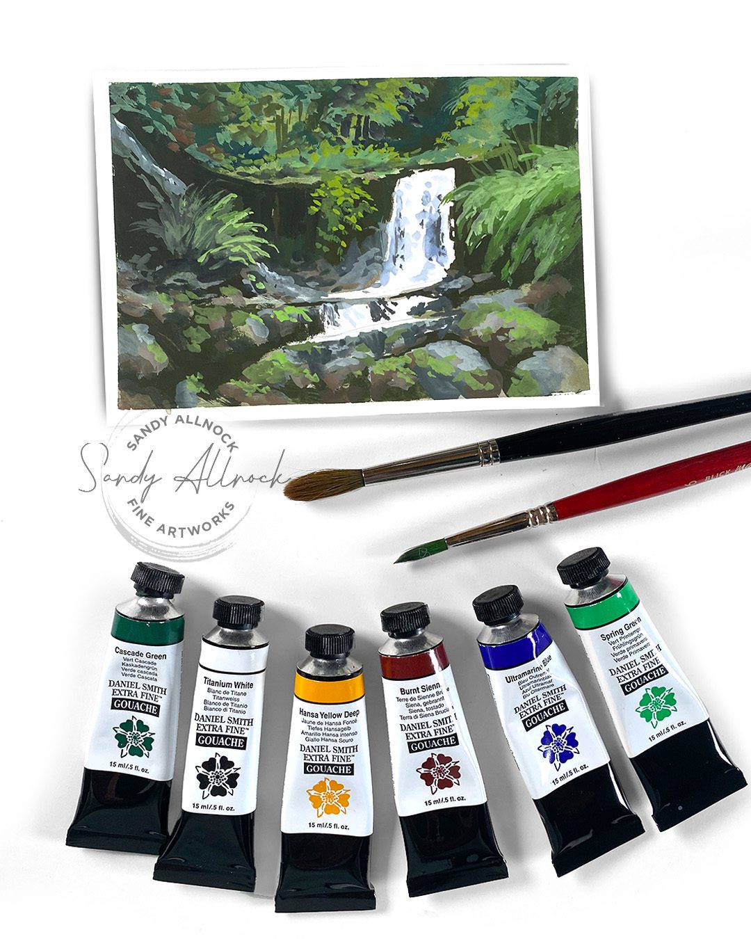
Real Time Gouache Painting: Waterfall in Tasmania

Real Time Gouache Painting: Waterfall in Tasmania

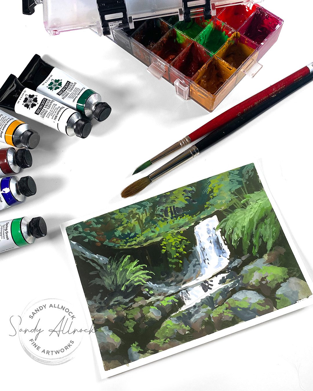
In this real time gouache painting, I’ll show you how I painted the Horseshoe Waterfall in Tasmania – and the process to build up lights on top of darks! I’ll be working from a photo, and you can, too –  just download it from Paint My Photo where you can create art from uploaded photos without any worries about copyright. Consider a donation to the site if you end up using their images, it’s not cheap to run a website!

Tutorial: Real Time Gouache Painting: Waterfall in Tasmania

Download the reference photo if you’d like to try painting along!

Watch the video below and scroll to the end to leave comments or questions — or click HERE to watch it on YouTube and leave comments over there. I read both dutifully!

Gouache Tips

After beginning with a loose wash to leave only the whites of the falls open, and add in darks, making the areas covered *larger* than needed. Later layers will be able to cover those edges, but it’s better to get the darks in early than try to add them later.

Working from darks, move to dark midtones, middle midtones, light midtones, then lights. The more delicate the jump between them, the more steps of dimension you can build.

Auction ends tomorrow!

Last chance to bid is sneaking up….go see what’s available and add your bid to the site!

Are you interested in gouache?

I’ve had a couple questions about a gouache class, and while I’m NOT ready to teach one yet (I’d want to do a jumpstart class and I’ve still got questions!)….I’d like to start finding out if there’s even interest in that kind of class. Let me know!

Supplies

Some product may be provided by manufacturers for review and use. Compensated affiliate links are here at no cost to you. I appreciate your support of my work with your purchases! Full affiliate and product disclosure | My trusted partners in art

  1. Daniel Smith Gouache 
  2. Joybest airtight palette 
  3. Etchr Postcards, Hot Press 
  4. Blick Master Synthetic Round 6 
  5. Winsor Newton Kolinsky Sable Series 7 Round #8 

Subscribe to receive blog posts by email:

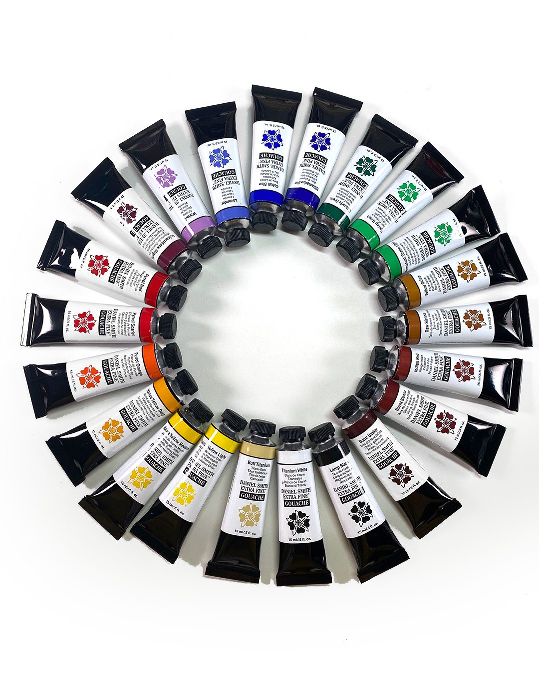
Swatching Daniel Smith Gouache (22 colors)

Swatching Daniel Smith Gouache (22 colors)

The last thing I figured I’d be doing right now is swatching Daniel Smith Gouache – all 22 colors. Or any other brand of gouache! 

I had misconceptions about the medium that, at least at first glance, seem to be very wrong. I’m just at the beginning of this crazy journey though, so stick with me while I learn!

The good folks at Daniel Smith gouache sent me these paints for swatching and painting with – I almost think as a dare. Or encouragement? I’m not totally sure. They do know me well enough to know I’ll try most things, but with my misconceptions about gouache, I’d have said no if they told me ahead of time a box was coming. I didn’t know gouache was so much like watercolor – that you can re-wet and re-activate it. I knew you couldn’t do that with acrylic, so it’s already been a great learning curve!

Tutorial: Paletting and Swatching Daniel Smith Gouache

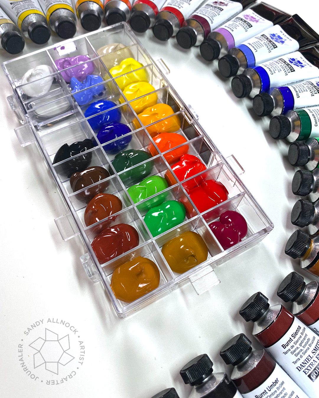
In this video I’ll be putting together an airtight palette of paints, then swatching the 22 Daniel Smith Gouache colors.

Watch the video below and scroll to the end to leave comments or questions — or click HERE to watch it on YouTube and leave comments over there. I read both dutifully!

Airtight Gouache Palette

Once I began researching, I realized the palette was going to be much more important for gouache than for watercolor. With regular watercolor you can just squeeze paint on a plate – doesn’t matter if it dries, it’ll be fine when you re-wet it.

Gouache will re-wet as well – but it changes consistency some when that happens. The “sweet spot” for mixing gouache is just wet enough to move, but thick enough to remain opaque. When pigment is re-wet from a dried puddle of color, it’s harder to get it thick again. From what I read, different brands handle this differently.

I watched a great video by a gal who tested a bunch of airtight palettes. This is the one she came away with as the best to keep paint fresh longest. The one she had was under a different brand name, but that one wasn’t available at the time I shopped, so I picked up this Joybest palette. (I think a lot of companies use the same one and just brand it with their name.)

KEEP THE LID ON IT! I’ve already found it’s best to put a blob of colors to use on the tile and close it up.

Swatching Daniel Smith Gouache

Swatching to see the color isn’t necessary for gouache; the colors in the pan and on the paper are the same. But it’s still a good exercise to do to practice getting that “correct” mix. I tried opaque, semi opaque, then transparent like watercolor – and most of the time I got it right. Ha! Painting with these is much better practice but this is a great exercise for a new gouache artist.

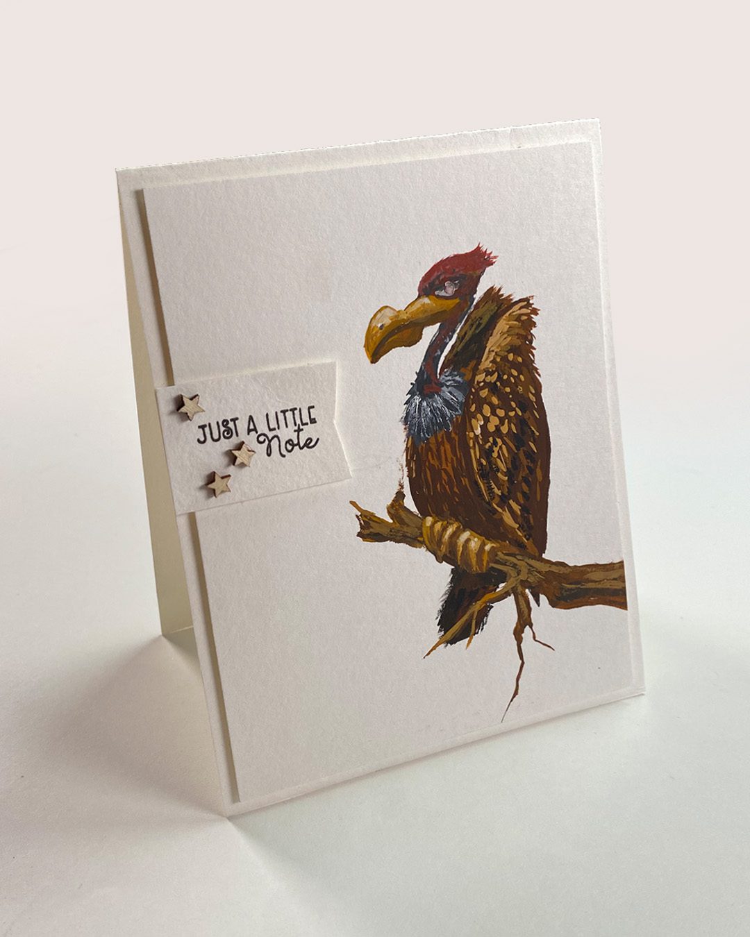
Gouache buzzard card!

Yesterday was the first of my “Friday Fun” card shorts – did you see it? Click here to watch! You can also catch up on the gouache paintings I’ve been posting this week on my Fine Art instagram account.

Is gouache on your want-to-try list?

Right now I’m new enough that I’m not sure I have much to offer for advice. Perhaps pick a warm and cool red yellow and blue plus a black and a white? You can mix them into a lot of other colors! Be prepared that you’ll use more pigment more quickly than when using watercolor – I’m trying not to panic about making it through 31 paintings in January! ha!

Supplies

Some product may be provided by manufacturers for review and use. Compensated affiliate links are here at no cost to you. I appreciate your support of my work with your purchases! Full affiliate and product disclosure | My trusted partners in art


Subscribe to receive blog posts by email: