Artists: Which is more important: value or hue?

Artists: Which is more important: value or hue?

Hello subscriber friends! There are some changes afoot around here. And that’s going to mean something for you if you got this post in your email inbox.

Having received this means you’re subscribed through WordPress, and though I could go in and just turn that sharing off completely, I didn’t want to do that to you without notice! I’m going to be moving my written posts over to Substack….and each time there’s a video to share here, I’ll be posting just the video and a paragraph with a couple sentences and some keywords to help Google with searching for things.

If you want to read the rest, and maybe even more than you’ve seen here on my blog, you’ll want to become a free subscriber over there. You can do that right now on this post. And before you click that, see what’s in this post vs what’s in that post and decide if you’d like to get thos emails.

In a couple weeks I’ll be turning off the WordPress sharing here, so things will stop coming to you. You can always get to my substack through the menu bar here – look under “Latest posts” and you’ll find it there.


Tutorial:Which is more important: value or hue?

Watch the video below and scroll to the end to leave comments or questions — or click HERE to watch it on YouTube and leave comments over there. I read both dutifully!

Subscribe to receive my weekly newsletter by email:

Happy Earth Day! 14 Tips for painting a Tulipscape

Happy Earth Day! 14 Tips for painting a Tulipscape

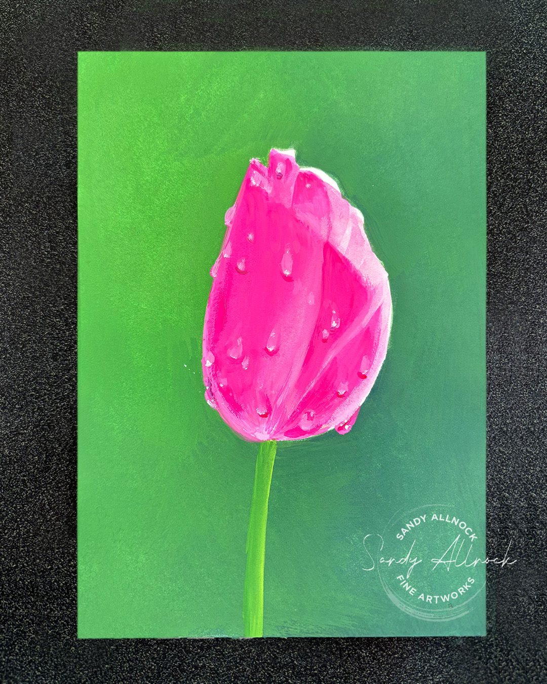
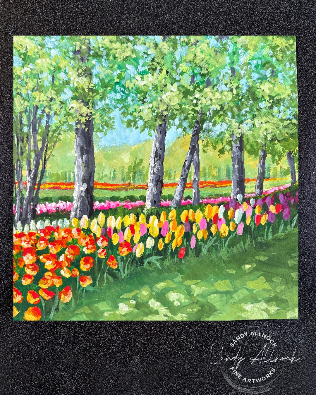
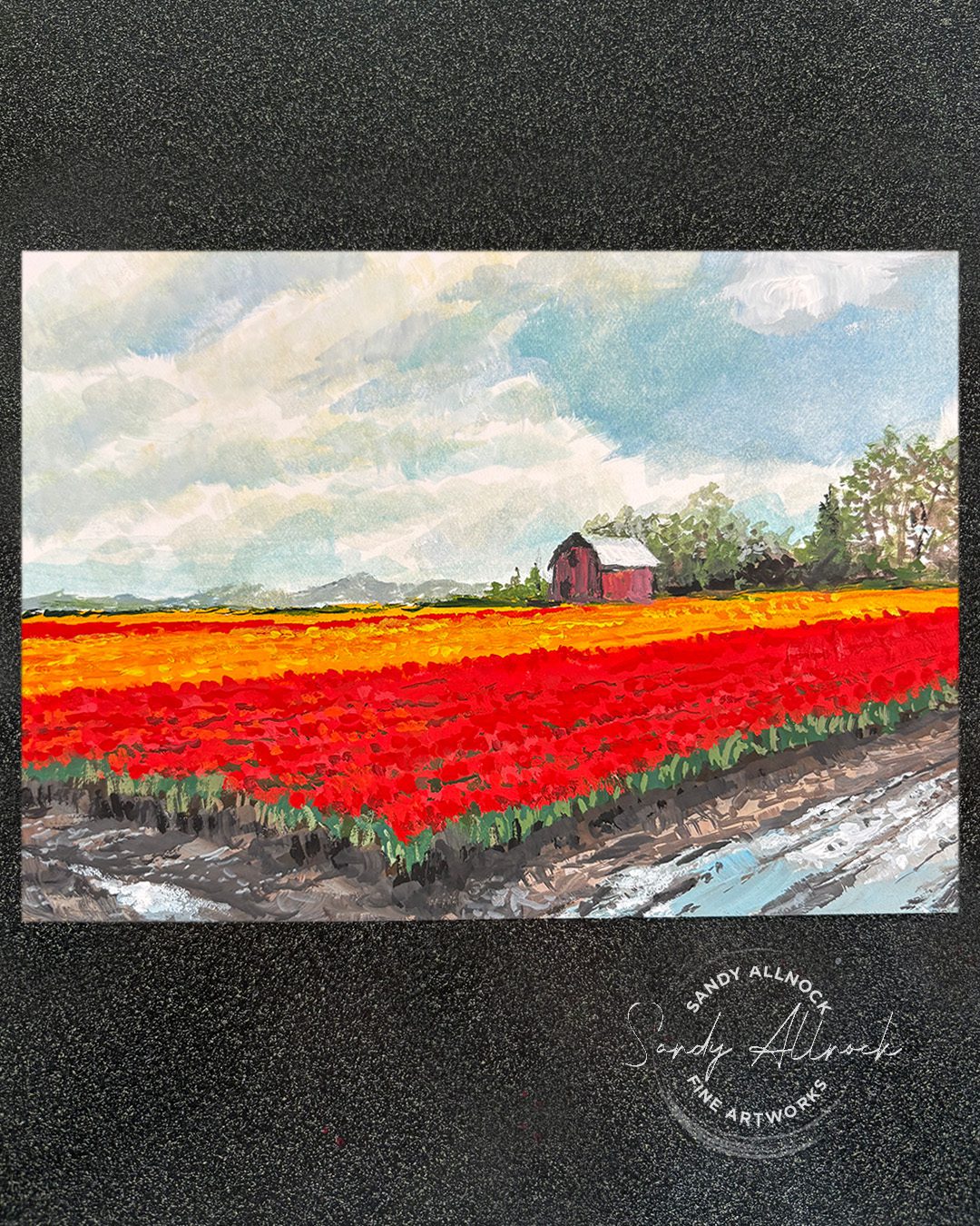
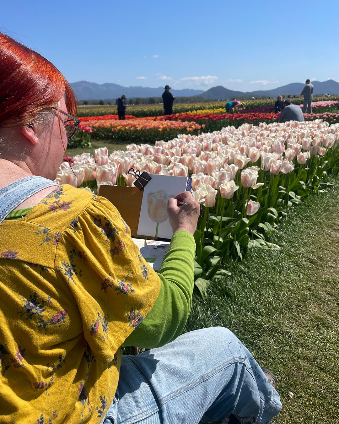
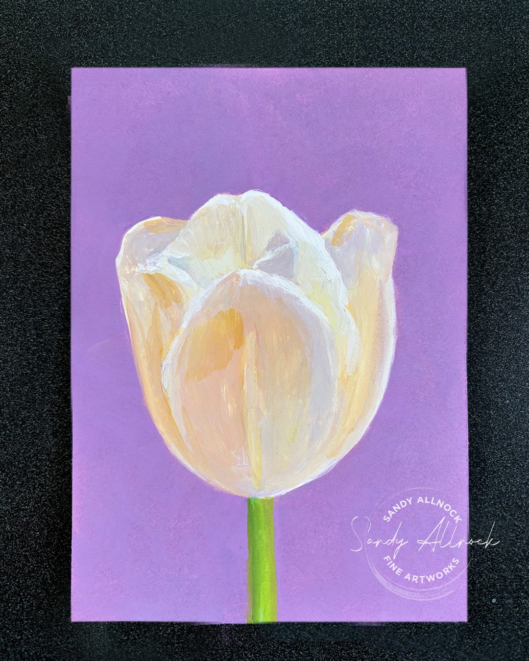
It’s Earth Day – and I always celebrate by making some art honoring our beautiful planet! Today it’s a tulipscape – like a landscape, but with tulips as the focus, not just ‘land’! I went up to the Tulip Festival in Skagit Valley last week, and had such a lovely time painting there. I took my gouache kit and a bunch of different papers and went a little wild. And even sold one painting right off the easel!

Tutorial: Happy Earth Day! 14 Tips for painting a Tulipscape

Watch the video below and scroll to the end to leave comments or questions — or click HERE to watch it on YouTube and leave comments over there. I read both dutifully!

SUPPLIES

Some product may be provided by manufacturers for review and use. Compensated affiliate links are here at no cost to you. I appreciate your support of my work with your purchases! Full affiliate and product disclosure | My trusted partners in art

Gouache sketch kit

  1. Sketchbook Easel Trues Hard Goods 
  2. Tripod Amazon Basics 
  3. Sketch Stool 
  4. Jack Richeson travel brush set 
  5. Daniel Smith Gouache 
  6. Black Watercolor Paper 
  7. White ceramic tile (from hardware store for a dollar or two)
  8. Baby Wipes, rag, plastic cup, water bottle

Tulipscapes

After many many years of visiting the tulip festival for one of my first plein air outings without a jacket (YAY!), I’ve decided my favorite medium to paint them is gouache – the brightest color, as well as a nice limited setup given the vast crowds. Both carrying it all out to the fields and making my setup so that a small child won’t just wander into an easel can be a problem. (And yes, you’d be surprised how many kids get away from their photo-op parents when tulips are involved!?) I do try to engage the kiddos in conversation to get them to just open their eyes and see me and my stuff.

So many tulips

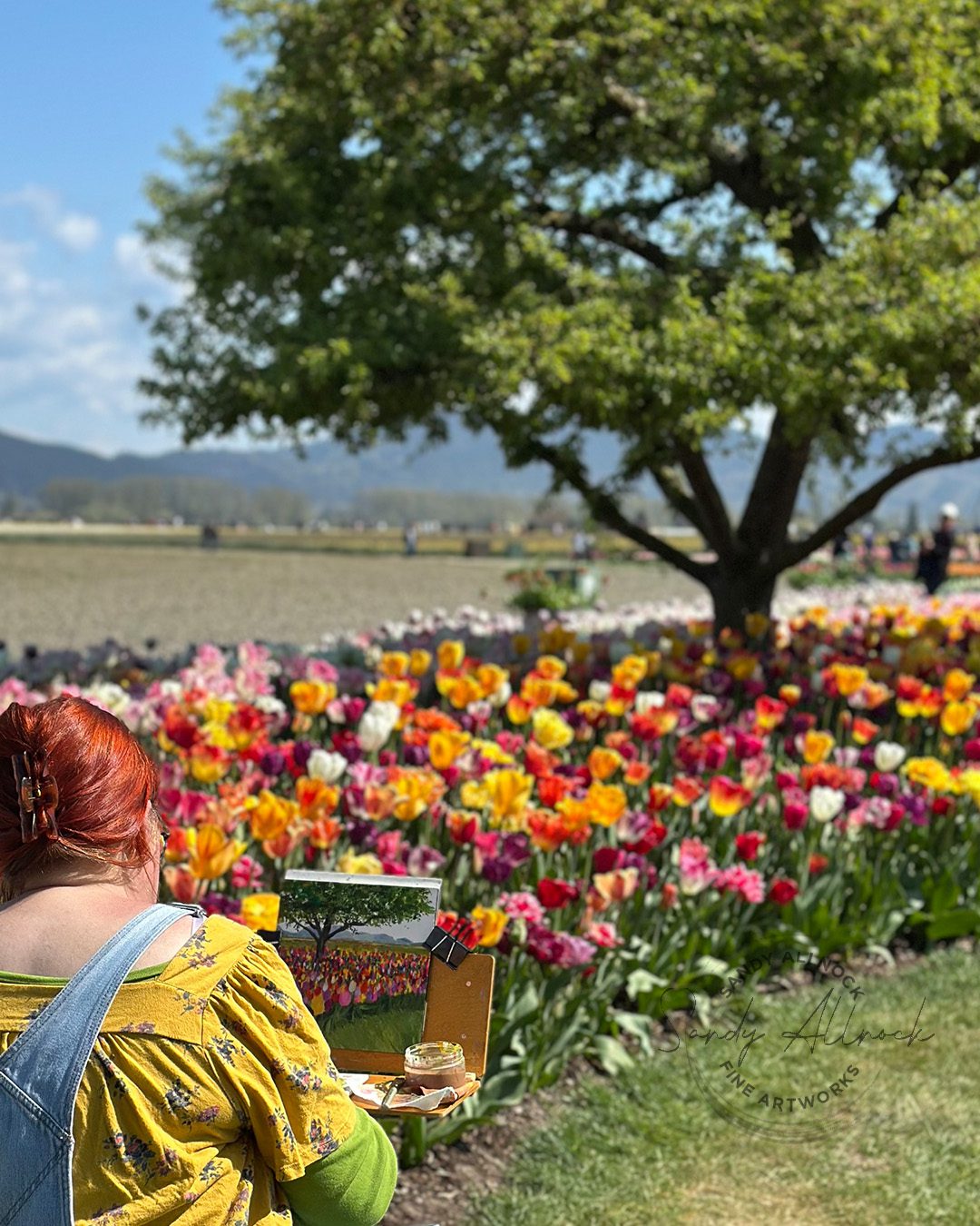
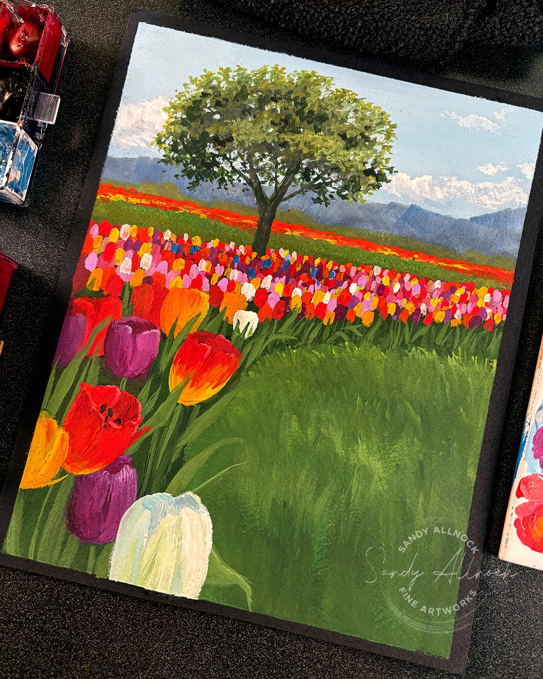
I think one problem I’ve struggled with is that there are just SO many tulips. In this particular bed it was such a mix of types and colors that I needed to somehow simplify it. I’m not at all sure how I’d tackle this in watercolor – I’ve tried in past years but had huge messes! So this was one of the first years when I felt like I’d wrangled the tulips. The public commentary endorsed that, though more comments were made about my tree than my flowers, so there’s that 🙂 

This painting in the video is a version of the one on my easel above – that one was square, and I didn’t have time to fuss around with some large and more detailed tulips in the foreground. So this was fun getting to sit down in the studio and spend hours playing with the things I wished I’d had time for while outside.


Subscribe to receive blog posts by email:

More tulips

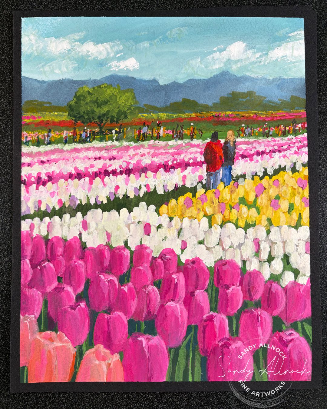
The rest of these are either paintings created out in the field or at home…or a combo, as I started several and brought them home to finish. Each of these is available for purchase – by clicking HERE.

The Healing Power of Art (Sketchbook, part 2)

The Healing Power of Art (Sketchbook, part 2)

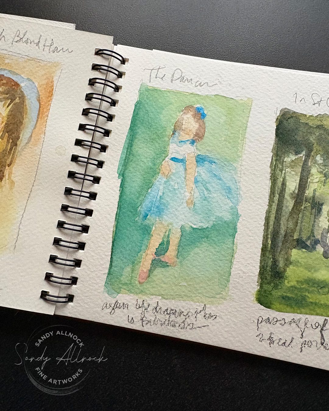
In part 1, I talked about the healing through a prompt book – and pencil sketches in graphite.  (Read that post here.) There’s a good discussion of thoughts along the process, and I hope you’ll give that a look as well as this post.

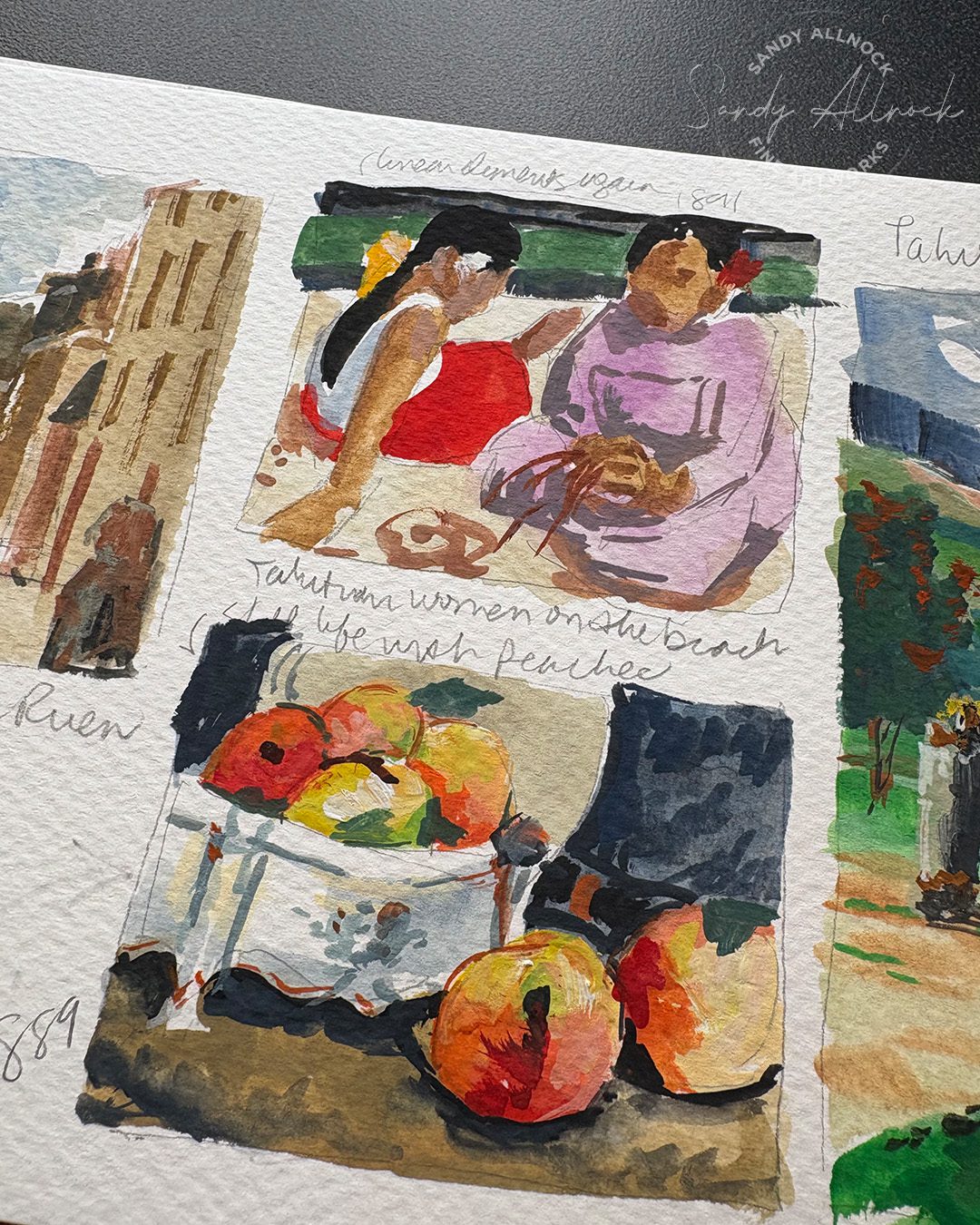
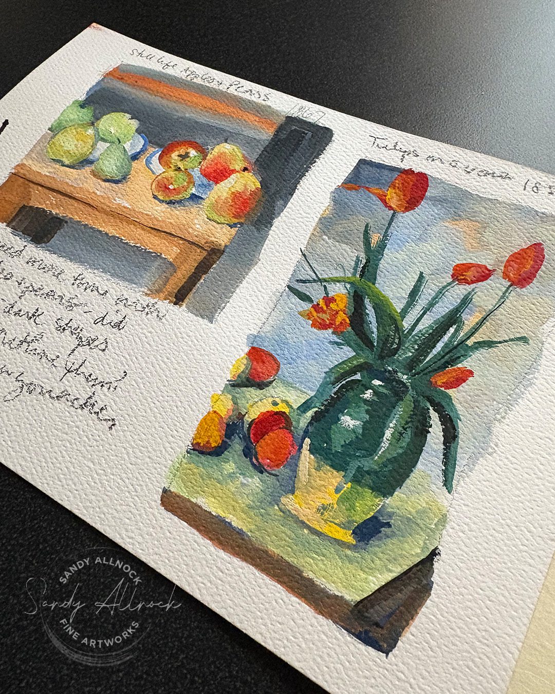
But here I want to talk through the sketches created during my healing process, but in watercolor and gouache. The graphite book was much better for days when I was braindead and just wanted to be given a prompt and draw it; but other days I was doing a deep dive study in art history, and it was a different experience for different kinds of days.

If you don’t paint, you might try this in pencil, markers, anything at all that you like to use; the process is truly the same, it’s a matter of giving yourself time to really learn about an artist through history, and seeing what elements of their work you might be able to incorporate in your own work. 

Watch the rather long video below – and then read on for more tips on what I learned.

Tutorial: The Healing Power of Art (Sketchbook, part 2)

Watch the video below and scroll to the end to leave comments or questions — or click HERE to watch it on YouTube and leave comments over there. I read both dutifully!
SUPPLIES

Some product may be provided by manufacturers for review and use. Compensated affiliate links are here at no cost to you. I appreciate your support of my work with your purchases! Full affiliate and product disclosure | My trusted partners in art

Sketchbook

  1. Sennelier handmade watercolor sketchbook 

Medium

  1. Daniel Smith watercolors and gouache paints

Enjoy some video study time

Pick an artist you might like to learn more about – someone famous helps, as there’s plenty of resources on more famous artists. Any genre is fine! 

On YouTube, search for the artist’s full name; hopefully there’ll be a documentary covering their life, and for some artists I’ve found several! Take your time watching through them, or as I did I listened through once, getting their life story in order, then watched it so I could focus more on the art. Maybe it was because my brain was fuzzy, but I found some of the videos I watched 

If you don’t know who to start with, a great place to start is the Perspectives channel, anything by Waldemar Januszczak – his playlist is here. He’s a great presenter, entertaining and very smart. Then after watching a few, your home page will start populating other channels and videos in time, and the more you get into this, the deeper you’ll get into more great content.

Take notes. You might not want to paint right away but if you see a particular painting you might want to look up, writing it down will help. And if they mention another artist who they’re influenced by or studied under, that might be someone to look for next. Sometimes I just open another tab and type that thing into the search bar so it sits there waiting when I finish the video. 

Note: There are some that are clearly made with AI (stilted scripts and narration) but I find their info is mostly accurate but some details can be wrong. 

Choose an artist & artwork

The artist can be anyone, any genre, any medium – whether your medium or not! I found that I learned plenty from those whose work I wasn’t at all interested in previously, or art that I liked at all!

What do you like in their work? Composition? Color? Brushstrokes? What could you emulate in your medium, your subject matter, your style? Even if it’s just something to try once, it’s worth a little effort.

Search for photos of their work – but use the word “original”, and their full name. That’ll help Google to not bring up every COPY of that artwork; my recommendation is to select images from galleries, museums, or auction houses, as they’re incentivized to have pictures posted that are closest to what the artworks. Beware of anything selling “prints” as lots of those sites bump up the color to make it bright to draw attention to their version. Also beware if it’s on an individual artist’s website, it may well be their COPY of it. And if it’s on Amazon or Temu? Skip those entirely.

Create a thumbnail copy in your sketchbook. Don’t go for perfection, just for something that will remind you of the elements you studied. Make written notes as well, so you recall what you were aiming for. 

You can do a bunch from one artist as I did, or do a study on a bunch of artists’ paintings of one subject to compare. Whatever floats YOUR boat!


Try a simple piece

If you have a day when you think you’re feeling better, and can get into your studio, try putting color on paper. Don’t set giant expectations for yourself; just set a goal of Color On Paper.

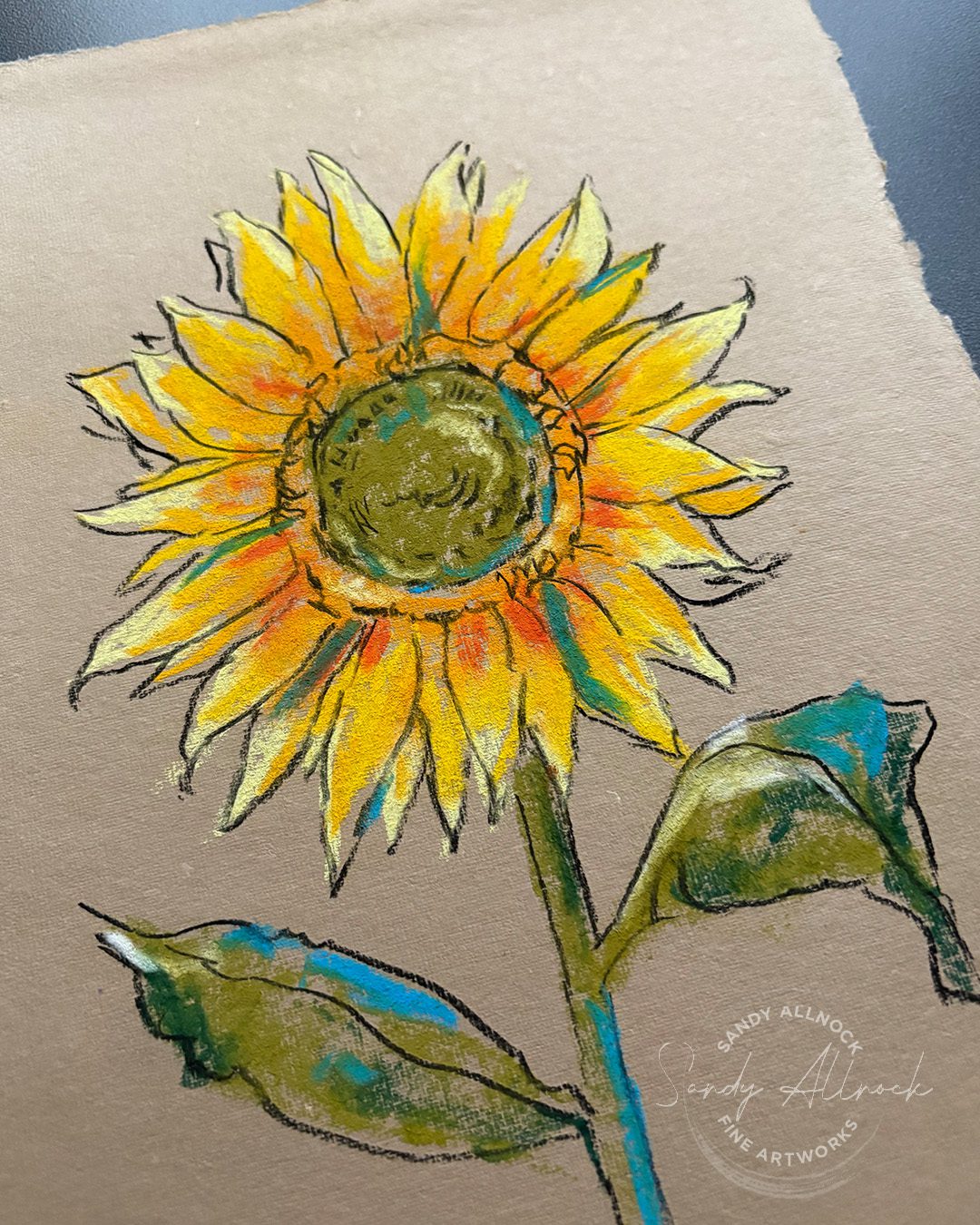
Pick something from your sketchbook that has an element that makes you happy. I had looked through my thumbnails and came across Van Gogh’s sunflowers, and decided on one that would keep me thinking about our friends in Ukraine. (It’s their national flower). 

I chose a medium I haven’t used in eons that would truly be messy. I was having depth of field issues and knew tiny detailed work was no good that day but a big chunky pastel seemed like it could work. I put color on paper, and found it vaguely looked like a very messy sunflower. And that was enough for me. 

But I remembered the outlines idea. I considered using an orange as Van Gogh did in one painting, but a charcoal pencil was the thing that was handy, so I used it instead. I let my lines become loose and wonky, no stress. And heck, I was tickled with the result of my little drawing! I also got to find out this handmade paper is stinky for pastels, so there’s that little learning too. LOL.


Subscribe to receive blog posts by email:

Pay attention to your core

Each time you create something, anything – a tiny sketch, a doodle on a sticky note, whatever it is – pay attention to how you’re feeling. Not just health issues, but does creating something make you feel different inside? Don’t judge your feelings on the basis of the quality of what you’ve made. It’s about how the act of creating may have changed you, your perspective, the amount of hope you feel.

When you do make something that tickles your fancy, celebrate it. You don’t have to share it – but tell yourself good things! Remind your mind and heart that you’re making progress. That you are more than capable of taking good steps. You’re not entirely a mess just because your human shell isn’t cooperating.

If you’re a journaler, write down what you’re thinking, how you’re feeling. Later your notes can help you see how far you’ve come.

Let the journey change you

Rather than ending up at the other end of a time in the wilderness with the feeling that “whew, now that’s over!” what would it be like to think, “Wow, I really grew from that!”

It may be just a small perspective change, but it might make you grateful for the season, which may also help you become a better cheerleader for others going through a rough time. Share your experience of healing so that you can provide hope when you tell people of your own experience.

Painting depth of field in gouache

Painting depth of field in gouache

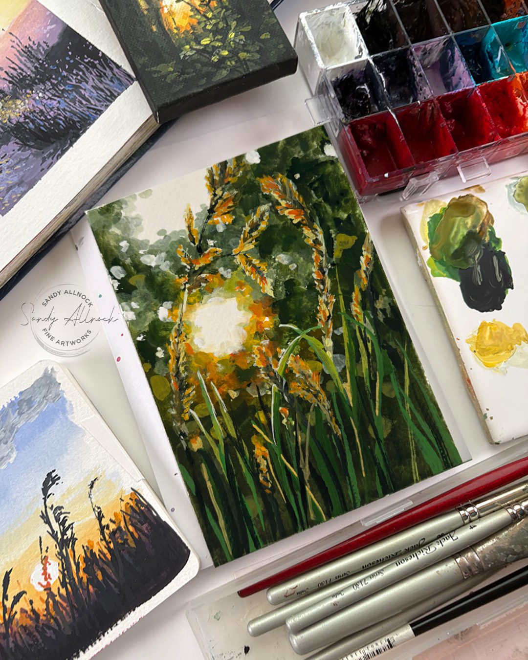
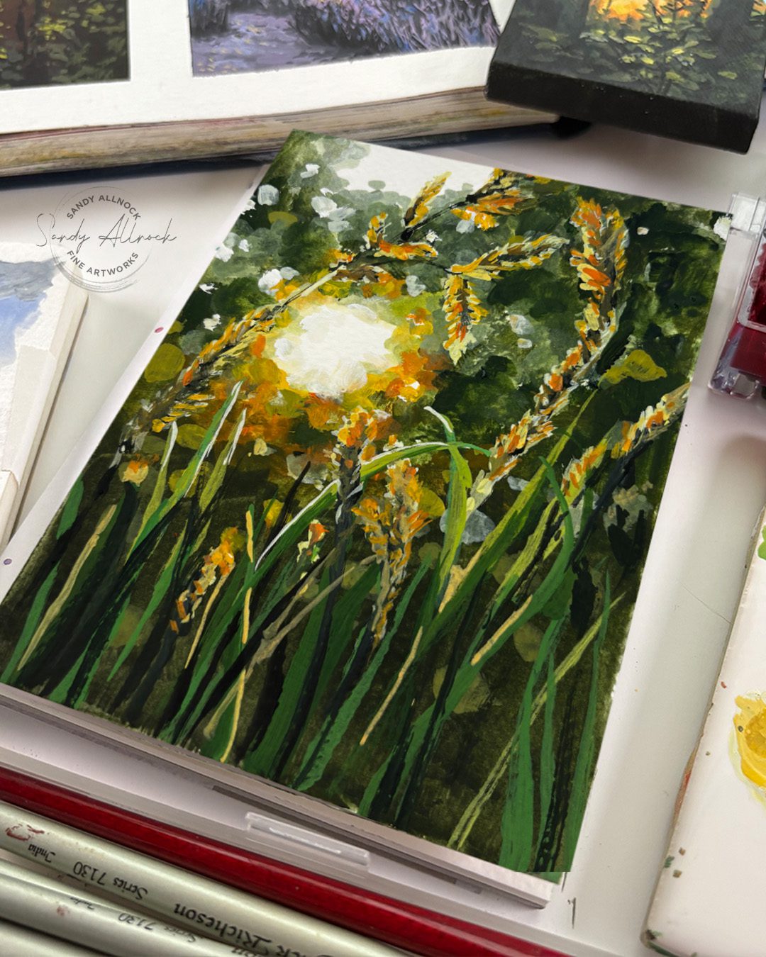
After talking a bit about how suns are white in my previous post – it’s time to paint a white sun! And since I’m fresh off my gouache phenology wheel, this will be in gouache.

I found this photo by Vlad Patana on Unsplash and since I’m a geek for bokeh, I decuded to do a little video exploring how to get that dappled, fuzzy, out of focus look – depth of field. 


Tutorial: Painting depth of field in gouache

Watch the video below and scroll to the end to leave comments or questions — or click HERE to watch it on YouTube and leave comments over there. I read both dutifully!
SUPPLIES

Some product may be provided by manufacturers for review and use. Compensated affiliate links are here at no cost to you. I appreciate your support of my work with your purchases! Full affiliate and product disclosure | My trusted partners in art

Sketchbooks

  1. Square sketchbook 
  2. Long sketchbook – Pentallic Aqua Journal 5×8 BLICK   AMZ

Brushes

  1. Jack Richeson Travel brush set BLICK  AMZ 

Palette

  1. Joybest airtight palette 

Daniel Smith Gouache

  1. Sap Green BLICK   AMZ   JACKSONS 
  2. Titanium White BLICK   AMZ   JACKSONS 
  3. Lamp Black BLICK   AMZ   JACKSONS 
  4. Cadmium Yellow Light Hue BLICK   AMZ   JACKSONS 
  5. Lemon Yellow BLICK   AMZ   JACKSONS 
  6. Cadmium Orange Hue BLICK   AMZ   JACKSONS 
  7. Cobalt Teal Blue BLICK  AMZ   JACKSONS 

Blurred edges

The trick to creating what looks like blurry edges without physically blending them (it’s difficult in gouache)…the idea is to really really look at the values. Around edges of a blurry object the colors of the background and the object become values of both of them – in the case of a white or light background, it’ll be a midtone color of a dark, or a light value of a midtone. In the distance they’ll often get desaturated too, which is  quickly achieved in gouache with black or white. Or both.

Foreground

Handling the foreground depends on the image – in this case, there’s more saturated colors to pull the grasses forward. All that sunny gold and orange.

Subscribe to receive blog posts by email:

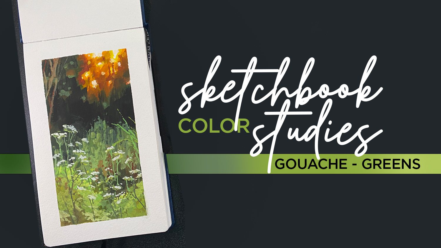
Sketchbook Color Studies in green

This course is on sale this month – perfect time to go play with your gouache paints! The video above in its uncut form is in a bonus lesson in the class. 

What if we taught this one art truth to kids?

What if we taught this one art truth to kids?

I’ve taught little art lessons to many many kids over the decades. Not always in formal settings, though sometimes I get invited to a homeschool group or other childcare setting. But when I go to babysit for a friend, or even go to have dinner at their home – I always have a little bag with sketchbooks and crayons or pencils. The kids know to ask if we get to make art!

I try to do more than “only” turn them loose, unless they’re on a mission to create something they know they want to do. But I try to find something fun at their level, with subject matter that’ll appeal to them, and teach a little something. A bit of shading, how to draw a shape, just something small – but they get to learn a fancy art word and that makes them feel like an artist!


During February I worked on my “skies” phenology wheel, so found myself painting the sun quite often. And it kept gnawing at me that the sun is white – so why do we color it yellow!? (Yes when it’s very low on the horizon it *can* be red, orange, or yellow, but that’s rare.) 

Much of it is that there’s no white crayon to show up on white paper. So sure, we need a color, and I’m cool with anything yellow. But how can we use the fact that the sun IS white to help kids to figure out how to draw that?

Video: What if we taught this one art truth to kids?

Watch the video below and scroll to the end to leave comments or questions — or click HERE to watch it on YouTube and leave comments over there. I read both dutifully!
Negative drawing

Coloring a subject that’s white requires some unique thinking; rather than filling IN the shape, coloring AROUND it is what makes the subject look white. 

For my adult students, I find many who say they just can’t think that way. It’s too much opposite-thinking. But what if we helped kids learn what negative drawing is while they’re young? They accept new concepts MUCH easier than adults do!

Try showing littles in your life how to make a white sun. Add whatever landscape is suitable – trees, houses, or an ocean like this. It can help if you find a picture of a sun shining on that kind of scene so they can SEE the sun is white. Or go outside and look at the sun (carefully, no blinding yourselves!) and see how it shines on the ground. Is there a lake it’s reflecting onto?

Phenology wheel

I’ve now finished month 2! I’m pleased enough with how this worked out; it’s been challenging working so small right now, as I still can’t see particularly well; taping off the segments really helped me keep the paint corralled! March will be birds…they’ve been out and singing up a storm for the last week as it’s gotten much warmer than the first snowy half of February.

Subscribe to receive blog posts by email:

It’s painted in gouache – an opaque watercolor. Text is in Copic Acrea pens as well as gel pen and sharpie.

Would this lesson have helped you as a kid?

I’m going to try it next time I’ve got kiddos at my disposal, and see if they even need to learn the “negative coloring” term. Just helping them see that coloring the background will make the circle white can be enough!

Underwater Gouache + 60-pg sketchbook flipthrough

Underwater Gouache + 60-pg sketchbook flipthrough

A bit over a week ago I was on Instagram live for the first time in ages – and almost 200 people came to visit! It was so much fun to finally “see” some folks there; it’s been so dead lately. 


I was finishing up this jellyfish painting, and asked what undersea creature should I paint for YouTube. A few were mentioned but one fish that I love to paint caught my attention….an angler fish!


Tutorial: Gouache underwater painting  

Watch the video below and scroll to the end to leave comments or questions — or click HERE to watch it on YouTube and leave comments over there. I read both dutifully!
Angler Fish

This guy was fun to “invent”! I looked through enough photos that I familiarized myself with the favorite parts of different kinds of these fish, and made up my own – including colors – and played with the lighting and values. Note that you might be seeing this WAY bigger if you’re on a laptop than it is in real life so you can see the mess that it is – yet stepping back, it looks pretty awesome. Next time you go to an art gallery, get close up to a painting and see how areas that appear blended from a distance often are not — it’s just a matter of the size of the strokes and the progression of their values and colors.

Birds of Harmony Hill

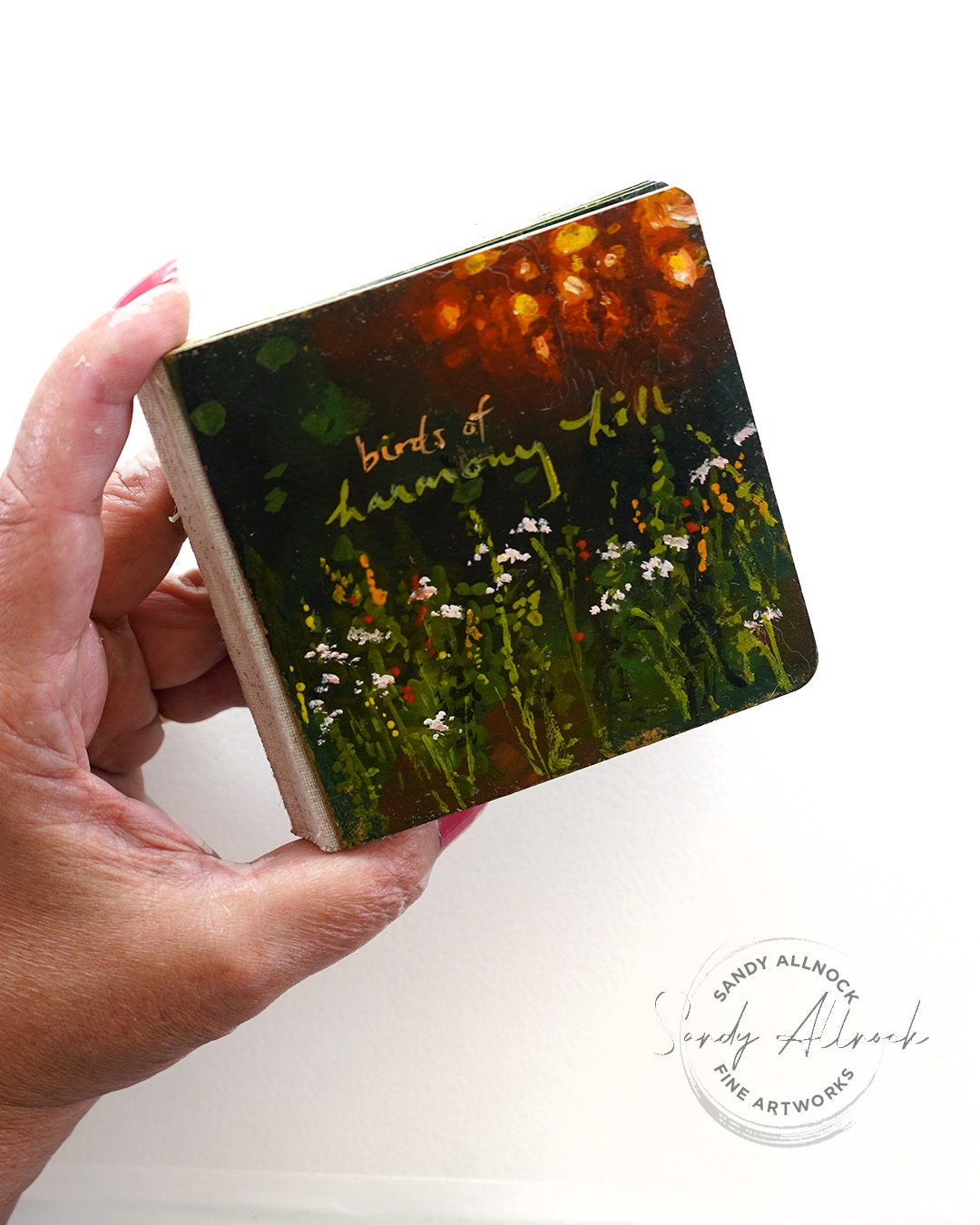
60 bird paintings paintings in a little sketchbook, all in gouache! Last year I started the epic adventure, shared some paintings on the daily sketches site so some of you saw them as I began….but the last 3/4 of the book hasn’t been seen til the flipthrough in the video! My sister LOVED it.

Subscribe to receive blog posts by email:

New gouache class

In this intermediate course you’ll work through three lovely nature scenes – and you have permission to be tidy if you like, or messy like me! We’ll talk through all kinds of layering issues, and I’ve even included some oopses and how I fixed them. See the Sketchbook Color Studies Class here.

World Watercolor Month is almost over!

If you thought about picking up a watercolor or gouache course, get on it! The coupon code on the WWCM page runs out on the 31st, so don’t miss a chance to help fundraise to help kids make art through International Child Art Foundation!

Supplies

Some product may be provided by manufacturers for review and use. Compensated affiliate links are here at no cost to you. I appreciate your support of my work with your purchases! Full affiliate and product disclosure | My trusted partners in art

  1. Daniel Smith Gouache
    1. Indanthrone Blue 
    2. Phthalo Blue Turquoise 
    3. Prussian Blue 
    4. Cadmium Orange Hue 
    5. Cadmium Yellow Light Hue 
    6. Opera Pink 
    7. Titanium White 
  2. Jack Richeson travel brush set Blick Amazon
  3. Pentalic Sketchbooks 5″ x 8″ Blick Amazon 
  4. Square sketchbook  for birds
  5. Dorlands Wax Medium 4oz • Blick • Amazon 
  6. Dorlands Wax Medium 16oz • Blick • Amazon