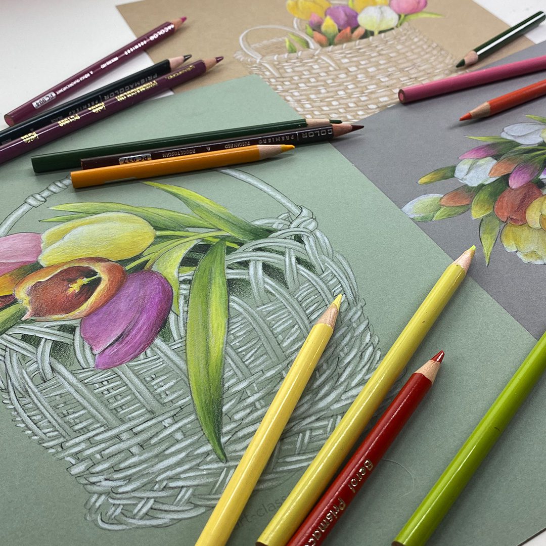
I’m revisiting a project from a few years ago in hopes it’ll ring in spring!?! I’m ready for it! The Tulip Basket Sketches printable set has not only the sketches to print on toned paper – but a big ol’ pdf with tons of step by step info on how to create the color tulips. But today – I’ll revisit in black and white, to create a piece for my bedroom wall.
Tutorial: Create STRIKING tulips in b&w or color on toned paper
Watch the video below and scroll to the end to leave comments or questions — or click HERE to watch it on YouTube and leave comments over there. I read both dutifully!
While we do love the color of spring tulips….there’s something so simple and pure in a black and white drawing. These will be framed for my bedroom where all the art is black and white!
Colored pencil tulips
These were created in 2023 – and are just as lovely now as they were then! See the video below for how these are created – use the technique for your own drawings, or go get the Tulip Basket Sketches Printable Set and create these drawings.
Subscribe to receive blog posts by email:
Bring on spring!
If we create a boatload of spring tulip art, that’ll covince Mother Nature to come see us, right? 🙂 Easter is April 20 so we have some time but gosh I’d love some warm weather soon!
I’m back with more about Mom today, I hope that’s okay! She’s given me her art supplies over the years as she downsized, and while I visited her recently she also passed on the last of her vintage pastel pencils. (Read more of that here.)
Today – I have an art piece to share! It’s a pastel painting of a fur seal; and yes pastels are called, by most artists, paintings, and I think the technique here will show you why. Because I used a paintbrush for the technique!
Tutorial: Colored Pencil vs Pastel Pencil (with Fur Seal painting)
Watch the video below and scroll to the end to leave comments or questions — or click HERE to watch it on YouTube and leave comments over there. I read both dutifully!
Colored pencil vs pastel pencil
In the little exercise below, I used Stonehenge – just to give colored pencil a leg up. I could have done this on Pastelmat, but it’s expensive per sheet, plus the pastel REALLY rocks on Pastelmat, so my Prismacolors needed an assist.
I do still love my colored pencils – there are some things they’re better for. Like cards, or any art that’ll be ‘handled’ in any way, because the pigment doesn’t move nearly as much as pastel. For colored pencils, wet blending intensifies color, helps to fill in the white gaps in the paper so it looks smoother. But – once you get a certain amount of pigment on the paper, you reach a point where you can’t add a lighter color on top.
Pastel (sticks or pencils) keep on a-moving – any dry pigment drawn onto paper will move with the slightest touch of a finger, especially if no fixative is used. When wet-blended with isopropyl alcohol, pastel turns into a mushier color rather than brighter. The pigment breaks down and moves with a watercolor effect, but does the opposite of colored pencils. However the technique restores the texture of the paper; think of the pastel as “filling” the valleys between the texture, and when dry, you can only put so much in. But once wetted with alcohol, the peaks and valleys are once again workable.
Both mediums can be sprayed with a fixative – though with the way I use pastel, I have yet to find an excellent fix that holds everything in place without yellowing or changing the color. If anyone has a good suggestion that does better than Delacroix Fixatif by Sennelier – let me know, I’ll be researching it!
Fur Seal painting
This was cobbled together from a variety of references – one of a different kind of seal in this position, another for the rock, and another for the fur seal markings. I created my own lighting situation too which meant imaginging colors!
I’m still torn on whether to add a background – more rocks on a coastal shore. I kinda like him just as is…..
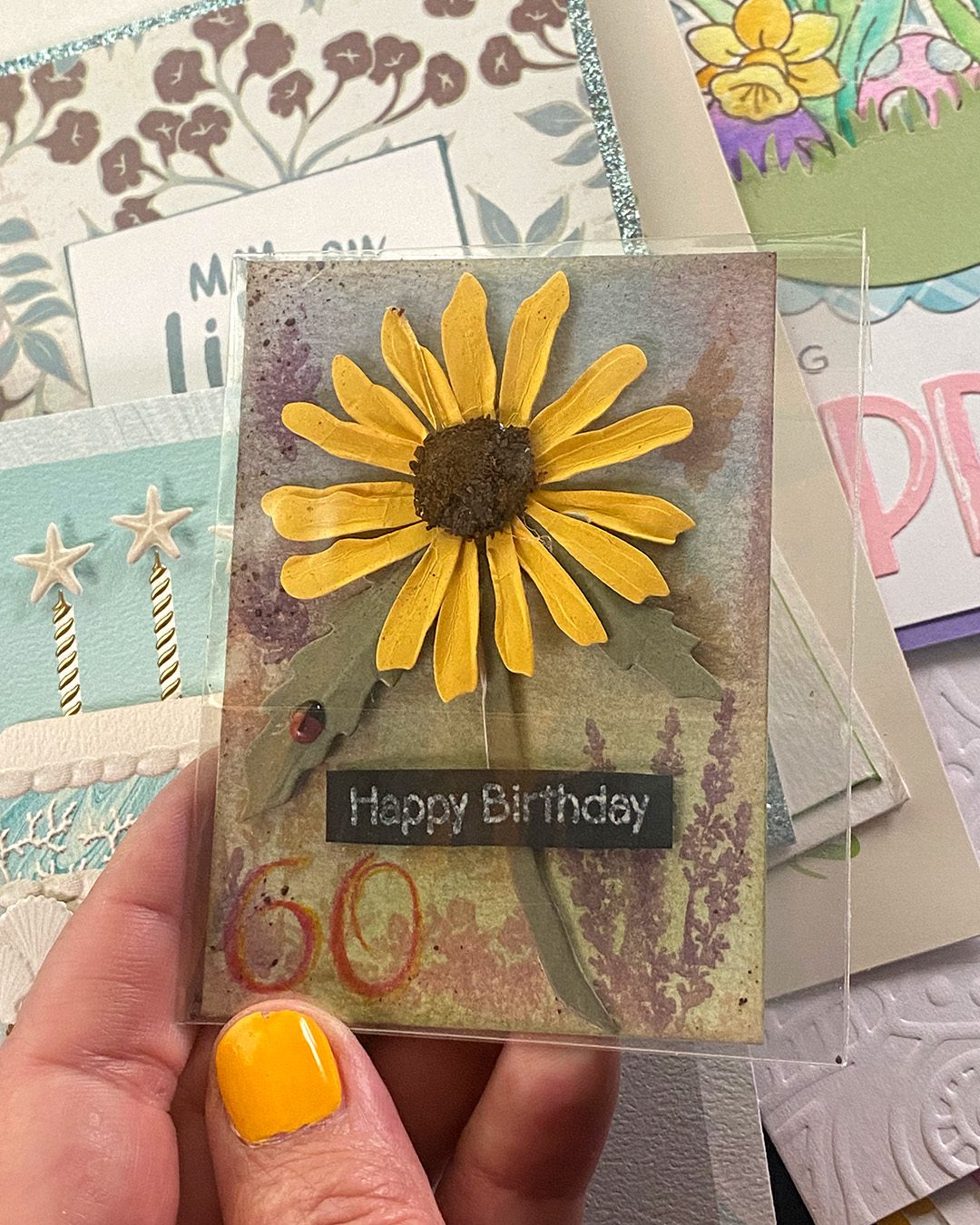
At the risk of sending people running for the hills by talking about Mom again…I’m talking about Mom again. 🙂 I mean, how many people can say they celebrated their 60th birthday with their mama after not having done so in over 45 years!? (Not because we didn’t want to, but spring has never been a time we’ve gathered. It’s always Thanksviging to Christmas.)
First, in non-vintage, Mom had sent my birthday package weeks ago. She’s on top of it! I set it on the counter, and when packing for the emergency trip, I entirely spaced it, even though I had some consciousness that my birthday was going to fall in the middle of the trip. On the day, I had dinner with my sisters at a nice Italian restaurant, then we traipsed to the hospital for cake with Mom; though we couldn’t figure out if candles would be okay since Mom had an oxygen tank and we weren’t sure if we’d blow anything up! So we pretended.
Mom did tell me what was IN the package she had sent, and how she’d looked for a yellow one, even orange, but the best she could do was maroon. And, well, that will show less dirt so I’m great with it! I might add my yellow flower pin to it.
But the best part of my 60th? That was looking over at Mom, in her hospital bed with a huge grin on her face, singing to me. She was hurting, she had tubes all over the place, uncomfortably in a hospital bed – but celebrating with me for the first time since I was a kid. That’ll stay with me for all the rest of my birthdays.
Tutorial: Vintage art supplies from Mom (and cards from YOU!)
Watch the video below and scroll to the end to leave comments or questions — or click HERE to watch it on YouTube and leave comments over there. I read both dutifully!
Pencil Sharpening
While this video was about sharpening pastel pencils, the same applies to colored pencils. There are lots of ways to sharpen, lots of ways to break the pencil pigment, and it’s all a matter of the time and effort you want to put into it.
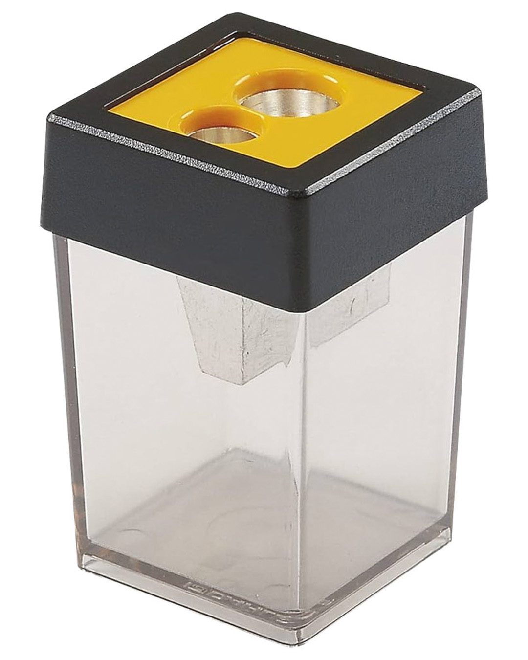
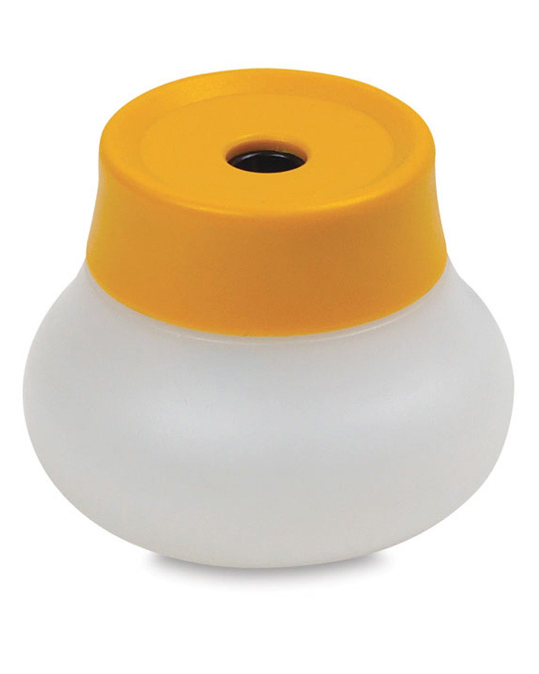
I have a variety of sharpeners, and this isn’t even all – but here’s how I use most of my sharpeners:
General’s All-Art Sharpener – I picked it up recently, and it works pretty great aside from pencils with thick barrels.
Soft pastel moves more easily than colored pencil – so be prepared for that. Not great for cards (though a shaker card with no shaker bits can really protect the pastel) and if using in a sketchbook I lightly tack a sheet of glassine on top to keep pastel from moving around. Framed pastel pieces should have the mat lifted above the surface of the paper using shims – that way if any pigment lets go and drops, it falls behind the mat and won’t dirty it.
Colored pencils are harder, and will stay in place better, though can also move. Thus why I love using it in powdered form where it behaves more like pastel. Lighter pressure keeps the pigment floating on the top of the paper, so it can move, but harder pressure or wet blending techniques make the pigment stick to the paper and not move around.
Both can be “fixed” (sprayed) but few fixes that I like are immovable. Those kind can change the color of your art, they might yellow, or become weirdly shiny. I use Delacroix Fixatif by Sennelier.
Mom’s advice
When talking with Mom for the last two weeks, I asked her so many questions! Knowing this would likely be the last time I could sit and just talk with her, I soaked up all I could from her. A recent newsletter contained a number of my learnings, and hopefully in coming months I’ll share more of her ideas as I create art using them.
The biggest takeaway that has me stumped is what she thought I do best: I wanted to know if it was watercolor, marker, pencil, etc. But what she wanted to know I would pursue: portraits. And secondly animals. “Not so much landscapes. You do people so well.” Now frankly, she doesn’t see all of what I do; she no longer watches YT or visits my blog. She only sees when I post art on my personal Facebook page, and since I don’t go post things there very often, it’s most of the time when I do a portrait of someone who died! What I plan to do more of is to post more of my regular art on my personal page, not just the biz page……so that my friends and family see more of the breadth of my work. Plus….I’ll try more portraits, because Mom said, and I listen to Mom. But she also said animals, and I’m hanging onto that tidbit. (And will continue my randomness too!)
BTW this little tangerine was begun before I left for the trip is still not finished, but hopefully will be soon.
Thank you all
I am deeply grateful for all the lovely comments and emails during this last couple weeks! So many of you have told me your own stories of loss of parents, some who were present for it, others who regretted not being able to be. It means so much to hear from you and know I’m not alone; it’s simply my turn.
Mom is still in hospice as I’m typing this, and we don’t know if it’ll be days or weeks. She still wants to get herself down to bingo, and to art group, and join her bff for scrabble or the whole gang for bridge. I worry over so much activity that could include falls – and yet I celebrate her passion to keep up with the things she loves! I can only hope to be as energetic as she’s been in her elder years.
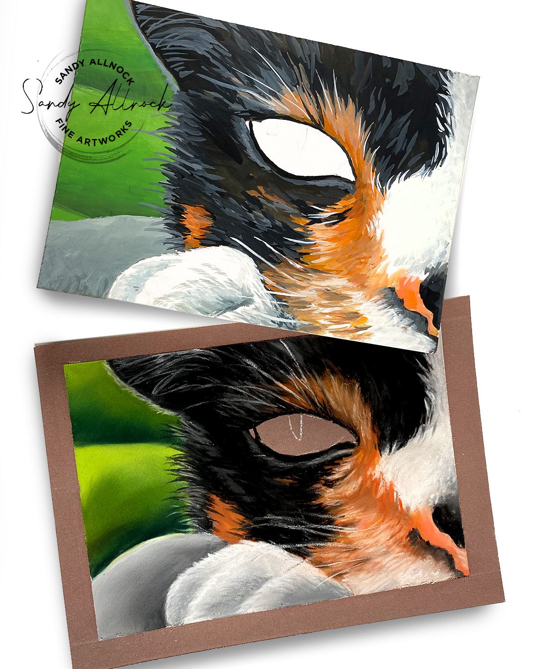
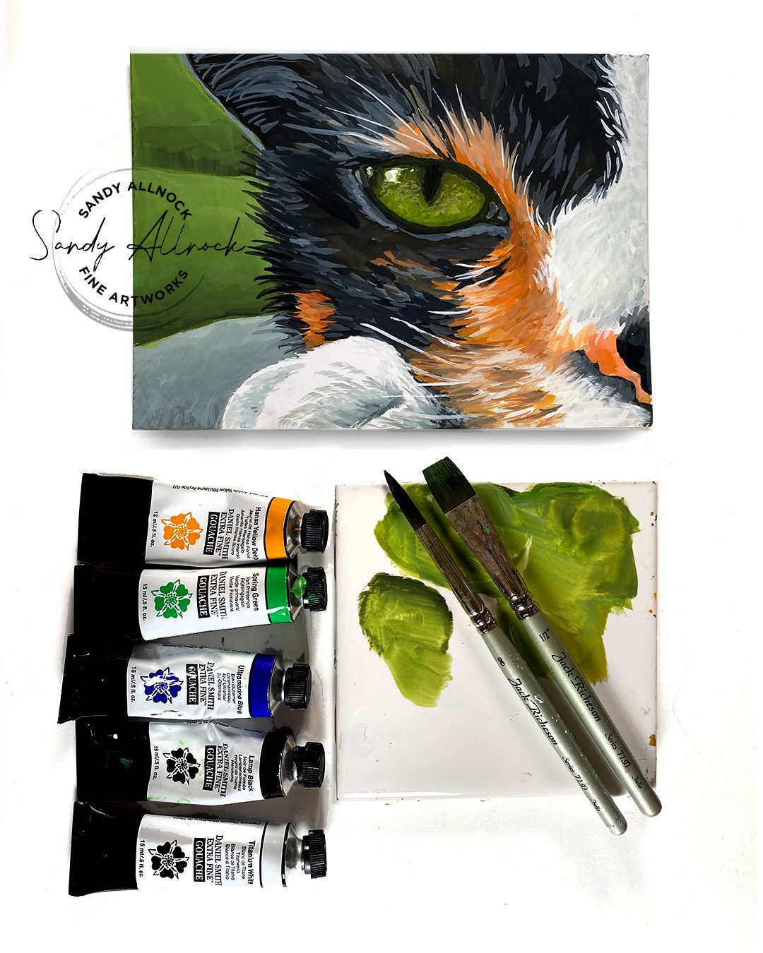
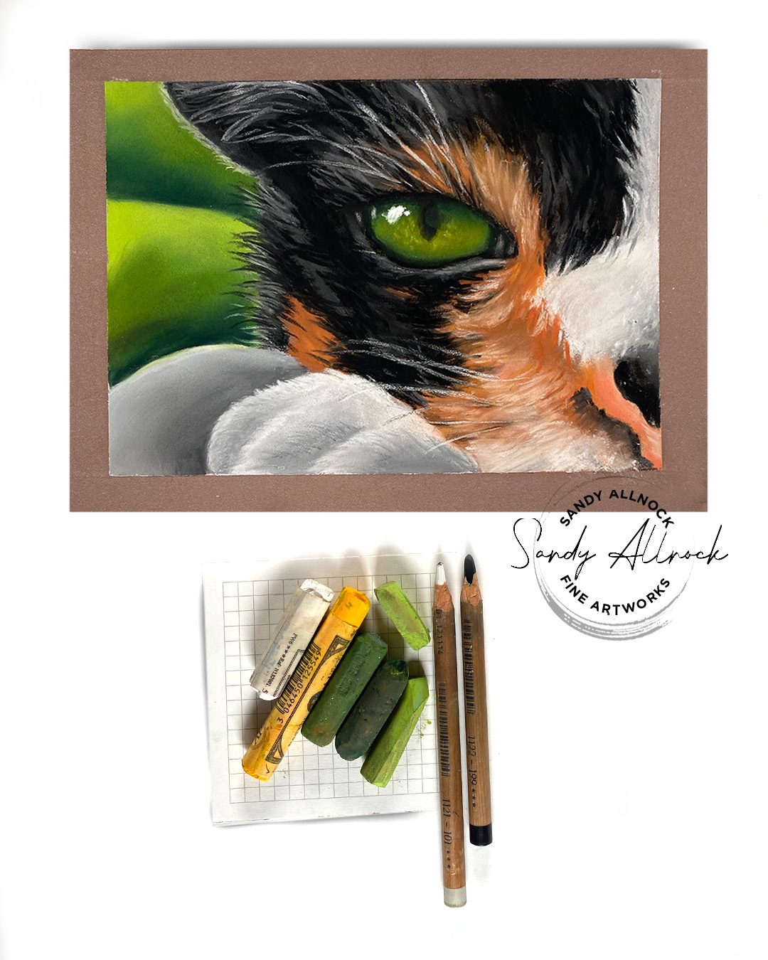
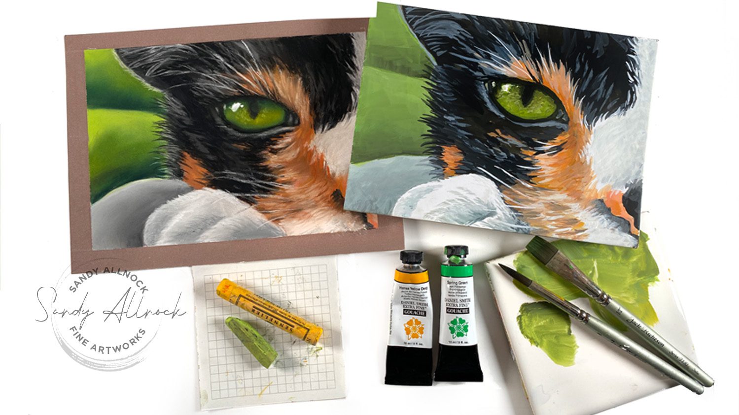
Ever need to mix the perfect green for a cat’s eye? (Or anything that’s an olive green?) With a little basic color theory, you can mix ANY color you want!
A little side story: while working on these two pieces I was on the phone with my Mom. She was SO EXCITED that I launched my Commissions page finally! And excited that a bunch of applications came in right away too! And that there are a bunch of pieces that sold in the big SALE currently going on. I mean, seriously. This is a milestone. Mom doesn’t do computer stuff and watch my videos or anything. She was giving me advice on pastels. Celebrating a MILESTONE here. 🙂
If this photo doesn’t convince you that eyes are what makes a drawing work…nothing will!
Tutorial: How to mix the perfect cat’s eye green hue
Quick question: what do you think about the thumbnail? I’m not worried as much about what it looks like here embedded in the blog, but in the grid you see on YouTube. Would it catch your attention more than my usual?
Watch the video below and scroll to the end to leave comments or questions — or click HERE to watch it on YouTube and leave comments over there. I read both dutifully!
Mixing colors for wet media
Watercolor, gouache, acrylic, oil….anything that is mixed on a palette before being applied—mix them on the palette. A warm yellow will turn a cool green into an olive color, desaturating it.
Mixing colors for other media
If your media doesn’t get premixed on a palette – think alcohol markers, colored pencils, pastels – then mix ON the paper. Either apply and blend like shown with pastels, or layer them atop each other in glazes.
Note: you can use this for watercolor too – if the color isn’t olive enough that you mixed in the palette, paint a thin wash of yellow on top of the green to glaze it.
What colors do you struggle with mixing?
I’d love to help out – what color do you need to mix, and in what mediums?
Believe it or not, I have some tragically awful art days, too.
I know some of you think that someone who’s an artist for a living doesn’t suffer that. Maybe you think we don’t get impostor syndrome. That we can draw or paint anything. Not so!
I had a tough day yesterday, and I’ll tell you all about it in the video!
Tutorial: What I do when watercolor won’t work
Watch the video below and scroll to the end to leave comments or questions — or click HERE to watch it on YouTube and leave comments over there. I read both dutifully!
Get back on the horse!
For some people just leaving the studio helps overcome a rough art day. Not for me. I take the failure-feeling with me, and next time I walk into the studio, I’m nervous about getting my mojo back!
Instead, changing medium, subject matter, or project helps to dispel that failure and prove to myself that yes, I can still make art!
What works for you on a bad art day?
Let me know in a comment…..and if your method isn’t always just what’s needed, try mine. Get back on the horse and prove to your inner voice that it’s time to hush up with the insults. 🙂
I hope today’s video will be an encouragement to you….I hope today’s video will be an encouragement to you….I know a lot of us struggle with just trying crazy new things without fear. But the best way to learn and grow is to step out – and maybe watching do wacky things will stoke your courage!
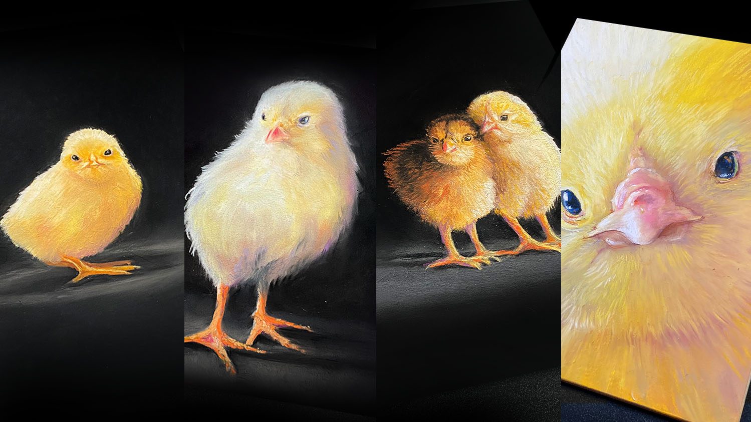
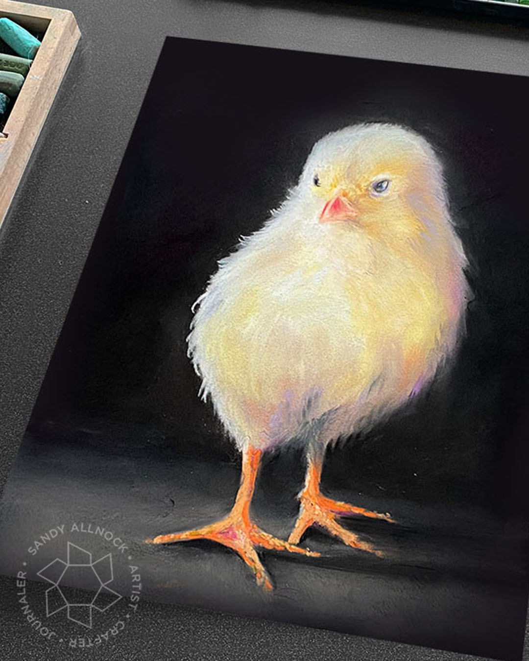
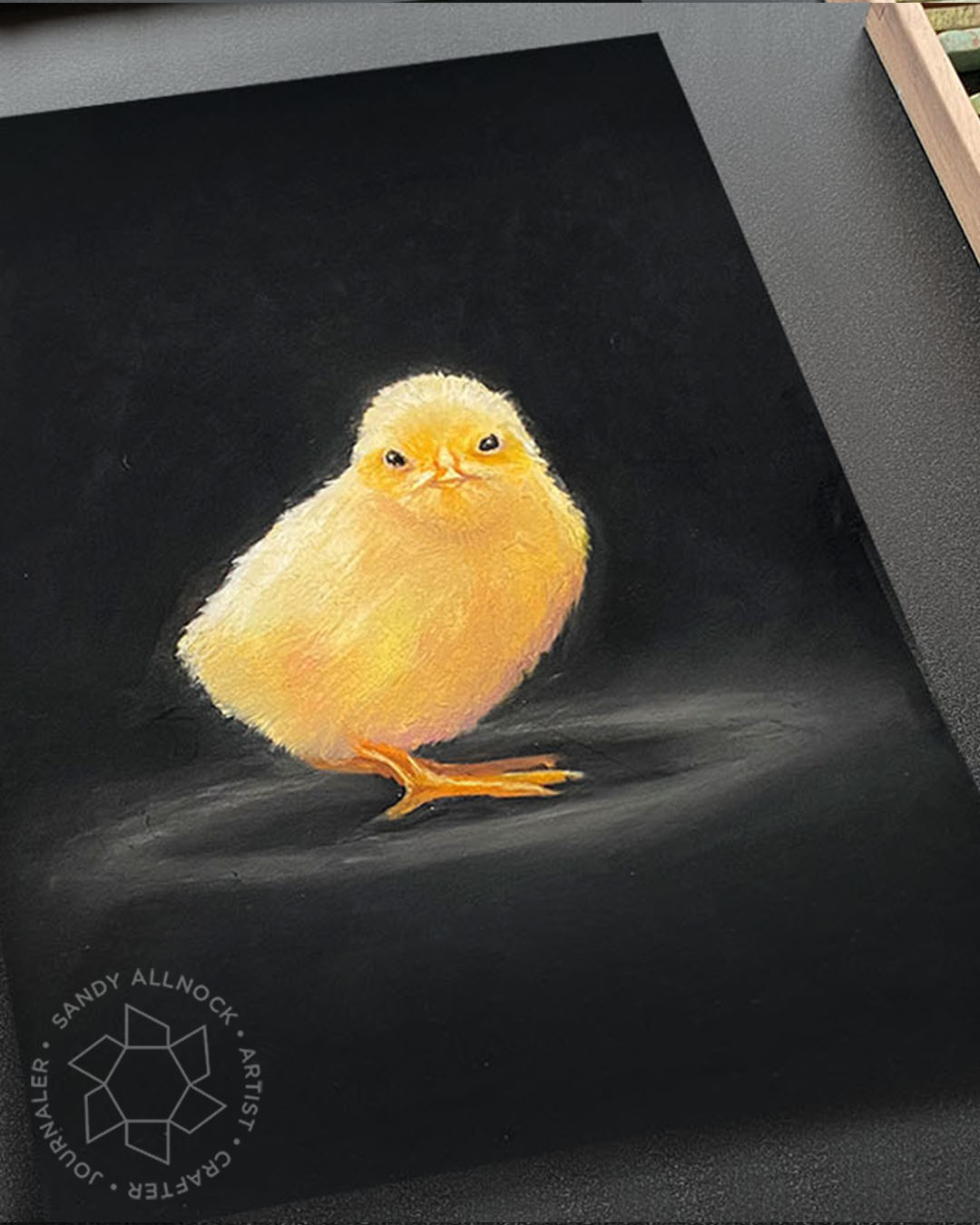
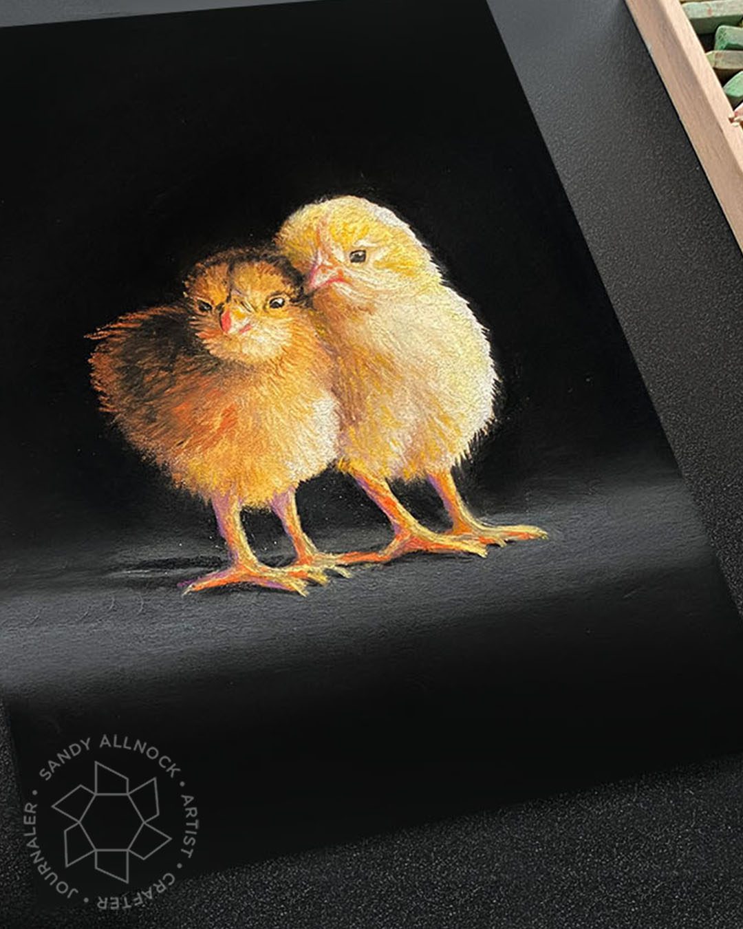
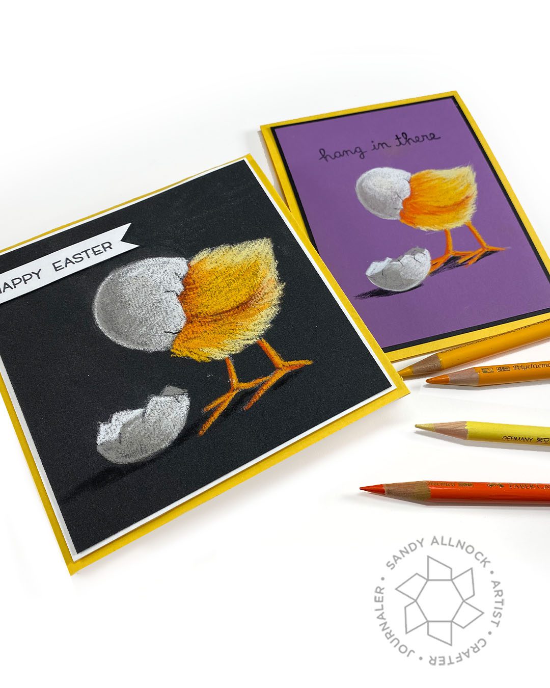
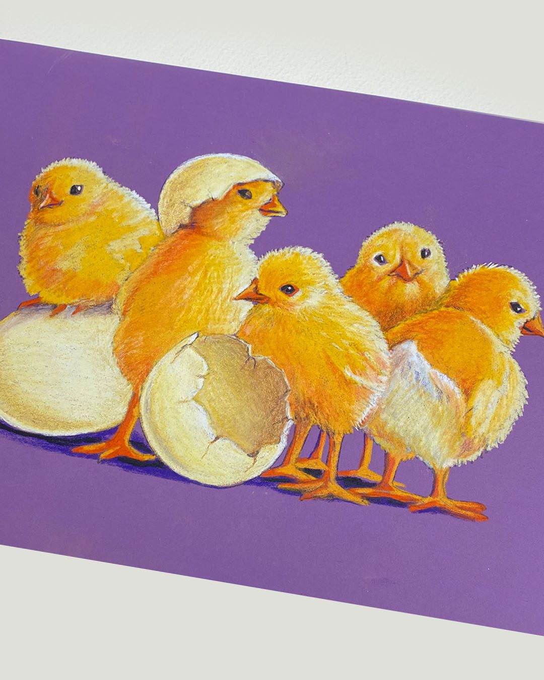
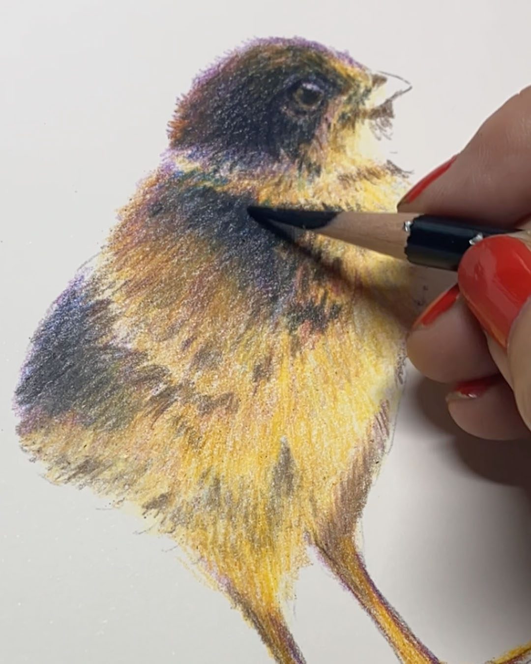
I don’t have much to teach in these four drawings, since I don’t know pastel very well – but I was so curious about all the different papers. So over the last 6 months I’ve been collecting pads of different ones….and it was now time to test!
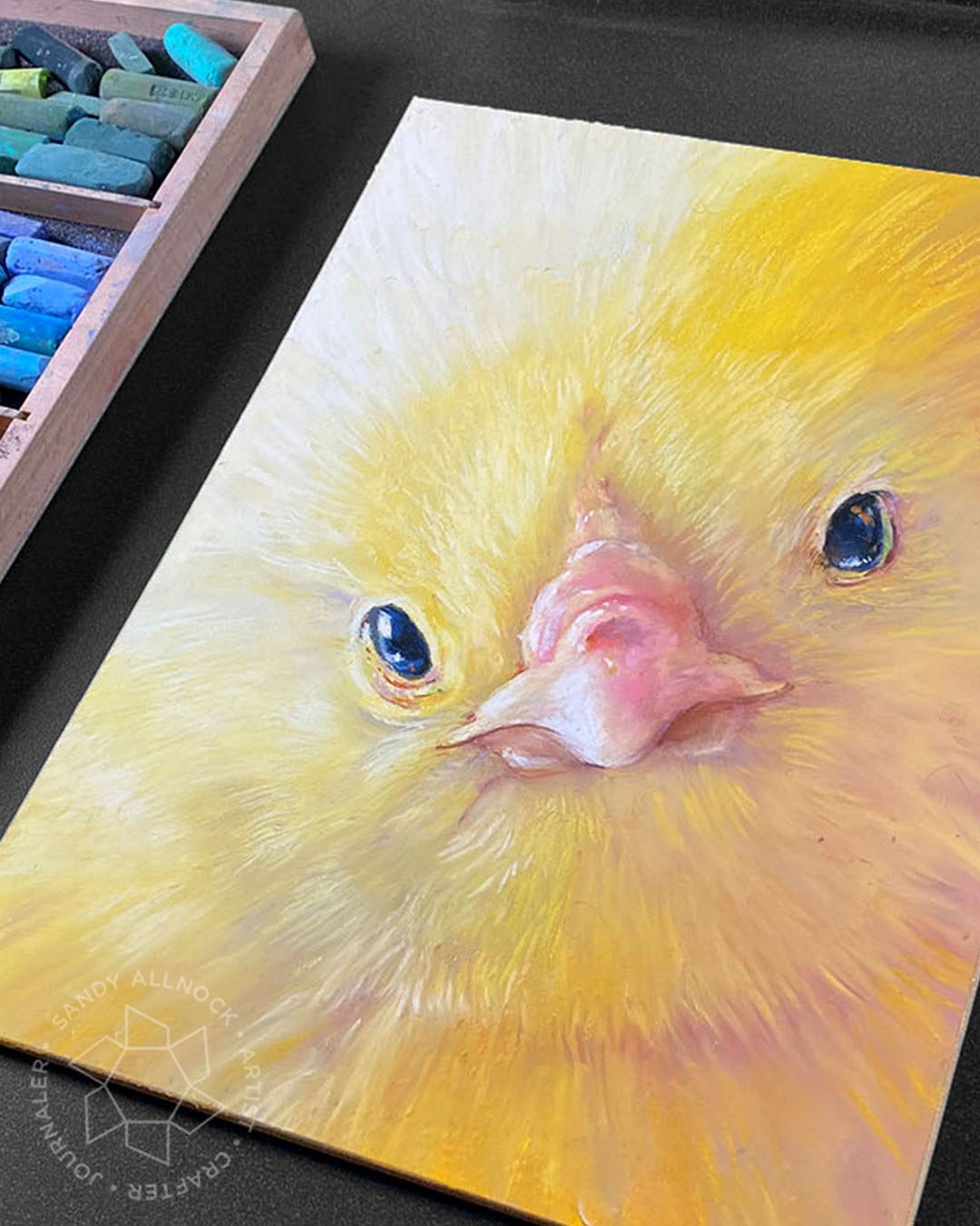
Severak of this week’s pieces are for sale; I’m framing the big chick face for me!
PS I’ve got a birthday coming up this weekend. So I’m giving myself one of these drawings – the big yellow chick is at the framer’s!
First up is the least expensive of these four, UArt Premium Sanded Pastel Paper Pads . I really did like it, but be aware the minimum price on any of these is pretty high – $3.10 for this one on the day I checked, for a 9×12″ piece. It comes in either black (charcoal actually) or a neutral, and you can get it in sampler packs like this one so you can try out a variety of grits.
Next up is the Clairefontaine Pastelmat Card Pads which I liked a lot – very nice surface and a pleasing touch to it. Pads can be bought in a mix of colors which is nice. I still have no idea why it’s called “card” but whatever, eh?
The Sennelier La Carte Pastel Card Pads were a disappointment, but – I do have to accept plenty of the blame myself. I’m a noob! So maybe I’m missing something. I’ll be trying it again, but for now will set it aside as I try to develop whatever my style is in pastel.
I think the most pleasing of these was the Ampersand Pastelbord – but being over $10 for one, that is a lot of why! It’s a hard surface too, so needn’t be handled as gently or taped down to work with it. This is the one I’m getting framed for myself!
ICYMI
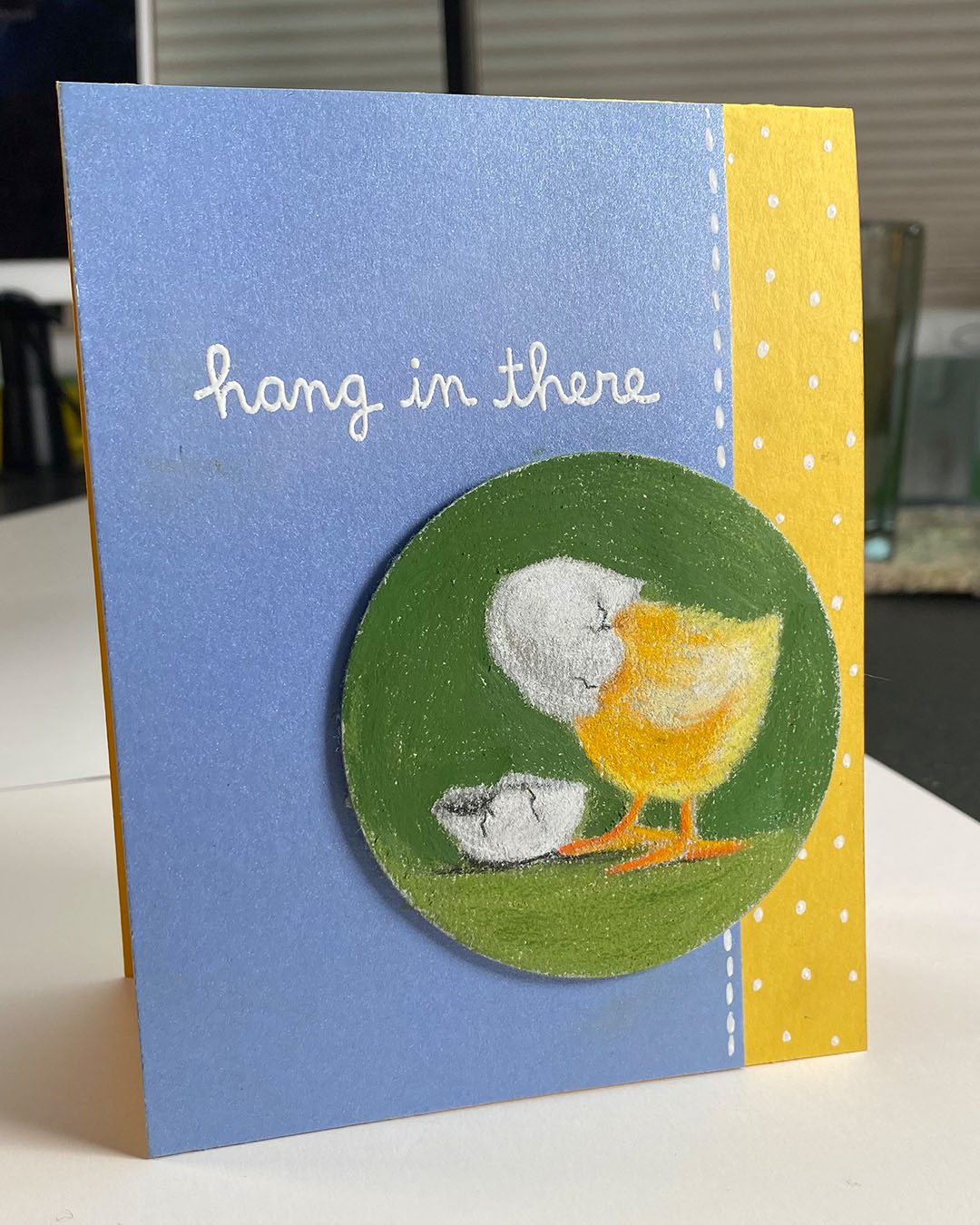
In case you missed the chickies all week, here’s the list!
Some product may be provided by manufacturers for review and use. Compensated affiliate links are here at no cost to you. If you choose to shop using my EH (Ellen Hutson) links, please accept cookies on that site in order to retain the link to my blog, or that compensation does not happen for me. I appreciate your support of my work with your purchases! Full affiliate and product disclosure | My trusted partners in art