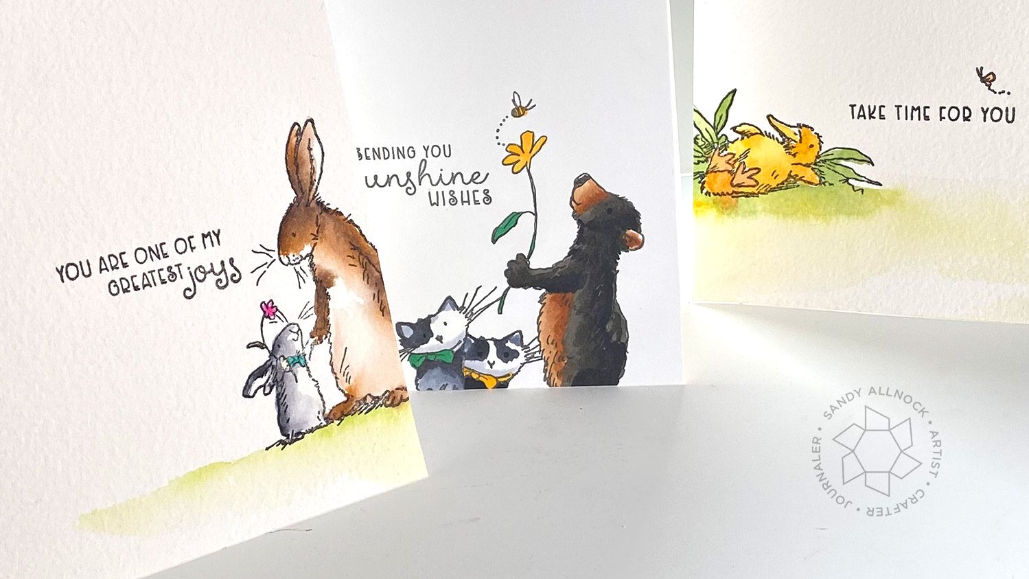
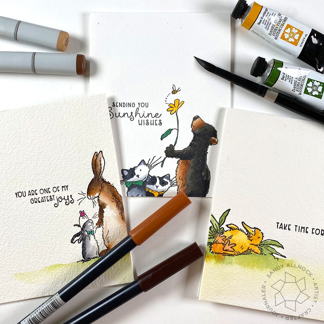
Sometimes we get “stuck” with creating the same designs over and over -this is a quick hack to try the next time you sit down to stamp…and automatically create a “story” without having to make a scene!
Supplies for this project are linked at the end of this post. Compensated affiliate links may be used at no cost to you.
Video
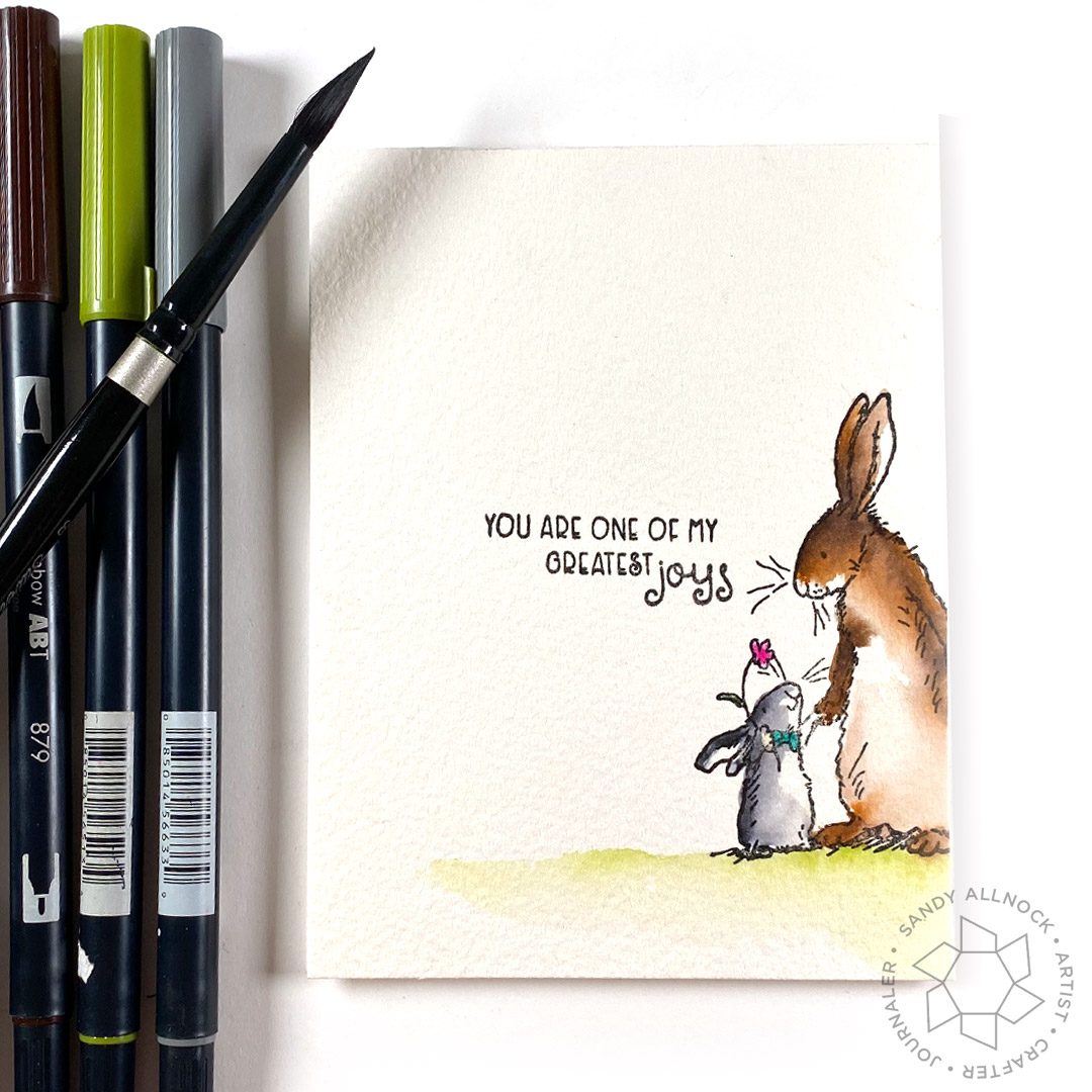
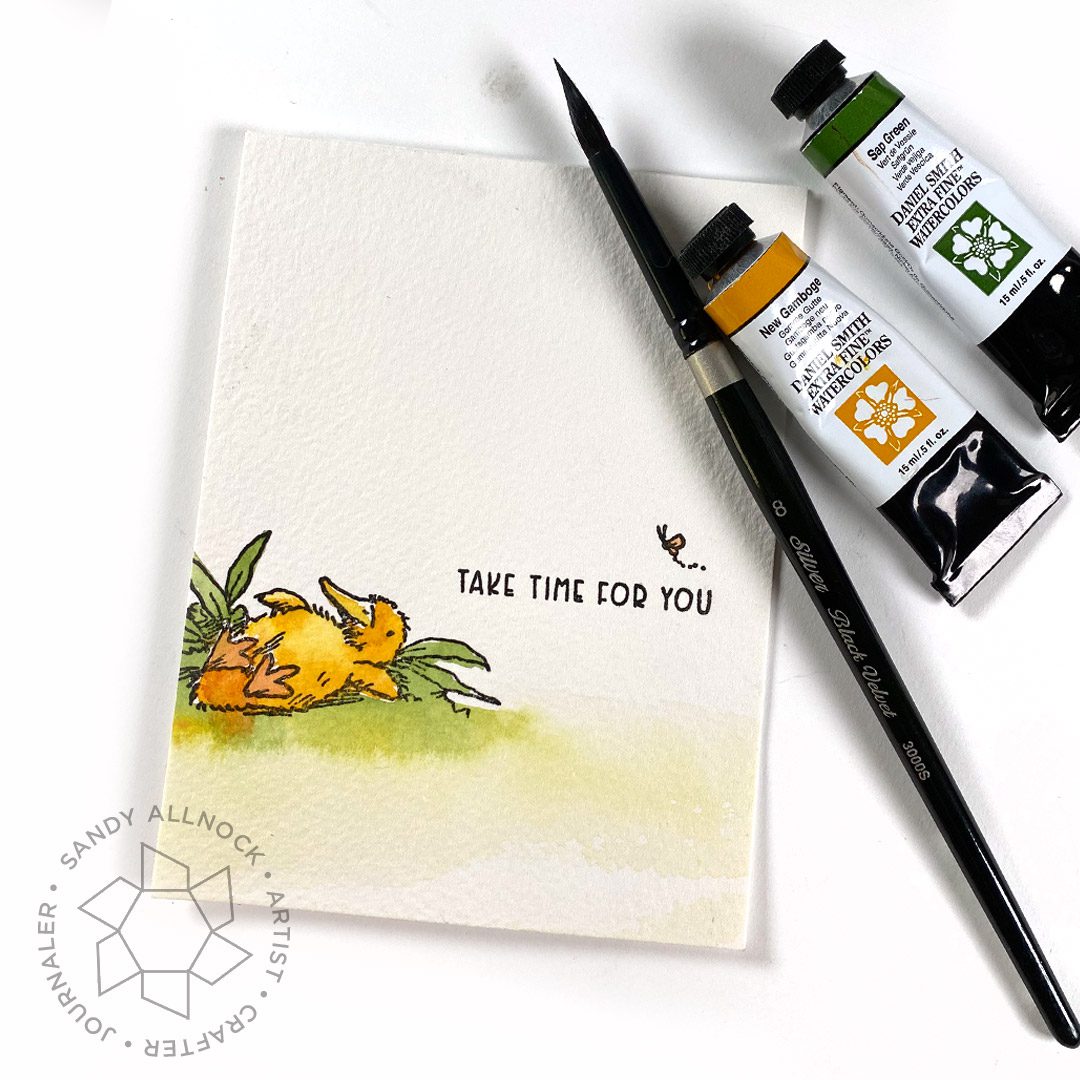
Stamping off-center is a way to add a little imagination into the viewer’s mind – let them wonder where the characters walked in from, or where they’re going. Let their imagination make up what they can’t see! No matter what medium you color with, it really helps for the focal point to stay outside the “center” of a design.
Imagine the paper in front of you being broken into 9 blocks; keep the focus in anything but the center one!
The bunnies from Happy Day are colored with Tombow markers – my little set at Ellen Hutson’s. The rabbits are off to the right – with the focus on just the one big bunny and one little – making the sentiment even more intimate.
The Copic card has the bear from Happy Day and I combined it with the kitty (stamped twice) from Pond Pampering – a nice little combo. Stamping off the bottom meant the kitty’s ground from the stamp set didn’t have to be dealt with – just a little post it on the left and right to help just stamp the kitten.
Last but not least – Pond Pampering also has a cute little napping duck (Can that be ME right now please??) soaking up the sun. Attaching the stamp to the left side of the card also creates that little story – where is this? Is this duck floating at the edge of the reeds or in a field? The viewer can figure it out on their own, engaging them, knowing or not, in the art.
Supplies
Some product may be provided by manufacturers for review and use. Compensated affiliate links are here at no cost to you. If you choose to shop using my EH (Ellen Hutson) links, please accept cookies on that site in order to retain the link to my blog, or that compensation does not happen for me. I appreciate your support of my work with your purchases! Full affiliate and product disclosure | My trusted partners in art
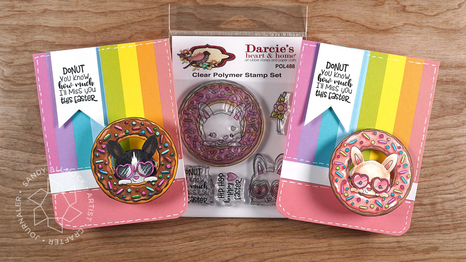
I think the craft industry is conspiring against my waistline….they know I need to buy every donut set that comes out, don’t they??? Thanks Darcies! ha!
Supplies for this project are linked at the end of this post. Compensated affiliate links may be used at no cost to you.
Video
I’ll give you some tips for chocolate frosting here, but by all means swap out colors to make it YOUR favorite frosting. (But hey, isn’t chocolate best!?!?)
My nieces love getting goofy cards from their old auntie – even though they’re in their (GAH) late 20s! Oh my how did the time fly? Fortunately they let me still pretend they’re little! I think they’ll love the shades on these two – just to make the bunnies extra cool, right?
I colored up the pink donut a little while back….same process, except on this one there’s shine on the frosting rather than the sprinkles and jimmies.
A note about action wobbles – A couple companies make them. I only found the minis over on AI’s site – they’re really helpful for small images, since the big wobbles are pretty big. They did fit on these, but you might want to have both sizes in your stash. Just saying. Craft emergencies happen, right?
Supplies
Some product may be provided by manufacturers for review and use. Compensated affiliate links are here at no cost to you. If you choose to shop using my EH (Ellen Hutson) links, please accept cookies on that site in order to retain the link to my blog, or that compensation does not happen for me. I appreciate your support of my work with your purchases! Full affiliate and product disclosure | My trusted partners in art
Last year I discussed the Pantone color of 2020, Classic Blue – and have had a few requests to make a tradition of it. So let’s do it!
In 2021, it’s actually TWO colors: Ultimate Grey and Illuminating Yellow. On their website one of the things they have for sale is some swag – so I ordered a Cortado cup – it’ll be a nice little water cup for painting in 2021!
Supplies for this project are linked at the end of this post. Compensated affiliate links may be used at no cost to you.
Video
The video has three parts: 1) coloring the chart (download here), 2) coloring an image from Three Room Studios, and 3) looking at a few sample cards, also pictured later in this post!
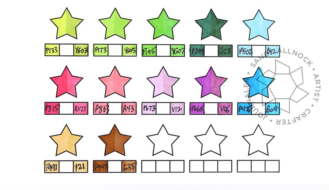
I’ve made a chart for you to download HERE– it’s 2 pages, one has my numbers on it, the other is blank. That way if you want to try to match a different medium like colored pencils, you can add those yourself.
Color harmony examples
To use harmonies the way they’re shown at Pantone, use the colors in different quantities – usually 3 or 4, though I tried using all 6 where possible on these sample cards. The tone of a piece will change dramatically based on which color takes up the most real estate, and what colors are next to each other.
The yellow background is the largest color percentage – and it definitely pulls your attention! The girl’s pink clothing is pretty important here, as the color is so much darker than what’s around it.
The mood is more peaceful with the deep grey background this time – and the yellow chair draws the eye right away. Polkadots on these two, by the way, are the green, and the tan color was replaced with skin and hair colors.
The background is the tan color, and it’s right next to the yellow – almost hiding the yellow outfit as they’re right next to each other. To make the corduroy fabric on the chair, use a white pen, let it dry, then go over it with Copics.
The pink is adapted to have two tones – the airbrushed one is lighter, carpet darker. This and the grey chair surround the shock of the yellow outfit, which pops against all those colors!
Supplies
Compensated affiliate links may be used – that means if you make a purchase using my links, I receive a small commission at no extra cost to you. Thank you for your support of my work on this blog! Read more.
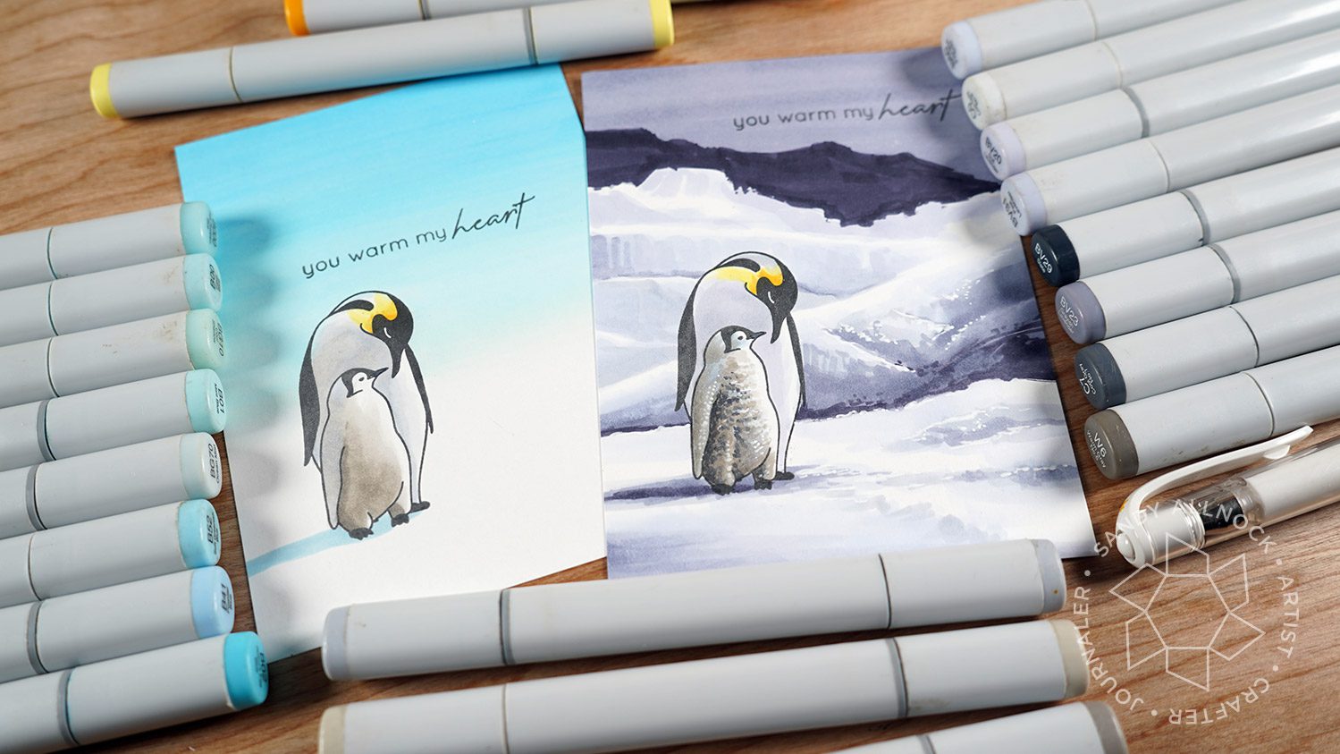
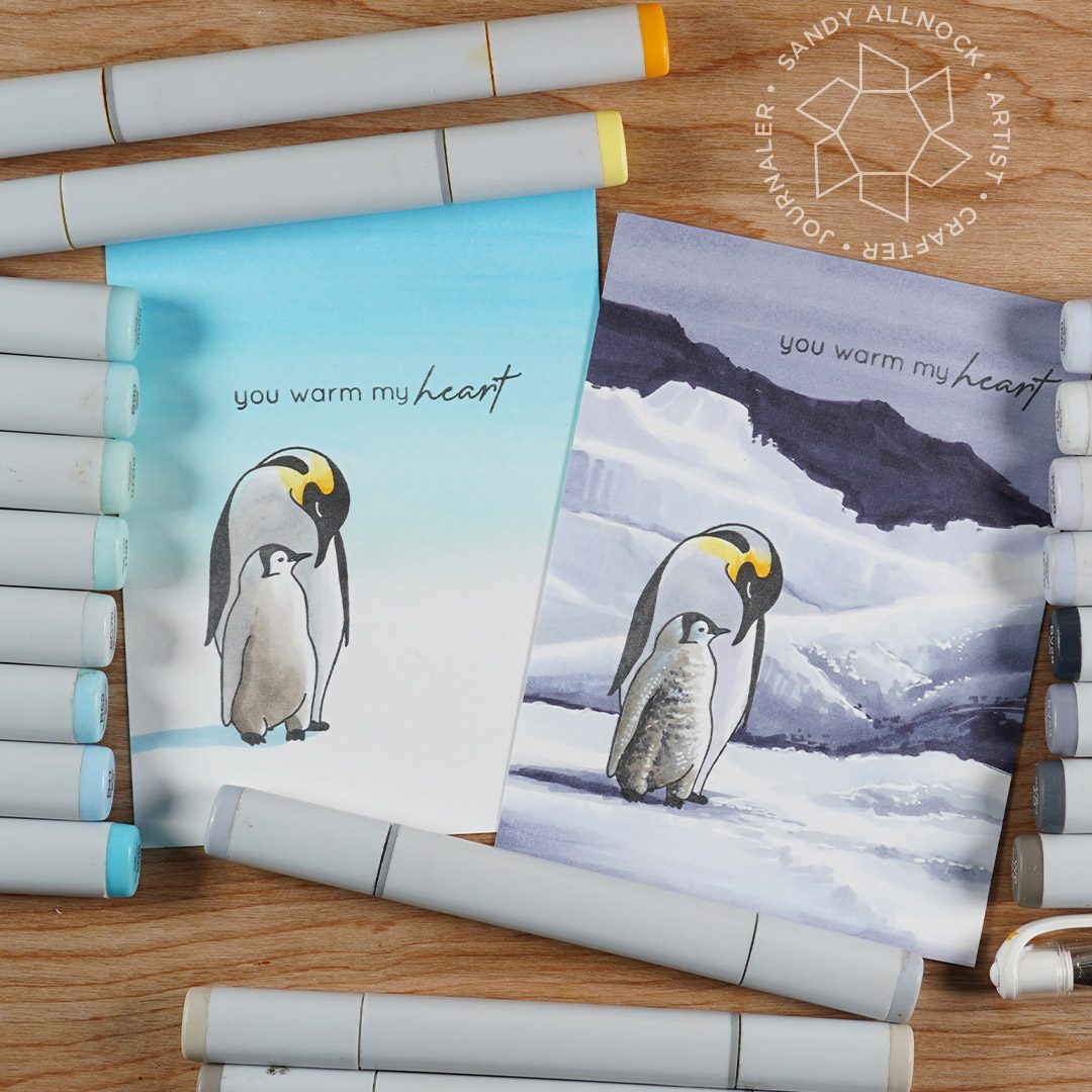
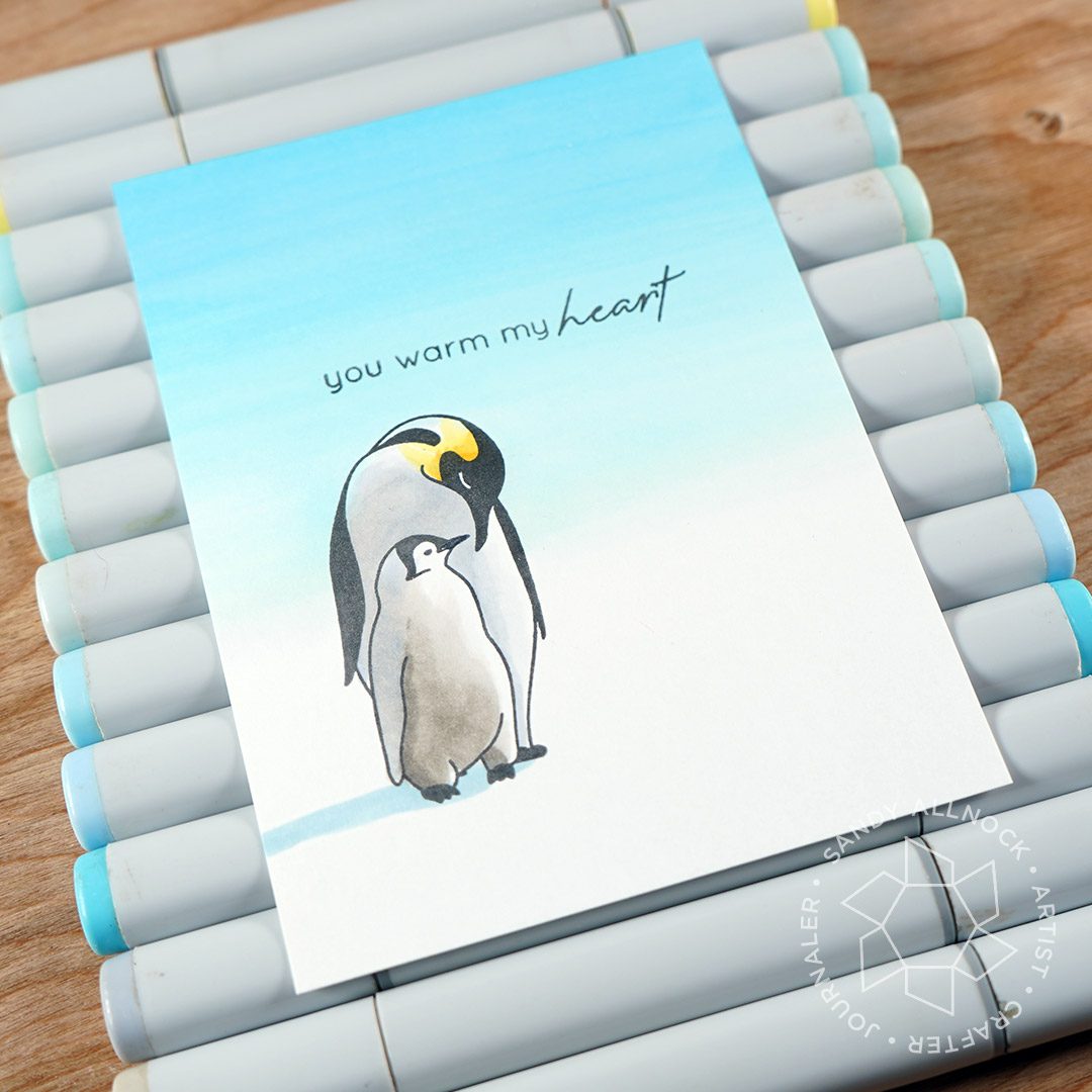
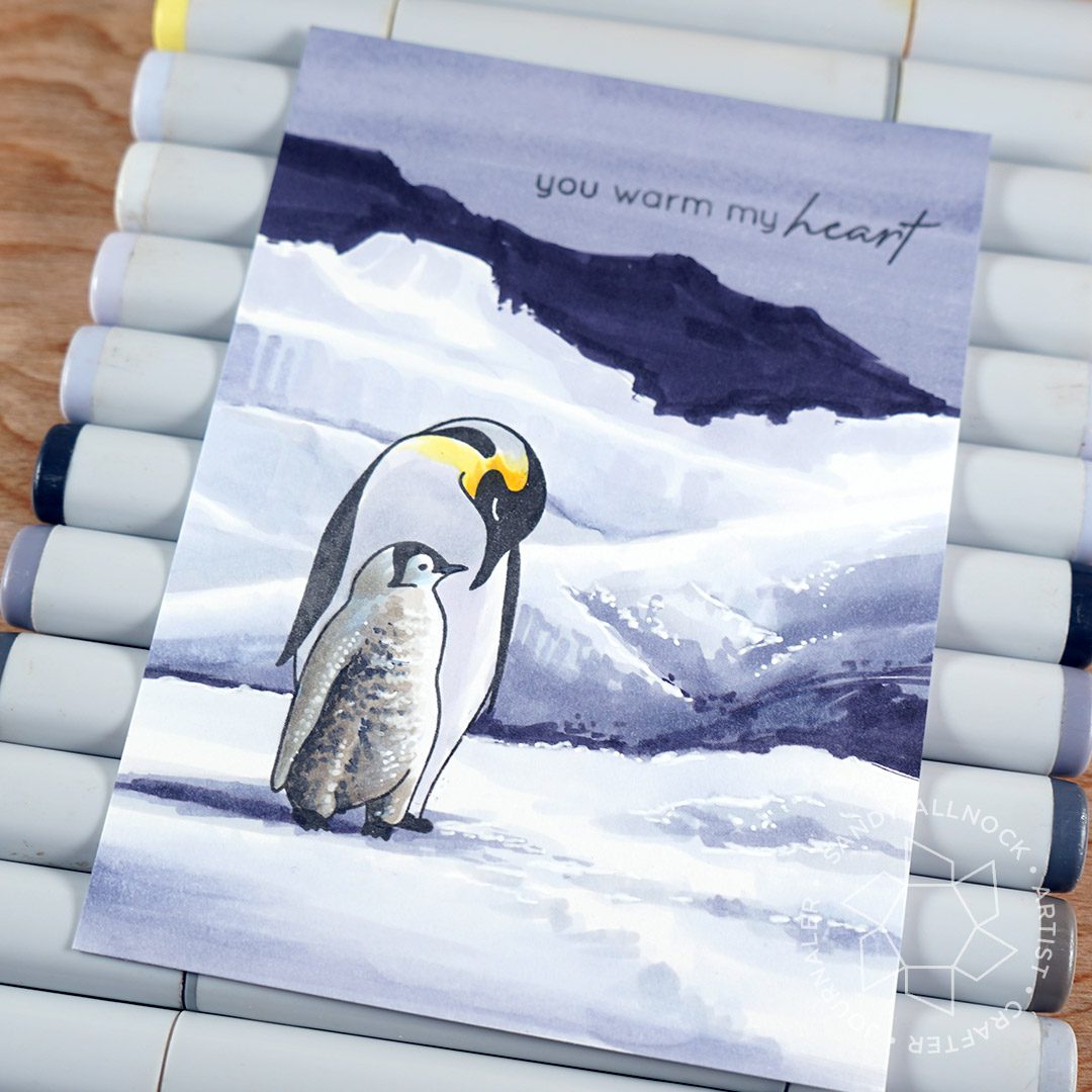
New penguins in da house! Realistic ones! Mama and babyyyyy! Okay okay I’m just a wee bit excited. LOL.
Supplies for this project are linked at the end of this post. Compensated affiliate links may be used at no cost to you.
Video
Thank you Altenew for making a sweet little pair called Warm Heart ….love me some penguins, PLUS I love realism too! And they’re sized just perfect so I can create all kinds of scenes around them!
The easy version is realistic to what Antarctica looks like – lots of times you can’t tell where the snow ends and sky begins! So a simple blended sky, whether in Copics or inks, is perfect!
But if you’re crazy like me, go find a snowy Antarctica scene on the Googles, and play around with values – darks, midtones, highlights, and bright whites!
Supplies
Some product may be provided by manufacturers for review and use. Compensated affiliate links are here at no cost to you. If you choose to shop using my EH (Ellen Hutson) links, please accept cookies on that site in order to retain the link to my blog, or that compensation does not happen for me. I appreciate your support of my work with your purchases! Full affiliate and product disclosure | My trusted partners in art
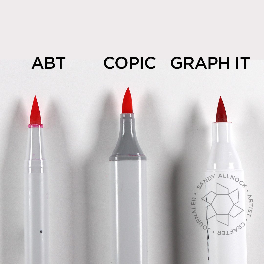
I’ve been asked by a number of folks if I’ve tried some of the other alcohol markers that came on the market in the last year or so….I bought a small set of two of them to play with and see what I thought!
NOTE: In YT comments, I’ve gotten crazy numbers of requests to review all the cheap knockoffs. Please know I’ve tried lots of them over the years and wasted hundreds of dollars on them — they weren’t worth even reviewing. I’m sorry. If you’ve tried using cheap makers to color like I do and aren’t happy with your results, it could well be the supplies, not your skillz. As I always say—get the best you can, cheap supplies will hobble you. ❤️
Supplies for this project are linked at the end of this post. Compensated affiliate links may be used at no cost to you.
First, why bother trying out others when I already own the Copics and refills I need? Well….changes happen! Copic was going to release the new bottles for refills this spring – and of course then Covid happened. I saw one post on one retailer site a few months ago showing the tiny bottles – and mentioning the price was going to be the same as before. Which, as an end result, means doubling the cost of inks, if true. Yikes! I really hope that post was wrong.
However if it’s not wrong, I don’t think Copic will have legs in the craft community after we all run out of the reinkers we now own. I would be REALLY BUMMED, since I really love my Copics. But I also want to be prepared if that does happen, and if prices aren’t adjusted to meet the market’s ability to pay…..so I decided I’d get some other brands to see what they’re like.
Aside from not being able to have a super variety of colors, I was able to get a general rainbow of blends – and I think the ink is the ink – it’s likely that the alcohol ink in alcohol markers is basically blendable with techniques we already know. I suspect the big difference will be in color selection and availability, the delivery system (pens and nibs), and cost.
Graph It Markers
These pens come in a bunch of color collections, and I just tried one little “Essentials” set – which didn’t have much blendable in it (everything blends, but I wanted to have three oof a color to really test that….Imagination International, the US distributor, kindly sent me three pens to try out to blend.) My swatch charts are HERE …..
And I love the price of these – $5.30 with $4 per refill bottle? Yes!
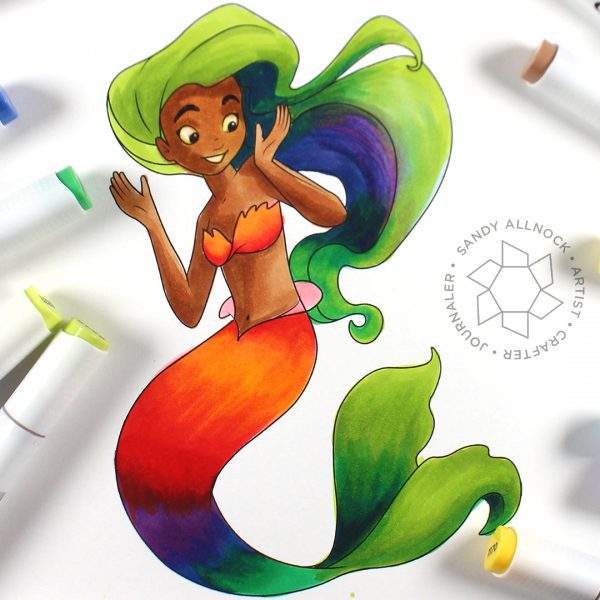
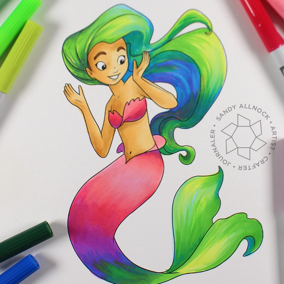
The color selection was the fail when coloring the mermaid from Sweet November Stamps – that poor girl’s skin! ha! So I did have to cheat and repair with some Copics. But The blending worked well enough for not having much for blending colors!
ABT Pro markers
I swatched these as well, just one set of them called Nature Palette; if anyone sees the bright colors like these in nature please do let me know! lol. Yes I suppose there are some florals in these colors – but you know me, I love my rich colors more than brights.
Performance with these was a disappointment. Yes they blend, since they are alcohol markers. The nib is even fine. But not being refillable, and arriving with a bunch that had little ink in them? That was a deal breaker for me. I’m really sad, I love so many of Tombow’s products.
Copic markers
No real review here – just coloring with my Copic marker true loves! I’ll still be sticking with these, at the very least until my refills all run out. (HA!) But I’ll keep my ear to the ground and try some pens occasionally and keep you posted. (Note: I have tried a bunch of the other brands – I haven’t reviewed because I got rid of the pens because they were so useless!)
SUPPLIES
Some product may be provided by manufacturers for review and use. Compensated affiliate links are here at no cost to you. If you choose to shop using my EH (Ellen Hutson) links, please accept cookies on that site in order to retain the link to my blog, or that compensation does not happen for me. I appreciate your support of my work with your purchases! Full affiliate and product disclosure | My trusted partners in art
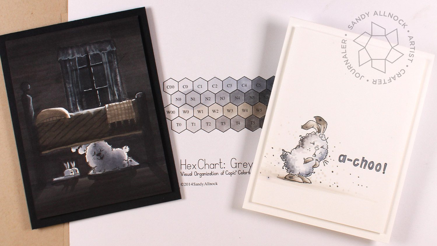
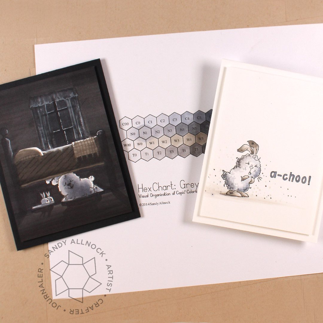
There are four different Copic greys – what the heck is the difference? Do I need them all? The short and blessedly happy answer: no!
10/1/2020 NOTE: Copic did NOT stopping making refill inks – they’ve now become much more available.
Supplies for this project are linked at the end of this post. Compensated affiliate links may be used at no cost to you.
On page 2 in the Copic Hex chart (the colored version that comes with the blank pdf)….you may or may not be able to see the visual color differences well, but hopefully in this video you’ll get a clear enough view to make your decisions on what’s needed.
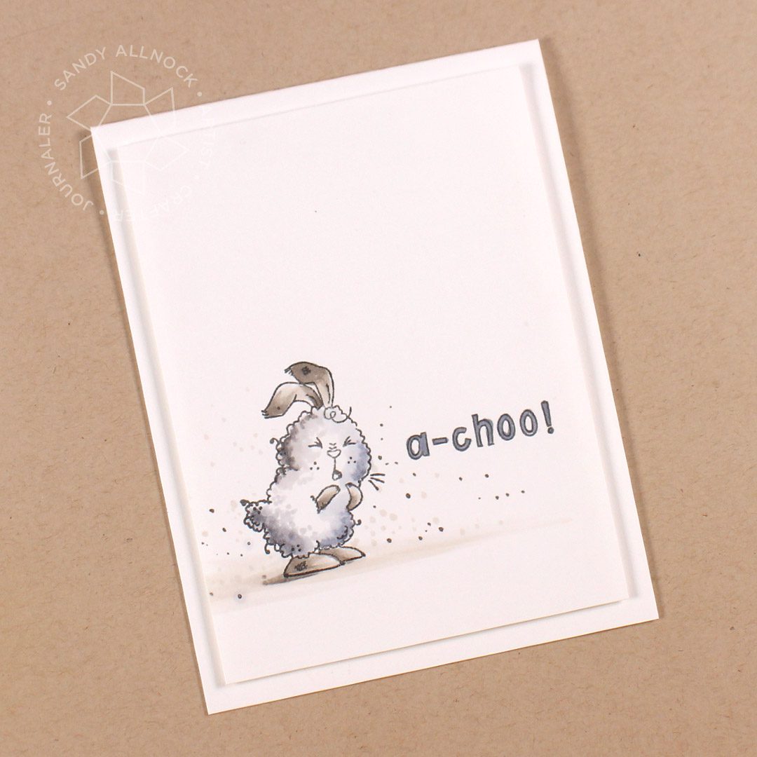
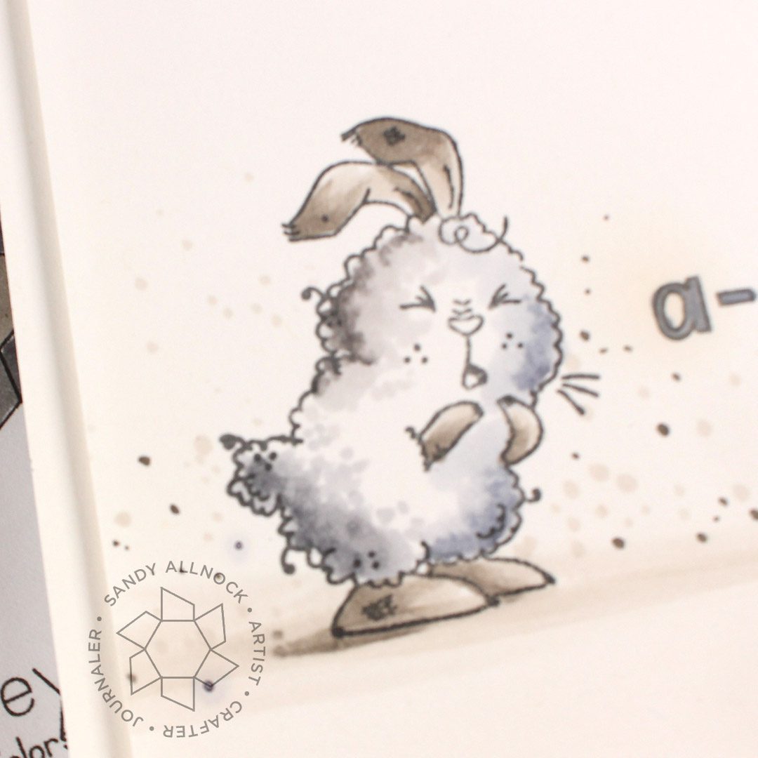
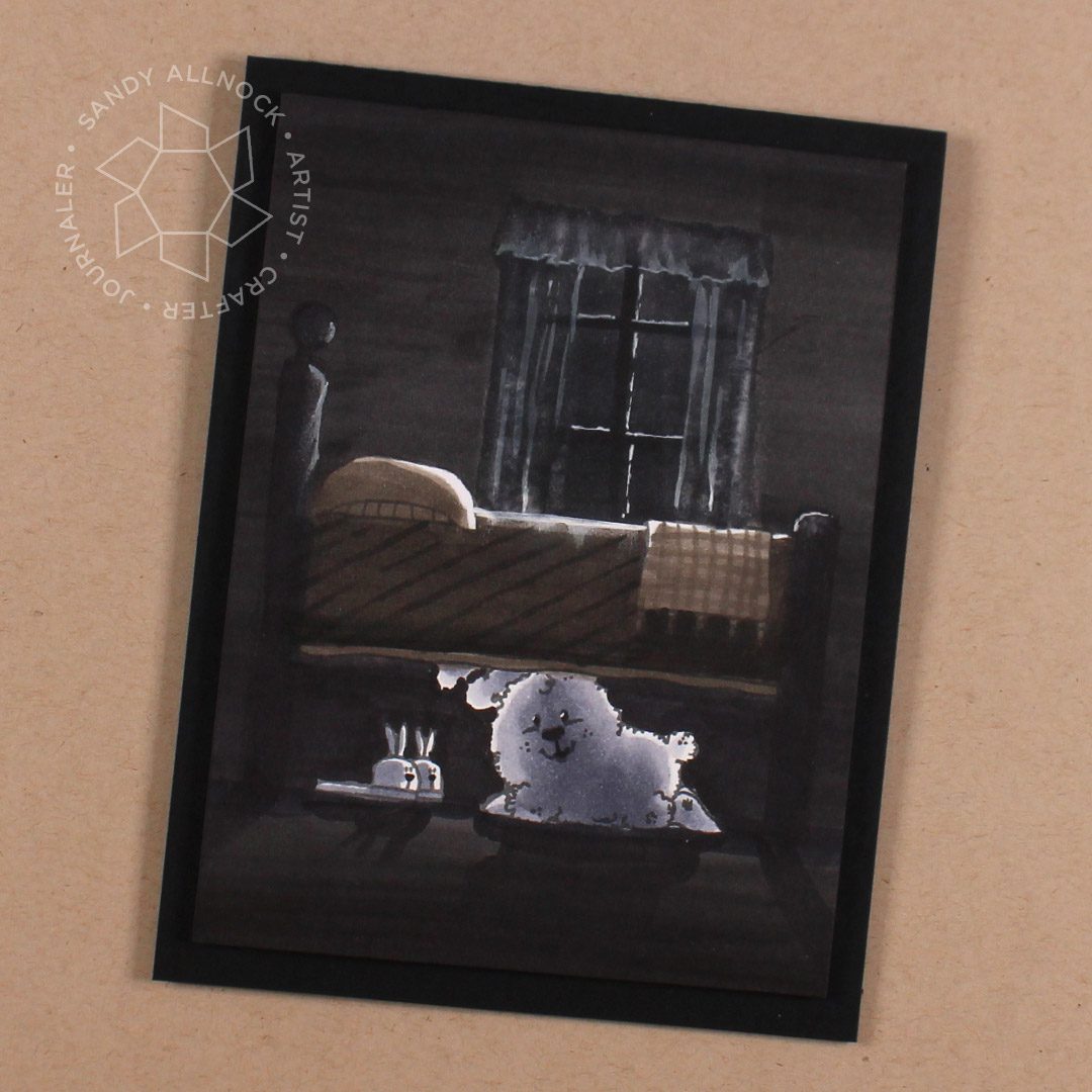
This dust bunny has all four greys in it….and if you just look at the image quickly, the body looks to be about the same basic grey.
The toners and neutrals are pretty close if you arent analyzing it closely.
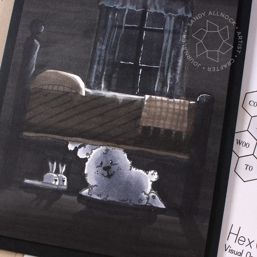
In the second card, you can visually see the coolness of the bunny compared to the warmth of the bed.
SUPPLIES
Some product may be provided by manufacturers for review and use. Compensated affiliate links are here at no cost to you. If you choose to shop using my EH (Ellen Hutson) links, please accept cookies on that site in order to retain the link to my blog, or that compensation does not happen for me. I appreciate your support of my work with your purchases! Full affiliate and product disclosure | My trusted partners in art