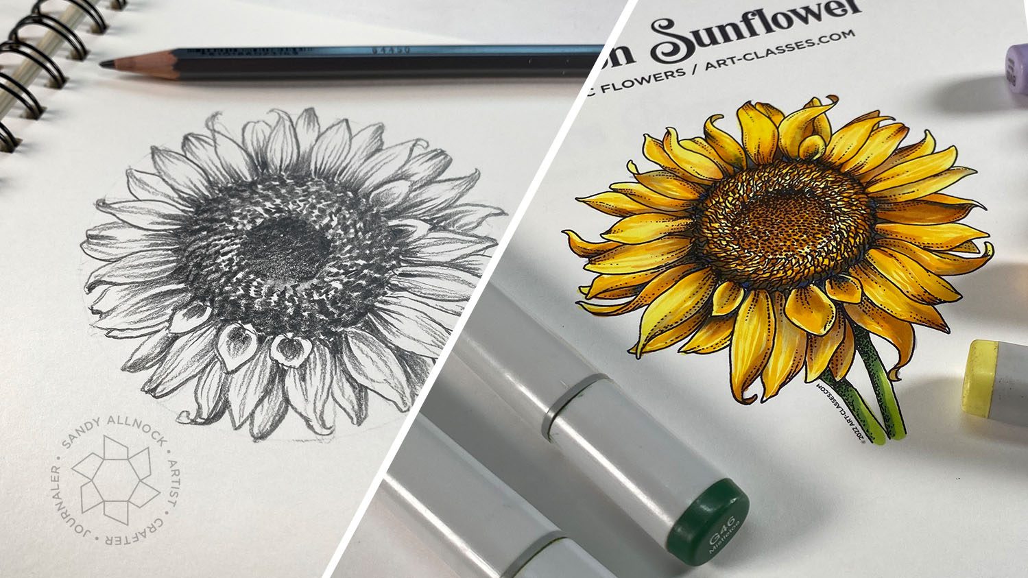
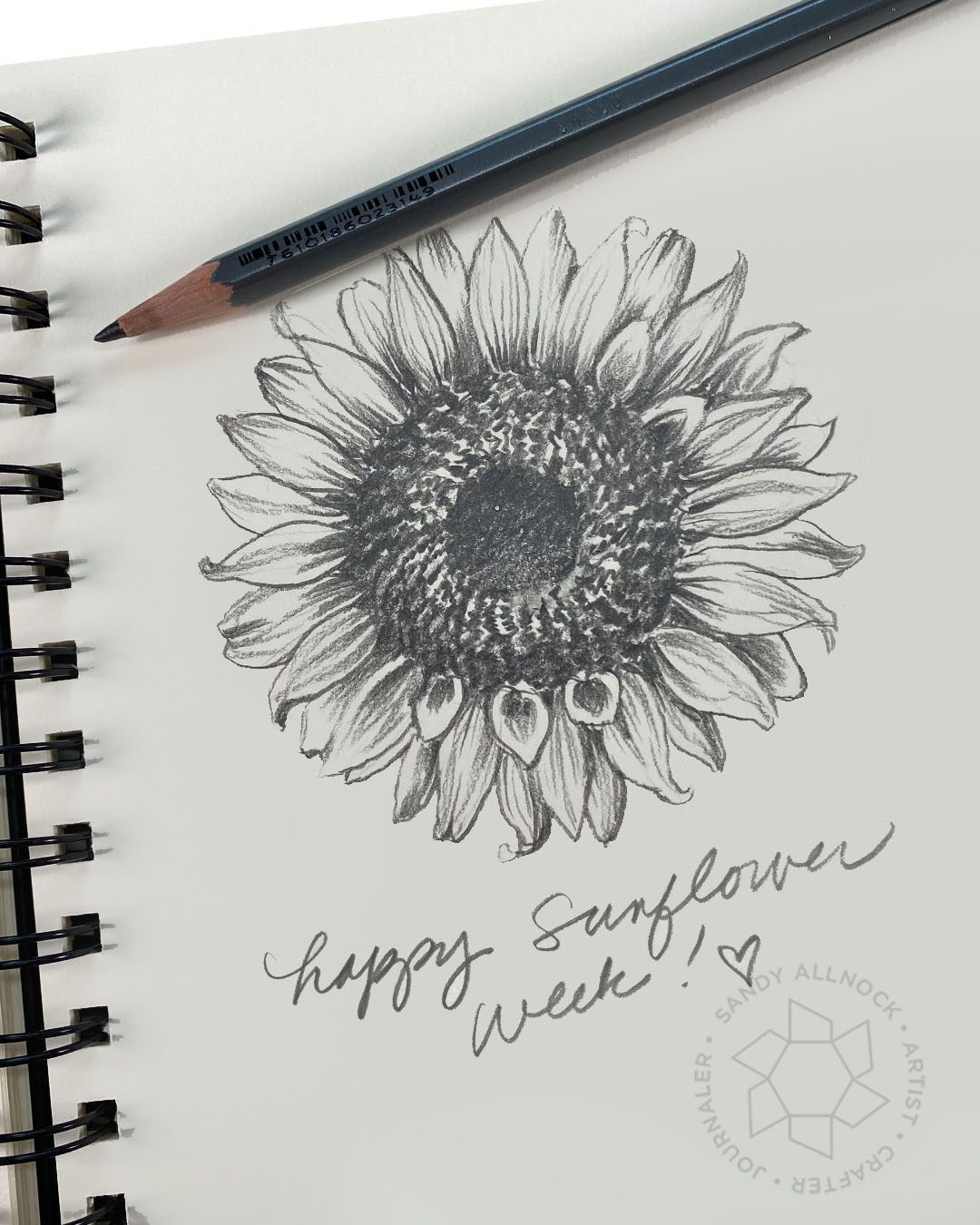
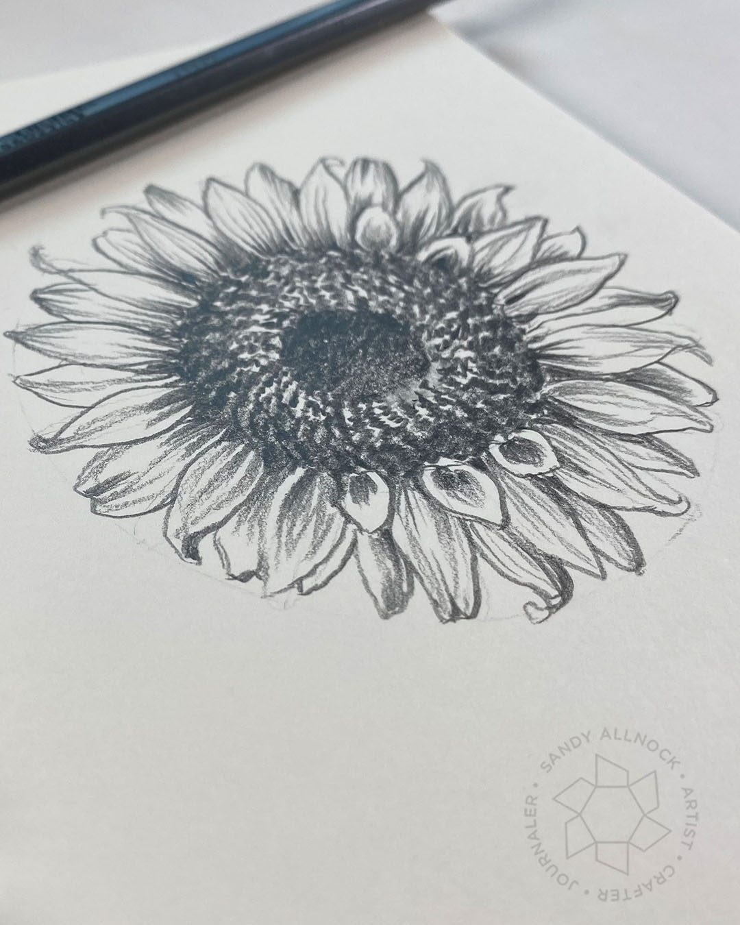
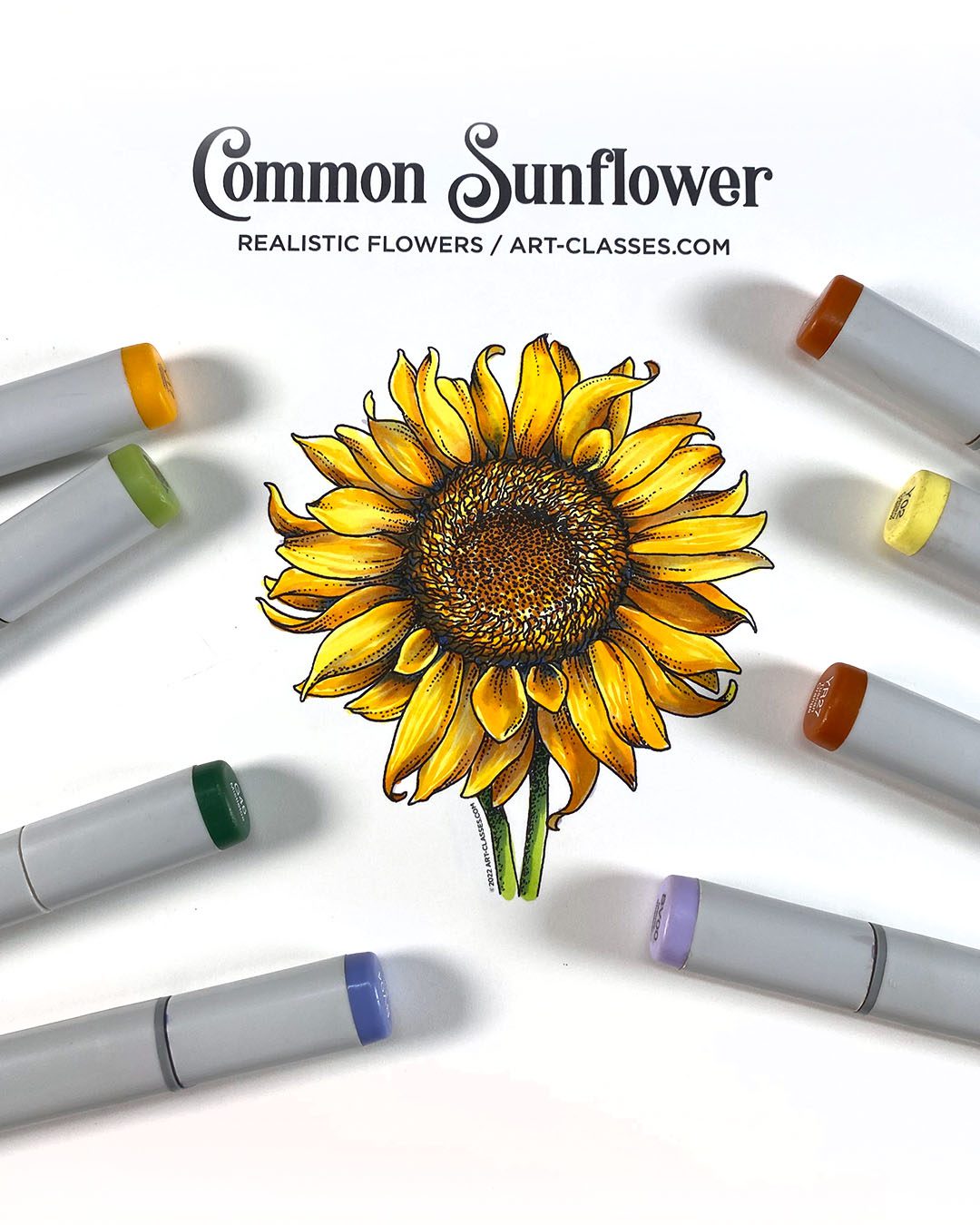
It’s a busy Monday – but hopefully I kept the video tight enough to cover it all without taking up your day! There are three parts –
How to draw a sunflower, using a compass
Free downloadable sunflowers if you’d rather only color
A new Copic flowers class
Video
Watch the video below or click here to see it on YouTube.
This sunflower is hopefully easier than you had imagined! The steps, short form:
Draw a circle for the full flower. Divide that circle in half so you can draw a second circle for the disk full of ray florets (oooh fancy word) in the middle.
Draw a horizontal and vertical line through the middle, then criss cross, then one between each of those – that will give you 16 petals evenly spaced.
Begin to create petals, rotating between different shapes – some small, some curled, some normal.
Add veins with darker (harder pressure) on the inside where it attaches to the disk.
Draw spiral lines and create scribbles around them.
Shade the inside of the concave center, and add a little shading to the outer edge of the disk.
Be proud of your drawing!
Free Printable Sunflowers
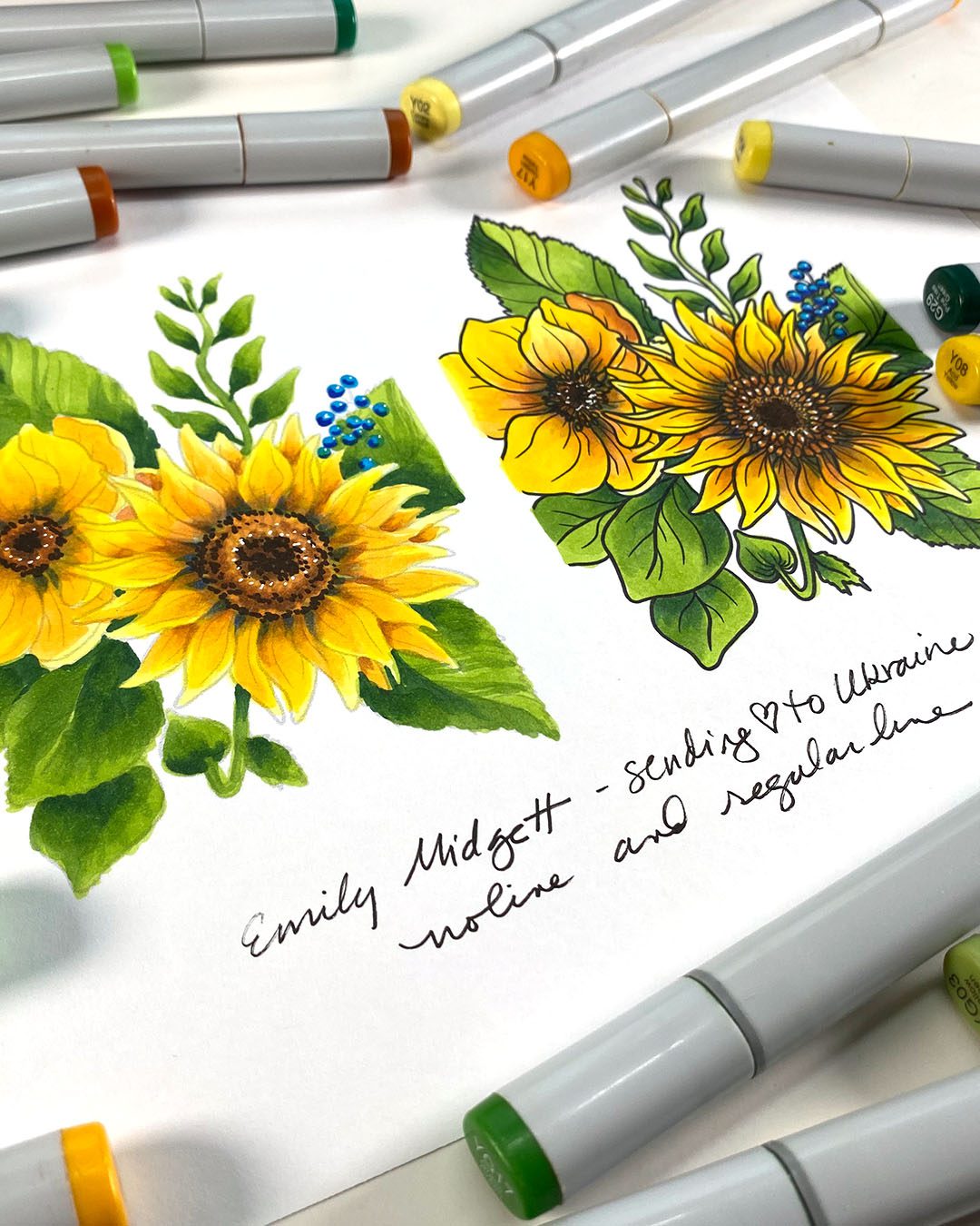
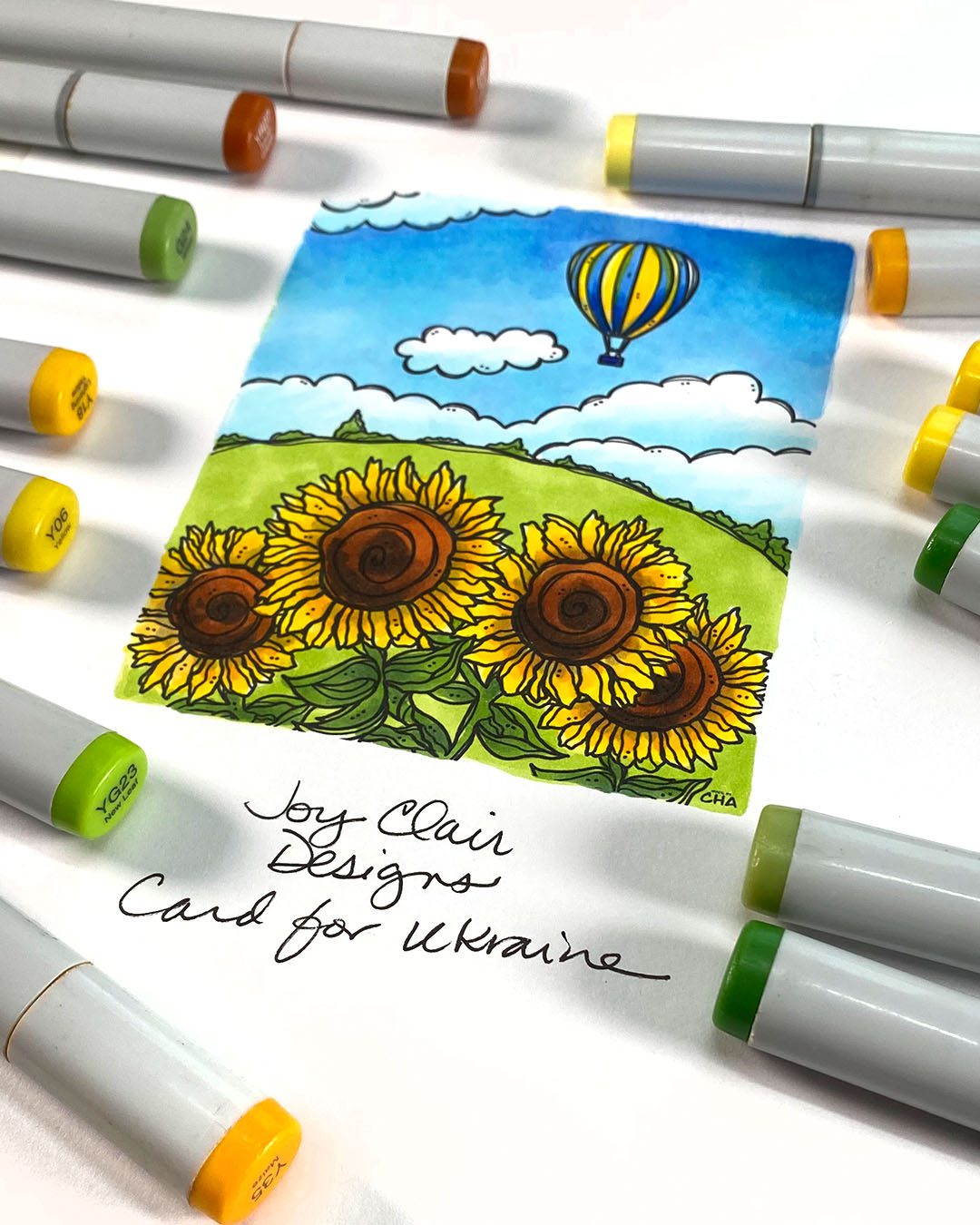
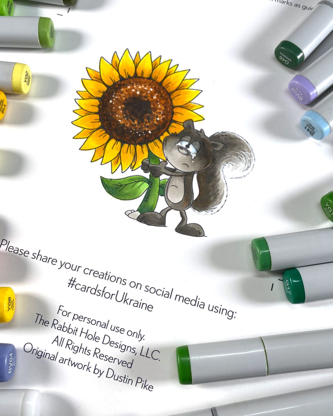
Click on any photo to go to the site offering these free images – and send them a thank you by email, or even better on their social media….and maybe buy something else while you’re on their site!
It’s getting to be spring, and we’re in need of some sunshine, aren’t we!? I’m so tired of rain and snow and ready to move on. So let’s do it in art even if Mother Nature isn’t cooperating yet.
This is a level 2 class – and each of these printable flowers can be bought without the class, or if you get the class it’s included. (If you buy them then change your mind and want the class, let me know and I’ll refund the digital image purchase.) The lessons in this class are in realtime, though I don’t talk through every second – there’s not much to say when it’s repeating the same steps over and over.
Supplies
Some product may be provided by manufacturers for review and use. Compensated affiliate links are here at no cost to you. If you choose to shop using my EH (Ellen Hutson) links, please accept cookies on that site in order to retain the link to my blog, or that compensation does not happen for me. I appreciate your support of my work with your purchases! Full affiliate and product disclosure | My trusted partners in art
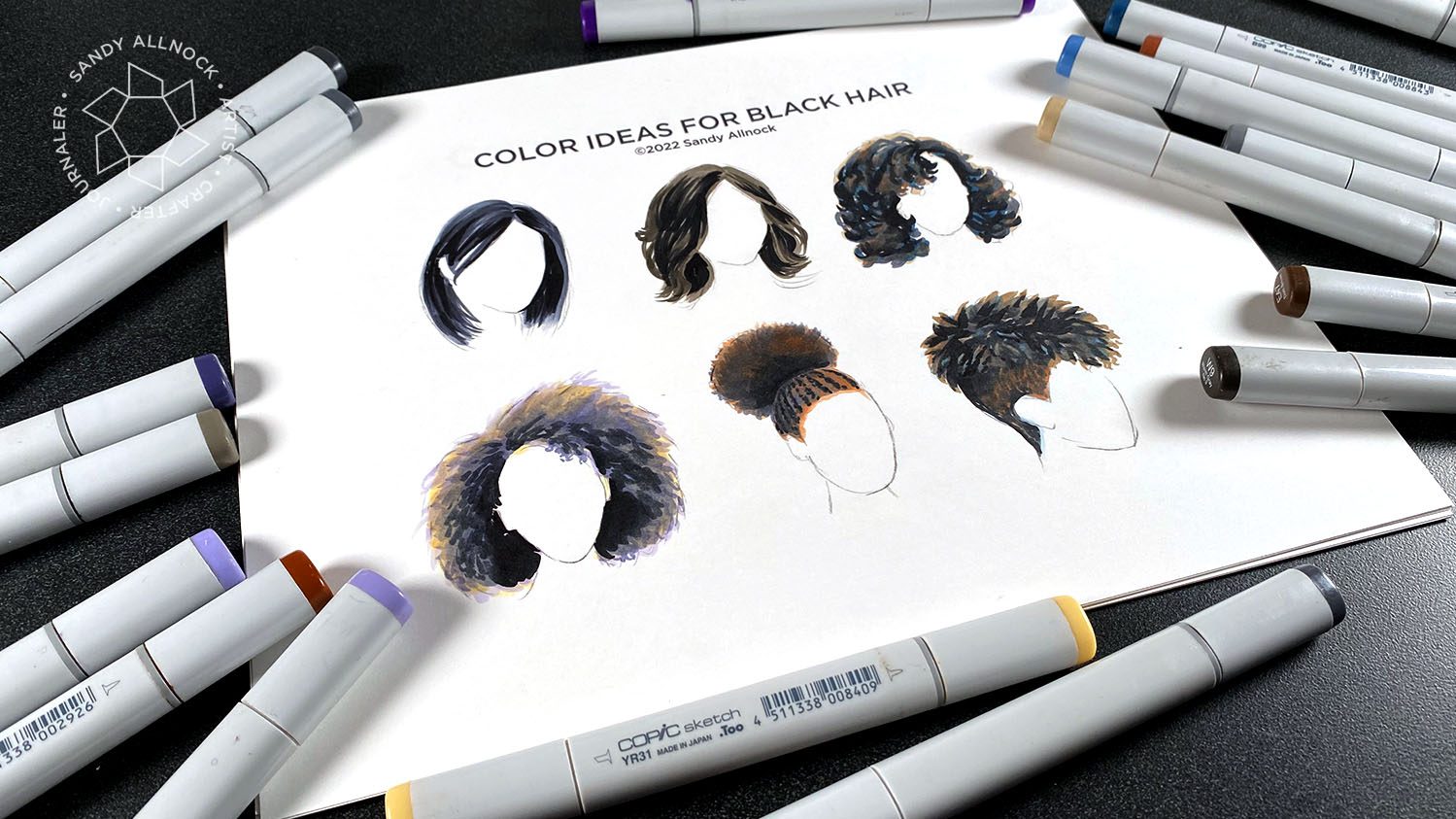
Aside from “why are reds so hard to blend without bleeding!?”, the color I get asked most to show is black objects – often asked in terms of coloring hair, but dogs as well. So….today’s the day!
The download is freeeee! I have been putting all my downloadables in the shop over at art-classes.com not just to be annoying (lol) – but because once you put it in your cart, you only have one place to go to re-find it when you lost the original. So go add this to your downloads in your account, then try coloring a black object in a new-to-you combo!
ICYMI from last week!
On Friday’s posts I’ve been doing a list of everything on social – and since this is skintones to go with the hair from this week….here you go!
Some product may be provided by manufacturers for review and use. Compensated affiliate links are here at no cost to you. If you choose to shop using my EH (Ellen Hutson) links, please accept cookies on that site in order to retain the link to my blog, or that compensation does not happen for me. I appreciate your support of my work with your purchases! Full affiliate and product disclosure | My trusted partners in art
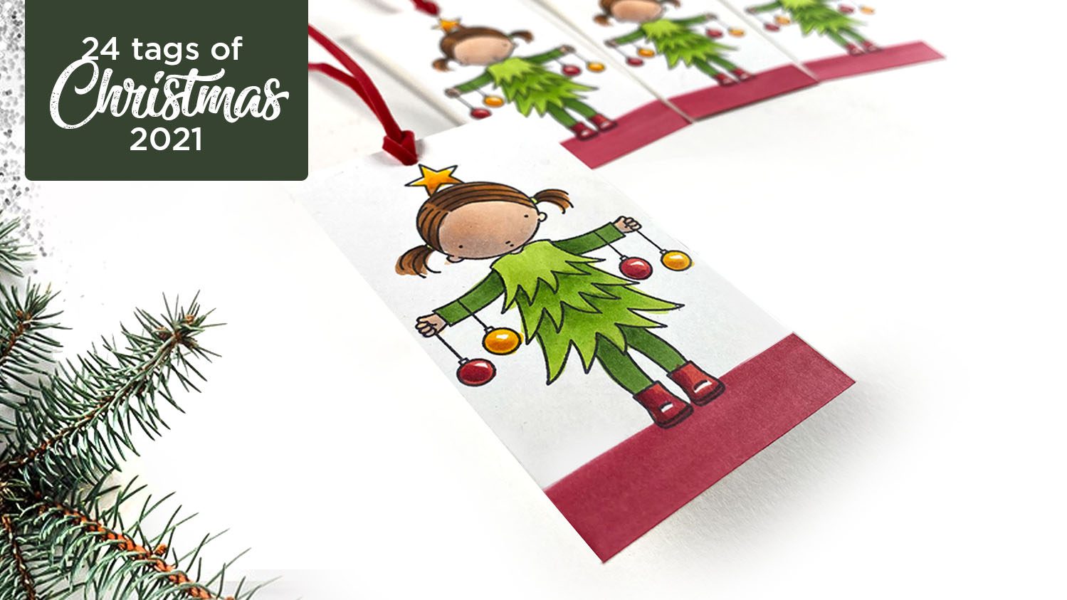
It’s that time of year! I’ve been creating 24 tags, four per video in a series of six, for years now….and they are always my most popular posts of the year. So let’s get rolling, shall we?
The tag giveaway is simple – just leave comments here on the blog, and for a second chance you can leave another on YouTube too! At the end of the series I’ll be picking winners – so comment by Sunday night and I’ll announce winners next Monday!
Supplies
Some product may be provided by manufacturers for review and use. Compensated affiliate links are here at no cost to you. If you choose to shop using my EH (Ellen Hutson) links, please accept cookies on that site in order to retain the link to my blog, or that compensation does not happen for me. I appreciate your support of my work with your purchases! Full affiliate and product disclosure | My trusted partners in art
Pure Innocence – Bright Holidays, My Favorite Things:
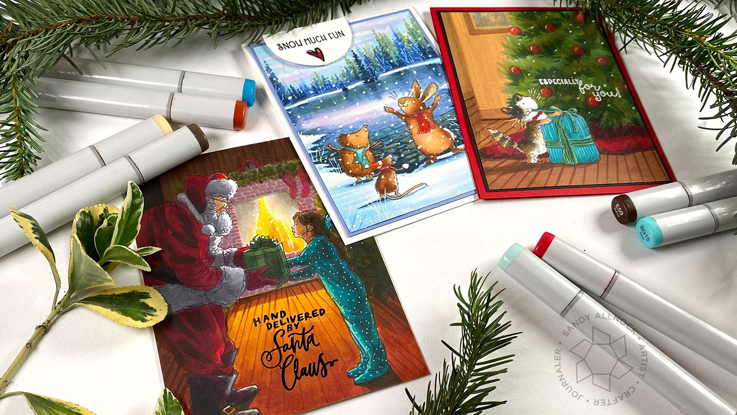
A common challenge for a lot of us as Copic colorists is keeping the marker where we WANT it rather than where IT wants to go! In today’s post I’ll give you the things that I know cause it and some ideas how to fix it.
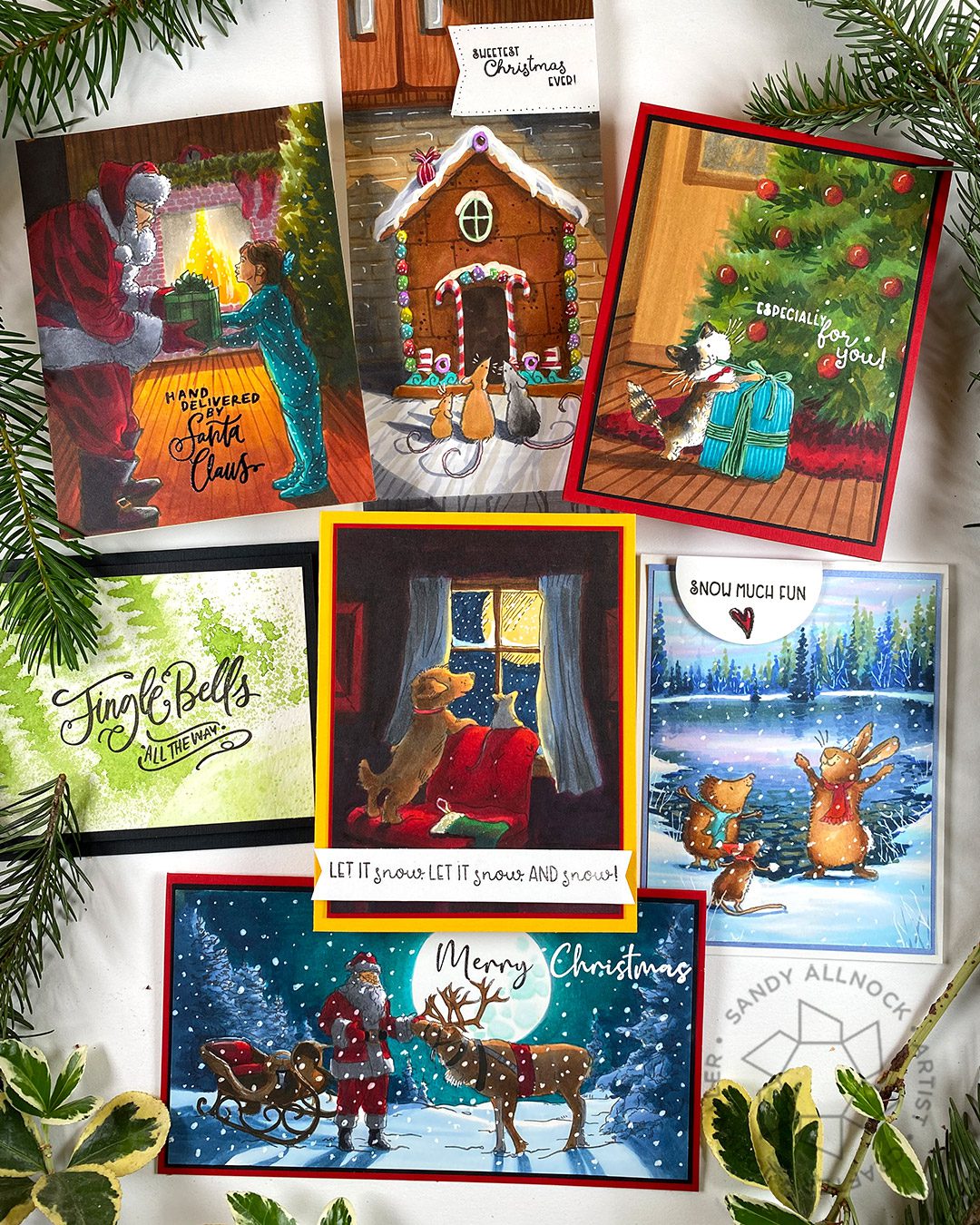
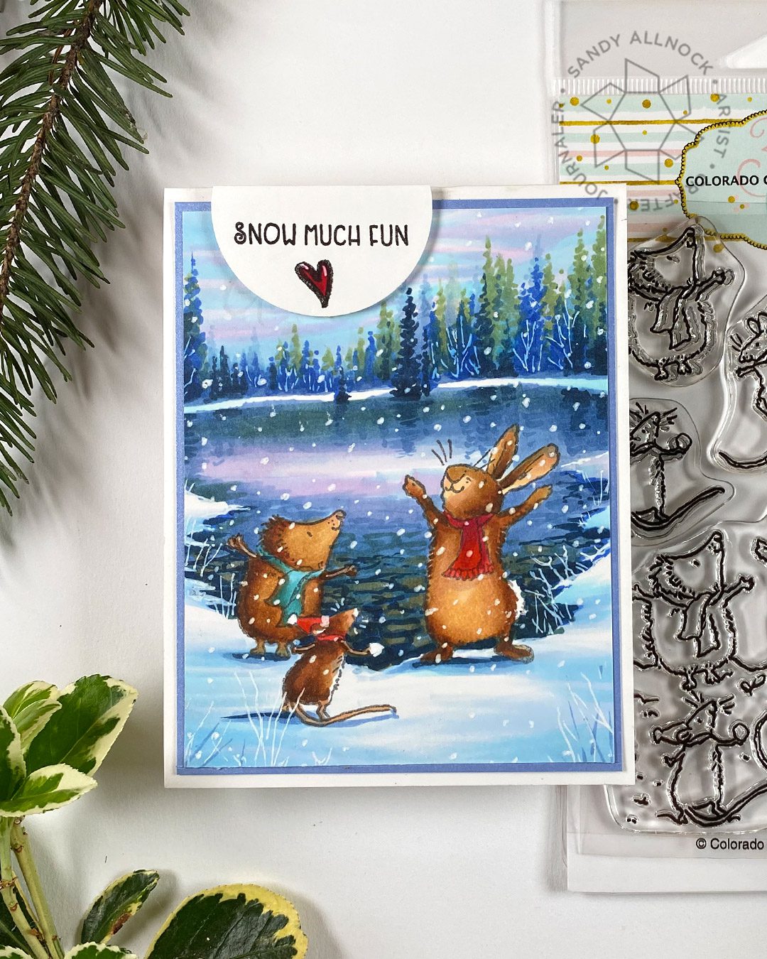
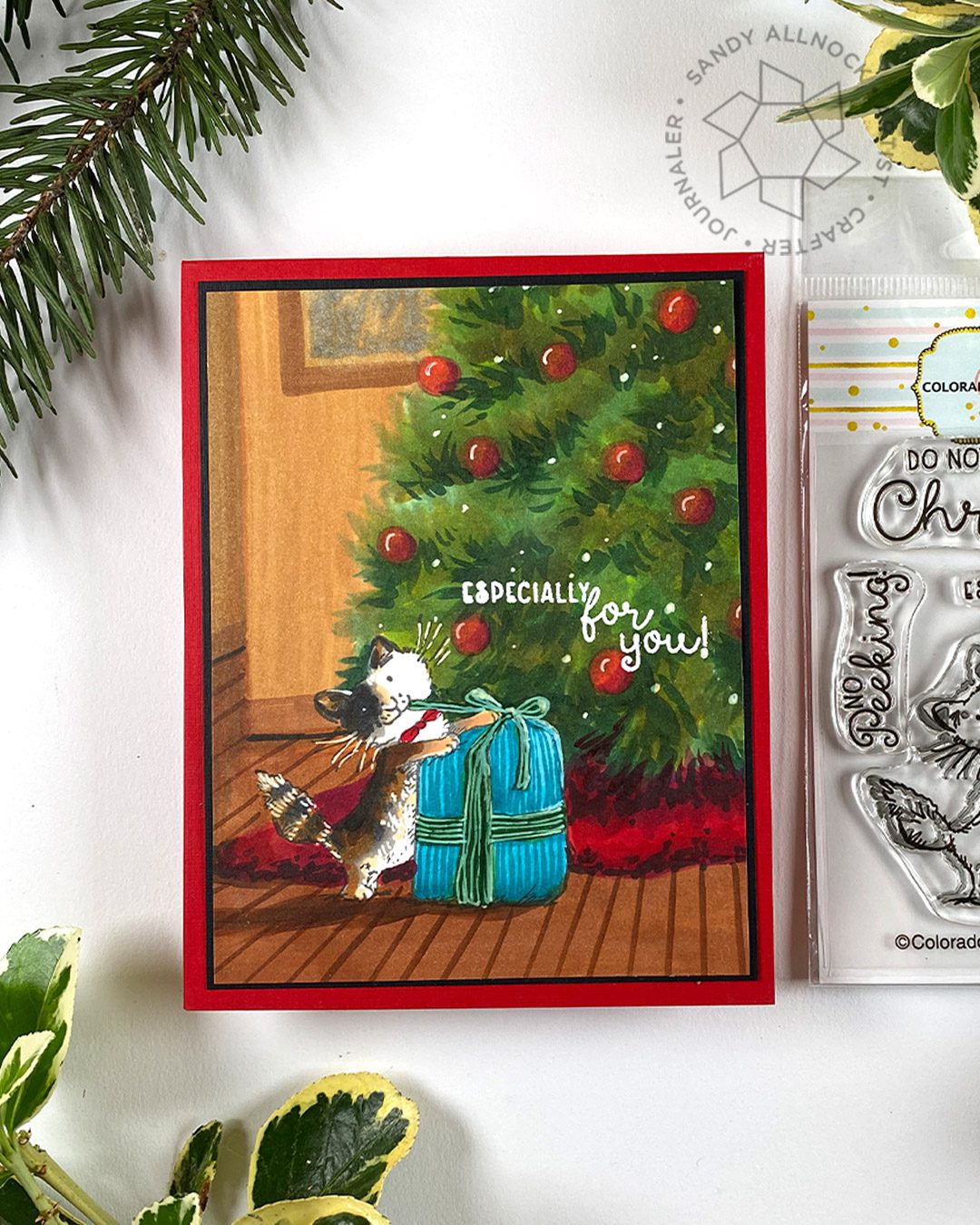
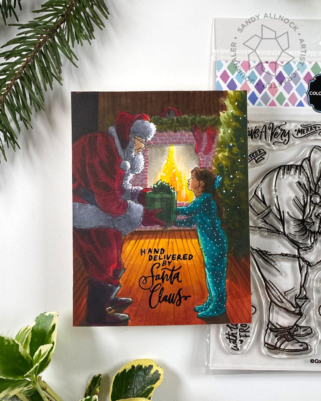
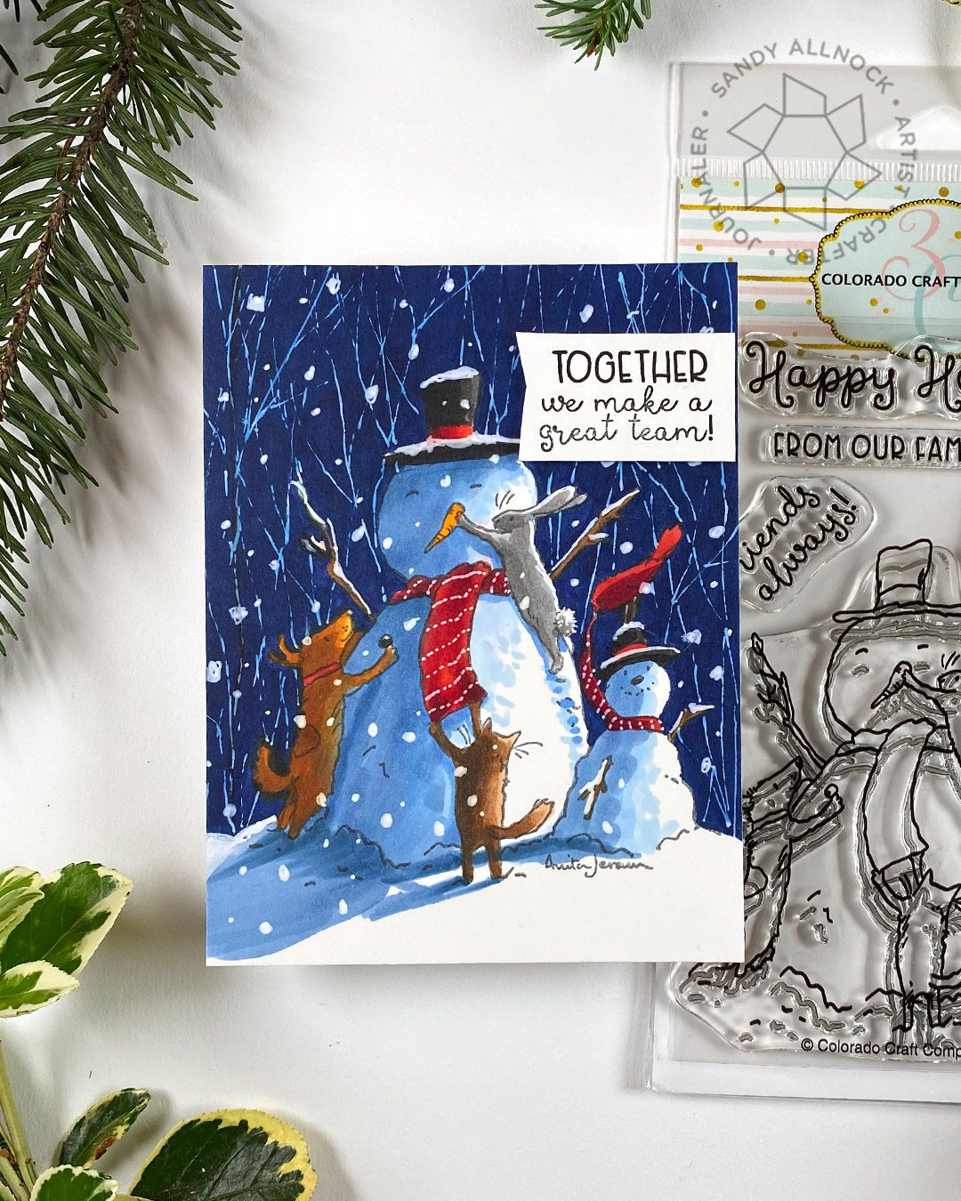
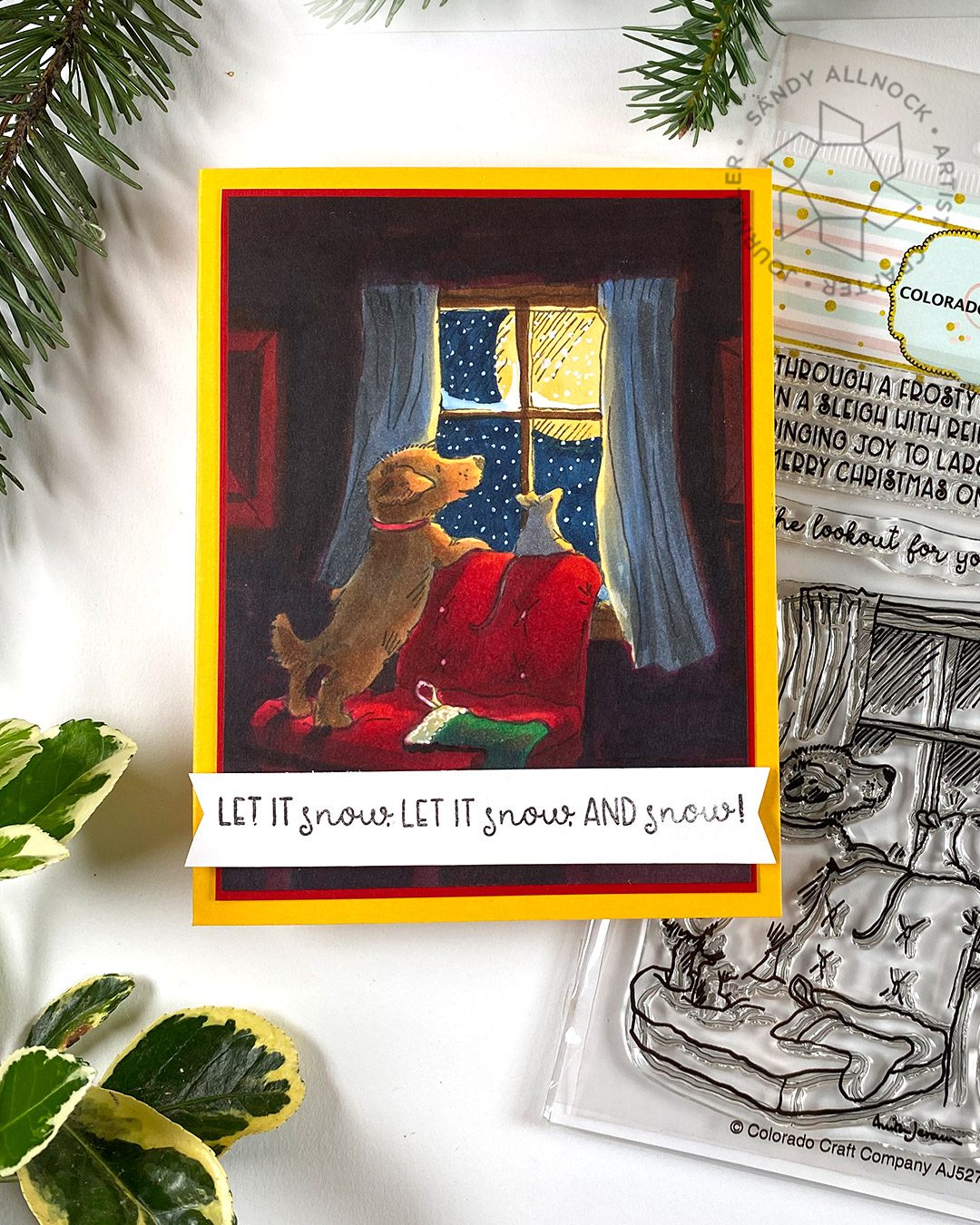
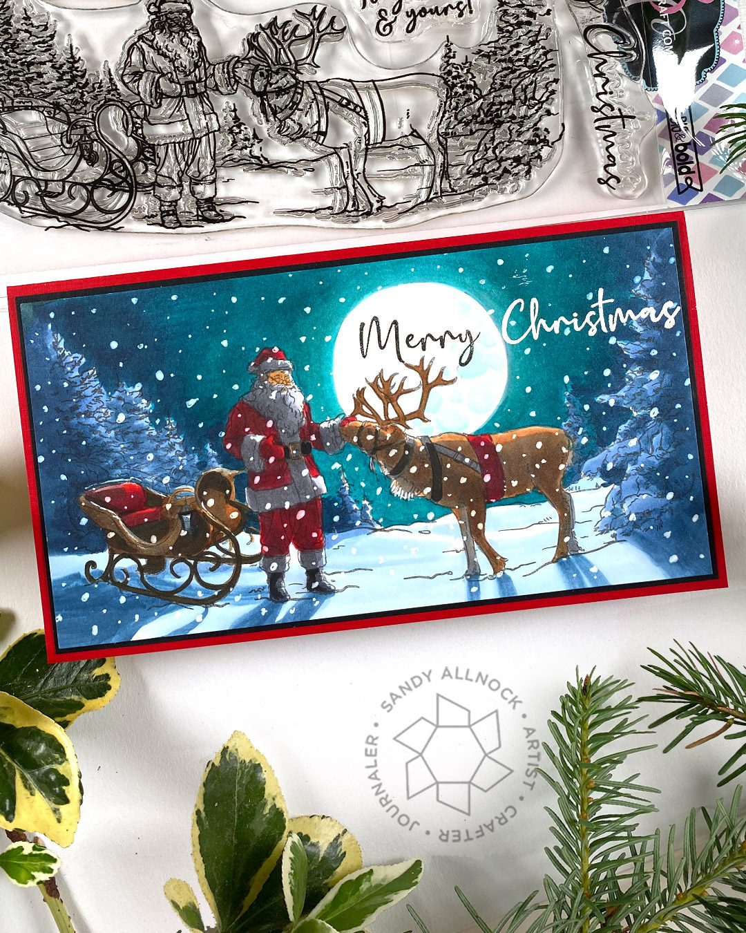
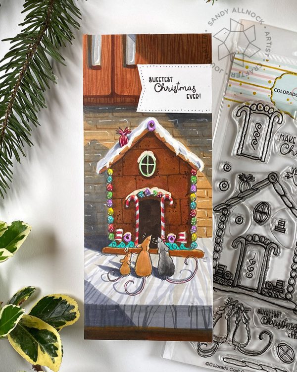
While the cards are some of my epic scenes – don’t worry, the tips here ARE for beginners too! I don’t do all the coloring, just a smidge of each one to demonstrate with. I’m trying to work out some scenes for holiday-themed classes to launch this fall, so these new stamps from Colorado Craft Company were perfect to get the ball rolling.
Classes plus free tutorials:
These scenes have classes associated with some – and each one lists what they would be. There are FREE tutorials on a whollllllle bunch of other CCC stamp sets collected right HERE.
Supplies for this project are linked at the end of this post. Compensated affiliate links may be used at no cost to you.
Video
In the video I talk through some ideas – and below there’s more info written up about each one. Watch below or click HERE to view this on YouTube.
Lots of us get obsessive over that *perfect* blend. And we pour lots of liquid into the paper as we try! Constantly going over and over an area is what oversaturates it and makes the color bleed past the line.
1. Make a scene
I started creating scenes years ago to cover up goofups! Partly from bleed, but lots because I work fast and go outside the lines sometimes. Your scene doesn’t need to be a full one like mine – but you can learn how to make a simple treeline behind the area of bleeding…that can cover the problem but not require more than learning how to draw a line of trees.
I get it that none of us are independently wealthy….but stress over bleeding and an inability to blend costs too – you’re paying in ink by having to work so hard! I haven’t colored on the Georgia Pacific 110 from Walmart in years, and when I did – I remembered why. It creates a mottled surface that looks yukky and makes me want to rework and rework to make it smooth….and thus the bleeding begins! You don’t need fancy topline art papers – but if you have consistent bleeding problems, try some other papers and see if that’s the problem.
While we all hear about using three colors – a dark, medium, and light – there’s no law against using more! If you have a smaller step between shades, it’ll be easier to get a good transition between them, especially with fabric folds, as seen in Santa’s pants in this example. Use 6 or 7, go for it!
If you use a craft mat – plastic, glass, or a table – you might be causing yourself trouble! I always put a scrap piece under what I’m coloring so it will absorb any color that bleeds through the back of the paper, so it doesn’t push back UP into my coloring area. Blending happens within the fibers of the paper, by the way, so it’s very normal for color to bleed through. It’s a good thing.
Sometimes, the only thing left to do is grab a white pen and make a repair! I’ve tried out a lot of white pens and love the uniball signo white gel pen – I know it doesn’t work for a lot of people, and I recommend being sure you aren’t smashing the pen on the paper out of rage that it’s not working (lol)…..there’s a “ball” at the tip of the pen and the liquid needs a place to move all around that ball to get to the paper, and smashing it closes off that ability to move.
But you can also pay attention to the amount of fine detail to be colored: got tiny itty bitty spaces that need to remain light? Use colors that you don’t have trouble with bleeding. Reds are notoriously bad!
There are FEW white mediums that’ll be 100% superbright white when they’re overtop of Copic, by the way. Copics have alcohol ink in them, and it’s absorbed into the white medium in pens.
Draw the viewer’s attention to a different place than the location of the bleeding! I struggled with the sleigh below, so decided to put a big moon in the middle of the card. With a rich night sky around it, the viewer is drawn to the light – anywhere there’s a place with the darkest of darks next to the lightest of lights, it unconsciously signals to the viewer to look there! And when it comes to winter scenes especially, snow achieves a lot of that naturally.
Stamp set shown below: Santa’s Sleigh SlimlineEH • CCC
Let it rest
There’s a bit of misunderstood principle of Copic blending – that the paper has to be really wet with ink in order to blend. In some ways, yes – but you can take a piece of partly colored paper that’s been sitting overnight, and go right back in to work on it again. You’ve probably experienced that, right? So if your piece is on the brink of bleeding – and you know that feeling of dread well! – then just let it sit for a little bit. In the card shown, I went from one area to another to keep letting color sit and rest for a few minutes in between.
Suggestion for learning more about cast shadows: Casting shadows
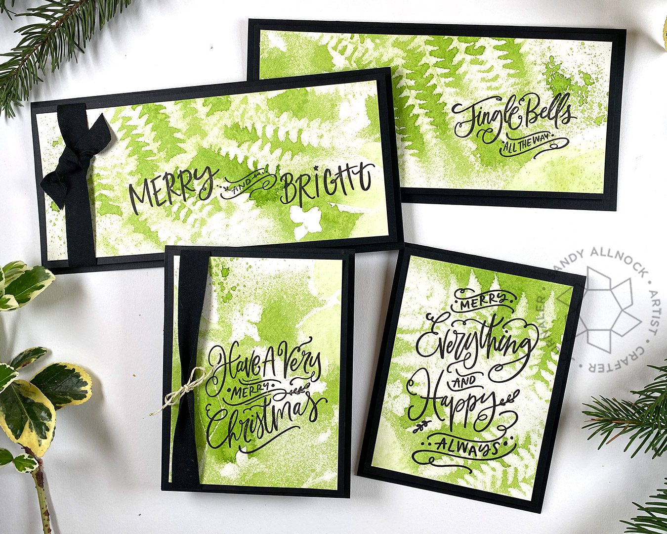
A nonCopic card here too, since it’s still World Watercolor Month! I created a big piece of paper using garden greens, and cut it up to make a bunch of cards. I used a black layer under the watercolored panels, then some dimensional adhesive was used to attach it to the card. They’re simple and elegant!
Some product may be provided by manufacturers for review and use. Compensated affiliate links are here at no cost to you. If you choose to shop using my EH (Ellen Hutson) links, please accept cookies on that site in order to retain the link to my blog, or that compensation does not happen for me. I appreciate your support of my work with your purchases! Full affiliate and product disclosure | My trusted partners in art
This is a technique shown before, but its totally different with layering stencils…get ready for fun!
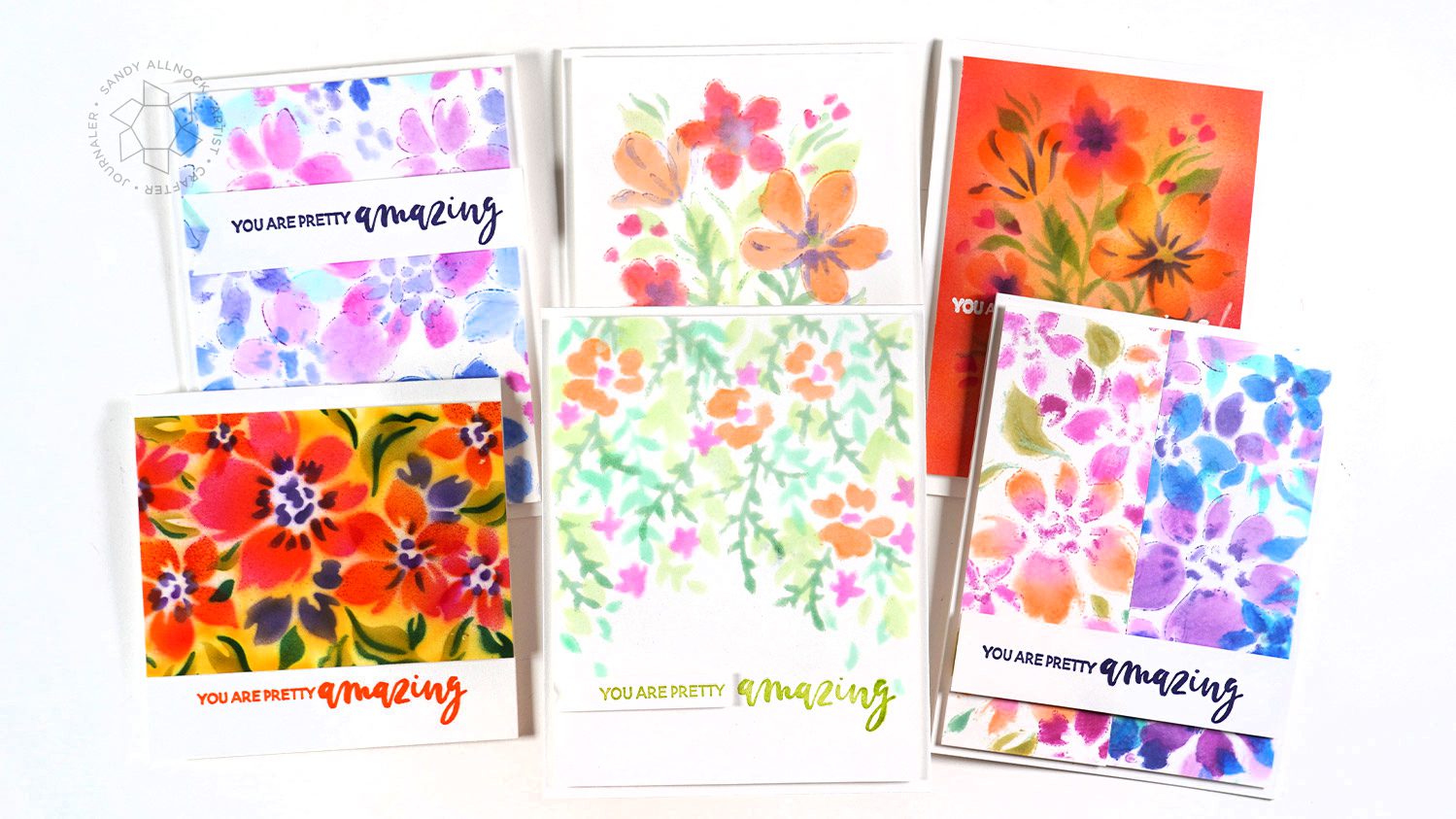
The “seamless” floral is just that – you can create as long a strip as you like of the flower pattern! I made a couple test runs with different colors and combined strips of different ones for the card on the left below; the card on the right was made with the same stencils but with me just placing flowers where I felt like it – so you can make up your own designs!
Both of these are from the same Garden Florals set – airbrushed on the left, and on the right, pushing the Isopropyl alcohol manually through the open stencil designs.
On the right – the hanging garden – which looks like a regular garden if turned upside down. On the left, another with the Garden Florals set in airbrush. I had to cut that piece way down because, well, I had a spill. LOL. Don’t have dinner in the studio!
More stencils!
There are lots more stencil sets than just the three I bought – here are thumbnails:
Hello Copic colorist friends! A few weeks ago I posted my Copic Marker Basics and asked on social media for topics that weren’t covered or could use another discussion – so the Copic Numbering System is one that came up a number of times. Let’s do it!
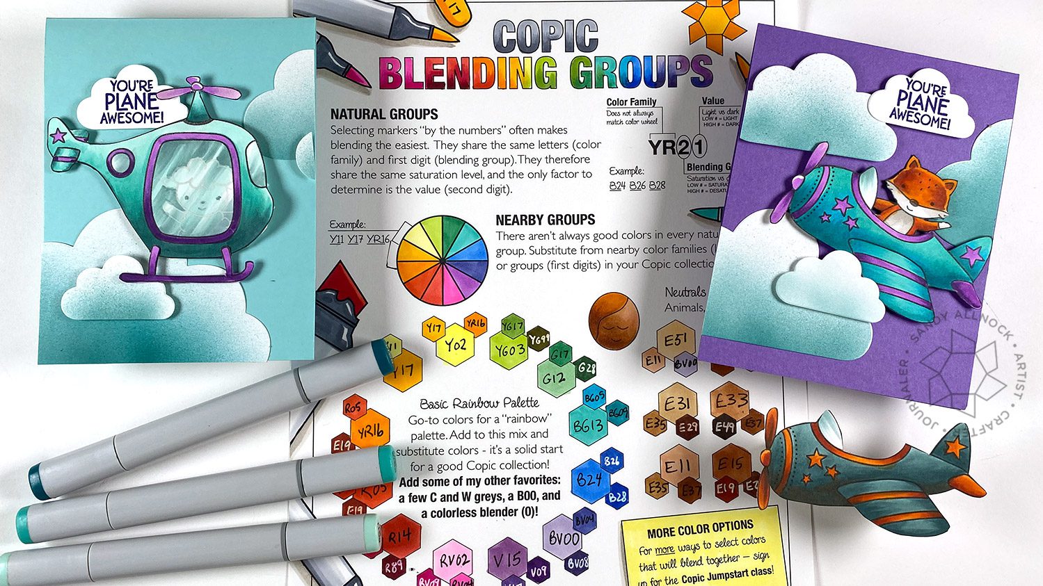
You might want to download and print out the free Copic Blending Groups chart to follow along – that’s HERE. It describes the code:
The letter is the color family. Blue (B), Green (G), Red (R) etc. Greys are Warm (W) Cool (C) Neutral (N) and Toner (T). The only color without a letter code is the colorless blender.
First digit: SATURATION. Highly saturated, intense colors are low numbers. Desaturated, greyed-out colors have high numbers.
Second digit: VALUE. Light colors are low numbers, dark colors are high numbers.
Some have multiple 000s – that just means they’re extra light.
Supplies for this project are linked at the end of this post. Compensated affiliate links may be used at no cost to you.
Video
It’s a long one today, so grab a cup of coffee and let’s have a chat.
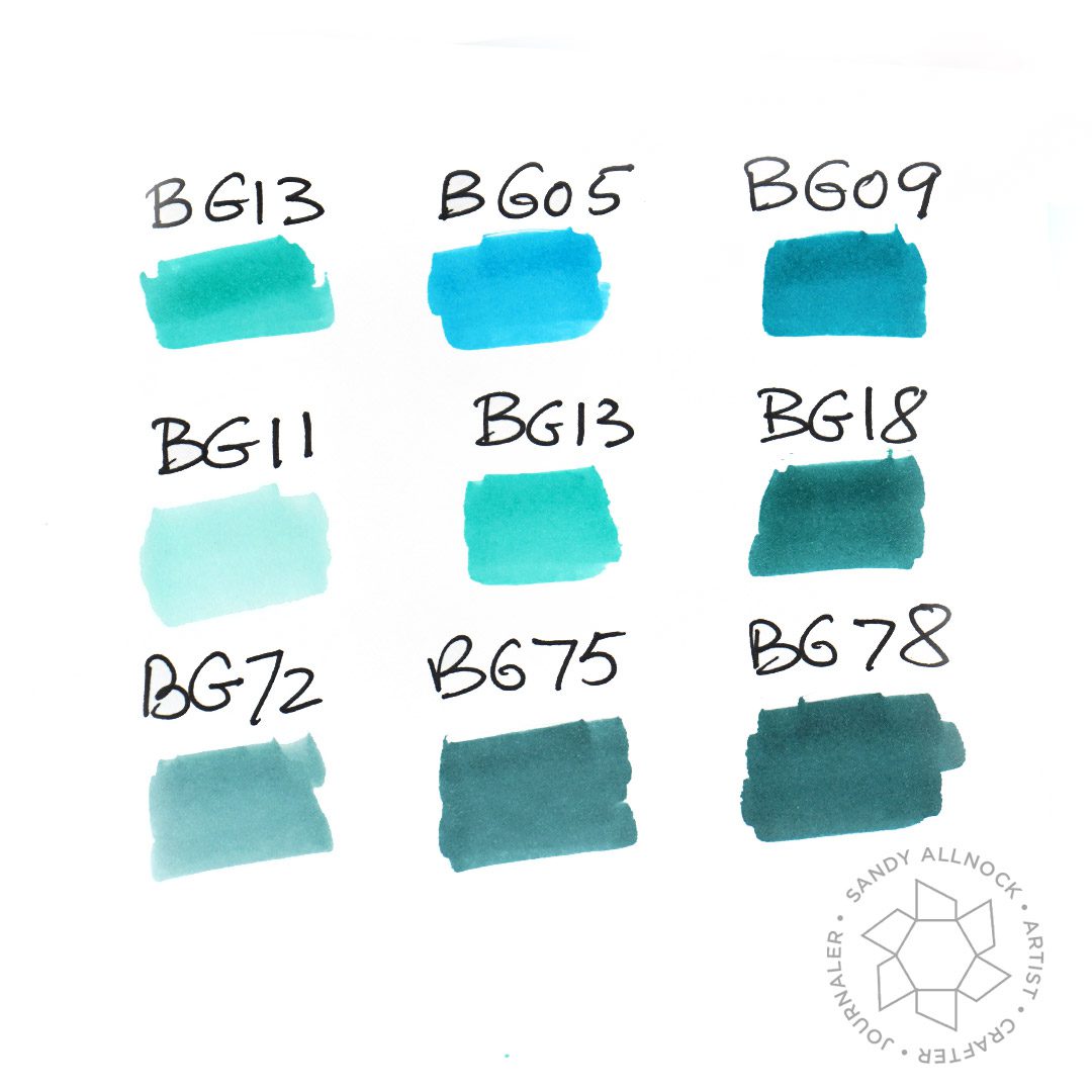
Saturation comparisons
Note below that the BG1s and BG0s are more saturated – more intense – than the BG7s in row 3. And any color ending in a 1,2,3 is lighter than anything ending in an 8 or 9. Some colors, like BG05, might not even look like they “fit” between colors numerically in line with them, and unfortunately that’s just something that happens – but it doesn’t mean we can’t use them to make beautiful art!
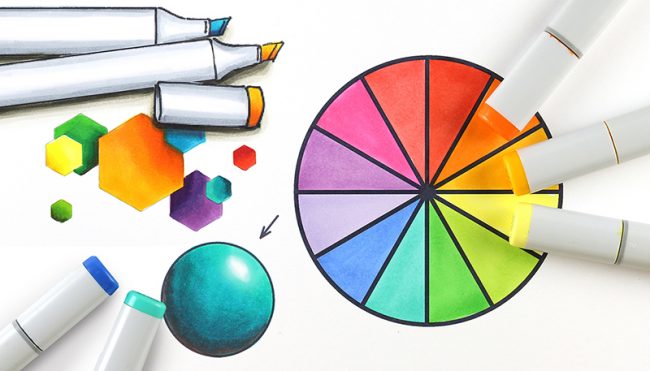
Want more on color theory? Try out the Copic Jumpstart class, it’s chock full of teaching and exercises to help you understand more!
Card samples
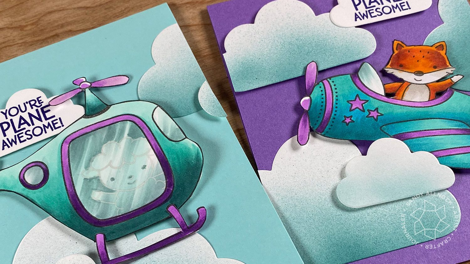
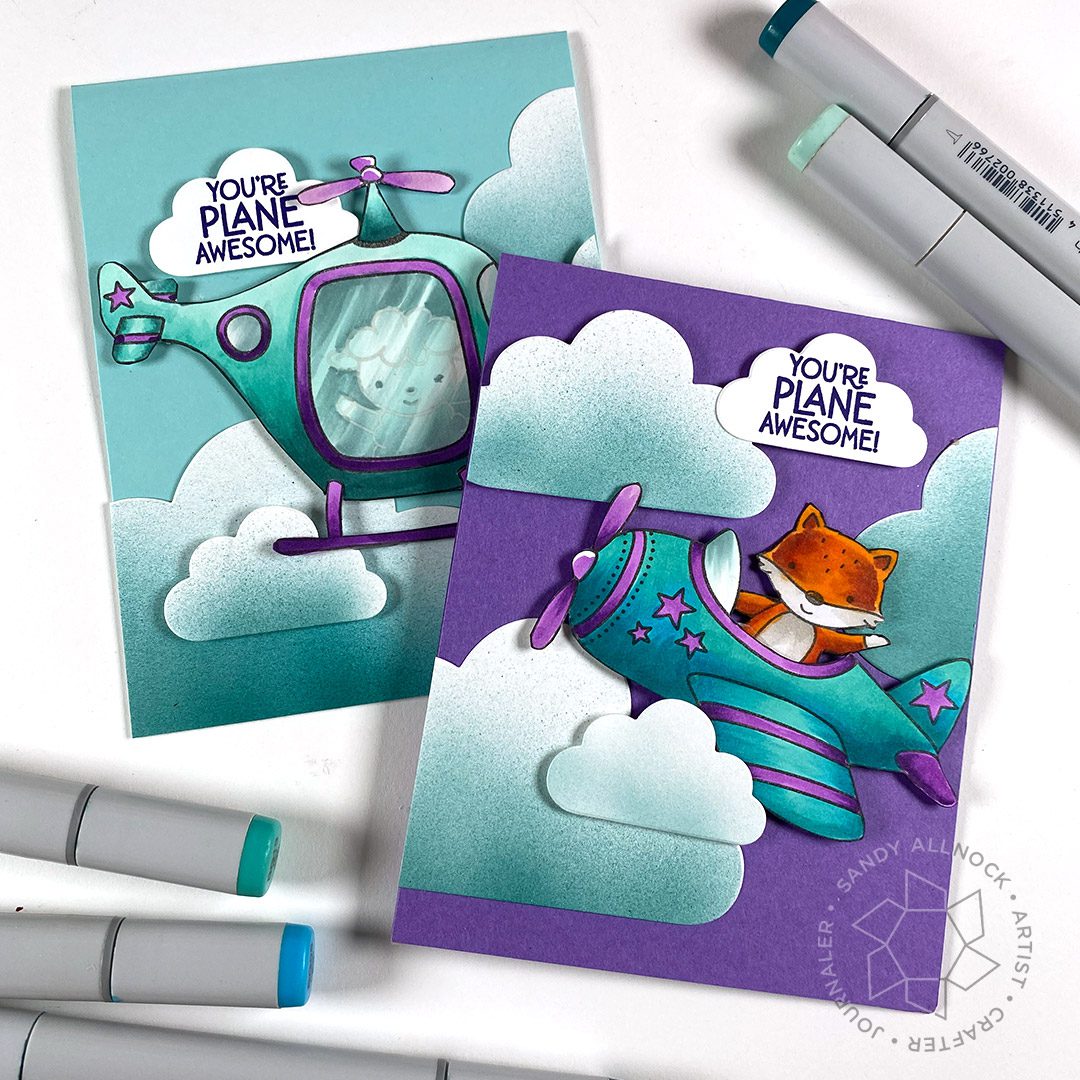
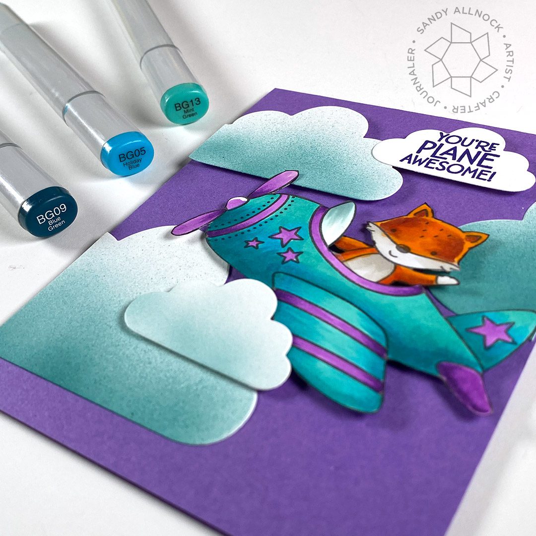
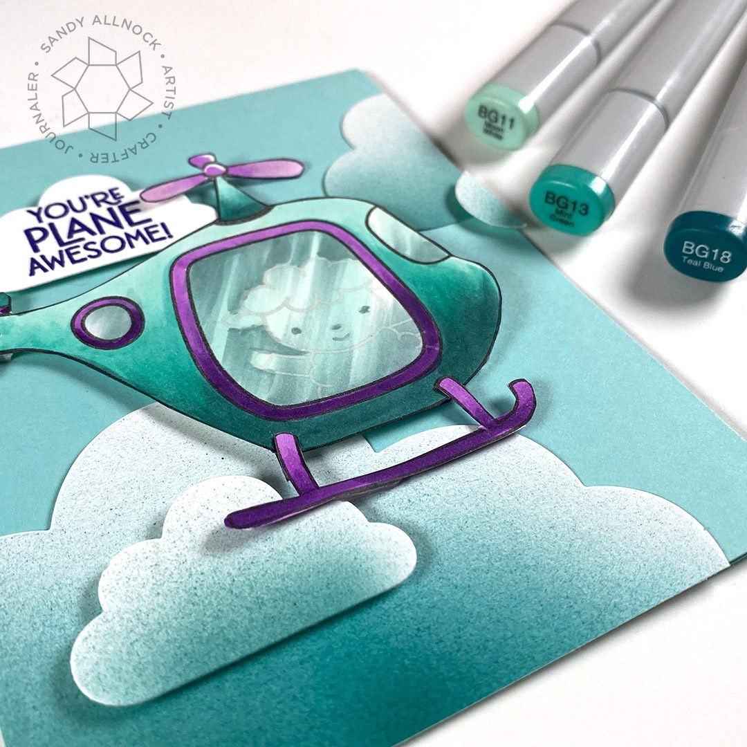
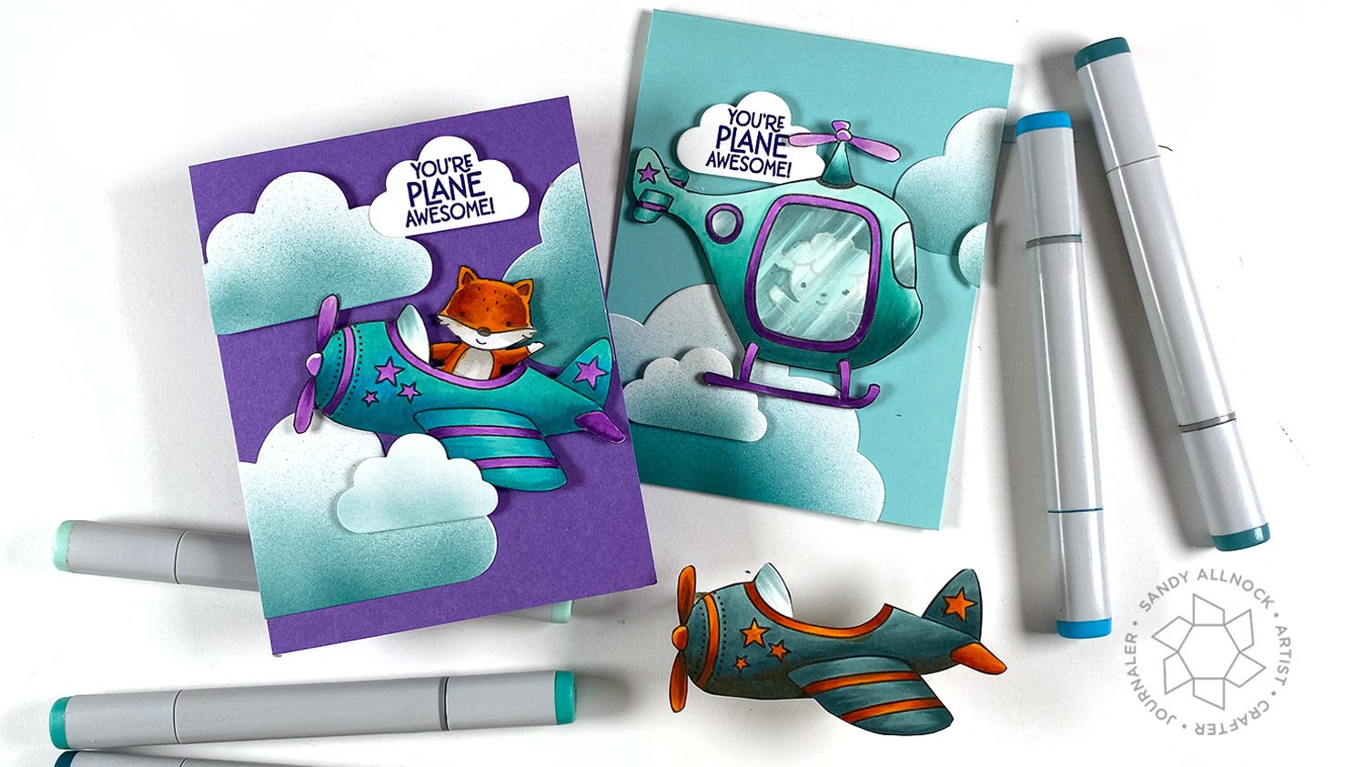
The airplane and helicopter were a fun pair to try the two main combos with.
The BG13, BG05, BG09 combo comes out with stronger color – because there’s no really light color. It means that an extra layer of a dark might be needed to convey dimension, but the BG05 is a fun addition to also add a different flavor to the BGs.
The helicopter, on the other hand, looks like a lighter aircraft – because it has that BG11 for a light color. The BG13 is the medium tone here, where in the previous card it was the light color. The dark marker in this blending group is a BG18 – which is more desaturated than the BG09.
The plane with the BG7 family has a very different feel to it – quite antiqued! I chose an orange to go with it, a rather rusty orange, to add to that vintage feel.
YT Livestream coming
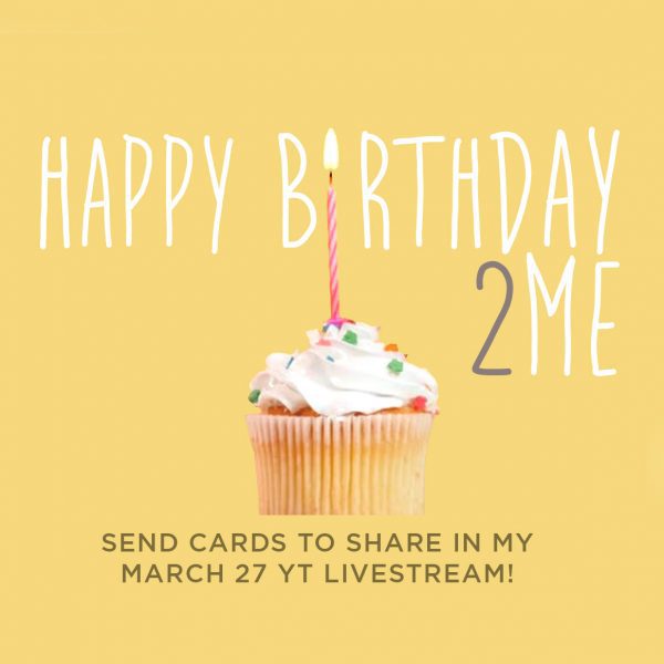
It’s my birthday month! Last year lockdowns started a few days before my day – and nobody really used Zoom yet. I spent last year throwing a bunch of Zoom parties for others to make up for not being able to do anything for my own day…and since we’re still stuck being apart, I thought maybe I’d throw my OWN birthday party!
You can “RSVP” by adding it to your calendar via my public calendar if you want, or just set a reminder on your phone….and drop a card in the mail for me to share that day! I’ll do something art-y that day too, no idea what as yet – but I wanted to get the word out beforehand to give you time to mail a card….remember, the Post Office is slowing everrrrrrything down so might want to get on it quick! Mail to: Sandy Allnock, PO Box 23395, Federal Way WA 98093
Supplies
Some product may be provided by manufacturers for review and use. Compensated affiliate links are here at no cost to you. If you choose to shop using my EH (Ellen Hutson) links, please accept cookies on that site in order to retain the link to my blog, or that compensation does not happen for me. I appreciate your support of my work with your purchases! Full affiliate and product disclosure | My trusted partners in art
Peek-A-Boo Flight, Avery Elle Clear Stamps —- Dies