Loose Urban Sketch with Bright Watercolor

Loose Urban Sketch with Bright Watercolor

Hello subscriber friends! There are some changes afoot around here. And that’s going to mean something for you if you got this post in your email inbox. 

Having received this means you’re subscribed through WordPress, and though I could go in and just turn that sharing off completely, I didn’t want to do that to you without notice! I’m going to be moving my written posts over to Substack….and each time there’s a video to share here, I’ll be posting just the video and a paragraph with a couple sentences and some keywords to help Google with searching for things.

If you want to read the rest, and maybe even more than you’ve seen here on my blog, you’ll want to become a free subscriber over there. You can do that right now on this post. And before you click that, see what’s in this post vs what’s in that post and decide if you’d like to get thos emails.

In a couple weeks I’ll be turning off the WordPress sharing here, so things will stop coming to you. You can always get to my substack through the menu bar here – look under “The Art” and you’ll find it there.

Tutorial: Loose Urban Sketch with Bright Watercolor

Watch the video below and scroll to the end to leave comments or questions — or click HERE to watch it on YouTube and leave comments over there. I read both dutifully!

Subscribe to receive my weekly newsletter by email:

Revamped! 2025 kit for urban sketching

Revamped! 2025 kit for urban sketching

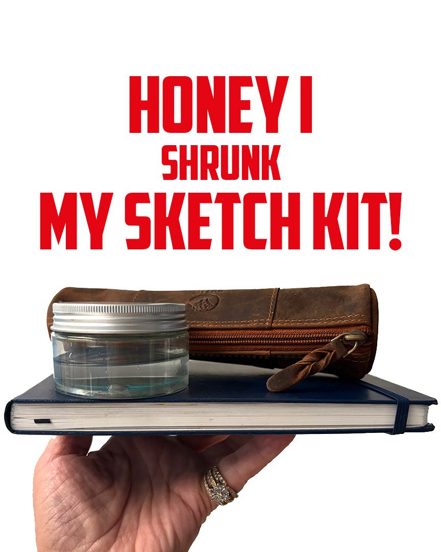
To Kaleb, who asked me on YouTube if I’d ever updated my urban sketch kit: I SHRUNK IT!

I’d always been trying to peel things back more. But then added more. Agh! I still do USE those other things, like my sketchbook easel. But I save that for a dedicated outing – when I know I’ll be going out, when I have a plan, etc. But I’ve found that for day-to-day sketching, I am doing more since I have cut back on the kit. Let’s talk about what’s in it!

Tutorial: Revamped! 2025 kit for urban sketching

Watch the video below and scroll to the end to leave comments or questions — or click HERE to watch it on YouTube and leave comments over there. I read both dutifully!

SUPPLIES

Some product may be provided by manufacturers for review and use. Compensated affiliate links are here at no cost to you. I appreciate your support of my work with your purchases! Full affiliate and product disclosure | My trusted partners in art

Sketchbook for wash and ink:

  1. Pentalic Aqua Journal 5×8 BLICK  AMZ
  2. Pentalic Aqua Journal 8.5×11 BLICK   AMZ 

Brushes:

  1. Tintoretto Cat’s tongue pocket brush 1315 size 6 A GALLO
  2. Silver Brush Black Velvet Round 4 Travel Brush BLICK   AMZ  

Drawin gPencil:

  1. Staedtler Mars Lumograph 2B BLICK   AMZ JACKSONS

Pencil eraser:

  1. Staedtler Mars Plastic Eraser BLICK  AMZ  JACKSONS

Pencil sharpener:

  1. Staedtler Mars Pencil Grip One-Hole Pencil Sharpener AMZ

Drawing pen:

  1. Sakura Micron Pigma Pen Set BLICK  AMZ  JACKSONS
  2. Sakura Micron Pigma Pen 08 AMZ 

Palette

  1. Whiskey Painters Mini palette
  2. Full size pans Full pans BLICK   AMZ

Watercolors:

  1. Daniel Smith Essentials Set BLICK  AMZ  JACKSONS
  2. Daniel Smith Lunar Black BLICK  AMZ  JACKSONS 
  3. Daniel Smith Burnt Sienna BLICK  AMZ  JACKSONS
  4. Daniel Smith Cobalt Teal Blue BLICK   AMZ   JACKSONS
  5. Daniel Smith Sap Green BLICK   AMZ   JACKSONS 

Folding camp chair

My kit really IS small.

The 5×8 sketchbook is the largest item! The case is about 7″ long. My cup is oversized for the need. But hey, I can carry ALL of this in one hand. Chair in the other. Easy peasy!

Advantages of a small kit are myriad!

  1. Easy to transport. No excuses.
  2. Tucks into a backpack, purse, car glove box……
  3. Eliminates hemming and hawing over which of 5 sketchbooks to pull from a stuffed backpack.
  4. Color choices are limited – so forces practice mixing. Always good.
  5. Very little maintenance to keep it sketch-ready.
  6. Not expensive since you don’t need to buy all the colors or all the sketchbooks.

Sketchbook idea

Have you tried sketching your kits as you change out items? It’d be great to date them and see how your supplies changed over time. Make notes about what you swapped out and why so you don’t revert back in 20 years when you forgot why you didn’t like an item back then.

Subscribe to receive blog posts by email:

Styles of sketching

I have so mannnny styles, depending on my mood. Lately I’ve been trying to practice editing ruthlessly to get down to simple basics. This sketchbook is dedicated to that style – and that’s what’s in the new class too! Going through the planning and filming, I realized if I keep my brain focused on that, I don’t tend to try to stuff in all the details.

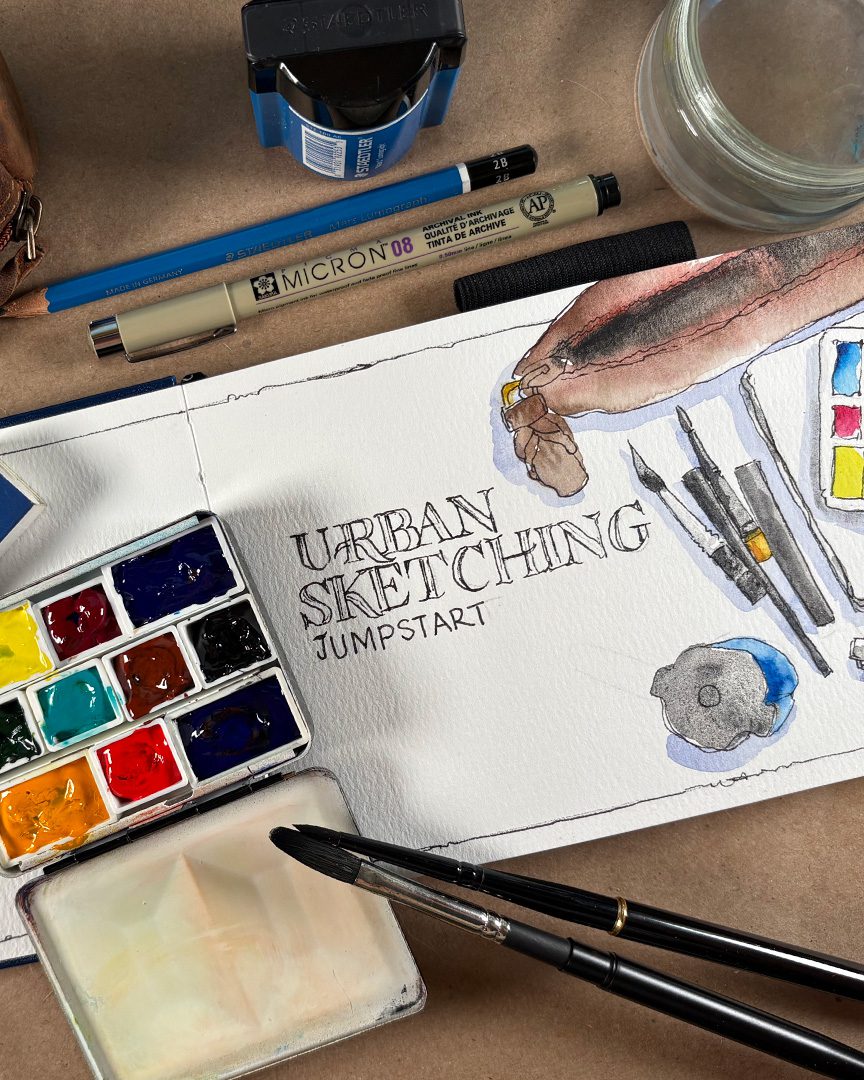
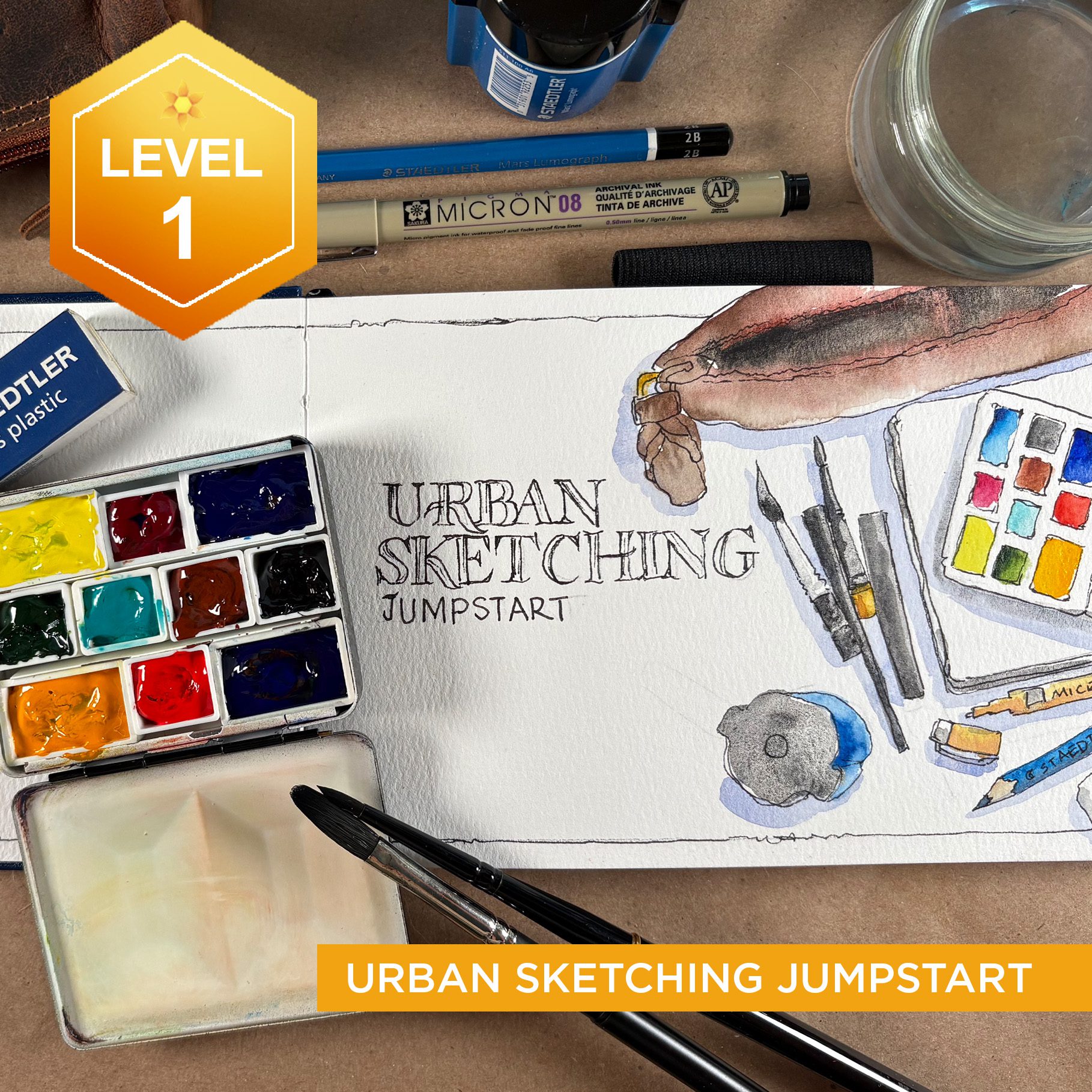
Urban Sketching Jumpstart Class

The new class is in pre-registration period right now! That means a deeper discount than normal; I like to reward the early adopters! I’ve got everything filmed but it takes lots to edit, process photos, write up lessons….so the Preclass lesson is done now, and has the first 2 pages for you to work on in your own book, plus elements you can set up for future lessons. Along with, of course, the supply list. 

I plan on having everything fully ready for Saturday the 19th, I’m so excited to see people sketching!!

Can we CROWDSOURCE color?

Can we CROWDSOURCE color?

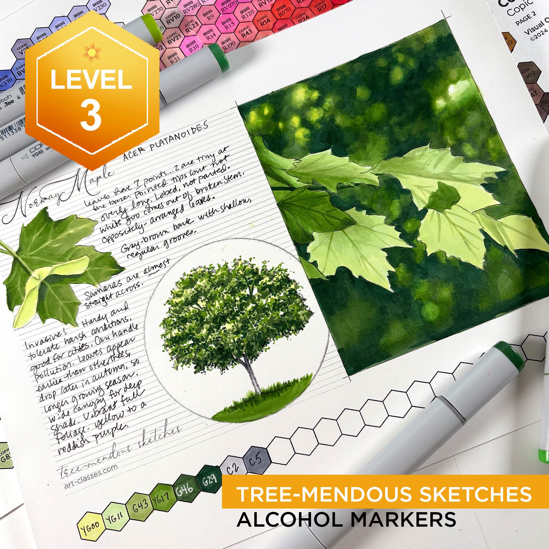
My crazy schedule continues right now….I was going to do some coloring today, but I’m burnt out at both ends! I decided to do something a little different – and went for a walk. ha! That saw me return with a handful of leaves that had looked different outside while on trees, in sunshine, and in shade. Instead, in the studio…they looked mostly the same color!

But honestly they aren’t the same when you look close. Textures are very different. Veination. Margins. (Yes I’ve learned what to call leafy things!) 

So I gave my marker fingers a little break and traced the leaves, added some veins….and created a little crowdsourcing project for us!

Tutorial: Can we CROWDSOURCE color?

Watch the video below and scroll to the end to leave comments or questions — or click HERE to watch it on YouTube and leave comments over there. I read both dutifully!

SUPPLIES

Some product may be provided by manufacturers for review and use. Compensated affiliate links are here at no cost to you. I appreciate your support of my work with your purchases! Full affiliate and product disclosure | My trusted partners in art

Copic Sketchbook 9×12

Copic Multiliner

Class and downloadable

Crowdsource with me!

Go pick up the printable – you’ll get the photo too, so you can try out some color combinations to see how close you can get! It’s not a big hurry – later in summer I’ll recap the submissions that come in.

When you figure out some colors, if they’re Copic or Olo I can replicate them for that video; if it’s Ohuhu I can borrow this set of pens again. But if it’s another brand, and you want to send me a physical swatch of your color mix, that’d be awesome so we can compare apples to apples. 🙂

Preregistration discount

Don’t miss the $10 off this week – once class begins Friday the price goes up!

If you’ve got markers and paper, that’s about all you’ll need. You can make a sketchbook like I’m doing with just things like a bone folder and scotch tape! Or cut the pictures down to make cards with them. 🙂


Subscribe to receive blog posts by email:

For Ohuhu Hex Chart customers

I’m working my tired fingers to the bone – staying up til 3am clicking away to add the chart back to everyone’s account. (And trying not to swear out loud at the shop platform for removing it!) I appreciate your patience – you’re the best!!

How to draw complex subjects — freehand!

How to draw complex subjects — freehand!

This is part two of a freehand drawing series – and this will be a much more complicated subject, using the same process! (See the first part here. Bring pencil and paper to draw along!)

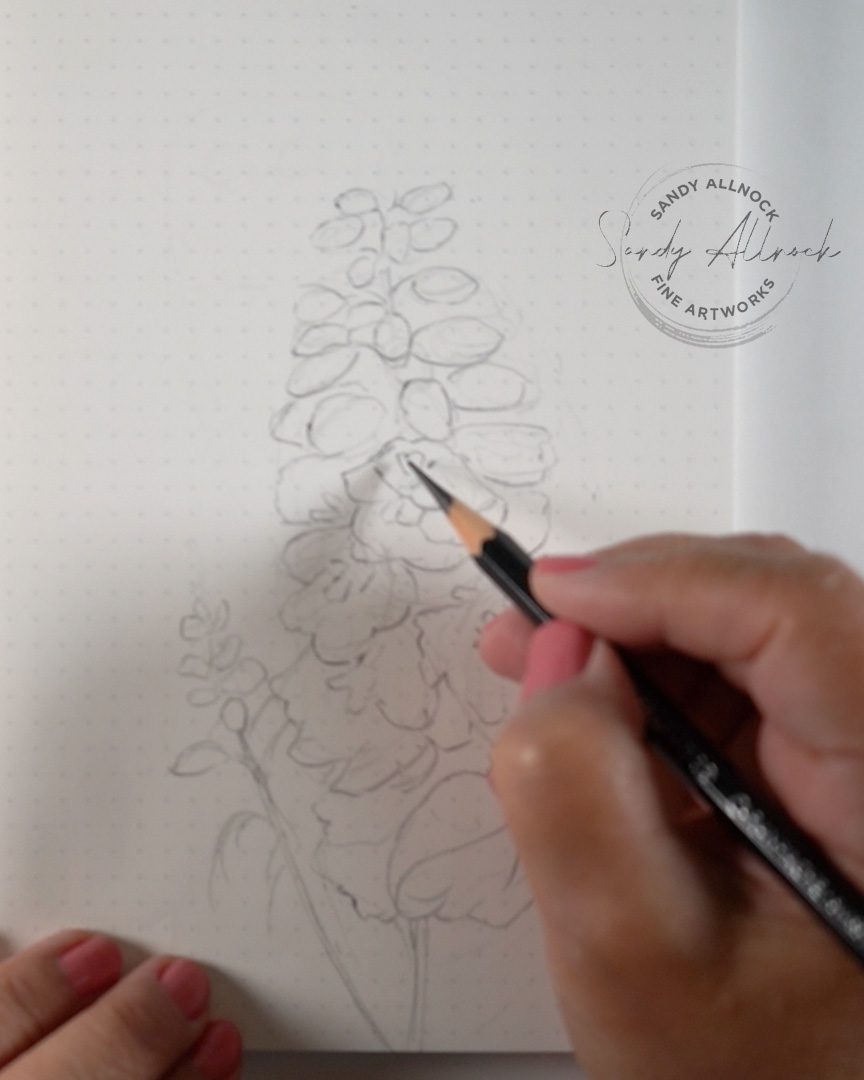
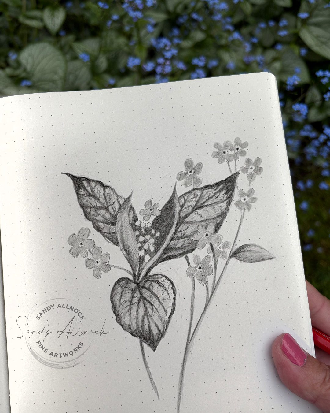
In part 1 we talked a lot about blocking in, and did more chatting on the Zoom call that followed it. So today – I chose a complex flower with a lot of blossoms, just to see how hard creating those shapes would be. And the technique worked out great!

Get out some paper and a pencil, and a kneaded eraser if you have one – and we’ll make a drawing during the video. You can draw the inital blocked in portion with me in realtime then I’ll speed it up – but give you lots of tips along the way so you can finish up your drawing!

Tutorial: How to draw complex subjects FREEHAND

Watch the video below and scroll to the end to leave comments or questions — or click HERE to watch it on YouTube and leave comments over there. I read both dutifully!
SUPPLIES

Some product may be provided by manufacturers for review and use. Compensated affiliate links are here at no cost to you. I appreciate your support of my work with your purchases! Full affiliate and product disclosure | My trusted partners in art

Paper

  1. JetPens Kanso Noto notebook (52gsm white with dot grid) 

Pencil

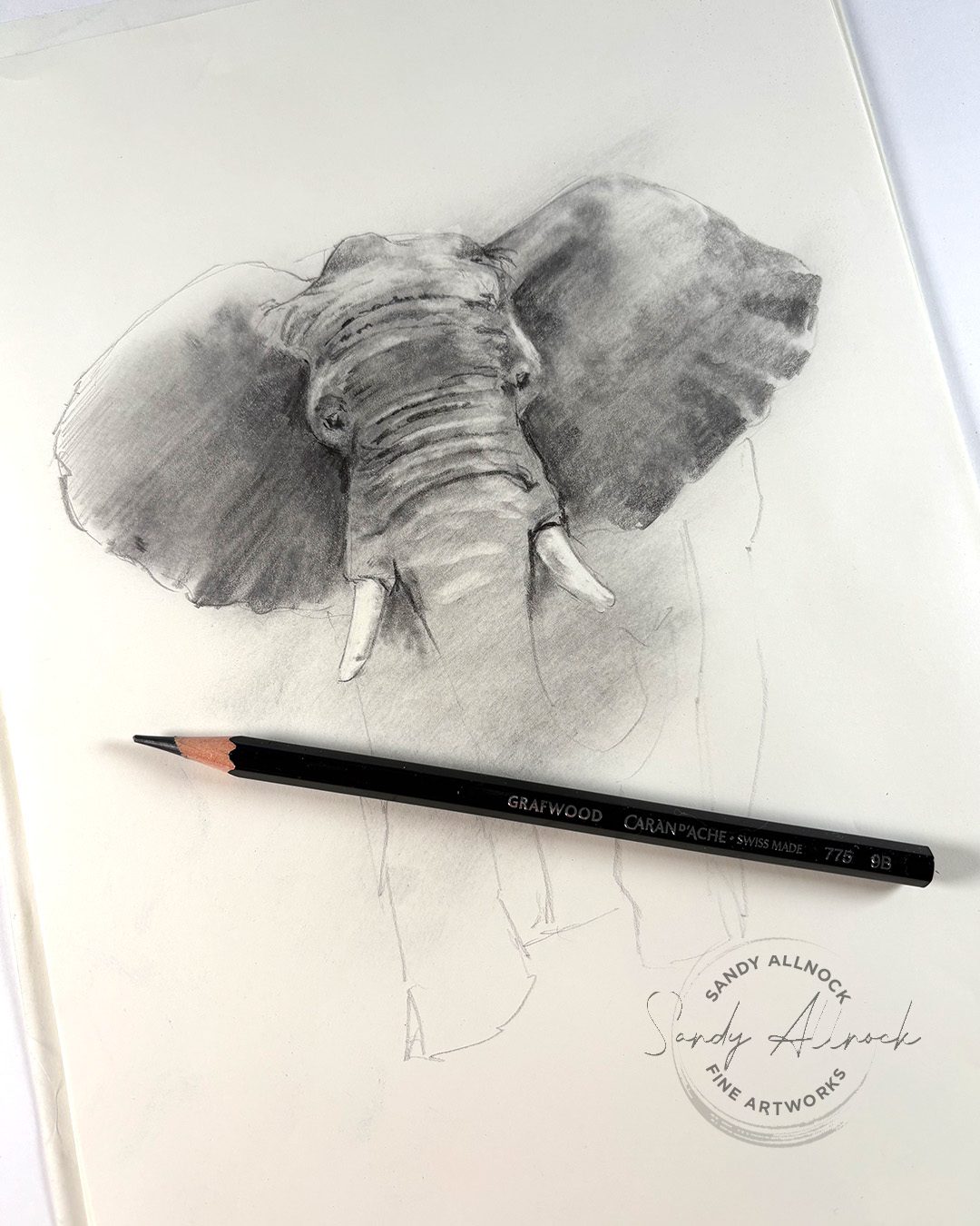
  1. Caran d’Ache Grafwood pencils 9B: BLICK  AMZ  JACKSONS 

Eraser

  1. Faber Castell Kneaded Eraser: BLICK  AMZ  JACKSONS 

Blocked-in sketch

Create the overall shape of the whole stem, a bit of a lava lamp shape (ha!) sketch in a couple of the biggest flowers, then once you’ve got the scale of the big ones set, it’s easier to get the smaller buds to scale. 

Don’t stress out about detail yet – this is all about getting the shapes in place!


Subscribe to receive blog posts by email:

Completed sketch

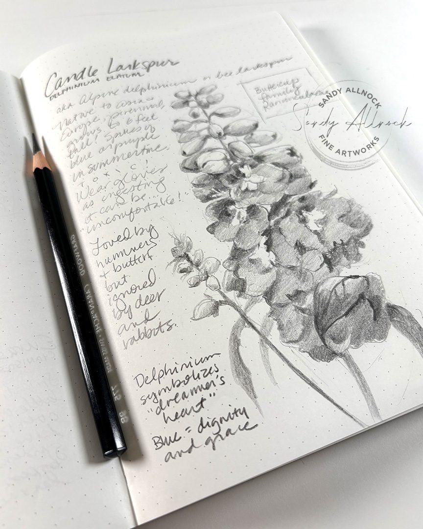
Now that the shapes are in place, take another look to be sure nothing looks awry – then you can start in on creating some of the more specific shapes.

When it’s a very complicated subject, I often look for the standout elements – here the dark centers were important for setting the first of the big flowers in place.

You can jump around to draw all the darks in first, but you can also work from one end of the drawing to another–because the overall shapes and their scale are already in place from blocking in!


Other pencil nature sketches

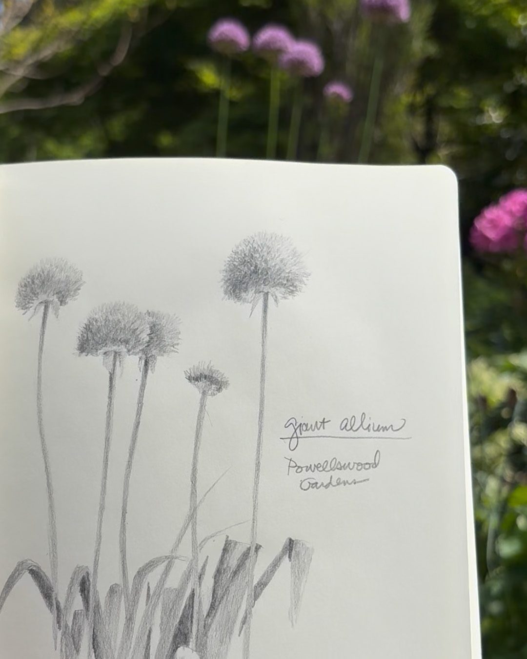
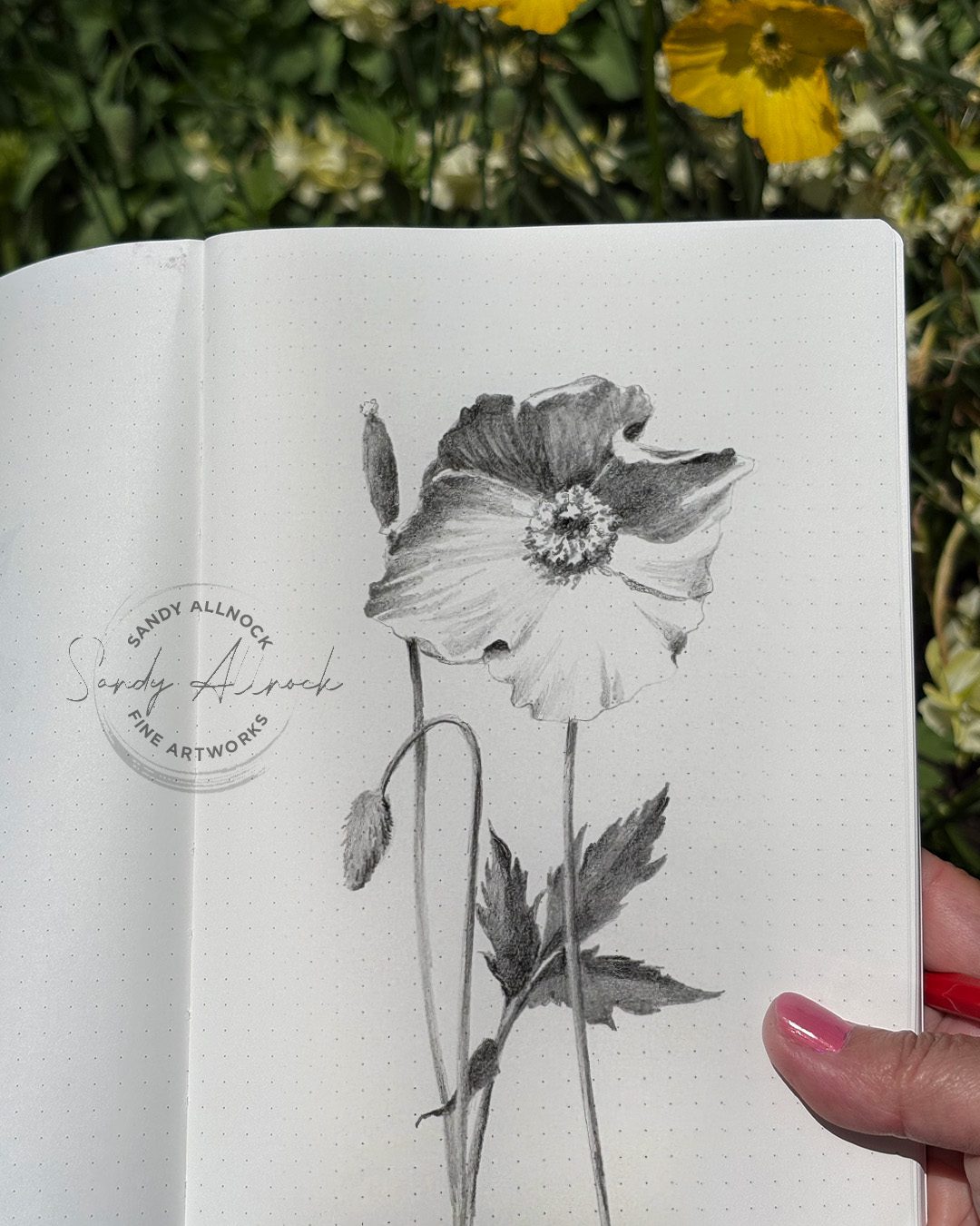
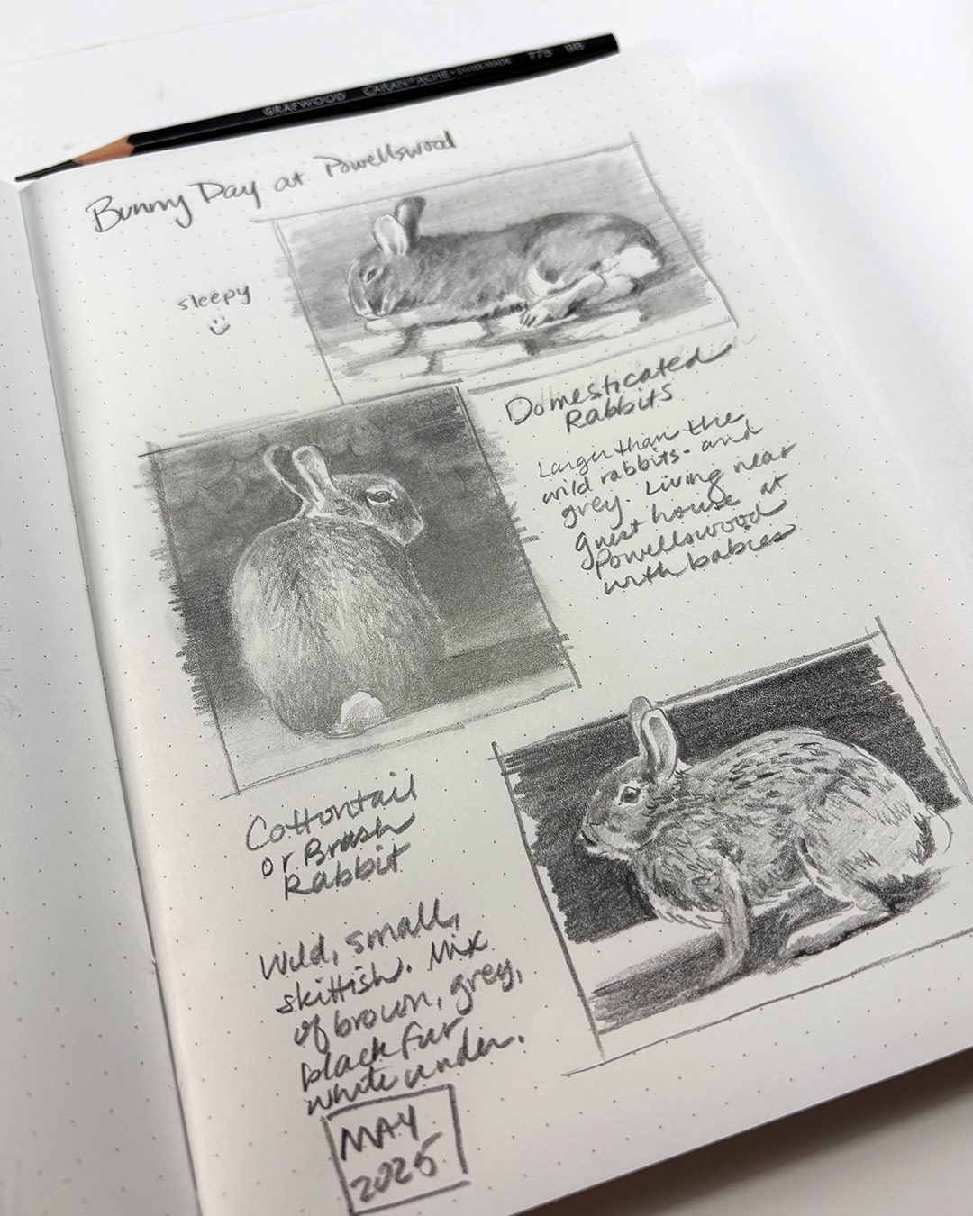
The allium in the first pic is in another book – cream paper, no dotted lines. The others are in the Kanso Noto with white paper and dotted grid.


Stippling has never been this easy. Or fast!

Stippling has never been this easy. Or fast!

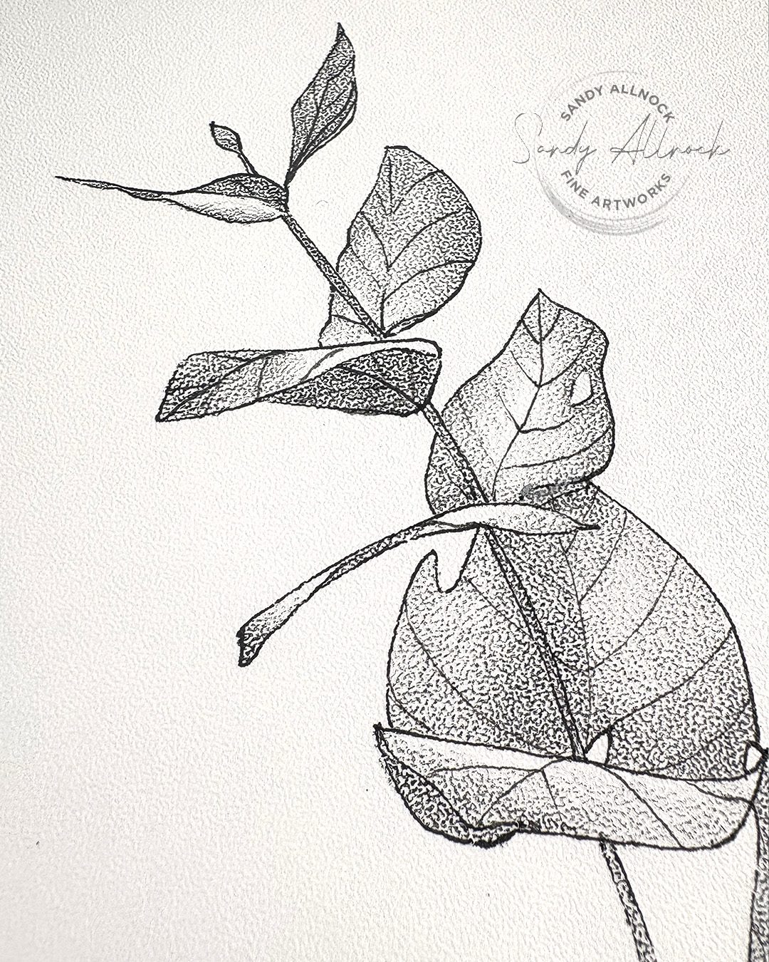
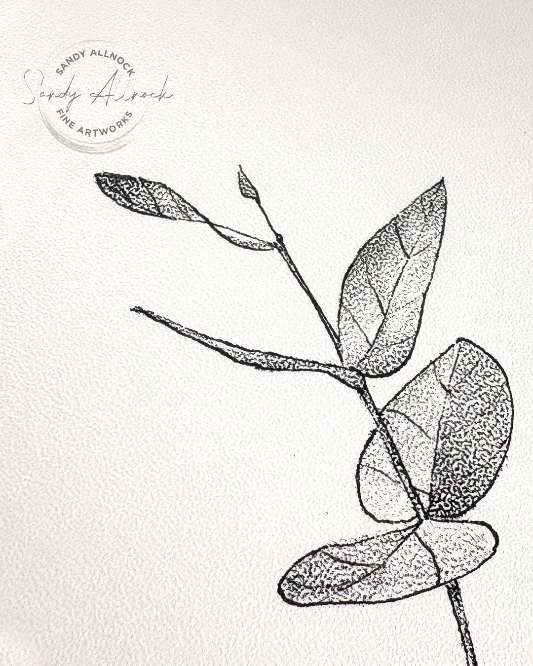
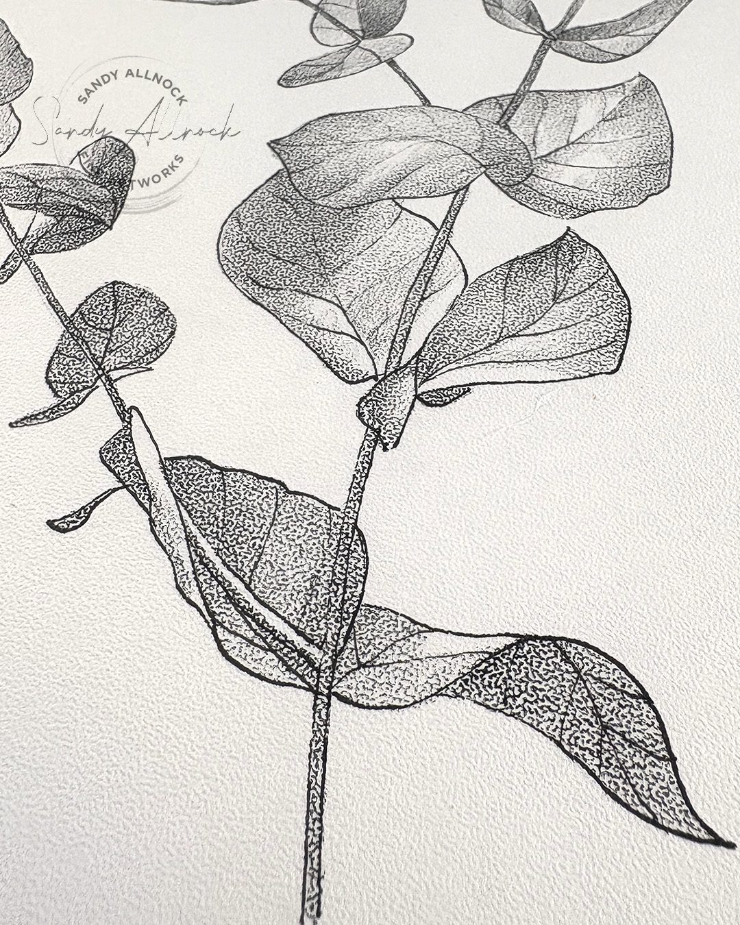
I’ve always loved stippling! Yes it’s a lot of dots – but sometimes it’s just mesmerizing to create beautiful waves of value changing from darks to lights and back again.

But it takes SO LONG. Is there something to make that process easier?

 You bet! And it’s a surprising thing – the paper!


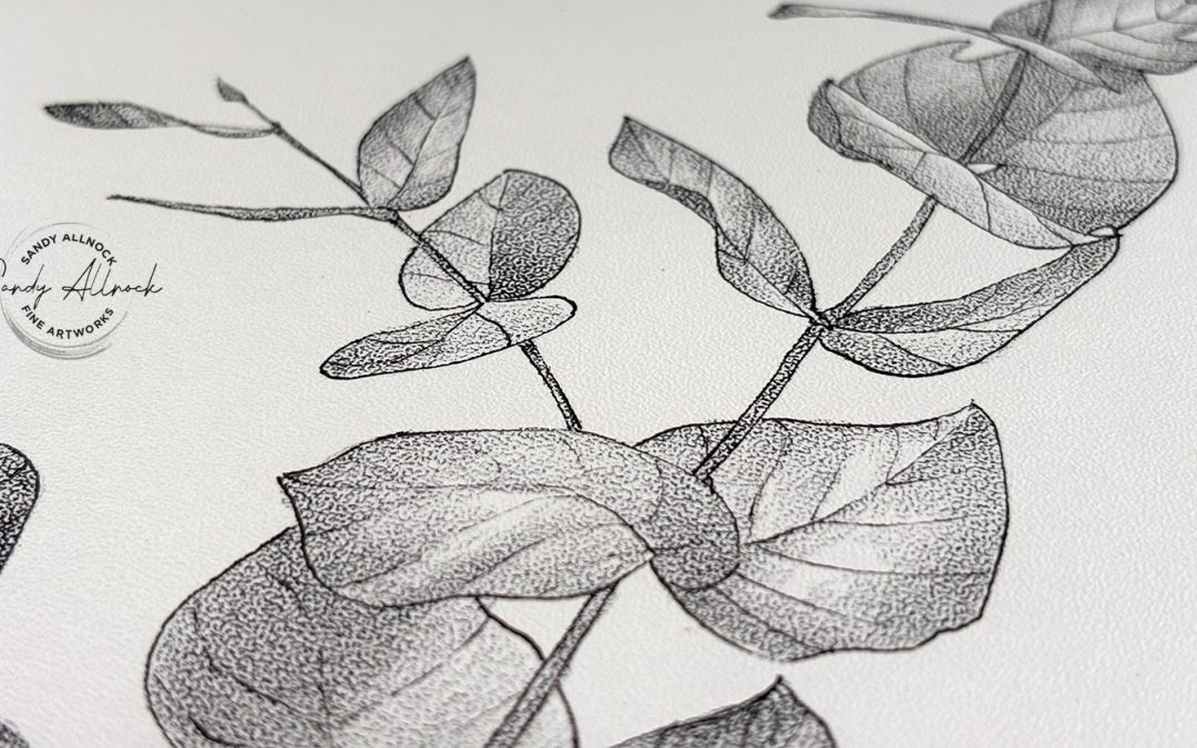
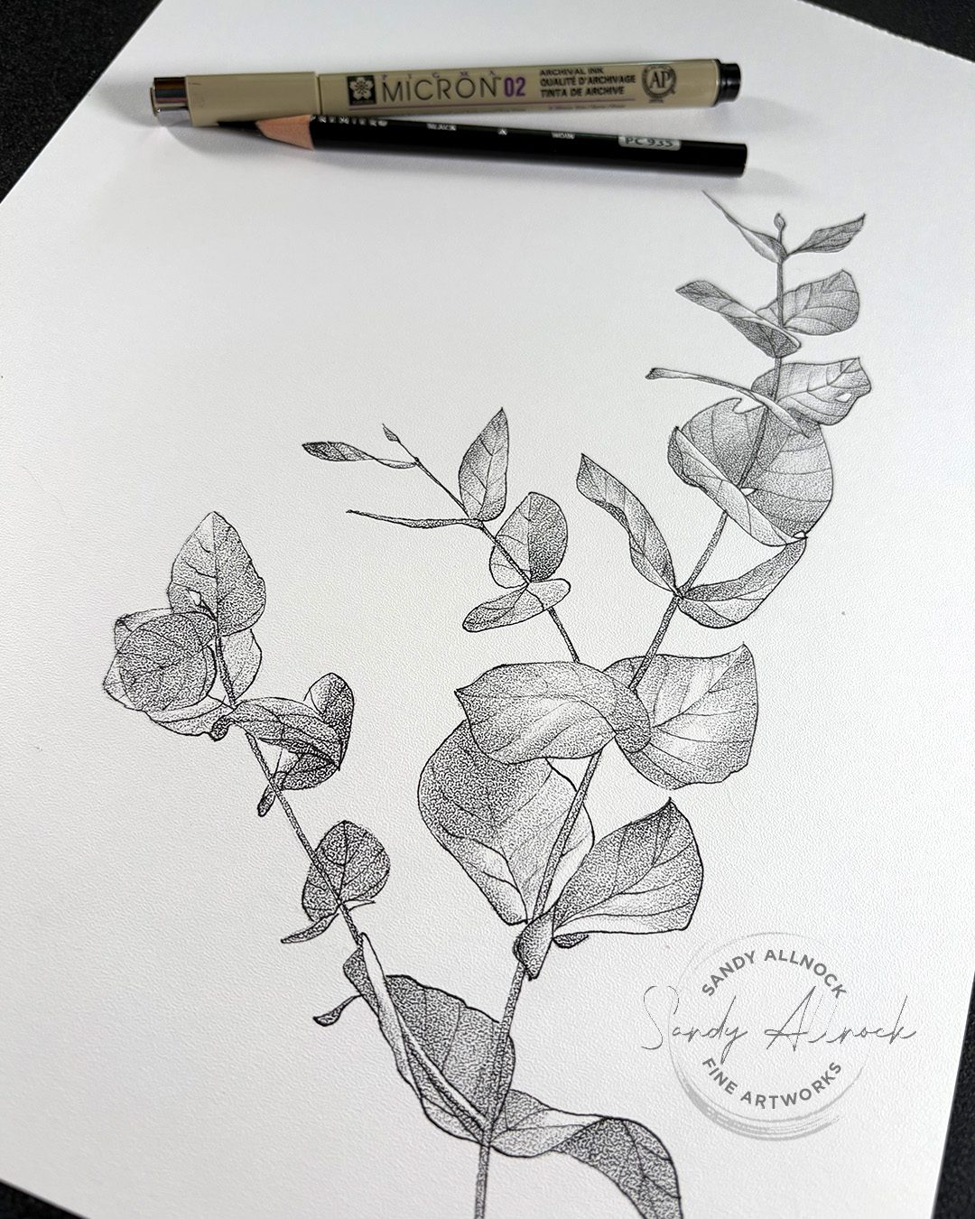
Bee Paper makes a stipple texture paper – it’s more bumpy than lots of other papers, and depositing pigment on the peaks can make it look like you’re making dots on it! I’ll show you how it works – and tell you a crazy little story about a fire that made me haul pads of paper all over the country since the 1989s!

Tutorial: Stippling has never been this easy. Or fast!

Watch the video below and scroll to the end to leave comments or questions — or click HERE to watch it on YouTube and leave comments over there. I read both dutifully!

SUPPLIES

Some product may be provided by manufacturers for review and use. Compensated affiliate links are here at no cost to you. I appreciate your support of my work with your purchases! Full affiliate and product disclosure | My trusted partners in art

Paper

  1. Bee Paper, Stipple Texture paper 9×12: BLICK  AMZ 
  2. Bee Paper, Stipple Texture paper 22×30: AMZ  (very expensive, but it’s full sheets!)

Drawing tools

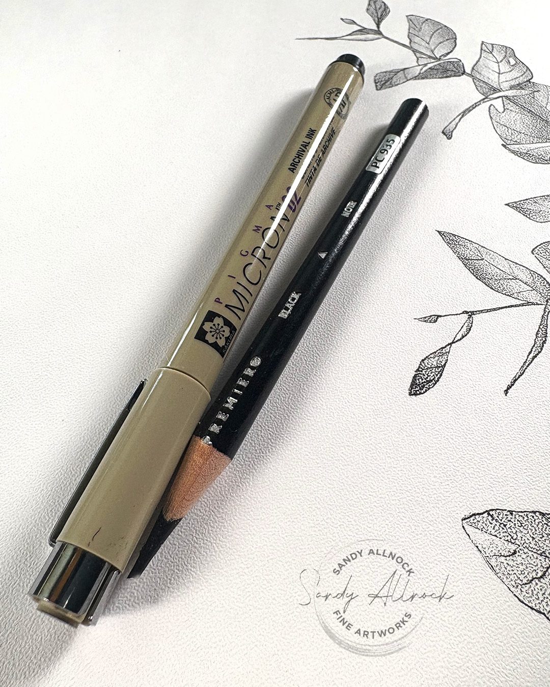
  1. Sakura Micron Pigma Pens BLICK https://bit.ly/3yznw17 AMZ   JACKSONS 
  2. Black Prismacolor Pencil BLICK

Inspired by John Muir Laws

Years ago I’d seen a video about how to draw black and white images by John Muir Laws; my recollection is that people came to parks and he wanted them to go out and draw things, and he collected the drawings to print for something. A great volunteer opportunity!

But I remember he said he needed good black and white images, ones that were accurate as well as with some consistency between artists. And he recommended this paper for just those reasons. I was sold, even though I wasn’t working on his project – the stippling paper sounded fascinating!

My brain didn’t hang onto that very long; the paper arrived and, well, I looked at the it and realized I’d forgotten where I heard about it and what had inspired me to get it. The pad ended up in a box of pads of papers, and until I received the box of new goodies from Bee Paper, I’d just not gotten it out.

Fortunately JML came back to my memory – and a quick search led me to this post. Which led me to today’s little drawing!

Simple Supplies

In addition to the paper, I found out from John Muir Laws’ tutorial that my gut instinct to just use a graphite pencil wasn’t necessarily great. He recommended drawing the outlines of the object in a Micron pen, then a black colored pencil for making the “wash” for the dots.

I hadn’t thought about pens, and when I just scribbled with the graphite, I could see I’d end up with fuzzy edges. That’s because of the deep valleys in the paper pattern – a crisp edge requires a line that goes up and down into the texture. A pen with “wet” ink can travel into the valleys, without moving and blending around. Makes sense! 

I did find a few other tutorials out there with this paper, and they all celebrated the sketchy look without the crisp edges – a look which I’ll definitely try. But finding the JML tutorial reminded me of what I bought the paper for, and that’s making a drawing that’s a bit tighter.

Subscribe to receive blog posts by email:

Value variance

A black colored pencil gives a nice smooth, consistent value with even an imperfect application of the pencil; it even works a little BETTER if it’s not super sharp so the pencil stays on the peaks of the paper! 

But to create value differences, let up on the pressure to let it get to a lighter value, and go over it a time or two in order to darken it. Lots of pressure won’t really help – but basically going over the same area again with the same pressure makes the amount of pigment on the peaks of the paper increase, making the dots appear bigger, therefore darker. While also retaining the texture.

Why might a stippled texture be helpful?

Especially if trying to print a drawing, crisp black vs white can make the very best prints; the greys that make beautiful transitions can be pushed darker or lighter by either a scan that interprets them wrongly for various reasons, or the printer that does the same. Some pigment is reflective, complicating how machines can render subtleties, and even your own phone’s camera has troubles interpreting very subtle value changes. 

But a piece of art with clear blacks and whites is a lot easier for machines to interpret!

As I’m working on a book I’ll eventually be producing, I may want to have some drawings that clearly show value transitions, and some of the drawings on this paper could really help in illustrating certain concepts. I’ll be keeping it in mind for which lessons may find this helpful!

If you’re interested in following along with my drawing book process, I’ve been sharing it with Patrons – you can find out more about it here. However for the next few months I’m changing things up to share a children’s book I’ll be illustrating; I can’t share everything but hopefully posting a little peek at something each week will help keep me motivated all summer! Different levels of patronage will get different numbers of posts, just like the drawing book, so you can choose how much of my inner thoughts you want to be bombarded with, lol! 


Bible journaling class

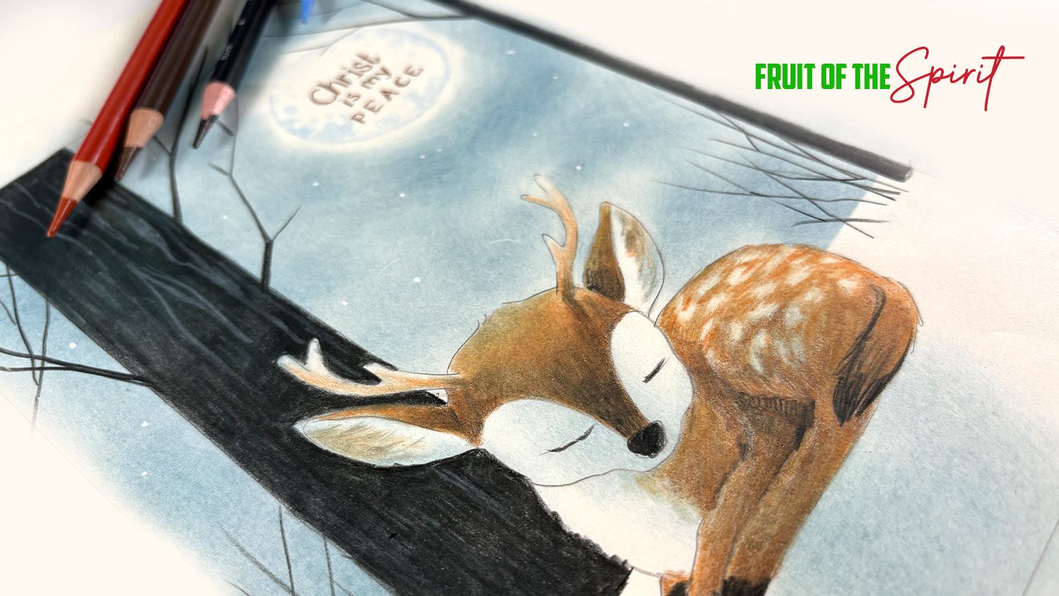
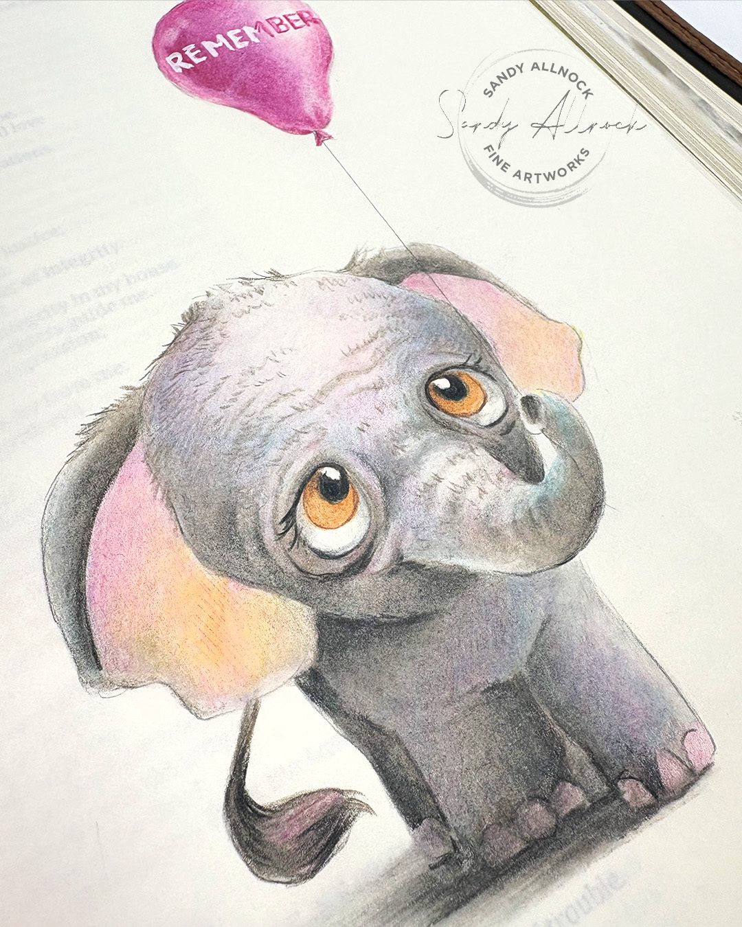
 I mentioned a class – and my new Fruit of the Spirit class is the one! It’s been a long while since I had a new one for Bible journalers, and I hope this one’s worth the wait. It’ all in colored pencil, and it’s level 3—but you can trace the images, so it’s not that scary. Lots of cutesie animals are in it! 

What is Tomoe River Paper?

What is Tomoe River Paper?

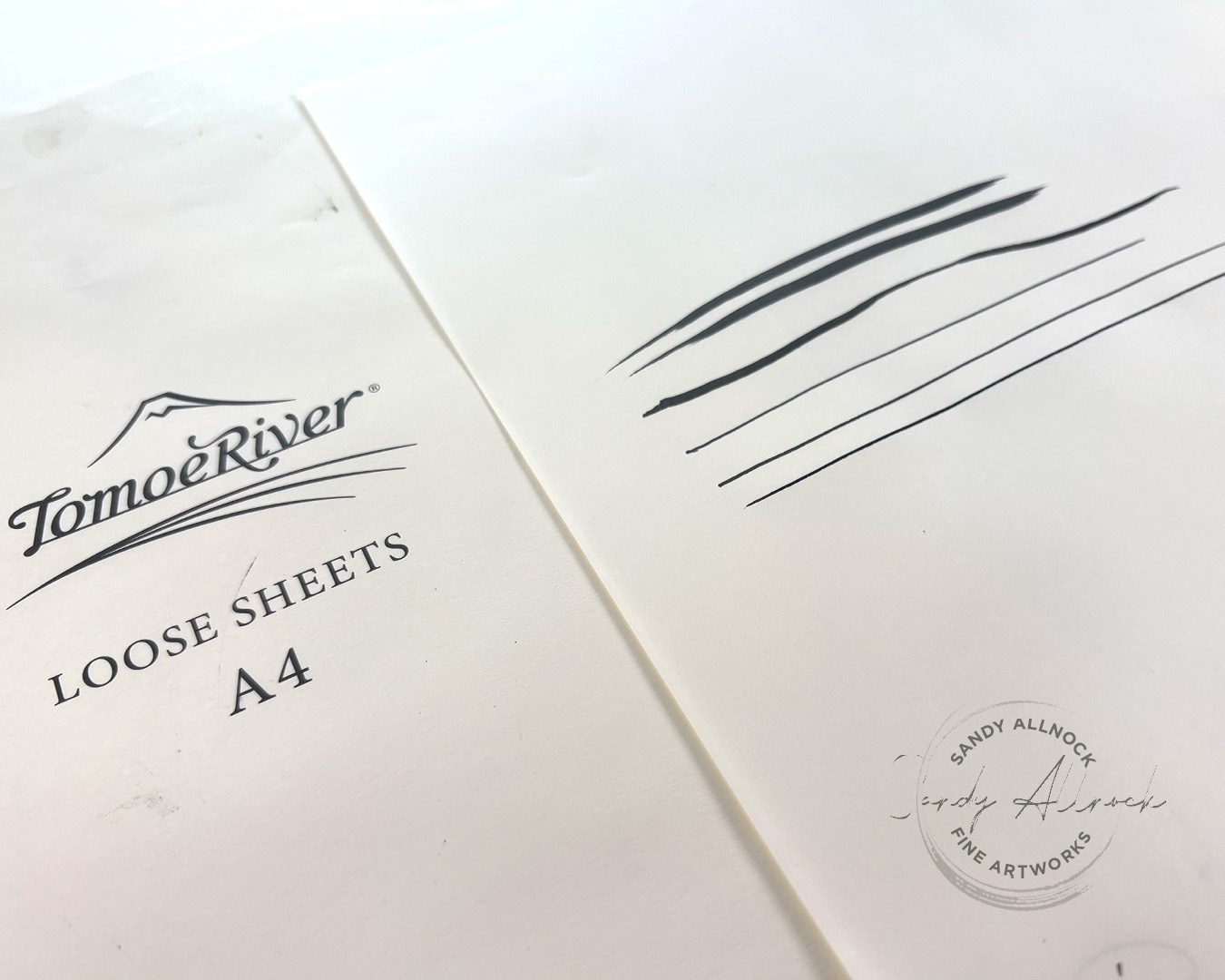
Tomoe River Paper has been around a long time, and was a favorite for ink artists and calligraphers. I kinda wish I’d known about it then! But over the course of a number of years, the paper went through a lot. The decommissioning of one machine, then another, then the sale of the paper to another company, Sanzen. Calligraphers have panned it, mostly because of feathering – and if that’s a big part of your work, I can totally see it.

Does that mean Tomoe River Paper is now useless? Maybe it’s not helpful for those whose work depends on crisp lines. If you know me and my sketchy style, I’ve never panicked over feathering a little from time to time. (My all time fave paper for pen and ink is Hahnemule’s Lettering Paper if I need a really crisp line, and I’m now becoming aware of some others that calligraphers recommend. Stay tuned.)

I tested out a few different black pens as well as fountain and dip pen….and yes, various amounts of feathering if you look really really close. Not a dealbraker for me, but yes, it’s there!

I’ve used this paper for more than pen and ink, though. Primarily Bible journaling, but maybe more in my future, after some revelations that clicked in my brain!

Tutorial: What is Tomoe River paper?

Watch the video below and scroll to the end to leave comments or questions — or click HERE to watch it on YouTube and leave comments over there. I read both dutifully!
SUPPLIES

Some product may be provided by manufacturers for review and use. Compensated affiliate links are here at no cost to you. I appreciate your support of my work with your purchases! Full affiliate and product disclosure | My trusted partners in art

Paper

  1. Tomoe River Paper pack A4, 52gsm (loose sheets) 
  2. Tomoe River sketchbook A5 68gsm (bound journal) 

Pen and ink:

  1. TWSBI Eco fountain pen M 
  2. Platinum Carbon Fountain Pen Ink 

Graphite:

  1. Caran d’Ache Grafwood pencils 9B: BLICK  AMZ  JACKSONS

Colored Pencil:

  1. Prismacolor Premier Colored Pencils: BLICK   AMZ 
  2. Afmat Long Point Pencil Sharpener Hand-powered 
  3. Afmat Long Point Pencil Sharpener USB rechargeable 
  4. Copic Acrea Paint Marker white: BLICK  AMZ 

Wet media tips

While this was once known as great paper for inking – the amount of liquid matters. Maybe one day it hadn’t mattered – although I do find I struggle with Sumi-e papers buckling too, so maybe it’s user error!

For Bible journaling I love watercolor and washes of color or ink enough that I’m good with somewhat wrinkly pages. To mostly flatten them I iron them (cotton setting) for 10-15 seconds between a few sheets of computer paper. I say “mostly” flatten – but remember we’re talking about paper. The buckling is sometimes turned into fine wrinkles in the paper. Not in a terrible way, IMHO – I’m not expecting perfection. But for art that I want to sell or frame, this paper wouldn’t work for me – not for washes.

But for line art, it’s fine, primarily for sketching and doodling. Most pens won’t bleed through, and it works nicely – though with slight feathering. So it depends on how bothered you might be by that. Again, I’m not sure I’d be selling anything on this paper that isn’t truly labeled a sketch, but for inexpensive paper that I can play with? It’s awesome. 

Graphite sketching – and kiddos

The smooth surface of this paper is lovely for graphite. The pigment rests on the top of the surface – no tooth to hide pigment down in the valleys of the paper. Which means blending methods work more immediately than a lot of papers I’ve regularly used! 

A simple cotton ball can soften and blend easily. Gamsol enriches the blackness, and drawing on top of wet blended areas comes out darker. Erasing can lighten areas, from soft kneaded eraser lifting blended highlights, or a stick eraser to draw with. The value range is pretty much off the charts.

The price here is a big benefit as well. I’ve talked with parents of kids who obsessively draw – and they ask what they should do with ALL THOSE SKETCHBOOKS they keep buying for their children. This paper is less expensive in its loose-sheet format than most sketchbooks (100 sheets for about $12-13), and the parent can spirit away some of the best drawings or the ones that mark special milestones or stories. (Parents, SAVE YOUR KIDS ART! What I wouldn’t do to have more of mine….)

Subscribe to receive blog posts by email:

Colored Pencils 

The same tips for graphite also apply to colored pencil – layering, blending, gamsol, tools, and techniques. But using artist grade pencils works better for more saturated drawing; the pencils you can get at the drugstore or grocery store are for kiddos, and have more binder than pigment in them. Your kids can still get some potential benefit from Gamsol, but I’d recommend getting even a small pack of good pencils. 

Bible journaling

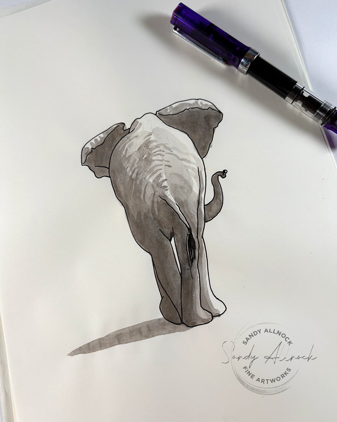
If you’re new to the concept of Bible Journaling, I’d recommend one of my courses to get yourself started; I find colored pencils are my top recommendation of a medium to start with since we all know how to hold a pencil! The whole point of Bible journaling is creating while in an attitude of worship, documenting what you’ve learned from a particular passage of Scripture, or a prayer in your heart inspired by the text. I find that creating imagery helps to cement those ideas in my mind and provide me with other reminders in daily life of what the picture was about – this elephant is paired with a passage about remembering God’s faithfulness….my next trip to the zoo might well help me recall that when I see the elephants.

Fruit of the Spirit class

As seen in the samples in the video – 9 of the images taught in the class are animals, and then I added the fruit for the 10th (I have a thing for round numbers!) The images are taught at full page size for ease of working with the techniques but feel free to use the smaller images in a column-style journaling Bible.

The new class could well be a little much if you’re truly brand new, but if you’ve got some drawing experience, colored pencil isn’t that different, so the new course could work out great for you.