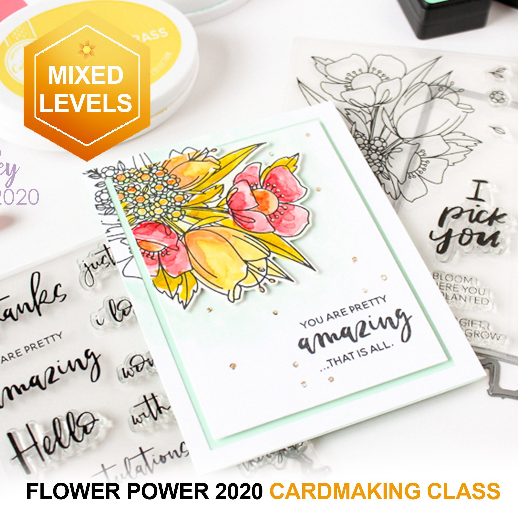
It’s finnnnnally here……Flower Power 2020!! This is a brand new class that I hope everyone will love….and I hope it inspires you to not only make beautiful things but to make someone else’s day! Watch the promo video and check out the little backstory below.
This class is for two good causes: supporting Ellen Hutson’s small business by using her beautiful flower stamps, and raising money for World Central Kitchen too! You can get this class FREE if you buy either one of the listed stamp sets on the website here, or FREE if you guy $75 worth of anything from Ellen….or you can choose to pay $10 for the class in addition to shopping, so you can help feed hungry people through World Central Kitchen!
A few weeks back, while the end of the StayHomeStaySafe orders looked soooo far away, I was trying to figure out a way I could help do something to assist someone else with my classes website. Not many of us have excess money, so it was going to need to be something special!
One cause I’ve fundraised for before – and give to monthly myself – is World Central Kitchen. So I wanted that to be a beneficiary somehow.
I also was heartbroken for my friend Ellen Hutson, who had to close her business temporarily under governor’s orders. I don’t know much about retail but man do I know it’s a bad time right now! Ellen was able to go in by herself to try to fill orders, but got so backed up as just one person….she’d pack up a ton of orders and was still staring at stacks of more! I wanted to do something to help her get back up and going once she was able to reopen…..and I came up with an idea.
I approached some of my friends from Ellen’s design team, and got takers right away – everyone wanted to help out! We met on Zoom and giggled and planned….what a great time it was to just be together; this was the first Zoom for several of them!
We spent some time putting together our lesson videos and taking our pics, and I spent more time assembling the class and getting everything set up. We were delighted to hear Ellen was open again, and had staff in to help catch up on orders again! Last weekend she had a big sale, so we waited til today once they were caught up from those…..so let’s all inundate her with more orders for this class!
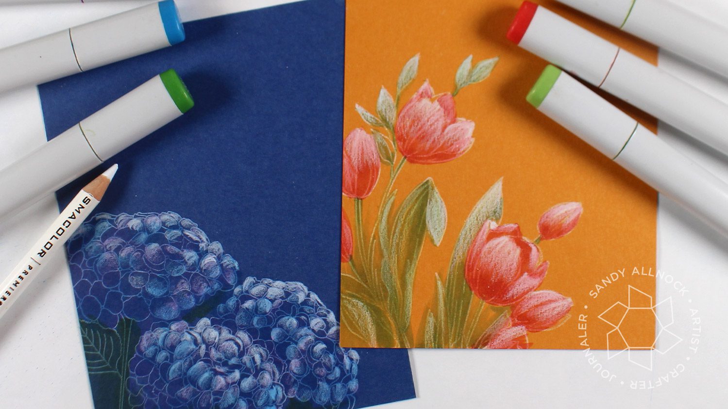
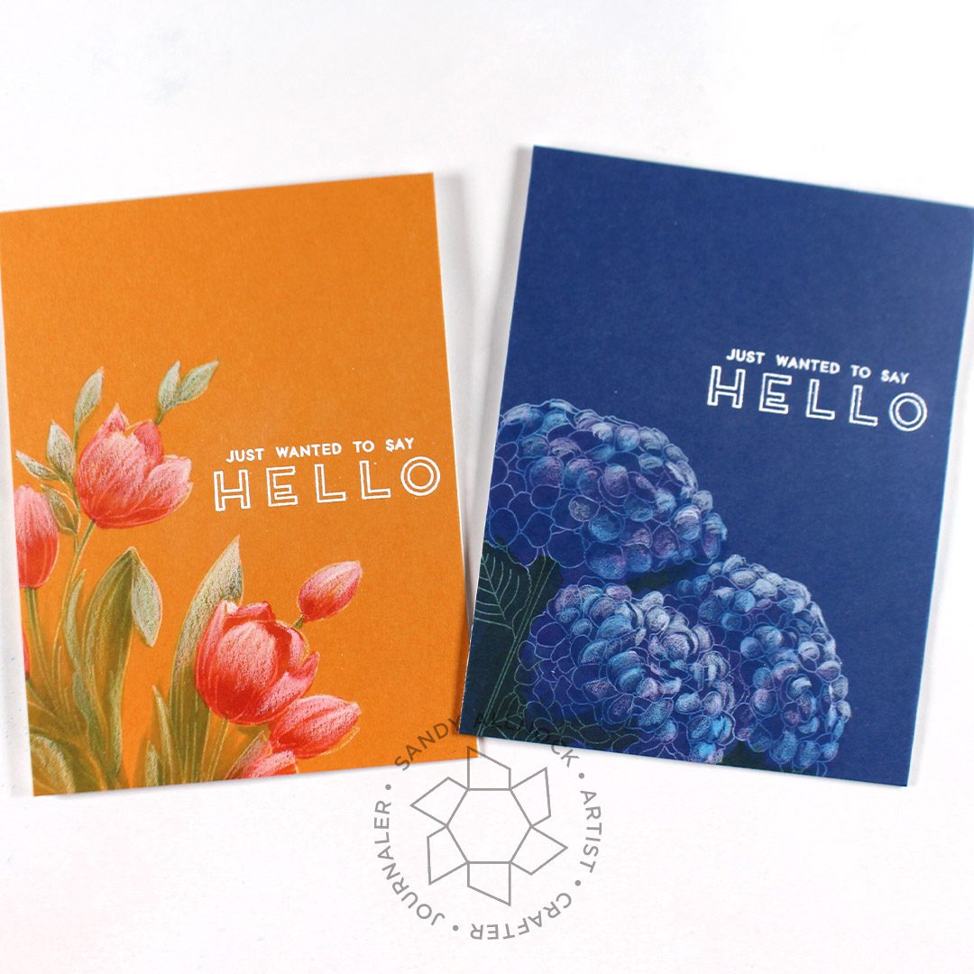
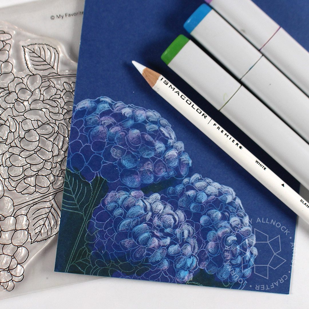
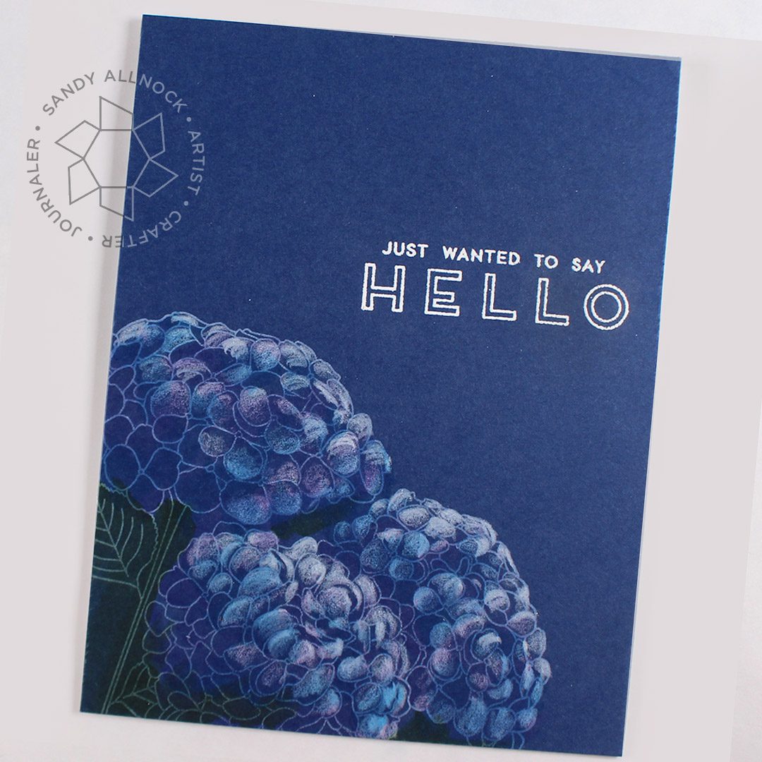
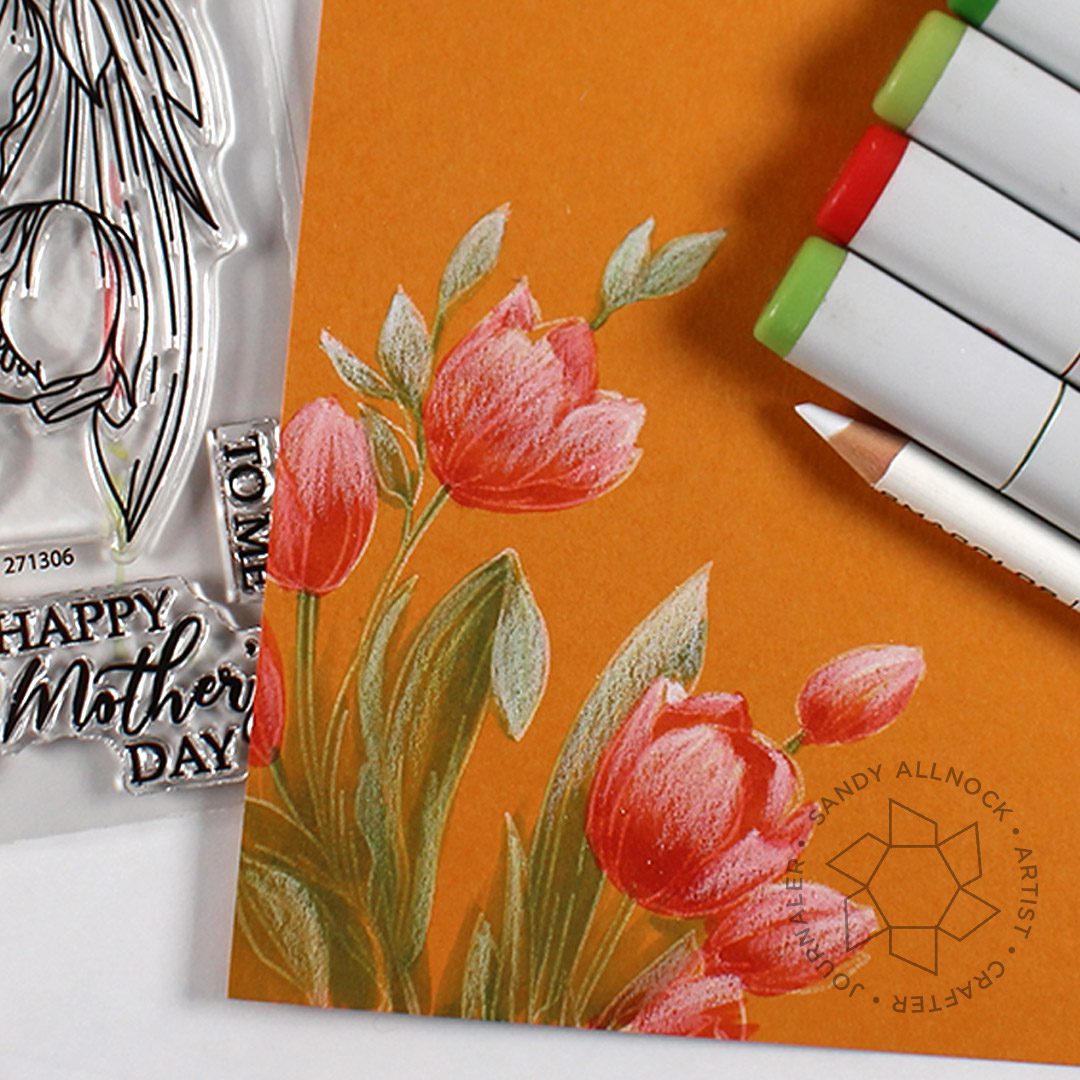
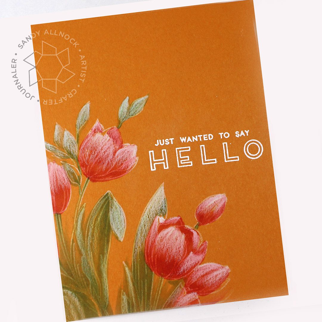
I love trying out different mediums on different papers – and today it’s dark, rich, colored papers! I layered pencil, then Copic marker, than more pencil.
I don’t have brand names for these papers; a few years back I cut up a bunch of papers into card front size and I’m still working through that stack, so I have no idea what it is – but you don’t want anything with a gloss or sheen to it. Heavier papers tend to work better too. Try out colors on scraps so you know what to expect!
Supplies for this project are linked at the end of this post. Compensated affiliate links may be used at no cost to you.
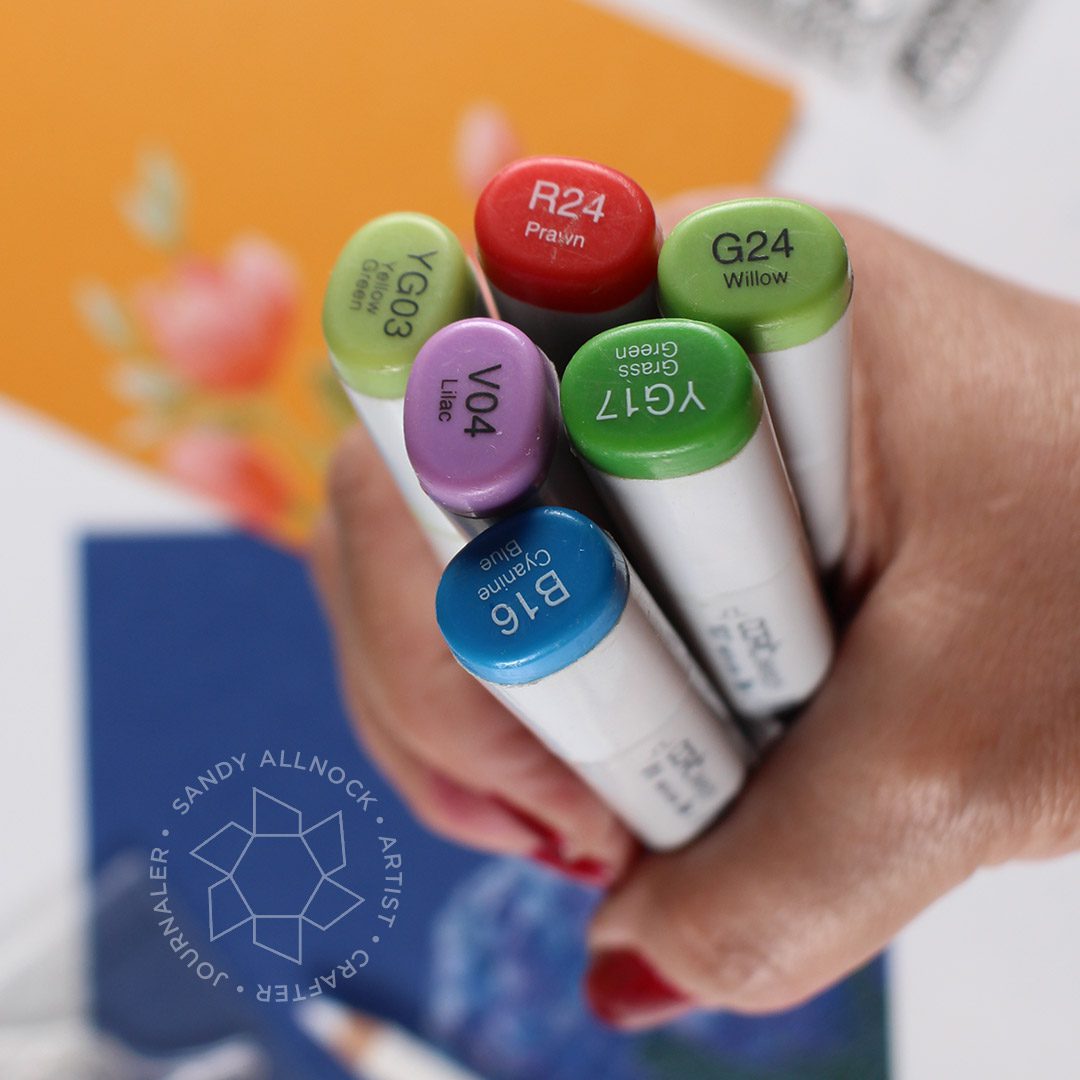
The colors used for the two cards….the G24 was the last color added to the tulip greens.
Hydrangeas in Bloom is a pretty little stamp! The lines are quite delicate and thin, which is what inspired this card design; it was so thin I thought I could get color variance mixing it with white pen.
Tulips, by Waffle Flower, is a Mother’s Day set but can definitely be used year round – there are other sentiments for the women in your life!
Supplies
Some product may be provided by manufacturers for review and use. Compensated affiliate links are here at no cost to you. If you choose to shop using my EH (Ellen Hutson) links, please accept cookies on that site in order to retain the link to my blog, or that compensation does not happen for me. I appreciate your support of my work with your purchases! Full affiliate and product disclosure | My trusted partners in art
Ok tell me in comments: Which part of the title of this post brought you here? (I’m dying to know how many want to know about the TP or pens! ha!)
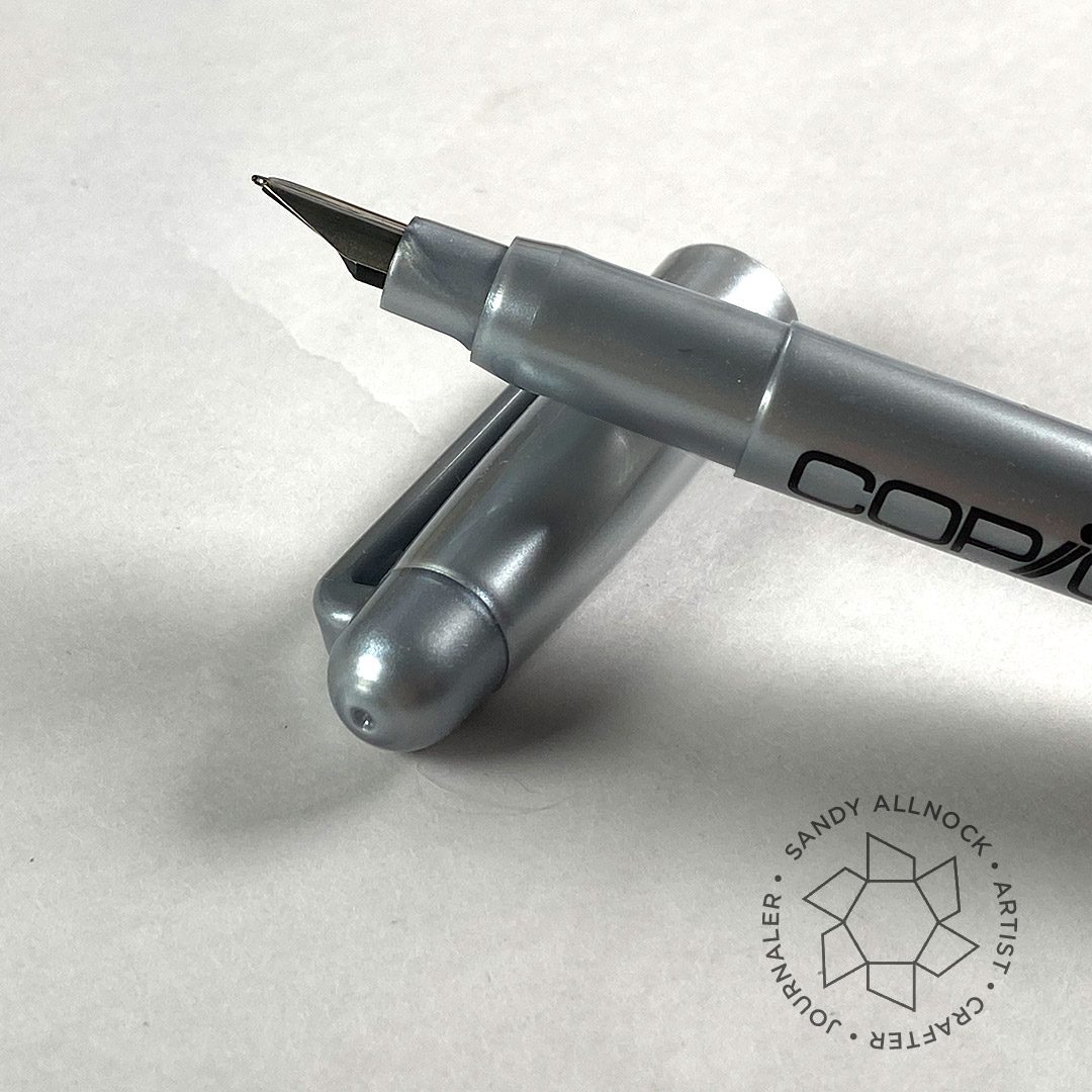
I hope you won’t find this a letdown no matter which you came for! The video covers both – a toilet paper craft you can make to gift to your favorite essential workers or neighbors…..and most of the selection of Copic multiliners – and FOUNTAIN PENS! Yep! They exist! (Supplies are compiled at the end of this post.)
Supplies for this project are linked at the end of this post. Compensated affiliate links may be used at no cost to you.
Here’s the video – scroll on down for the pics and more description.
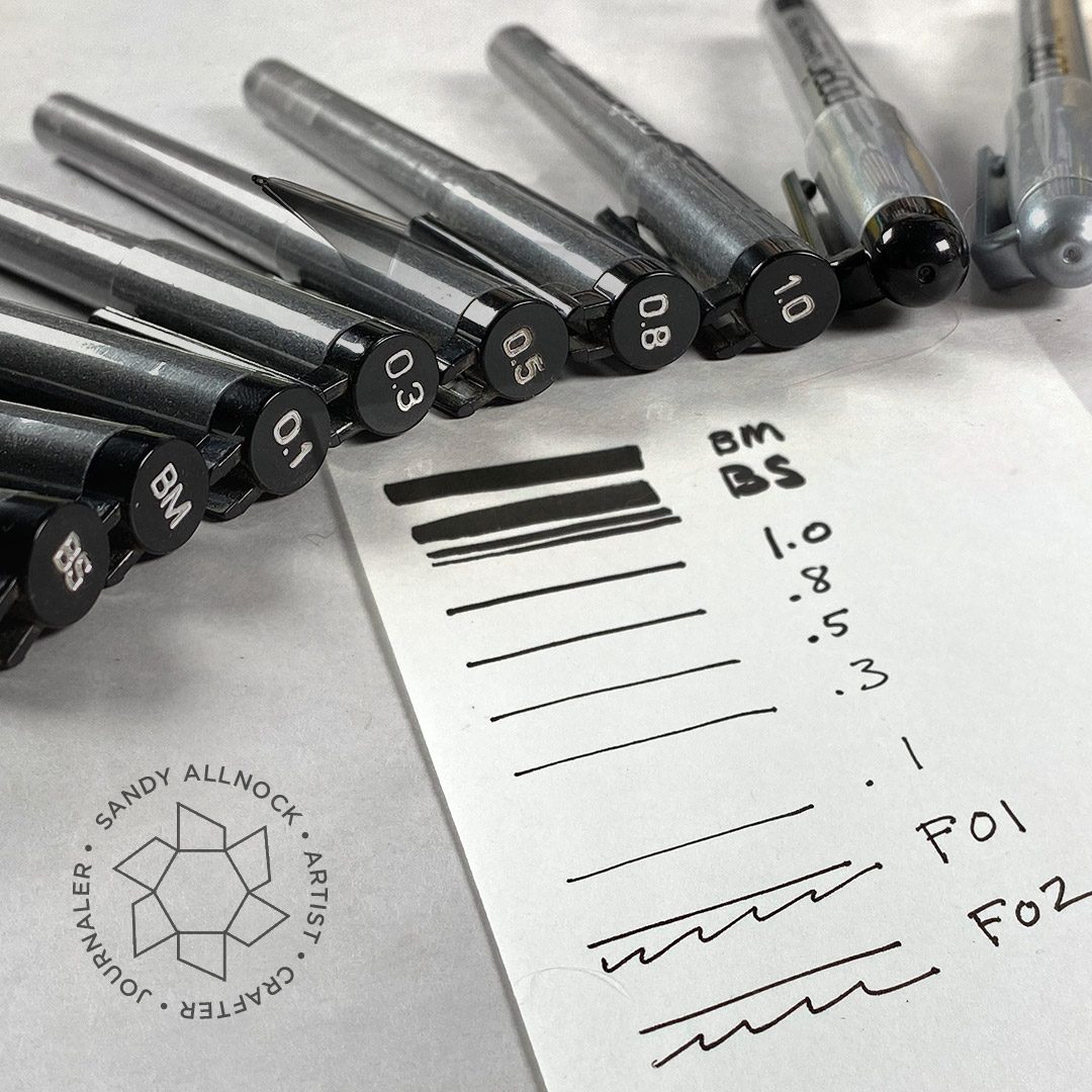
I’ve had multiliners for a long time, and I like having a selection of sizes so I can match it to the line weight of my project or stamp set. These pens can be used for a drawing, then Copic color on top won’t bleed or smudge.
The multiliners come in a variety of packs, depending on where you get them – they can have all the pens or smaller selections, and you can find them in sepias or greys too.
My suspicion on the Copic fountain pens is that they’ve been around a long while and I’m only learning about them belatedly – because they aren’t widely available. Blick carries F01 and F02 … but Amazon only carries the F02 — sooooo that might well mean they’re on the way out rather than in.
My thoughts: they aren’t a necessity, just a fun thing! They’re disposable, which means they aren’t refillable, so they’re just going to sit in a landfill someday. They don’t have the “flow” of a regular fountain pen either….they’re nice but not a must-have. But they are nice if you’re a doodler who mixes your drawing with Copic!
My crazy toilet paper project was SO fun to create, and soo easy – thank you Google for having African fabrics that I could search through for ideas and a simple design like this!
Supplies
Some product may be provided by manufacturers for review and use. Compensated affiliate links are here at no cost to you. If you choose to shop using my EH (Ellen Hutson) links, please accept cookies on that site in order to retain the link to my blog, or that compensation does not happen for me. I appreciate your support of my work with your purchases! Full affiliate and product disclosure | My trusted partners in art
Let’s talk about choosing Copic green colors. Greens are a color that Copic doesn’t do well; I’m not particularly sure if it’s not the color’s fault – they’re a bear to mix yourself. Or maybe they’re a frog, not a bear!
Supplies for this project are linked at the end of this post. Compensated affiliate links may be used at no cost to you.
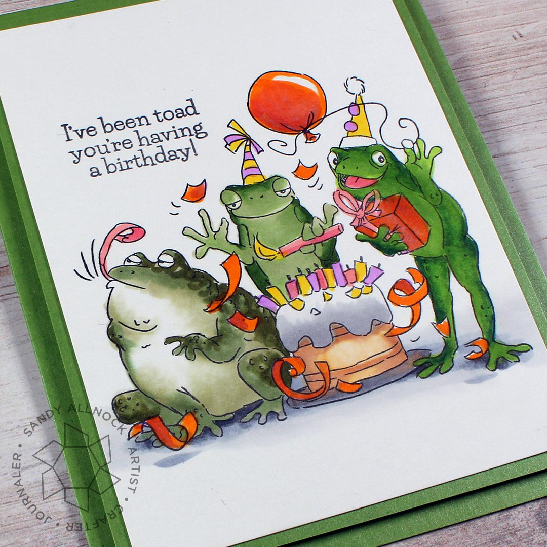
This fun new Frog set from Art Impressions just makes me laugh so hard – I really identify with that frog on the left, tongue out lookin’ for snacks!
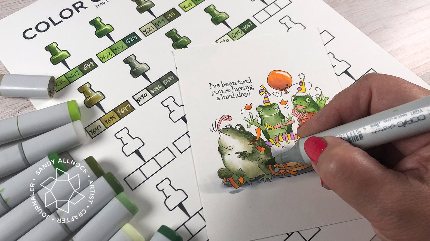
I decided to print out one of my free charts (see below) and test out some green combos that I haven’t used much!
If you’re in any doubt – or if you just want to try something new – testing out combinations of colors is a helpful exercise to go through! I tested out some greens on mine, and chose three combos (see below this photo for each one)…you can download the free swatch sheets too:
The other colors I chose began with oranges – a nice bright, light contrast to the greens, and part of a triadic combination (3 colors equidistant from each other on the color wheel). I also had to add a tiny touch of purple as the 3rd in the triad, and yellow because, well, yellow!
Some product may be provided by manufacturers for review and use. Compensated affiliate links are here at no cost to you. If you choose to shop using my EH (Ellen Hutson) links, please accept cookies on that site in order to retain the link to my blog, or that compensation does not happen for me. I appreciate your support of my work with your purchases! Full affiliate and product disclosure | My trusted partners in art
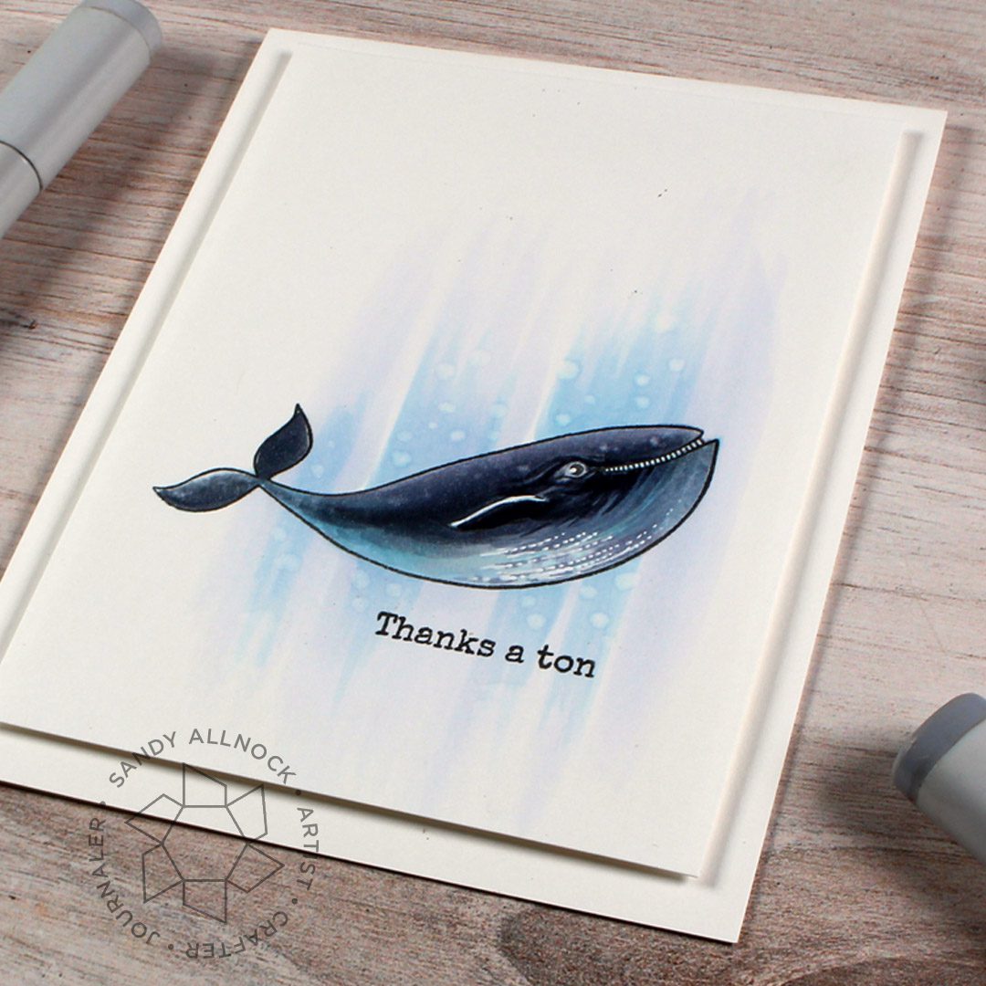
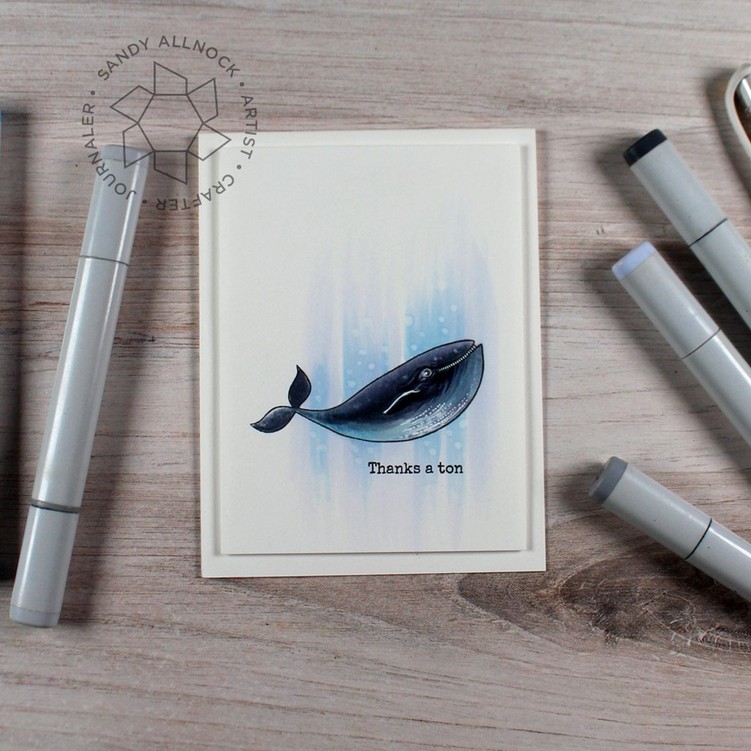
Today I’m adding Copic details to a Humpack whale on a rather old stamp set; I love this little whale! There are two in the set along with punny sentiments….be sure to get to the end of this post for a second video from back when the set came out!
Supplies for this project are linked at the end of this post. Compensated affiliate links may be used at no cost to you.
I used a very simple collection of colors – mostly greys, but with blues for the undercoat of the whale and different blues for the pale background. The contrast provides the “pop” on this card instead of strong color.
The textures can be created in a variety of ways – marker strokes (pressing hard for thick lines, barely skimming the surface to make thin lines), dots, dotted lines. Don’t forget the colorless blender for both fixing areas and adding extra texture. And oh – that white pen! ha. I wonder if I could use it on every card for the whole year!?
The simpler the image, the more I tend toward a white-on-white look; even though the coloring is detailed, all the white on the colored paper and the card base really set off the whale and draw attention to him!
This bonus video was back from when this stamp set came out, in case you want another way to use the set; you can see the blog post HERE.
Supplies
Some product may be provided by manufacturers for review and use. Compensated affiliate links are here at no cost to you. If you choose to shop using my EH (Ellen Hutson) links, please accept cookies on that site in order to retain the link to my blog, or that compensation does not happen for me. I appreciate your support of my work with your purchases! Full affiliate and product disclosure | My trusted partners in art
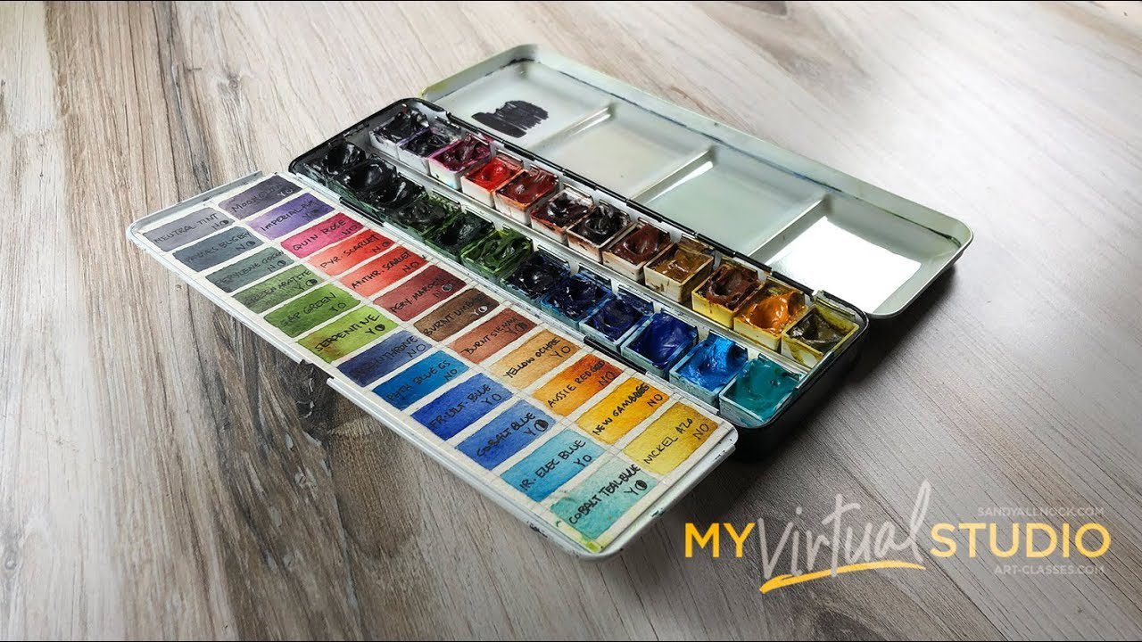
Choosing your watercolor palette can be a hard decision….but it’s an individual one! Choosing another person’s palette color-for-color might not help much at all. In this short overview – my swatches and palette are shown.
Supplies
Some product may be provided by manufacturers for review and use. Compensated affiliate links are here at no cost to you. If you choose to shop using my EH (Ellen Hutson) links, please accept cookies on that site in order to retain the link to my blog, or that compensation does not happen for me. I appreciate your support of my work with your purchases! Full affiliate and product disclosure | My trusted partners in art