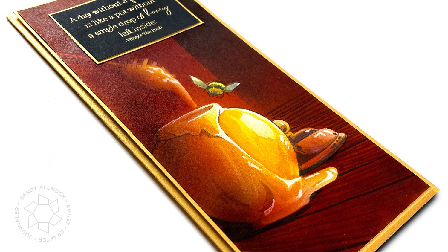
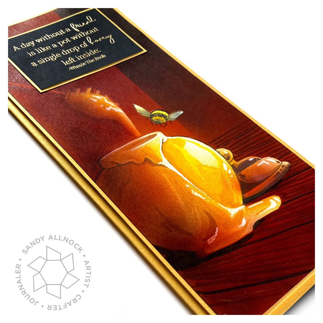
Back in college I had a good friend whose medium was airbrush. The regular, old-school kind! He had all kinds of bottles of ink, masking materials, all sorts of supplies for airbrushing. I’ve often thought he would be green with jealousy about Copic airbrush now….or is he still out there making art and using Copic? I’ve googled him and have seen no sign of him, so I just don’t know. But…..
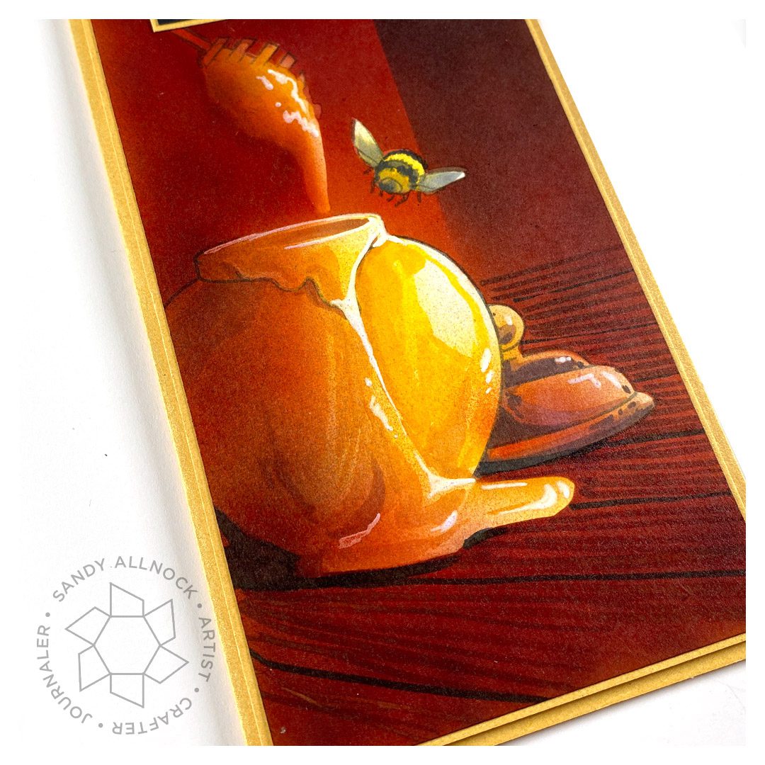
I decided to do some of what I saw him do when I would watch him work. Not all of it – he wouldn’t have taken a pen stroke to paper, he was the type to cut every single piece of color from his fancy masks. I didn’t think I had that patience, especially for a card!
In some ways I think the difference in paper textures when using marker strokes makes the glass look more glassy. With that last touch of airbrush on top it brings it back to feeling like it was airbrushed, but without all that masking.
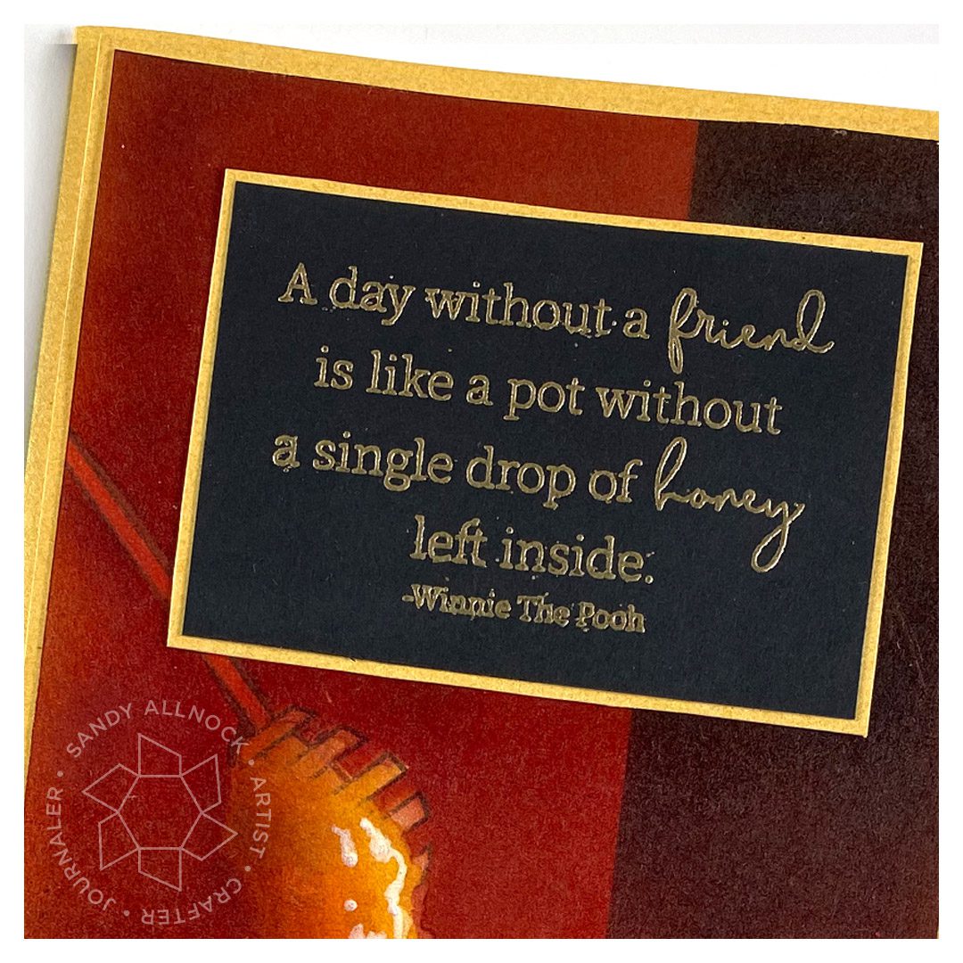
There are several sentiments in the set – but I made a slimline card specifically to leave a nice big space at the top for this one. (Secret: I stamped and embossed it directly on the airbrushing first, but my ink splooged and it looked terrible. The good thing? This black paper with the gold layer pops even more than that had!)
Supplies
Some product may be provided by manufacturers for review and use. Compensated affiliate links are here at no cost to you. If you choose to shop using my EH (Ellen Hutson) links, please accept cookies on that site in order to retain the link to my blog, or that compensation does not happen for me. I appreciate your support of my work with your purchases! Full affiliate and product disclosure | My trusted partners in art
In which I talk through some of my many color choices – and re-choices when I pick the wrong one first. Never give up, just keep going!
The number of times I change my mind on which color to use is rather vast…it’s one of the reason I work in layers, constantly able to vary what I’m working with!
If that was too much to take in – remember to use the most saturated colors in the foreground, and the desaturated (natural, more greyed-out colors) in the background. Whitest whites in the front will make those images pull forward, as do darkest darks. The eye loves to see contrast!
Supplies
Some product may be provided by manufacturers for review and use. Compensated affiliate links are here at no cost to you. If you choose to shop using my EH (Ellen Hutson) links, please accept cookies on that site in order to retain the link to my blog, or that compensation does not happen for me. I appreciate your support of my work with your purchases! Full affiliate and product disclosure | My trusted partners in art
A month or so ago I spoke at an art league in another part of my state – via zoom! The person inviting me said in our discussions that they’d like a demo; I assumed watercolor at first, but she indicated that she thought Copic would be interesting. Hmm. Well, though most of the members are painters, and the painters I know prefer to see painting, I figured I’d go for it.
I crafted a whole message to encourage them to create daily…then in the demo, explained the basics of what Copics are, and the downsides – like, they’re not archival, so be aware of that before deciding to switch from painting, of course! For papercrafting they’re great but….not as much for fine art, though they do a beautiful job.
My patrons got to attend my practice session – if you’d like to become a patron and see that as well as other monthly livestreams, you can do that here.
Video
Prints available
You can buy prints of this tulip here – or scroll on that page for a pillow….or…….
A note about the paper: it’s 12″ x 18″ and is the heavyweight version of Neenah – I got a ream of it several years ago at a paper store.
Supplies
Some product may be provided by manufacturers for review and use. Compensated affiliate links are here at no cost to you. If you choose to shop using my EH (Ellen Hutson) links, please accept cookies on that site in order to retain the link to my blog, or that compensation does not happen for me. I appreciate your support of my work with your purchases! Full affiliate and product disclosure | My trusted partners in art
I get occasional questions that I’m not sure are serious or just rhetorical….
How on earth do you come up with this stuff?
How much more time do you have than the rest of us mortals?
Where do you get all your ideas?
Well, the answer is…..SOFA TIME!
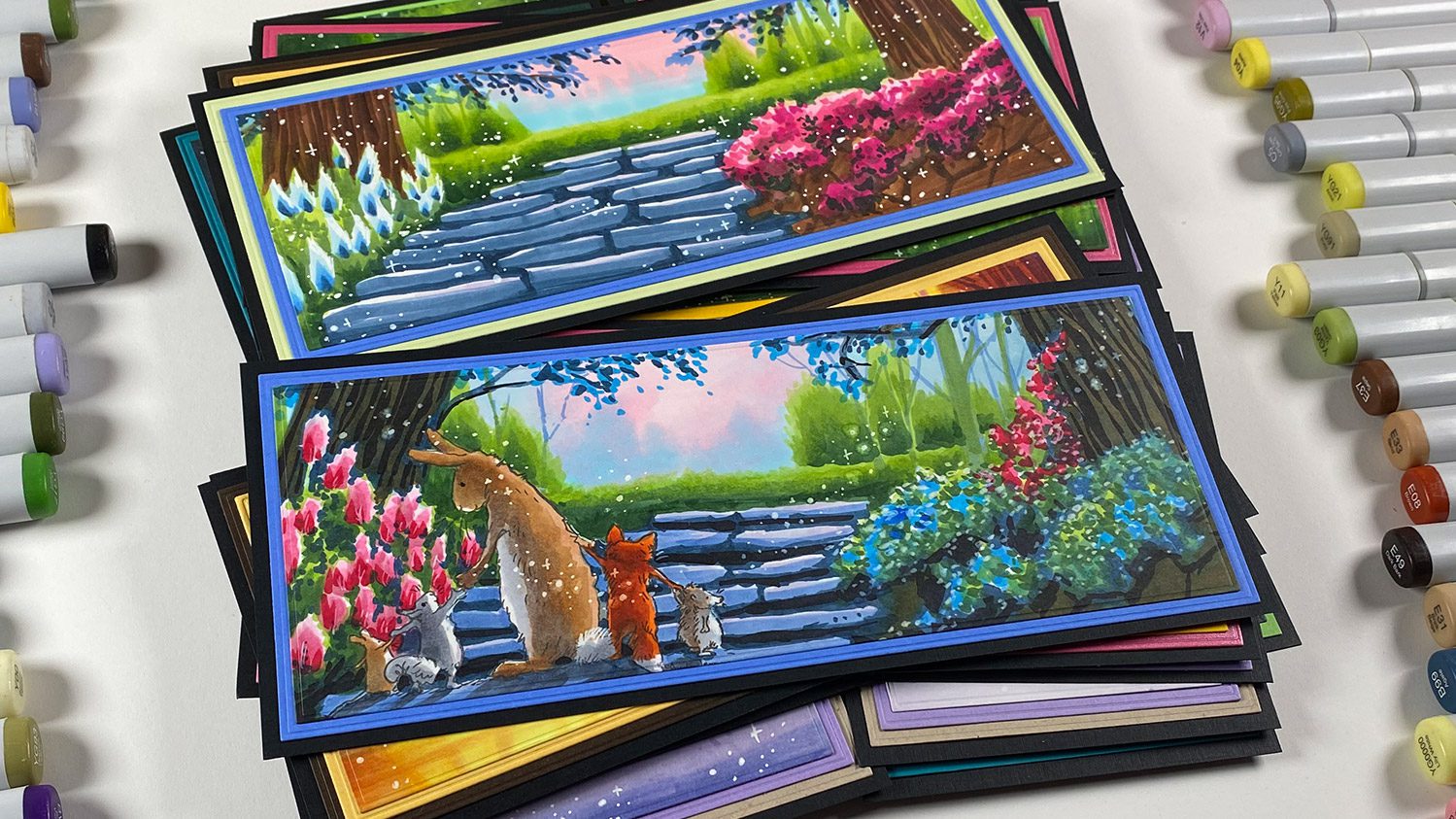
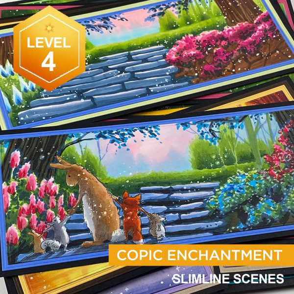
Ha! Well I guess it depends on the sofa but….I spend lots of evenings away from the studio, cuddling with the pups and watching stuff on my ipad and…coloring, drawing, sketching, making notes. And in December, remember I took that “sabbatical” from YouTube? Well this new class, Copic Enchantment, is just one of the results of that….watch the video below or click HERE to see it on YT.
And I just cracked up looking at the previous pre-registration page that I had assembled amid serious hand pain – it was practically gibberish, some text left over from other classes….ha. And no one told me! Would y’all tell me if I had ketchup on my chin? Well, it’s all fixed and tidied up now. 🙂
Also as for how much time I have in my day…I work way ahead of schedule! I’m a rare bird as an artist and plan things out for at least a month or more.
I keep an ongoing list in a Google Sheet with what stamps I have in the stash to use, pair them with mediums, list techniques I want to try, manufacturers….
I filter in holidays and special things so I have content prepared for them for social media.
Now that I’ve been making more reels and YT shorts, I schedule those well ahead too.
I have a folder system in Dropbox for staging stuff so I can get to it while away from the laptop (or while the hand is hurting too much to work on the computer).
All this may seem crazy but it’s honestly been a life saver in this last month or so when my hand has been recuperating! I’m getting better all the time, for those asking – I can do half days on the computer again, but my hands generally tell me when to stop. (Yes I say hands – my left has been doing double duty to compensate, and it too gets tuckered.) Rotating what I do and for how long I do it seems to be the best pattern, so I change mediums regularly through the day – juggling several projects at once. And throwing in some gardening now that the weather is nice!
Now that the Copic Enchantment class is fully live, I’ve got other classes working in my brain, so I’ll let yall know when that gets underway. I’m thinking a Level 2 colored pencil class is next.
Last year I discussed the Pantone color of 2020, Classic Blue – and have had a few requests to make a tradition of it. So let’s do it!
In 2021, it’s actually TWO colors: Ultimate Grey and Illuminating Yellow. On their website one of the things they have for sale is some swag – so I ordered a Cortado cup – it’ll be a nice little water cup for painting in 2021!
Supplies for this project are linked at the end of this post. Compensated affiliate links may be used at no cost to you.
Video
The video has three parts: 1) coloring the chart (download here), 2) coloring an image from Three Room Studios, and 3) looking at a few sample cards, also pictured later in this post!
I’ve made a chart for you to download HERE– it’s 2 pages, one has my numbers on it, the other is blank. That way if you want to try to match a different medium like colored pencils, you can add those yourself.
Color harmony examples
To use harmonies the way they’re shown at Pantone, use the colors in different quantities – usually 3 or 4, though I tried using all 6 where possible on these sample cards. The tone of a piece will change dramatically based on which color takes up the most real estate, and what colors are next to each other.
The yellow background is the largest color percentage – and it definitely pulls your attention! The girl’s pink clothing is pretty important here, as the color is so much darker than what’s around it.
The mood is more peaceful with the deep grey background this time – and the yellow chair draws the eye right away. Polkadots on these two, by the way, are the green, and the tan color was replaced with skin and hair colors.
The background is the tan color, and it’s right next to the yellow – almost hiding the yellow outfit as they’re right next to each other. To make the corduroy fabric on the chair, use a white pen, let it dry, then go over it with Copics.
The pink is adapted to have two tones – the airbrushed one is lighter, carpet darker. This and the grey chair surround the shock of the yellow outfit, which pops against all those colors!
Supplies
Compensated affiliate links may be used – that means if you make a purchase using my links, I receive a small commission at no extra cost to you. Thank you for your support of my work on this blog! Read more.
Another of my MFT guest posts…..I’ve begun collecting them here on this blog since they archive stuff over there. 🙂
Video
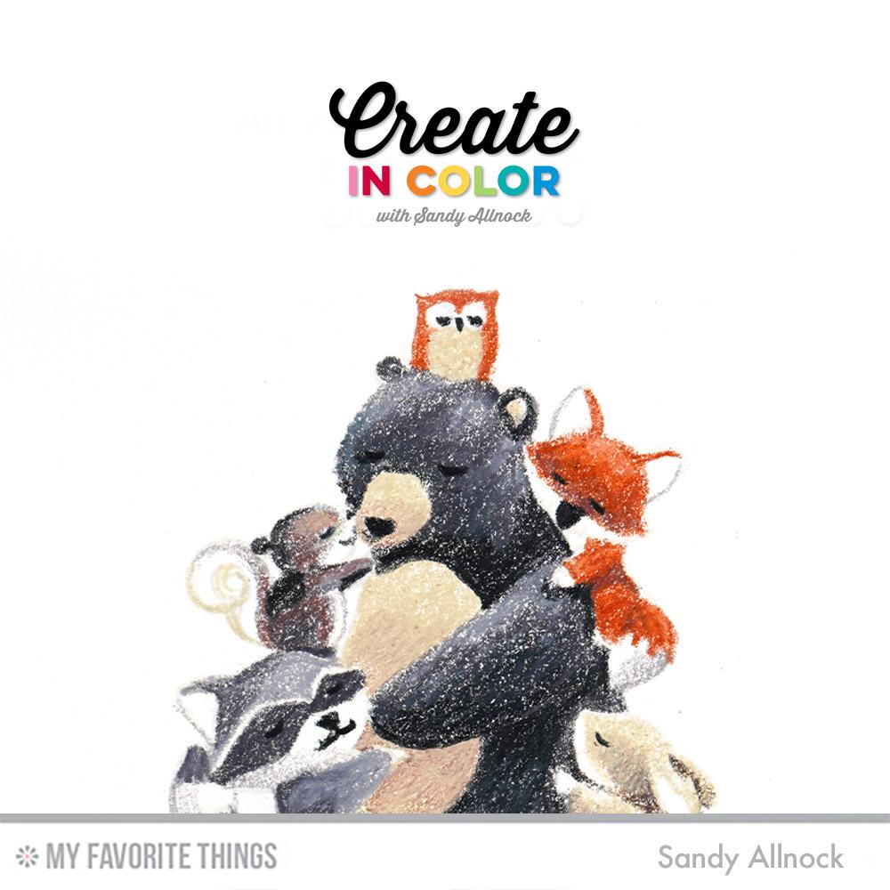
The sentiments in this set also couldn’t be more perfect for the times we’re in…I can’t WAIT for the end of air hugs, how about you? Consider my video a real bear hug coming your way! Watch it below or on YT.
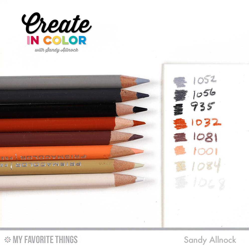
I used a pretty limited set of colors. Repeating them throughout all the animals but in different combinations keeps the whole picture looking unified yet gives each critter a character all their own. I love what adding a little of the reddish brown did to change up the squirrel!
Supplies
Some product may be provided by manufacturers for review and use. Compensated affiliate links are here at no cost to you. If you choose to shop using my EH (Ellen Hutson) links, please accept cookies on that site in order to retain the link to my blog, or that compensation does not happen for me. I appreciate your support of my work with your purchases! Full affiliate and product disclosure | My trusted partners in art