Watercolor Bouquets – from the car!

Watercolor Bouquets – from the car!

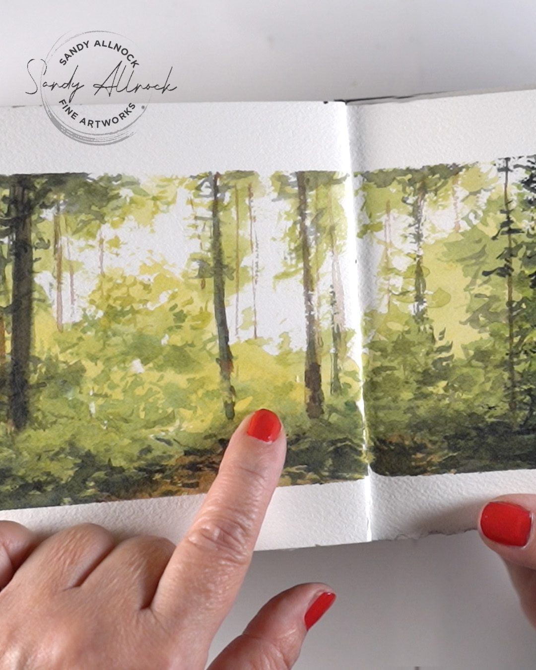
As they say – if you don’t laugh, you’ll cry, right? I’ve had one HECK of a week fighting this cable slowdown! The company came out to our neighborhood to “improve” service, and all week it’s been half speed. GAH! But I’m going to laugh about it by vlogging from my car and using even MORE expensive phone data (I already used up the extra I had left on my account, phooey!) and get a video out today anyway!

The vlog:

Stay tuned to the end!

Watch the video below and scroll to the end to leave comments or questions — or click HERE to watch it on YouTube and leave comments over there. I read both dutifully!

Watercolor Bouquets Class!

While I didn’t get it ALL done and launched when planned (thus disappointing my hopes to cover the mortgage, gah!), I did get the preclass lesson uploaded as well as lesson one. And Lesson one is all about thumbnail sketches which can keep you busy for a week anyway 🙂 Sign up right now for a $10 discount!

GIVEAWAY: if you sign up for the class and then win, I’ll just refund your fee. That way you get to start on lesson 1 this week!
Artventure Zoom TODAY

We’re gathering on Zoom for an Open Studio session – no agenda, just making art and chatting. Join us anytime in the 2 hour window! I’m turning off every bit of internet-enabled stuff so hopefully will be able to host a stable Zoom with my slow internet. Oh and I’ll be working on my birdos for Whimsical Sketching class.

Check the events calendar in the top menu at Artventure for the zoom link.

 

Subscribe to my weekly newsletter, Creativity In Your Inbox

* indicates required

Coming up

February 1 is around the corner! A growing group of us will be starting (or restarting) the 30 days to more confident sketching class! I’ll be redrawing them myself too (no video) and checking to see if I have additional tips to provide inside the lessons. Probably no Tiny Tutorials, that’s a lotta content, but we’ll see!

If you’ve wanted to learn to draw but need someone to walk alongside you, this is the best opportunity! We’ll all get through it together. Again its being hosted over at Artventure.

I need a nap!

After the Zoom I think I’m gonna log off EVERYthing and bake. Or something…..how can slow internet make you so tired!?!?

Subscribe to receive blog posts by email:

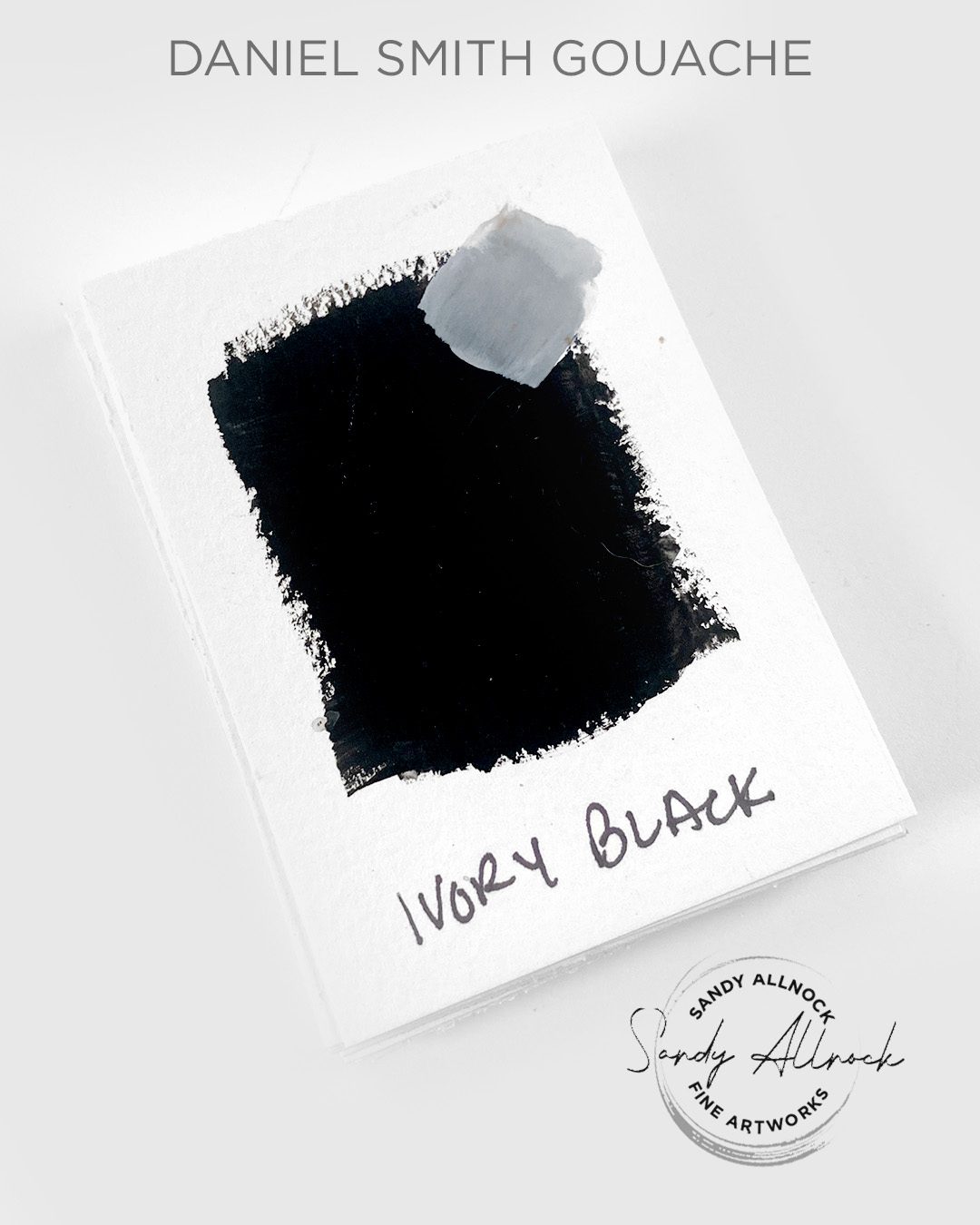
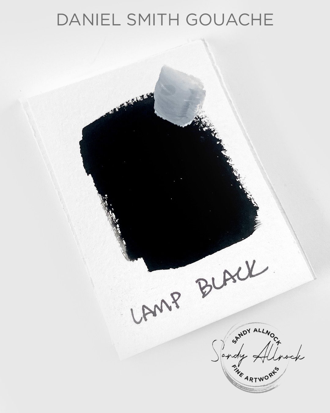
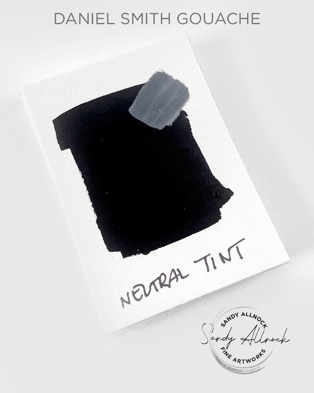
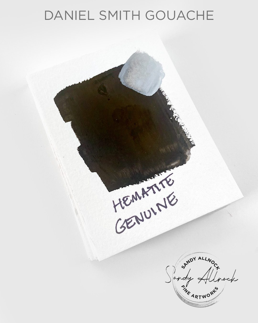
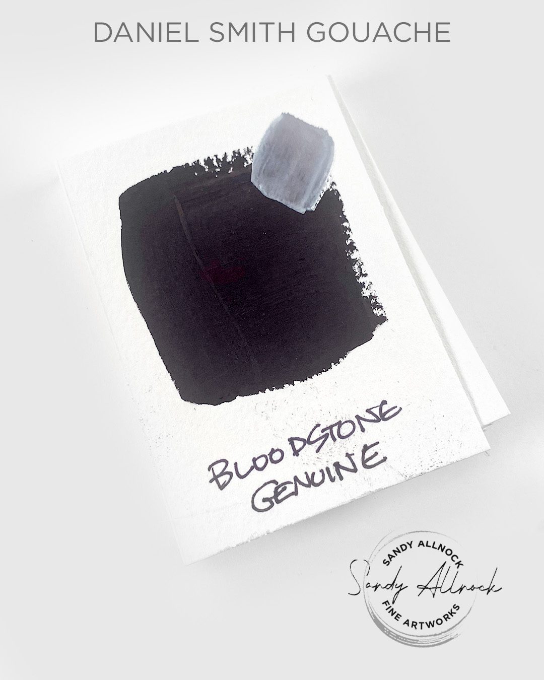
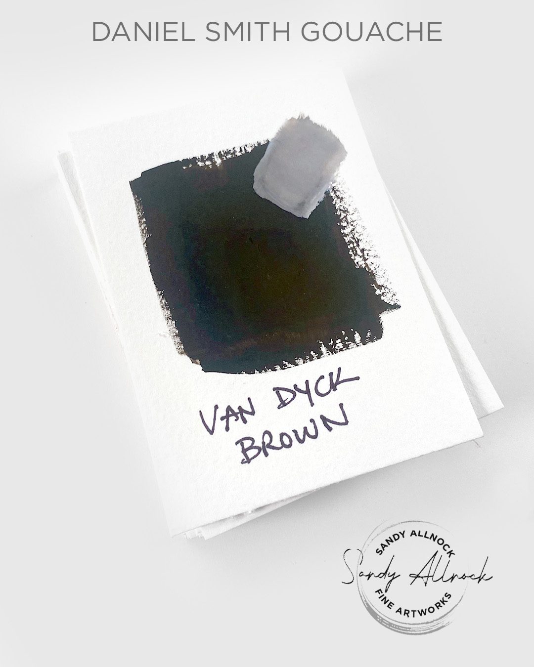
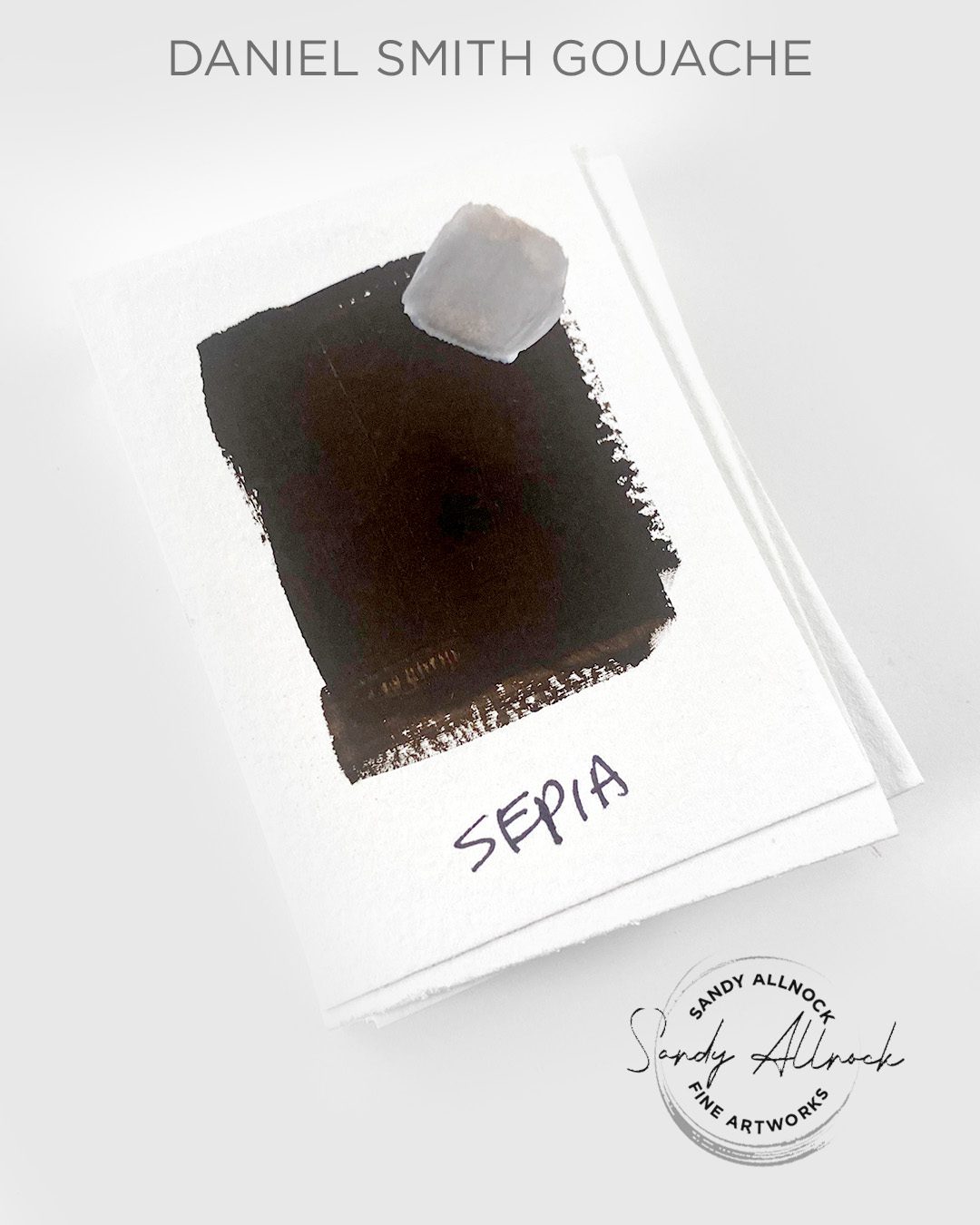
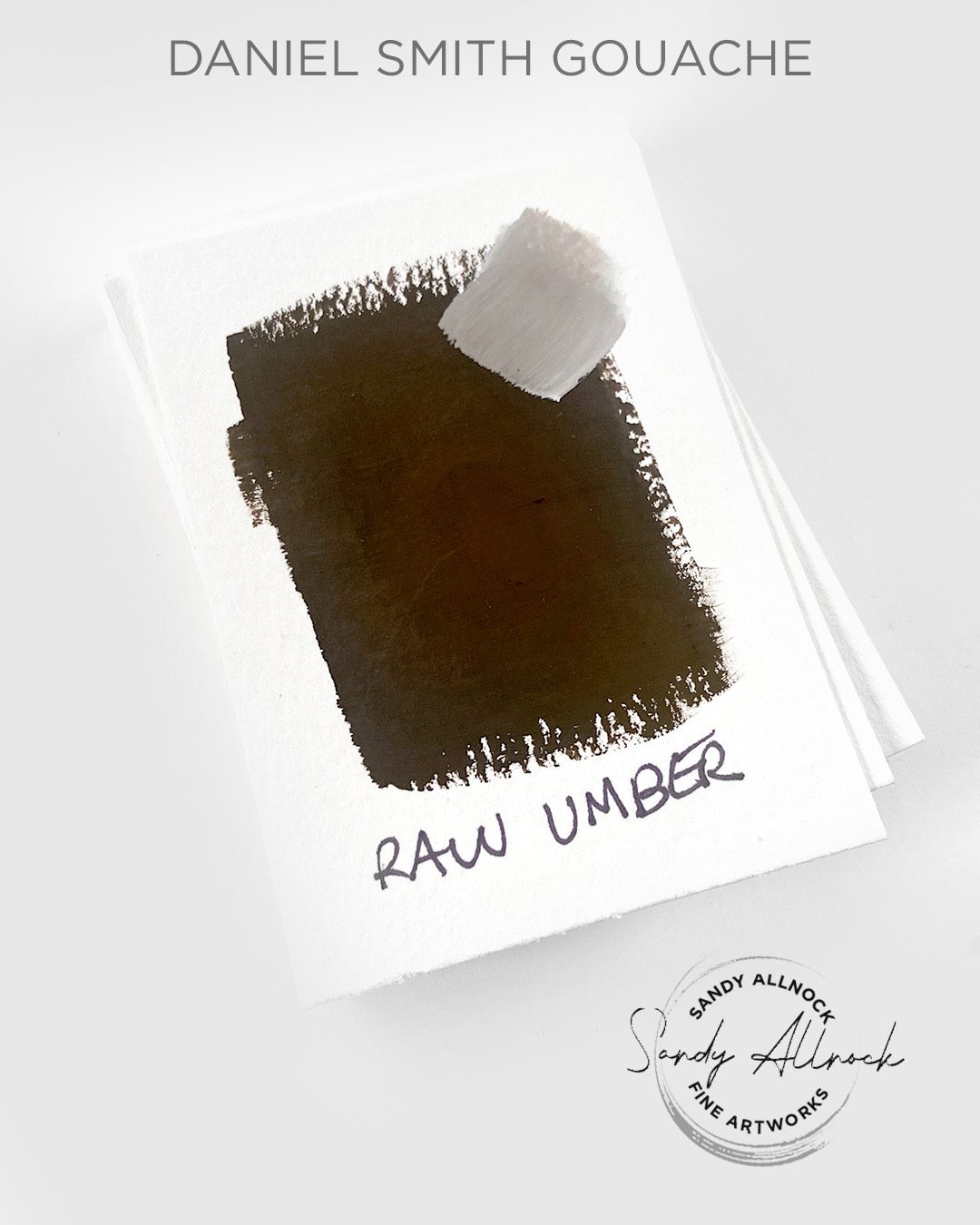
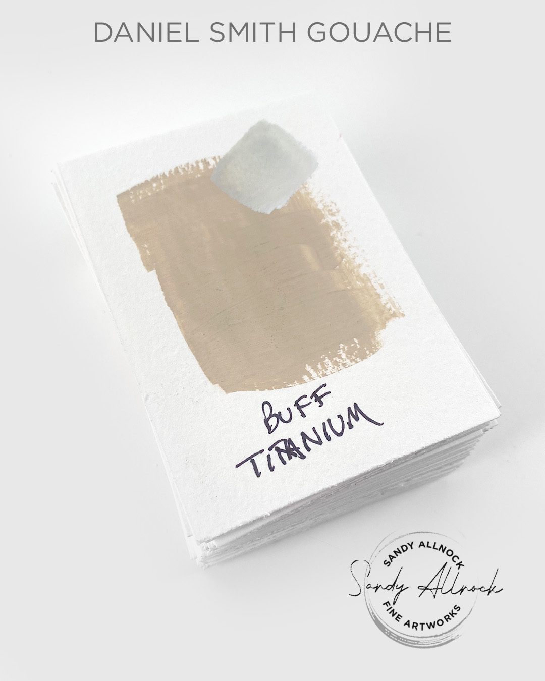
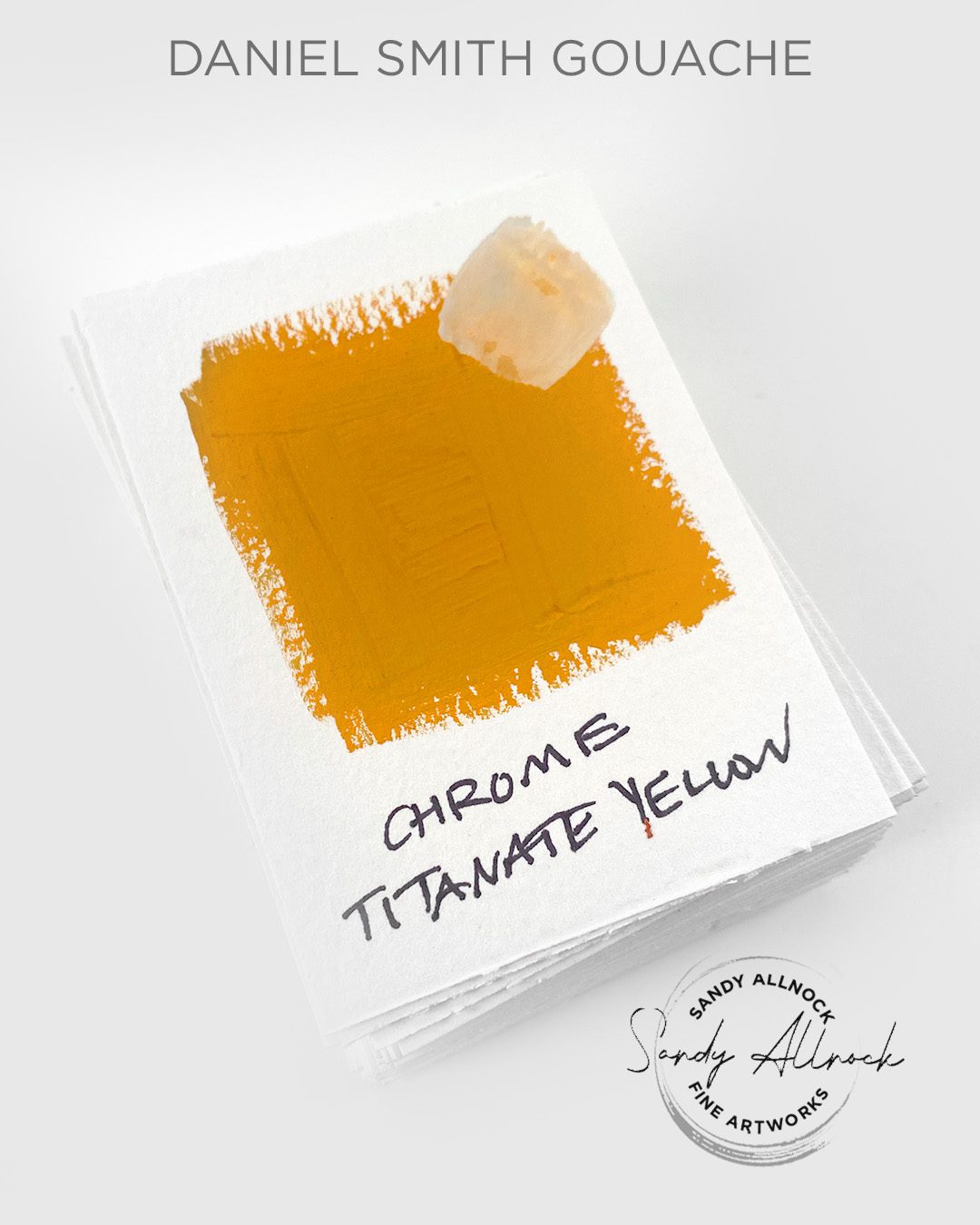
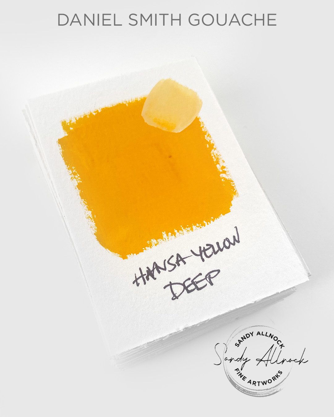
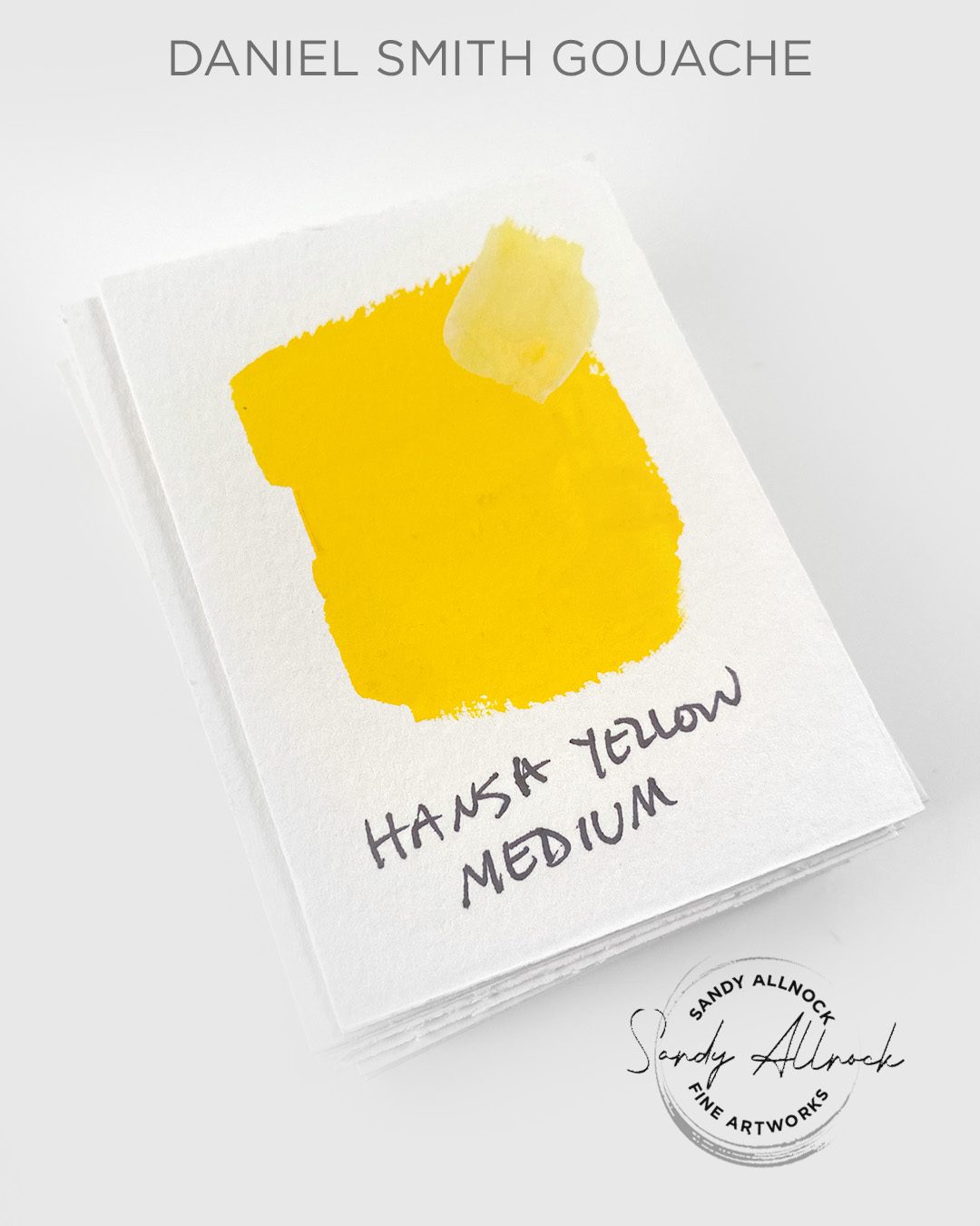
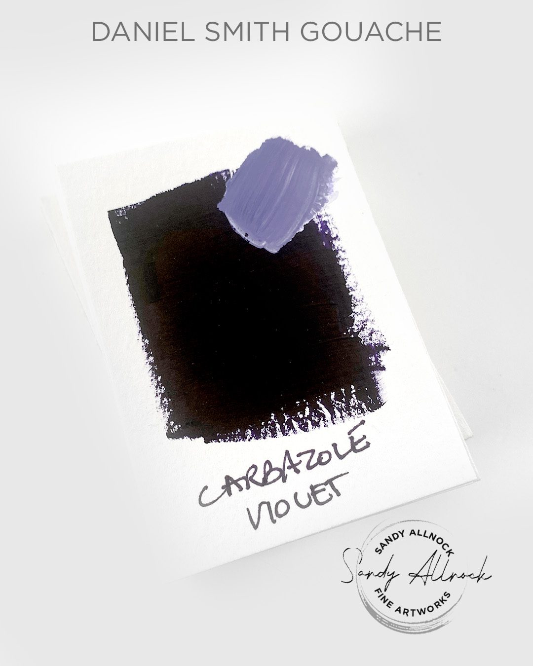
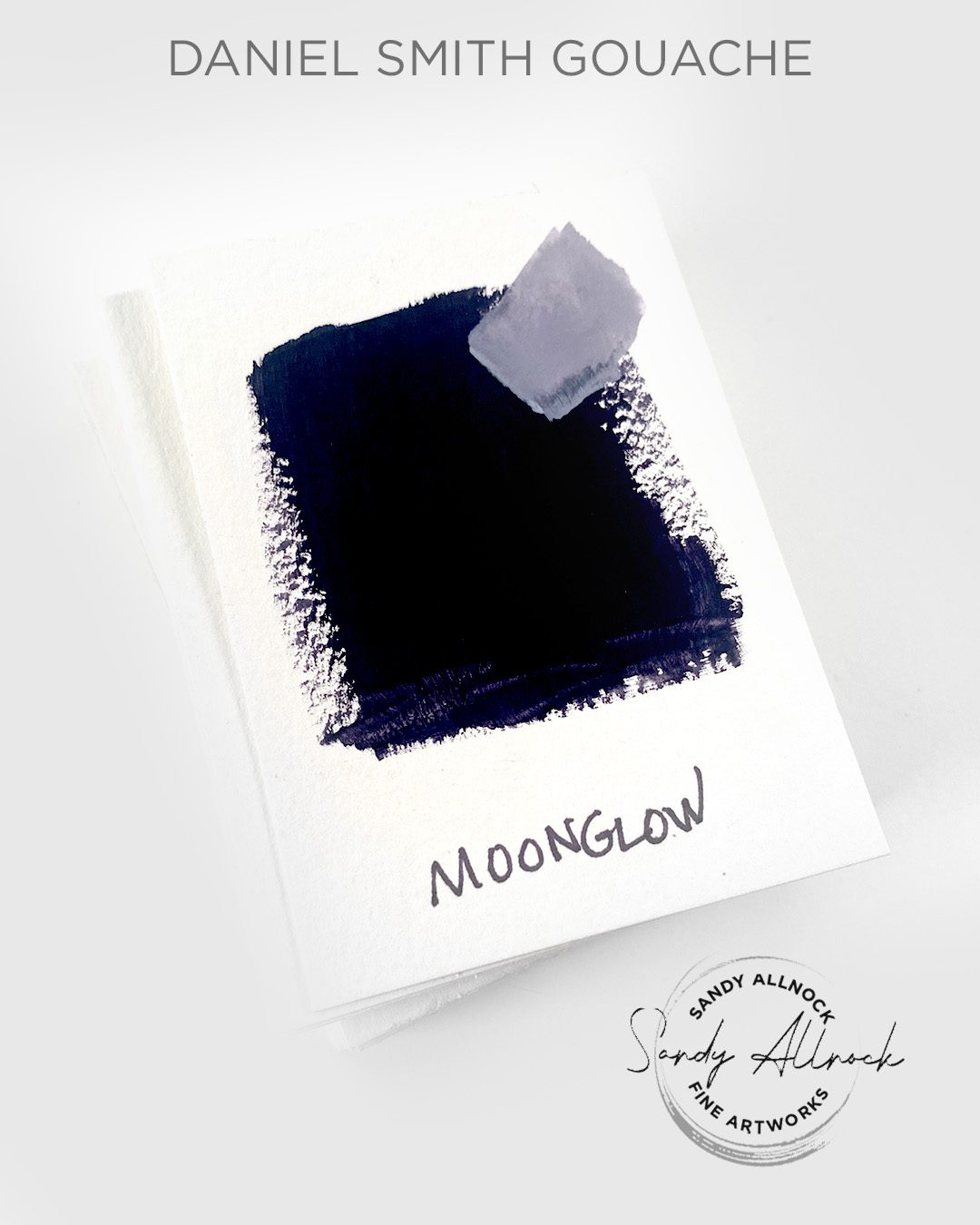
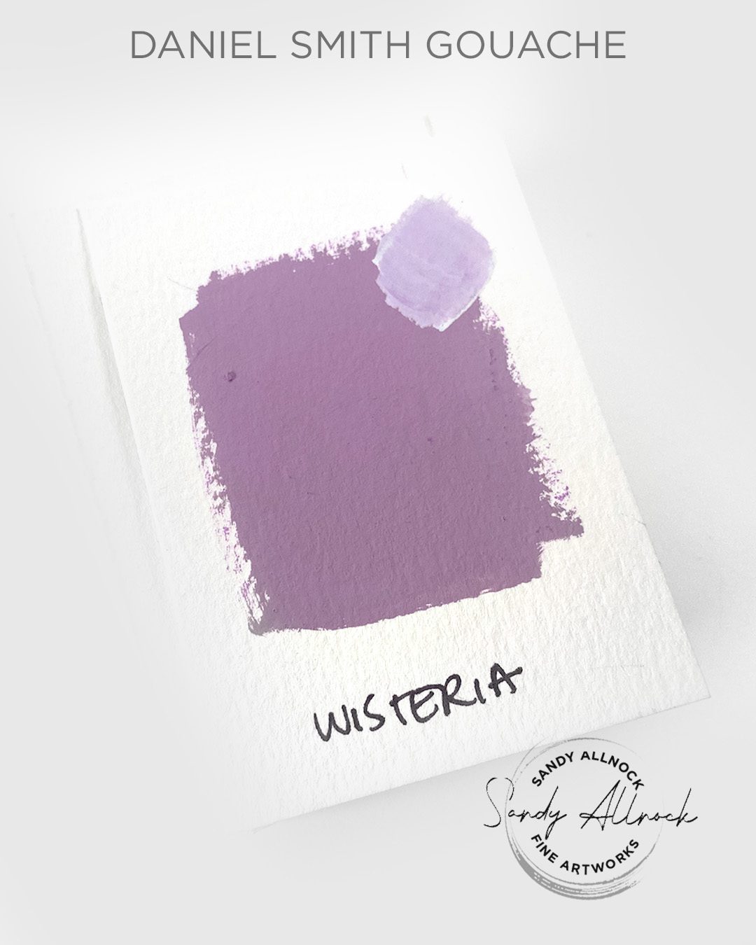
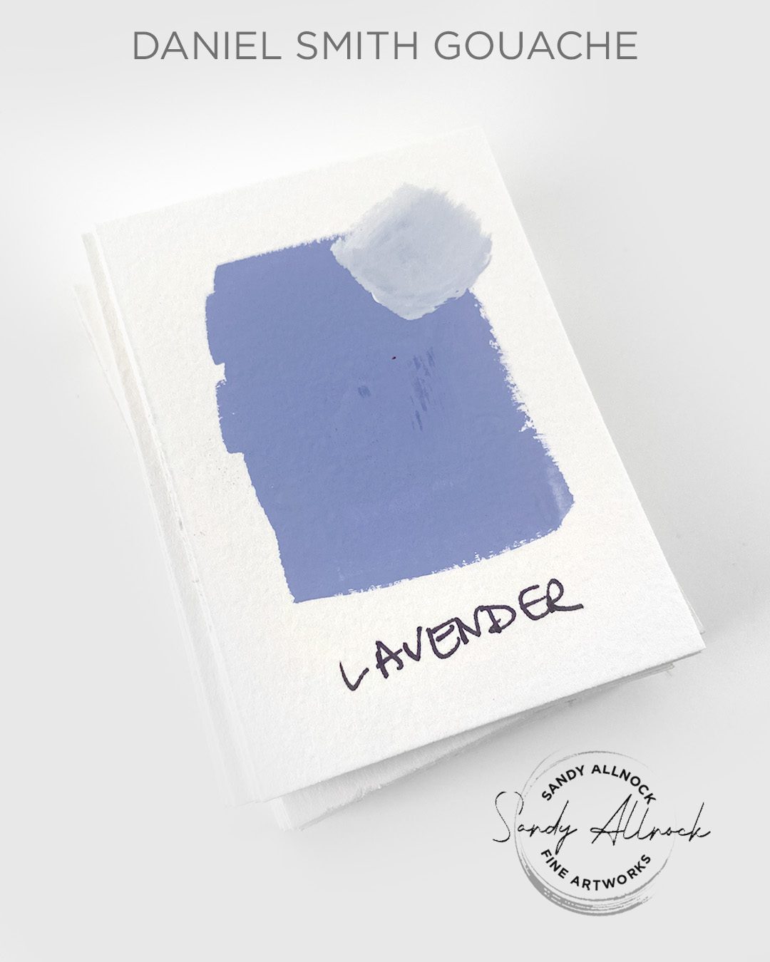
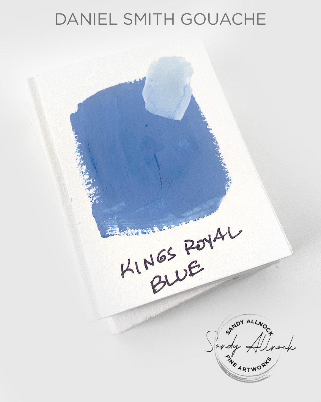
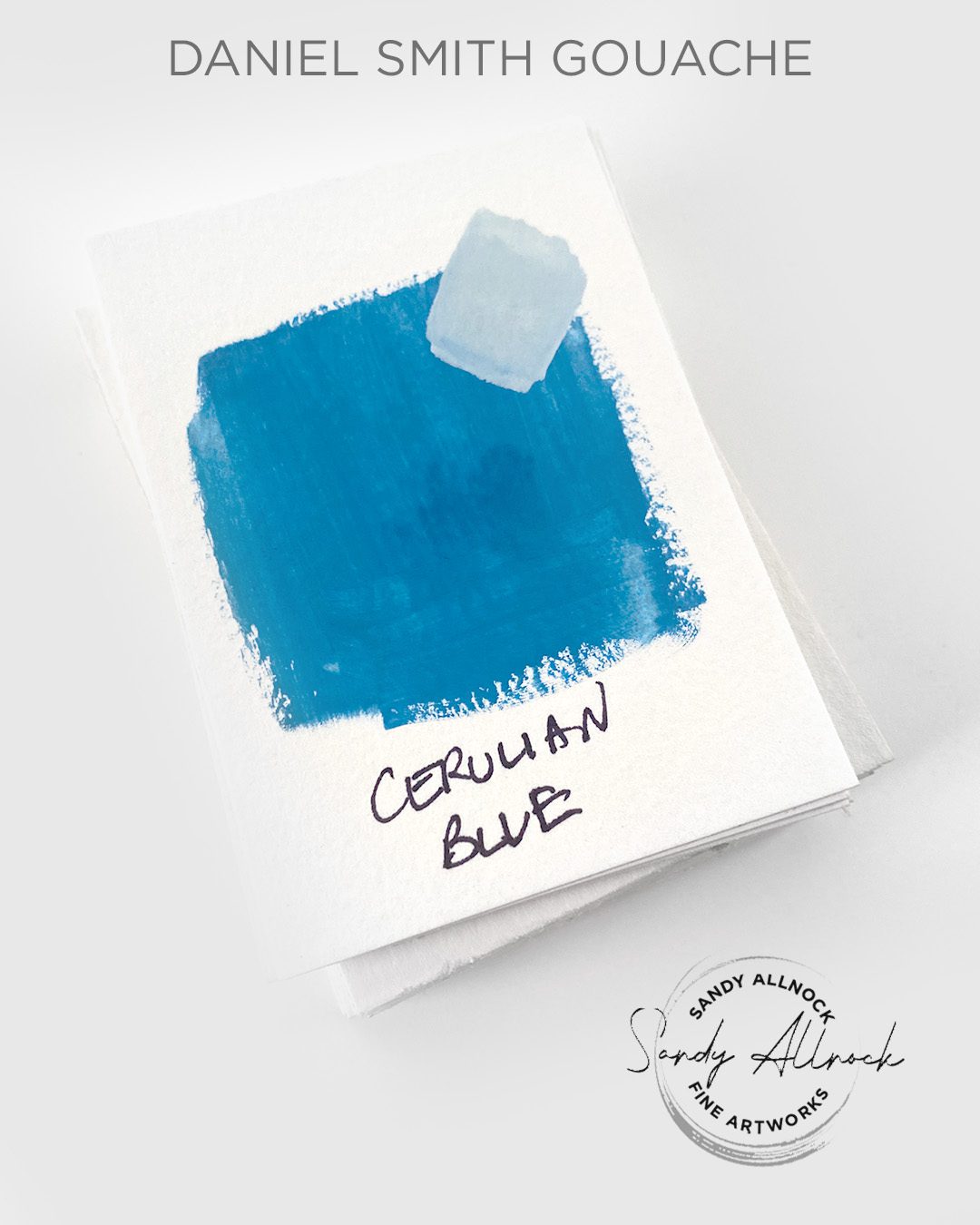
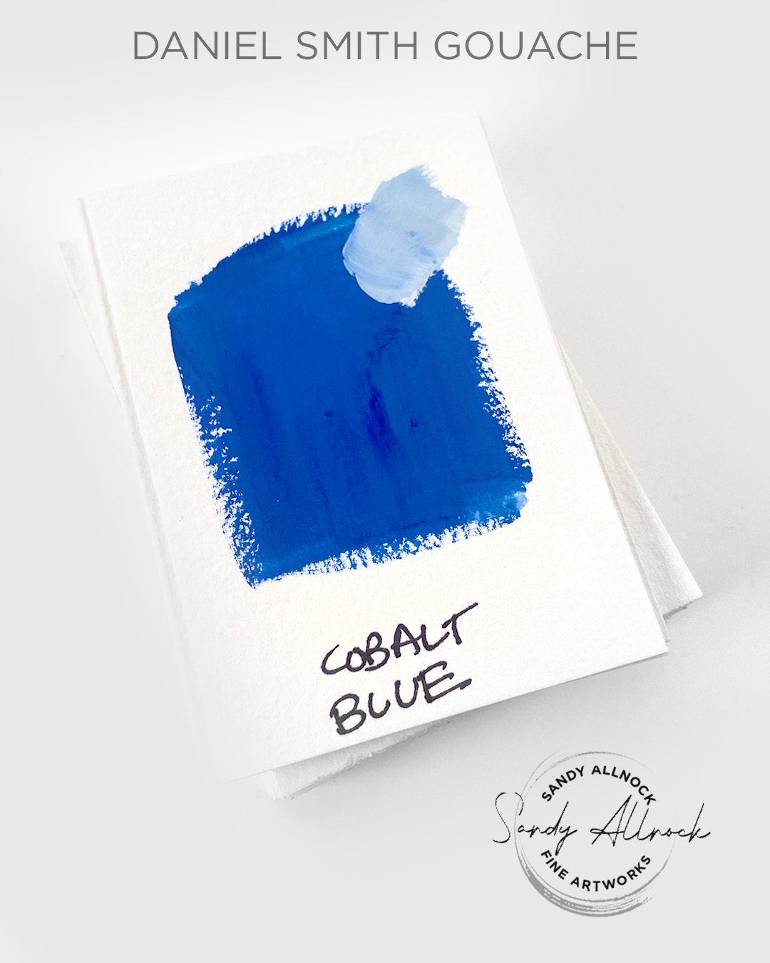
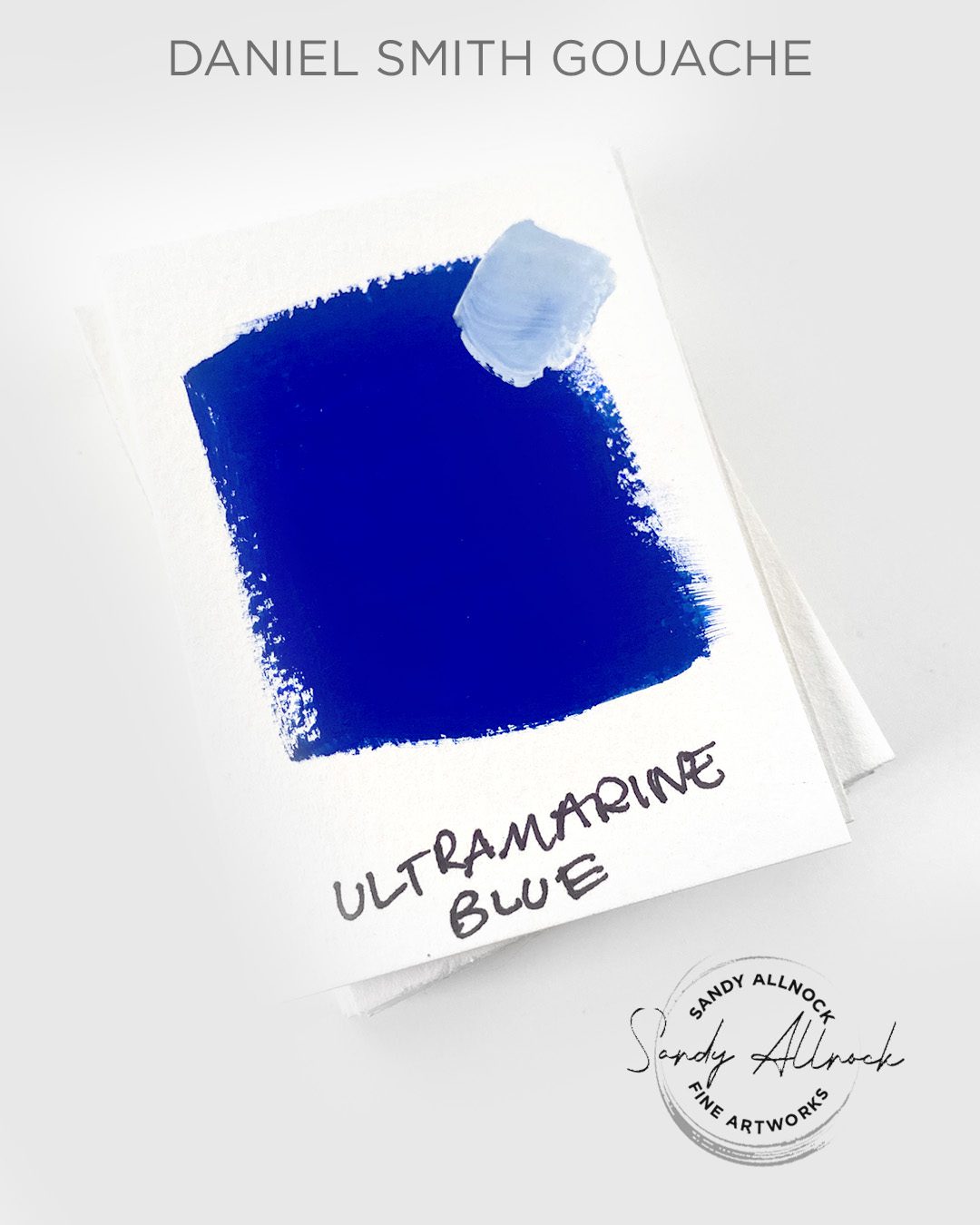
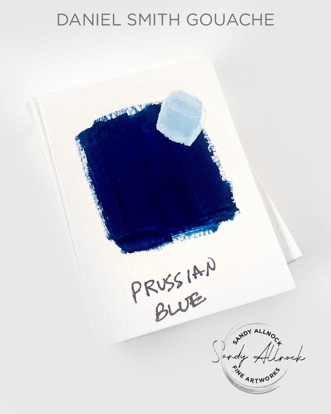
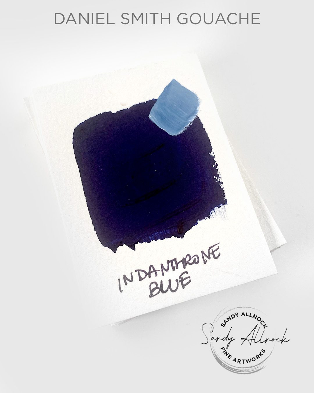
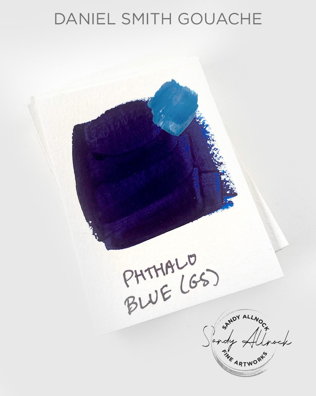
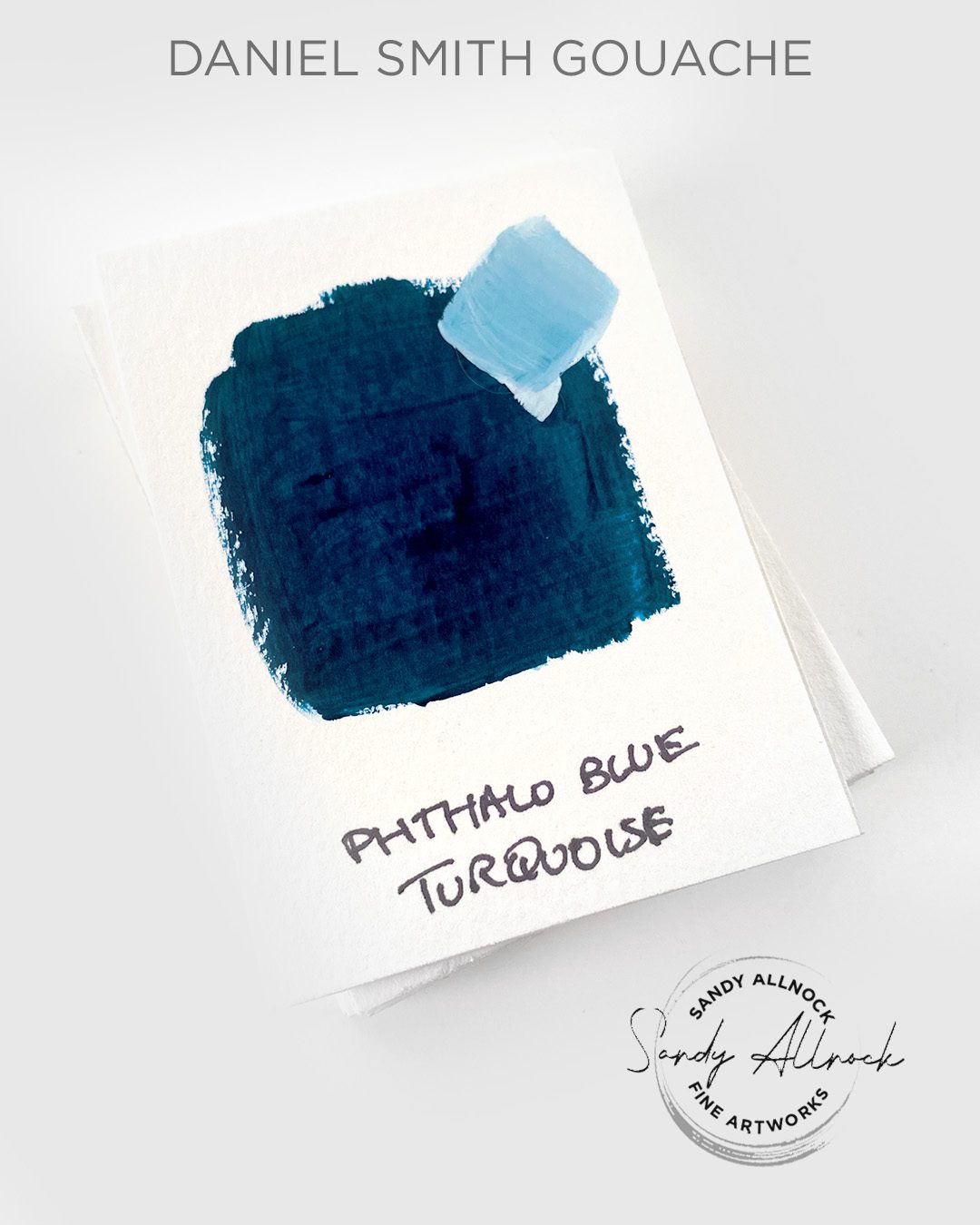
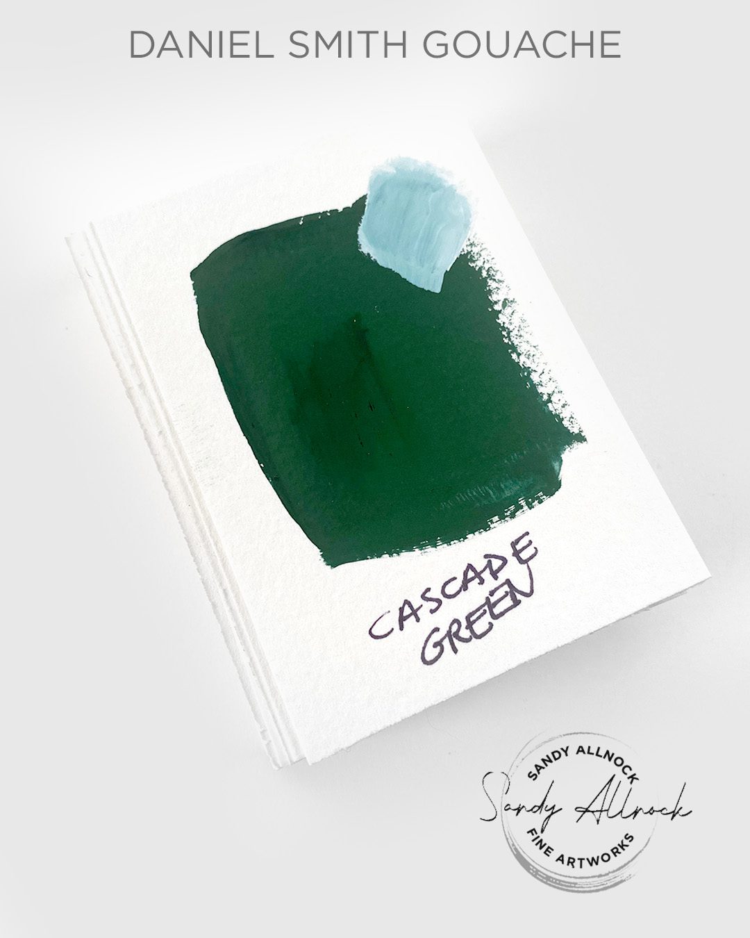
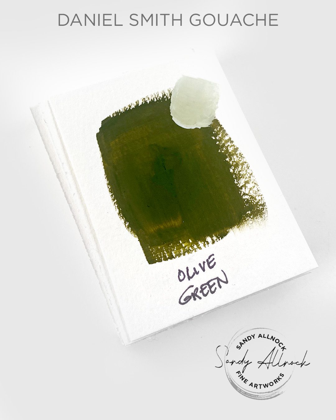
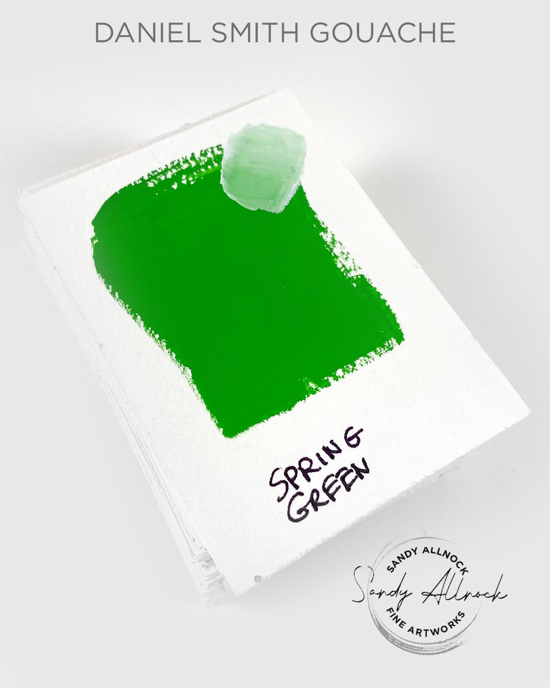
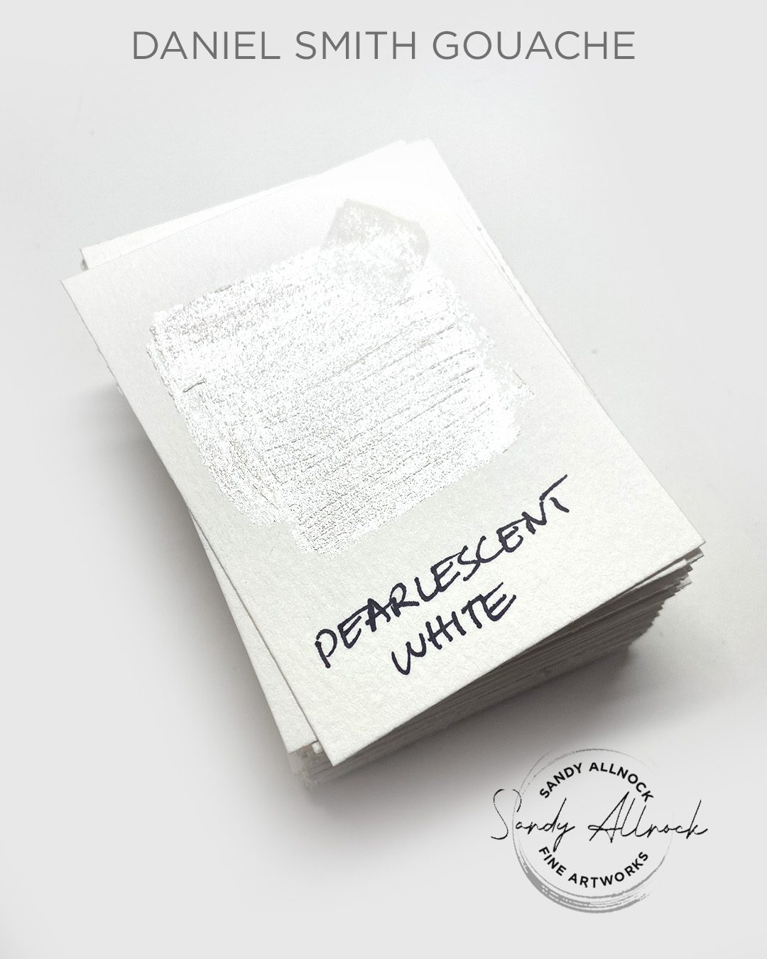
74 Colors of Daniel Smith Gouache

74 Colors of Daniel Smith Gouache

When the good folks at Daniel Smith sent me their first 22 colors of gouache, that package was met with an “Oh no, another medium, I don’t need to get into another medium!”

Granted, I was grateful! Being an Ambassador is a blessing, getting some free product is awesome. But I went into gouache quite resistantly. But found that I actually love it.

I’m in an oil painting school where I’m using their techniques for gouache, and learning a ton! I’m filling sketchbooks. Selling some of my paintings. I mean, it’s going well!

And then a HUGE box arrived before Christmas last year. I left it unopened under my tree, and even stuck a bow on it—my family had decided to not exchange gifts, so this was going to be my Christmas present.

Receiving lovely goodie boxes like this is not something I take for granted. I am blessed!

But please also know that if Daniel Smith made terrible products, I would NOT be promoting the company. I’m just not that person. There are even some colors (I’m looking at you Quin Magenta) whose gouache versions are, to say the least, a challenge to paint with. And some watercolors are hues make me go hmm. I don’t gush over everything like some ‘influencers’ do in order to get you to buy something. (As a matter of fact, I’m not sure you NEED the gouache colors I’m sharing here. I don’t even know what *I* like  yet!)

I’d be using DS paints whether I was an Ambassador or not. It doesn’t mean there aren’t decent companies who make decent paints! I just find Daniel Smith supplies to be oh so consistent in their quality.

And with that…let’s get on to looking at the 52 new gouache colors to add to the 22 originals!

The tutorial

I’ll show how I swatched these, tested a few, and go through them; I’d say the colors are perhaps more accurate in the video then some of the photos below – it was soooo hard to get them at the right intensity and value in photos.

Watch the video below and scroll to the end to leave comments or questions — or click HERE to watch it on YouTube and leave comments over there. I read both dutifully!

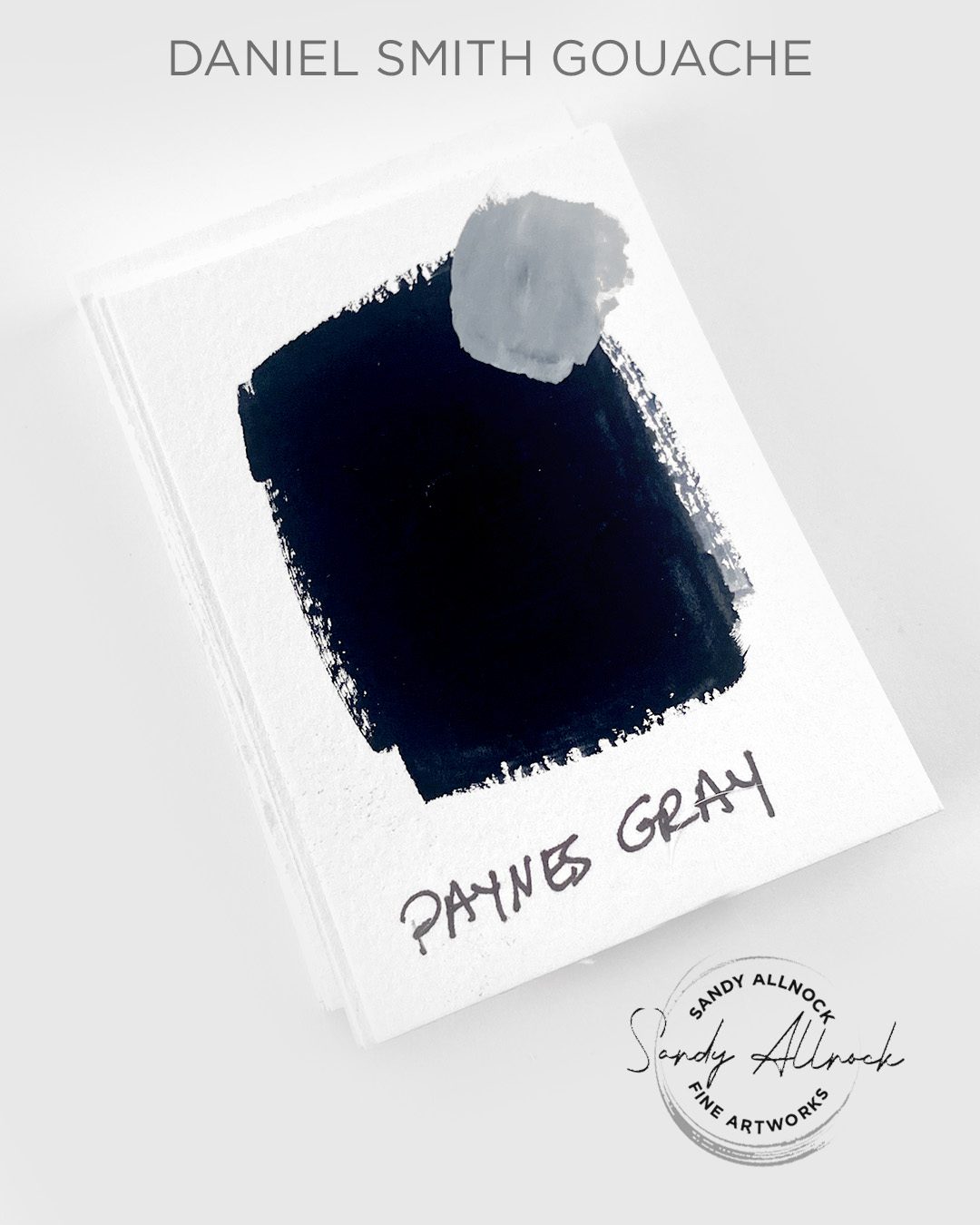
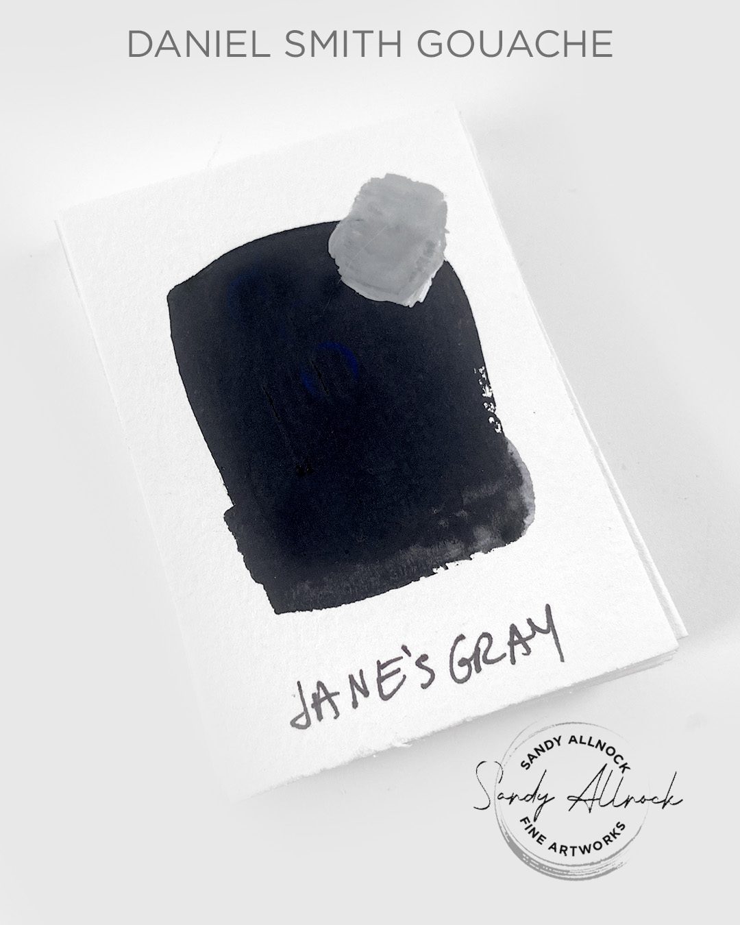
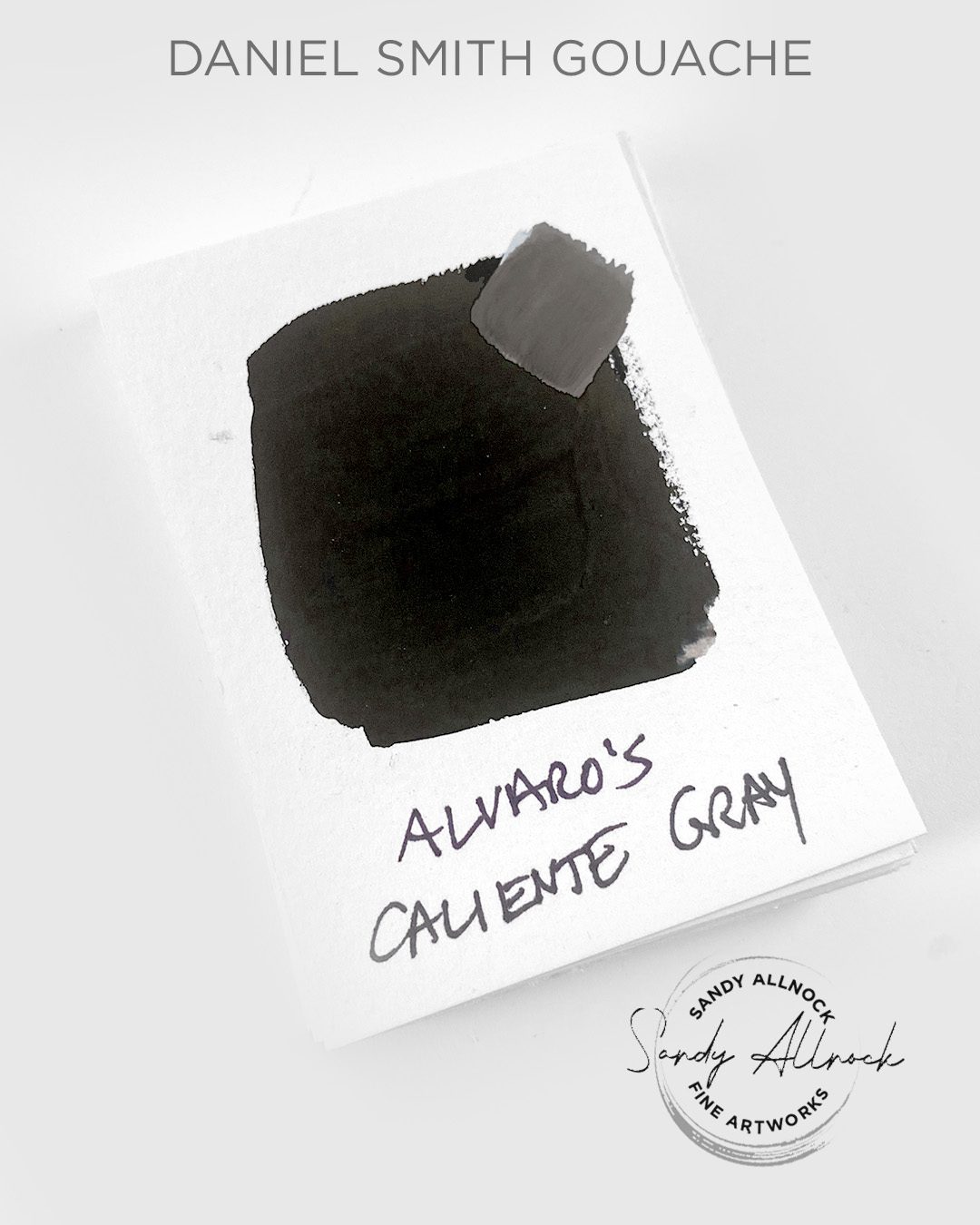
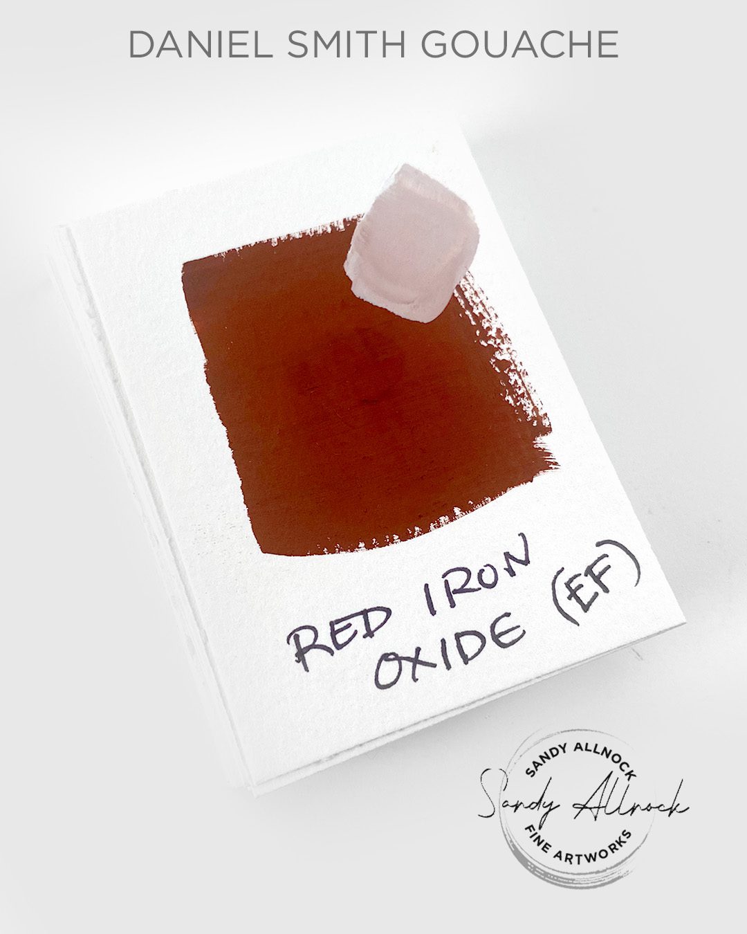
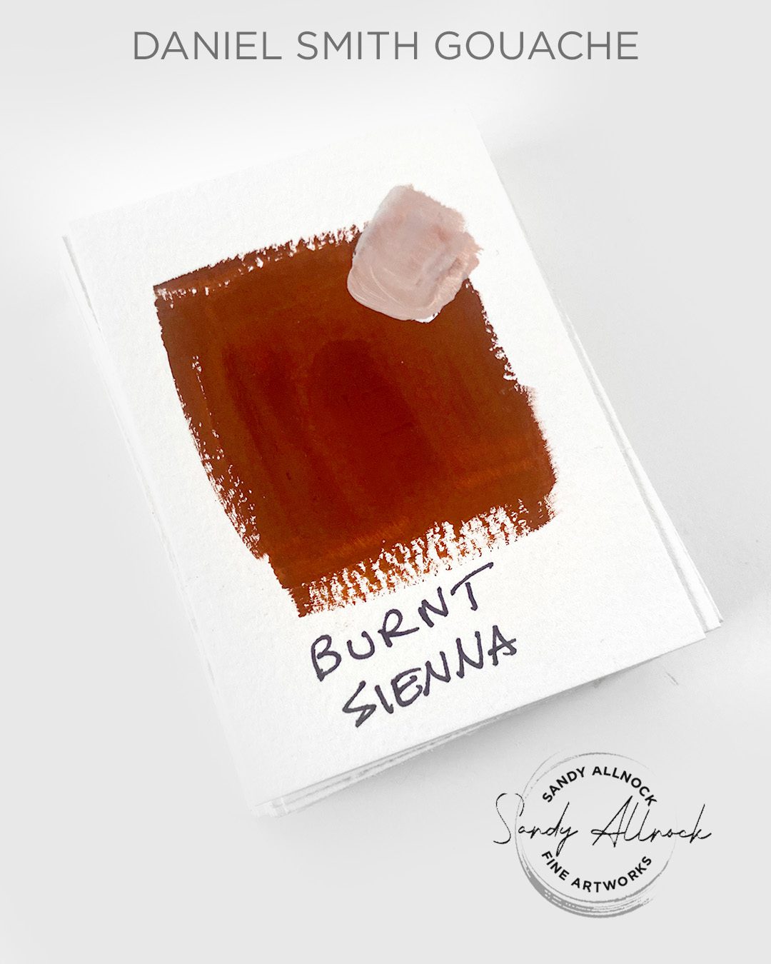
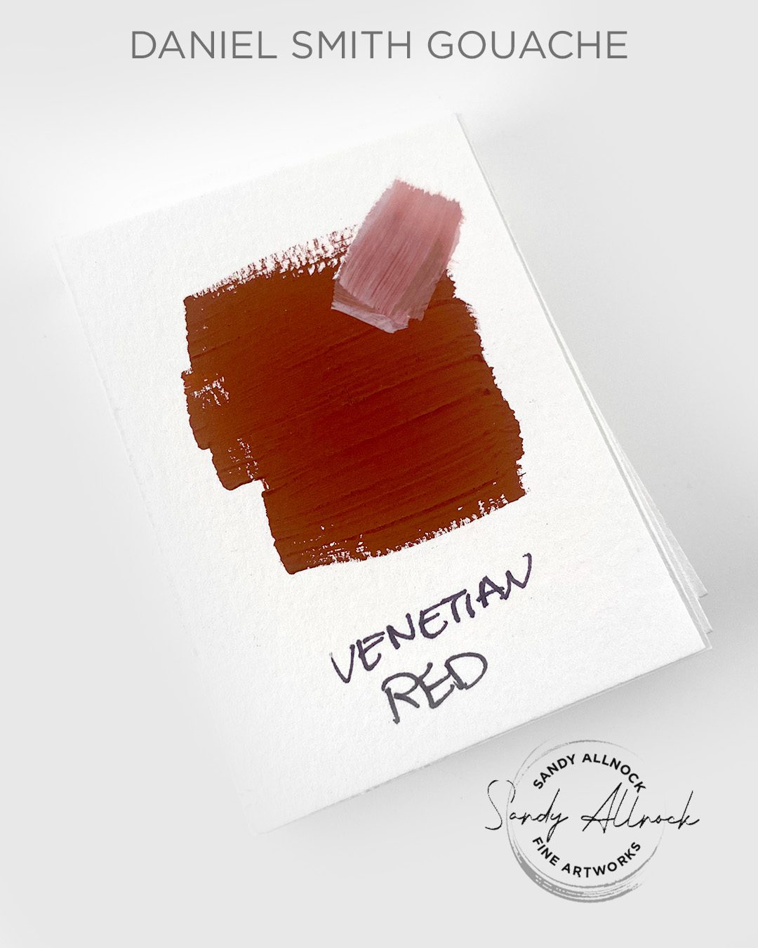
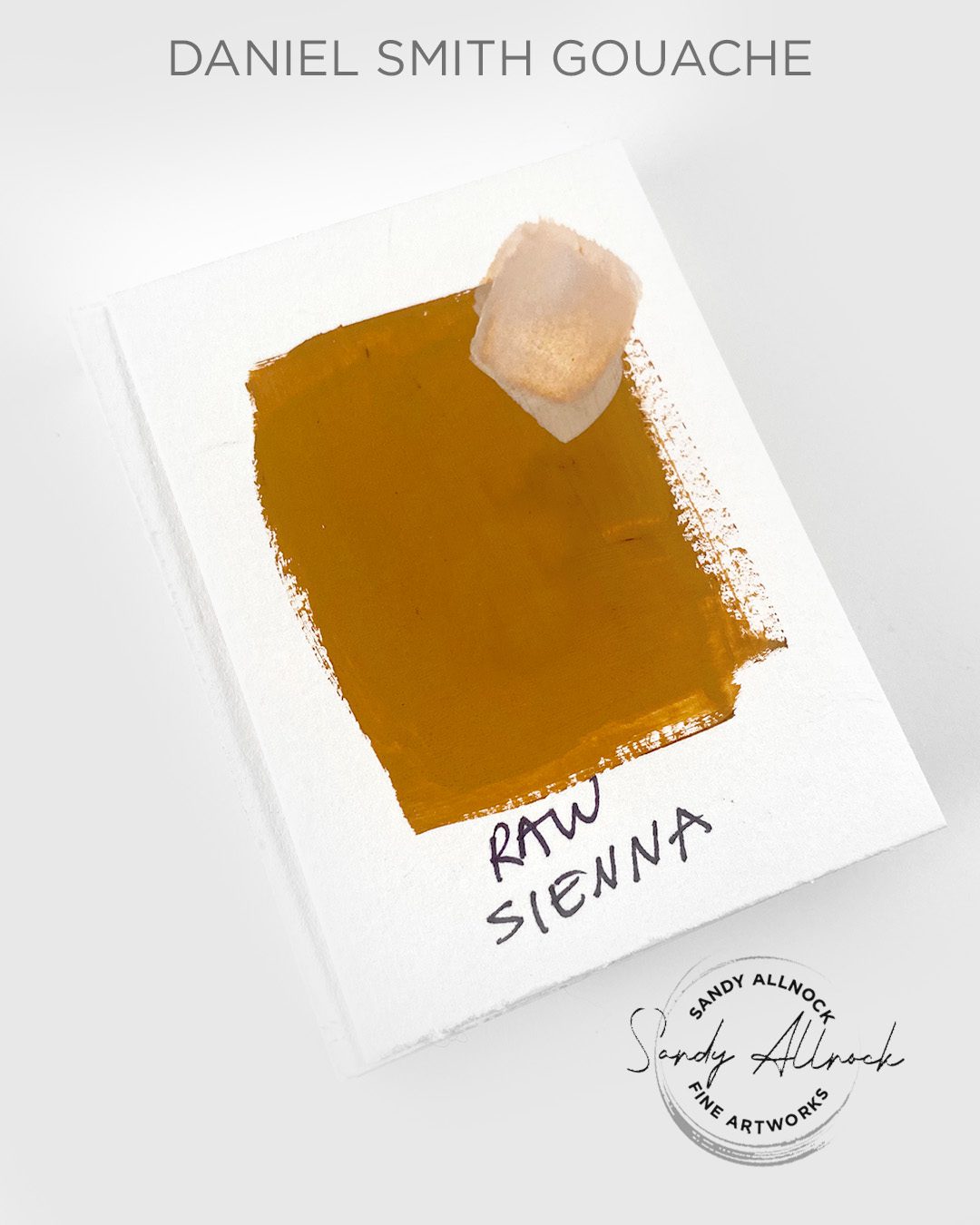
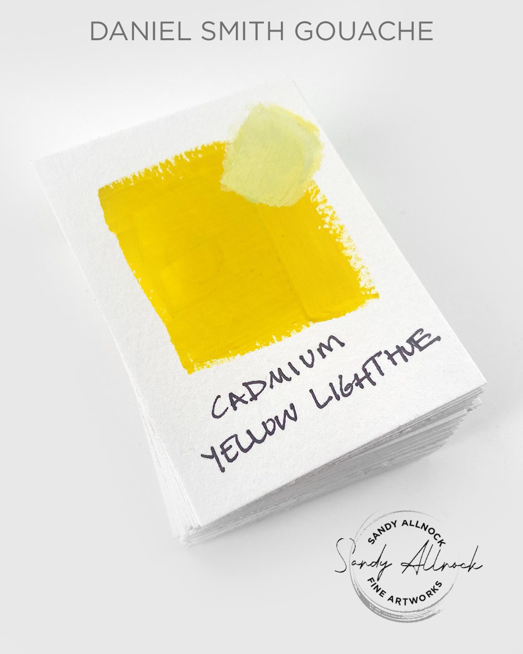
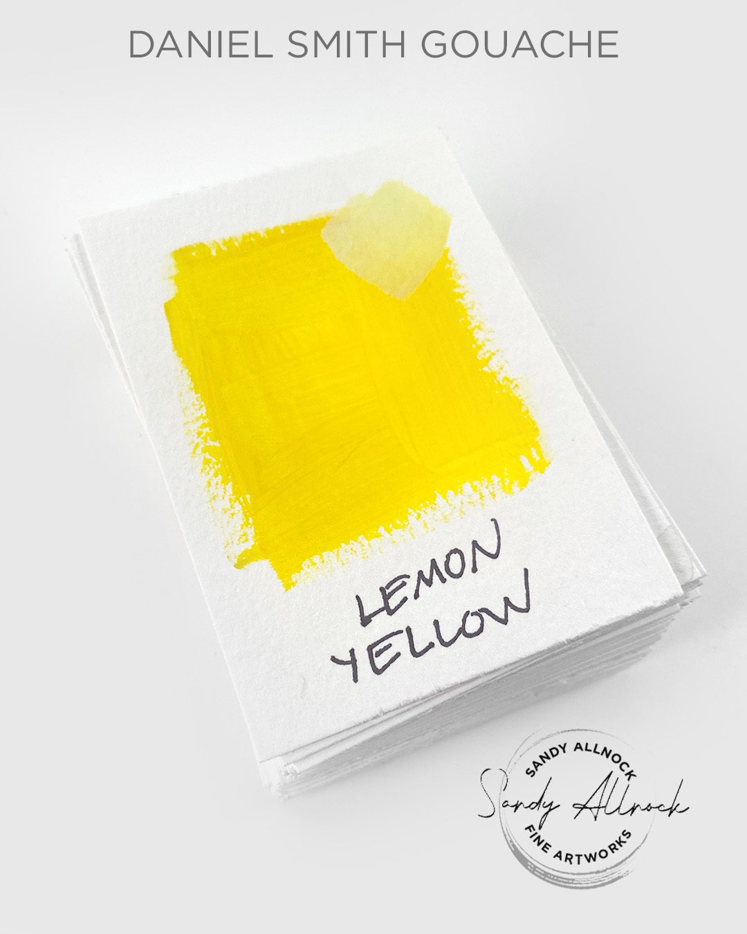
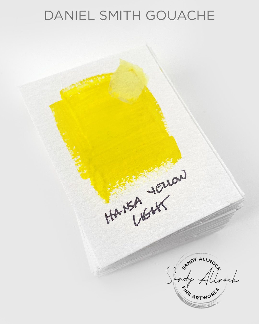
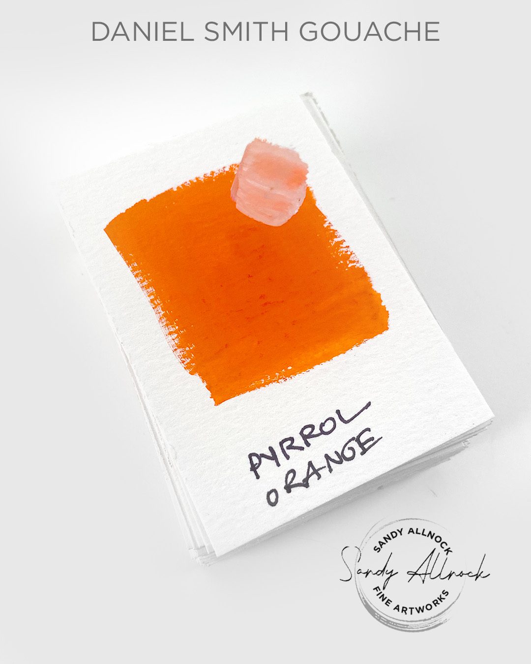
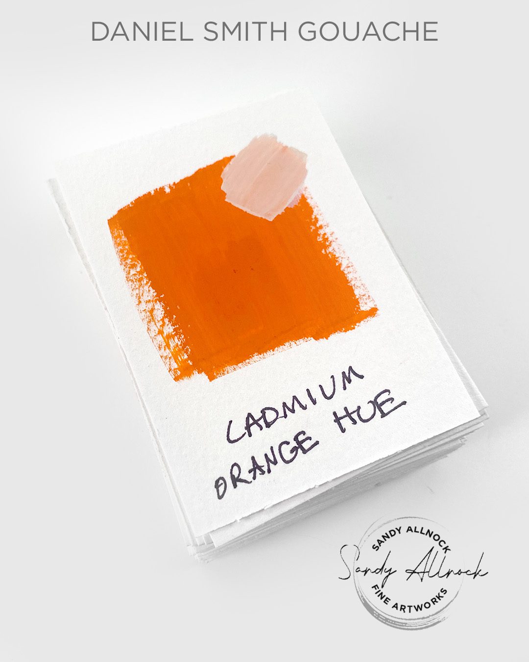
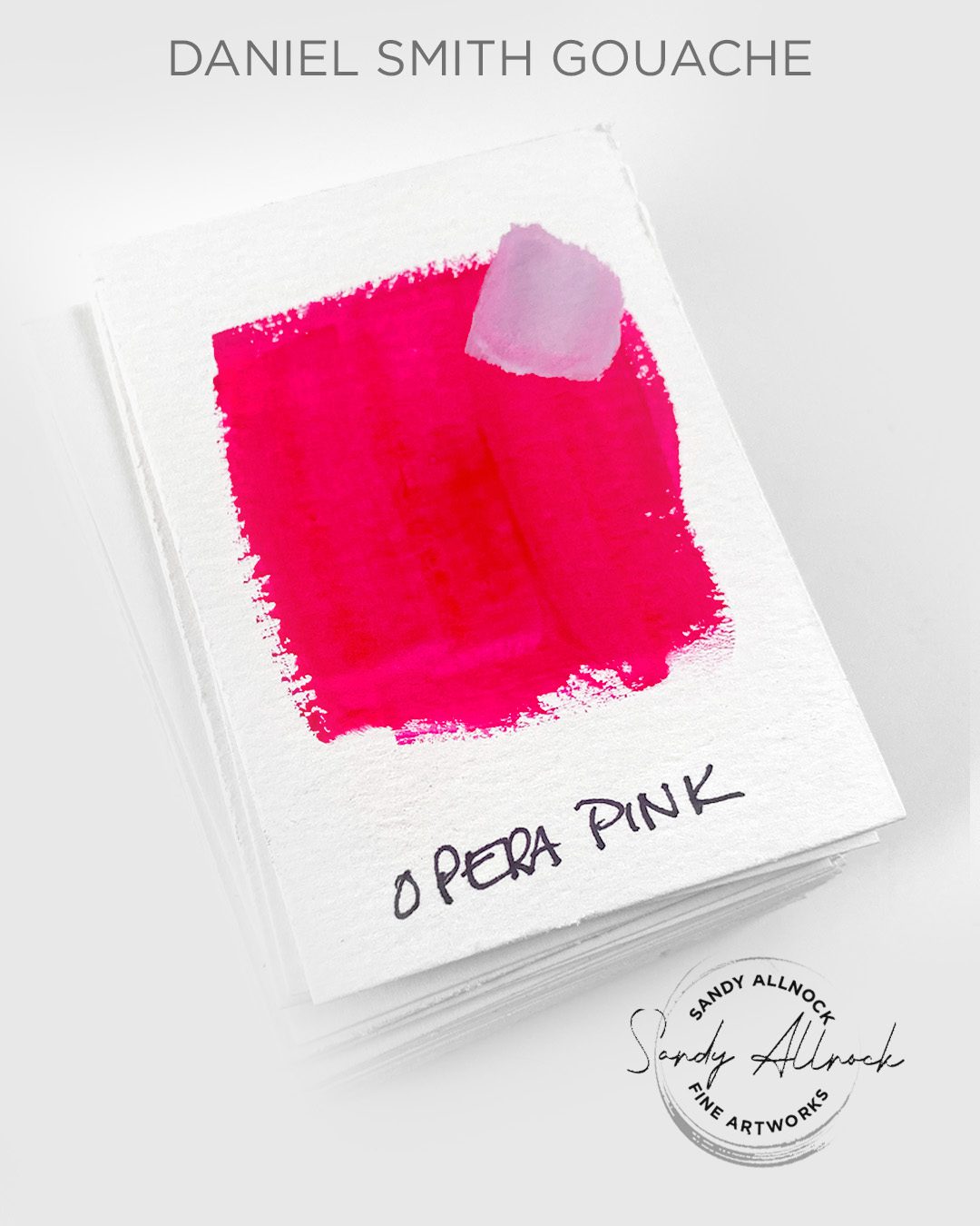
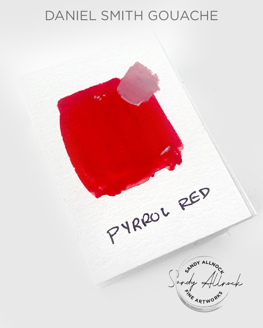
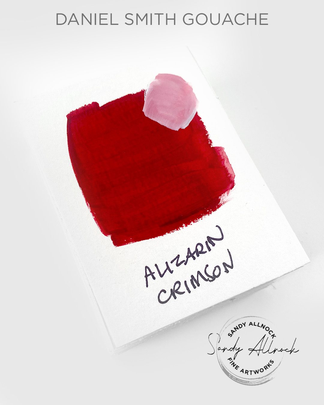
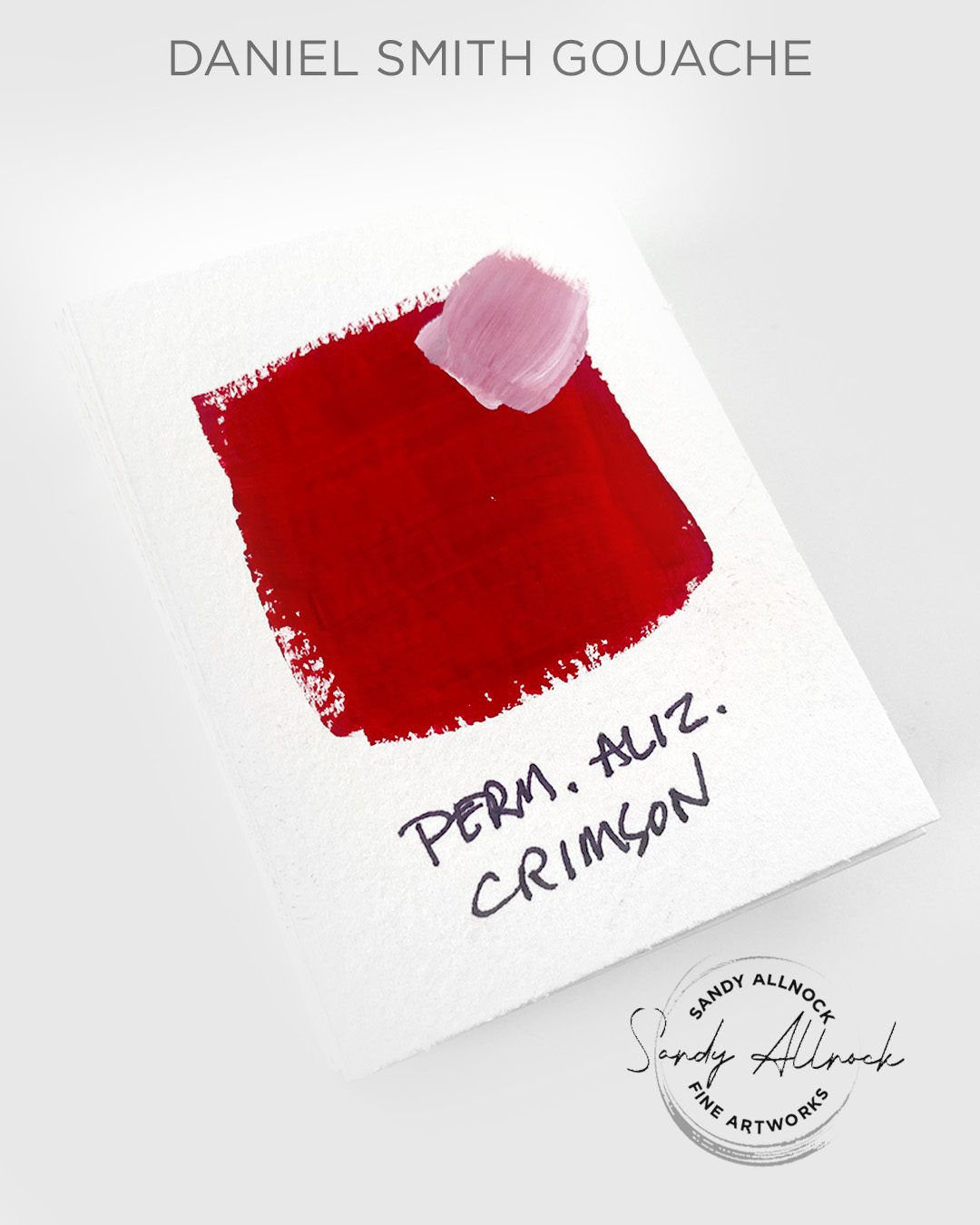
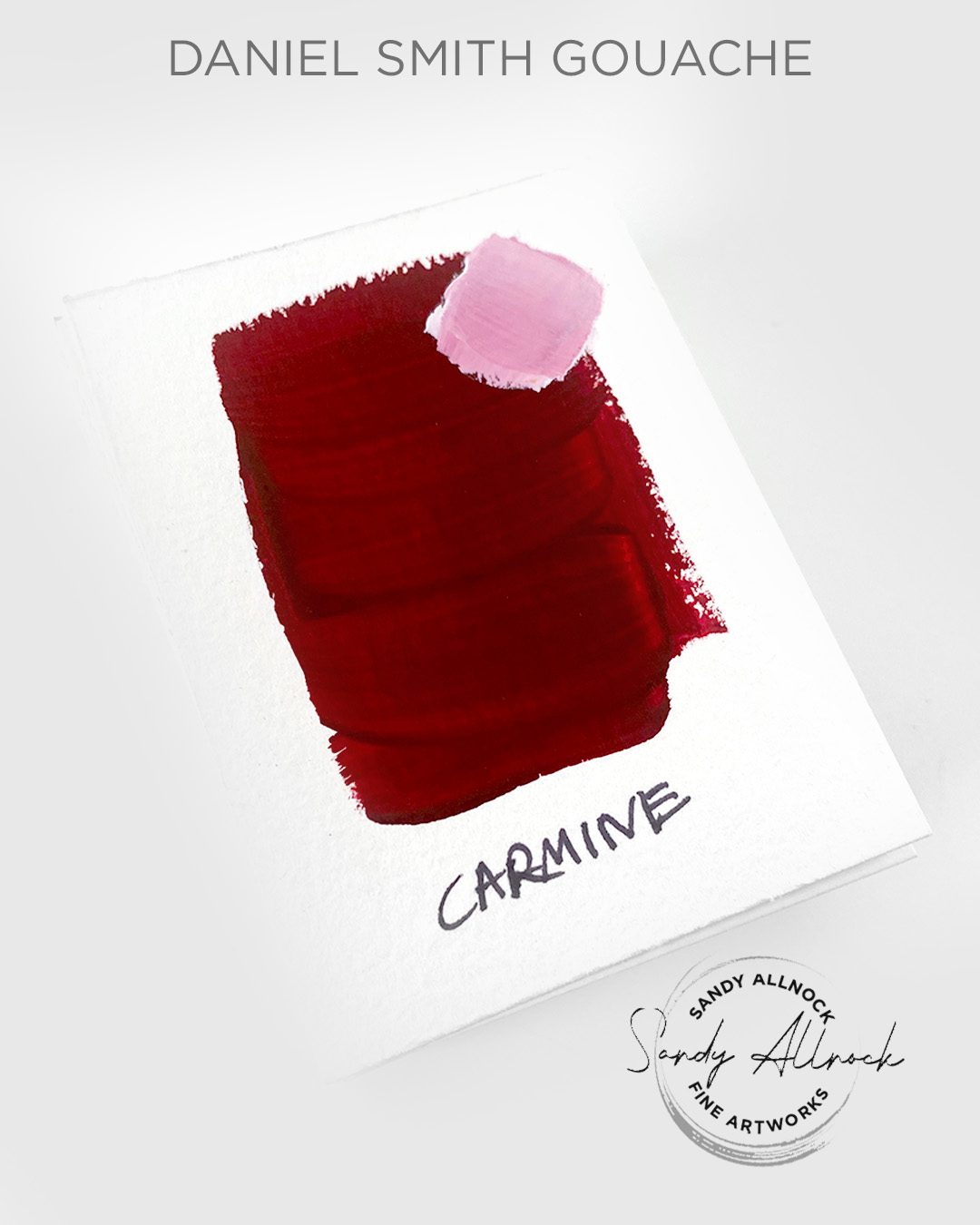
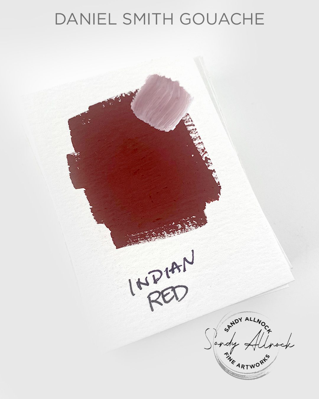
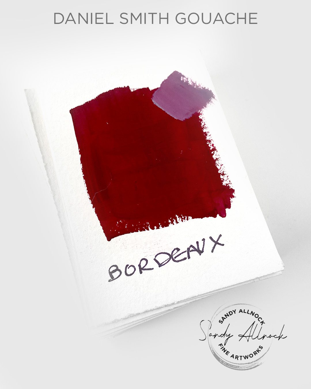
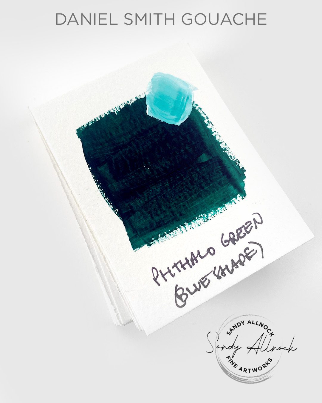
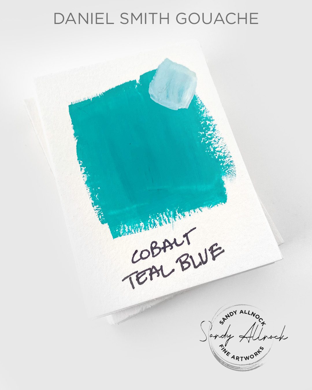
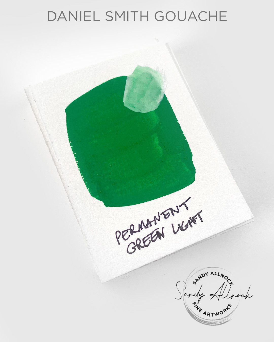
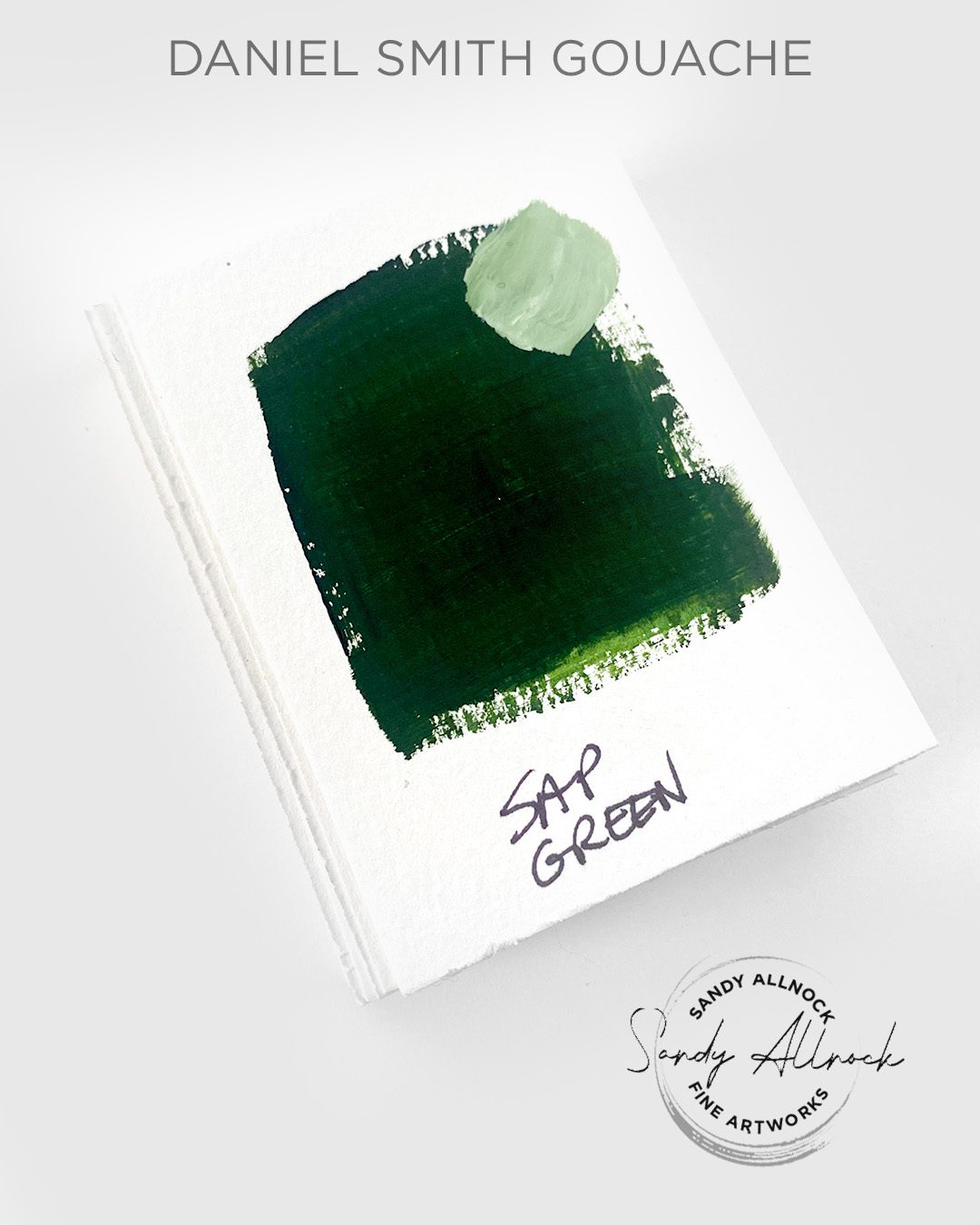
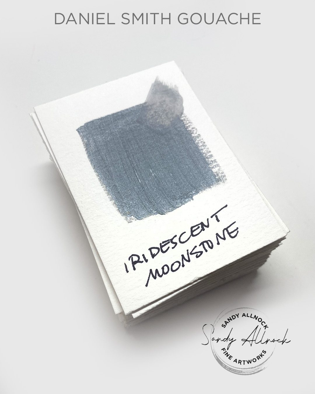
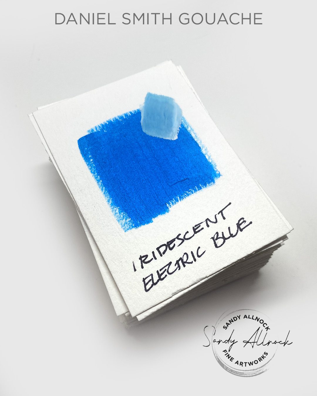
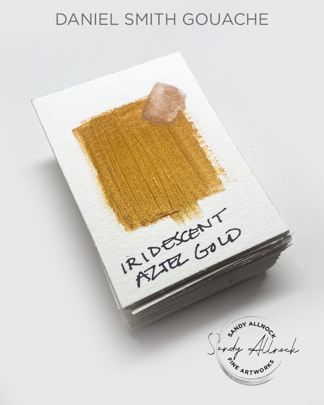
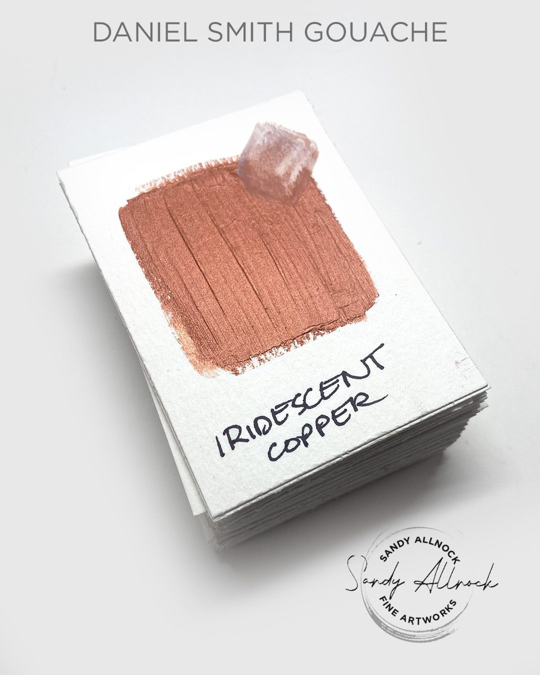
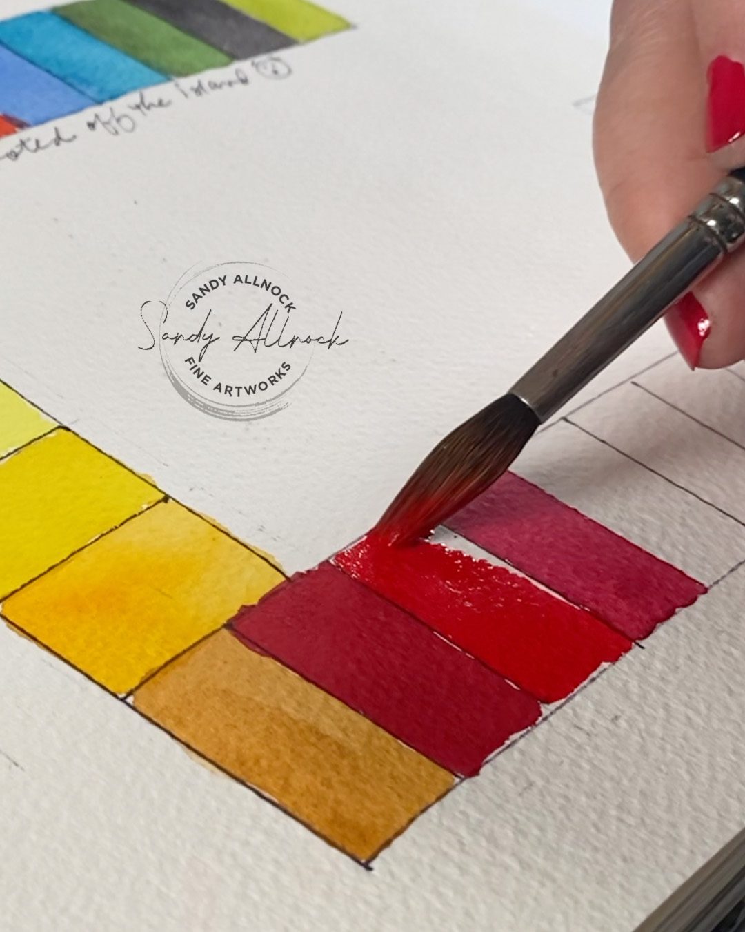
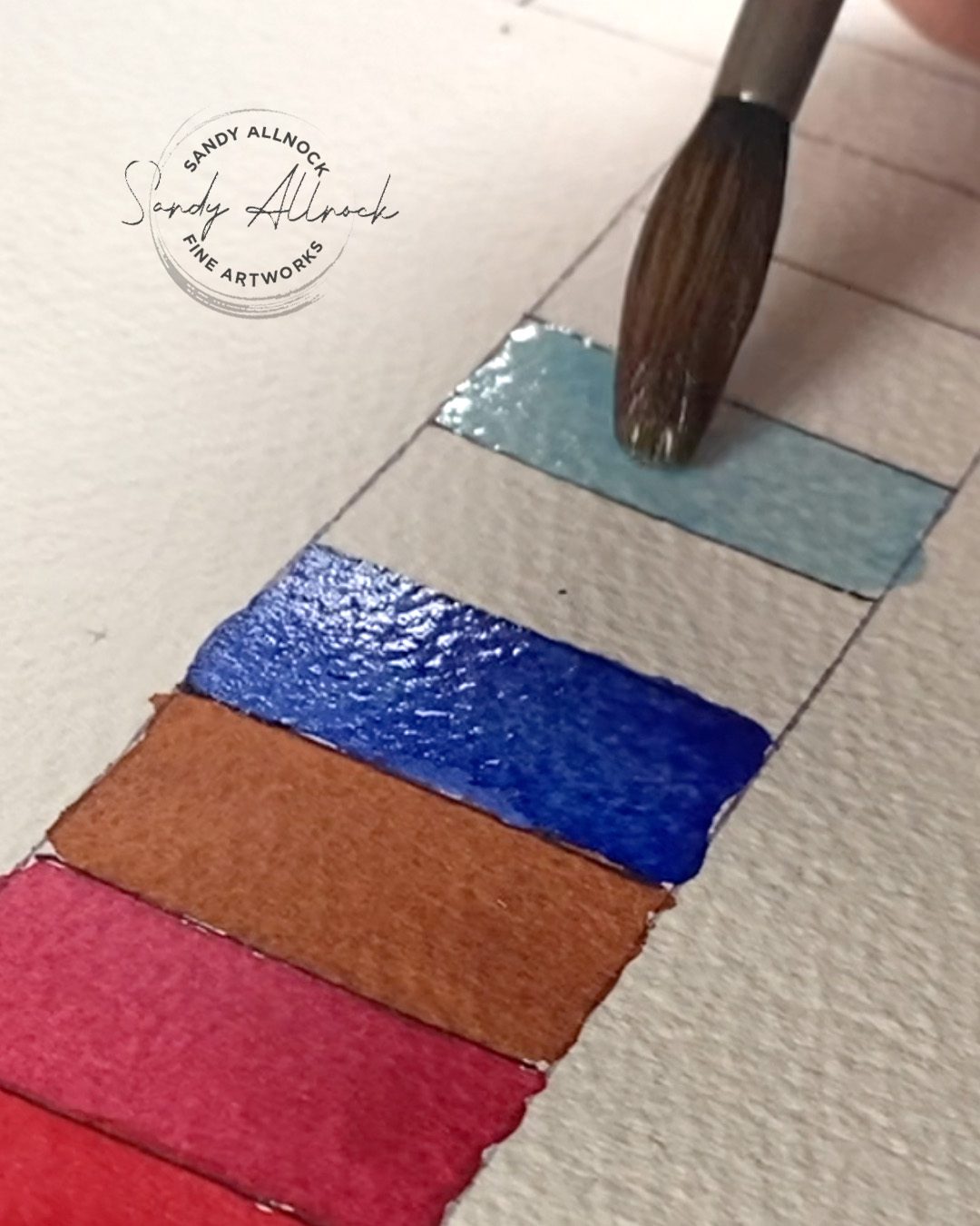
Swatches of 74 Daniel Smith Gouache colors!

Oh my goodness was this biting off more than I could chew….I did attempt to color correct as best I could, but please remember you see things through your own monitor’s calibration, which has gone through the internet as well as my monitor’s calibratoin. And some colors just get trashed when sent into RGB mode! But it’s better than nothing, right? 🙂
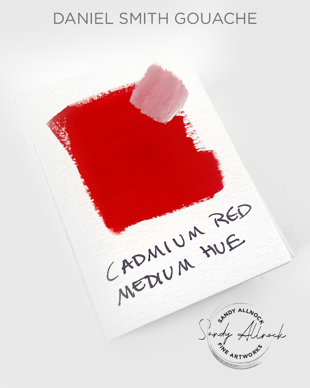
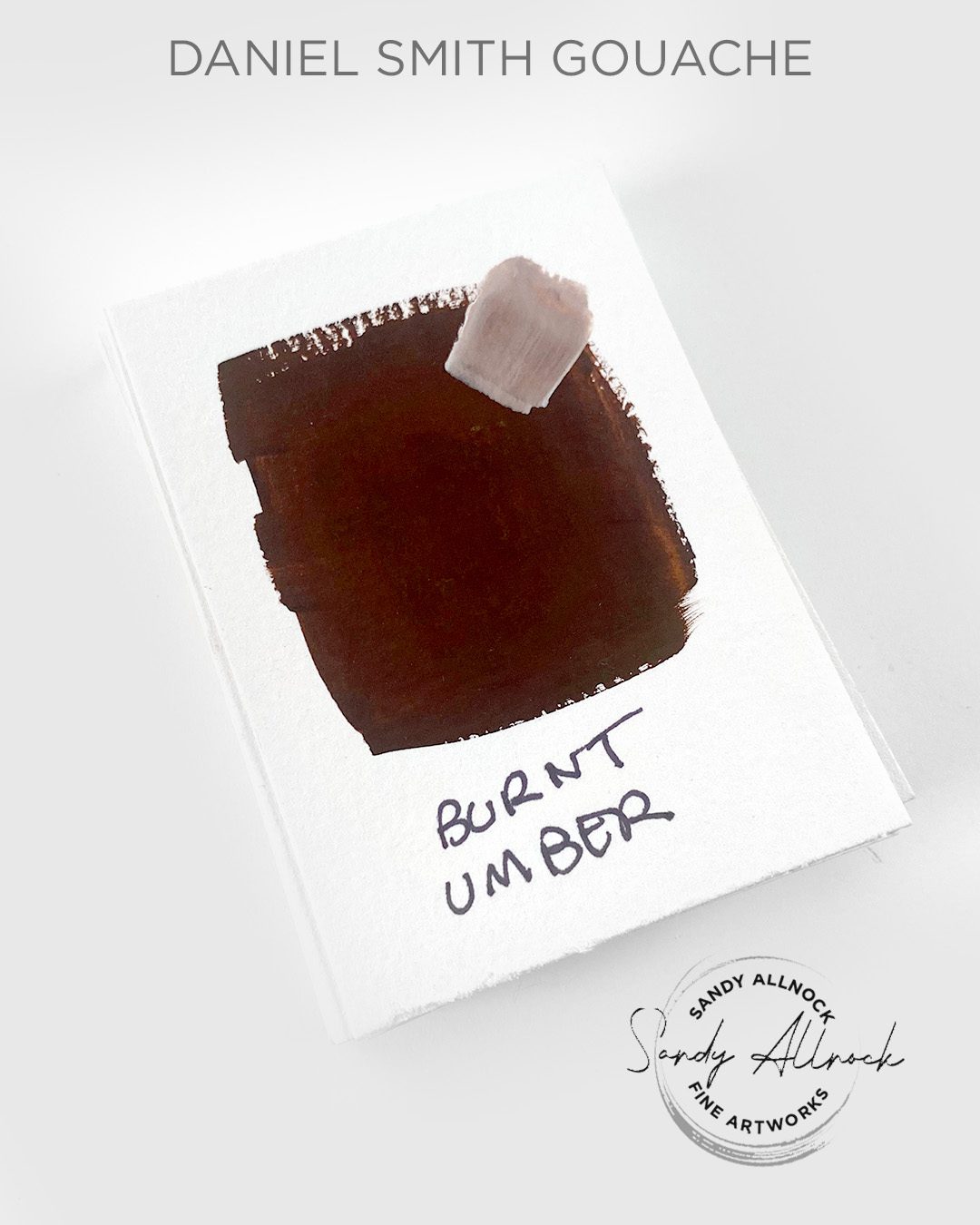
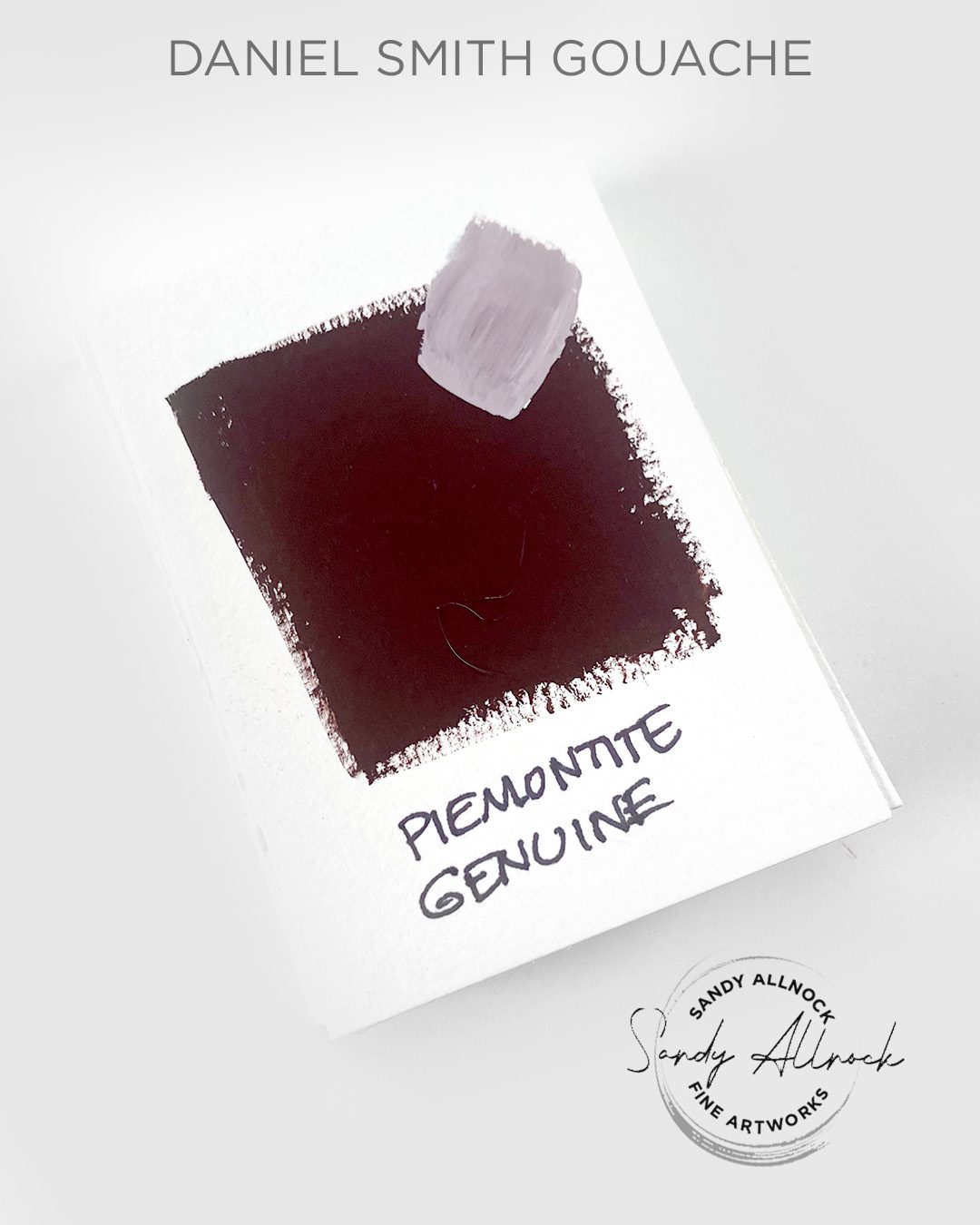
These are grouped by color. Ish. (Some straddle groups or can belong in more than one) Tap on any photo to go snag a tube if you need one….or do a search for the color name you’re looking for in the alphabetical text list below in this post.

Testing sketch: Poppy

Colors for the flower are Cad Medium Orange Hue, Red Medium Orange Hue, Carmine, plus Titanium White. Center is Moonglow plus Titanium White

Testing sketch: Teapot

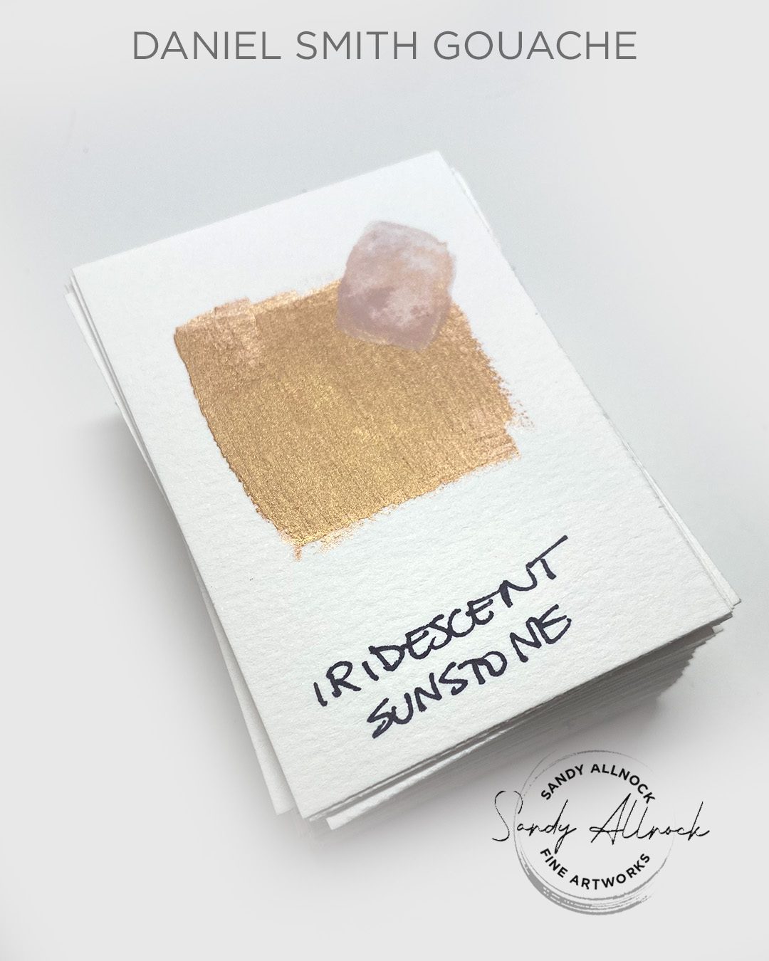
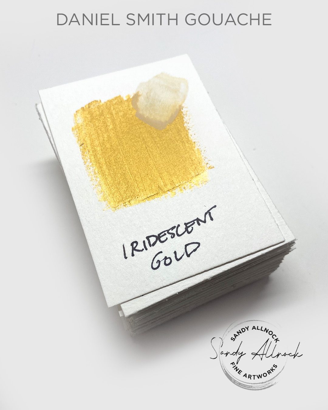
Colors for the teapot: Iridescent Gold, Iridescent Aztec Gold, Iridescent Copper, Van Dyck Brown. Plus White.

Subscribe to my weekly newsletter, Creativity In Your Inbox

* indicates required

Testing sketch: Horse

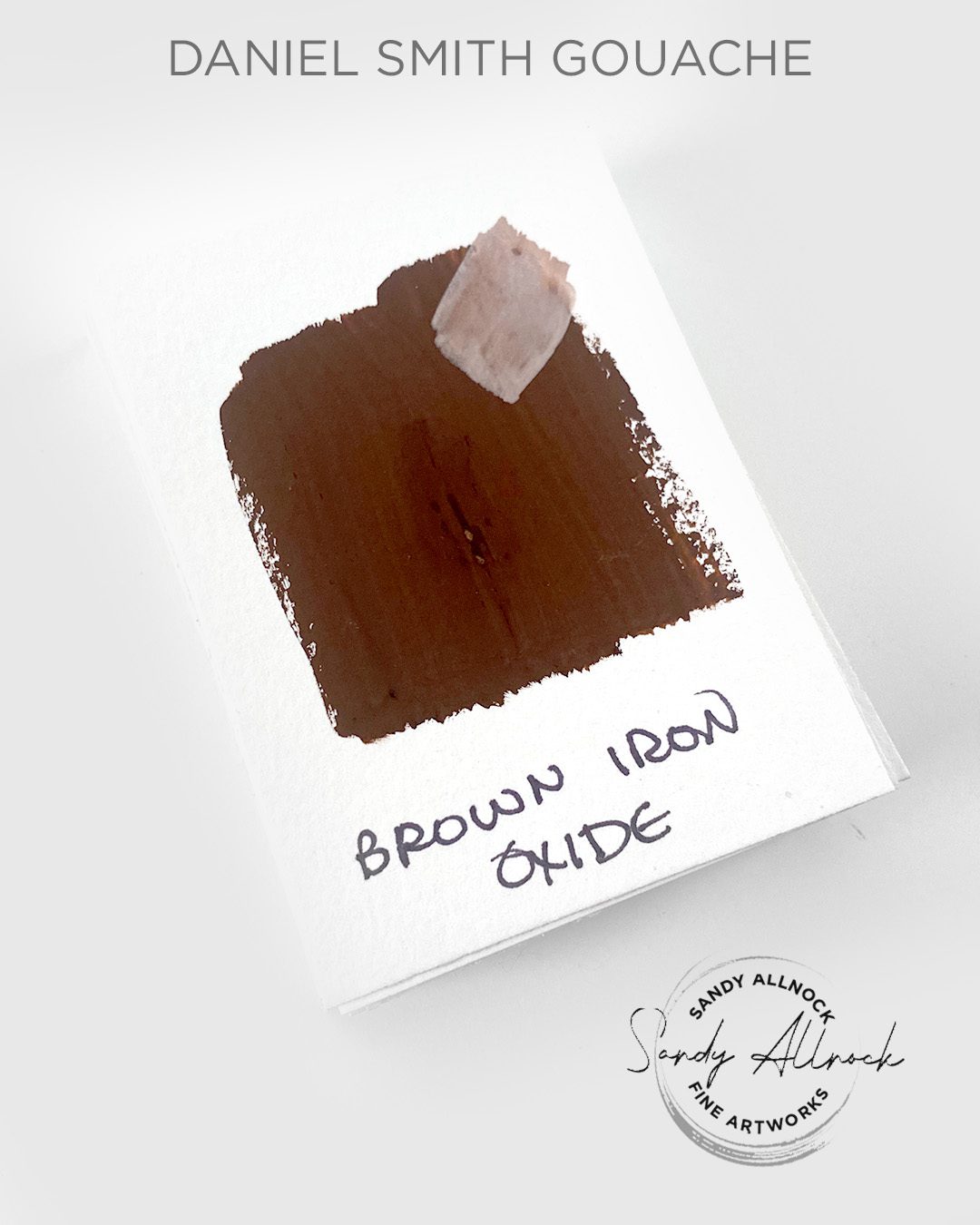
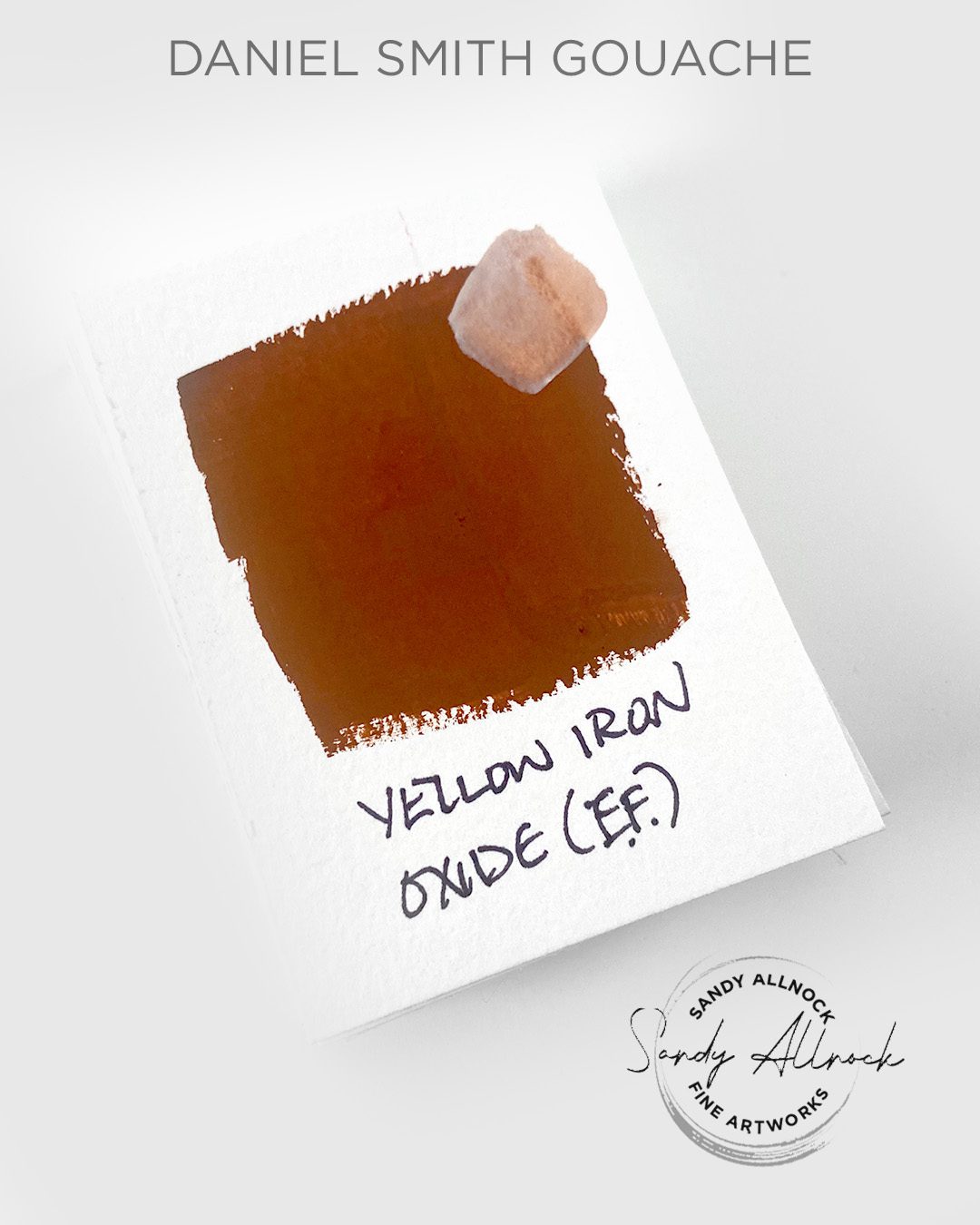
Colors for the horse are Raw Umber, Yellow Iron Oxide, Brown Iron Oxide, and Raw Umber. Mane is Titanium White and Buff Titanium with a tiny bit of the other colors.

Testing sketch: Fruit

Colors are Lemon Yellow, Indian Yellow, Phthalo Blue Green Shade, Titanium White.

Alphabetical list of the colors

Daniel Smith Gouache colors (all)


These colors were provided by Daniel Smith for my review and use. Compensated affiliate links are here at no cost to you. I appreciate your support of my work with your purchases! Full affiliate and product disclosure | My trusted partners in art

WINNER!

Congratulations to Phyllis Wendt for winning the giveaway of my colored stamped page! Email me with your address and I’ll drop it in the mail to you!

Your color suggestions?

Are there colors here that intrigued you but they look too close to something else? Side by sides you want to see? A pairing you want to see mixed? Let me know, I’ll be doing some painting coming up and would love to know what YOU want to know!

Why YOU need a curated watercolor palette…and my scary overhaul!

Why YOU need a curated watercolor palette…and my scary overhaul!

What’s a curated palette? It might sound like something an art dealer would come up with, right? Nope. It’s YOUR palette. YOUR group of colors. It’s what helps define YOUR voice as an artist.

And you know what? That can change from time to time. Mine just did, and I want to share the excitement and the terror with you!

Tutorial

Watch the video below and scroll to the end to leave comments or questions — or click HERE to watch it on YouTube and leave comments over there. I read both dutifully!

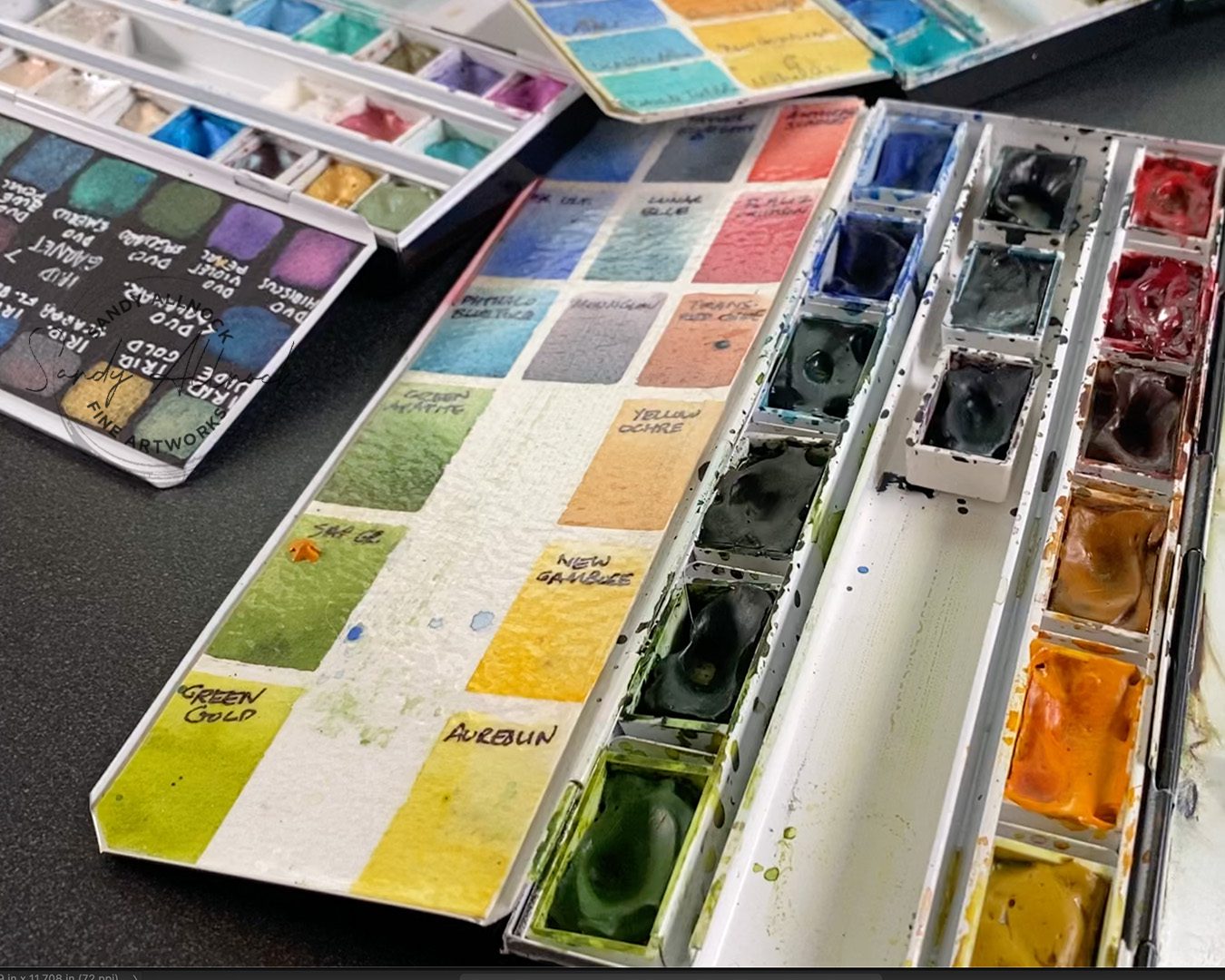
Meet the 8 new colors

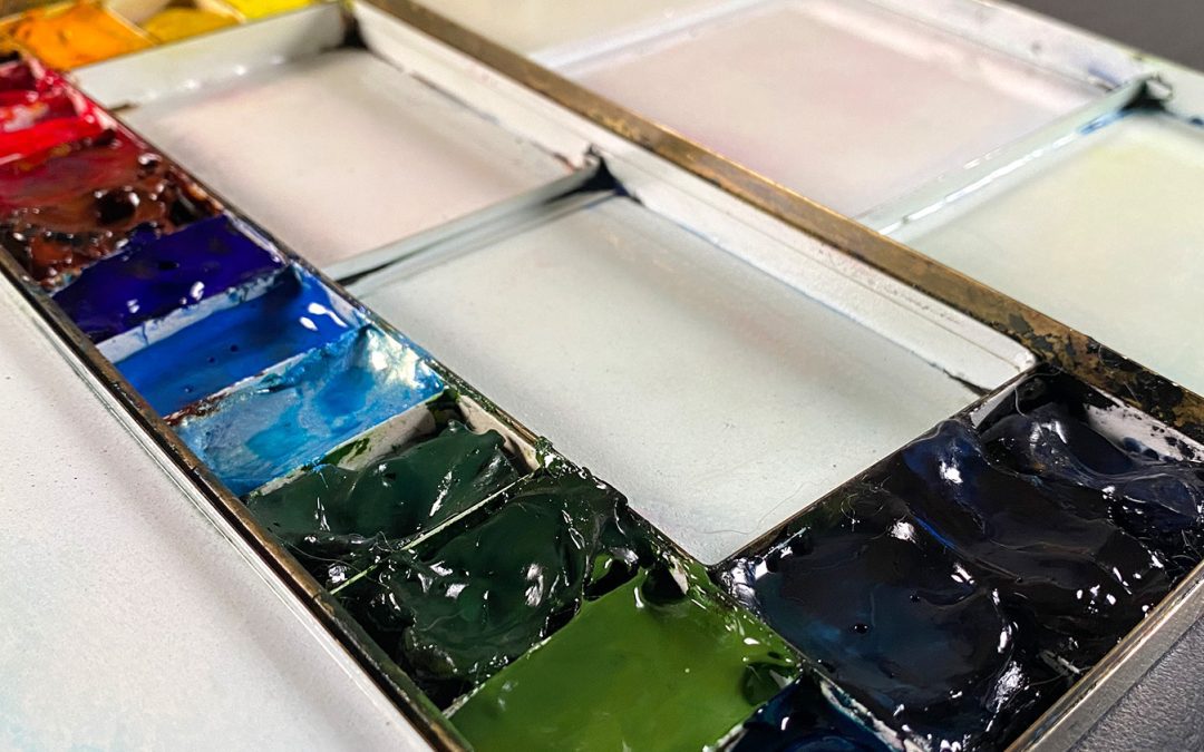
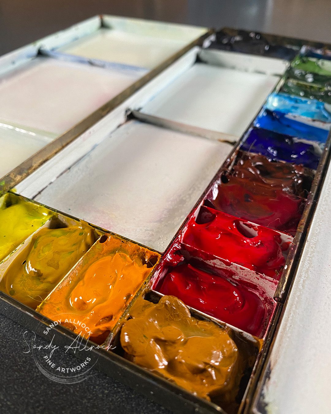
I’d like to introduce you to the new colors that have entered the scene – and say a fond and loving farewell to those who served me well but needed a period of retirement. I reserve the right to bring some back if I miss them!


Yellow changes

Aureolin sadly got the boot to make room for a yellow that bursts; if you’ve been watching me for a while, you know I love me some Nickel Azo and the way it breaks into its own song and dance when it meets wet pigment! But I have never liked the actual color of it by itself. 

I found a good substitute though, after testing out all the yellows I could find and seeing who played nice like NA. And it’s Indian Yellow! It’s got not only the playfulness but a nicer base color, and the ability to have a gentle value range too.

Remaining in the collection: Hansa Yellow Light, New Gamboge, Yellow Ochre.


Red changes

I’ve wrestled with reds for a while, even avoiding red subjects sometimes because of my dissatisfaction with how Anthraquinoid Scarlet sometimes dries. It’s not reliable for a strong red. So byebye to that as well as Permanent Alizarin Crimson, which I just don’t seem to use much at all.

Hellooooooo to new friends Pyrrol Crimson and Permanent Red Deep! Both are more staining, but are also more intense when painted, so I’m excited to try some of those red roses I’d avoided for a long time.

Remaining in the palette: Quinacridone Rose. And since Transparent Red Oxide is renting space in the reds, it stays too.

Subscribe to my weekly newsletter, Creativity In Your Inbox

* indicates required

Blue changes

Massive overhaul here! Going away are Cobalt Blue and Phthalo Blue Turquoise; yes I had a limited blue selection but that’s now changing!

Welcomed to the palette: French Ultramarine, which I’ve wanted to swap in for some time now, since SO many artists swear by it for mixing neutrals. I want to see what the fuss is all about because I’ve been doing that successfully with Cobalt for years.  French Ultramarine does have a bigger value range too, so I’ll be playing with that.

Also welcomed: Duochrome Cabo Blue. A duochrome has some shimmeryshiny properties which is nice, but also the ability to burst like Indian Yellow and Nickel Azo, so watch for playtime there.


And some fun: Verditer Blue was a class requirement some years back and while it was nice I just never paid attention to that tube. Which has now changed, because OH how perfect is this blue?

Turquoise change

I mentioned Phthalo Blue Turquoise making an exit….it’s described as perfect for oceans but I never found it to have quite a greenish turquoise feel to it. Pretty and intense, but too staining and too blue.

Meet Ultramarine Turquoise! This color has a wide value range, which can get overwhelming if overdone, but oh I love it for a soft wash.


Green change

Two exits: Green Gold is easily mixed with a yellow, and while I liked having it handy, I decided to vacate it to make room for the bonus Verditer blue. And I’ve noticed I haven’t used Green Apatite in quite some time so it was voted off the island.

Incoming in greens is Chromium Green Oxide, which I promise to regularly misname Chromium Oxide Green or other combinations of the three, ha! But I’m interested in what I’ll do with an opaque green, and playing with how it mixes with other colors too. I love the non-screamy and natural tone it brings to a painting.

Sticking around: Cascade Green and Sap Green.


Last but never least, my heroes

In the last section of my palette are my most and least used colors but all must stay until something else begs its way in. Payne’s Blue Gray is likely my most-used color! I use it to deepen colors; even if darkening with complements, a dash of PBG is often just what I need. A friend who was helping me with my paint color choices in my house even noticed it; she looked at my collection of framed paintings and asked “What’s that color? It’s your signature hue!” And it was a PBG sky.

Lunar Blue and Moonglow are simply some of the most wonderful granulators. If I need some granulation within another color, I can drop a little of one of these in and get that texture. Plus both have a HUGE value range and can create a lovely painting all by themselves!

So what’s in your palette?

How many colors are in your curated palette? Or have you yet to try curating one? Let me know in a comment, as well as what questions you have about setting one up….I’d love to help!

Supplies

Some product may be provided by manufacturers for review and use. Compensated affiliate links are here at no cost to you. I appreciate your support of my work with your purchases! Full affiliate and product disclosure | My trusted partners in art

Subscribe to receive blog posts by email:

A small diversion: Valentines critters

A small diversion: Valentines critters

I’ve got a super quick post with a heads-up presale today! No major new tutorial video but there’s a short that might be of help:

CCC release: Anita Jeram’s latest

Amy and Adrienne sent me some of the new release to color up; there are more stamps in the release, I just didn’t have time! Later in this post are the stamp pics if you want to see what the sentiments are in the sets. And, of course, to see what it started out as before I did my implied-line coloring! Plus a bit about supplies—and a giveaway from them – and me!

Preorder sale, 4 days only

Colorado Craft Company is hosting a PREorder of the new Valentines right now. Here’s the deal:
Pre-sale for 4 days only. Shop from the release for those 4 days only until the stamps and dies are fully stocked in two-ish weeks. At the end of the four days the items will be removed from the website until they are in stock.
Pre-orders get free shipping (or international shipping of $12) — all 4 days. You’ll receive your order in 1-2 weeks.
If you wait until everything’s in stock in 2 weeks, you cover your own shipping. 

While you’re visiting my blog…

If you’re new to my blog – WELCOME! And if you’ve been away a while, GOOD TO SEE YOU AGAIN!

I have two quick things I want to invite you to do:

1. Join Artventure and check out the “Let’s draw together” initiative! Whether you like to draw, hate to draw, or just fear it — I hope to make it a way to join the community as we learn together.

2. Add yourself to the newsletter list below – I send out a Saturday newsletter with all the info about tutorials from the week, some flashbacks, sale info, BTS peeks and more.

Subscribe to my weekly newsletter, Creativity In Your Inbox

* indicates required

Stamps

Tap on any image to go straight to their shop!

The supplies

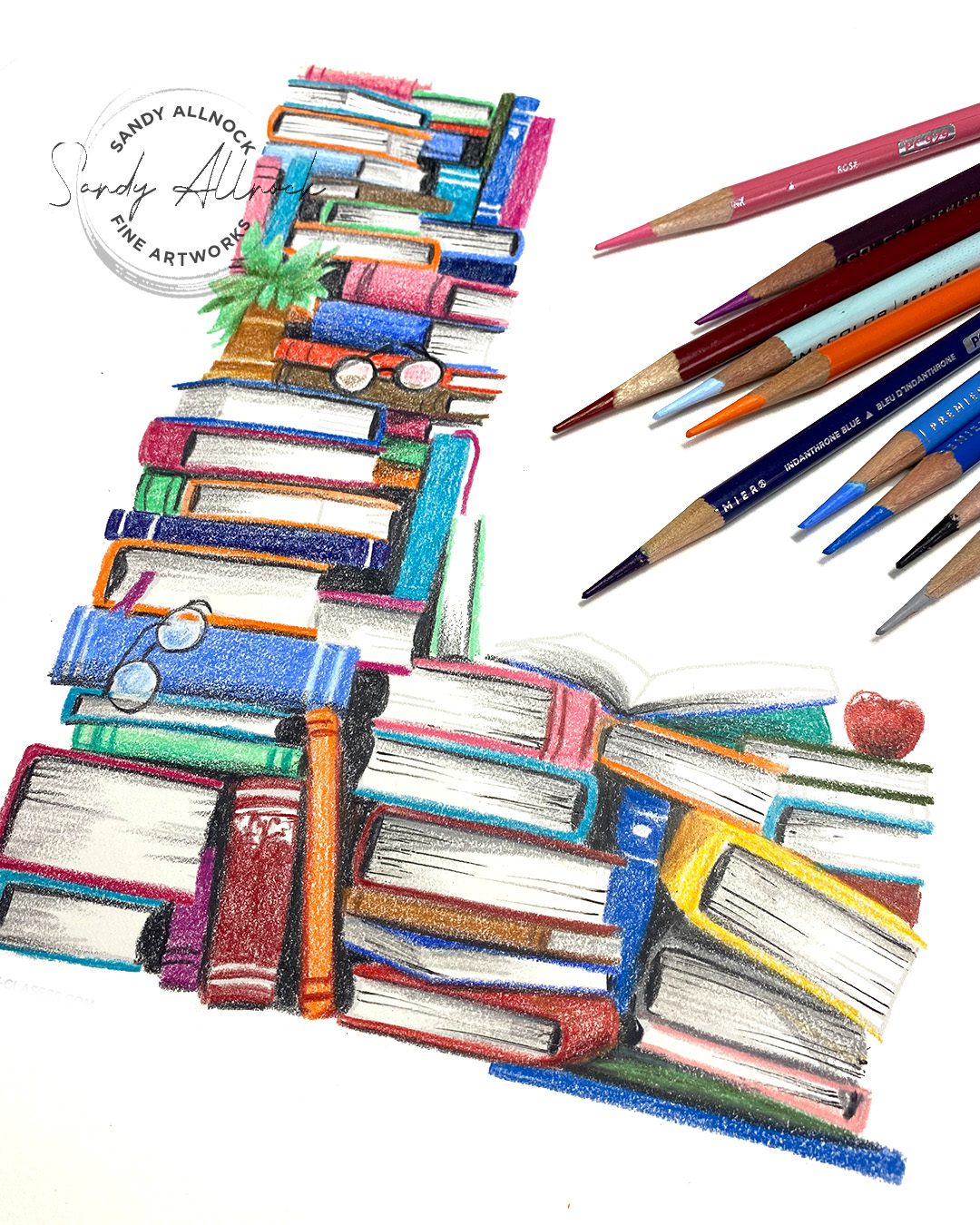
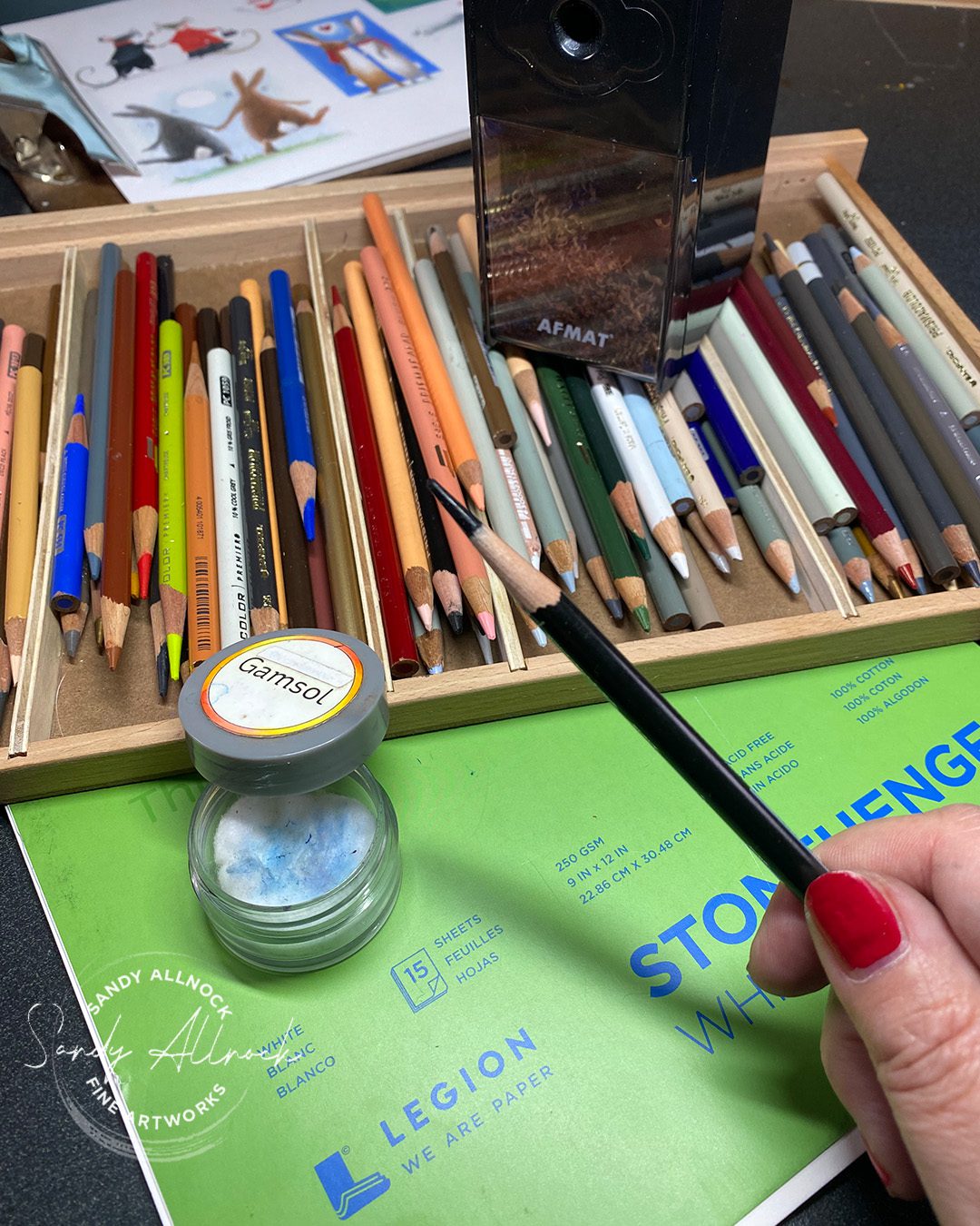
A couple common questions I get when posting colored pencil work:

Favorite paper for pencil coloring? Stonehenge.

How do you get those long points? With an Afmat Long Point Pencil Sharpener. 

Preferred colored pencils? My go to of late are Prismacolor pencils.

What’s in the gamsol jar? Gamsol. tongue-out  Gamsol is a blending solution and I put it in a small jar with a lid, soaking a cotton ball, so it won’t spill. Because I am a klutz.
Why don’t the black stamp lines show in your art? I like to do “implied line” (sometimes called no-line in crafting) artwork. I stamp the images with a light ink, then color right up to that edge so the lines disappear. I have plenty of freedom to change things up – like with the trees in the short video, they can be any shape since the pencil covers the lines.


A drawing with several blending techniques 

The pencil sharpener

Tomorrow – my palette and yours!

My video coming out tomorrow is about curating your own watercolor palette. I’ll show you what’s in mine, with all it’s scary changes for 2024, and maybe convince you that YOU also need to curate your own! Bookmark the blog or wait for the newsletter in the morning. OR if you’re an IG addict, go to my page and join my free “Create every day” broadcast channel – basically a giant DM where I can drop links to my tutorials etc!

The giveaway!

As always CCC is giving away some goodies:

CCC will give away one free clear stamp set to one of my commenters!
If you use any of my affiliate links on this post to make a purchase, you will be entered to win the entire release!
Comment up until Midnight (ET) Jan 22nd.
CCC will announce the winners Jan 24th on their blog.

I am ALSO giving away the sheet of colored stamped images!! You can cut them up and make cards, stick it in a reference book, whatever you like. I’ll announce my winner in my post on Tuesday the 25th.

To qualify to win

Leave a comment and tell me who YOUR valentine is. (And it’s totally ok if it’s your grandchild or pet!!)


The bloghop:

Sandy Allnock <—that’s me, last but never least!
How to create a value scale BEFORE you paint/draw

How to create a value scale BEFORE you paint/draw

Is it dangerous to mention the word “scale” in a January post?

This is not about that kind of scale! I’m talking a value scale: a range from white to black and all the values in between. Yes they can be greys, but also – color!

A bit on Saturday’s mess-up:

My apologies for the broken link in the previous post; that caused some massive stress for a bunch of you, and I’m sorry about that.  

The reason I even switched to a newsletter instead of relying on a link to work in an automated email is because of mistakes. I hate being so human that I disappoint readers.

If there’s an error when you receive a newsletter, please just come back in a few hours. Inevitably someone has told me there was a problem and it got fixed. Newsletters link to this blog, and this blog I can edit anytime, but an email in your inbox remains busted.

Tutorial: How to create a value scale BEFORE you paint/draw

Watch the video below and scroll to the end to leave comments or questions — or click HERE to watch it on YouTube and leave comments over there. I read both dutifully!

Black and white value range

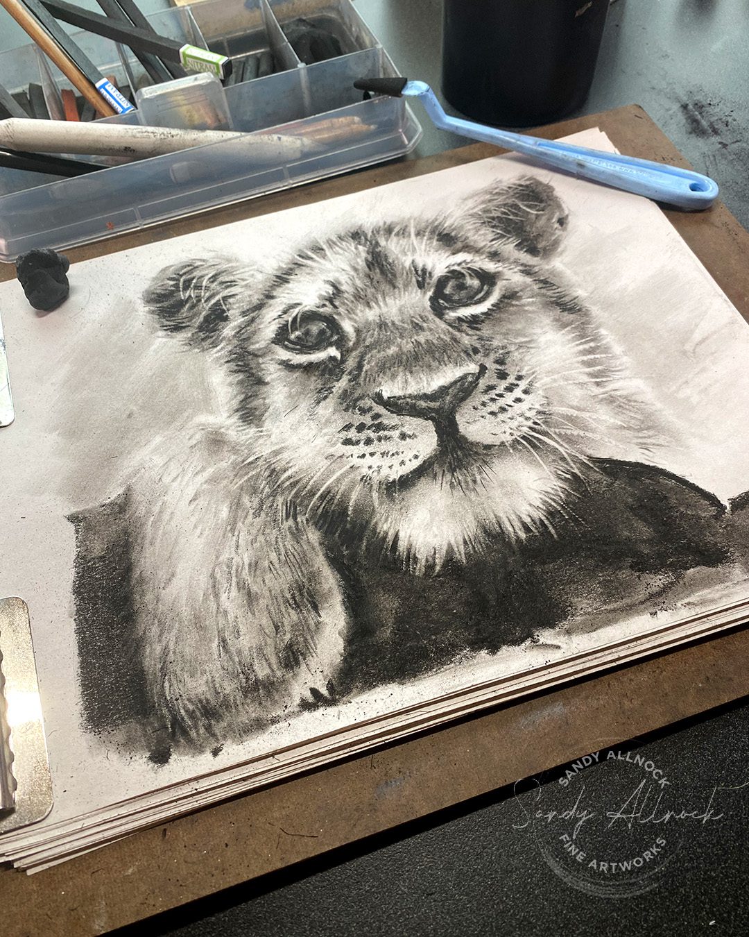
It’s relatively easy to think of value when it’s black and white. It’s not hard to see one grey lighter or darker than another. This tiger cub was drawn during the monthly Open Studio zoom call at Artventure, where we gather and just chat while working on our own projects. One attendee said she was surprised because she had thought I had finished already, then I added the richest darks. That inspired today’s video! 

The January call will be on the 27th, come bring your own art project and visit with us on Zoom. See the Artventure Event calendar for info.

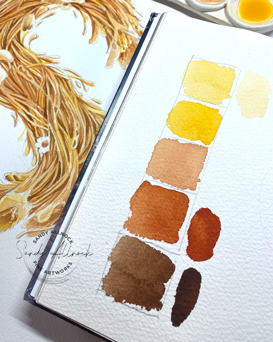
Color value scale

You can create a value scale in any hues. Be prepared that you might THINK a color fits in one slot but will need to be in another spot instead. If you label your swatches, keep them in an envelope so if you use those colors again, you’ll have the value scale handy.

Decide if you will WANT the full range, or stop one or two short. For my piece I didn’t want the REALLY dark darks.


Subscribe to my weekly newsletter, Creativity In Your Inbox

* indicates required

Apply the value scale

Once you’ve decided what the range is, get busy painting or drawing! Some mediums work best dark to light, but I find if I’m in doubt, starting light and getting darker is safer. Keep your scale nearby to compare as needed.

The palette

When Seth from FraNordHandmade on Etsy  asked if I’d be interested in trying a palette, I looked through the site…so many options! Different shapes, sizes, numbers of wells – tons of options. I had thought maybe the 6 well palette would be a little bit big for my sketch easel but not so much that it wouldn’t work. But once I saw it’s not just ceramic, it’s ceramic. Meaning a klutz like me will assuredly drop it on a sidewalk someday and shatter it. So it’ll instead stay in the studio, where it works great for using colors that aren’t in the big palette – I can squeeze out a little paint or create puddles with sticks, then wash it and be done. You’ll see it in an upcoming video since I found a great purpose for it!

One thing that does bother me a little is the handmade-ness means paint is getting stuck under the corners of the pressed-on wells. While I can run ceramic under the sink and clean that out, the feet under the palette are felt – anyone know what would happen to wet felt? How long would that take to dry…? I’d like to wash it then use it right away but I might not be able to do that with wet feet.


Mentioned in this video:

The watercolor sticks video

For your convenience….

Supplies

Some product may be provided by manufacturers for review and use. Compensated affiliate links are here at no cost to you. I appreciate your support of my work with your purchases! Full affiliate and product disclosure | My trusted partners in art

Subscribe to receive blog posts by email: