Unboxing & Swatch-Testing Inks (Ferris Wheel Press)

Unboxing & Swatch-Testing Inks (Ferris Wheel Press)

I’m so excited to bring a new partner into my world: Ferris Wheel Press! You may know how much I love pen and ink – not only drawing with it but painting too. And inks that have spectacular properties like many of FWP’s? Oh baby!

I was so thrilled to receive a message from Ferris Wheel a few weeks ago, inviting me to partner with them. I’ve been off the shopping train for a while now, so receiving their new releases is going to be such a treat. And I’ll receive a small commission when you make a purchase – at no extra cost to you.

But this partnership is not just good for me. It’s good for YOU!  

Use ALLNOCK at checkout and you’ll get 10% off your purchase at Ferris Wheel Press!

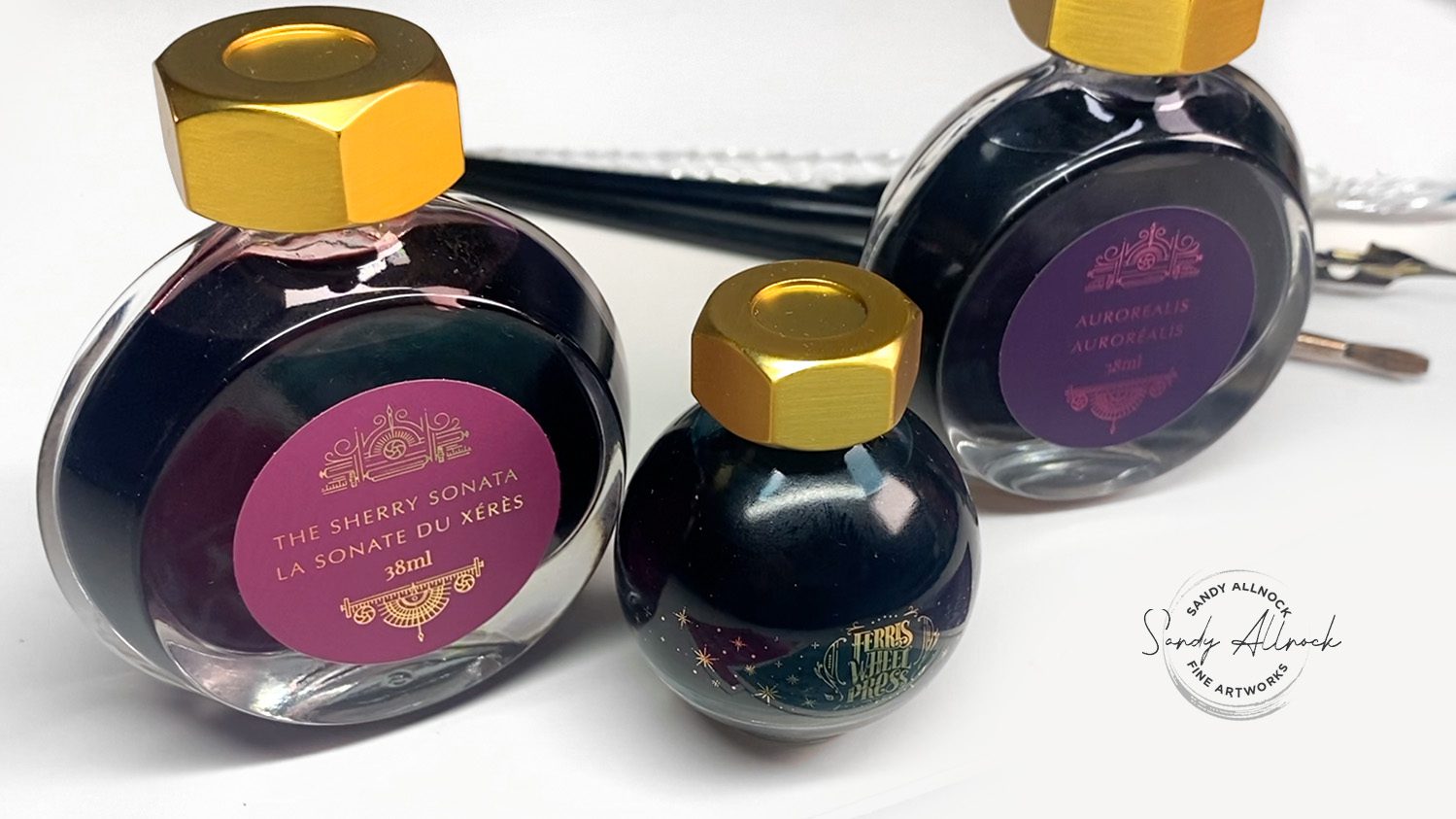
Let me introduce you to their newest three ink colors – I’ll show you how I swatch inks and test them to see what they can do!
Tutorial: Unboxing and Swatch-Testing Inks

Watch the video below and scroll to the end to leave comments or questions — or click HERE to watch it on YouTube and leave comments over there. I read both dutifully!

The Sherry Sonata

This pretty brick-colored ink fades out to a soft pink with water. But it’s rich enough in full strength to draw or write with too! On Saturday I’ll hopefully have a line drawing here to share.
Knitted Nettle

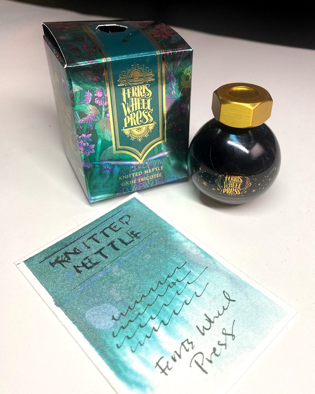
A turquoise that’s so lovely – lifts slightly with water, and has a little bit of shimmery sparkle when used in enough quantity. I’ll see about getting better pics of it as I play with it this week, come back Saturday for more!
Aurorealis

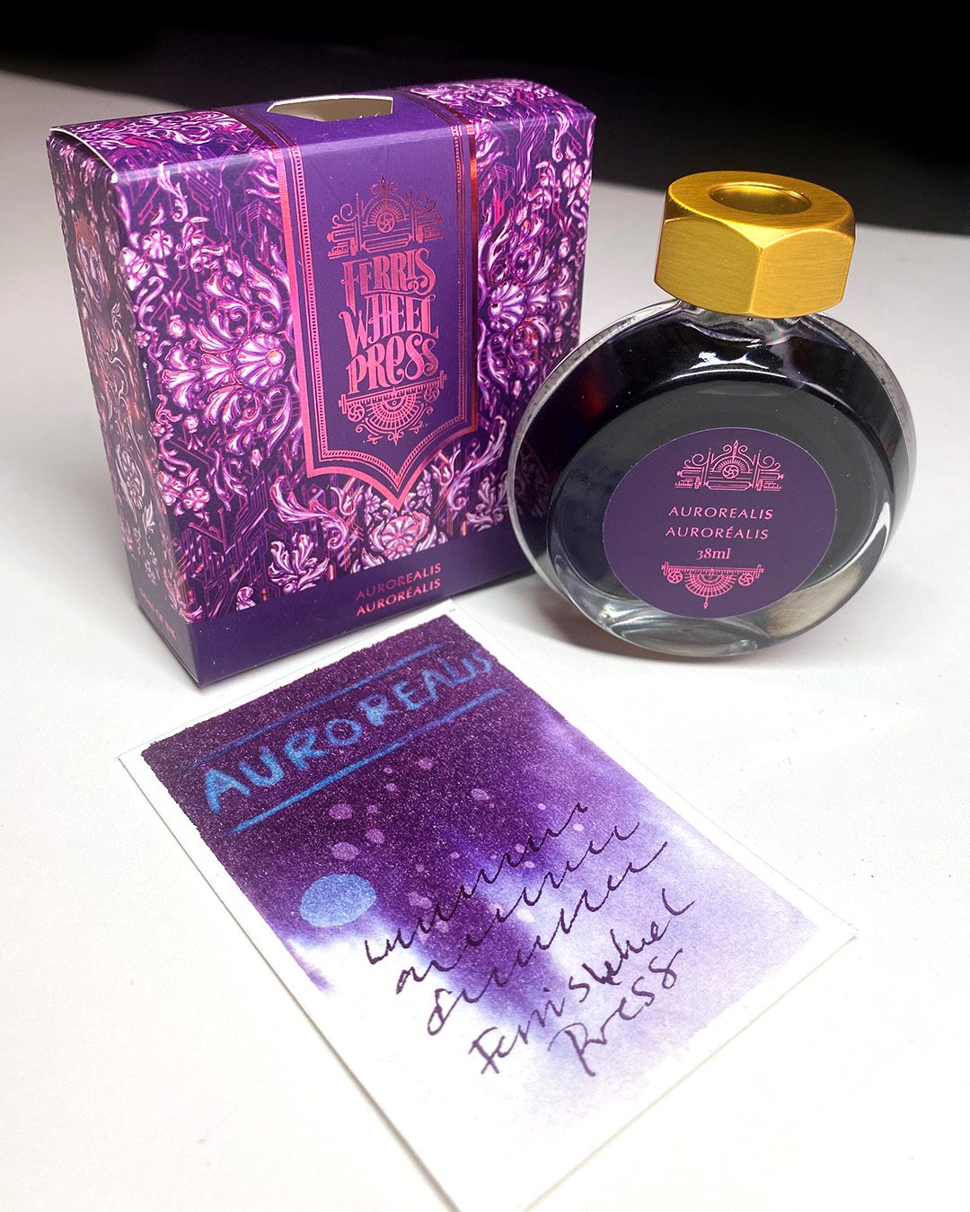
A pretty purple that turns pale bright blue with bleach! It’s got a bit of gold sparkle to it that’s lovely. The  bleach may have been what caused the dulling of it, I’ll be playing with it more this week to see what it takes to get it to shimmer!

Subscribe to my weekly newsletter, Creativity In Your Inbox

* indicates required

My Rorschach (ish) Test

Seeing the blue show up on the Aurorealis swatch made me want to play more! On the swatch it was liquid bleach on dry paper – when I added it wet in wet, it was an explosion of bright blue in a sea of purple! 

What else should I paint with these colors?

I’d love your ideas, I’ll be playing with them this week!

Supplies

Some product may be provided by manufacturers for review and use. Compensated affiliate links are here at no cost to you. I appreciate your support of my work with your purchases! Full affiliate and product disclosure | My trusted partners in art

  1. Use coupon code ALLNOCK at Ferris Wheel Press
    1. The Sherry Sonata (red-pink) 
    2. Knitted Nettle (turquoise) 
    3. Aurorealis (purple) 
  2. Arches Cold Press sheets

Subscribe to receive blog posts by email:

I BIT MY PAINTING SUBJECT!

I BIT MY PAINTING SUBJECT!

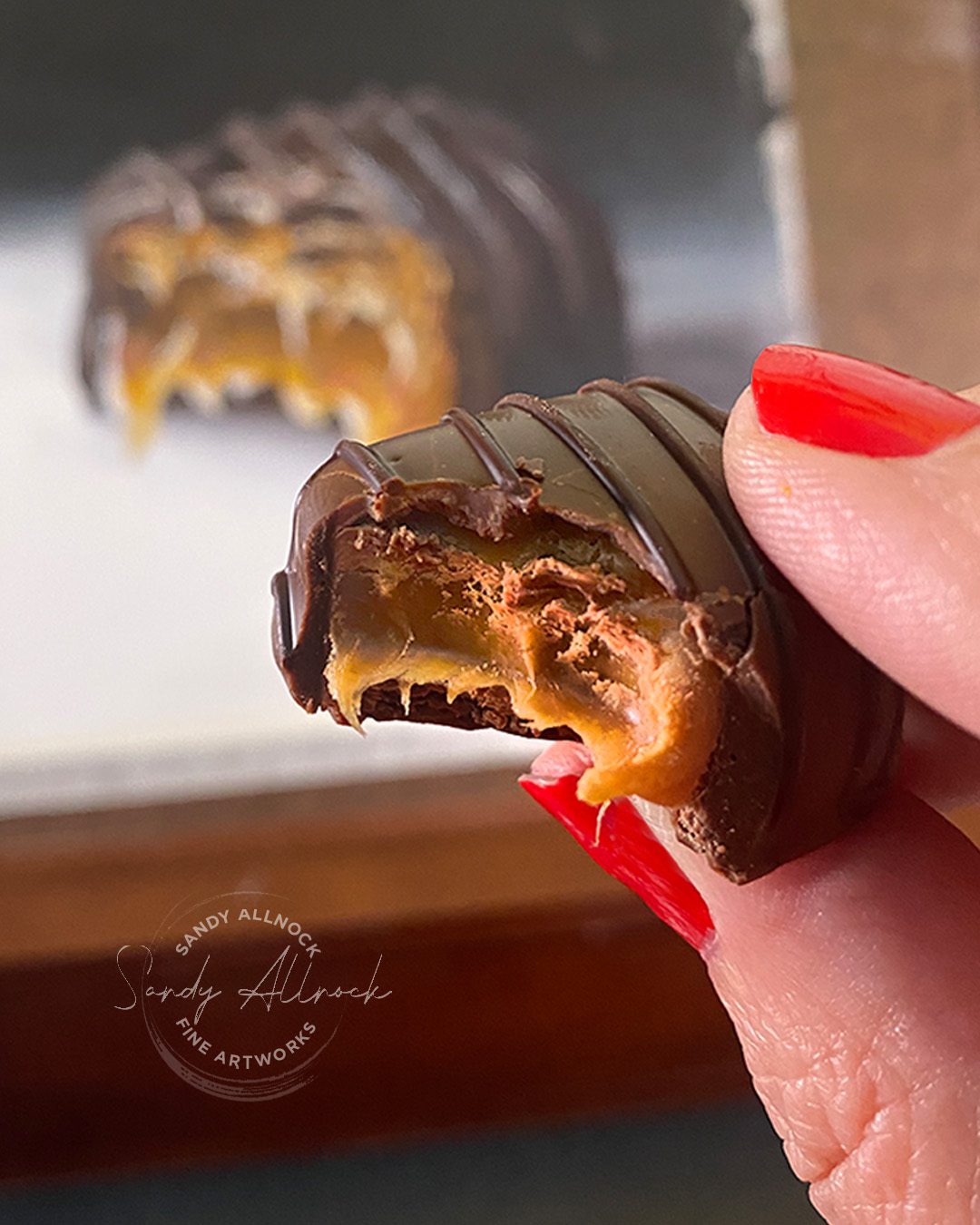
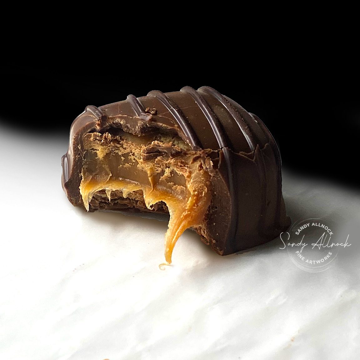
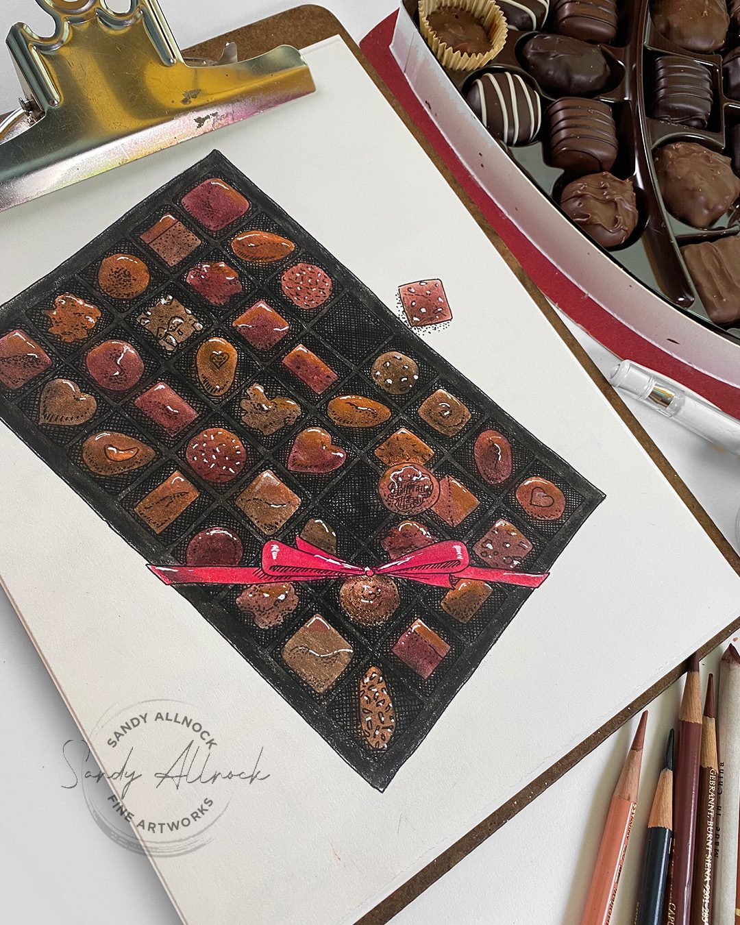
I don’t usually recommend eating your subject matter for a still life. But this case required an exception! I wanted to paint a realistic candy – and “had” to take one for the team and buy the BIG box and bite one to photograph myself!

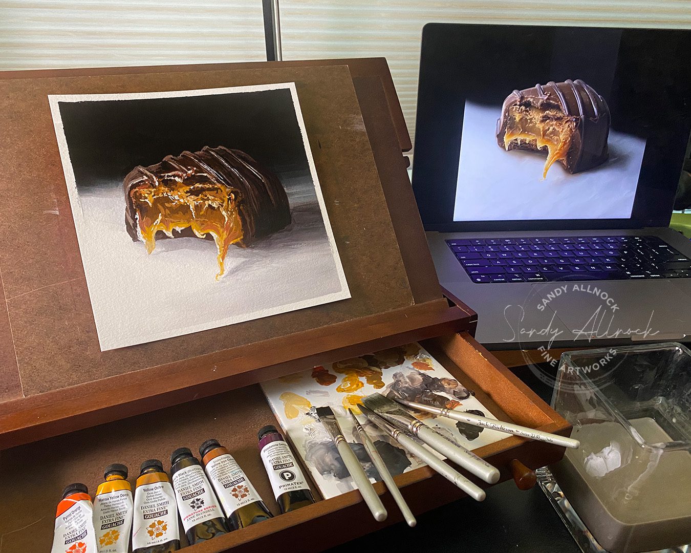
Once I bit it (okay I had to do it a few times to different candies….getting it to look good wasn’t easy! Pinky swear!) I placed it on the puffy insert in the heart-shaped box to take a photo on my iphone. I set up lights so the open caramel part would show up best, then in Photoshop I added the dark background. Coz I’m no photographer and wouldn’t know how to do that! Feel free to use my picture for your reference to draw or paint from!

(Side note: How on rearth do candy manufacturers put so many strawberry and vanilla cremes and toffees in their boxes of chocolates? More caramel please!)

Tutorial: Painting chocolates!

Watch the video below and scroll to the end to leave comments or questions — or click HERE to watch it on YouTube and leave comments over there. I read both dutifully!

Gouache

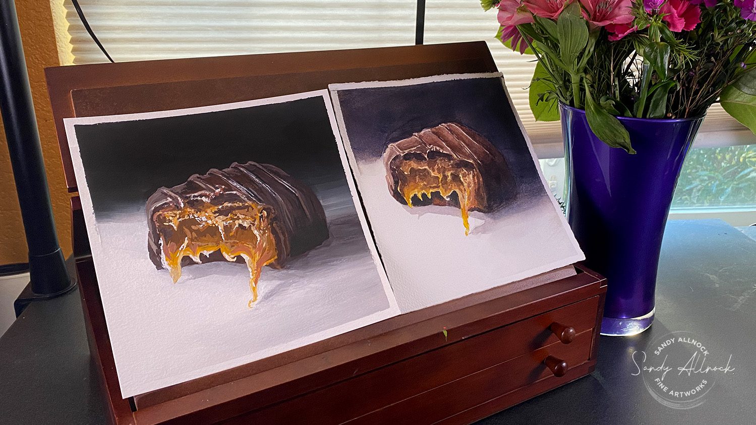
I’ve been taking oil painting lessons in gouache (very similar techniques) – and trying to turn my brain upside down to paint dark to light. It doesn’t always happen that way! BUT the thing that is the same in both is that SHAPE and VALUE matter a lot to create realism and depth. 

Watercolor

I came back to my sweet spot where I know how I want to plan a painting. It’s much more natural for me! I know how life goes when starting light and going dark, and can “see” the process in my head without nearly the effort that gouache takes. But again – shape and value are crucial.

Subscribe to my weekly newsletter, Creativity In Your Inbox

* indicates required

Comparison

Each painting has its own problems and areas of excellence! With my limited experience, I’m just figuring out how to handle a background, especially a blended one. (I’m debating whether I should start painting really loose and impressionistic so I can skip worrying about blending, HA!) But a rich black background is easy to achieve in the matte medium. The watercolor background in the light area looks excellent by contrast – and until it was right next to the gouache painting the background looked pretty decent; but watercolor simply hasn’t got the “oomph” of guache. But I’m not unhappy with either painting!

Zoom call today!

We’re working our way through the 30 Days to More Confident Sketching class, and seeing a lot of student work all at once has helped me see some areas that I think I need to spend more time teaching – and that’s how to see shapes and values better. It’s a very natural thing for me after all these years, and I need to figure out how to communicate it in ways that’ll make sense to students!

In a little while – 2 hours after this post is live, as a matter of fact – I’ll be hosting a zoom session about graphite and charcoal, and I think I’ll be demonstrating trees since that’s the subject for the day in the class. Trees are often a frustration point for students! If you’d like to join in, pop over to Artventure, we’d love to have you join in! (It’s free!)

Supplies

Some product may be provided by manufacturers for review and use. Compensated affiliate links are here at no cost to you. I appreciate your support of my work with your purchases! Full affiliate and product disclosure | My trusted partners in art

Subscribe to receive blog posts by email:

Going from messy & scribbly — to beautiful art

Going from messy & scribbly — to beautiful art

Today’s art is inspired by the coming Valentine’s Day holiday – but also by things I hear from my students and readers!

I often see comments bemoaning a person’s own art. “I wish I could blend.” “My coloring stinks!” “My art looks so bad compared to ___!”

And though I say it often, I don’t think I can ever emphasize it enough: get your nose off your paper! When you are staring at your paper from 6 inches away, of course you’ll see any faults. But you know what? No one else looks at your work that way. And if they do, they don’t have a vision in their heads like you do – they just see a beautiful piece of art, and that’s it.

So today I’ll show you some of my art close up so you can see how messy it appears at a few inches away, but how lovely when at a distance. Maybe that’ll convince you to give yourself grace!

Tutorial: Title

Text

Watch the video below and scroll to the end to leave comments or questions — or click HERE to watch it on YouTube and leave comments over there. I read both dutifully!

Alcohol Markers (transparent color)

With strong, transparent color, it’s quite easy to color these chocolates with ease – go outside the lines to your heart’s content around the chocolates! Keep layering the colors til they look as dark as you want. Make the plastic liner of the box black (grey 7 or 8) or go over that with a brown to create a REALLY dark brown. White gel pen highlights top  off the “high points” and uppper left corner to create a shiny look.

Colored pencil (semi-opaque)

Since colored pencil can cover black lines below it, the medium can look a bit messier than alcohol marker. Gamsol, a blending solution, can be applied and color smooshed around to blend color and press it down into the texture of the paper.

Subscribe to my weekly newsletter, Creativity In Your Inbox

* indicates required

Gouache (opaque)

Gouache is an opaque watercolor – if you’re unfamiliar with it, it’s a little like acrylic with different properties. (You could try this same thing with acrylics). Make the plastic tray black, add highlights in a very dark grey, then painted blobs for the chocolates. This was definitely the most fun to add the drizzled chocolate to! Gradually lightening the color until it’s white creates the look of softly molded chocolates.

So how about you?

What’s your internal language like about your art? Do you look at your blending and wish you could create art like so-and-so? It’s quite possible their art doesn’t look perfectly smooth…..sometimes it does but it’s certainly possible to make art that looks realistic without being “perfect”!

Intricate Sketches you can color

There’s a set of 5 (five for the price of four!) or you can purchase any of them, including the chocolate box, singly. Visit the printables page for more info!

Supplies

Some product may be provided by manufacturers for review and use. Compensated affiliate links are here at no cost to you. I appreciate your support of my work with your purchases! Full affiliate and product disclosure | My trusted partners in art

Subscribe to receive blog posts by email:

Watercolor a Mixed Bouquet (from a dream!)

Watercolor a Mixed Bouquet (from a dream!)

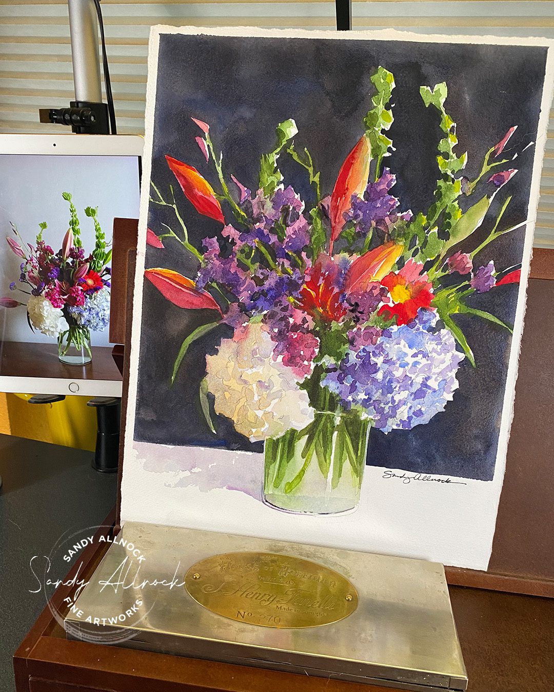
I had another art dream. This keeps happening! But in this case, I’m ok with it. In my dreams I have some pretty wicked watercolor skills!

In today’s video I’ll be sharing some clips of the process, but I don’t have much in terms of explanation; I was trying things I’ve not done before but could picture maybe working, and planned some workarounds that seemed to have worked a bit. But…..in any case, I hope you enjoy the crazy dream stories I’ve got to share!

Video: Watercolor a Mixed Bouquet (from a dream!)

Watch the video below and scroll to the end to leave comments or questions — or click HERE to watch it on YouTube and leave comments over there. I read both dutifully!

Dreaming about art

I don’t know if I’m the only one who regularly dreams of painting or drawing, but it’s a pretty regular thing for me. I’m chronically under-rested since I have insomnia so maybe my brain tries to stay awake so at least I’m not painting while I sleep?

However – unless it’s a crazy thing like making tiny cannons that shoot real cannonballs, or bows that shoot arrows that can really hurt……I recommend following any art dreams you do have! If you’re clueless about HOW to achieve what your sleeping brain understood, take some baby steps. Paint in ways you DO know. See what you can learn from the piece of paper. Who knows!

It may take me a while to figure out that painting technique, as well as how to explain what I did in today’s video. But I’m going to get there. I’m determined! 

Watercolor Bouquets Class

I hope this is a course you’ll love for spring! These are not tiny paintings for cards – it’ll be hard to paint them that small. But rather than make them the size I prefer (1/4 sheet), I’m teaching them at 1/8 sheet – knowing a lot of my students are only just getting used to painting a little larger. 🙂

This course is listed as between level 3 t0 4 – which means that the flowers are about a level 3-1/2, the vases have some aspects that are maybe level 4…..it’s always hard to assess what to label a class as when there’s different aspects! 

Subscribe to my weekly newsletter, Creativity In Your Inbox

* indicates required

“Let’s Draw Together” has begun!

A group of us have started going through the 30 Days to More Confident Sketching Class, and will be posting daily at Artventure….I’ll also be posting mine in the classroom lessons for each of the days, along with some extra tips. I’m kind of excited – when I filmed the sketches, I was using weird paper in a weird sketchbook, which had quite the effect on my drawings. This time I’m using charcoal so I can practice the techniques with the medium, and am working in a nicer sketchbook!

Cats! 2-Minute Gesture Drawings

Cats! 2-Minute Gesture Drawings

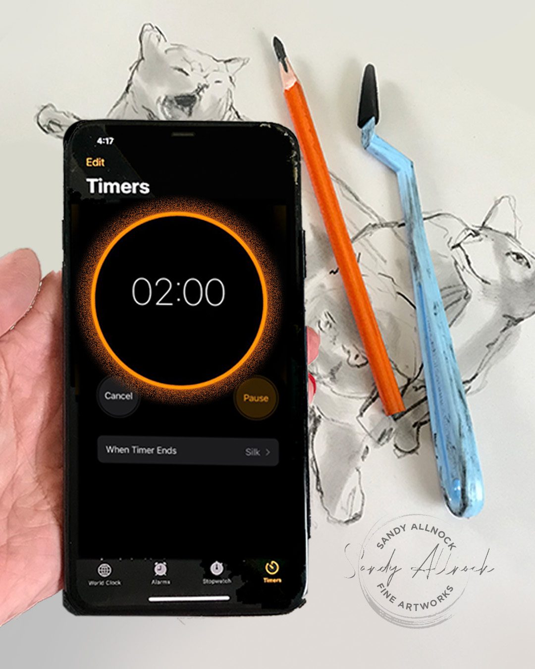
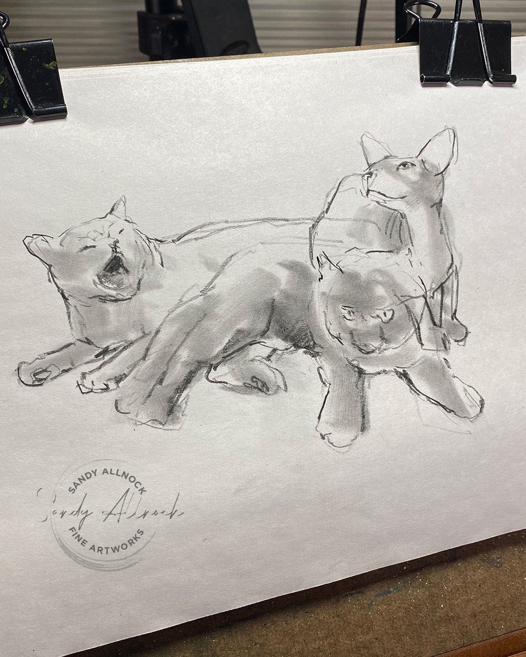
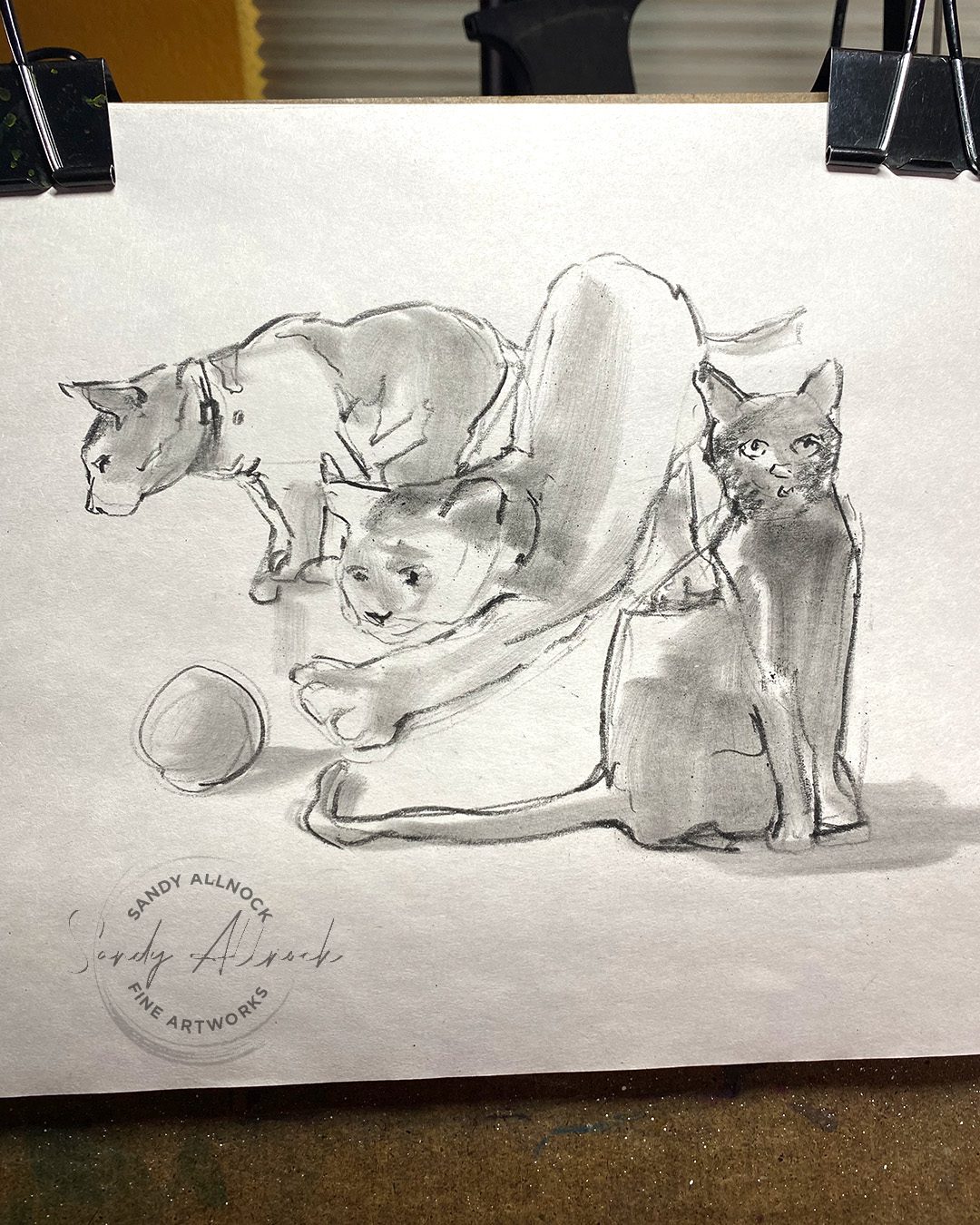
Two minutes and counting! Today’s tutorial is all about creating quick gesture sketches—these are timed, but not just for the sake of speed. There’s usually not a “duel” to see who will be able to draw a subject faster than another person…but there’s plenty of good reason to consider these sketches anyway.

Tutorial: Cats! 2-Minute Gesture Drawings

Watch the video below and scroll to the end to leave comments or questions — or click HERE to watch it on YouTube and leave comments over there. I read both dutifully!

Tips for learning to create gesture drawings

You can make gesture drawings in a variety of time segments; in college we did 10 second poses! But once you get to 10 minutes or more I think you’ve moved out of the “gesture” realm. The idea is to quickly capture the essence of the subject: the pose, the movement, the shape. It need not be perfect!

Aim for loose strokes made with not just your hand but your arm; try a large sketchbook (I usually use something that’s 20X24 or so) and sit or stand in a way that lets your have movement in your arm up through your shoulder.  Hunching over a sketchbook only tightens your hand and arm.

Draw from life if at all possible. Search your local meetups or community pages for Life Drawing Groups – sometimes you can join one at a college or university – just be aware that “Life drawing” typically means nude models. There are also online groups that meet over Zoom; one thing to remember is that most will tell you no screenshots or photos, and that’s important to follow for a variety of reasons.

For clothed models, you might find portrait groups, and I know near me there are “sip and draw” events too, and you can check with organizers to see if they have gesture drawing evenings or sections of evenings. (Anytime there is a model, please know they are being paid, so you likely will be paying to attend these events. You can also just sit in a park or a mall or a coffee shop and draw people anytime!

I recently discovered Line of Action, an online site that will help you in your gesture drawing discipline too. It’s not optimal since it’s not real life, and some of the photos aren’t high quality (I believe they’re sourced from their community)….but I do love that you have no idea what photo is comimg up next. You can certainly just set a timer and draw your dog or the lamp in the living room in 2 minutes—but there’s something energizing about not knowing what’s coming. 

Why try gesture drawing?

No matter the medium you select, the basic foundations of drawing undergird all you do. Yes, perhaps you’re at a stage where you still trace a picture you want to paint—but you are still drawing with the paint. If you’ve been unsatisfied with the results, consider that it could be that underlying skill that could use some polishing.

I find gesture drawing helps me see my subject as shapes. In 1-2 minutes I can’t get lost in anatomy, I can’t fully render the jacket and its pockets, and I am not able to think back to the last time I drew something similar. There’s not time for more than anything than observing what’s right in front of me, and looking for its shapes.

I’ve found that a circle for a head is okay but it’s not the shape it really is. That a torso often bends, and only some people have an hourglass shape. That each person’s hands at their sides come to a different place in comparison with their hips or thighs. I’ve learned that by getting quick with seeing shapes in their relation to each other, and those relationships help me see if I’m capturing the subject.

Some people get more focused on the line—creating contour line drawings around the edges. Others pay close attention to where the weight is being carried (left or right foot, leaning to one side or another.) Plenty of artists have their own focus, and you will find yours in time as you practice and begin to see your own style of calligraphy emerge – that’s your own “handwriting” as an artist with a pencil, pen, or brush! We’re each unique and yours is unlike anyone else’s. What better way to find it than to let yourself try it out!

Subscribe to my weekly newsletter, Creativity In Your Inbox

* indicates required

Supplies for gesture drawing

Gesture drawings can be in any style – just google the term and you’ll see that! Some people use a single elegant line. Others a bold stroke of chunky marker. Graphite, charcoal, paint – whatever medium works for you! The paper isn’t important either, though you’ll find different kinds may help you make smoother marks in your chosen medium.

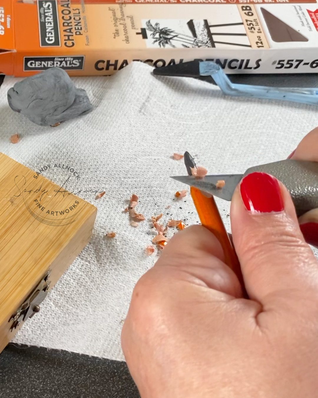
The charcoal pencils shown in this video are ones I discovered about 6 weeks ago – I used compressed charcoal sticks for a while, vine charcoal for a season, pencil during another season. I seem to rotate between them. One friend uses watercolor and makes huge splashy paintings in minutes. Another uses gouache to create her sketches—I’ve tried that a few times but found that for this season I’m enjoying charcoal so much that I’m sticking with it til it outlives what it’s teaching me. 

Scroll down a little bit for links to the supplies I used for the cat sketches.

Let’s Draw Together 

As we get rolling on the 30 Days to More Confident Sketching on Feb 1 at Artventure, we’re going to be doing a lot of drawing. Come join us! I’ll be right there with ya.

Supplies

Some product may be provided by manufacturers for review and use. Compensated affiliate links are here at no cost to you. I appreciate your support of my work with your purchases! Full affiliate and product disclosure | My trusted partners in art

Subscribe to receive blog posts by email: