14 TIPS to draw better plants, trees

14 TIPS to draw better plants, trees

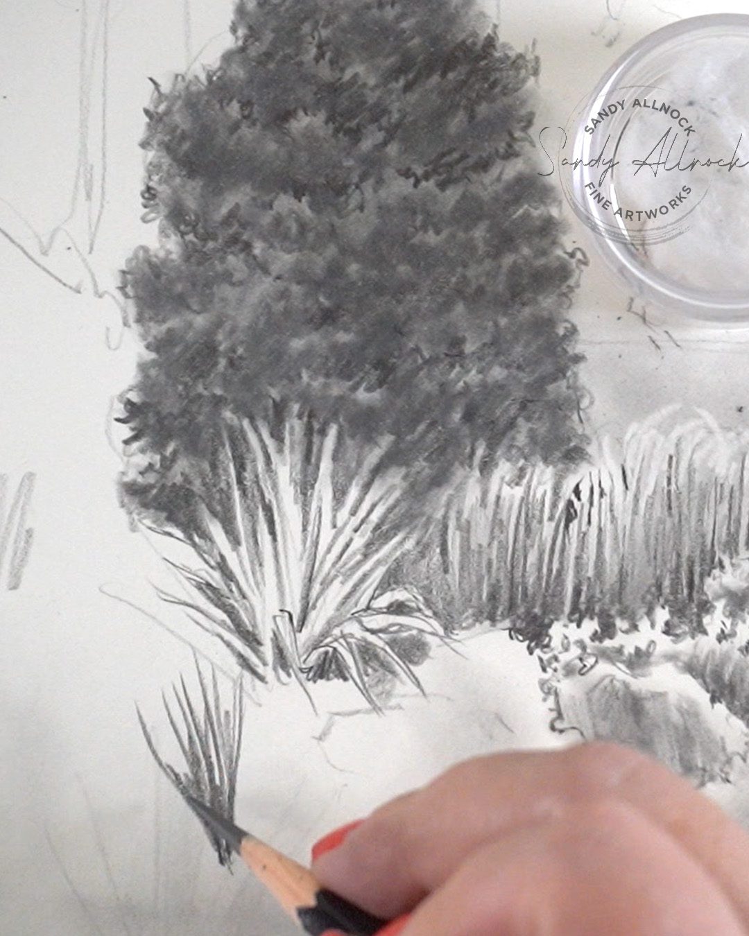
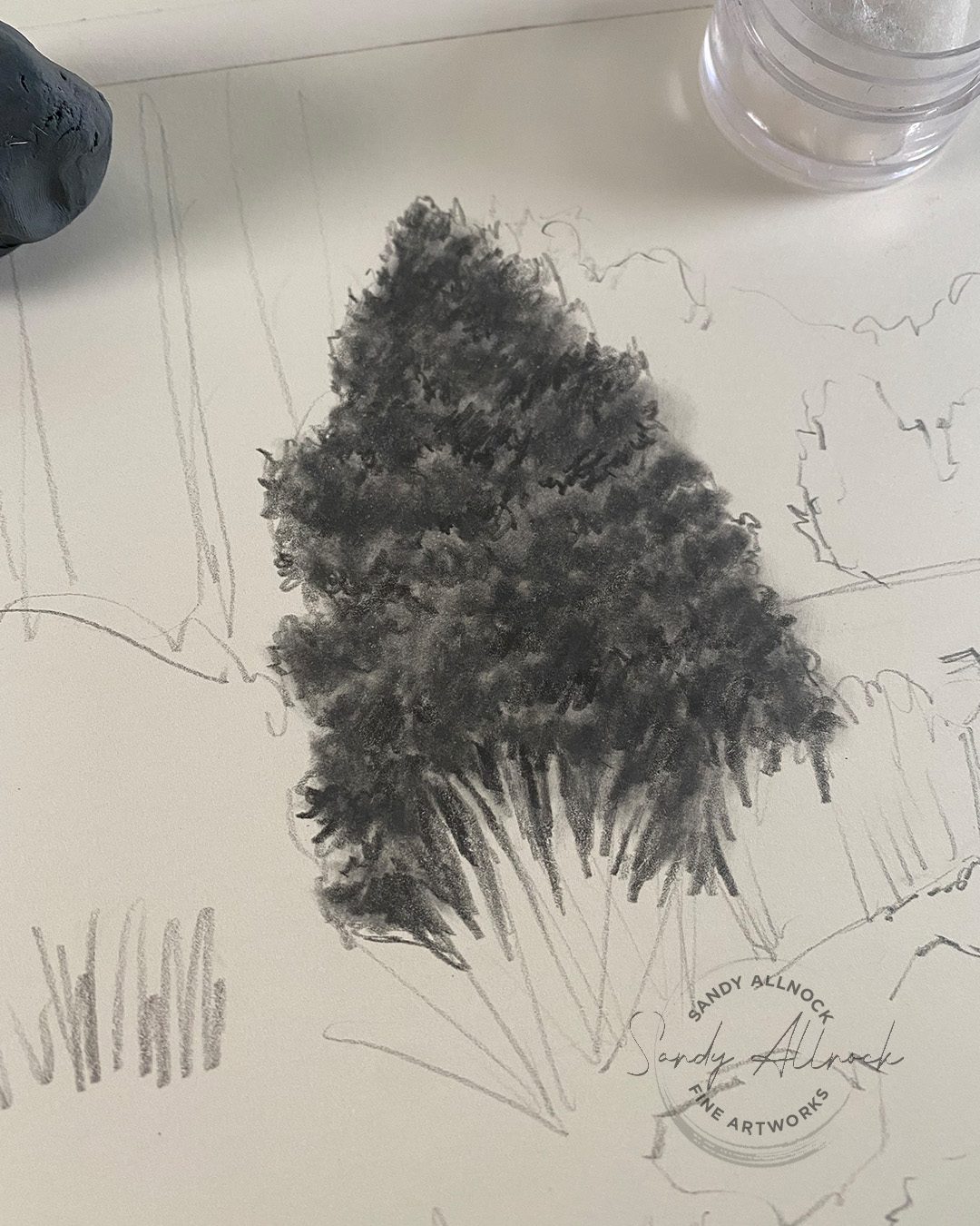
Every artist has their own ‘favorite’ subject to draw or paint. I feel most comfortable with landscapes even though I include all kinds of subjects in my repertoire. I know for some, trees are crazy hard, and I’ve started a series that may go on for a while – I would love to help more people create awesome trees. In any medium the same principles apply, though I’ll be using a graphite pencil.


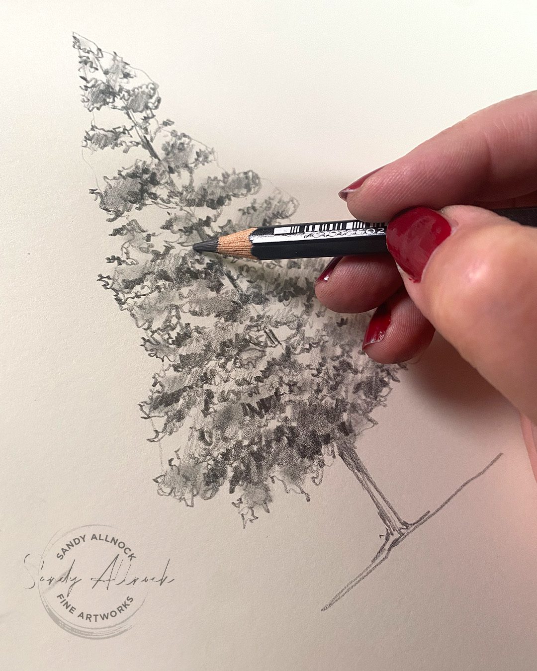
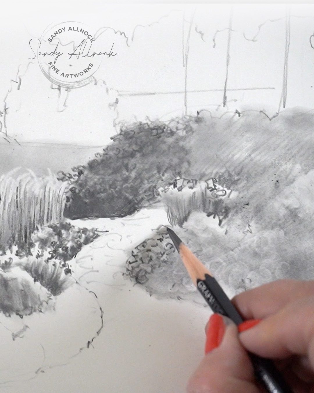
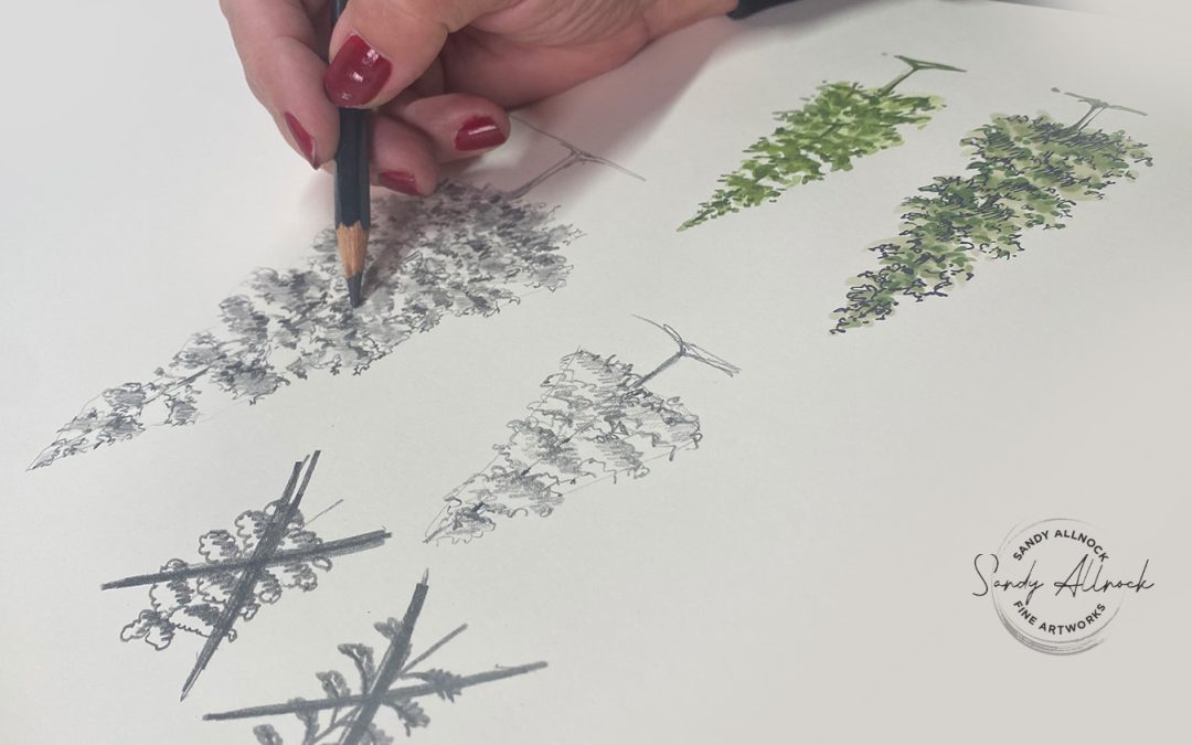
In my last tree tutorial, we talked about pine trees (left)….today we’ll talk about other plants and shrubs too (right).

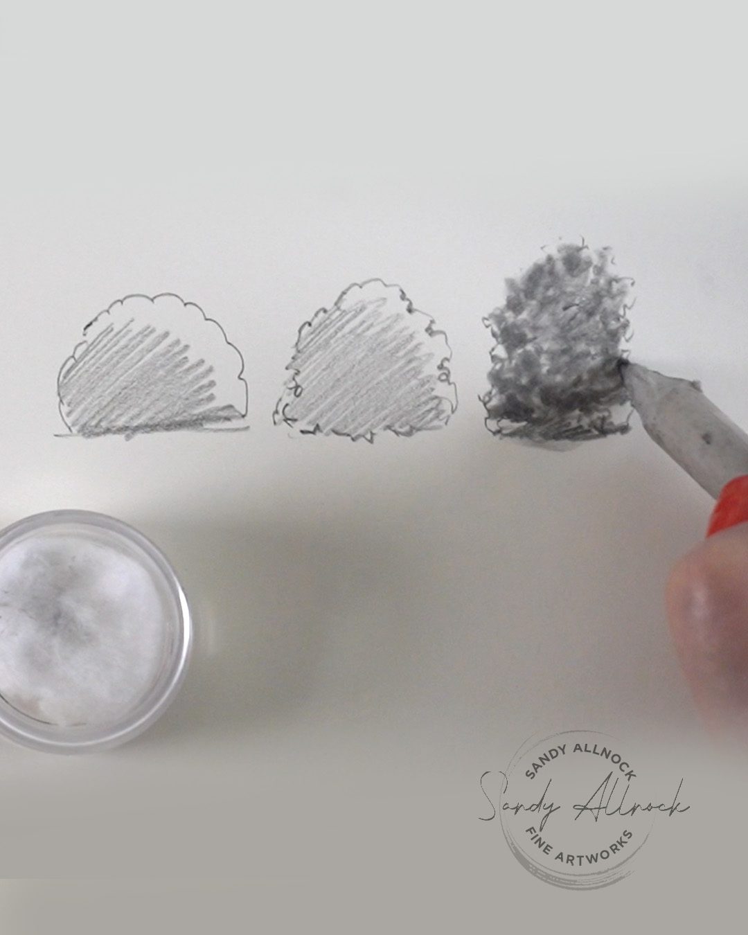
The photo reference is HERE and is by photographer Pauline West.

Tutorial: 14 Tips to draw better plants, trees

Watch the video below and scroll to the end to leave comments or questions — or click HERE to watch it on YouTube and leave comments over there. I read both dutifully!

Subscribe to my weekly newsletter, Creativity In Your Inbox

* indicates required

14 Tips

  1. Study real trees! And bushes. And plants. Walk around them, peek under branches. What’s causing shadows? How bright are the highlights?
  2. Make each plant unique. What shape are the leaves? What size? Can you see branches or are they covered? How tight are leaves packed in?
  3. Set the darks. Choose an area that has a real dark section so you have something to balance against as you work through the drawing.
  4. Create shadows within shadows. A black in a field of 85% black will create more depth than just making the whole thing really dark. 
  5. Differentiate directional grasses. Do they lean in one direction? Vertical or angled? Sharp or soft tips? 
  6. Match darks. Refer back to the dark area you already set. Make sure you populate some of that dark elsewhere in the drawing.
  7. Scale matters. Sometimes scale is dictated by the plant itself and the size of its leaves or needles. But additionally, the further away the plant is, foliage gets smaller further away.
  8. Clearest detail in the foreground. It’s closest so you’ll see the most sharp detail. Additionally, draw the viewer’s eye to the place YOU want them to look by putting the most detail and value change there (lightest light next to darkest dark).
  9. Repeat yet vary. Most landscapes will have several plants of the same variety; be careful you aren’t replicating the same plant shape or floral pattern – mix it up.
  10. Strategically deploy an eraser. Don’t forget sometimes a light coat of graphite can be erased to great effect.
  11. Layer plants. Look for where one is in front of another. Lighter plants in the back with darker in the front are much easier than the negative drawing that has to be used to go the other direction.
  12. Soften distant elements. Exaggerate the value differences from the distant background to the mid and foreground. Let them be both lighter and more out of focus.
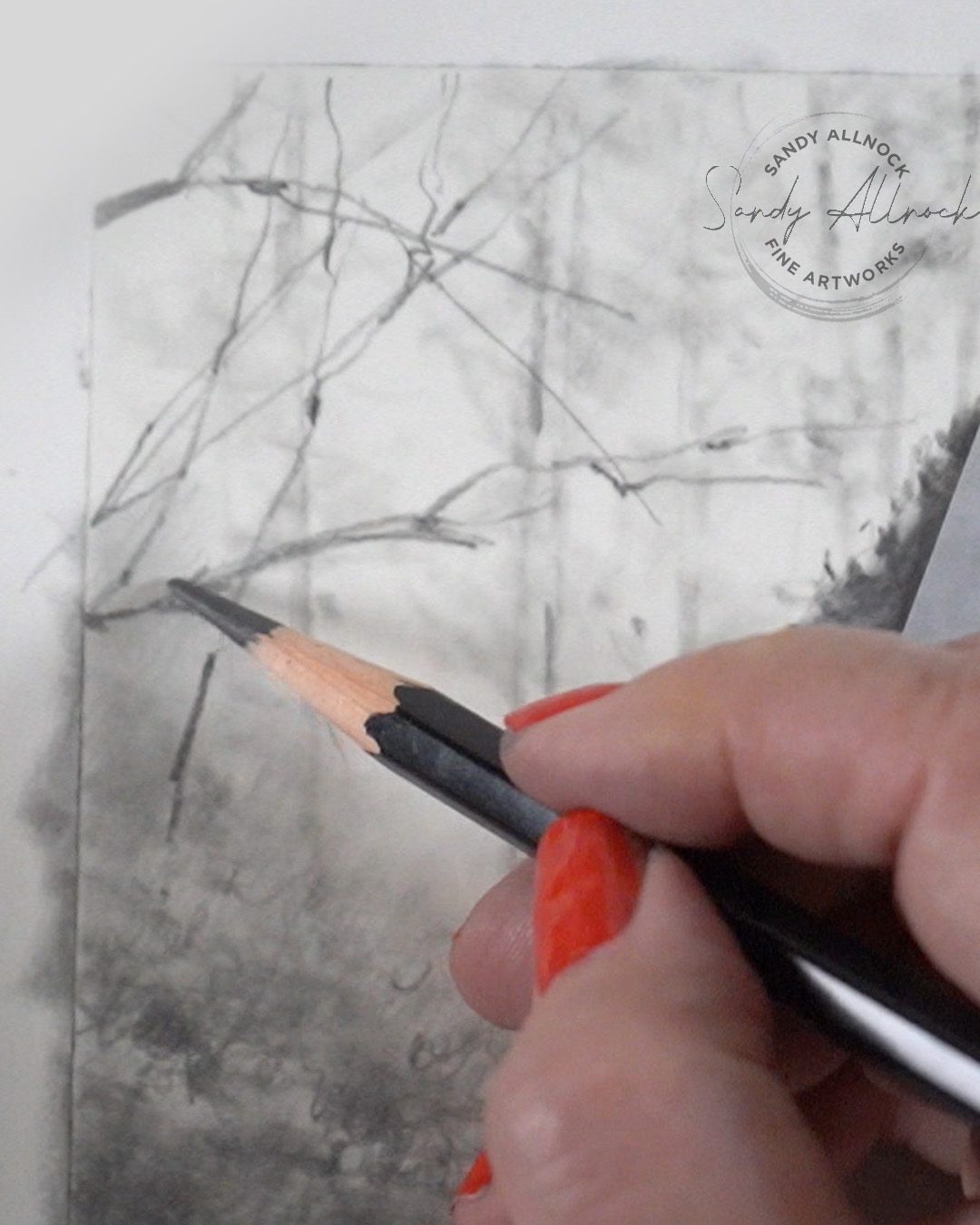
  13. Crisp midground twigs. On top of distant elements, add in some trees or plants in the mid gruond.
  14. Leave openings in canopies. When trees have sky behind them, you can often see light areas – they aren’t empty, but will have some twigs or leaves breaking into them.
Need a class?

I wasn’t planning on a class but I had posted a few days ago on the Community tab about whether a class is in order since I have the footage of this drawing. Let me know if you’re interested! 

Supplies

Some product may be provided by manufacturers for review and use. Compensated affiliate links are here at no cost to you. I appreciate your support of my work with your purchases! Full affiliate and product disclosure | My trusted partners in art
Bite-sized art instruction: tiny tutorials

Bite-sized art instruction: tiny tutorials

I’m so tired of being sick! The image below is pretty much what I look like right now (except she looks so cute still while sick!)…..I can’t stop my nose from running!


It’s not Covid and that’s the one thing I’m thankful for, but man. It’s brutal! I get tired SO easily….I got up feeling better on Sunday and got dressed for church, but had to leave early or I knew I wouldn’t last long enough to pick up meds at the store on the way home. Yeesh! 

I did lay on the sofa for most of the week though, the dogs were very sweet and comforting. In between naps I used some of the time to work on something I’d wanted to get to for ages: replicating the Tiny Tutorials class at art-classes.com!

Tutorial: Bite-sized art instruction: tiny tutorials

Watch the video below and scroll to the end to leave comments or questions — or click HERE to watch it on YouTube and leave comments over there. I read both dutifully!

Tiny Tutorials class

This course was originally just on Artventure – as a way to fundraise for the platform. If you purchased it that way you’re welcome to continue! But Artventure is not as yet paying its way, so just in case we can’t keep it going, the Tiny Tutorials class is now on Art-classes.com as well. Which makes it accessible for all those who want this kind of teaching but don’t want to have to join another platform to get it!

In both locations I’ll keep uploading new TTs as I come up with them! Content will continue to grow.

The differences between the two locations:

  1. On the app: a $3.99 annual subscription, a bit less video but all the tiny tutorials. Titles of each tutorial are listed but not the visuals. When new TTs are uploaded you get a notification in the app. 
  2. On the website: a one-time purchase (it’s on sale right now) with lifetime access. Scroll through the pages and you’ll see the cover image for each, which is easier to know which ones you’ve seen before. When new TTs are uploaded you won’t get any notification, so you’ll need to remember to pop in once in a while.


Subscribe to my weekly newsletter, Creativity In Your Inbox

* indicates required

Got questions?

If you’ve had one of those questions that just sounds like it’s too dumb to raise, IT IS NOT. Some of the tiny tutorials that have been the MOST POPULAR have been explaining a ‘”d’oh” idea! Just last week I posted about the “belt” around a pencil extender and a ton of people said they had no idea it was even there.

LMK if you have ideas for those very basic things – or bigger things. I might do a full YT video, it might even lead to a class – but might be perfect for another tiny tutorial too!

Supplies

Some product may be provided by manufacturers for review and use. Compensated affiliate links are here at no cost to you. I appreciate your support of my work with your purchases! Full affiliate and product disclosure | My trusted partners in art
  1. Main product
  2. Medium
  3. Paper
  4. Other
  5. Brushes


Current Sketchbook Flip-through

Current Sketchbook Flip-through

A quickie today – I’m sick! Waaaah. Partly I got sick due to trying too hard; I went out in the rain trying to get footage of deciuous trees and came home soaked. And the next day I walked the dogs on another pouring down rain day. I came home and changed into dry clothes and had some soup – and woke up with a terrible sore throat!

The good news is that I tested negative for Covid. But i also know a bunch of people with some kind of long, slow, miserable cold….and I need this to be gone fast! Monday I’m teaching art to a homeschool group, and I have a new Travel Sketches class ready to do the voiceovers.  Cmonnnnnn cold medicine do yo thang!

In order to keep YT moving forward, as slow as it is, I thought a flip through video without me having to talk might be fun. Hope you enjoy it!

Video: flip through

Watch the video below and scroll to the end to leave comments or questions — or click HERE to watch it on YouTube and leave comments over there. I read both dutifully!

Subscribe to my weekly newsletter, Creativity In Your Inbox

* indicates required

Supplies

Some product may be provided by manufacturers for review and use. Compensated affiliate links are here at no cost to you. I appreciate your support of my work with your purchases! Full affiliate and product disclosure | My trusted partners in art

How NOT to draw trees (part 1 pines)

How NOT to draw trees (part 1 pines)

Hey there, welcome to a little miniseries on trees and plants! In the 30 Days to More Confident Sketching class we hit the usual roadblocks – it happens allllll the time so do not feel bad if trees are your nemesis! I think I have an explanation that might really help to change how you SEE trees – plus I’ll take you on a walk to a park so I can show you what you need to look for.

Before we begin: if these first sketches are like yours – NO SHAME. Okay? Seriously. Whether you’re a beginner struggling to make a pine look like a 3D tree or someone who can draw everything BUT a pine tree….all are welcome here. I wanna help you get over that, alrighty? And I am sure we can do this together!

Above on the left: a stick with horizontal lines, adding needles onto them…basically a Charlie Brown Christmas tree. (I love Charlie, so that’s a happy thought for me!) A tree like this looks flat – like a fake tree laid on the ground with all its “arms” to the side, nothing coming out from the middle to make it 3d.

Above on the right: this one is MY fault, since I know I have often said “just scribble, then add some shading.” That’s not a very careful explanation of what’s actually going on with a tree, right!?! Making a long scallopy shape and adding shading along the bottom of it reminds me of a stuffed animal appendage – it’s bumpy on the surface and would have its shading down on the bottom side. Makes sense for a stuffed animal, but NOT for a tree.

I owe you better than that lame explanation! And I hope this video is going to help.

Tutorial: How NOT to draw trees (part 1 pines)

Watch the video below and scroll to the end to leave comments or questions — or click HERE to watch it on YouTube and leave comments over there. I read both dutifully!

Small scribbly sketch

This small tree started with a LIGHT triangle if you need training wheels so your tree stays in an approximate shape. Hold your pencil BACK from the tip and loosen your grip! As you scribble, make some roundy curvy lines and occasionally some points – but as  you go, change the pressure regularly. If you need to, count 1, 2, 3, 4 and figure out if you should lift up on 1 and 3 or on each number (depending on how fast you count!) to get heavier (darker) lines along with faint (lighter) lines.

Add some midtone shading either with the pencil, a qtip, a blending stump, or any tool you like. I did leave some light areas here. Then add some dark shapes – NOT just lines across under the branches, but make interesting shapes. If there’s enough midtone in the tree, the darks shouldn’t stand out too much – you want the whole tree to feel unified, not focusing on OMGTHESHADOWSAREDARK! or WOWALLISEEISTHEBOLDTREETRUNK! 

Larger pencil tree

It’s easier to get more detail and more values into a larger drawing of course! The base shape here wasn’t a triangle, but it’s how I usually sketch a tree: I look for where branches bulge out to one side or another or if there’s a main feature (a bald spot, etc) to note in very light pencil. Then I pick a spot on the tree and one on my drawing using the shapes I see to make shapes on my paper. 

Note: I’ve been working on my own calligraphic style of line work for years now – if it takes you a while that’s perfectly ok!

Cover with a light midtone the area of the branches. In reality you’ll rarely see any VERY light highlights on a pine, though some species will have a light(ish) green in good sunshine. Then start carving in the darks – this is where I adjust some details too, since my initial scribbly outline might need a little twig hanging out or something to make the whole shape more interesting. 

Smooth out some of the graphite using a stump or blending tool of some kind (a finger can work!) then re-establish the darks and refine details.

This week I’ll be working on a big pine tree drawing so watch my social media, and I’ll post it here when it’s all done!

Subscribe to my weekly newsletter, Creativity In Your Inbox

* indicates required

Color and ink

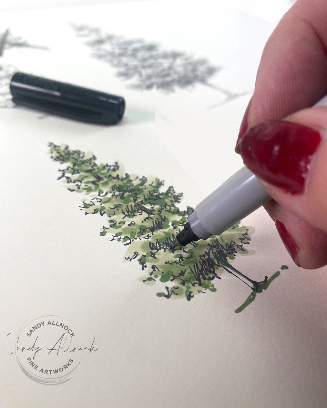
Whatever your favorite medium is, it may well do great with this technique. Start with a light “wash” of color – loose edges to define the whole shape of the tree. With a midtone add in more; don’t get fussy with detailed small marks yet! When you get to adding darks, use your calligraphic line drawing style developed with pencil – sometimes it may look like dots, but other times wiggly little lines. Polks dots can make it look like the measles, so be careful; you’re only adding darks in the shadow areas plus perhaps breaking up any large sections.

Then go over it with a ink pen; if this is your last step it won’t matter what kind since the color medium won’t drag any pen lines around. Use that calligraphic style again, letting the lines come and go so it’s not a solid outline.

Color only

If you won’t be adding pen, you’ll need to use a dark enough value of the color medium to create that last pass. Keep reducing the size of the marks as you go from the first light wash of color to the dark details.

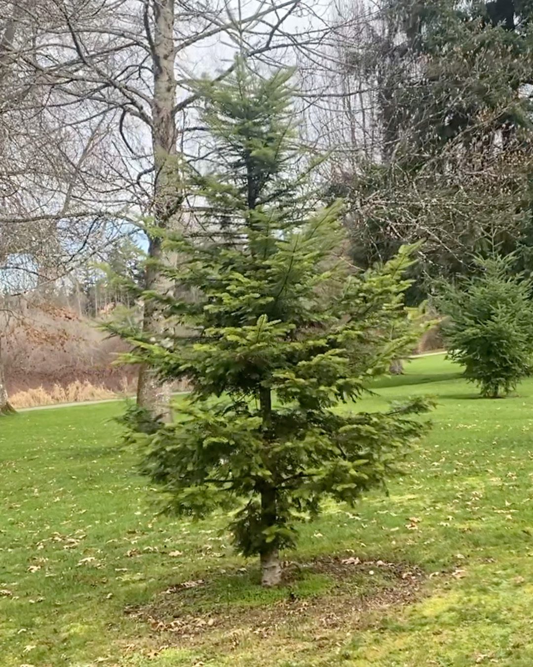
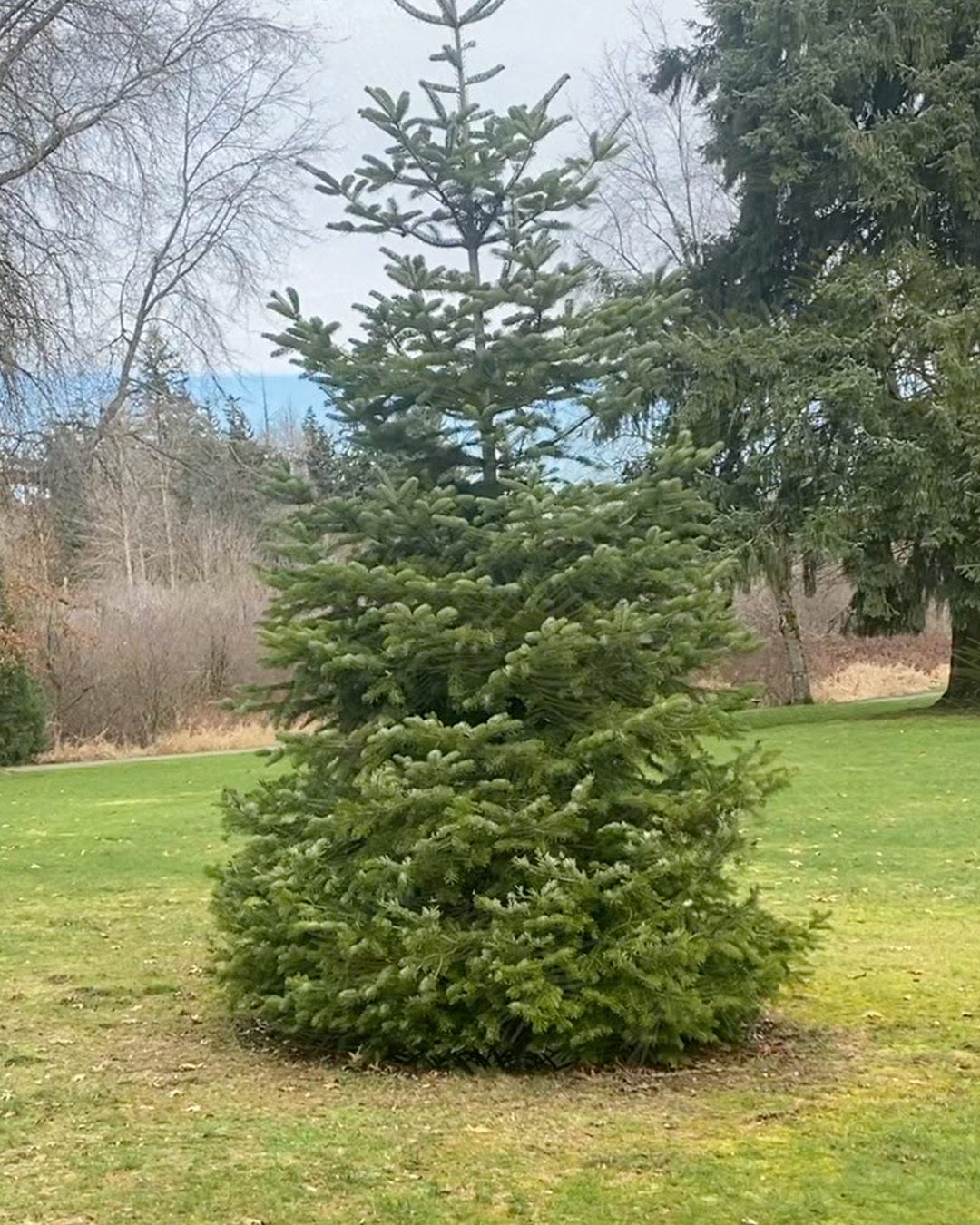
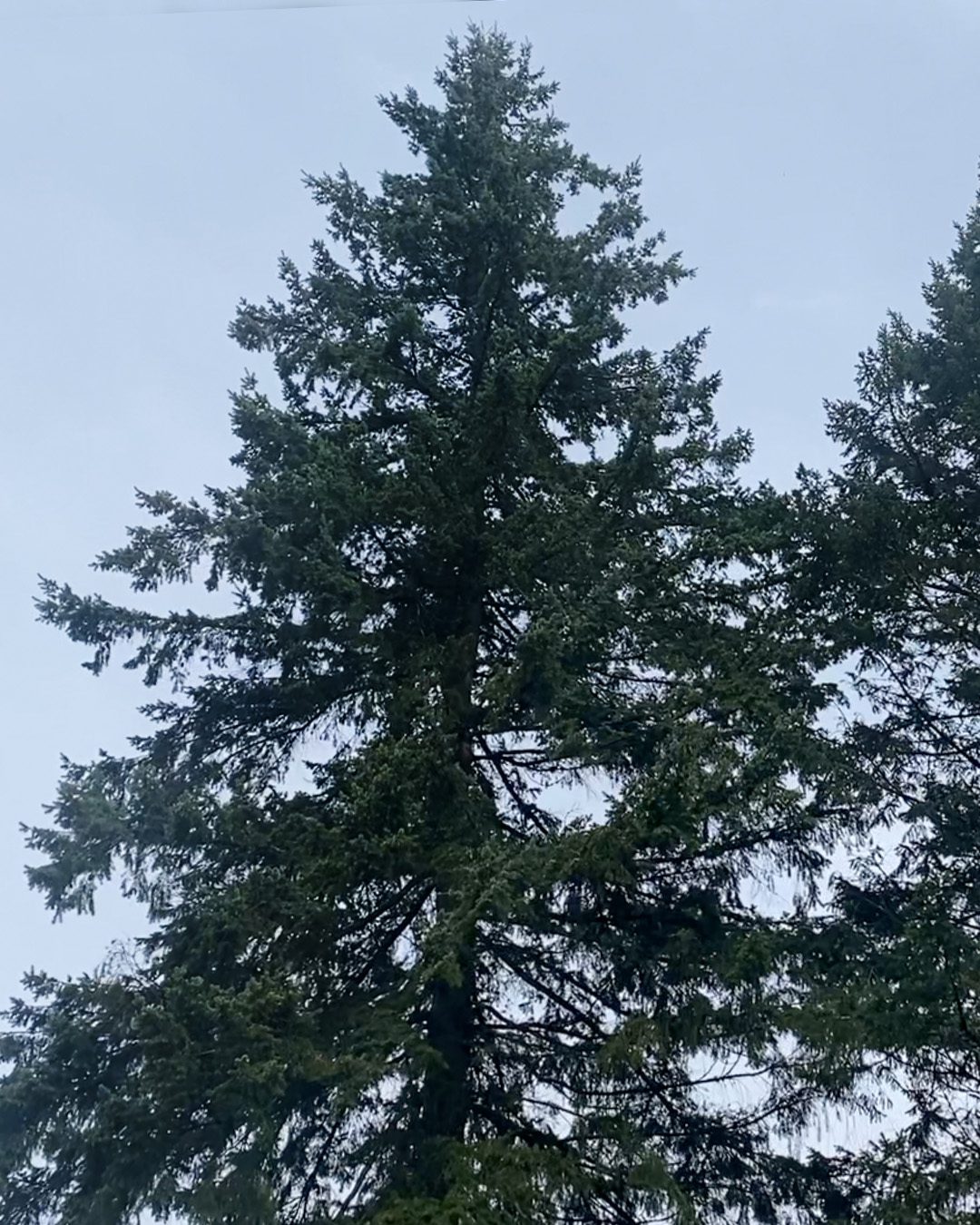
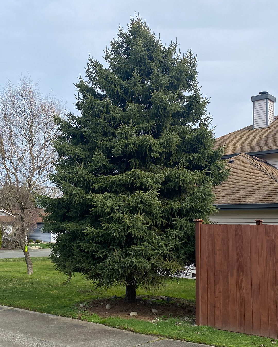
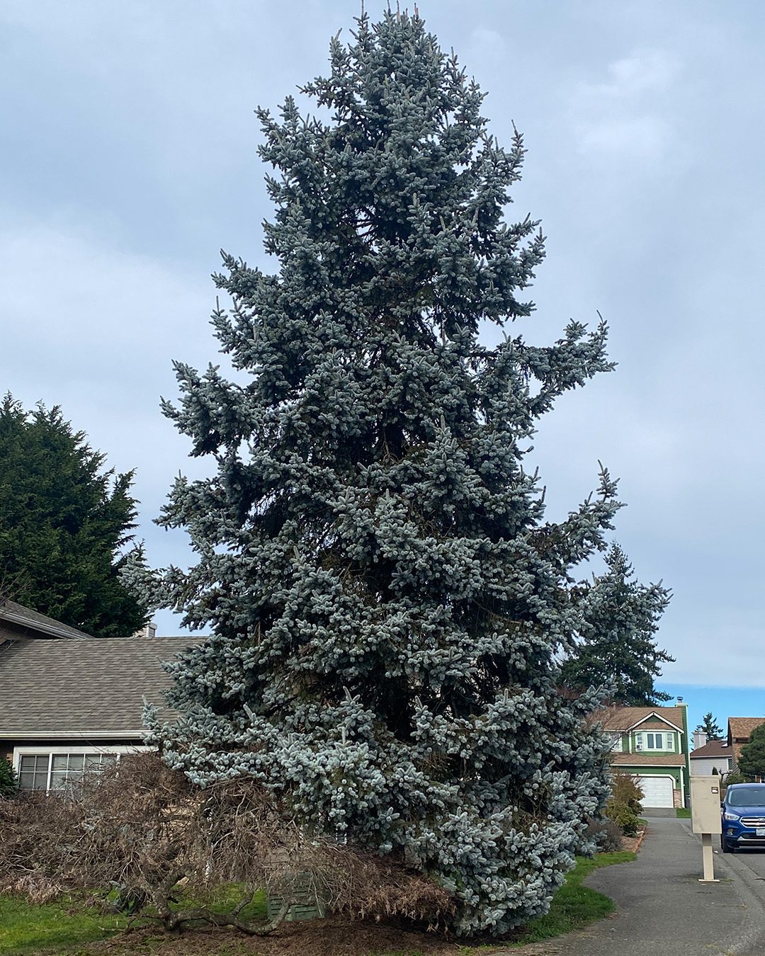
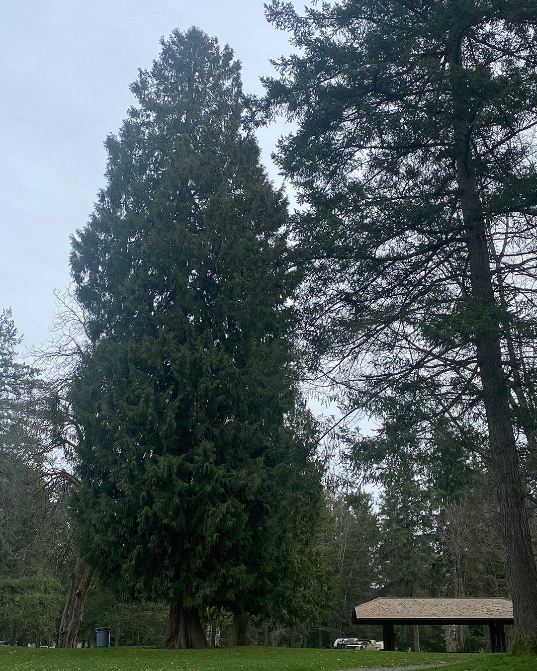
A few photos for you to use

I collected a few pics while I was out – feel free to use any that you like!

See you in a few days with part 2!

If I find any deciduous trees with actual leaf canopies, I might be working with those, otherwise we’ll draw some bushes next, ok? See you Saturday!

Supplies

Some product may be provided by manufacturers for review and use. Compensated affiliate links are here at no cost to you. I appreciate your support of my work with your purchases! Full affiliate and product disclosure | My trusted partners in art
Tri-Color Ink Painting (Ferris Wheel Press)

Tri-Color Ink Painting (Ferris Wheel Press)

Hello there, and welcome to the second post in my Ferris Wheel inks pair! At the end of this post is a special request so I’d appreciate it if you scroll through to the end 🙂

If you missed my last post – let me reprise:

I’m so excited to bring a new partner into my world: Ferris Wheel Press! You may know how much I love pen and ink – not only drawing with it but painting too. And inks that have spectacular properties like many of FWP’s? Oh baby!

I was so thrilled to receive a message from Ferris Wheel a few weeks ago, inviting me to partner with them. I’ve been off the shopping train for a while now, so receiving their new releases is going to be such a treat. And I’ll receive a small commission when you make a purchase – at no extra cost to you.

But this partnership is not just good for me. It’s good for YOU!  

Use ALLNOCK at checkout and you’ll get 10% off your purchase at Ferris Wheel Press!


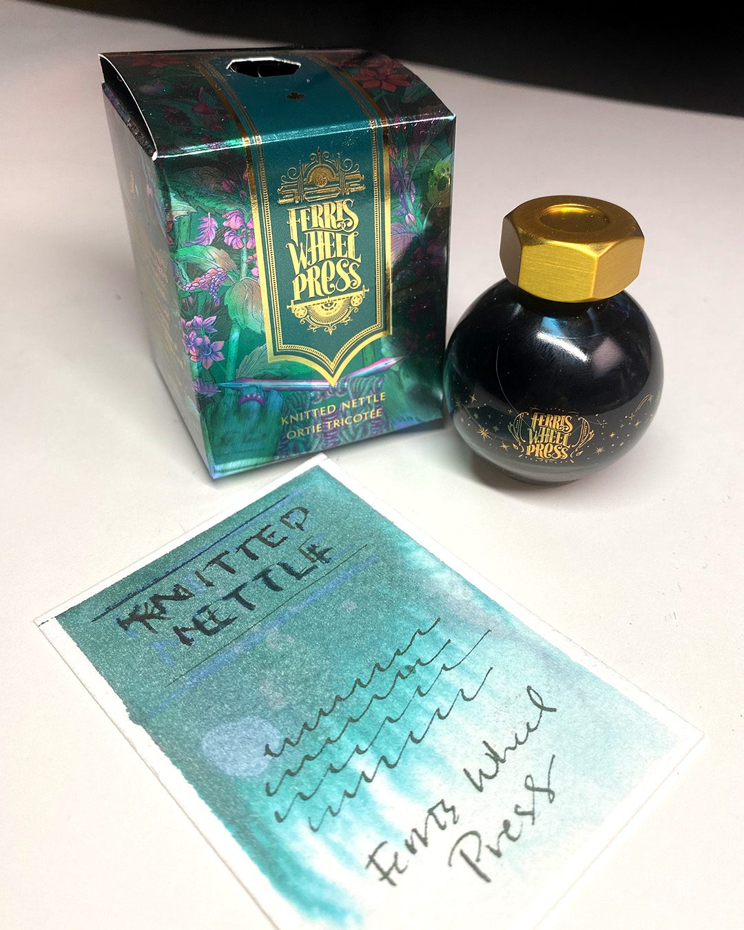
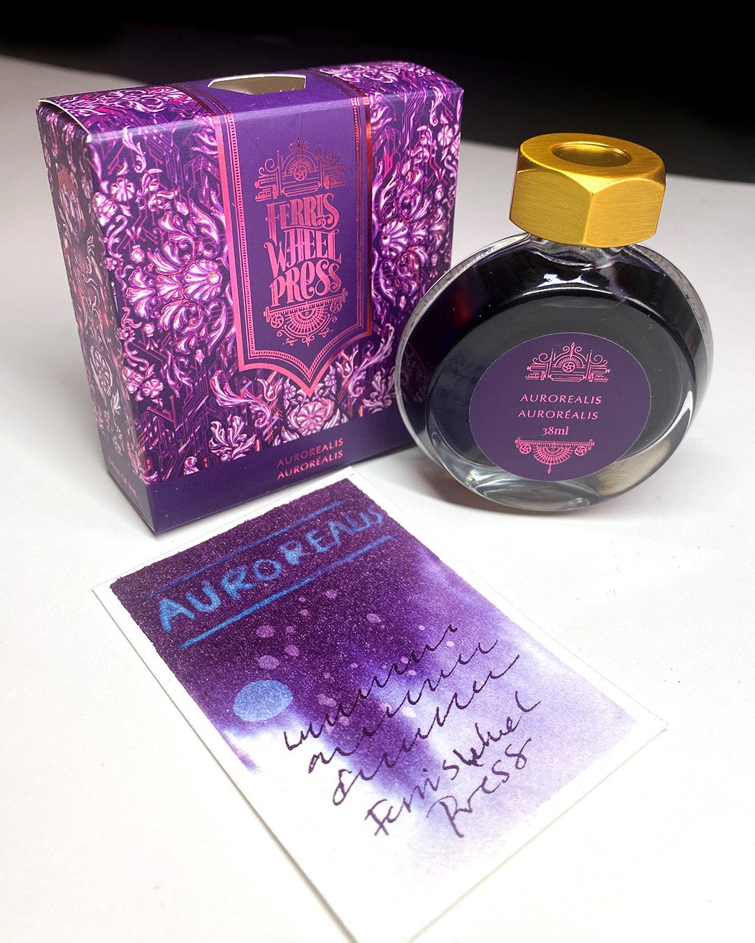
See my previous post for the swatching of these three newly-released colors:


The Sherry Sonata

Knitted Nettle

Aurorealis

Tutorial: Tri-Color Ink Painting

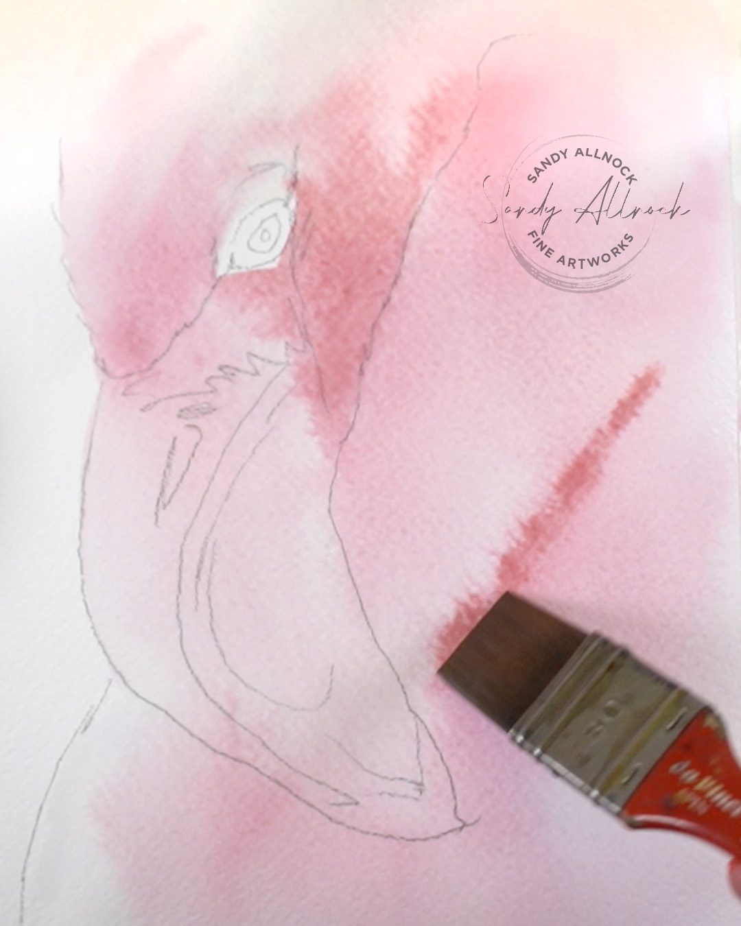
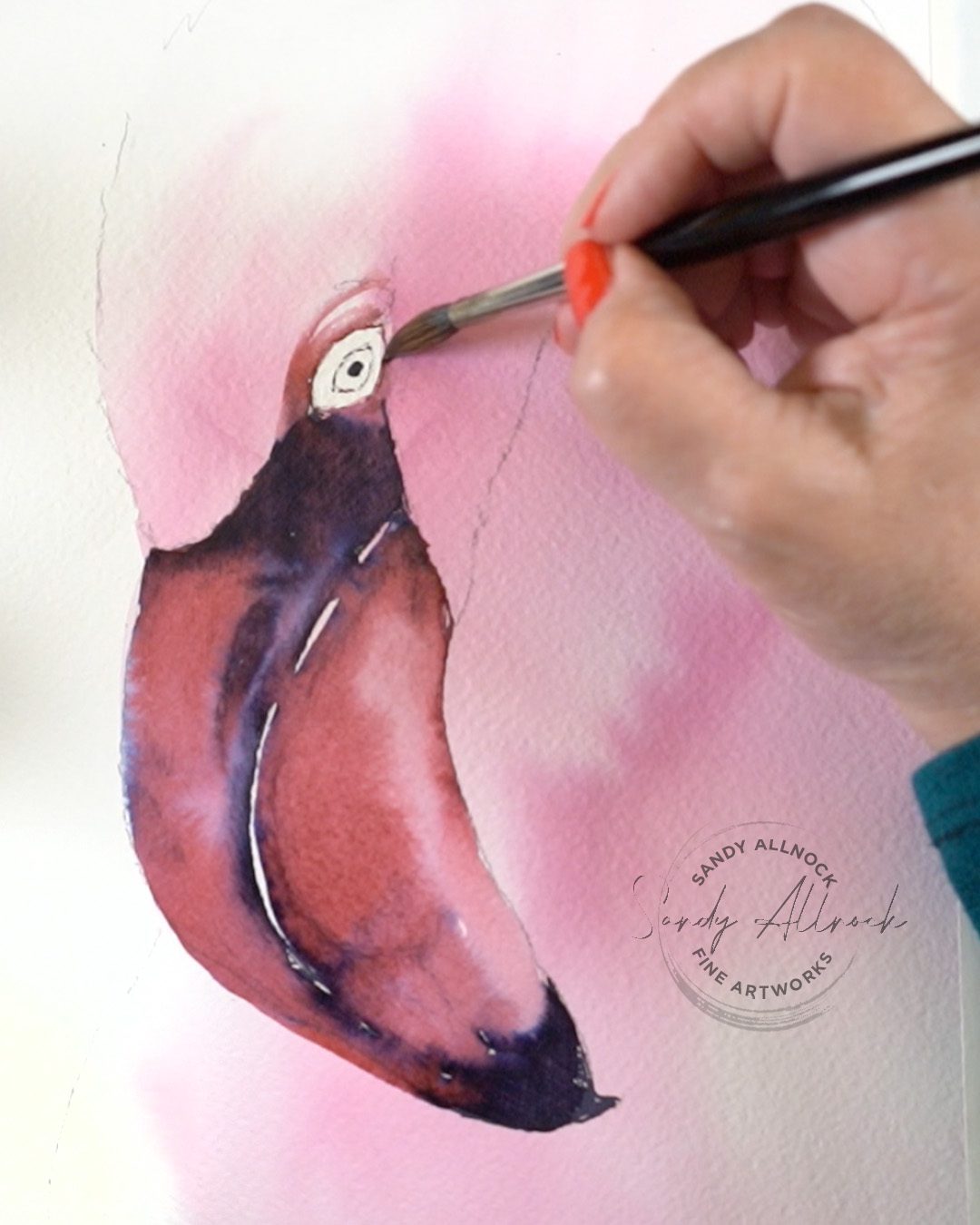
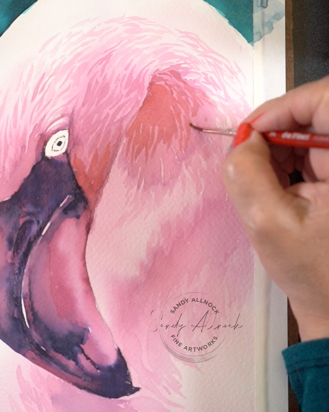
I challenged myself to create a painting using all three inks – and not just sandwiching them together, but to find a nice way to do it. What do you think of my flamingo?

Watch the video below and scroll to the end to leave comments or questions — or click HERE to watch it on YouTube and leave comments over there. I read both dutifully!

Soft pink

I wanted to see JUST how soft I could turn that pink – so I mixed ink and water in a little bowl, and also wet the paper thoroughly first.

Warmer when dark!

Inks do such different things compared to watercolor – the brick-like color of Sherry Sonata is a soft, cool pink when applied lightly as in the previous photo. But when more ink is applied it gets darker and more brown. Mixed with some purple in the Auroreolis, it made for an insteresting swirling blend in the beak.

Subscribe to my weekly newsletter, Creativity In Your Inbox

* indicates required

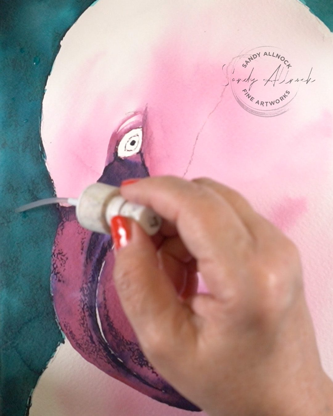
Recovery mode

After realizing too late that I hadn’t dried the paper completely – I had a bloop! But making the entire Knitted Nettle background darker worked nicely, and I used water from the plunger inside of my water bottle to create some light bokeh texture.

Pink feathers

Managing the amount of water vs ink in the mix was a challenge – more water in the areas nearest the highlight, then a more dense ink mixture for shadows within shadows, while keeping the color still very light so I don’t lose the pink hue.

What I love about ink painting

While it’s stressful – I love that ink “does its thing” faster than watercolor. Not that I love panicking when ink starts to run, but it causes me to stay in the moment. I can’t “plan” the outcome as well as I can with watercolor! I think more ink painting will likely make me a better watercolorist too—I’m looking forward to this journey with Ferris Wheel Press!

Special request

I have a small request for you: can you help me with the YouTube algorithm? They changed something in the last month or so, and I’m hearing it’s not just me, lots of artists had a sudden drastic drop in views. More than a 50% drop!

I’d like to ask you to do something that I do for channels I like:

Go to the YT channel, click on the “videos” tab, and hit play, and let it run. I do this in a background tab while I’m doing other things on my computer, muting YT if needed so I can do my other tasks, and rack up views for my favorite artists. Even if they’re only videos I occasionally want to see, I can support them and help their channel by letting the videos play and tapping a thumbs up on a bunch of them.

It’s not a huge effort, but can mean a ton to a channel. You see, far from YouTubers getting rich, my own payments each month average about $150-$200. And with 2 videos a week, 4 weeks a month…I’m spending the majority of my time every month creating free content for… about $200. It’s not sustainable when I’m struggling to pay basic bills, and I am finally seriously entertaining how to move forward if things keep going backwards on YT with the new algorithm settings they’ve employed.

I would be so grateful if you’d just let the videos play – of course watching and getting inspired would be great too, but at this point….I’ll be happy for whatever you can do.

Thank you for the support of my work!

PS If you’re interested in doing more to support my work, you can also join Patreon, take a class, purchase an original….all the usuals!)

Supplies

Some product may be provided by manufacturers for review and use. Compensated affiliate links are here at no cost to you. I appreciate your support of my work with your purchases! Full affiliate and product disclosure | My trusted partners in art

  1. Ferris Wheel Press The Sherry Sonata (red-pink) 
  2. Ferris Wheel Press Knitted Nettle (turquoise) 
  3. Ferris Wheel Press Aurorealis (purple) 
  4. Arches Cold Press sheets

Subscribe to receive blog posts by email: