Funky fold cards for artists like me

Funky fold cards for artists like me

Are you like me? Love all those fancy funky fold cards with things that have multiple folds, flip and slide? I play with them til they fall apart when I get one because they’re so. much. fun!

However, when I make cards, I’ve focused on coloring for years now – and had gotten rid of a lot of the tools needed for all the fancy shmancy stuff. But I decided to finally get down to finding some funky folds that’ll work with my colored panels for cards.

Tutorial: Funky Fold Cards for artists like me

Watch the video below and scroll to the end to leave comments or questions — or click HERE to watch it on YouTube and leave comments over there. I read both dutifully!

Funky Fold Class

Over at Artventure , the class is mostly available (I say mostly because Apple is slow about getting approvals done; if you’re on an iOS device, you can go to the web and purchase the class and it’ll become available to you also on your phone or ipad.)Ā But it’ll be fun for the folks who want to do something a little special with your colored cards – whether scenes or just an image.

As I had promised a while back, I used the 20 images colored in the 4 Favorite Things classes (all seen on the Holiday page) to create cards in this class that’s all about the engineering of the card bases. There are five templates, some have both horizontal and vertical templates….and since completing it realized I had another idea or two so there might be more added to it, too!Ā 

To get to the class, just pop into Artventure and look in the list of classes on the left hand menu!

Swap is almost closed!

If you were thinking about signing up, get on it! Deadline for signup is October 31. Go to Artventure and look for this orange graphic in the Featured section.
Weekly Zoom calls

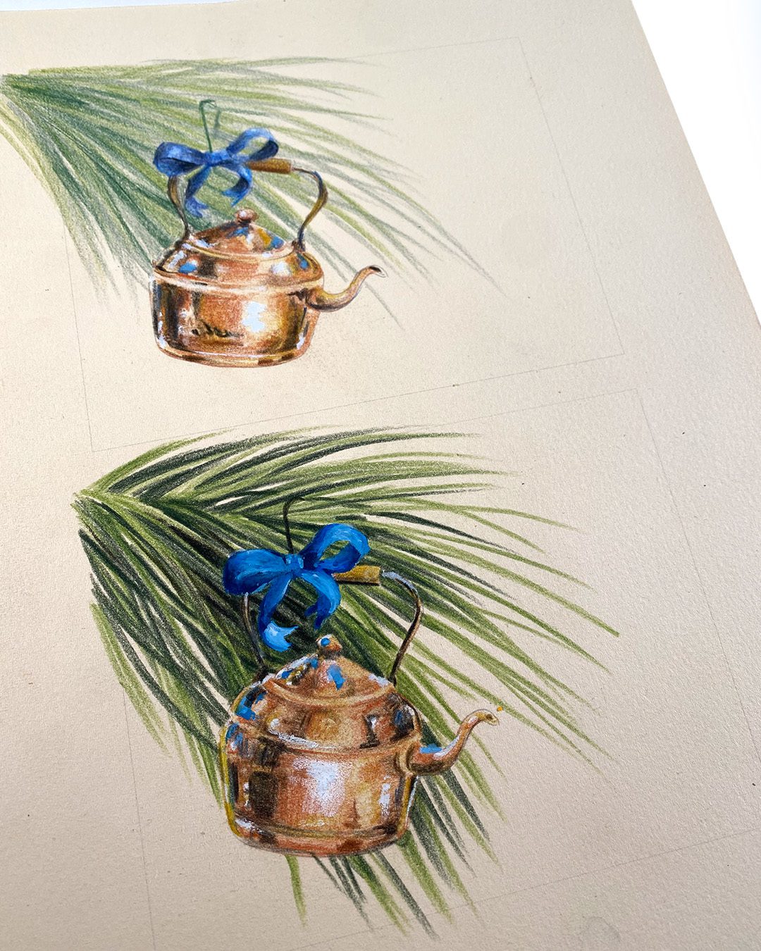
I’ll be continuing weekly Zoom calls through Thanksgiving – please do join us! They’re in Artventure (are you getting the idea that’s my social hub? lol!) and the kettles colored below were in the Thursday call. Unfortunately the replay didn’t capture the right screen, so only those who showed up got to see it. But I did post some tips on a post over at Artventure; the kettles drawing is in the Watercolor Favorite Things class but I colored them in pencil. Monday’s Zoom will also be colored pencil, so be sure to weigh in on the medium in the comments on the event page!
Heads up for cardmakers

My next video is also a card video – woohoo! Be sure you’re subscribed to either my blog or YT to get notified!

Supplies

Some product may be provided by manufacturers for review and use. Compensated affiliate links are here at no cost to you. I appreciate your support of my work with your purchases! Full affiliate and product disclosure | My trusted partners in art

Subscribe to receive blog posts by email:

10 Tips for detailed pen and ink drawings

10 Tips for detailed pen and ink drawings

I probably should have gotten this one done earlier in the month to help inktober participants get through their drawings…..better late than never, right? Have you been drawing in October?

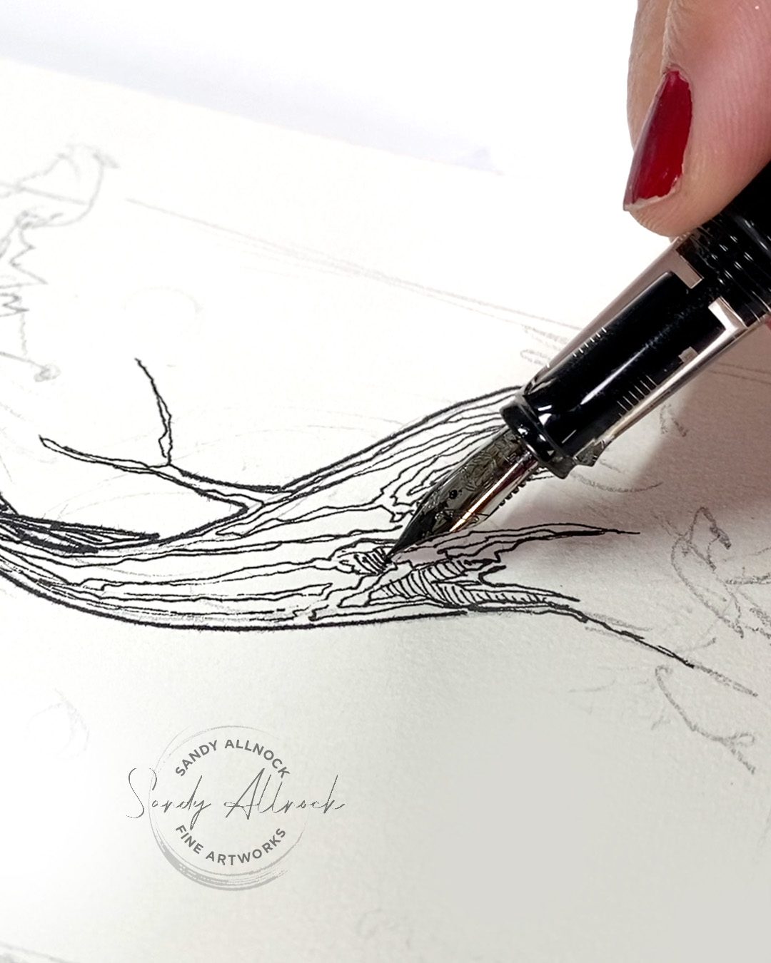
Tutorial: 10 Tips for detailed pen and ink drawings

Watch the video below and scroll to the end to leave comments or questions — or click HERE to watch it on YouTube and leave comments over there. I read both dutifully!

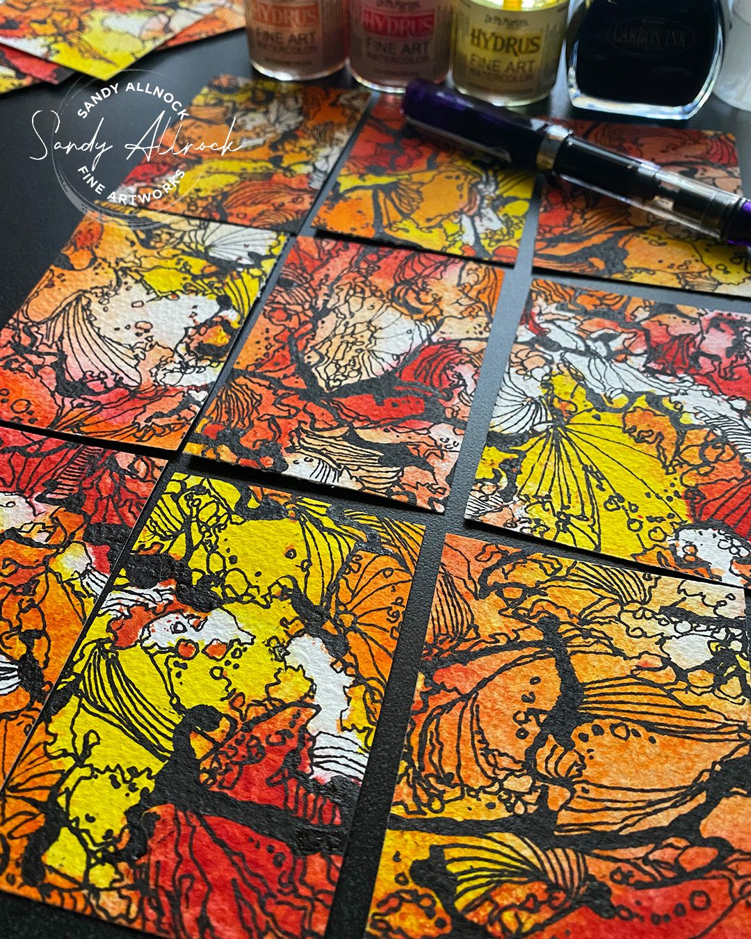
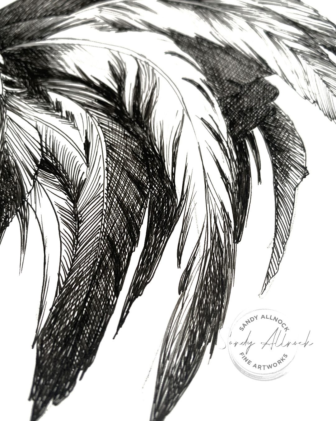
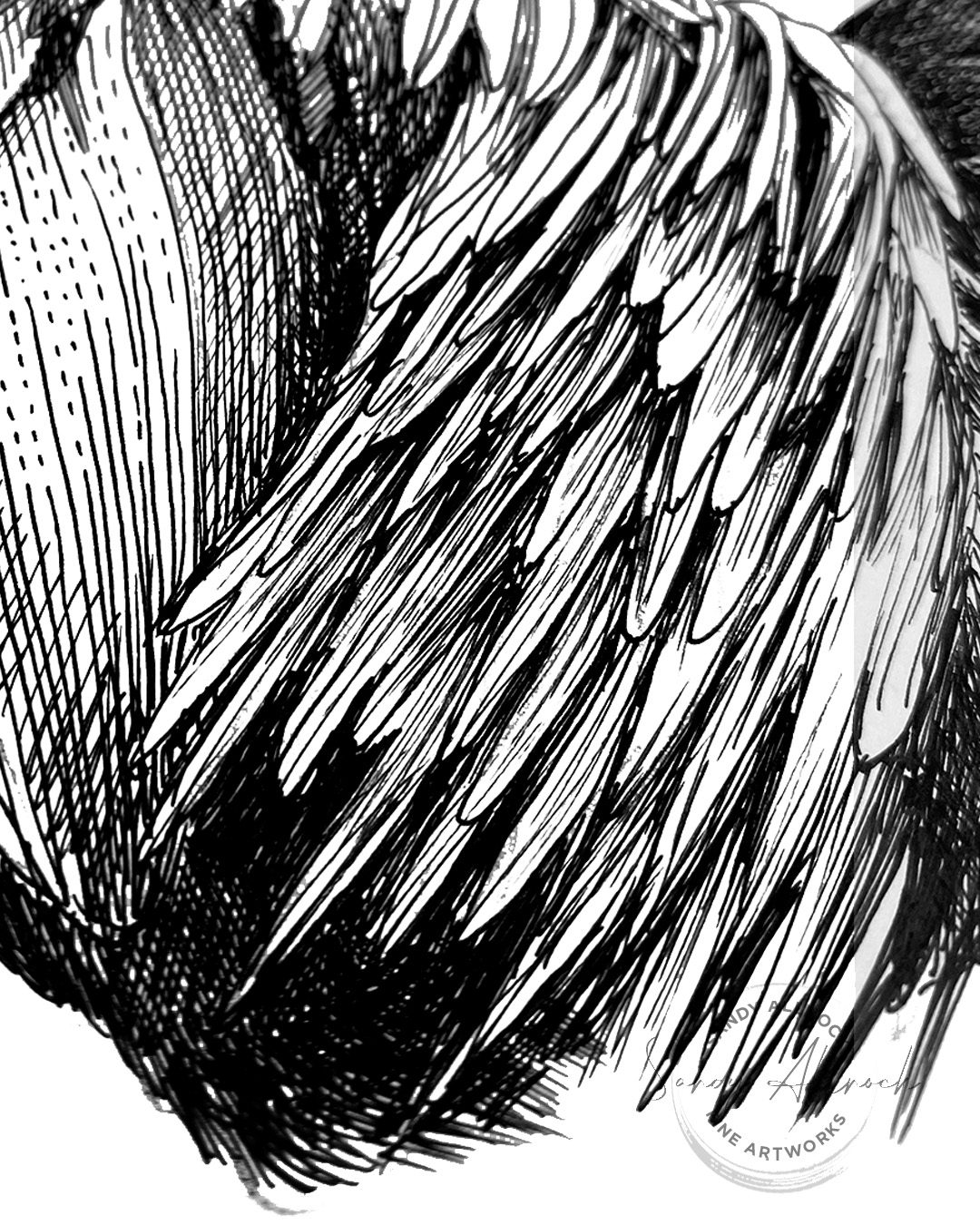
Below are the 10 tips with a little more about each than in the video. Note something I saw in the photos….when zoomed in on a section, they look like abstract art, huh?

1 Correct supplies for the task

Think about your goal. If you want a piece with really crisp lines, the Lettering pad is great for lots of pens I’ve tried. No feathering! It’s smooth without being shiny, which is nice, and the writing experience is great. But note that you can create other drawings that have a looser feel on any papers— I do that all the time. Note this kitten drawing that was on very rough paper and allowed for entirely different subtle techniques.

In this drawing I used Copic multiliners because I’d already wrecked one drawing by laying my hand in wet ink, so sometimes it’s just practicality that forces a choice!

2 Choose a suitable style

Relaxed or tight? Detailed or just the essentials? Playful or technical? All are just great, it depends on what you want. Sometimes the subject matter will even dictate what you choose.

3 Draw to the destination

A great tip from John Muir Laws – when making a line, keep your eyes on the destination of that line. Don’t watch the pen. You’ll find you reach your destination with a better looking line as well as ending in the right spot! This works for both straight and curved lines, in my experience, though it takes a while to retrain your brain.

4 Vary line length

Different parts of your drawing can be delineated by the kinds of lines used. Short lines for small details and longer lines for flowing sections. Choppy in some cases, dashed in others. A good combination can add a lot of interest in your drawing too!

5 Consider value

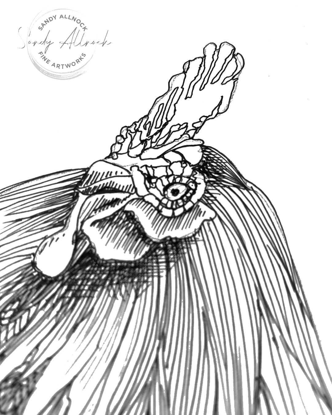
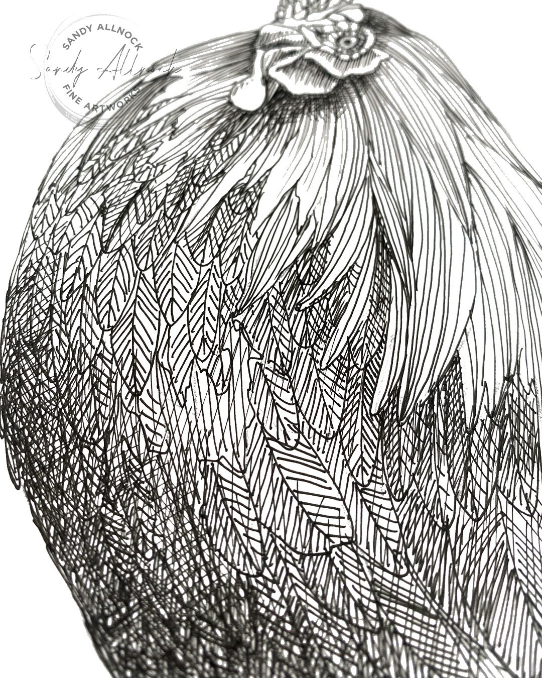
Value is the amount of light vs dark – and having changes in values adds so much to the depth! Lines that are closer together or have overlapping crosshatch layers will be darker, and leaving more space between lines or making them dashed will add more light.

*a caveat on the photos in this post: some of the areas look like a blurry grrey or blown out highlights; that’s because the photos had some depth of field going on, and when I brightened them to make the paper white, it did weird things. I did not have grey areas in the drawing! šŸ™‚

6 Draw attention

Where would you like your viewer to look? Find ways to make some of the sections start to take the stage. In this drawing each cluster of feathers had a different level of interest and the ones that drew the most attention had lighter values to them and some of the darkest shadows. The focal point of most any art is where the lightest lights are next to the darkest darks, pulling attention to themselves.

7 Follow directions

Not that there’s directions to follow in art – but this is all about letting lines follow along with the direction of the subject matter, which contributes to the flow.

There are styles where ALL lines are the same direction, even ones that are perpendicular to subject matter elements. But in general following the directono of the subject is a great choice.

8 Bump contrast

Amp up the difference between lights and darks to increase visual interest overall. Where do shapes need a little separation? Make sure the value is darker on one side or the other to increase the difference in the implied line between them.

9 Highlight favorite part

For every drawing you do, think about your favorite bits of it. “Everything” can lead to a cacophony of elements arguing about who’s at center stage, so you need to assess a hierarchy of your interest! Then figure out what you’ll use to draw the viewer to see what you see. Is it contrast? Amount of detail? Lighting? Composition?Ā 

The audience might not resonate with what you resonated with—that’s an audience for you. But that doesn’t mean that having a point to make isn’t a desirable part of the process.

10 Finish well

My last step is always to squint and see what I see. Are the darks nice and dark? Or are the darkest spots in the right places I want them to be? Is there good roundness? Definition of shapes? Don’t let the “Whew! I’m done!” but bite you before you put in the final tweaks!

Need a rooster?

A few people I previewed this image to asked me if I’d be offering it up as a printable…..so here you go! Color it and use it for your art projects, or study it and try to create your own rooster!

Color up this gorgeous rooster! Match the colors from the reference photo provided when you purchase this printable image, or make up your own rainbow of beauty to splash on this noble fellow!

Supplies

Some product may be provided by manufacturers for review and use. Compensated affiliate links are here at no cost to you. I appreciate your support of my work with your purchases! Full affiliate and product disclosure | My trusted partners in art
Subscribe to receive blog posts by email:

What’s an ATC? (And would you like one?)

What’s an ATC? (And would you like one?)

Have you heard of ATCs and thought, “Oh that’s just for THAT kind of person.” I’m about to prove you wrong!Ā 

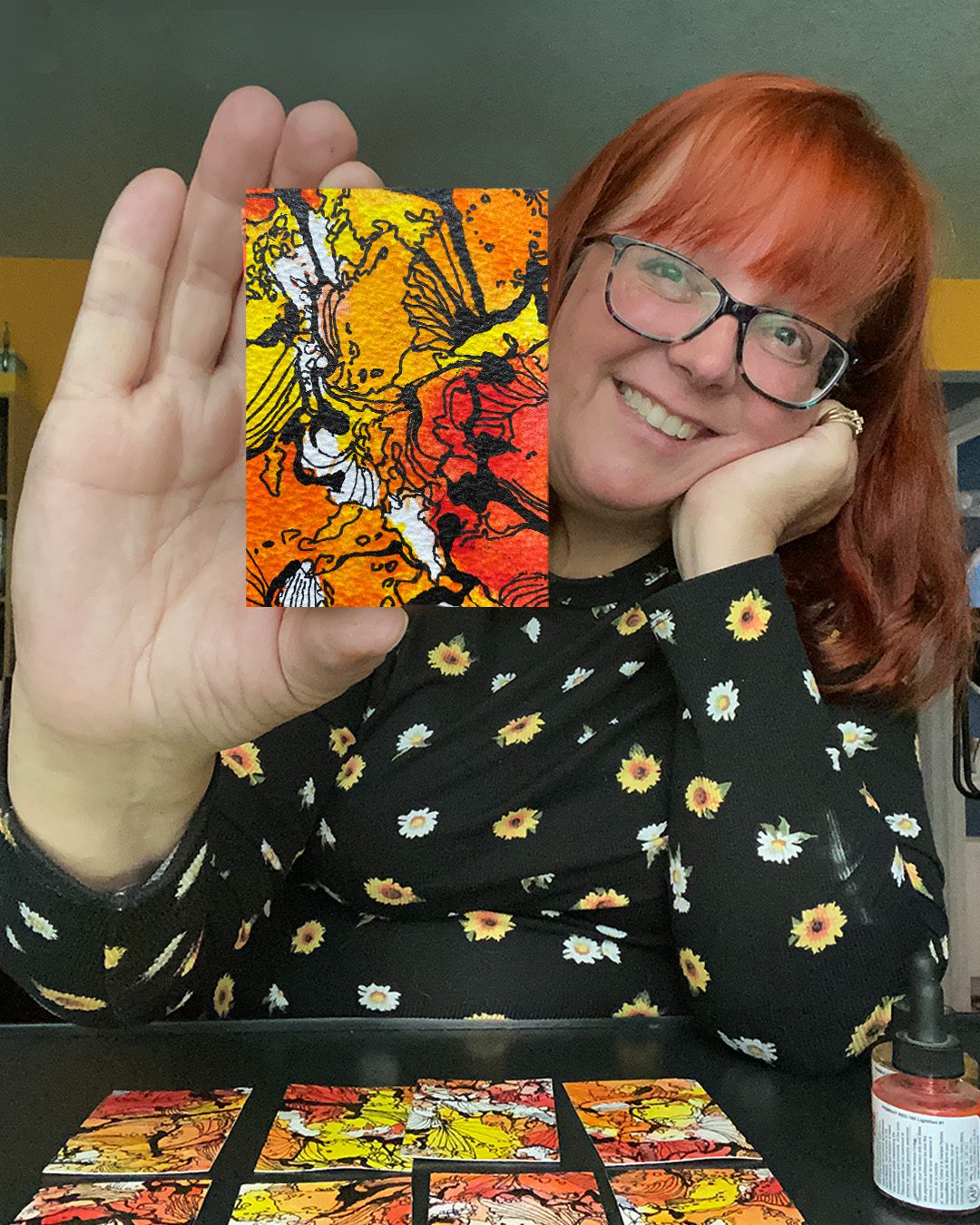
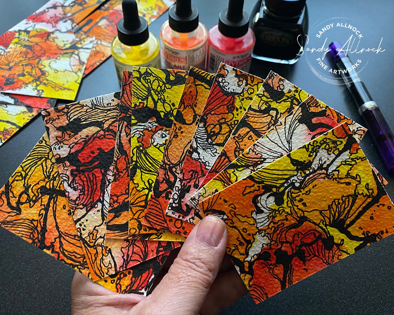
ATCs are Artist Trading Cards. Baseball-sized cards that you trade with someone else or give them away. No selling—and anyone who makes art can make and swap ATCs! Read on to find out a bit more.

Tutorial: What’s an ATC? (And would you like one?)

Watch the video below and scroll to the end to leave comments or questions — or click HERE to watch it on YouTube and leave comments over there. I read both dutifully!

How long have ATCs been around?

The artist trading card is thought to have started in 1997 when M. VƤnƧi Stirnemann hosted the first swap in Zurich, Switzerland. Since then these tiny art pieces have been traded all around the world!

ATC details

👍🏻 Each ATC should be exactly 3.5 inches tall and 2.5 inches wide – same as a baseball card. Most are rectangular but some artists do experiment with arched tops, folding flaps, pockets etc. ATCs should have a little weight to them – cardstock, not lightweight paper – but not so much that it couldn’t slip into a clear plastic sleeve made for this size card.

👍🏻 Some artists include interactive parts that fold or swing out of it (think flaps and doors, limbs on paper doll cards, tails on animal cards).Ā 

👍🏻 ATCs can include text like quotes or journaling, stamping, painting, pencil, mixed media, basically anything goes. Make yours a reflection of YOU and your own style. If you do cute, cute is perfect! Grunge? Go for it! Just remember: these aren’t throwaway art. Put your heart into what you share with someone else! Ā ❤️

👍🏻 ATC cards are often traded insideĀ card sleevesĀ to keep the art safe inside, but the sleeves are not required. (I bought a pack of these because I think it’d be fun to use them as “business cards” when someone buys one of my paintings instead of a printed card.)

There are 3 types of ATCs

1️⃣ One-off – a one-of-a-kind card
2️⃣ Series – a few cards that are on one theme, usually numbered – 1 of 5, etc
3️⃣ Edition – two or more cards that were created to look identical

On the back of an ATC

Include the following, typed & attached or handwritten:

  1. Name of the artist
  2. Date it was created
  3. Title (if it has one)
  4. Email or website
  5. Any notes like whether it’s part of a series or editionĀ 

If you join a swap

Be sure to thoroughly read the instructions! Some swaps have themes, or require sleeves, or want more info sent with the card.

Our swap at Artventure is pretty straightforward. Fall theme (not halloween), due to the recipient during the week of Nov 12-18. All are welcome – no matter your artistic experience level!

Gratitude Junk Journal Class

Time is running out to get 20$ off in the Earlybird sale of Gratitude Junk Journal class! It runs out Oct 31 – use code HAPPY23 at checkout (ends October 31, 2023 at 11:59pm eastern)!

Supplies

Some product may be provided by manufacturers for review and use. Compensated affiliate links are here at no cost to you. I appreciate your support of my work with your purchases! Full affiliate and product disclosure | My trusted partners in art
Subscribe to receive blog posts by email:

Zeke’s Tree Farm: Storytelling in art

Zeke’s Tree Farm: Storytelling in art

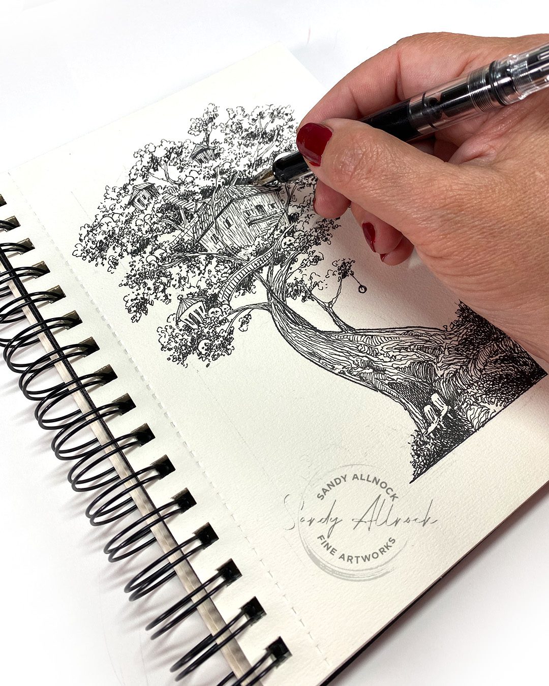
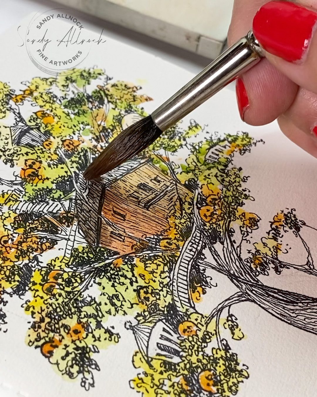
Have you ever had a drawing literally tell you a story? I’ve had storytelling experiences before – when I didn’t know what I would be drawing, I thought about the characters and gave them personalities, etc. But I’d never had the drawing, which was loosely penciled in, start to tell ME a story. Fleshed out with details! Kinda crazy.Ā 


I wrote it up on my Substack and wasn’t thinking about putting it in the YT video, but when I was wondering what I should ‘teach’ in this video, I realized…..that story needs to go with the drawing. So…I bring you Zeke!Ā 


Video: Zeke’s Tree Farm

Watch the video below and scroll to the end to leave comments or questions — or click HERE to watch it on YouTube and leave comments over there. I read both dutifully!

Zeke and Frannie

The names weren’t provided by the drawing; Zeke came to me right away, as that was my grandpa’s nickname. His wife was Frances. He wasn’t a pumpkin farmer, nor a tree farmer…. so the rest was all made up. By the drawing.

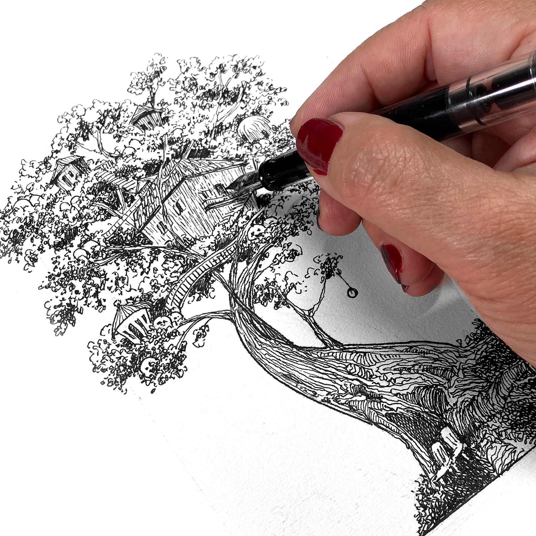
The drawing

I loosely pencilled in the tree; I wanted to draw one that had my swoopy shape, and while sketching it I doodled buildings in, not sure if they’d be birdhouses or whatnot. This is in a cheapie no-name sketchbook, drawn with an Eco pen by TWSBI with Carbon Black ink by Platinum, and the watercolors are Daniel Smith.

Want Zeke’s tree?

I had messaged with a friend about my story, and she encouraged me to post it on Substack, which is a great platform for me to practice my writing and storytelling skills. She then said she wanted to print it out from Substack and read it to her grandkids, and print out the drawing so they could color it while they listened. So…..it’s available for you, too, if you want to try that

Download this pumpkin-farm-in-a-tree to color for your art projects, or sit down with your grandkids and ask them to fill in more of Zeke’s story.Ā Ā 

Zoom call tomorrow!

I’ve been wanting to get back to hosting more art Zooms….I had stopped because the few I did got carried away and too long! But if I have it in my head I’ll be doing it a lot, maybe I’ll just get ‘er done and move on, right?

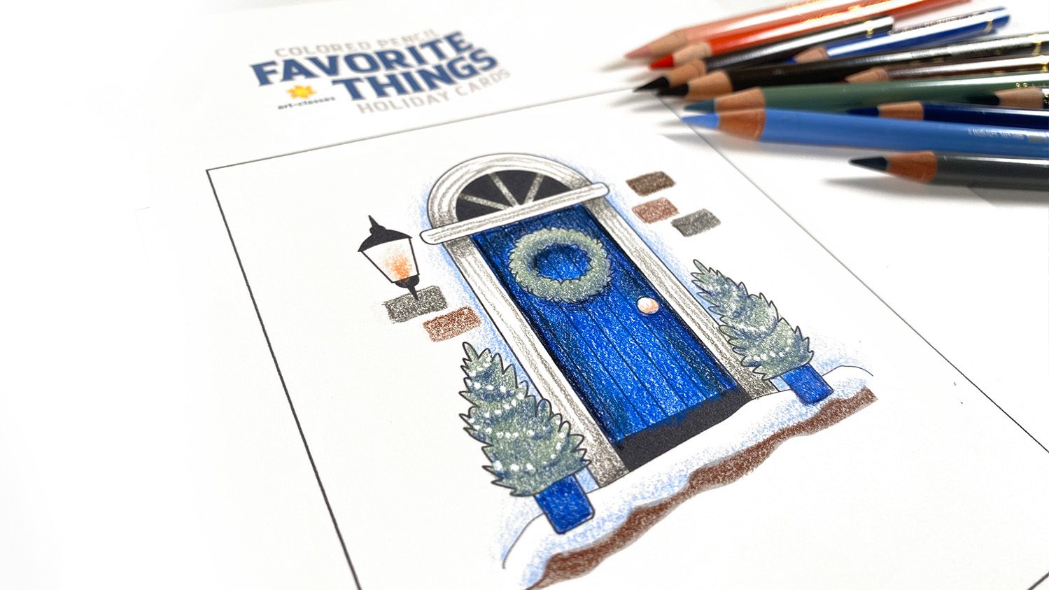
So I’m starting a series of livestreams on Zoom to color images from the new Favorite Things courses in a medium other than the class it came from. Like this lovely door, I’ll do in either alcohol marker or watercolor! Folks are voting over at Artventure, which is also where the Zoom calls will be.Ā 

This one is set for Weds 9am Pacific, but I’ll vary the times and dates to allow for more folks to join in on the series. Replays will be available in the app for a week, then will be moved to a course that’ll cost a few dollars, just to help support the cost of the platform. šŸ™‚

ATC swap, anyone?

At Artventure we’re having a fall ATC swap – I wrote up all the details over there!

WHEW!

That was a lot, I know. Thanks for reading to the end! Leave a comment and let me know if you’ve ever had a seed of an idea dropped on you while drawing. Was it a story? Idea for another art piece? A solution to an entirely unrelated thing? My brain just lets loose, and I never know what’s coming!

Supplies

Some product may be provided by manufacturers for review and use. Compensated affiliate links are here at no cost to you. I appreciate your support of my work with your purchases! Full affiliate and product disclosure | My trusted partners in art
  1. Sketchbook (no-name, terrible paper, lol)
  2. TWSBI Eco Medium nib fountain pen

Ā 

Subscribe to receive blog posts by email:

Favorite things for finishing a card image (and new classes!)

Favorite things for finishing a card image (and new classes!)

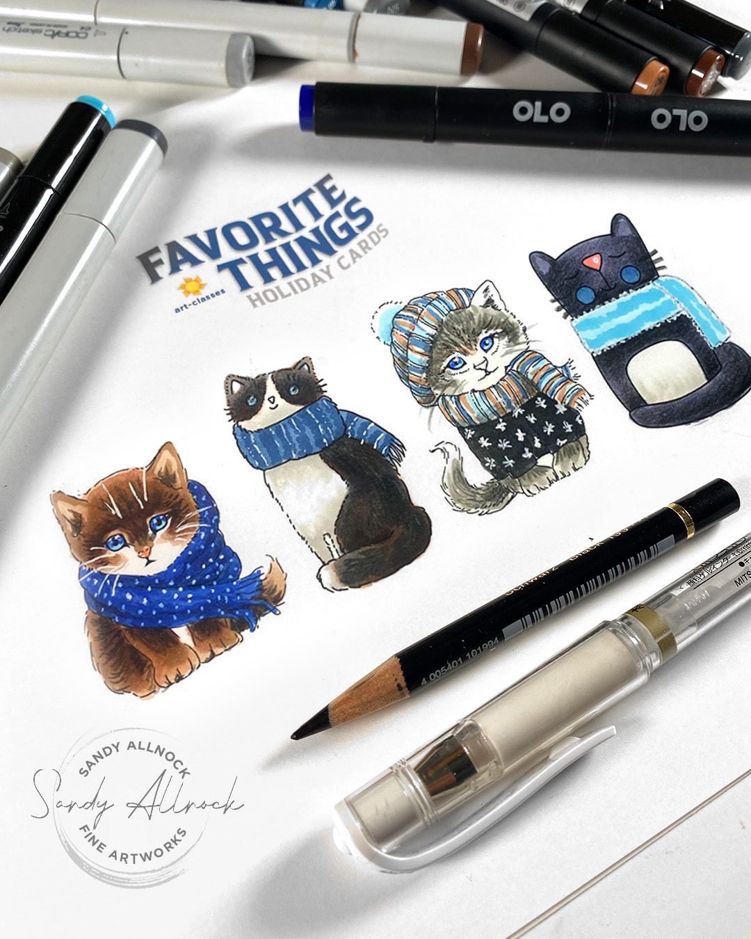
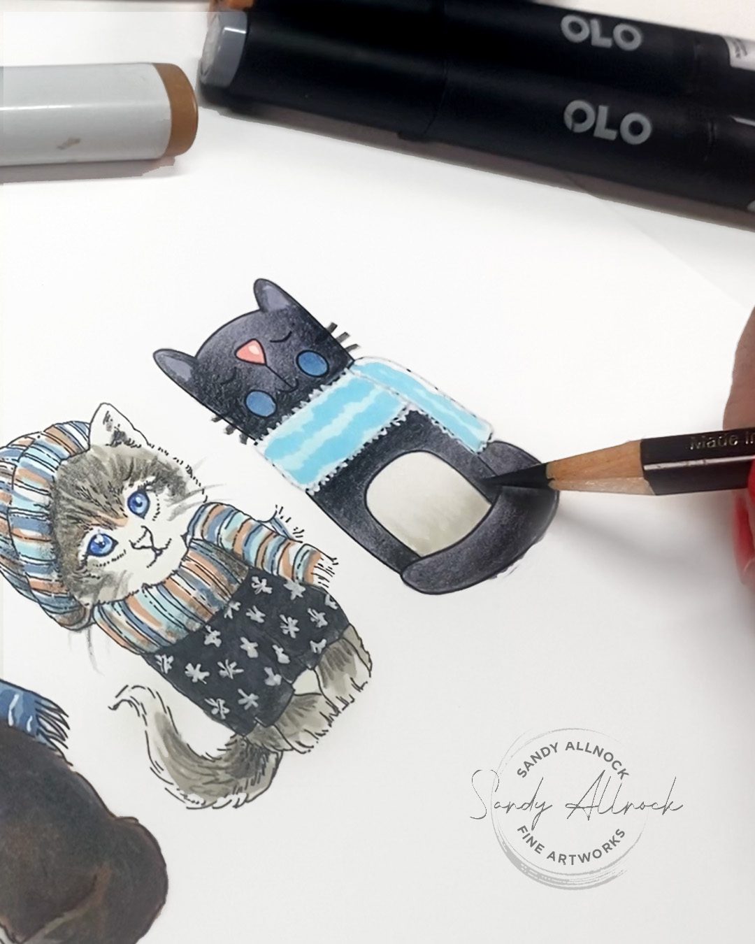
Have you begun your holiday cardmaking yet? I have a small handful done but I feel so far behind! Today I’ll give ou a couple tips that’ll take a simply-colored image and spice it up – and one tip will even make your coloring faster.

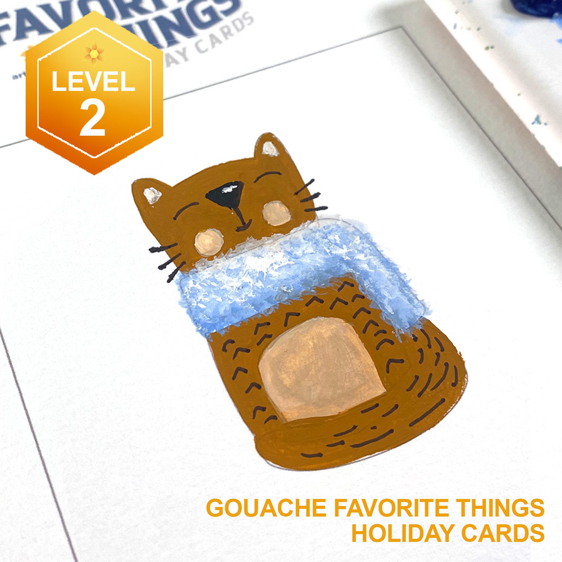
PLUS I’ve just released four brand new Level 2 classes—coloring images that’ll be unique ones for your holiday cards. Let’s get going!

Tutorial: Favorite things for finishing a card image (and new classes!)

Watch the video below and scroll to the end to leave comments or questions — or click HERE to watch it on YouTube and leave comments over there. I read both dutifully!

Four Tips, especially for new colorists

  1. Got some messy blending? Cover it up by adding a pattern on top! Either white snowflakes or polka dots, or even dark stripes or dots on an outfit would do the same. And if it’s a background, just add falling snow! No one will see the messy color beneath.
  2. EASY blending: Color an image with one flat alcohol marker color, then do colored pencil blending on top. It’s the best of both worlds: simple flat alcohol marker with no blending needed, then the pencil won’t be fighting white gaps caused by the paper texture. Win win!
  3. Add shading to white pen texture! Go over the shaded areas with the alcohol marker base tone of the object being shaded. That’ll dull down the pattern in shadow areas, making it look more supple like real fabric. Scribble the pen on scrap paperĀ 
  4. Make the tiniest highlights on eyes by drawing the dot with a pen, then “shave” it down to a good size with a pencil!

New Classes & more

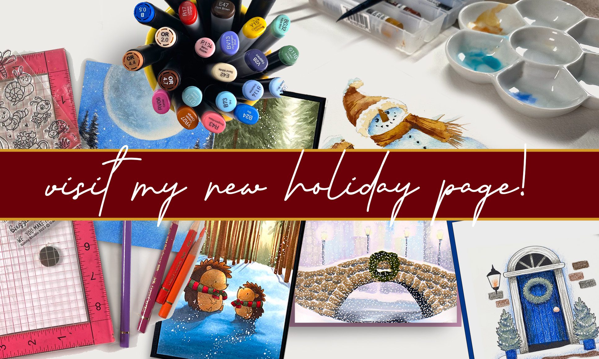
Click on the image below to get to the course you’re interested in – you can see all the images that’ll be in the lessons once you’re there! OR you can go to the brand spanking new HOLIDAY page, where these are all at the top, and all the other holiday/winter classes are all on one page! Tap on the image below:

Alcohol Marker

Colored Pencil

Gouache

Watercolor

A timely older tutorial…for winter

White pens are the bane of the existence of many…this might help!

WHEW!

Those who’ve followed along on Patreon and Artventure know this was a heroic effort to get all this together; and I’m excited that I also have next week’s videos scheduled. So after I take a couple days to just SLEEP, I’ll be spending time working on sample pieces and figuring out prices for the upcoming commission fiesta. Hooray!

Subscribe to receive blog posts by email: