How to mix the perfect cat’s eye green hue

How to mix the perfect cat’s eye green hue

Ever need to mix the perfect green for a cat’s eye? (Or anything that’s an olive green?) With a little basic color theory, you can mix ANY color you want!

A little side story: while working on these two pieces I was on the phone with  my Mom. She was SO EXCITED that I launched my Commissions page finally! And excited that a bunch of applications came in right away too! And that there are a bunch of pieces that sold in the big SALE currently going on. I mean, seriously. This is a milestone. Mom doesn’t do computer stuff and watch my videos or anything. She was giving me advice on pastels. Celebrating a MILESTONE here. 🙂
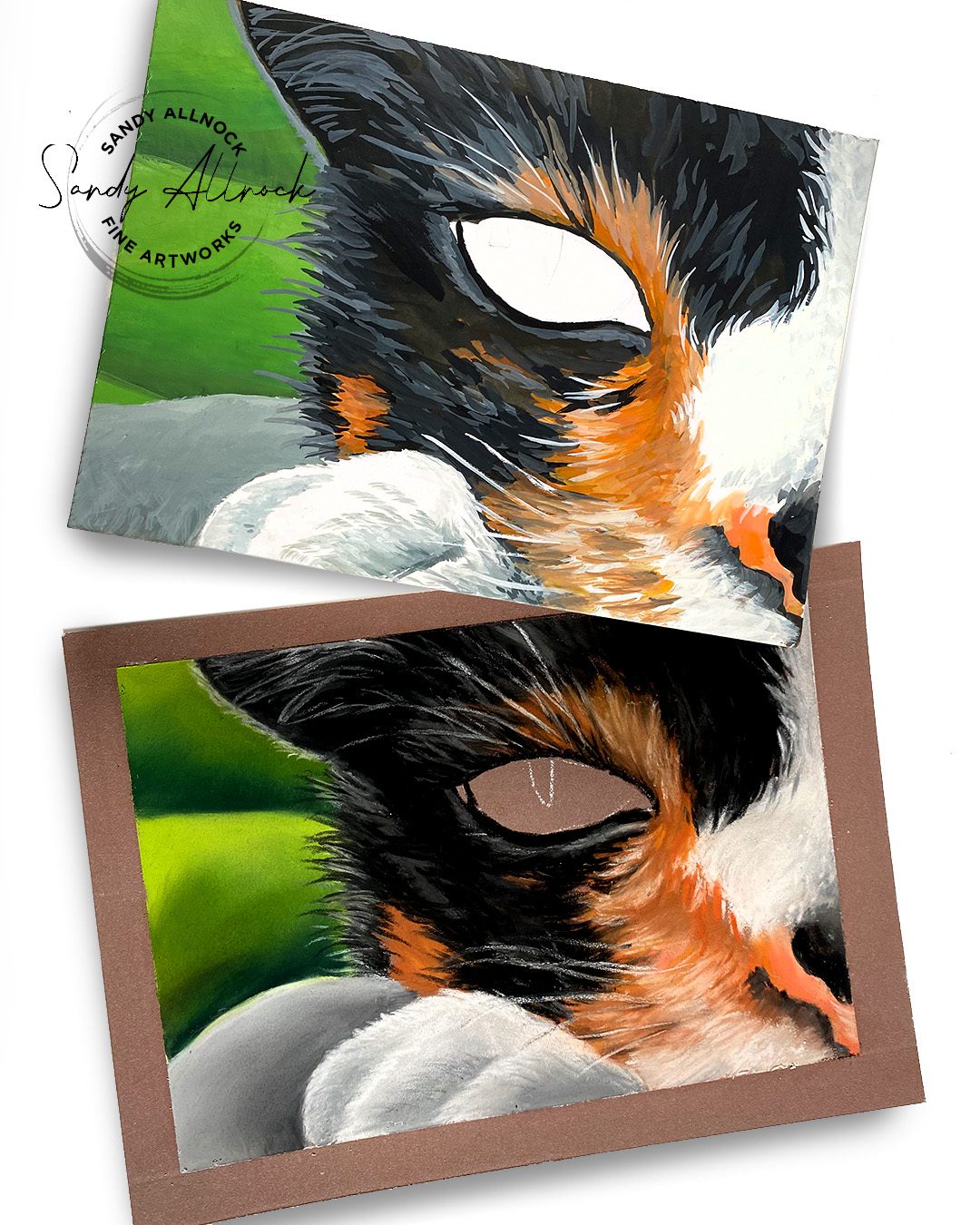
If this photo doesn’t convince you that eyes are what makes a drawing work…nothing will!

Tutorial: How to mix the perfect cat’s eye green hue

Quick question: what do you think about the thumbnail? I’m not worried as much about what it looks like here embedded in the blog, but in the grid you see on YouTube. Would it catch your attention more than my usual?

Watch the video below and scroll to the end to leave comments or questions — or click HERE to watch it on YouTube and leave comments over there. I read both dutifully!

Mixing colors for wet media

Watercolor, gouache, acrylic, oil….anything that is mixed on a palette before being applied—mix them on the palette. A warm yellow will turn a cool green into an olive color, desaturating it.
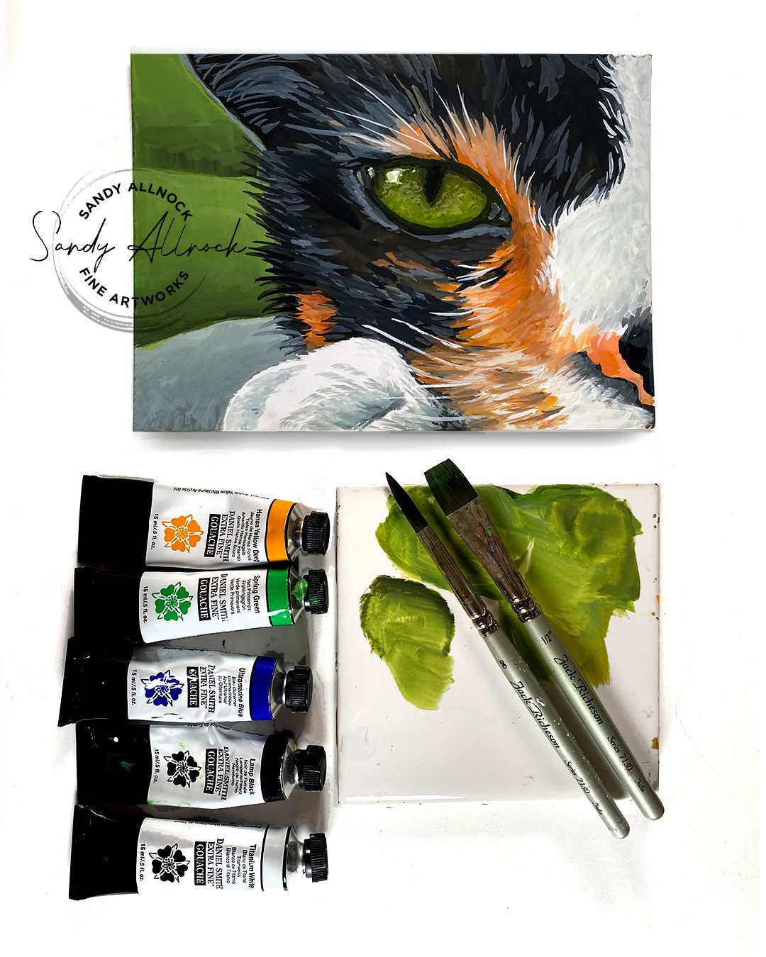
Mixing colors for other media

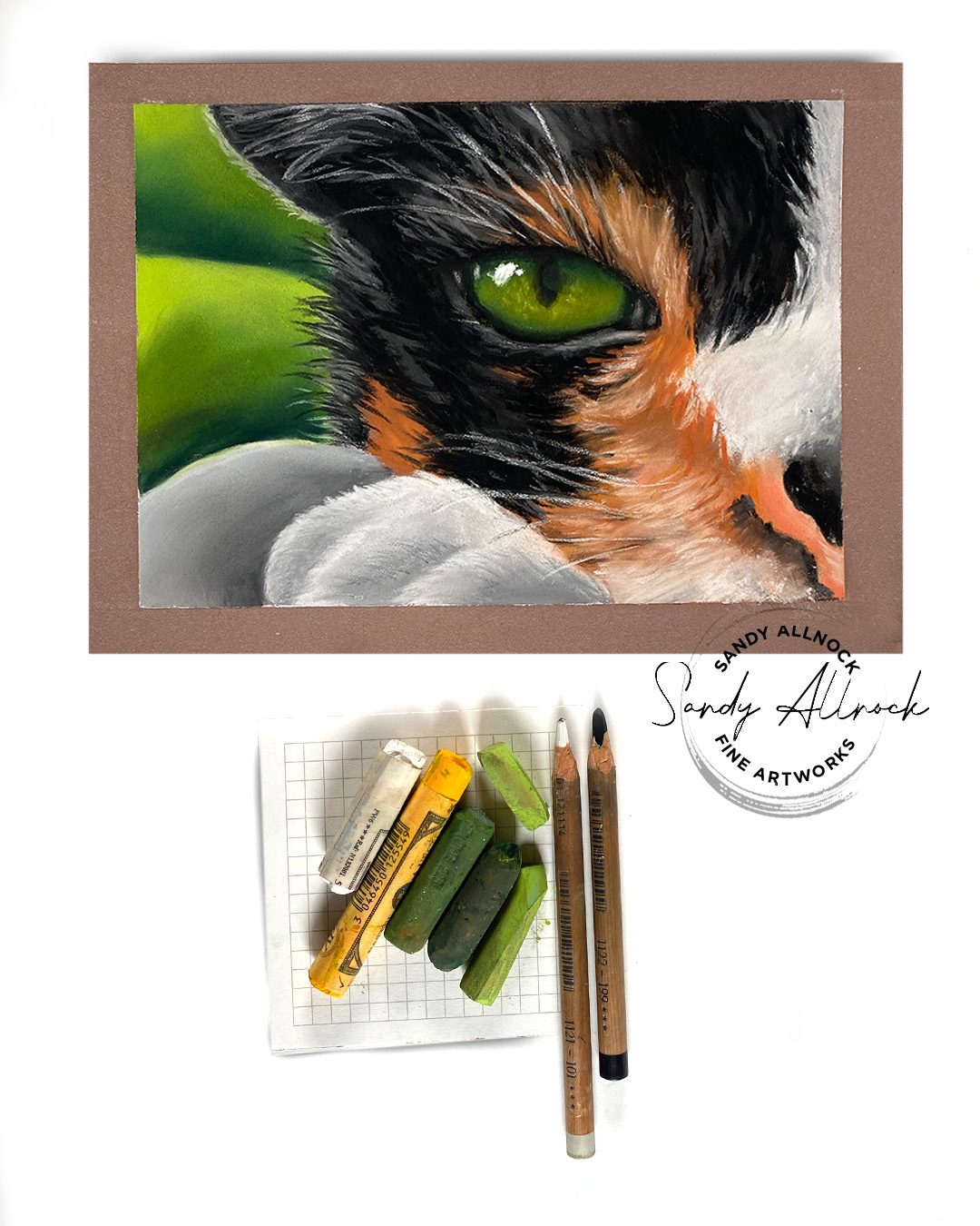
If your media doesn’t get premixed on a palette – think alcohol markers, colored pencils, pastels – then mix ON the paper. Either apply and blend like shown with pastels, or layer them atop each other in glazes. 

Note: you can use this for watercolor too – if the color isn’t olive enough that you mixed in the palette, paint a thin wash of yellow on top of the green to glaze it.
What colors do  you struggle with mixing?

I’d love to help out – what color do you need to mix, and in what mediums? 
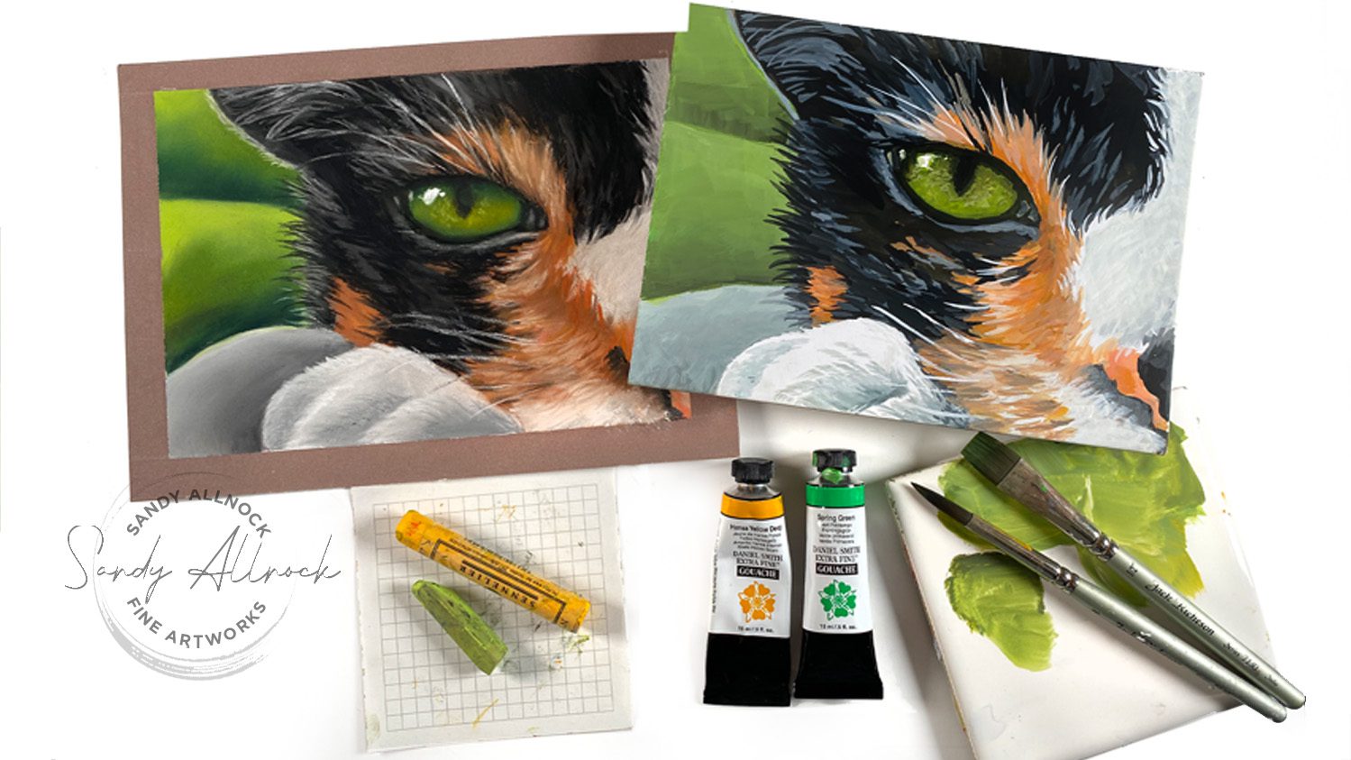
Supplies

Some product may be provided by manufacturers for review and use. Compensated affiliate links are here at no cost to you. I appreciate your support of my work with your purchases! Full affiliate and product disclosure | My trusted partners in art

  1. Pastel:
    1. Mom’s random pastels
    2. Clairefontaine pastel mat pads
    3. Faber Castell Pitt Pastel Pencils  (I’m looking for softer ones. Not sure on these)
  2. Gouache:

    1. Scrap board
    2. Daniel Smith Gouache 
    3. Joybest airtight palette 
    4. Jack Richeson travel brush set 

Subscribe to receive blog posts by email:

Huge news on commissions – and a sale!

Huge news on commissions – and a sale!

Today’s been coming for a long time!! I’ve been thinking about what to do with my December sabbatical all year long, and it’s time to start the planning – commissions, animals, pastels, and fun!

I know not everyone cares, but a number of you have asked me over the last couple years about a commission. I apologize for always putting you off, but now at least I have a way to get going. 

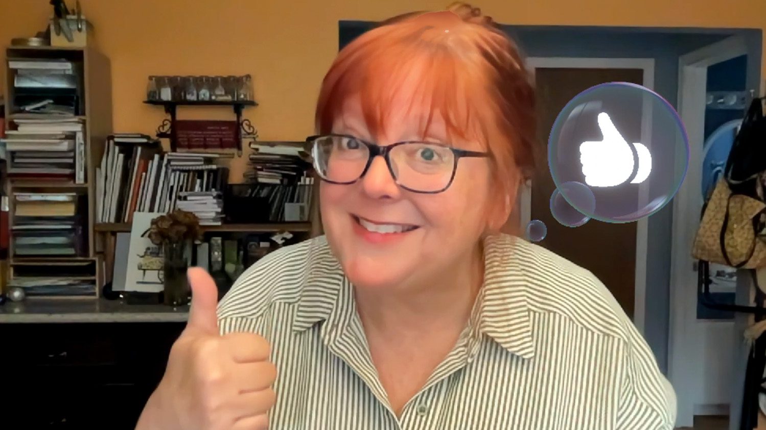
Side note – I was filming the headshot portion of this video, and apparently there’s some kind of automatic emoji stuff going on – if I put a thumb up, a thumb bubble popped in. I was freaked out when the software threw balloons all over the screen! I think I need to find out how to turn that off, it scared me! ha!

Tutorial: News about commissions – and a sale!

Watch the video below and scroll to the end to leave comments or questions — or click HERE to watch it on YouTube and leave comments over there. I read both dutifully!

A few pics

The rest of the photos are over on the commissions page, but here’s a few to show you here:

Kitty

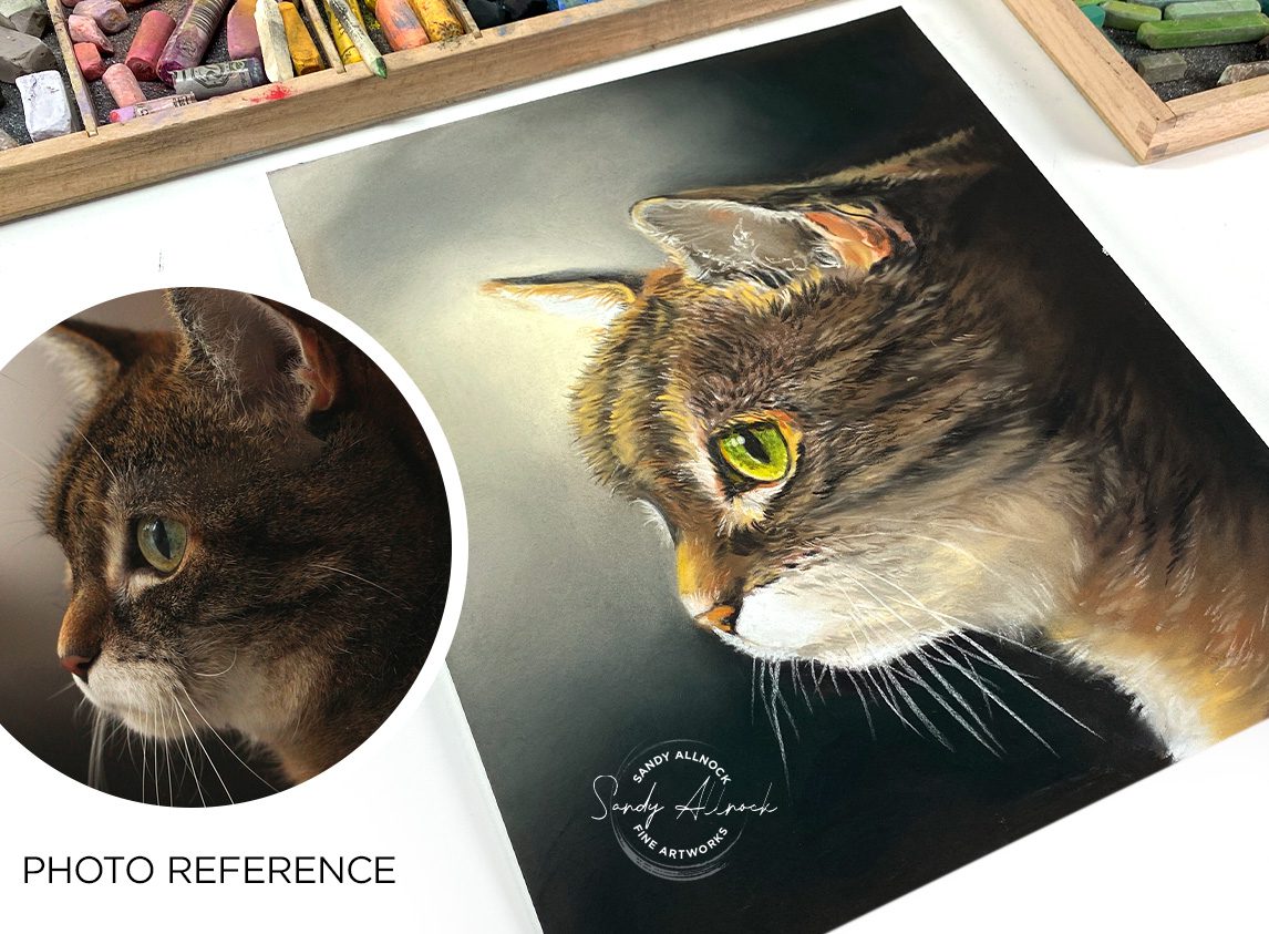
This sweet kitty makes me want to cuddle him! I brightened up the colors for the portrait and amped up the saturation. 

Simplification

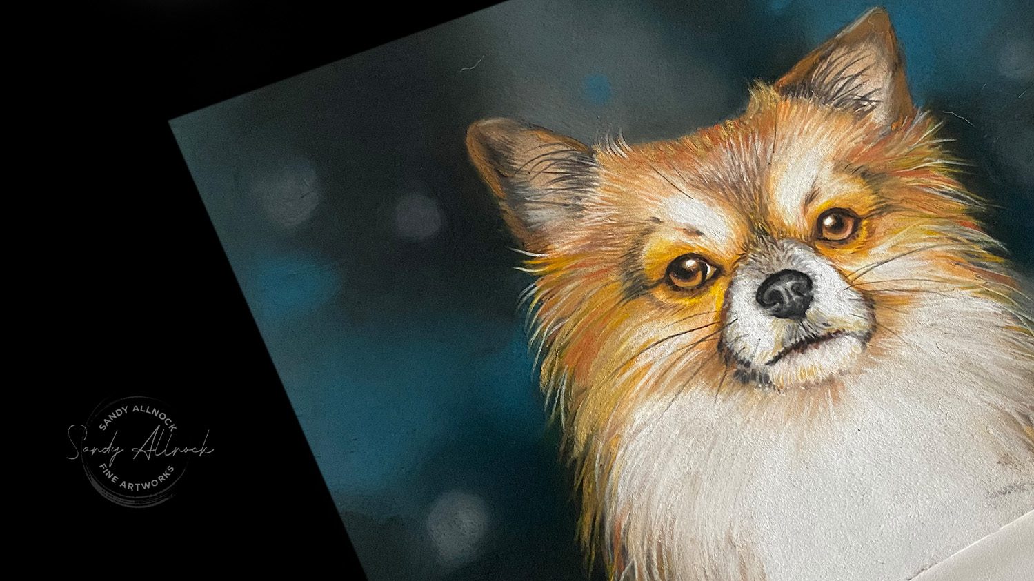
I’ve been playing with backgrounds – soft blends, a little bokeh, enough to be interesting but a nice way to make the attention really fall on the subject.

Size matters

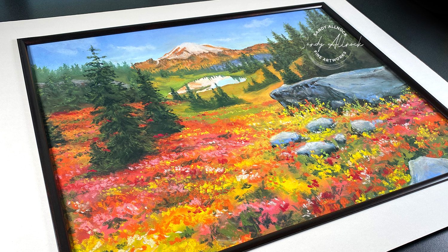
For some subjects you might need/want something bigger. Like if you want all your dogs and cats in one picture, the 8×10 or 9×12 would be too small. This landscape is done at 16×20 – and yes, that means you can request a landscape too.

Sketch option

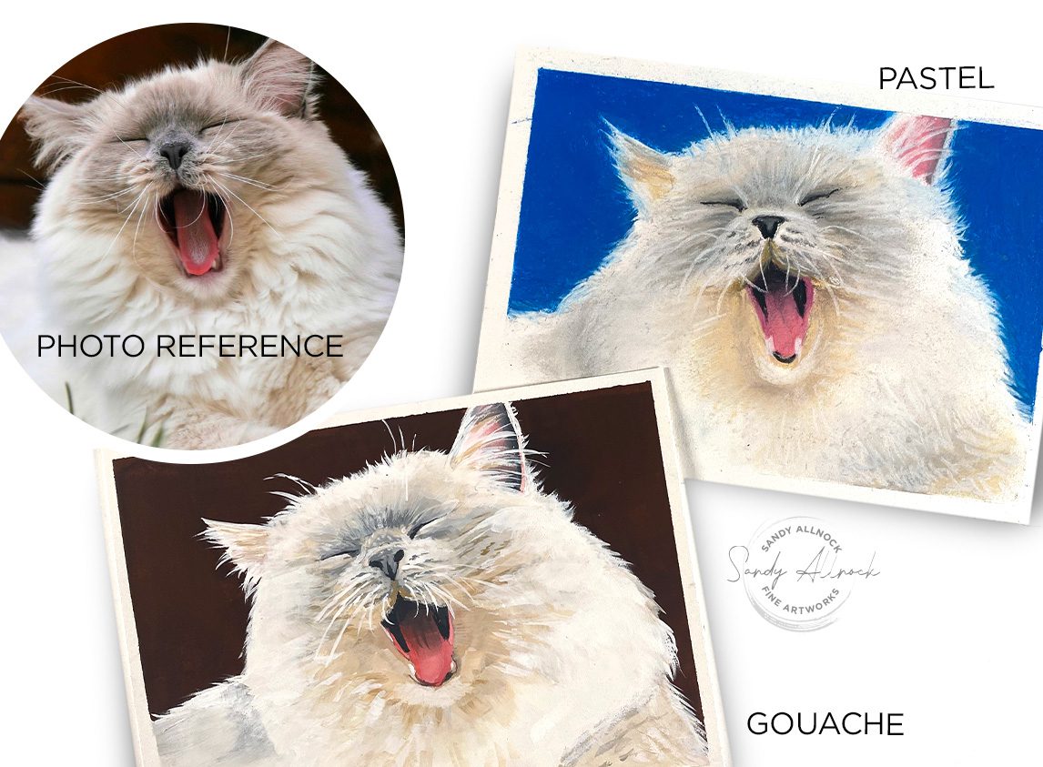
I decided to include an option for 5″ x 7″ sketches – looser since they’re smaller, and they can be in pastel, gouache, or pen and ink. I created a yawning cat in both pastel and gouache to compare them.

Pop over to see more

On the Commissions page are more photos of my pastel paintings and the small sketches, plus the form. And on the Works for Sale page, you can get 20% off with coupon code – it’s at the top of the page. Help me clear the shop, I have more to add but need to get a few things moving 🙂

Subscribe to receive blog posts by email:

What I do when watercolor won’t work

What I do when watercolor won’t work

Believe it or not, I have some tragically awful art days, too.

I know some of you think that someone who’s an artist for a living doesn’t suffer that. Maybe you think we don’t get impostor syndrome. That we can draw or paint anything. Not so!

I had a tough day yesterday, and I’ll tell you all about it in the video!

Tutorial: What I do when watercolor won’t work

Watch the video below and scroll to the end to leave comments or questions — or click HERE to watch it on YouTube and leave comments over there. I read both dutifully!

Get back on the horse!

For some people just leaving the studio helps overcome a rough art day. Not for me. I take the failure-feeling with me, and next time I walk into the studio, I’m nervous about getting my mojo back!

Instead, changing medium, subject matter, or project helps to dispel that failure and prove to myself that yes, I can still make art! 

What works for you on a bad art day?

Let me know in a comment…..and if your method isn’t always just what’s needed, try mine. Get back on the horse and prove to your inner voice that it’s time to hush up with the insults. 🙂 

Supplies

Some product may be provided by manufacturers for review and use. Compensated affiliate links are here at no cost to you. I appreciate your support of my work with your purchases! Full affiliate and product disclosure | My trusted partners in art

Subscribe to receive blog posts by email:

How to watercolor a pile of fall leaves (realtime)

How to watercolor a pile of fall leaves (realtime)

Have you wondered how to watercolor a pile of fall leaves in this lovely season?

I’ve been wanting to get out to paint some fall trees — it’s been so pretty where I live! But every time I have time on my hands, it’s pouring rain. And when it’s sunny, I’m swamped and unable to go. So I’m satisfying my itch for fall color by painting some leaves in my sketchbook. Layer by layer!

This is how far I’ve gotten in my Sketchaday Sketchbook….Can I finish it in 2023!?!?!?!

Tutorial: How to watercolor a pile of leaves

The video is in realtime but with so many repetitive steps, a bunch were cut so you can go spend your day painting and not watching more leaves. 🙂

Watch the video below and scroll to the end to leave comments or questions — or click HERE to watch it on YouTube and leave comments over there. I read both dutifully!

Wet in wet first layer

I dropped color across my sketch in pretty much random order. I only barely targeted leaves, just a few here and there.

Carving with washes

Light washes allow for a slow buildup of layers. But don’t go too light; if you need to “match” a layer below, you’ll just have more and more layers to try to paint right up to an edge. But don’t go super thick either. Practicing in a sketchbook helps figure out how much paint will work, and how much will lead to mud.

Deeper layers

Darker colors — mixed from the very same colors in that first layer (New Gamboge, Anthraquinoid Scarlet, Lunar Blue). Each successive layer covers, typically, less than the layer above, so that smaller and smaller areas get richer and darker.

Final detail

I’ve chosen a few leaves to add a vein, a shadow, or a small detail to—and knocked some more leaves back into the depths with a wash atop them.

The inspiration

Go over to Paint My Photo and download the photo yourself if you like – and try my colors or others! Have fun practicing negative painting.

Supplies

Some product may be provided by manufacturers for review and use. Compensated affiliate links are here at no cost to you. I appreciate your support of my work with your purchases! Full affiliate and product disclosure | My trusted partners in art

  1. Sketch a day by Lake Michigan Book Press 
  2. House of Hoffman Palette 
  3. Daniel Smith Watercolors:
    1. Hansa Yellow Light
    2. New Gamboge
    3. Anthraquinoid Scarlet
    4. Lunar Blue
  4. Artist tape 1/2” 
  5. Winsor Newton Kolinsky Sable Series 7 Round #10
  6. Winsor Newton Kolinsky Sable Series 7 Round #8 
  7. Da Vinci Maestro Kolinsky Sable Round 4 

Subscribe to receive blog posts by email:

Ways to Use a Cardmaking Sketchbook

Ways to Use a Cardmaking Sketchbook

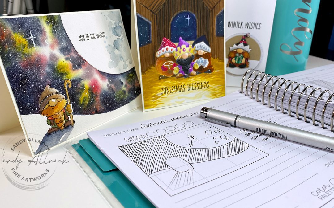
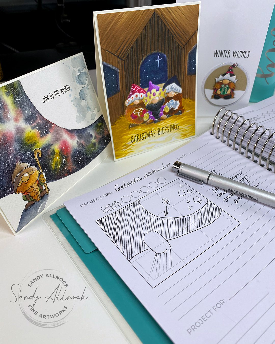
I received a lovely care package from Trinity Stamps (they take such good care of me!) with the new Card Making Sketchbook in it, along with a few gnomies to color up. I played around with the book and thought of some ways it might help you. Let’s take a look!

Video: Ways to use a Cardmaking Sketchbook

Big thanks to Trinity Stamps for sharing this sketchbook with me!

Watch the video below and scroll to the end to leave comments or questions — or click HERE to watch it on YouTube and leave comments over there. I read both dutifully!

Sketching

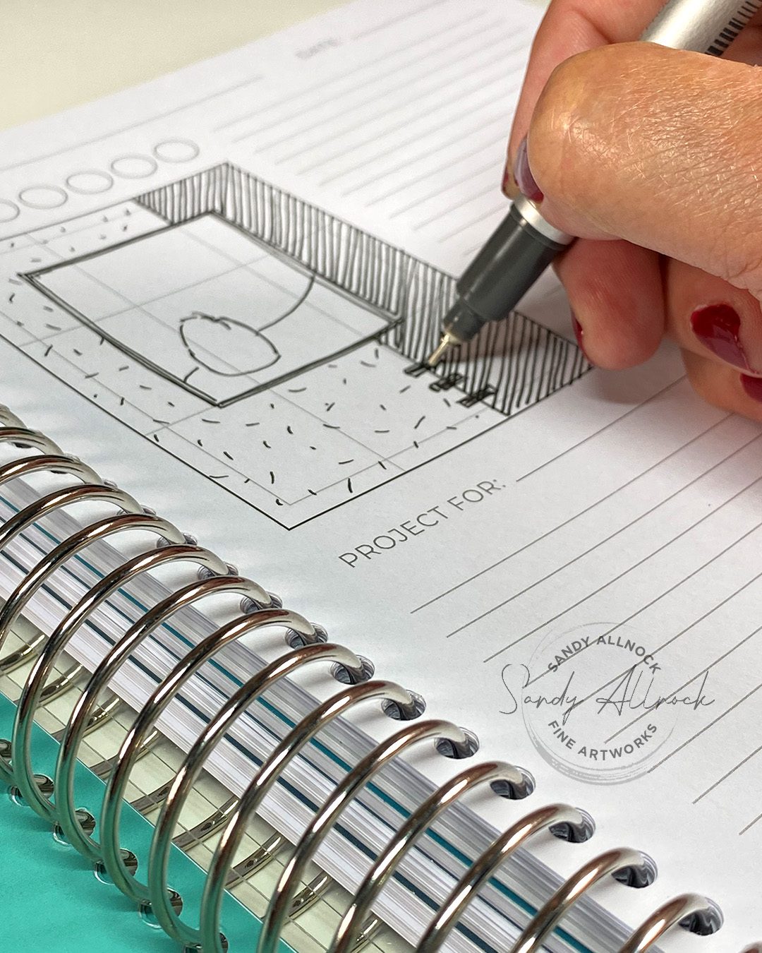
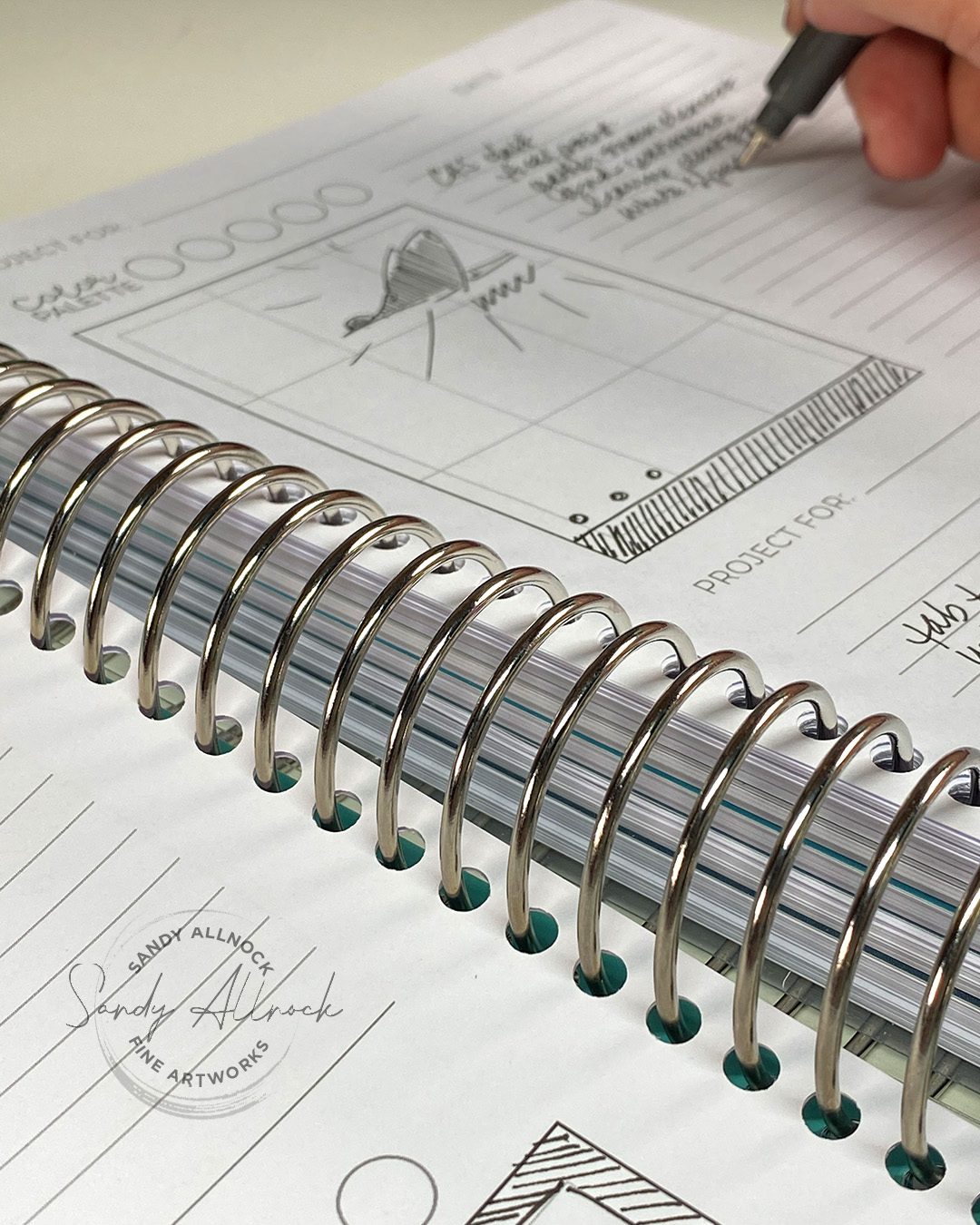
Obviously sketching is the thing to do, right? I created loose sketches in the boxes; there are several sizes in the book and each box is divvied into thirds horizontally and vertically. Some card designs fit with that but others might need you to “ignore” the lines if it’s in quarters.

I used a Copic friendly pen which didn’t bleed through at all. For the various patterns of paper I just used some lines in different ways; if you’re jotting down ideas from something you’ve seen, it can help you to remember whether it’s a dark pattern or light, detailed or graphic, etc. But you can also just shade with pencil too to get the value (light vs dark) in place.

For the image, which I thought of as a small stamp of a character (if you’re indicating a larger stamped image you’d scale up the ‘blob’). Sometimes marked with an I for image, but often not.

And a scribbled sentiment can indicate where to place that. Don’t forget to indicate embellishments!

But overall, the things to jot down are the things YOU liked. Sometimes a card is great except for [that one thing] and it’s perfectly fine to just sketch out what you DO want to use on your design.

Notetaking

There are some indicated lines for things like “Project for” — which I assume is for Design Team members to track what designs they’ve used for a manufacturer assignment. There’s also a date listed. But you could also write WHO you made it for –  your recipient.

There are empty circles for a color palette; Copics won’t work on this paper but a few colored pencils could be handy, or if you know color names or numbers write those down.

There are blank lines for more notes – and that’s pretty valuable in remembering what you started sketching for.

  1. Where was the original? (a blog? YT? What was the title of it so you can go find it again if you want it?
  2. Were there interactive features you couldn’t adequately indicate in the sketch? (does something flip or move? have dimension?)
  3. Product ideas – if there’s a stamp you need to order, what was the name of it and who makes it? 

More ideas

I started sketching the lessons from classes; it’s often hard to remember which class something was in, so a quick doodle can remind you of something you learned that you’ll want to try again without digging through the list in your account to guess what it was. Remember to write down which website it was, and which lesson number.

You can also sketch other non-card ideas that you want to try out on a card! See a ketchup bottle label that has potential? A billboard with an idea for laying out a slimline card? Don’t forget to look all over for inspiration. Having them all in one sketchbook is a handy place not to lose them so the next time you’re in need, you have a ton of ideas.

Is this sketchbook for you?

Maybe. I’m not you so I really can’t say! But it’s not a cheap book, as helpful as it is; consider what your crafting budget is, and if the price makes sense. You can do the same with a cheap sketchbook; to create a small proportioned box for A2s or slimlines, just trim one out of cardstock that you can trace around to get the horizontal x vertical correct.

But if you like teal (who doesn’t?) and having a nicely organized book that’ll fit right in with your crafty stuff, all those boxes and lines already printed out, it’s a nice book to have.

A warning: DO NOT SPEND ALL YOUR TIME COPYING YOUR ENTIRE PINTEREST INTO THE SKETCHBOOK. You could literally spend weeks filling the book and getting NO cards made. I spent 3 days on my book, but also came out with a whole bunch of cards that I used as samples in this video, so it wasn’t awful. But if you’re being careful and using rulers, etc, it can take a long time to get these completed. Manage your time well, grasshopper. 🙂


Where are the cards?

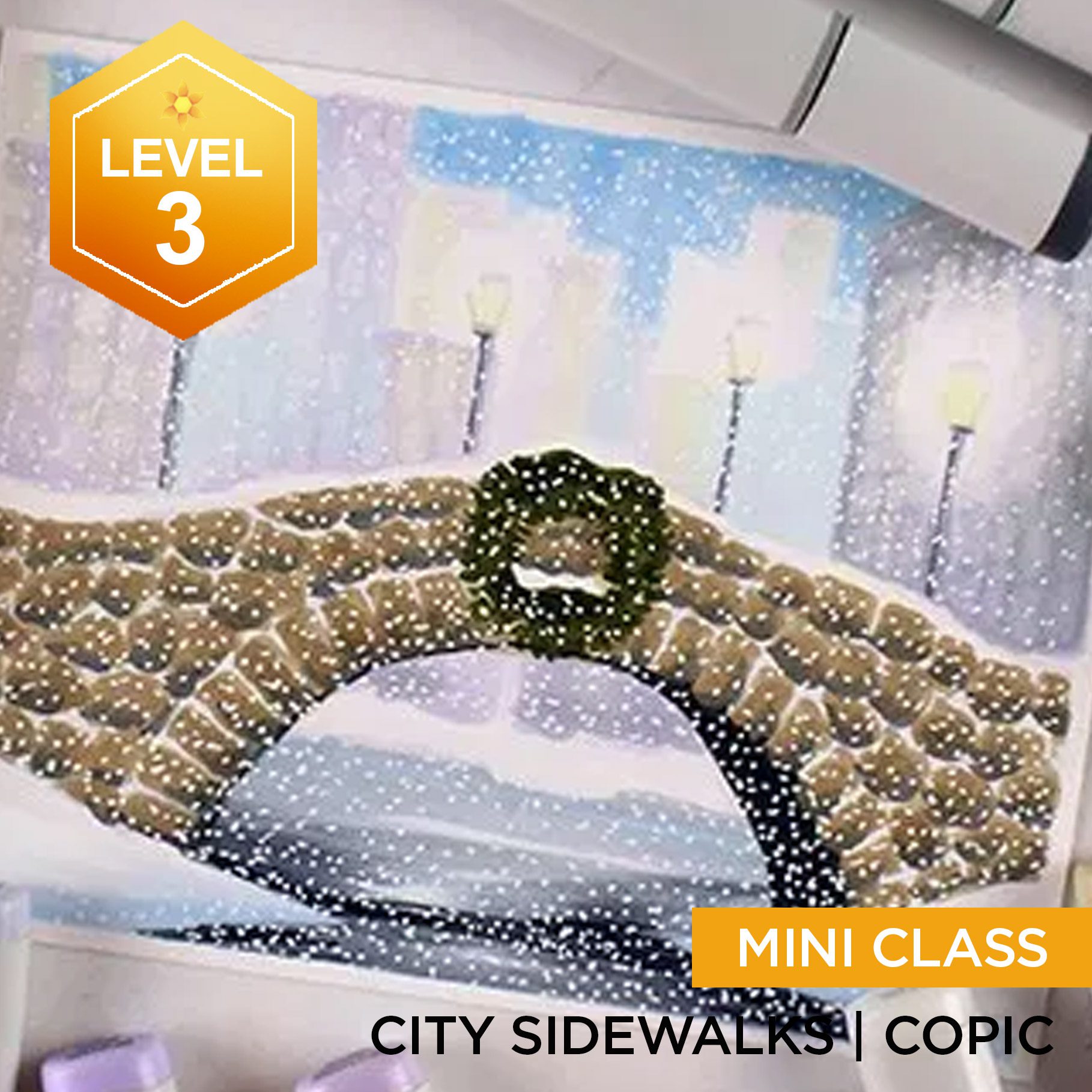
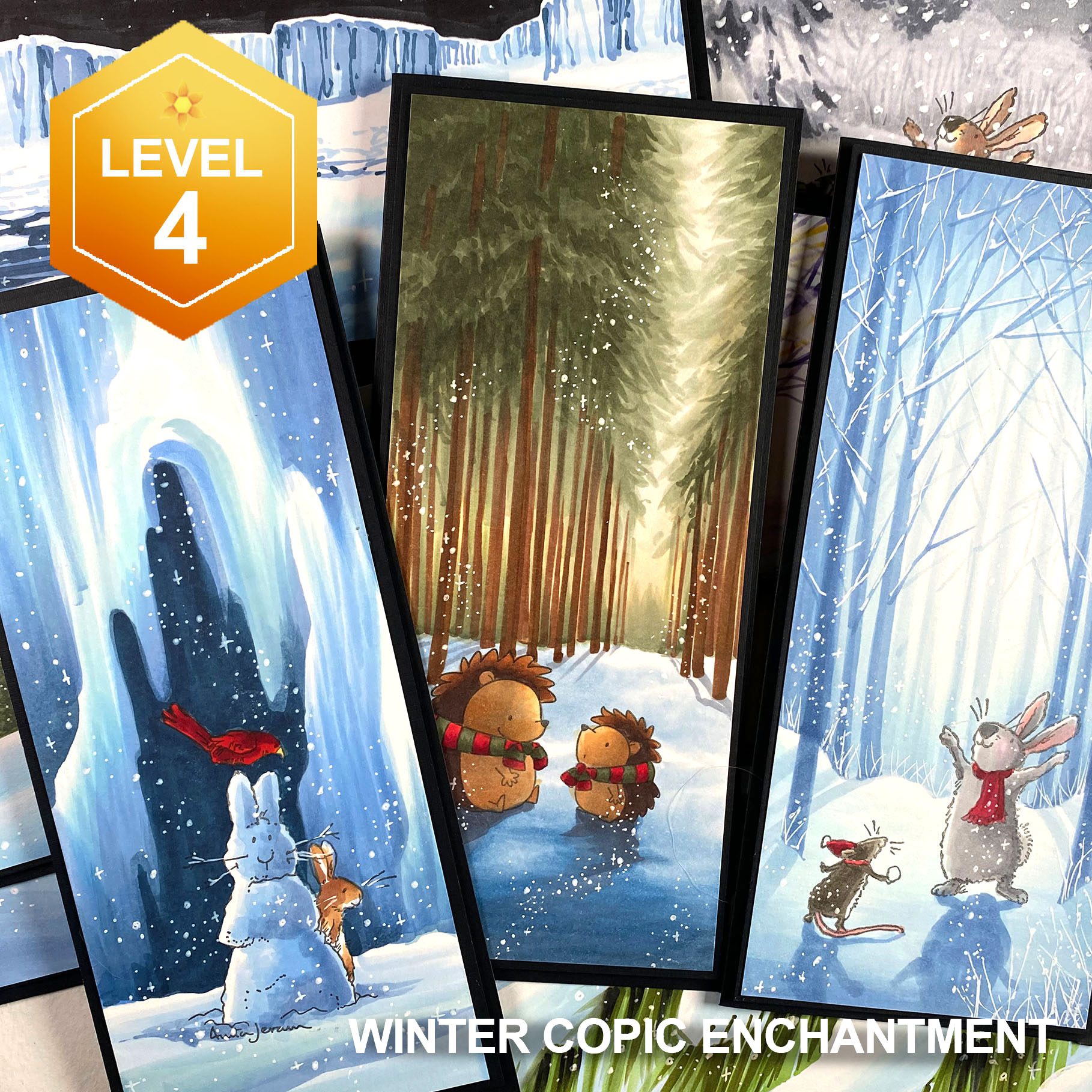
They’re each posted as inspiration in the courses they are from. Each of which are on sale til October 13! Tap on the image to go see more about the class.


Need more holiday inspiration? Try the new Holiday page to see what is available!

Supplies

Some product may be provided by manufacturers for review and use. Compensated affiliate links are here at no cost to you. I appreciate your support of my work with your purchases! Full affiliate and product disclosure | My trusted partners in art

Subscribe to receive blog posts by email: