How to Make Thumbnail Sketches in Pencil and Watercolor | Docked Boat, part 1

How to Make Thumbnail Sketches in Pencil and Watercolor | Docked Boat, part 1

Sometimes I think maybe I have too many sketchbooks…..each one is for different uses, and if one has something placed on top of it, I can entirely forget it exists! 

That happened with this nearly-complete sketchbook filled with thumbnail sketches; And with just a few pages left in it, I feel a newfound desire to actually fo thumbnails before my next artworks just so I can check this one off as DONE! I had bought a replacement sketchbook at some point, so maybe I can make a habit of it.

But how does an artist go about creating thumbnail sketches – and what on earth are they good for? Can’t we just dive into the art piece? Well yes, but…..it goes much more easily when sketches help plan out what you need to do to be successful!
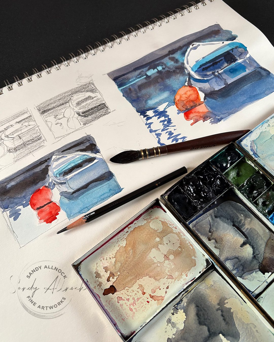
Tutorial: Docked Boat, part 1 Thumbnail sketches

Watch the video below and scroll to the end to leave comments or questions — or click HERE to watch it on YouTube and leave comments over there. I read both dutifully!

SUPPLIES

Some product may be provided by manufacturers for review and use. Compensated affiliate links are here at no cost to you. I appreciate your support of my work with your purchases! Full affiliate and product disclosure | My trusted partners in art

Brush and pencil

  1. DaVinci Silverpoint Brush 
  2. Caran d’Ache Grafwood pencils 9B BLICK  AMZ   JACKSONS 
  3. Afmat Long Point Pencil Sharpener 

Sketchbook

  1. Bee Paper Super Deluxe Mixed Media Sketchbook 14×17 BLICK  AMZ 

Daniel Smith Watercolors

  1. Anthraquinoid Scarlet BLICK  AMZ  JACKSONS 
  2. New Gamboge BLICK  AMZ  JACKSONS 
  3. Quinacridone Rose BLICK  AMZ  JACKSONS 
  4. Transparent Red Oxide BLICK  AMZ  JACKSONS 
  5. French Ultramarine BLICK  AMZ  JACKSONS 
  6. Iridescent Electric Blue (Luminescent) BLICK  AMZ  JACKSONS
  7. Paynes Blue Gray BLICK AMZ  JACKSONS 

Pencil thumbnail sketches

In the flip through you could see lots of times when I created more than two – but even two is better than none. And they take just a few minutes! No need to be accurate or have lots of detail – just get the gist of the image, indicate the basic shapes and values.

If you find yourself getting fussy with details, that might be a sign that pulling back and editing some details is in order. You can add some things back in later, but if you can’t keep the thumbnail simple, it’ll be even harder to keep the finished larger piece clean.

Try different compositions, crops, lighting. Let yourself ask the question “What if….?”
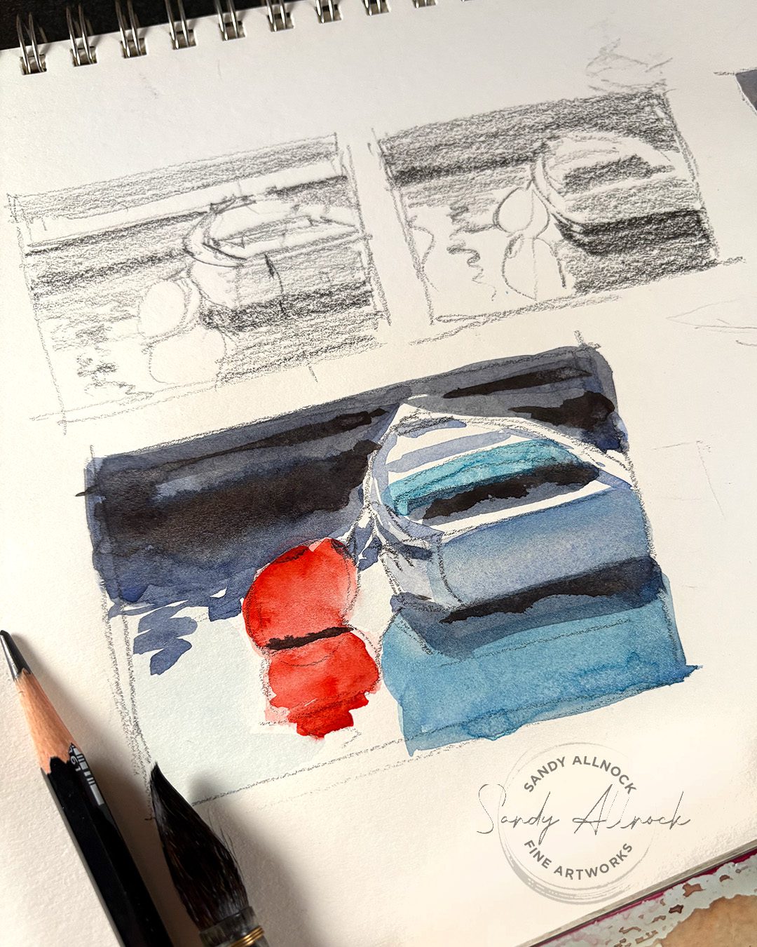
Watercolor thumbnail sketches

Color sketches can be done in any medium – I recommend using the finished medium if possible. however if you’ll be doing something like pastel, that’s hard to do a 2″ x 3″ sketch with – so another medium might be needed.

Make the color sketch as simple as you can; paint the biggest shapes, and play with colors you might like to use in the finished work. think about how you might break up sections of the composition, so you can plan which wash makes sense to paint first, and whether things need to be wet or dry when adding extra color.

Subscribe to receive blog posts by email:

What if you aren’t making fine art?

If you’re a crafter who makes cards, you can also sketch out your designs before getting started1 Trying out colors and layouts ahead can save time when looking for patterned papers and inks to work with your vision.

Coming up Tuesday

My next video will be the realtime painting of the docked boat; while waiting, get your sketching done and the sketch ready to paint with me!

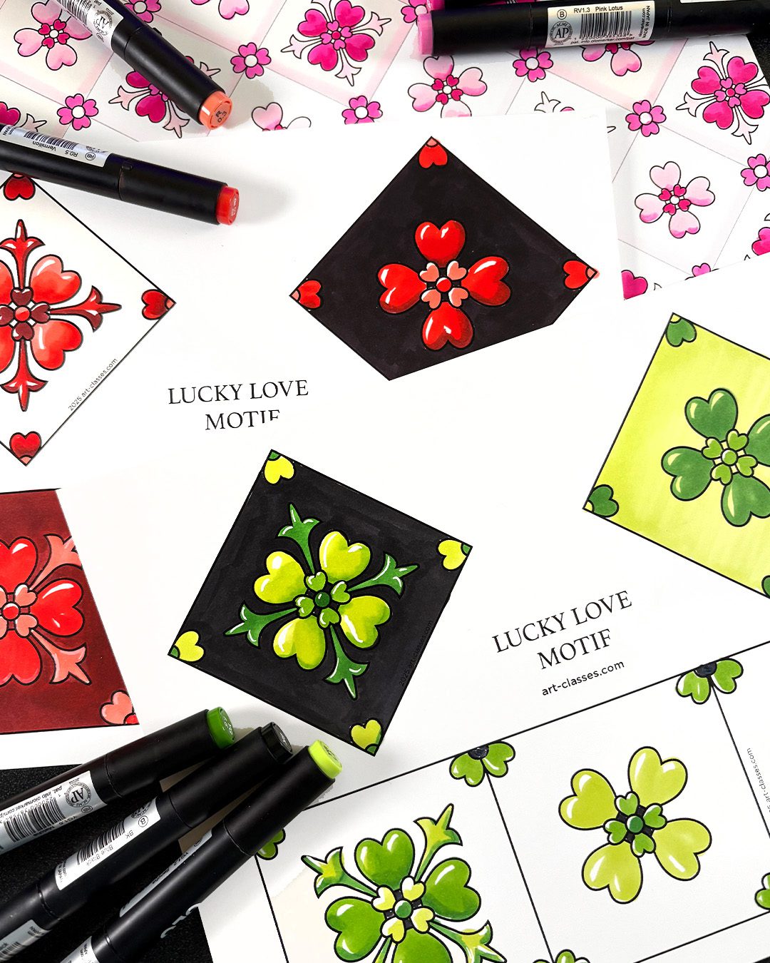
EASY! Color a dual themed Valentine design motif (Bonus class material)

EASY! Color a dual themed Valentine design motif (Bonus class material)

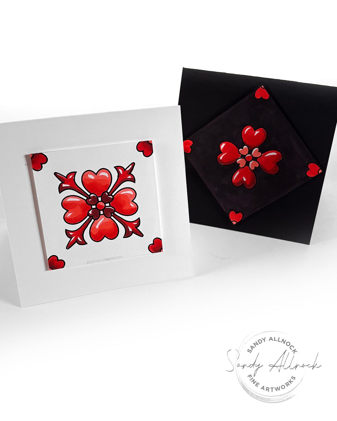
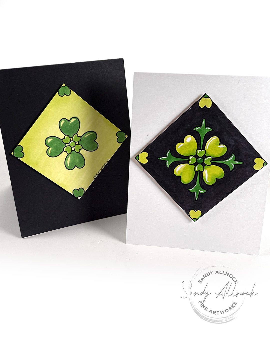
I’ve been having a lovely time designing while preparing for the new Design Motifs course – and out of a big sketchbook full of ideas that I was noodling around with, I discovered I had a design that could double for both Valentine’s Day and St Patricks Day. Just change up the color and sentiment – boom! 

So while I’ll show you how to do some very easy coloring – with options – this is a new printable, too. That means you can play along with a motif without taking the class. Maybe it’ll get you excited and inspired to try the class too?

Tutorial: Color a dual-themed design motif!  

Watch the video below and scroll to the end to leave comments or questions — or click HERE to watch it on YouTube and leave comments over there. I read both dutifully!

SUPPLIES

Some product may be provided by manufacturers for review and use. Compensated affiliate links are here at no cost to you. I appreciate your support of my work with your purchases! Full affiliate and product disclosure | My trusted partners in art

MARKERS

  1. Sandy’s Olo Marker Set 

PAPER

  1. Neenah Cardstock

Copic Acrea Paint Markers 

Note that singles are 3x more on Amazon than Blick, yikes

  1. White BLICK  AMZ 
  2. Gold BLICK AMZ 
  3. All colors and sets BLICK

Single design motif on a card

Whether square or regular sized cards, these motifs can be so pretty! Place them at an angle, or turn them 45 degrees to make a square. A good design will often work in either way! 

Color it up in reds for Valentines, greens for St Patty’s!

Alternate card types

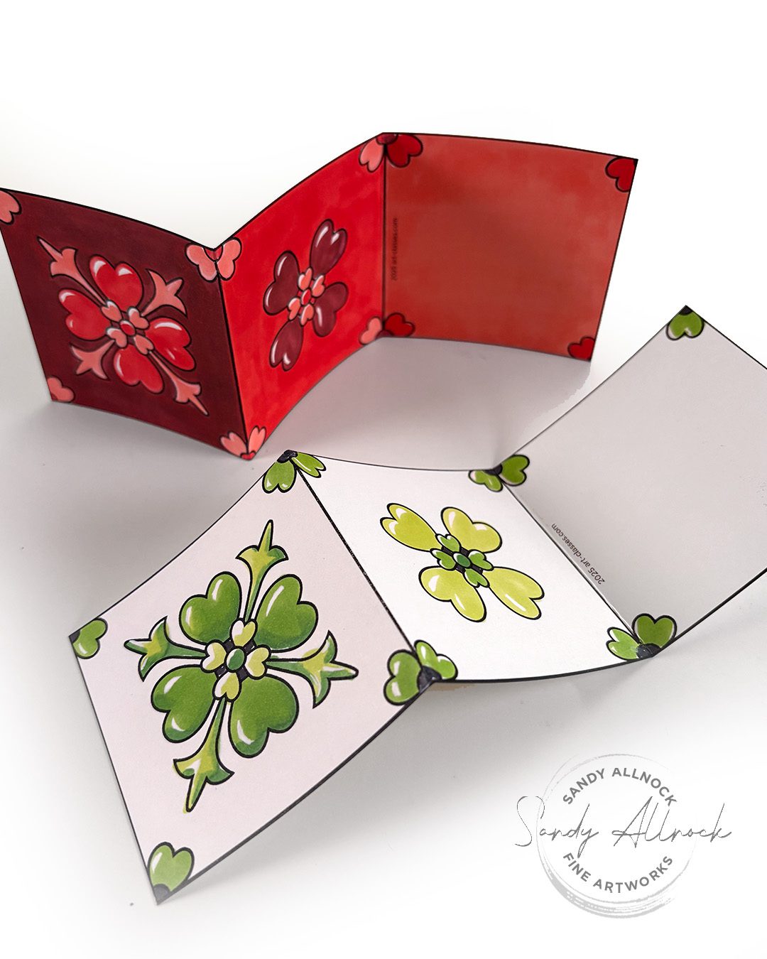
The little three-panel minicards are so sweet – I colored the Valentine with a red background, and the green was left with just wahite background…both are small cards that feel just right for a sweet holiday greeting!

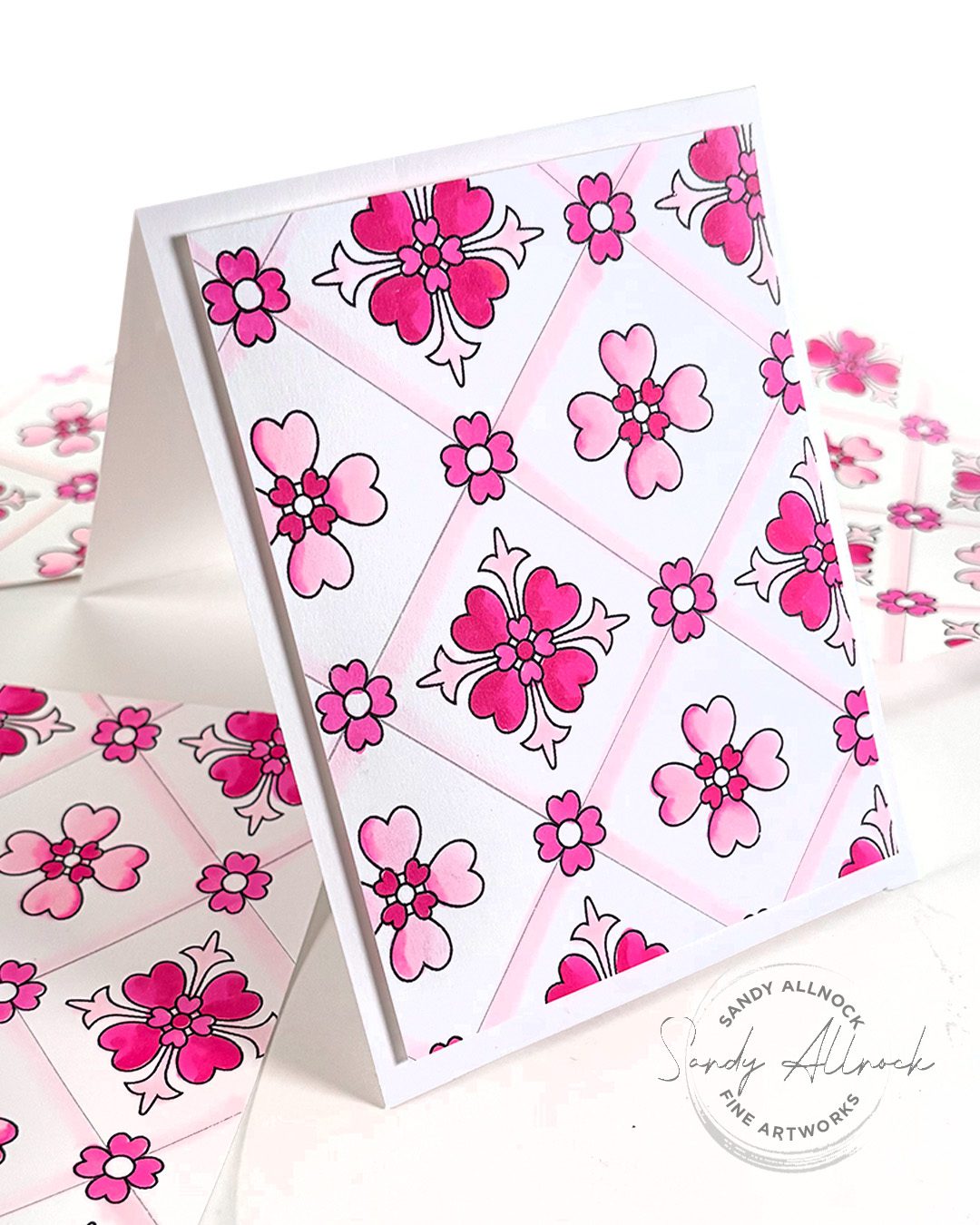
The background sheet can be cut into card backgrounds! Color them in either reds or greens…or go with yellows and pinks to make it an Easter card, or greens and purples for summer….so many options! FIles are included for both of these in the Lucky in Love printable set.

Subscribe to receive blog posts by email:

Lucky in Love Design Motif Printable Set

If you’d like some fun cards to print and color, consider yourself covered! This includes two jpgs, one for the simpler flower, one for the complex one; and a 2 page PDF with those images placed in it and a 3-panel card, as well as a full sheet pattern background. Set is INCLUDED in purchase of Design Motifs class.

If you’d like to help keep me afloat while I’ll be taking some time off this month for medical reasons, this would be a lovely way to help yourself out while helping me. Share with your friends, I bet they’d love to color up some Valentines too!

Peacock theme redux!

One last treat – in last week’s newsletter something funky happened to the video link for the peacock-themed motif, and if you didn’t get to see it, well here you go! 🙂 

Phenology Wheel Update #2: January/February 2025

Phenology Wheel Update #2: January/February 2025

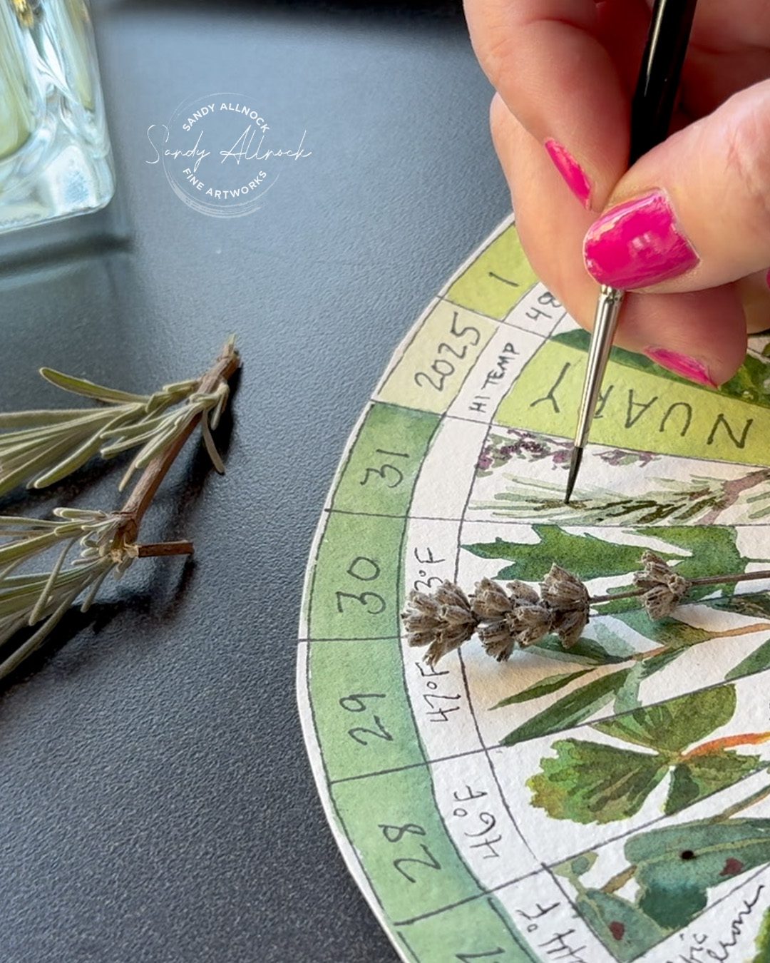
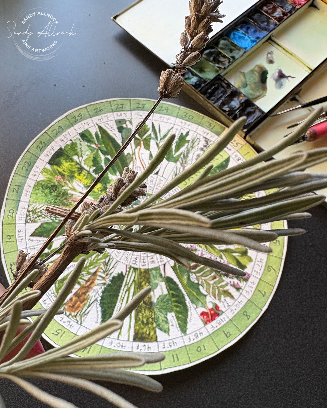
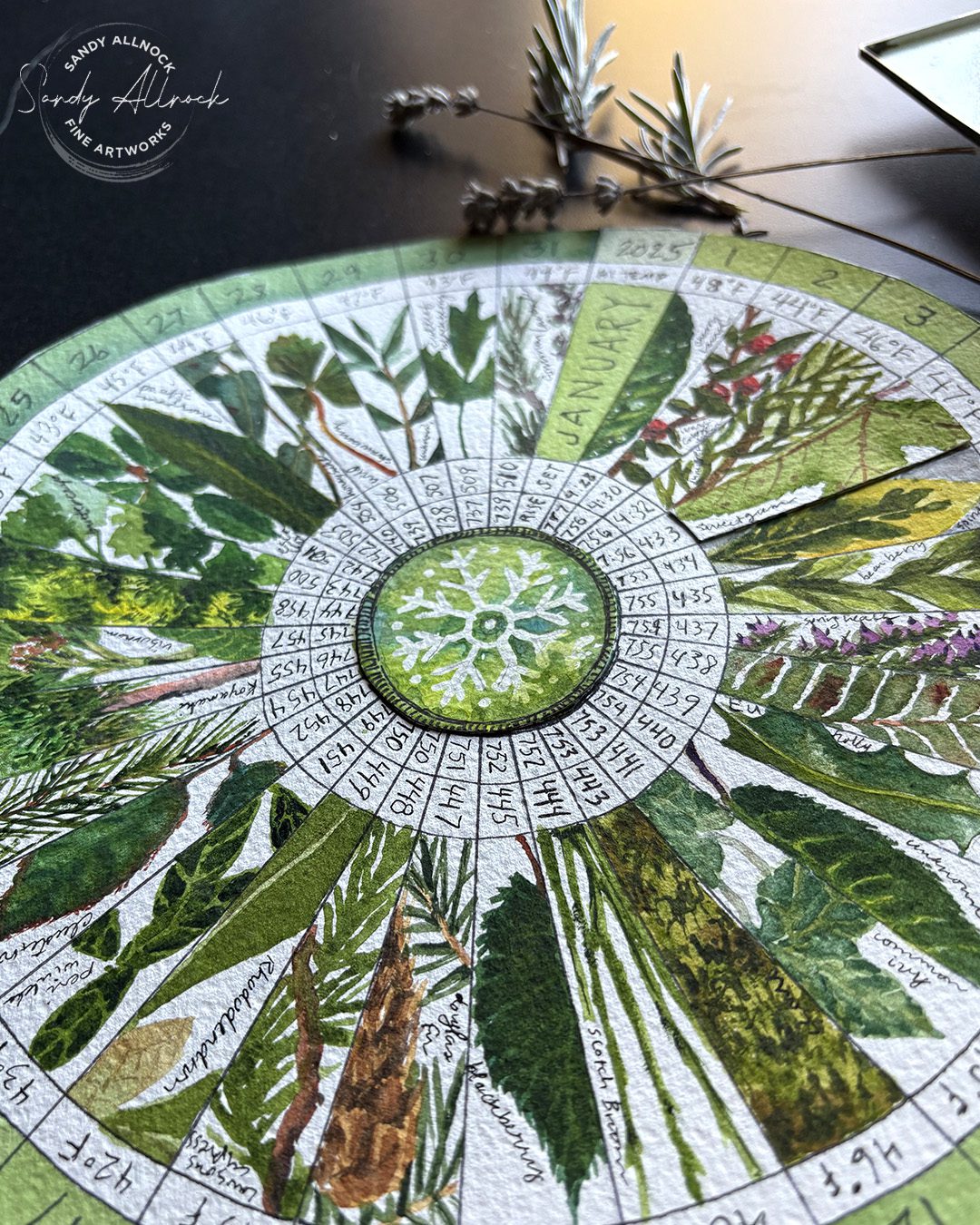
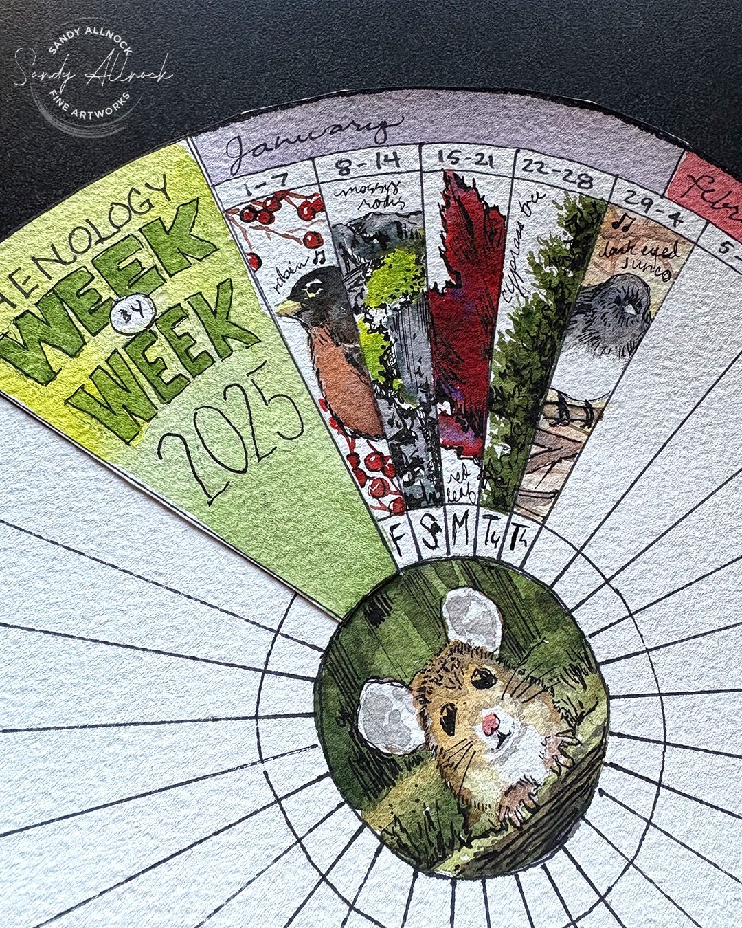
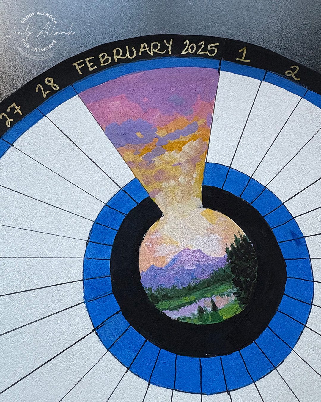
Welcome to February – and my phenology wheel update! I promised I’d share how it went, and today’s video has some treats in it – from a walk through my neighborhood (with birds!) to looking at others’ wheels, painting my last January entry and setting up the February one. Let’s go!

Tutorial: Phenology Wheel Update

Watch the video below and scroll to the end to leave comments or questions — or click HERE to watch it on YouTube and leave comments over there. I read both dutifully!

SUPPLIES

Some product may be provided by manufacturers for review and use. Compensated affiliate links are here at no cost to you. I appreciate your support of my work with your purchases! Full affiliate and product disclosure | My trusted partners in art

January version, watercolor:

PAPER

Arches Bright White CP 22×30 sheet BLICK    JACKSONS 

TOOLS

  1. Staedtler Mars Compass with universal adaptor: BLICK  AMZ
  2. Westcott Tsquare JR BLICK  AMZ

WATERCOLOR BRUSHES

  1. Da Vinci Maestro Kolinsky Sable Round 4 BLICK  AMZ  JACKSONS 
  2. Da Vinci Maestro Kolinsky Sable Round 2 BLICK  AMZ 

WATERCOLOR PAINTS

Daniel Smith Watercolor Tubes BLICK 

PENS

  1. Tachikawa Comic Pen Nib Holder AMZ
  2. Sharpie Ultrafine black marker: BLICK  AMZ

Gouache version for February:

PAPER

Arches Natural White HP 22×30 sheet

PAINTS

Daniel Smith Gouache BLICK  JACKSONS 

BRUSHES

Jack Richeson Travel brush set BLICK  AMZ 

Lavender: final Phenology Wheel entry for January

I’ve been asking my pups to show me green plants to use for entries – so they’ve been LOVING this month of walks! Normally they both pull in different directions, but if one is permitted an extra few moments of sniffing, the other joins in and doubles the time spent there. ha!

The phenology project has changed how I experience my walks; now I’m slowing down, looking closely at the plants all around. Sniffing the leaves. Examining  how branches fan out from the stem/trunk. Mentally “marking” plants for future days, as I worried a little that I might have to resort to dandelions if I ran out of greens! But that wasn’t needed, whew!

If you decide to follow in my footsteps and have neighbors with interesting plants, if you can ask for a tiny branch to take with you, that’d be best. But in January during the mornings, there wasn’t anyone around for me to ask….so I took the smallest piece I could from the back or underneath, so that I wouldn’t create any broken branches where they are seen.

Last tweaks

In January I mentioned that I’d created the snowflake in the middle in wash AND ink – but that my first entry with no ink gave me the thought I should have skipped the ink. Given that this is just for me, it’s perfectly fine to glue another shape on top, so I redid the snowflake with masking fluied (same technique as in the previous video) – and just did the border around it when the circle didn’t fit quite perfectly.

I also decided to trim the white edge from around the outside, inking the very edge to make sure its all black.

In this picture you can also see I messed up January 4 – had trouble weith the leaf smooshing, so I glued a new piece on top.

Subscribe to receive blog posts by email:

Monthly Phenology Wheel

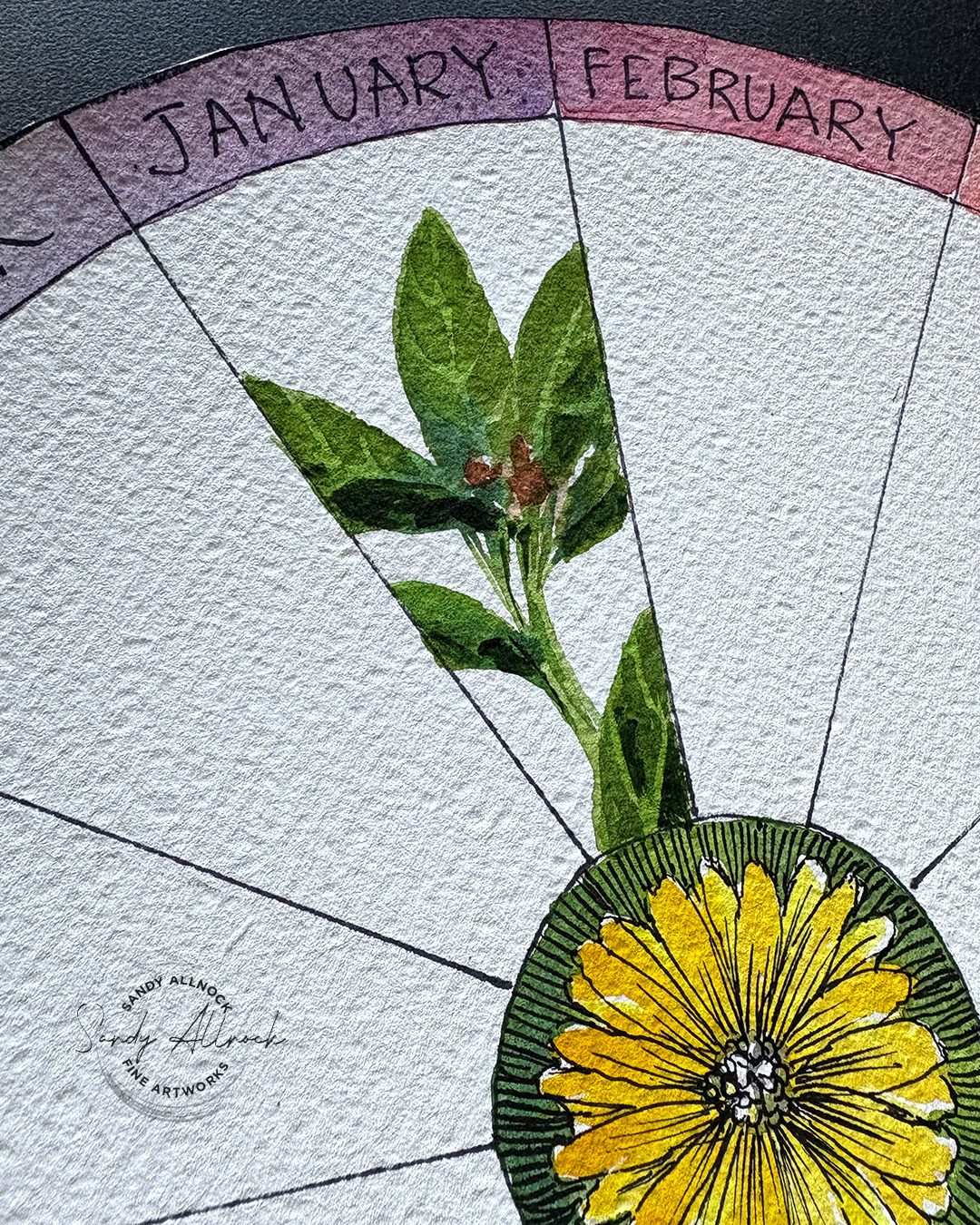
For this wheel I’ll be choosing my favorite entry for the month and painting it here where it has more “room.” I think it’ll serve as a “key” or “index” for the book when I get the year done. I may write notes in the white space about about what I was capturing that month. Because one day I may well forget. lol!

Weekly Phenology Wheel

This one’s going to be a bit of a cacophony….I know even when looking for green plants, I noticed other things. Birds calling. Moss on a wall of rocks. An intensely red leaf, a tree profile. This one gives me a place to sketch that thing without interrupting my other wheel, and helps me realize I can sketch something that won’t go onto the main wheel for the month.

February Phenology Wheel

For the coming month it’ll be skies! Initially my thought is to attempt early morning skies, but…well, it might not always work. For one it won’t all be colorful, for two if I oversleep even a moment or two I could miss the color. So i’ll be giving myself permission to paint a sky from another time in the day, and will record that time on the wheel. We get some glorious sunsets out the back of the house. But there might also be a spectacular cloud formation that I’ll capture too.

Through February I’ll be a little bit out of pocket, and I don’t really know how much. (For all I know I could be on my phone way more than usual?) I’ve got a few surgeries with surrounding doctors appointments, so if you send in an email, please be patient. I’ve worked hard at getting my content ready ahead, and also finally paid someone to fix some website things at art-classes, so I’m hoping everything stays stable while I’m dealing with medical stuff. Thanks in advance for your patience!


It’s not too late to start!

I posted one of my wheel entries on Reddit, and was excited to see so many responding that they’ll be starting. One posted a picture of their first day – they started on the 28th!!! I’m such a neard I’d have to wait til the first, but hey I’m impressed by that dedication. No time like the present!

So whenever you see this post, know you can just dive in. There’s not a need to wait! Your month can run from the 17th to the 17th or something – no problem!

GET A BALANCED LIFE MONTH:10 things to love about art

GET A BALANCED LIFE MONTH:10 things to love about art

After spending a few days being completely OUT of balance – far too much crazy computer work eating me alive – finding out that all month it’s been “Get a balanced life month” hit me upside my dizzied head – get back to ART!

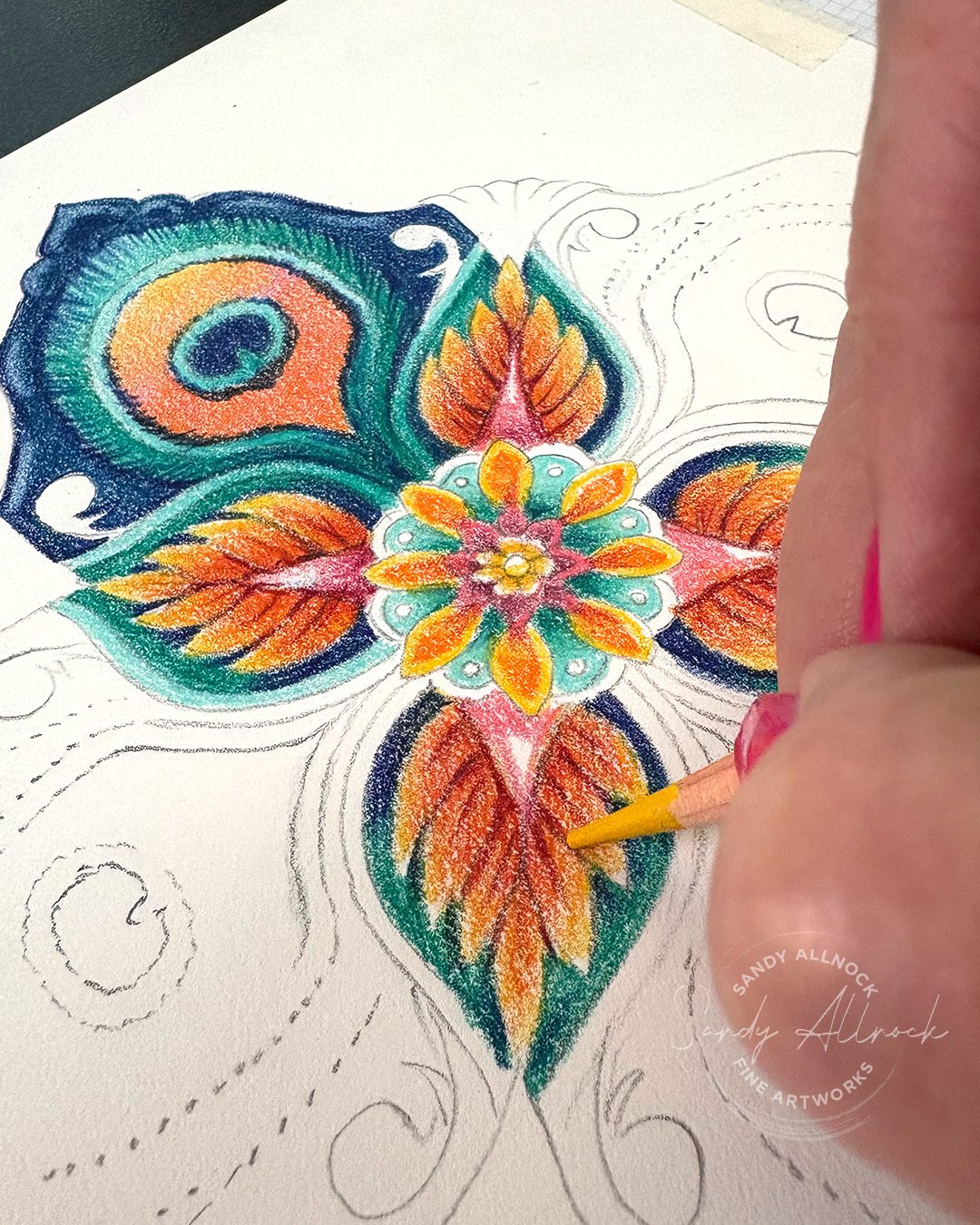
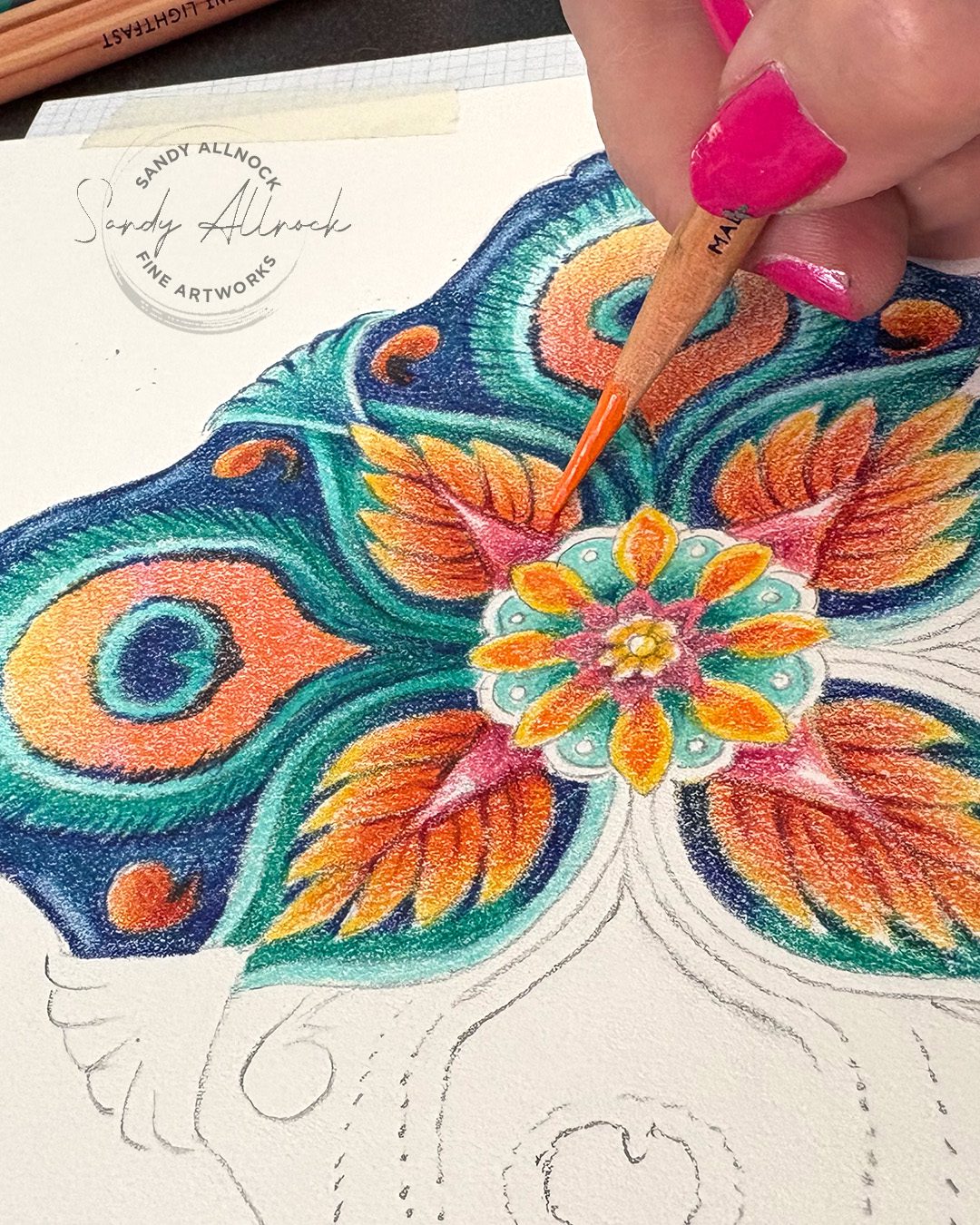
So I took an evening to make a rather epic design motif, then a full day to transfer it to paper and apply color. And I felt HUMAN again afterward! I need to remember this when I get grumpy following all the to-do-list stuff.

Video: 10 things to love about art

Watch the video below and scroll to the end to leave comments or questions — or click HERE to watch it on YouTube and leave comments over there. I read both dutifully!

SUPPLIES

Some product may be provided by manufacturers for review and use. Compensated affiliate links are here at no cost to you. I appreciate your support of my work with your purchases! Full affiliate and product disclosure | My trusted partners in art

Tracing process

  1. Artograph LightTracer light boxes BLICK  AMZ   JACKSONS
  2. Legion Stonehenge Drawing Pad BLICK  AMZ
  3. Canson Grid paper 8 squares per inch BLICK  AMZ

Pencils

  1. Koh-i-noor Lead holder BLICK  AMZ  JACKSONS
  2. Staedtler Mars leads BLICK  JACKSONS
  3. Derwent Lightfast Colored Pencils BLICK  AMZ  JACKSONS DERWENT

Pencil sharpeners

  1. Afmat Long Point Pencil Sharpener AMZ
  2. Staedtler Mars Lead holder pointer (sharpener) BLICK  AMZ  JACKSONS

My list…what’s on yours?

  1. Favorite supplies – this day it was my lead holder pencil until it was colored pencils
  2. Preparation – if I prepare, it means I’m calm/slow enough to relax and do that proper prep to be successful
  3. First color – yessssss
  4. Colorways – I love selecting a limited color palette, even if not til the piece has already begun
  5. Contrast – to make colors pop
  6. Blends – smooth and layered
  7. Drawing with eraser – unique technique
  8. Line work – lines in contrast to smooth blends
  9. Layer for intensity – more color to take away the white paper
  10. Dimension – shadows to make an area pop forward

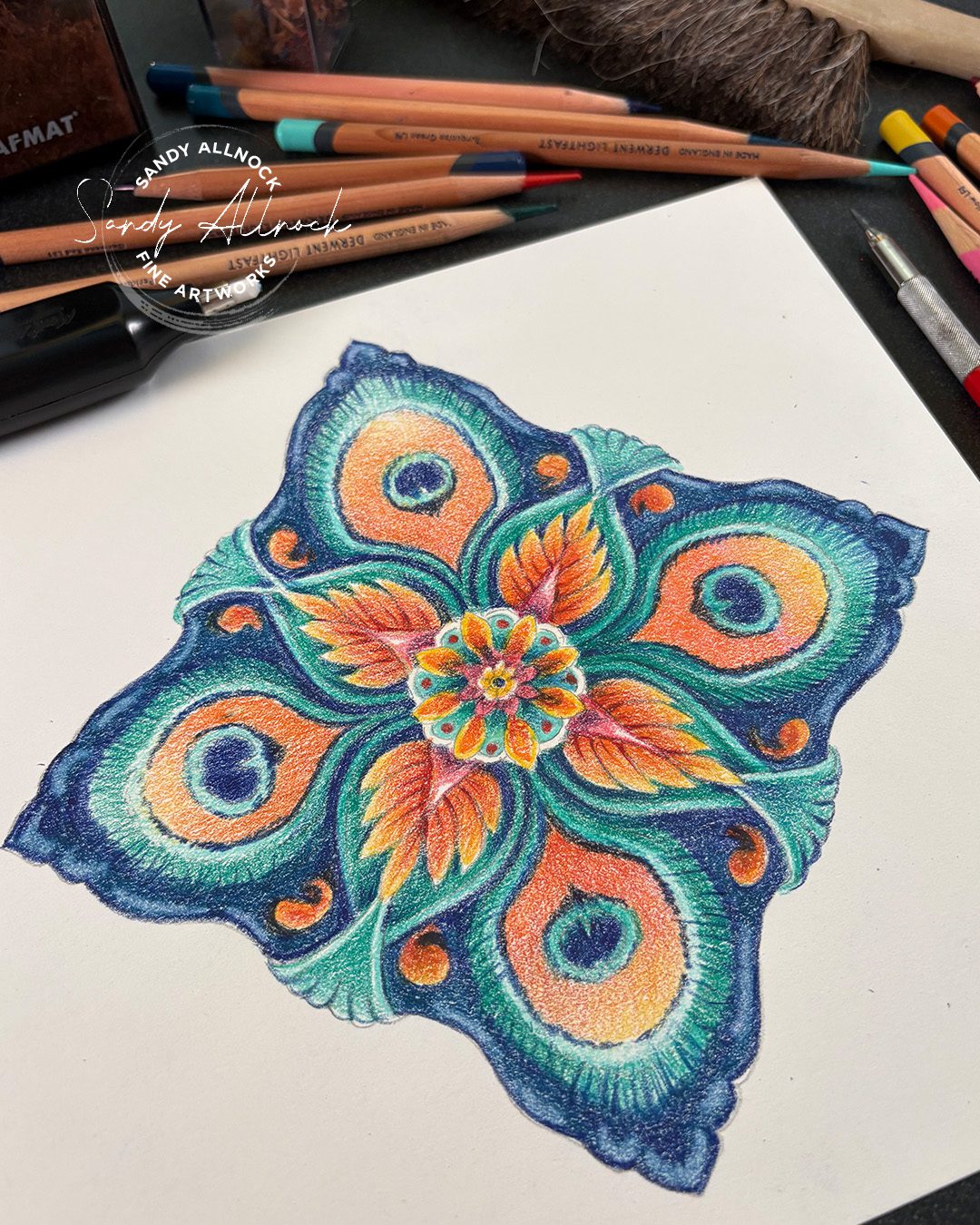
Peacock Motif 

This is a more advanced motif than those in the new course; I drew it larger so it ended up with a lot more detail sliding into it! Finished size is 8″ x 8″.

Subscribe to receive blog posts by email:

Design Motifs Class

Learn to design your own motifs inspired by nature! You’ll discover techniques to create corners, focal images, symmetrical, and asymmetrical designs in a variety of styles from tin tiles to loose and sketchy, stained glass to folk art. 20 examples are taught in 3.5 hours of video instruction, focusing on the hand-created design with pencil on paper. Old-school style! (Not a coloring class, though some examples are included.)

What do you consider the elements of a balanced life?

I’d love to hear your thoughts – and what part art plays in it.

I got punk’d by a ‘Monet’ plus my 2025 watercolor palette

I got punk’d by a ‘Monet’ plus my 2025 watercolor palette

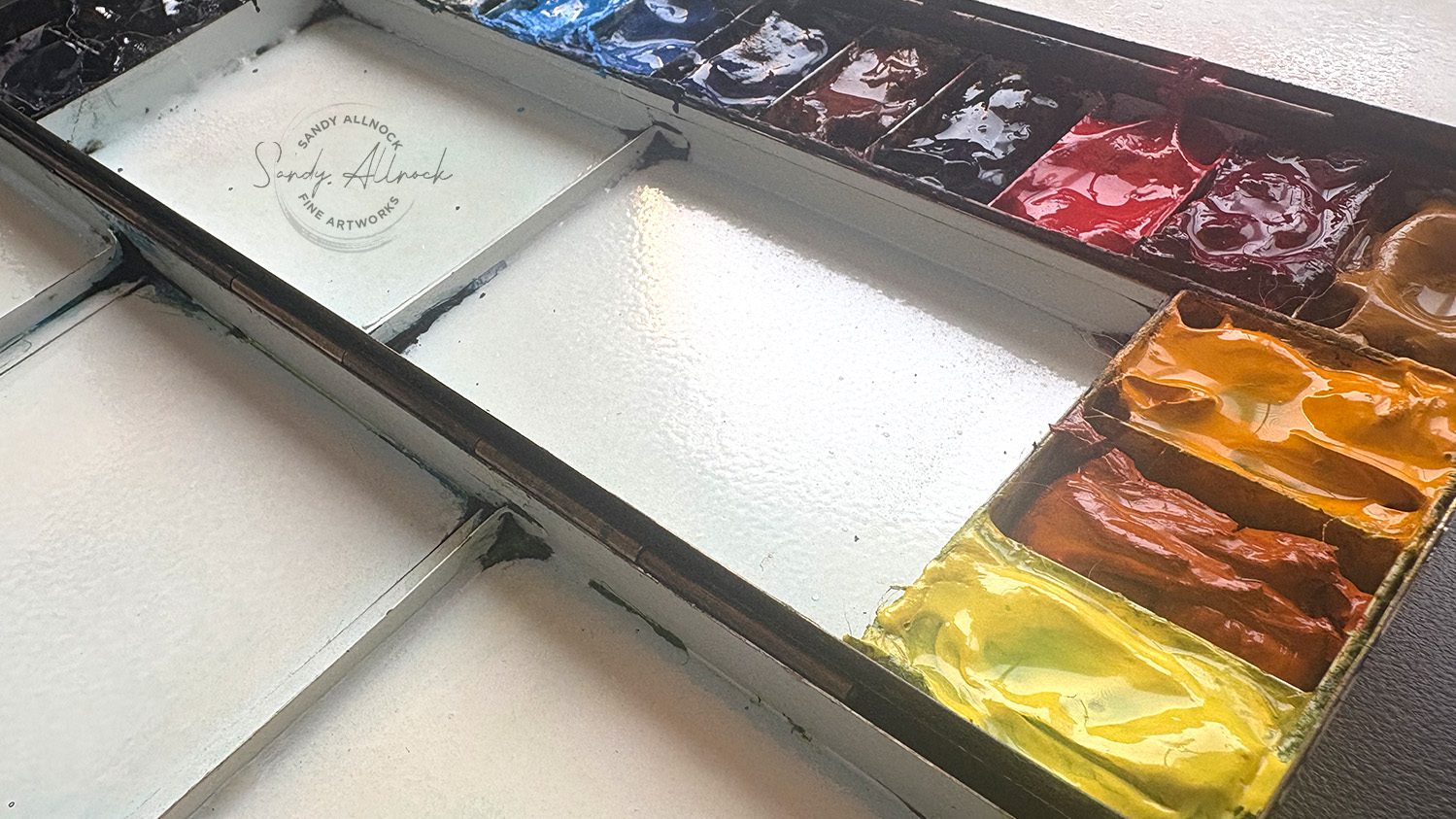
At the start of each year, I tend to do a little rethink on the colors in my palette. Lots will just stay on, but if there’s anything that didn’t get used much/enough to get refilled, or if I have something in mind that I really want to add in….it’s time to vote someone off the island! Last summer I kicked off a few colors, which I neglected to talk about…and today two more went buhbye. Not permanently, maybe, but they’re more for work I’d do in the studio, and I want my palette to work well for me outdoors.

The rethink this year was informed by a bit of a side trip I’ve taken into art history – getting the education about favorite painters that I kinda forgot from college! I wasn’t paying nearly the attention I should have (sorry Dr Rodeiro!!!)….I stuffed enough in my brain to be able to recognize a Caravaggio vs a Rembrandt in a slideshow exam, but I didn’t take in enough of their life stories to get to know them as people. So that’s now changing, thanks to the magic of the internet and a lot of educated folks on documentaries available for free on YouTube!

Tutorial: I got PUNKED by a “Monet” (plus my 2025 watercolor palette)

Watch the video below and scroll to the end to leave comments or questions — or click HERE to watch it on YouTube and leave comments over there. I read both dutifully!

SUPPLIES

Some product may be provided by manufacturers for review and use. Compensated affiliate links are here at no cost to you. I appreciate your support of my work with your purchases! Full affiliate and product disclosure | My trusted partners in art

Palette

  1. House of Hoffman Signature Series Palette 
  2. Magic Eraser to clean palette

Sketchbook

  1. Sennelier handmade watercolor sketchbook

Daniel Smith Watercolors (in order around my palette)

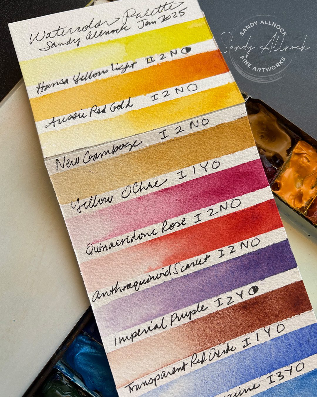
  1. Hansa Yellow Light BLICK  AMZ  JACKSONS 
  2. Aussie Red Gold BLICK  AMZ  JACKSONS 
  3. New Gamboge BLICK  AMZ   JACKSONS 
  4. Yellow Ochre BLICK  AMZ  JACKSONS 
  5. Quinacridone Rose BLICK  AMZ  JACKSONS 
  6. Anthraquinoid Scarlet BLICK  AMZ  JACKSONS 
  7. Imperial Purple BLICK  AMZ  JACKSONS 
  8. Transparent Red Oxide BLICK AMZ  JACKSONS 
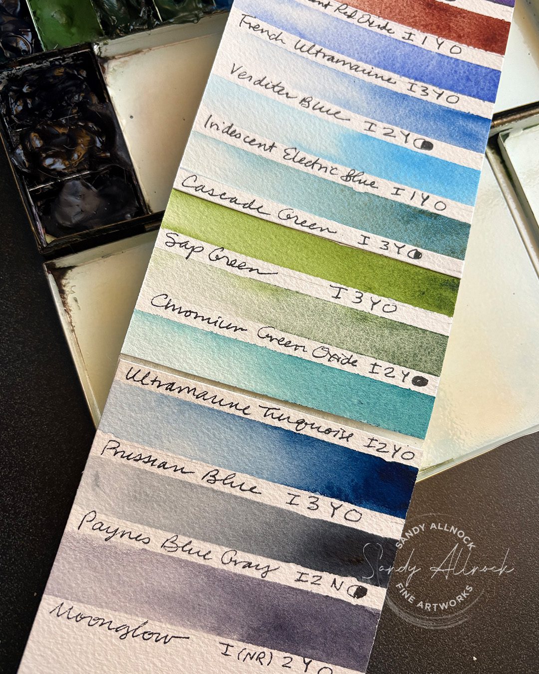
  9. French Ultramarine BLICK  AMZ  JACKSONS 
  10. Verditer Blue BLICK  AMZ  JACKSONS 
  11. Iridescent Electric Blue (Luminescent) BLICK AMZ  JACKSONS 
  12. Cascade Green BLICK  AMZ  JACKSONS 
  13. Sap Green BLICK  AMZ  JACKSONS 
  14. Chromium Green Oxide BLICK  AMZ  JACKSONS 
  15. Ultramarine Turquoise BLICK  AMZ  JACKSONS 
  16. Prussian Blue BLICK  AMZ  JACKSONS 
  17. Paynes Blue Gray BLICK AMZ  JACKSONS 
  18. Moonglow BLICK  AMZ  JACKSONS 

My 2025 palette, for now

I recommend setting a palette and sticking with it for a year or so – it’s not an iron-clad rule, but if there’s not time to really settle in and play with that group of colors, then there’s not all that much learning to be had. I recommend 24 colors or less if you can vote enough colors off the island; it forces you to mix colors from what you have, rather than have a 48-color palette that only gives you the ability to skip that part of the learning process.

You can always change out a color or two before a year, of course! I figured out early that the two reds I had were not working for me. I missed the reds I already had well-practiced, and swapped them last summer. But now I decided since I needed a good cleaning, I’d also just dive in an change a few colors – courtesy of the impressionists. More on that in a minute.


My colors are swatched out here if that’s something that’ll help; they’re all Daniel Smith colors, and they’re linked above in the supply box. I’ve listed color names, lightfastness, staining level, gralation y/n, and opacity/transaparency.

My art history side trip

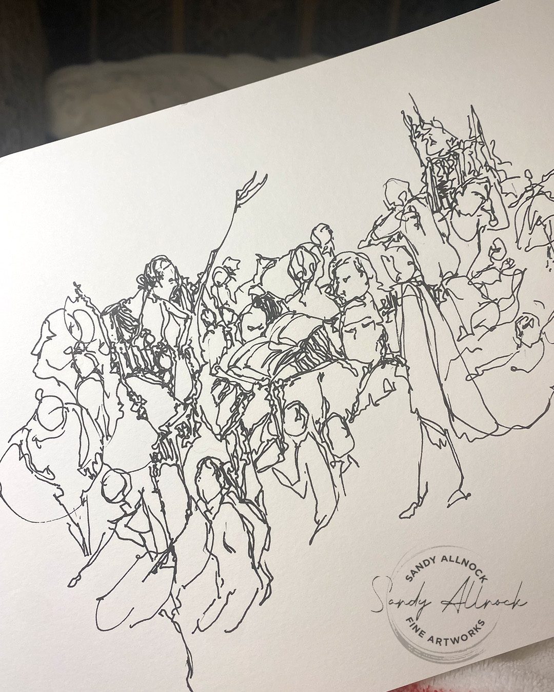
During this long dark winter, when I wanted to feed my brain good stuff and do less scrolling, I decided to do some research on a favorite painter. I started with, of course, Caravaggio, my hero. And I started doing little sketching while watching videos about him, about each artist that kept cropping up in more and more documentaries. Some evenings I had a pen out and drew quick gestures of paintings as they passed by my screen for 20 seconds.

Subscribe to receive blog posts by email:

Taking visual notes

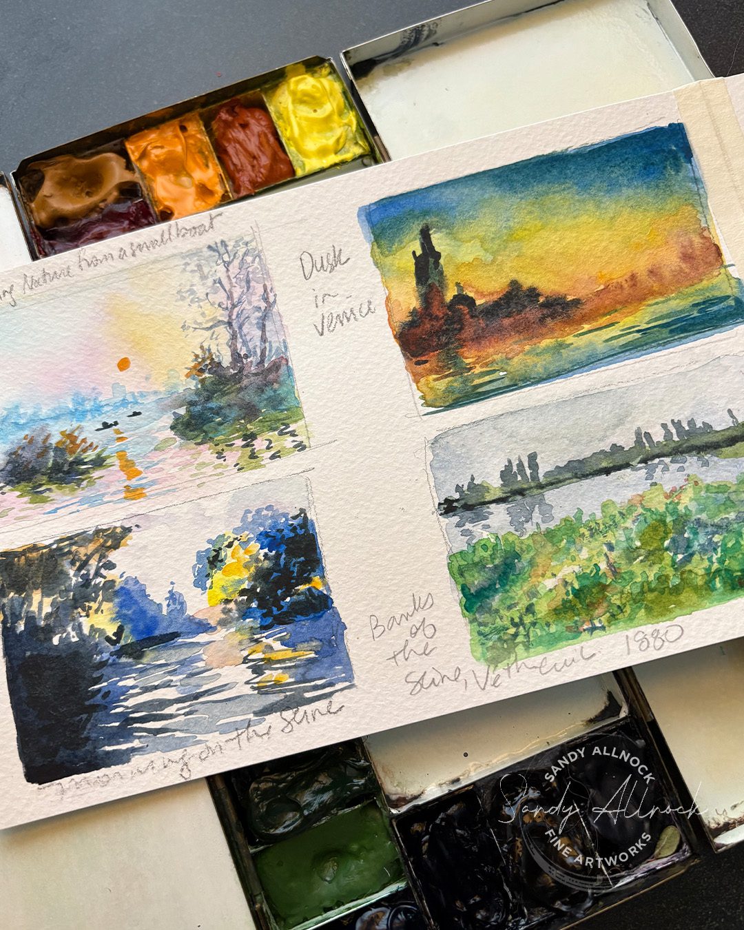
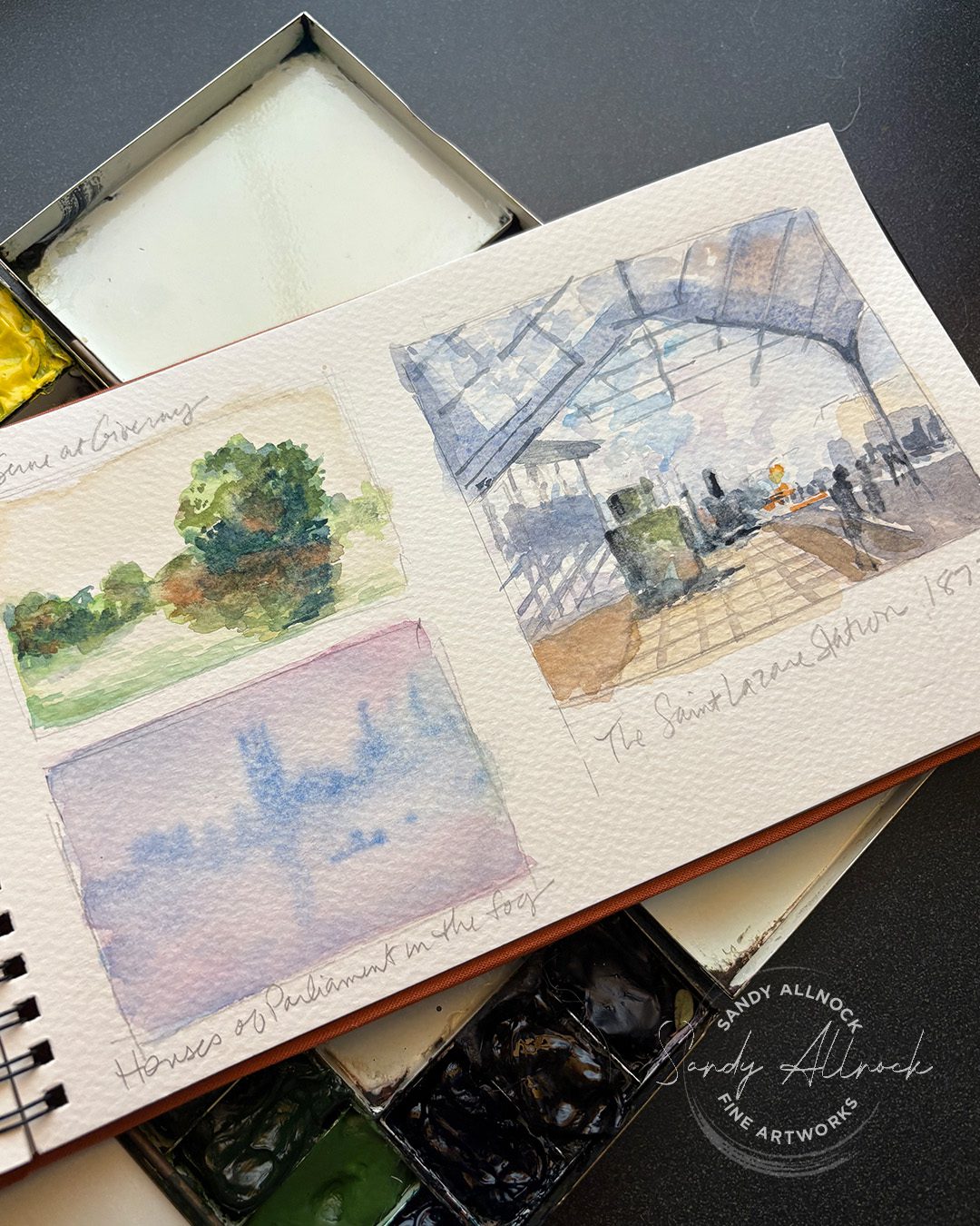
But then I got out watercolors and a sketchbook, and decided to try some color studies. I wasn’t sure what was going to happen – but as the documentary would discuss a painting sometimes I’d look it up so I could zoom in, and would sketch a portion, or a thumbnail of it all.

During my Monet period (ha!) I just googled “paintings by Claude Monet” and started doing quick little thumbnails while the art historian told stories. I was taking visual notes from the paintings – what colors I could see in a tree or grasses that I never use. What would it feel like to include that? These were quick 5 minute paintings, max. 

And the blue and yellow one, well, that one’s not a Monet. The artist who painted it was trying to paint the Seine in Monet’s style, and I should have known it was not a color combo that appealed to Monet at all – but the title was the same as a Monet totle and was in French, and  I didn’t question it til I went to locate the picture to grab for the video. Whoops! Punk’d. Alas. 

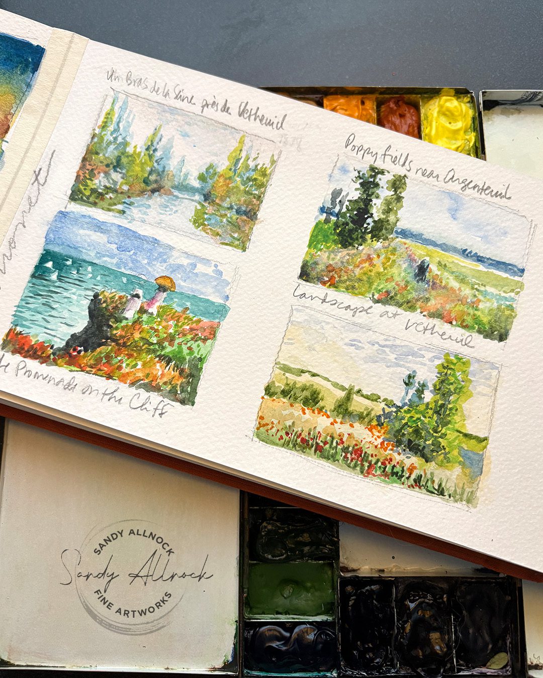
I created a few pages of these sketches, and the panel on the far left was taped in to give me room for more paintings in a spread about Monet. But the Promenade on the Cliff has colors that are, again, unlike Monet’s work – he did add color but now I saw quickly what OVERdoing Monet’s colors could be like. While it pleased the “ooh color!” side of my brain, I don’t have interest in painting that way, and want to do more of the colorways in real Monet paintings….closer to realism but with great pops of color that meld together when looking at the painting as a whole.

Monet’s Poppy Fields at Argenteuil has got me anxious for spring to get here so I can try some of these colors in fields of flowers. (And reminded me that I treated myself to a park pass for 2025 so I can go up to Rainier anytime to paint now!)


In little sketches like these, accuracy wasn’t my goal – it was getting a feel for what it might be like to paint with pops of color. I’ll be experimenting with what that impressionist “pop” could look like within my own style; while at some point I might get out the pastels and gouache and try it, what could I do with watercolor to incorporate that excitement? I’m anxious to see.

I was talking with artists on Reddit about painting water and boats last week, and promised them I’ll be painting a boat in the near future, so maybe I’ll give these ideas a try then. 🙂


Who would you research?

Picking an artist needn’t be choosing someone who you would like to be when you’re a grown up painter. That’s not really the point of studying their work, in the way that I’m approaching it. Sure, if you want to be an impressionist, mimic all you like.

But if, like me, you want to dive deeper into your own style, sometimes trying on something new will teach you either how to expand your own visual language – or might show you that NO you don’t want to create that artist’s work, you just love that artist’s work. And sometimes, that’s a very good thing to learn about yourself.