Create STRIKING tulips in b&w or color on toned paper

Create STRIKING tulips in b&w or color on toned paper

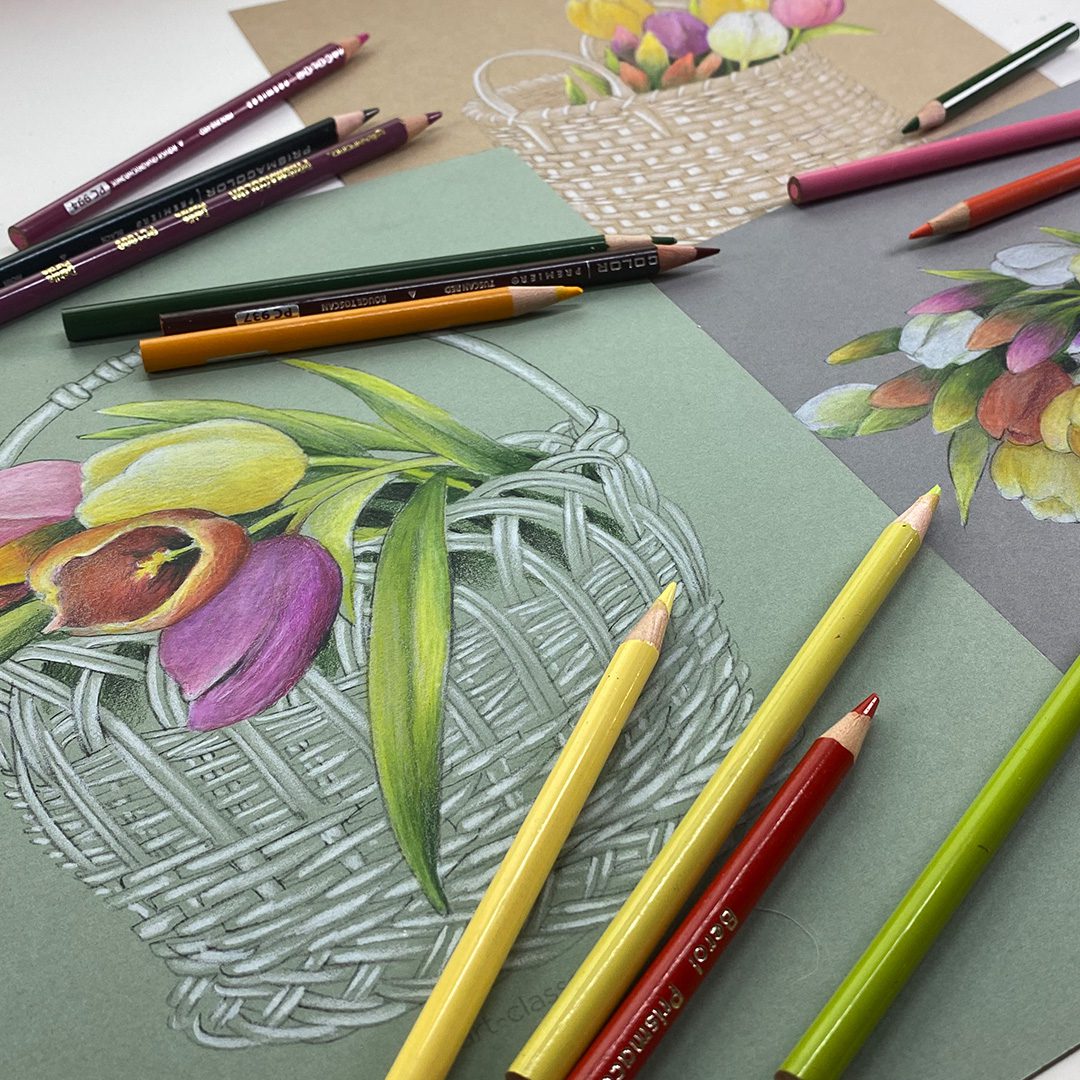
I’m revisiting a project from a few years ago in hopes it’ll ring in spring!?! I’m ready for it! The Tulip Basket Sketches printable set has not only the sketches to print on toned paper – but a big ol’ pdf with tons of step by step info on how to create the color tulips. But today – I’ll revisit in black and white, to create a piece for my bedroom wall.

Tutorial: Create STRIKING tulips in b&w or color on toned paper

Watch the video below and scroll to the end to leave comments or questions — or click HERE to watch it on YouTube and leave comments over there. I read both dutifully!

SUPPLIES

Some product may be provided by manufacturers for review and use. Compensated affiliate links are here at no cost to you. I appreciate your support of my work with your purchases! Full affiliate and product disclosure | My trusted partners in art

Paper

  1. Faber Castell Pitt Pastel Pencil – soft white BLICK  AMZ  JACKSONS

Pastel pencils

  1. Faber Castell Pitt Pastel Pencil – black BLICK  AMZ  JACKSONS

Black and white tulips

While we do love the color of spring tulips….there’s something so simple and pure in a black and white drawing. These will be framed for my bedroom where all the art is black and white!

Colored pencil tulips

These were created in 2023 – and are just as lovely now as they were then! See the video below for how these are created – use the technique for your own drawings, or go get the Tulip Basket Sketches Printable Set and create these drawings.
Subscribe to receive blog posts by email:

Bring on spring!

If we create a boatload of spring tulip art, that’ll covince Mother Nature to come see us, right? 🙂 Easter is April 20 so we have some time but gosh I’d love some warm weather soon!

Unboxing Copic Award – and drawing a night interior self portrait

Unboxing Copic Award – and drawing a night interior self portrait

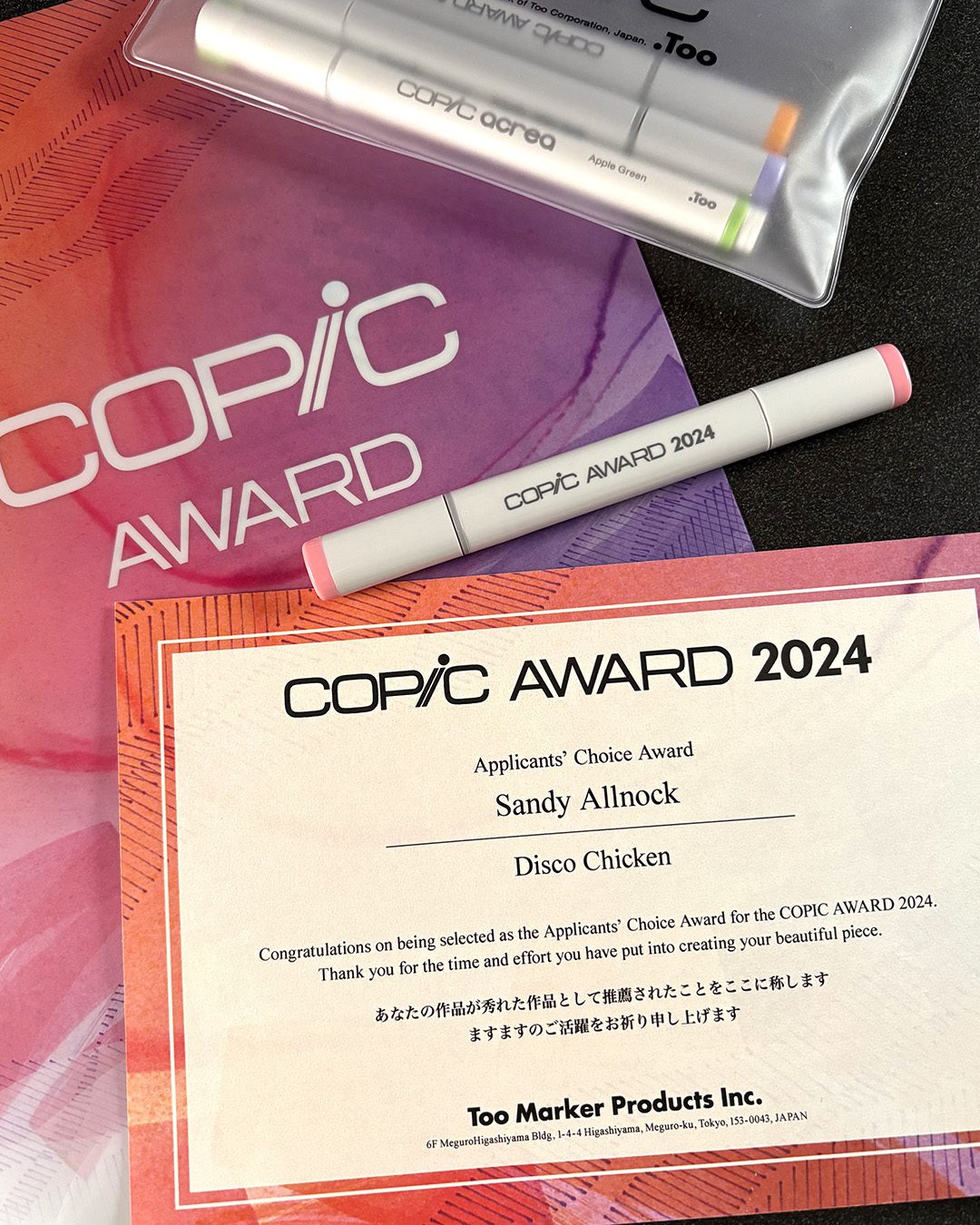
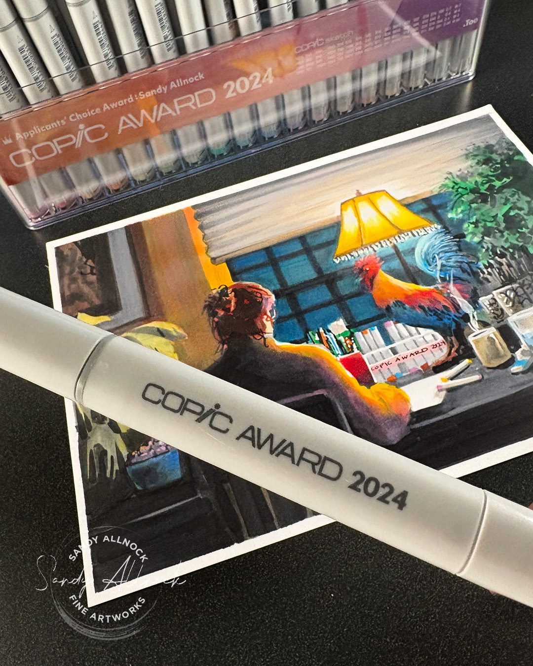
Last year, as in past years, I entered the Copic Award contest – and for many in a row, nada! I always went and looked through the entries, then the winners, and It was clear it was a contest focused on a lot of animé style work. Which is great, but I kept hoping realism would break through and it never did.

Though in 2024 – that changed! Well, maybe. ha! Read on to hear more about what i think the award was for  – and I reposted both videos for that project at the end of this post.

I opened the box that arrived just after the first of the year, but saved the opening of the marker pack for a time when I had an epic project to serve as my thank you to Copic – and you – and finally I had THE idea.

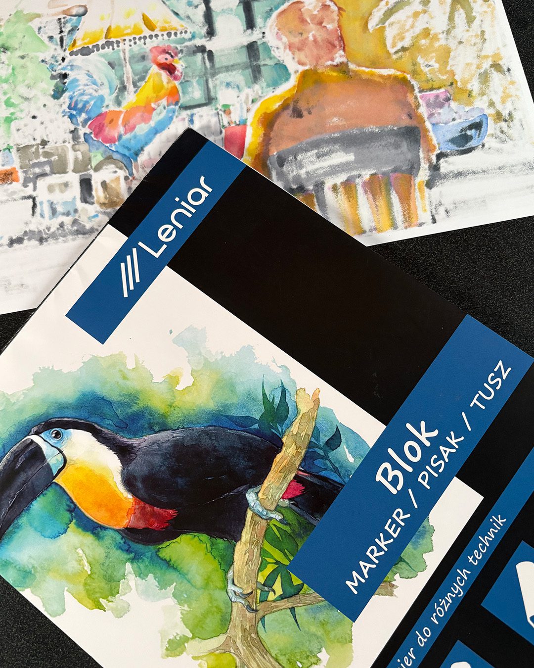
Another little treat in this project was getting to finally use this Leniar paper from Poland! Magdalena had told me about it and she sent me a care package at Christmastime to share some with me. Nice paper! It has some bleed through but not as much as would be expected for the amount of ink poured into the fibers of this sheet. LOL! If you’re in or near Poland, here’s where you get it.

Unboxing  and demonstration:

Watch the video below and scroll to the end to leave comments or questions — or click HERE to watch it on YouTube and leave comments over there. I read both dutifully!

SUPPLIES

Some product may be provided by manufacturers for review and use. Compensated affiliate links are here at no cost to you. I appreciate your support of my work with your purchases! Full affiliate and product disclosure | My trusted partners in art

Paper

  1. Leniar Marker paper 

Markers

  1. Copic Sketch markers BLICK  JACKSONS
  2. Copic Acrea Paint Marker white BLICK  AMZ

Copic Award

Since the contest appears to be mostly animé, manga, and the like, I kept wondering if I was spitting into the wind. I hoped my style would stand out, since I just never saw anyone using the markers the way I do. Kinda funny to have that realization – I’m the weirdo!

But they sent a video notification about the award – it was in Japanese so all I know is the title of my award!

It’s the “Applicant’s Choice” which would normally mean a selection by all the fellow applicants in some way. I never saw any request to vote for a favorite, so I don’t think it was that kind of assessment.

After I uploaded my Disco Chicken, though, I sent a link to my followers, and talked about it in videos – and what I think happened was no one else did that – so the 324 likes that it got maybe were what won the award? I’m certain they would think most people wouldn’t invite hundreds of people to come see it, so they might have just assumed other applicants checked the box..

I could be wrong – maybe I missed a call for voting! But I’m grateful to all of you who clicked that link and left me your little endorsement!

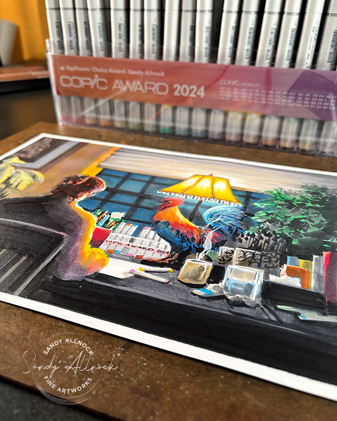
The joke in my drawing

During the time they had emailed for my address, it was the holiday season – and when they said I won an award my mind went to A Christmas Story’s scene where the dad won a “major award” – a leg lamp!

I kept thinking I should just draw a leg lamp like his. But that seemed kind of…..expected. I wanted something pretty epic to help me to thank both Copic and all of YOU who voted for me. 

Once I thought through the fact that a chicken drawing was the one that won, and put that together with the leg lamp, this drawing came to my mind. I spent ridiculous amounts of time taking photos of my workspace at night to get an idea what it would look like, THEN erasing all that from my mind so I could get into the fantasy aspect of it. That paid off when I started thinking about changing up the view out the window; even if I didn’t alter a lot else, that gave me happy thoughts about my days living in New York. Lots of fun to think about on a snowy night!

Lighting at night

During the time they had emailed for my address, it was the holiday season – and when they said I won an award my mind went to A Christmas Story’s scene where the dad won a “major award” – a leg lamp!

I kept thinking I should just draw a leg lamp like his. But that seemed kind of…..expected. I wanted something pretty epic to help me to thank both Copic and all of YOU who voted for me. 

Once I thought through the fact that a chicken drawing was the one that won, and put that together with the leg lamp, this drawing came to my mind. I spent ridiculous amounts of time taking photos of my workspace at night to get an idea what it would look like, THEN erasing all that from my mind so I could get into the fantasy aspect of it. That paid off when I started thinking about changing up the view out the window; even if I didn’t alter a lot else, that gave me happy thoughts about my days living in New York. Lots of fun to think about on a snowy night!

Subscribe to receive blog posts by email:

Disco Chicken!

Watch both parts of the project…

Big thanks to all!

To everyone who voted – thank you!  You’ve been a part of making this award happen. Bless you!

To everyone who’s been praying: Monday’s another medical day, so keep it up 🙂 

My favorite photo reference sites for artists

My favorite photo reference sites for artists

A few weeks back I had fessed up to being punked by AI in a google search while I wasn’t paying a lot of attention. Bad on me – but it’s got me thinking, how on earth will we keep up in knowing how to recognize AI faster?

When selecting references, it’s important to have real photos. (Better still would be drawing from real life!) If we find ourselves working from AI, we’ll start thinking that the wacky proportions and unreality of artificial intelligence images are somehow real.

In light of all that – today I’ll walk you through two websites that I use a lot, and that I trust – although I use them both very differently. See that discussion in the video, or the notes later on in this post!

Tutorial: Favorite photo reference sites

Watch the video below and scroll to the end to leave comments or questions — or click HERE to watch it on YouTube and leave comments over there. I read both dutifully!

Paint My Photo

I do like a good “real people pictures” kind of reference site like PMP, but it has some pros and cons that make me choose how I use it.

On the good side: These are REAL photos. No photoshopping, no fancy lights. Think of it like the instagrammer whose life looks clean and perfect vs a normal human with dishes on the kitchen counter and kids running around with cookie crumbs flying everywhere! When we practice with photos that include all the crazy details, then we learn to edit – to choose what we do and don’t include. 

On the bad side: It can take quite some time to find a photo that is just what you want. You’ll perhaps get caught up in the quality (“Oh I could figure out what to edit from that photo but I just don’t have the time/energy.”)  and pass by images that may have worked. 

That’s why I’m always saving so many photos into folders; I stumble on a picture that randomly pops into a search I’m doing, and saving it for later preserves a lot of time.

Unsplash

I resisted using Unsplash for a while. They do have a low limit on downloads when you’re not a member, and I wasn’t certain I’d use much from their site since I do like to do my own editing. 

But what I started to find is that I can get a different kind of inspiration there. I may not use those photos all the time, but after spending time there, I have a much clearer idea what amount of detail “feels” right. Even if I do a search on PMP and find something that mostly works, Unsplash can show me how clean the image could be if I work at cutting ruthlessly!

Unsplash also helps to get a better view of things – if I have a reference where I can’t see how the animal’s nostrils or feet are shaped, I can often find a quality image close up that can inform me. 

And as I mentioned in the bonus tip at the end – if you enter a “vibe” in the search bar, it can help you think through alternate ideas to “say” something in your art. I haven’t used it this way but it makes me think about the challenges I do every few months – enter a weird prompt in the search and find unique ideas to represent a concept.

Exotic Animal Photo Reference Photo Library

This photo site is a new site for me – I saw a post by the stie owner, and she talked about how there’s no AI, she’s taking photos herself at sanctuaries and wildlife preserves, and she lets artists use anything for free. (To use elsewise, permission is needed.)

They’re animals in captivity, but I like that she takes photos in a series so you can “watch” the animal walk. Even the pros get a lot of standing-still pics, so the ones on this site are unique in what I can learn from them!

For any of these sites, if you use the images, then make a donation, regularly or once a year. Running websites isn’t cheap, and we want to encourage as many good sites to stick around and stay away from AI!

Subscribe to receive blog posts by email:

A few more notes

New artists are often drawn toward pre-simplified references; we look at those and think, “hey I can handle that!”

And yes, that may be the case. Extraneous details were already cut out by the photographer, either in the way they shot or cropped the image, the cleanup they did to the scene before even getting out the camera, or editing work they did later in Photoshop or other software. 

I sometimes choose those too. The boat I painted last week was a photo from Unsplash that already had a number of decisions made. It didn’t stop me from making my own – but that’s not something a lot of newer artists would do. 

​The reason I choose photos for our classes from Paint My Photo instead of Unsplash is that they’re a better training ground for students.

What photos at PMP have going for them is that they’re by ‘regular’ people – not nearly as many pro photographers. They’re people like us. Often using a smart phone. Not doing post-production work. Not cleaning up a scene before shooting a picture of it. 

That all means that the images are ones we see around us all day every day. Full of clutter, full of things that aren’t perfectly arranged. I think of the difference between these two sites as similar to regular-people-instagram photos of our messy, human lives, compared to the influencers with millions of followers. Their homes are perfect, always tidy, minimalist in design, focus and lighting is always perfect. Much of that is done by editing the photos – so while it’s not usually AI (though who knows nowadays!), it’s not normal life.

So why do those messy, imperfect photos provide a better training ground? Because when you sit down to paint your own life, or you go outside to sketch what your town looks like, you need to know how to edit what you see. To be ready to make decisions about what to keep and what to let go of. If someone else already made most of those decisions for you, there’s not much left for you to do aside from executing a copy of their edited world.

As newbie artists, that is often a good thing; you can focus on technique without thinking about editing. I get that. But….if you want to learn to just sit down and draw or paint something on your own, learning the skills of editing is vital. That’s the point of creating thumbnail sketches, as I spoke about in the boat sketches video. I know it’s not the fun technique part – but if you want to keep growing, it’ll make a huge difference in your growth rate!


I hope this helps!

In the Open Studio Zoom last month, I answered a little about working with searching at PMP – and a few people said I should post a video about how to use it for students. That led me to combining it with all that I talked about today. So if you have questions be sure to send them my way – you never know when it’ll inspire a whole video!


DaVinci Silverpoint brush – yay or nay? Flowering Spring Tree

DaVinci Silverpoint brush – yay or nay? Flowering Spring Tree

I’m back with one more post about this brush! I had to do some more practicing with it – because I had my doubts about why DaVinci included a silverpoint tip on a watercolor brush! Why?

Well, traditional silverpoint has some special things about it – one, it needs a ground to show up. Typically it’s either a specialty solution made just for silverpoint, or an acrylic gesso mixture. (In olden days it had all kinds of powder and binders in it.) And I was very uncertain about whether you could watercolor over them.

Secondly, metalpoint drawing requires drawing over a line several times if you want it to show up very much – which would mean it would either smash the surface of the watercolor, or dig into it and create grooves that would collect watercolor pigment and leave lines behind.

So….today we’ll do a little sketch and talk about all that.

Tutorial: DaVinci Silverpoint Watercolor Brush: yay or nay?

Watch the video below and scroll to the end to leave comments or questions — or click HERE to watch it on YouTube and leave comments over there. I read both dutifully!

SUPPLIES

Some product may be provided by manufacturers for review and use. Compensated affiliate links are here at no cost to you. I appreciate your support of my work with your purchases! Full affiliate and product disclosure | My trusted partners in art

Brushes:

  1. DaVinci Silverpoint Brush 
  2. Jack Richeson Travel brush set for gouache: BLICK  AMZ 

Paper:

  1. Arches Watercolor Travel Sketchbook BLICK  AMZ 

Daniel Smith Watercolors

  1. Hansa Yellow Light BLICK  AMZ  JACKSONS 
  2. Quinacridone Rose BLICK  AMZ  JACKSONS 
  3. Iridescent Electric Blue (Luminescent) BLICK  AMZ  JACKSONS 
  4. Ultramarine Turquoise BLICK  AMZ  JACKSONS 
  5. Daniel Smith White Gouache BLICK  AMZ  JACKSONS 

So what’s the skinny?

First, the tip is Ethergraf, not silver. I’m not sure if that’s higher/lower quality than real silver or not, I’m still learning. “Different” is fine – lots of different metals can be used.

Second – the point is quite rounded and chunky – which means it’s not point and won’t dig into the paper. It may still smash the paper texture, but in making a few paintings using this tool to draw with, I didn’t find it created anything weird to paint over. 

The value, however, is very light when on regular, unprepped paper; it’s perhaps an HB or so. and the lines are soft, without the ability to get detail with the chunky tip – also okay so you don’t get too lost in drawing everything out.

I tried using the metal tip on paper prepared with watercolor ground, and the value of the lines IS darker, which helps. Except I find grounds very difficult to paint on, so that doesn’t help m much!

Subscribe to receive blog posts by email:

The Verdict

I’m going to give this brush a big thumbs up, despite the silverpoint not being what I would like it to be. Because it paints like a dream! And for a brush of its size, it’s a reasonably priced sable brush. It’s not a must-have, but it’s likely you’ll see me using it again, as it’s fun to play with — and I have a lot to learn about it too.

Stay tuned for metalpoint to come

I’ve been testing papers, types of gessos, colors, tools, and metal types, but with a lot to learn, it’ll be a little while til I get enough info to cover it!

Docked Boat, part 2 Real Time Watercolor

Docked Boat, part 2 Real Time Watercolor

Now that the thumbail sketches were completed in the previous post, we’re ready to embark on the full painting. It’s in realtime, and you’ll see the watercolor paints being mixed. I’ve captured the ambient sound of sitting in a harbor with the sounds of boats and seagulls – I hope it helps transport you somwhere warm!

Let’s walk through this painting slowly, step by step – you can paint along, stopping the video from time to time if needed. 

Tutorial: Docked Boat, part 2 – realtime watercolor

Watch the video below and scroll to the end to leave comments or questions — or click HERE to watch it on YouTube and leave comments over there. I read both dutifully!

SUPPLIES

Some product may be provided by manufacturers for review and use. Compensated affiliate links are here at no cost to you. I appreciate your support of my work with your purchases! Full affiliate and product disclosure | My trusted partners in art

Brush and pencil

  1. DaVinci Silverpoint Brush 
  2. Caran d’Ache Grafwood pencils 9B BLICK  AMZ   JACKSONS
  3. Afmat Long Point Pencil Sharpener 
  4. Faber Castell Kneaded Eraser BLICK  AMZ  JACKSONS

PAper

  1. Arches Natural White CP 22×30 sheet

Daniel Smith Watercolors

  1. Anthraquinoid Scarlet BLICK  AMZ  JACKSONS
  2. New Gamboge BLICK  AMZ  JACKSONS
  3. Quinacridone Rose BLICK  AMZ  JACKSONS
  4. Transparent Red Oxide BLICK  AMZ  JACKSONS
  5. French Ultramarine BLICK  AMZ  JACKSONS
  6. Iridescent Electric Blue (Luminescent) BLICK  AMZ  JACKSONS
  7. Paynes Blue Gray BLICK AMZ  JACKSONS

Abstracting/simplifying elements

The under side of the pier isn’t important to the picture aside from setting up the location, and providing contrast for the boat. It doesn’t have to look like anything but a structure; the audience will interpret it in their own way.

Keep the main thing the main thing

For me, the important part of this scene was the light on the boat, and the pop of color in the buoy; your own vision might take  you somewhere else, so you could crop or address your own interests and come u with another painting entirely.

i wanted that light blue color, as well as the dollops of French Ultramarine as a contrast to its complement in the orangey color. adding it in shadows really helped.  At the end dropping in some rust tied back to the buoy too!

Subscribe to receive blog posts by email:

Need more painting instruction?

If you’re new to me, you might not know I teach classes! Over at Art-Classes.com, you can brows watercolor courses at all levels to find something to inspire you!