Get started exgg-stra early for Easter crafts!

Get started exgg-stra early for Easter crafts!

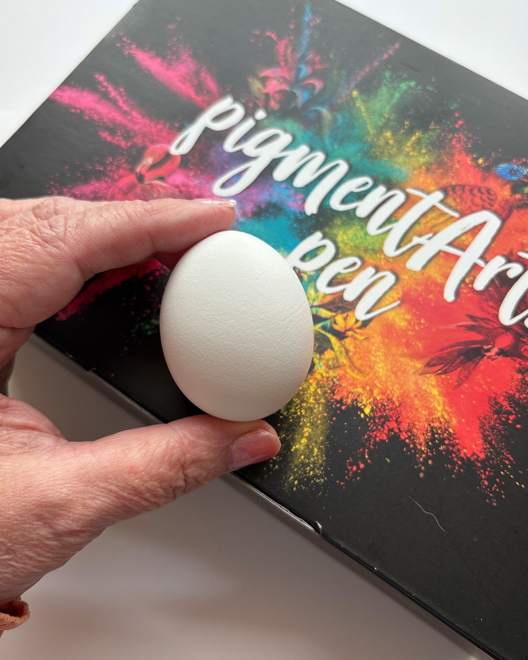
I just saw eggs this week for $12 a dozen – crazy crazy crazy! And they say the price is only going to keep rising. So what do we do when Easter is around the corner? No more eggs? Decorate wooden or plastic ones? Well, I decided that I have a strategy that’ll help me create some beautiful eggs….but by preparing them all NOW even if not decorating til later in April.


NOTE: In addition to today’s video, there are two other egg videos at the end of this post to inspire your Easter crafting!
 

Tutorial: Get started extra early for Easter egg crafts!

Watch the video below and scroll to the end to leave comments or questions — or click HERE to watch it on YouTube and leave comments over there. I read both dutifully!

SUPPLIES

Some product may be provided by manufacturers for review and use. Compensated affiliate links are here at no cost to you. I appreciate your support of my work with your purchases! Full affiliate and product disclosure | My trusted partners in art

Availability of the new colors in the 60 set are kind of hit or miss; if you have a favorite store that carries some sets, and you want a different one – give them a call and have them order it for you. Ok well not Amazon because, yeah. Billionaires.

  1. Staedtler Mars Pigment Arts Pen set: 24 BLICK  JACKSONS
  2. Staedtler Mars Pigment Arts Pen set: 36 BLICK  AMZ  JACKSONS 
  3. Staedtler Mars Pigment Arts Pen set: 60 BLICK 
  4. Staedtler Mars MultiInk Blending Liquid AMZ

Coloring with Pigment Brush Pens

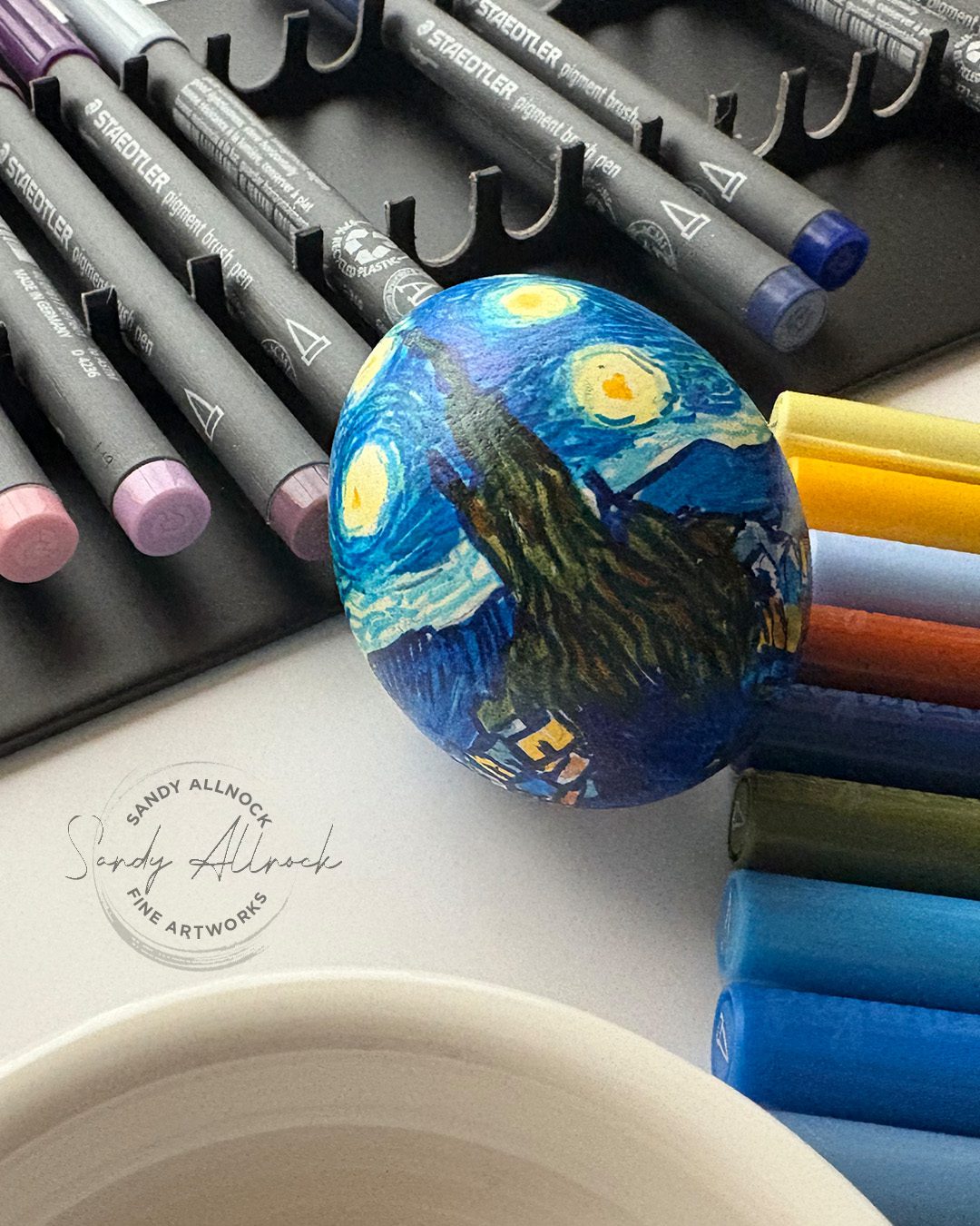
These markers dry permanent unless using the blending solution with them, giving you lots of options! I let colors keep drying between layering so the underlying lighter layers stayed in place while the other colors ended up on top. They’re transparent colors, too, so you won’t cover and block them like an opaque pen would.
Going to NAMTA Seattle?

I’ll be there Sunday and Monday (April 6-7) doing demos – I’ve designed bookmarks for the make-and-takes. Pop over to the Staedtler booth and say hi, and take a look at the eggs and other projects I’m working on to show!

And even if you’re not coming, ask at your local art store if they’re sending anyone. Have them pop by and say hello for you!


Subscribe to receive blog posts by email:

Other ideas?

I’ll be making a few other eggs for samples for the show. Got ideas that I should try? I’m trying for an art-theme!

Pysanky Eggs part 1

This older video shows how to make tone-on-tone eggs by etching.

Pysanky Eggs part 2

This older video shows how to make more traditional colorful pysanky.

6 New Daniel Smith Watercolors (part 2, painting)

6 New Daniel Smith Watercolors (part 2, painting)

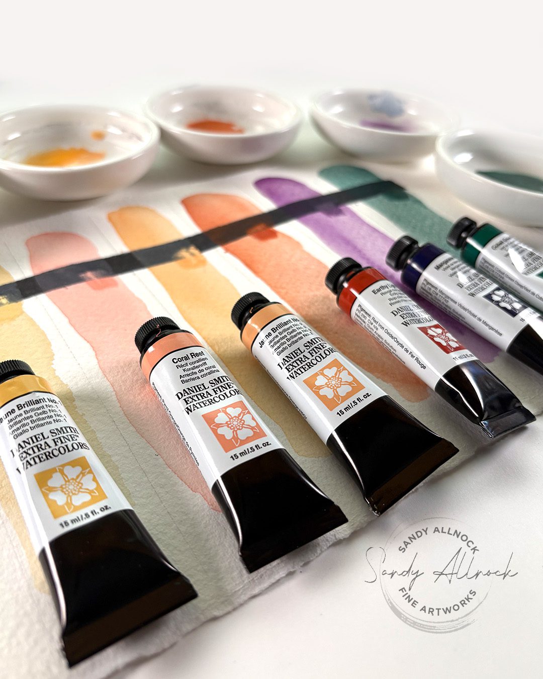
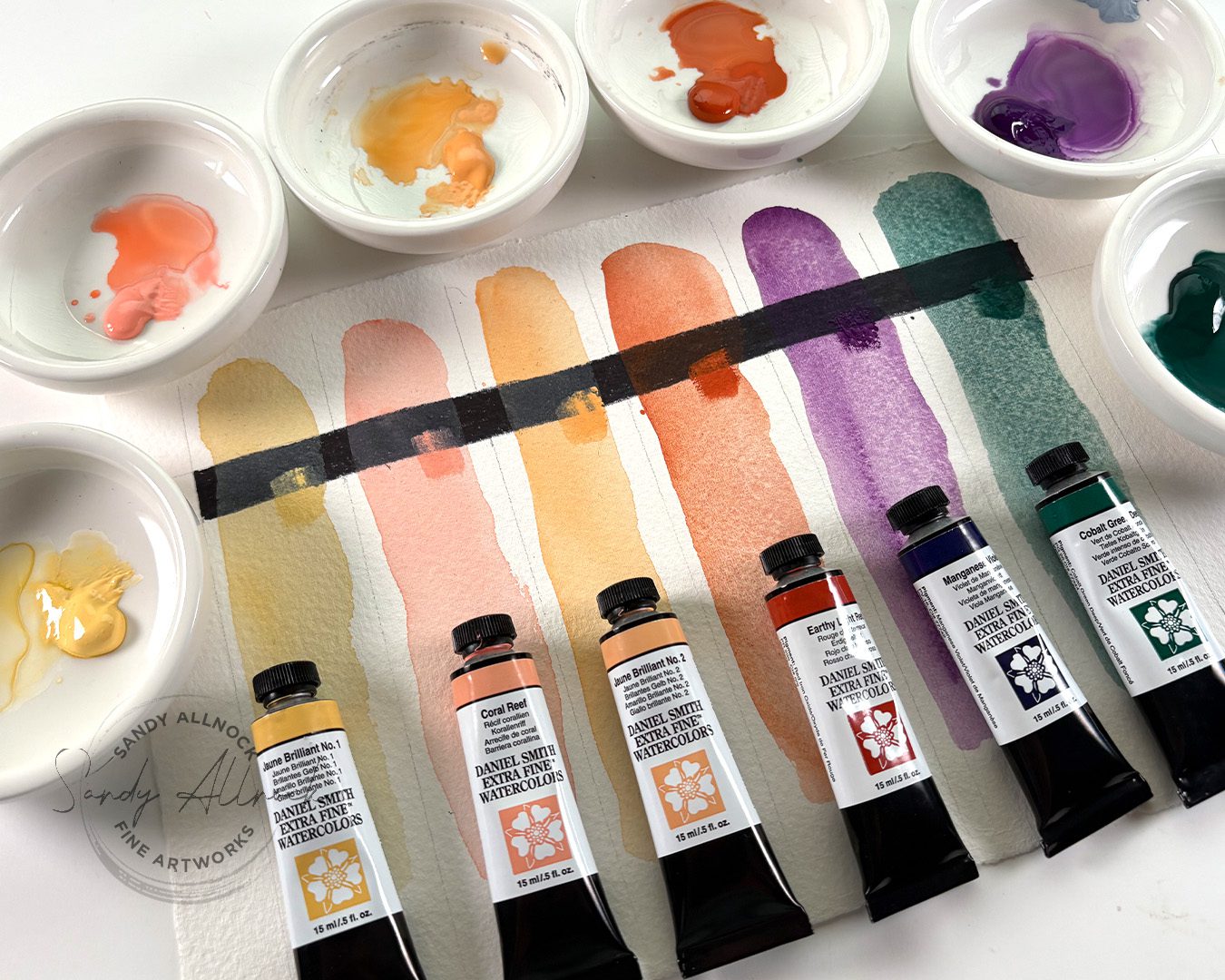
In my previous post I showed the new 6 colors from Daniel Smith for 2025: Jaune Brilliant 1 and 2, Coral Reef, Earth Light Red, Manganese Violet, and Cobalt Green Deep. Now it’s time to try to create a painting using all SIX! See the swatching HERE.

Video: Portrait of a young girl

Watch the video below and scroll to the end to leave comments or questions — or click HERE to watch it on YouTube and leave comments over there. I read both dutifully!

SUPPLIES

Some product may be provided by manufacturers for review and use. Compensated affiliate links are here at no cost to you. I appreciate your support of my work with your purchases! Full affiliate and product disclosure | My trusted partners in art

Daniel Smith new colors

  1. Jaune Brilliant 1
  2. Jaune Brilliant 2
  3. Coral Reef
  4. Earth Light Red
  5. Manganese Violet
  6. Cobalt Green Deep

Paper

  1. Arches Bright White CP 22×30 sheet BLICK   JACKSONS 

Brushes 

  1. DaVinci Silverpoint Quill Brush 
  2. Da Vinci Maestro Kolinsky Sable Round 4 BLICK  AMZ  JACKSONS 
  3. Da Vinci Maestro Kolinsky Sable Round 2 BLICK   AMZ 
  4. Winsor and Newton Kolinsky Sable Series 7 Round #10 

Portraits, agh!

It’s so hard to get a portrait to come out right; lots of them barely look human, much less like the person in the photo. This reference is by Janko Ferlič  who does great shots of people as well as puffins and more. She’s younger in real life than she looks here, but hey – she still looks young so I’ll take it! I liked a few things about her – the blue eyes, the “glow” around her from the sun, and the pure skin tones that would work with the colors I had to work with. And the purple in her shirt and green background, too, so I didn’t have to just figure out how to pop them into her hair!

Jaune Brilliant #1


This is the swatch from DS; my photo above is far closer to reality than this. Here’s what they say about Jaune Brilliant No.1: “This light yellow is sunlight in a tube. Excellent for sky-scapes and floral/garden paintings. Perfect for finishing highlights and negative painting techniques.”

Pigment: PY 65, PW 6 | Series: 1
Lightfastness: Excellent
Transparency: Semi-Opaque
Staining: Non-Staining
Granulation: Non-Granulating

Jaune Brilliant #2


Here’s what they say about Jaune Brilliant No.2: “This light peach color leans toward orange. It is a creamsicle on a summer day. Makes a great sunrise or sunset sky-scape. “

Pigment: PO 62, PW 6 | Series: 1
Lightfastness: Excellent
Transparency: Semi-Opaque
Staining: Non-Staining
Granulation: Non-Granulating

Coral Reef

 Again, their swatch is really greyed out. Not sure what’s up with that!

Here’s what they say about Coral Reef: “This is such a happy color! Great for painting florals. This color brings to mind flamingos, shrimp, and shells. Pair it with Cobalt Teal Blue and it whispers of sun kissed Caribbean adventures.” I think this is Ai. LOL.

Pigment: PO 73, PW 6 | Series: 1
Lightfastness: Excellent
Transparency: Semi-Opaque
Staining: Non-Staining
Granulation: Non-Granulating

Manganese Violet

Here’s what they say about Manganese Violet: “The gorgeous granulating quality provides a bold tool for painting deep rich floral landscapes. You’ll be in excellent artist company—Manganese Violet was a staple on Claude Monet’s palette.” I kind of agree with Monet, this one’s a purple I may use.

Pigment: PV 16 | Series: 3
Lightfastness: Excellent
Transparency: Semi-Transparent
Staining: Low Staining
Granulation: Granulating

Cobalt Green Deep

Here’s what they say about Coral Green Deep: “…lends itself to gorgeous deep woodland landscapes. It mixes effortlessly with other colors– try it with Neutral Tint, or Indigo for fascinating stormy sea and sky effects.” As I said in the video, it reminds me of Cascade Green without the color breakout to blue.

Pigment: PG 26 | Series: 2
Lightfastness: Excellent
Transparency: Semi-Transparent
Staining: Low-Staining
Granulation: Granulating

Subscribe to receive blog posts by email:

Not bad, though

Even if I do say so myself. I like when I surprise myself with the end results!

Paint along with us!

In April 2025 over at Artventure, we’ll be doing a “Let’s Paint Together” again – going through a course together as a group. It’s not mandatory, but the 30 Days to More Confident Watercolor Sketching class is one that I think a number of people have bought and just not gotten the motivation to get rolling on!

I’ll be painting larger than the postcards in the class – and looking for reference photos that are similar to the paintings in the class, potentially, just to explore the idea from the lesson in a different way. I may add a video here and there but mostly it will be text/photo additions to the lessons.

Hope you’ll consider joining us, as it’ll be lots of fun!

6 New Daniel Smith Watercolors for 2025

6 New Daniel Smith Watercolors for 2025

Just a quick post for today….Daniel Smith sent me their 6 new watercolors! I’m playing with them now and will share a painting and some learnings about each color soon, but I thought I’d get ’em swatched for you in case you’ve been just waiting for colors like these. 🙂 

Video: 6 New Daniel Smith Watercolors for 2025

Watch the video below and scroll to the end to leave comments or questions — or click HERE to watch it on YouTube and leave comments over there. I read both dutifully!

SUPPLIES

Some product may be provided by manufacturers for review and use. Compensated affiliate links are here at no cost to you. I appreciate your support of my work with your purchases! Full affiliate and product disclosure | My trusted partners in art

Daniel Smith new colors (coming soon to more stores)

  1. Coral Reef JACKSONS
  2. Earthy Light Red JACKSONS
  3. Jaune Brilliant 1 JACKSONS 
  4. Jaune Brilliant 2 JACKSONS
  5. Manganese Violet JACKSONS
  6. Cobalt Green Deep JACKSONS

Paper

  1. Arches Bright White CP 22×30 sheet BLICK   JACKSONS 

Brushes 

  1. DaVinci Silverpoint Quill Brush 


More info on these colors… 

Jaune Brilliant #1


This is the swatch from DS; my photo above is far closer to reality than this. Here’s what they say about Jaune Brilliant No.1: “This light yellow is sunlight in a tube. Excellent for sky-scapes and floral/garden paintings. Perfect for finishing highlights and negative painting techniques.”

Pigment: PY 65, PW 6 | Series: 1
Lightfastness: Excellent
Transparency: Semi-Opaque
Staining: Non-Staining
Granulation: Non-Granulating

Jaune Brilliant #2


Here’s what they say about Jaune Brilliant No.2: “This light peach color leans toward orange. It is a creamsicle on a summer day. Makes a great sunrise or sunset sky-scape. “

Pigment: PO 62, PW 6 | Series: 1
Lightfastness: Excellent
Transparency: Semi-Opaque
Staining: Non-Staining
Granulation: Non-Granulating

Coral Reef

 Again, their swatch is really greyed out. Not sure what’s up with that!

Here’s what they say about Coral Reef: “This is such a happy color! Great for painting florals. This color brings to mind flamingos, shrimp, and shells. Pair it with Cobalt Teal Blue and it whispers of sun kissed Caribbean adventures.” I think this is Ai. LOL.

Pigment: PO 73, PW 6 | Series: 1
Lightfastness: Excellent
Transparency: Semi-Opaque
Staining: Non-Staining
Granulation: Non-Granulating

Manganese Violet

Here’s what they say about Manganese Violet: “The gorgeous granulating quality provides a bold tool for painting deep rich floral landscapes. You’ll be in excellent artist company—Manganese Violet was a staple on Claude Monet’s palette.” I kind of agree with Monet, this one’s a purple I may use.

Pigment: PV 16 | Series: 3
Lightfastness: Excellent
Transparency: Semi-Transparent
Staining: Low Staining
Granulation: Granulating

Cobalt Green Deep

Here’s what they say about Coral Green Deep: “…lends itself to gorgeous deep woodland landscapes. It mixes effortlessly with other colors– try it with Neutral Tint, or Indigo for fascinating stormy sea and sky effects.” As I said in the video, it reminds me of Cascade Green without the color breakout to blue.

Pigment: PG 26 | Series: 2
Lightfastness: Excellent
Transparency: Semi-Transparent
Staining: Low-Staining
Granulation: Granulating

Subscribe to receive blog posts by email:

Florals and more in mind

These colors make me think of portraits, skies, and garden paintings – so I’ll be playing around with these colors in coming weeks and more. This is one of my little studies…

Paint along with us!

In April 2025 over at Artventure, we’ll be doing a “Let’s Paint Together” again – going through a course together as a group. It’s not mandatory, but the 30 Days to More Confident Watercolor Sketching class is one that I think a number of people have bought and just not gotten the motivation to get rolling on!

I’ll be painting larger than the postcards in the class – and looking for reference photos that are similar to the paintings in the class, potentially, just to explore the idea from the lesson in a different way. I may add a video here and there but mostly it will be text/photo additions to the lessons.

Hope you’ll consider joining us, as it’ll be lots of fun!

Painting depth of field in gouache

Painting depth of field in gouache

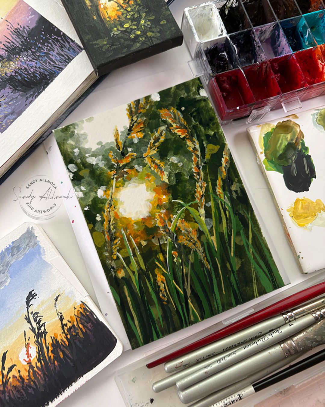
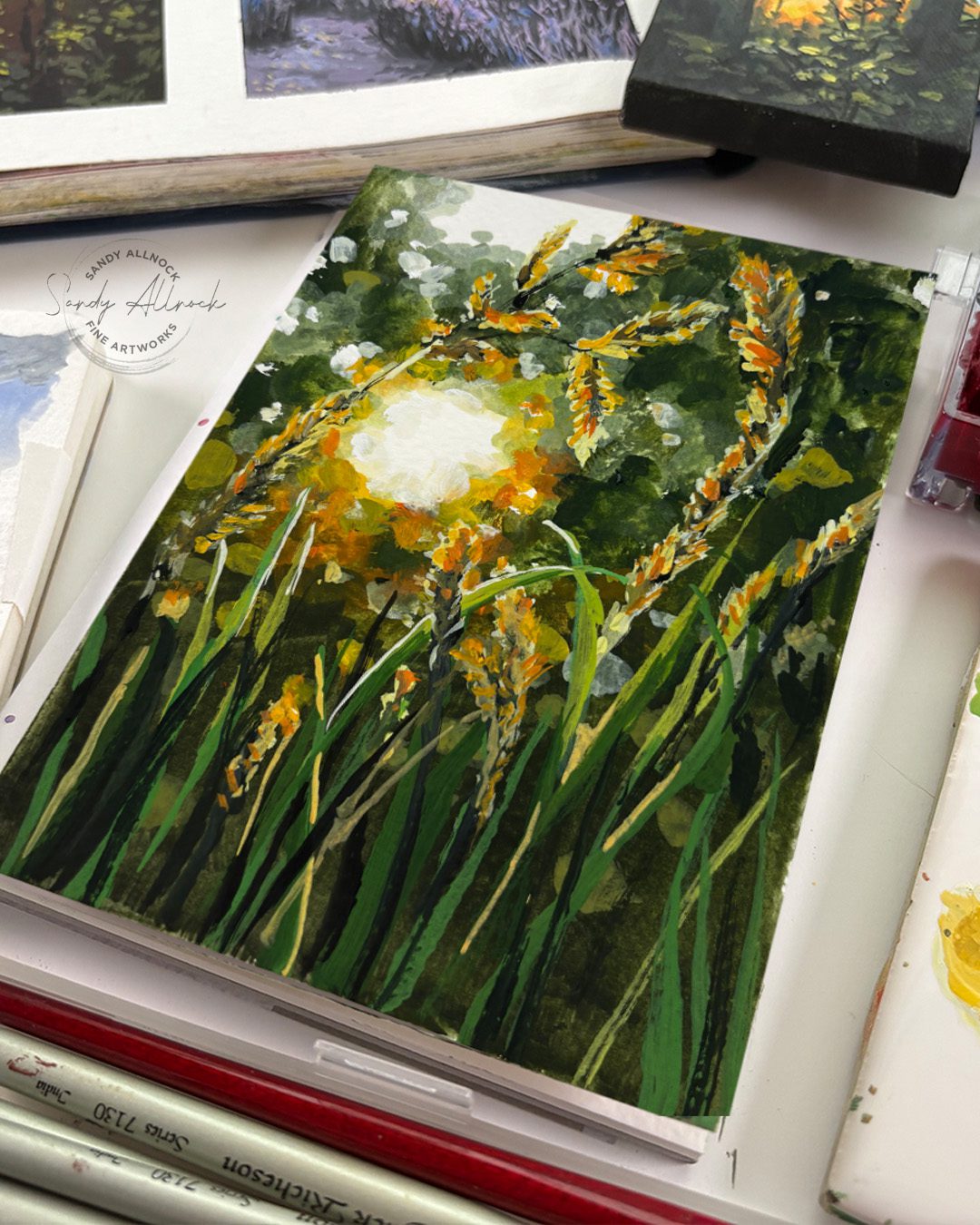
After talking a bit about how suns are white in my previous post – it’s time to paint a white sun! And since I’m fresh off my gouache phenology wheel, this will be in gouache.

I found this photo by Vlad Patana on Unsplash and since I’m a geek for bokeh, I decuded to do a little video exploring how to get that dappled, fuzzy, out of focus look – depth of field. 


Tutorial: Painting depth of field in gouache

Watch the video below and scroll to the end to leave comments or questions — or click HERE to watch it on YouTube and leave comments over there. I read both dutifully!

SUPPLIES

Some product may be provided by manufacturers for review and use. Compensated affiliate links are here at no cost to you. I appreciate your support of my work with your purchases! Full affiliate and product disclosure | My trusted partners in art

Sketchbooks

  1. Square sketchbook 
  2. Long sketchbook – Pentallic Aqua Journal 5×8 BLICK   AMZ

Brushes

  1. Jack Richeson Travel brush set BLICK  AMZ 

Palette

  1. Joybest airtight palette 

Daniel Smith Gouache

  1. Sap Green BLICK   AMZ   JACKSONS 
  2. Titanium White BLICK   AMZ   JACKSONS 
  3. Lamp Black BLICK   AMZ   JACKSONS 
  4. Cadmium Yellow Light Hue BLICK   AMZ   JACKSONS 
  5. Lemon Yellow BLICK   AMZ   JACKSONS 
  6. Cadmium Orange Hue BLICK   AMZ   JACKSONS 
  7. Cobalt Teal Blue BLICK  AMZ   JACKSONS 

Blurred edges

The trick to creating what looks like blurry edges without physically blending them (it’s difficult in gouache)…the idea is to really really look at the values. Around edges of a blurry object the colors of the background and the object become values of both of them – in the case of a white or light background, it’ll be a midtone color of a dark, or a light value of a midtone. In the distance they’ll often get desaturated too, which is  quickly achieved in gouache with black or white. Or both.

Foreground

Handling the foreground depends on the image – in this case, there’s more saturated colors to pull the grasses forward. All that sunny gold and orange.

Subscribe to receive blog posts by email:

Sketchbook Color Studies in green

This course is on sale this month – perfect time to go play with your gouache paints! The video above in its uncut form is in a bonus lesson in the class. 

What if we taught this one art truth to kids?

What if we taught this one art truth to kids?

I’ve taught little art lessons to many many kids over the decades. Not always in formal settings, though sometimes I get invited to a homeschool group or other childcare setting. But when I go to babysit for a friend, or even go to have dinner at their home – I always have a little bag with sketchbooks and crayons or pencils. The kids know to ask if we get to make art!

I try to do more than “only” turn them loose, unless they’re on a mission to create something they know they want to do. But I try to find something fun at their level, with subject matter that’ll appeal to them, and teach a little something. A bit of shading, how to draw a shape, just something small – but they get to learn a fancy art word and that makes them feel like an artist!


During February I worked on my “skies” phenology wheel, so found myself painting the sun quite often. And it kept gnawing at me that the sun is white – so why do we color it yellow!? (Yes when it’s very low on the horizon it *can* be red, orange, or yellow, but that’s rare.) 

Much of it is that there’s no white crayon to show up on white paper. So sure, we need a color, and I’m cool with anything yellow. But how can we use the fact that the sun IS white to help kids to figure out how to draw that?

Video: What if we taught this one art truth to kids?

Watch the video below and scroll to the end to leave comments or questions — or click HERE to watch it on YouTube and leave comments over there. I read both dutifully!

Negative drawing

Coloring a subject that’s white requires some unique thinking; rather than filling IN the shape, coloring AROUND it is what makes the subject look white. 

For my adult students, I find many who say they just can’t think that way. It’s too much opposite-thinking. But what if we helped kids learn what negative drawing is while they’re young? They accept new concepts MUCH easier than adults do!

Try showing littles in your life how to make a white sun. Add whatever landscape is suitable – trees, houses, or an ocean like this. It can help if you find a picture of a sun shining on that kind of scene so they can SEE the sun is white. Or go outside and look at the sun (carefully, no blinding yourselves!) and see how it shines on the ground. Is there a lake it’s reflecting onto?

Phenology wheel

I’ve now finished month 2! I’m pleased enough with how this worked out; it’s been challenging working so small right now, as I still can’t see particularly well; taping off the segments really helped me keep the paint corralled! March will be birds…they’ve been out and singing up a storm for the last week as it’s gotten much warmer than the first snowy half of February.

Subscribe to receive blog posts by email:

It’s painted in gouache – an opaque watercolor. Text is in Copic Acrea pens as well as gel pen and sharpie.

Would this lesson have helped you as a kid?

I’m going to try it next time I’ve got kiddos at my disposal, and see if they even need to learn the “negative coloring” term. Just helping them see that coloring the background will make the circle white can be enough!