
In my previous post I showed the new 6 colors from Daniel Smith for 2025: Jaune Brilliant 1 and 2, Coral Reef, Earth Light Red, Manganese Violet, and Cobalt Green Deep. Now it’s time to try to create a painting using all SIX! See the swatching HERE.

Video: Portrait of a young girl
Watch the video below and scroll to the end to leave comments or questions — or click HERE to watch it on YouTube and leave comments over there. I read both dutifully!
SUPPLIES
Some product may be provided by manufacturers for review and use. Compensated affiliate links are here at no cost to you. I appreciate your support of my work with your purchases! Full affiliate and product disclosure | My trusted partners in art

Daniel Smith new colors
- Jaune Brilliant 1
- Jaune Brilliant 2
- Coral Reef
- Earth Light Red
- Manganese Violet
- Cobalt Green Deep
Paper
Brushes
- DaVinci Silverpoint Quill Brush
- Da Vinci Maestro Kolinsky Sable Round 4 BLICK AMZ JACKSONS
- Da Vinci Maestro Kolinsky Sable Round 2 BLICK AMZ
- Winsor and Newton Kolinsky Sable Series 7 Round #10
Portraits, agh!
It’s so hard to get a portrait to come out right; lots of them barely look human, much less like the person in the photo. This reference is by Janko Ferlič who does great shots of people as well as puffins and more. She’s younger in real life than she looks here, but hey – she still looks young so I’ll take it! I liked a few things about her – the blue eyes, the “glow” around her from the sun, and the pure skin tones that would work with the colors I had to work with. And the purple in her shirt and green background, too, so I didn’t have to just figure out how to pop them into her hair!


Jaune Brilliant #1
This is the swatch from DS; my photo above is far closer to reality than this. Here’s what they say about Jaune Brilliant No.1: “This light yellow is sunlight in a tube. Excellent for sky-scapes and floral/garden paintings. Perfect for finishing highlights and negative painting techniques.”
Pigment: PY 65, PW 6 | Series: 1
Lightfastness: Excellent
Transparency: Semi-Opaque
Staining: Non-Staining
Granulation: Non-Granulating

Jaune Brilliant #2
Here’s what they say about Jaune Brilliant No.2: “This light peach color leans toward orange. It is a creamsicle on a summer day. Makes a great sunrise or sunset sky-scape. “
Pigment: PO 62, PW 6 | Series: 1
Lightfastness: Excellent
Transparency: Semi-Opaque
Staining: Non-Staining
Granulation: Non-Granulating

Coral Reef
Again, their swatch is really greyed out. Not sure what’s up with that!
Here’s what they say about Coral Reef: “This is such a happy color! Great for painting florals. This color brings to mind flamingos, shrimp, and shells. Pair it with Cobalt Teal Blue and it whispers of sun kissed Caribbean adventures.” I think this is Ai. LOL.
Pigment: PO 73, PW 6 | Series: 1
Lightfastness: Excellent
Transparency: Semi-Opaque
Staining: Non-Staining
Granulation: Non-Granulating

Manganese Violet
Here’s what they say about Manganese Violet: “The gorgeous granulating quality provides a bold tool for painting deep rich floral landscapes. You’ll be in excellent artist company—Manganese Violet was a staple on Claude Monet’s palette.” I kind of agree with Monet, this one’s a purple I may use.
Pigment: PV 16 | Series: 3
Lightfastness: Excellent
Transparency: Semi-Transparent
Staining: Low Staining
Granulation: Granulating

Cobalt Green Deep
Here’s what they say about Coral Green Deep: “…lends itself to gorgeous deep woodland landscapes. It mixes effortlessly with other colors– try it with Neutral Tint, or Indigo for fascinating stormy sea and sky effects.” As I said in the video, it reminds me of Cascade Green without the color breakout to blue.
Pigment: PG 26 | Series: 2
Lightfastness: Excellent
Transparency: Semi-Transparent
Staining: Low-Staining
Granulation: Granulating
Subscribe to receive blog posts by email:
Not bad, though
Even if I do say so myself. I like when I surprise myself with the end results!

Paint along with us!
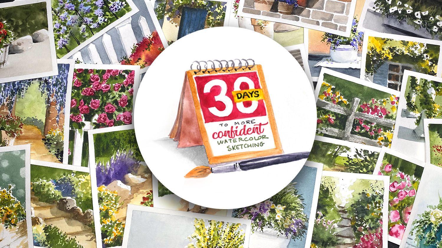
In April 2025 over at Artventure, we’ll be doing a “Let’s Paint Together” again – going through a course together as a group. It’s not mandatory, but the 30 Days to More Confident Watercolor Sketching class is one that I think a number of people have bought and just not gotten the motivation to get rolling on!
I’ll be painting larger than the postcards in the class – and looking for reference photos that are similar to the paintings in the class, potentially, just to explore the idea from the lesson in a different way. I may add a video here and there but mostly it will be text/photo additions to the lessons.
Hope you’ll consider joining us, as it’ll be lots of fun!





0 Comments