
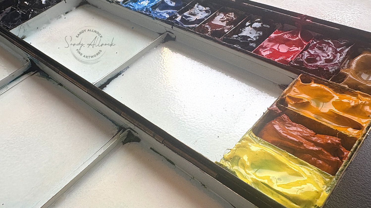
At the start of each year, I tend to do a little rethink on the colors in my palette. Lots will just stay on, but if there’s anything that didn’t get used much/enough to get refilled, or if I have something in mind that I really want to add in….it’s time to vote someone off the island! Last summer I kicked off a few colors, which I neglected to talk about…and today two more went buhbye. Not permanently, maybe, but they’re more for work I’d do in the studio, and I want my palette to work well for me outdoors.
The rethink this year was informed by a bit of a side trip I’ve taken into art history – getting the education about favorite painters that I kinda forgot from college! I wasn’t paying nearly the attention I should have (sorry Dr Rodeiro!!!)….I stuffed enough in my brain to be able to recognize a Caravaggio vs a Rembrandt in a slideshow exam, but I didn’t take in enough of their life stories to get to know them as people. So that’s now changing, thanks to the magic of the internet and a lot of educated folks on documentaries available for free on YouTube!
Tutorial: I got PUNKED by a “Monet” (plus my 2025 watercolor palette)
Watch the video below and scroll to the end to leave comments or questions — or click HERE to watch it on YouTube and leave comments over there. I read both dutifully!
SUPPLIES
Some product may be provided by manufacturers for review and use. Compensated affiliate links are here at no cost to you. I appreciate your support of my work with your purchases! Full affiliate and product disclosure | My trusted partners in art

Palette
Sketchbook
Daniel Smith Watercolors (in order around my palette)
- Hansa Yellow Light BLICK AMZ JACKSONS
- Aussie Red Gold BLICK AMZ JACKSONS
- New Gamboge BLICK AMZ JACKSONS
- Yellow Ochre BLICK AMZ JACKSONS
- Quinacridone Rose BLICK AMZ JACKSONS
- Anthraquinoid Scarlet BLICK AMZ JACKSONS
- Imperial Purple BLICK AMZ JACKSONS
- Transparent Red Oxide BLICK AMZ JACKSONS
- French Ultramarine BLICK AMZ JACKSONS
- Verditer Blue BLICK AMZ JACKSONS
- Iridescent Electric Blue (Luminescent) BLICK AMZ JACKSONS
- Cascade Green BLICK AMZ JACKSONS
- Sap Green BLICK AMZ JACKSONS
- Chromium Green Oxide BLICK AMZ JACKSONS
- Ultramarine Turquoise BLICK AMZ JACKSONS
- Prussian Blue BLICK AMZ JACKSONS
- Paynes Blue Gray BLICK AMZ JACKSONS
- Moonglow BLICK AMZ JACKSONS
My 2025 palette, for now
I recommend setting a palette and sticking with it for a year or so – it’s not an iron-clad rule, but if there’s not time to really settle in and play with that group of colors, then there’s not all that much learning to be had. I recommend 24 colors or less if you can vote enough colors off the island; it forces you to mix colors from what you have, rather than have a 48-color palette that only gives you the ability to skip that part of the learning process.
You can always change out a color or two before a year, of course! I figured out early that the two reds I had were not working for me. I missed the reds I already had well-practiced, and swapped them last summer. But now I decided since I needed a good cleaning, I’d also just dive in an change a few colors – courtesy of the impressionists. More on that in a minute.
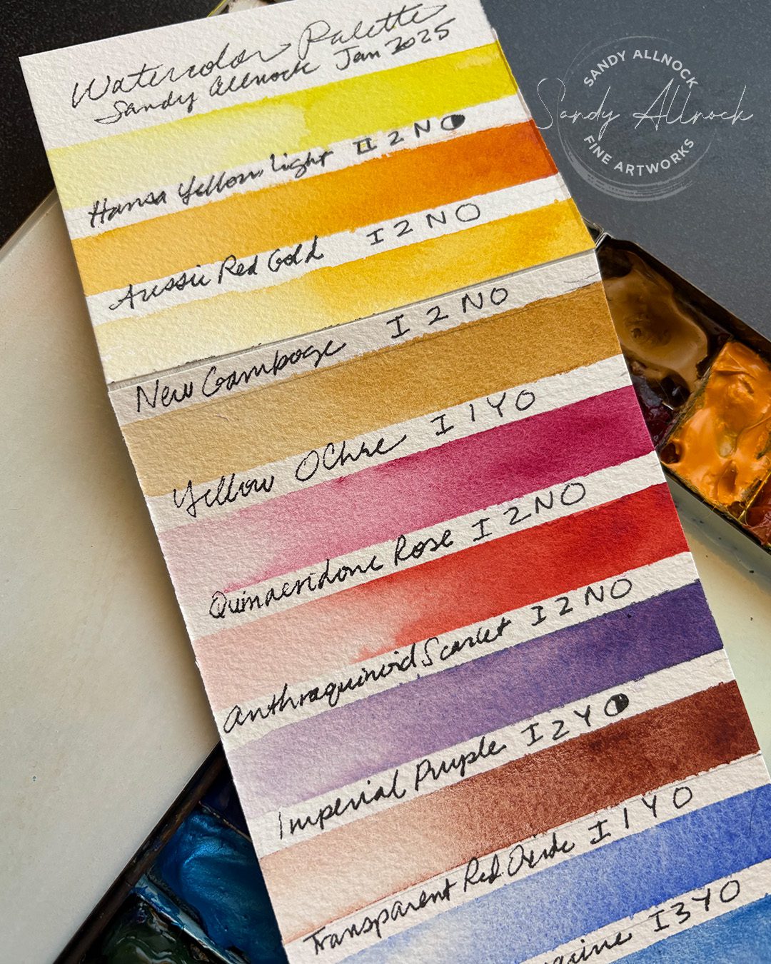
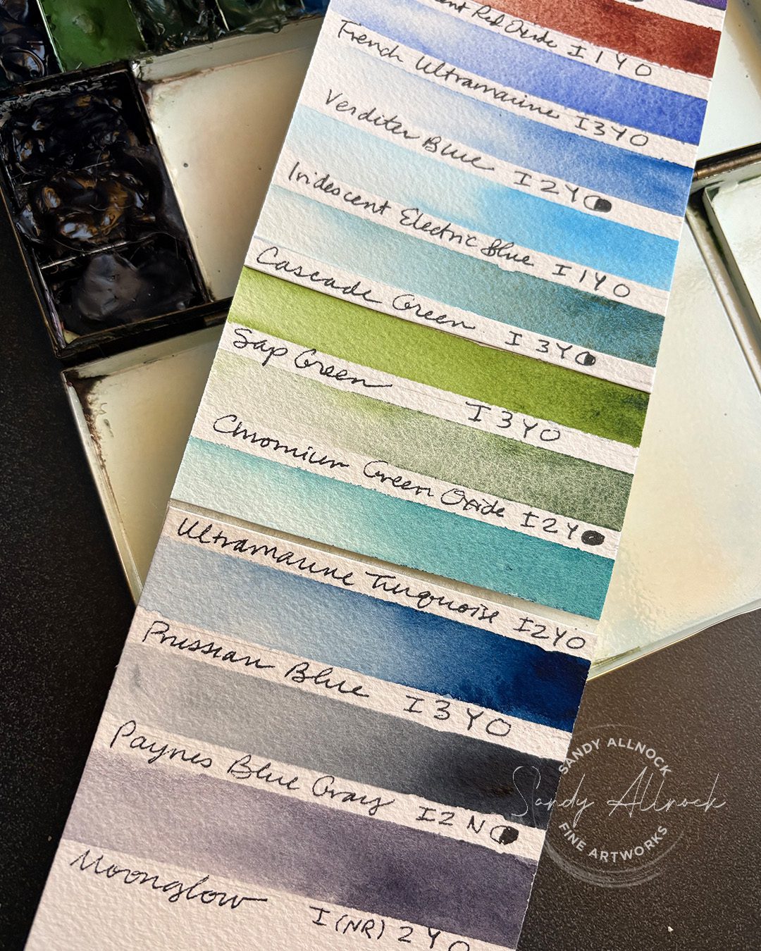
My colors are swatched out here if that’s something that’ll help; they’re all Daniel Smith colors, and they’re linked above in the supply box. I’ve listed color names, lightfastness, staining level, gralation y/n, and opacity/transaparency.
My art history side trip
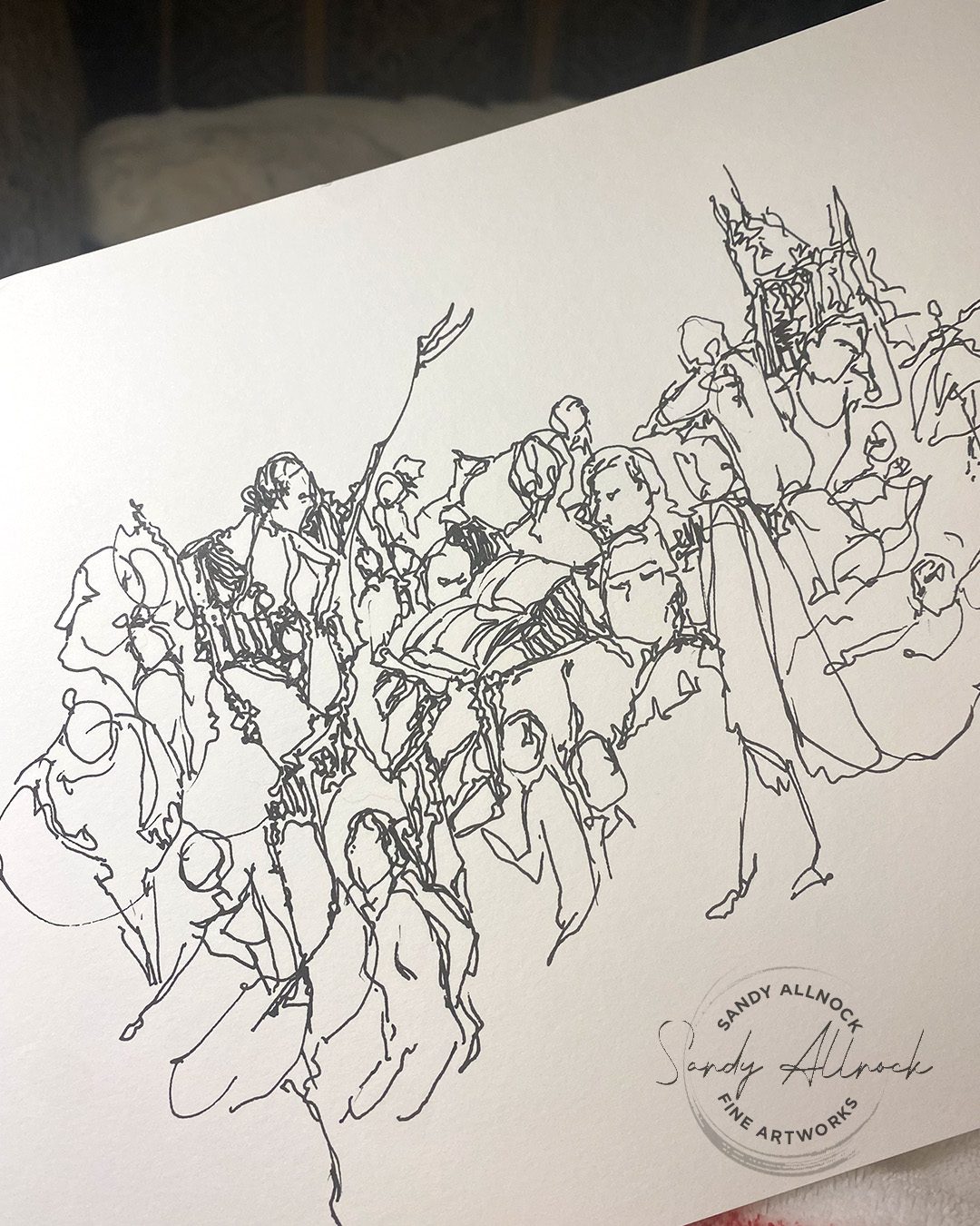
During this long dark winter, when I wanted to feed my brain good stuff and do less scrolling, I decided to do some research on a favorite painter. I started with, of course, Caravaggio, my hero. And I started doing little sketching while watching videos about him, about each artist that kept cropping up in more and more documentaries. Some evenings I had a pen out and drew quick gestures of paintings as they passed by my screen for 20 seconds.
Subscribe to receive blog posts by email:
Taking visual notes
But then I got out watercolors and a sketchbook, and decided to try some color studies. I wasn’t sure what was going to happen – but as the documentary would discuss a painting sometimes I’d look it up so I could zoom in, and would sketch a portion, or a thumbnail of it all.
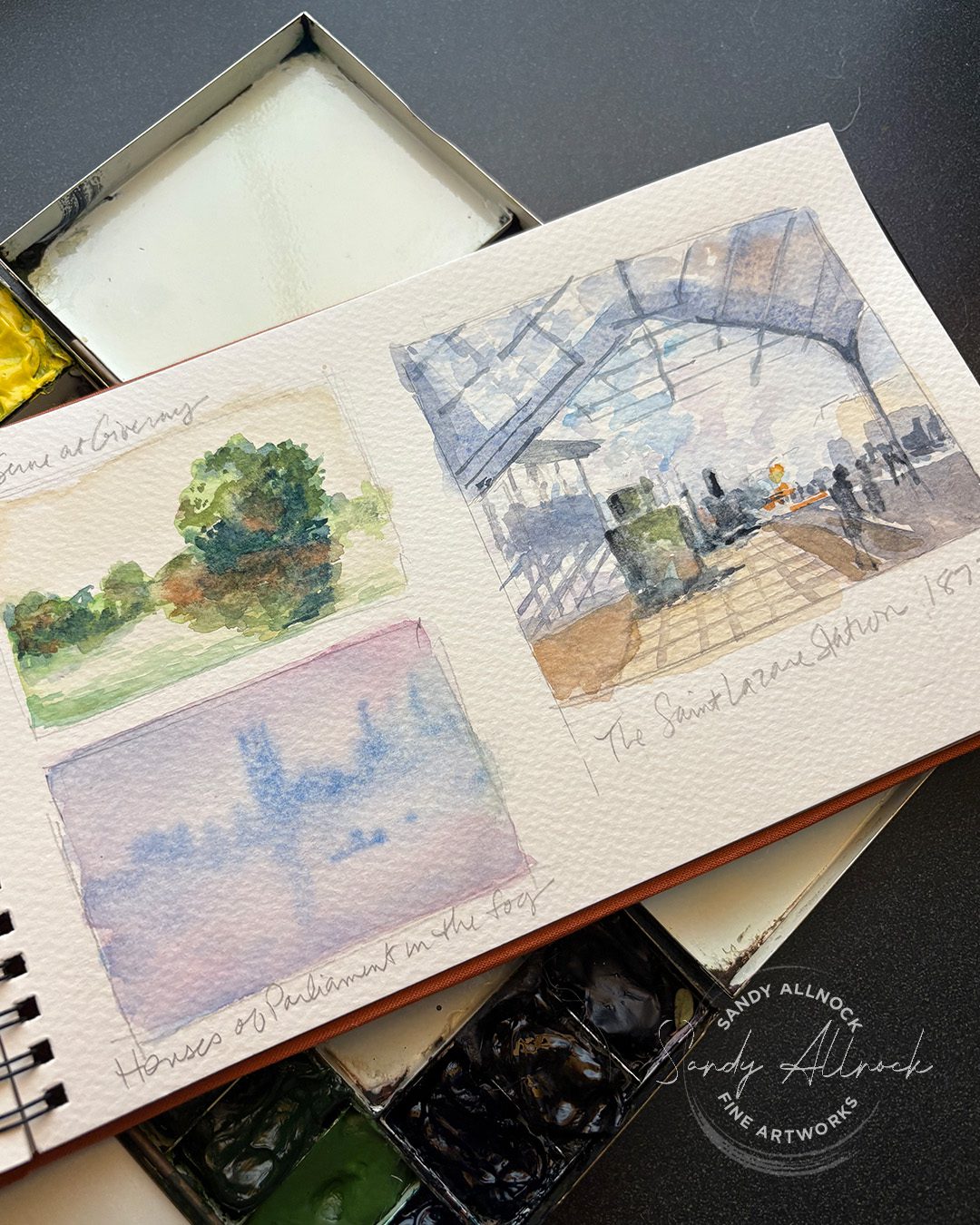
During my Monet period (ha!) I just googled “paintings by Claude Monet” and started doing quick little thumbnails while the art historian told stories. I was taking visual notes from the paintings – what colors I could see in a tree or grasses that I never use. What would it feel like to include that? These were quick 5 minute paintings, max.
And the blue and yellow one, well, that one’s not a Monet. The artist who painted it was trying to paint the Seine in Monet’s style, and I should have known it was not a color combo that appealed to Monet at all – but the title was the same as a Monet totle and was in French, and I didn’t question it til I went to locate the picture to grab for the video. Whoops! Punk’d. Alas.
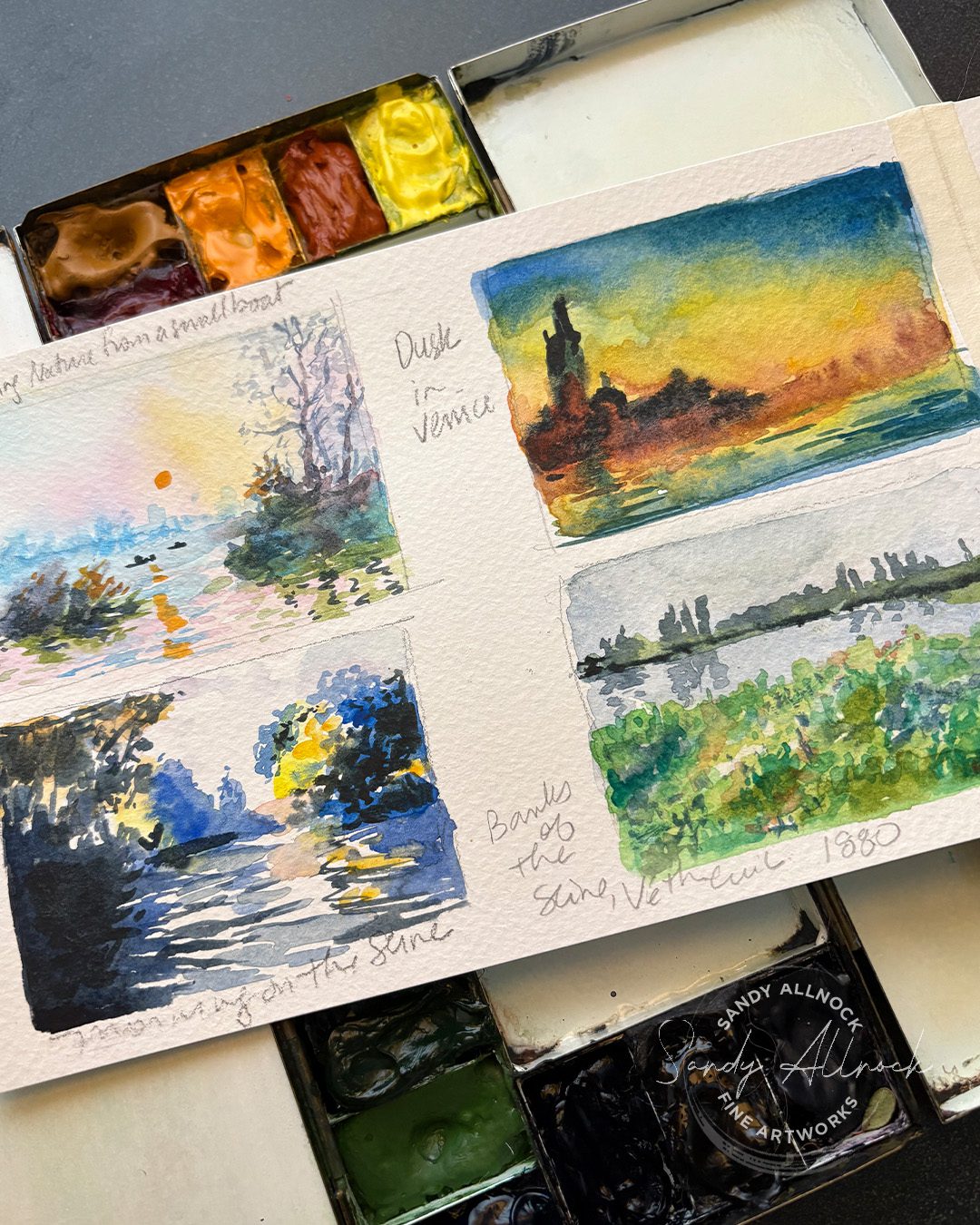
I created a few pages of these sketches, and the panel on the far left was taped in to give me room for more paintings in a spread about Monet. But the Promenade on the Cliff has colors that are, again, unlike Monet’s work – he did add color but now I saw quickly what OVERdoing Monet’s colors could be like. While it pleased the “ooh color!” side of my brain, I don’t have interest in painting that way, and want to do more of the colorways in real Monet paintings….closer to realism but with great pops of color that meld together when looking at the painting as a whole.
Monet’s Poppy Fields at Argenteuil has got me anxious for spring to get here so I can try some of these colors in fields of flowers. (And reminded me that I treated myself to a park pass for 2025 so I can go up to Rainier anytime to paint now!)
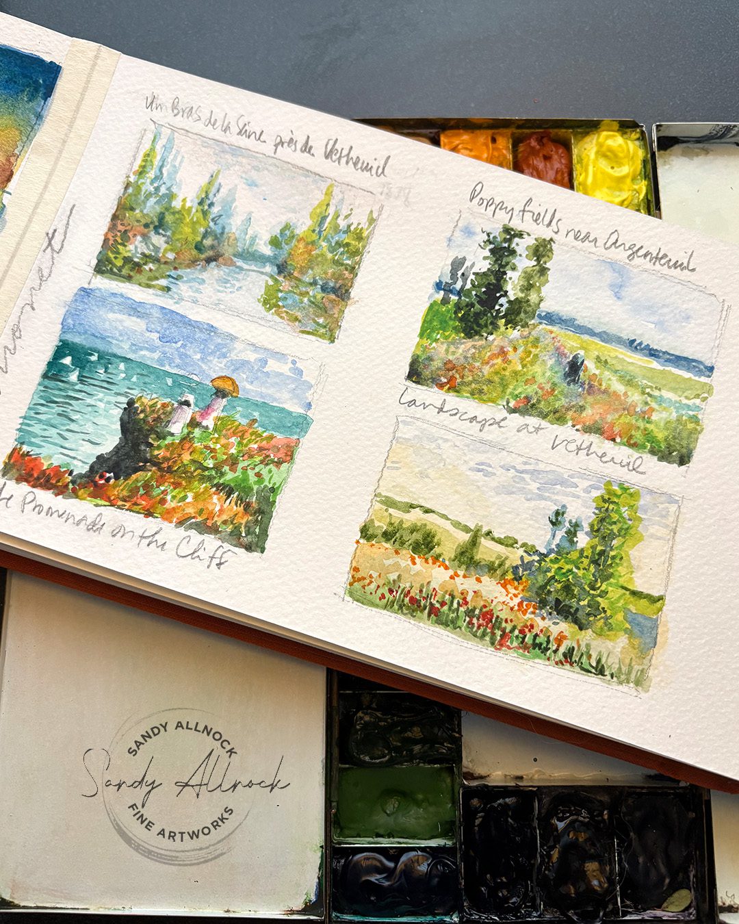
In little sketches like these, accuracy wasn’t my goal – it was getting a feel for what it might be like to paint with pops of color. I’ll be experimenting with what that impressionist “pop” could look like within my own style; while at some point I might get out the pastels and gouache and try it, what could I do with watercolor to incorporate that excitement? I’m anxious to see.
I was talking with artists on Reddit about painting water and boats last week, and promised them I’ll be painting a boat in the near future, so maybe I’ll give these ideas a try then. 🙂
Who would you research?
Picking an artist needn’t be choosing someone who you would like to be when you’re a grown up painter. That’s not really the point of studying their work, in the way that I’m approaching it. Sure, if you want to be an impressionist, mimic all you like.
But if, like me, you want to dive deeper into your own style, sometimes trying on something new will teach you either how to expand your own visual language – or might show you that NO you don’t want to create that artist’s work, you just love that artist’s work. And sometimes, that’s a very good thing to learn about yourself.





Hi Sandy, do you worry about the abrasiveness of the magic eraser on Steve’s palette finish?
I haven’t found it to have ill effects; it’s more important to try to get rid of some of the stains that build up over months. that said I don’t scrub at it with the magic eraser, so I’m trying to get the worst of it of off rather than every last bit.
What fun to watch and see your “sketch” and the original artist. Love your confidence and just your skill and ability to talk about the available history and be honest about we are our engagement at various stages of our life! Li e your work, the iTunes (I’m always learning a thing or two! YAY!!)