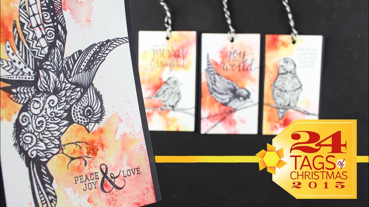
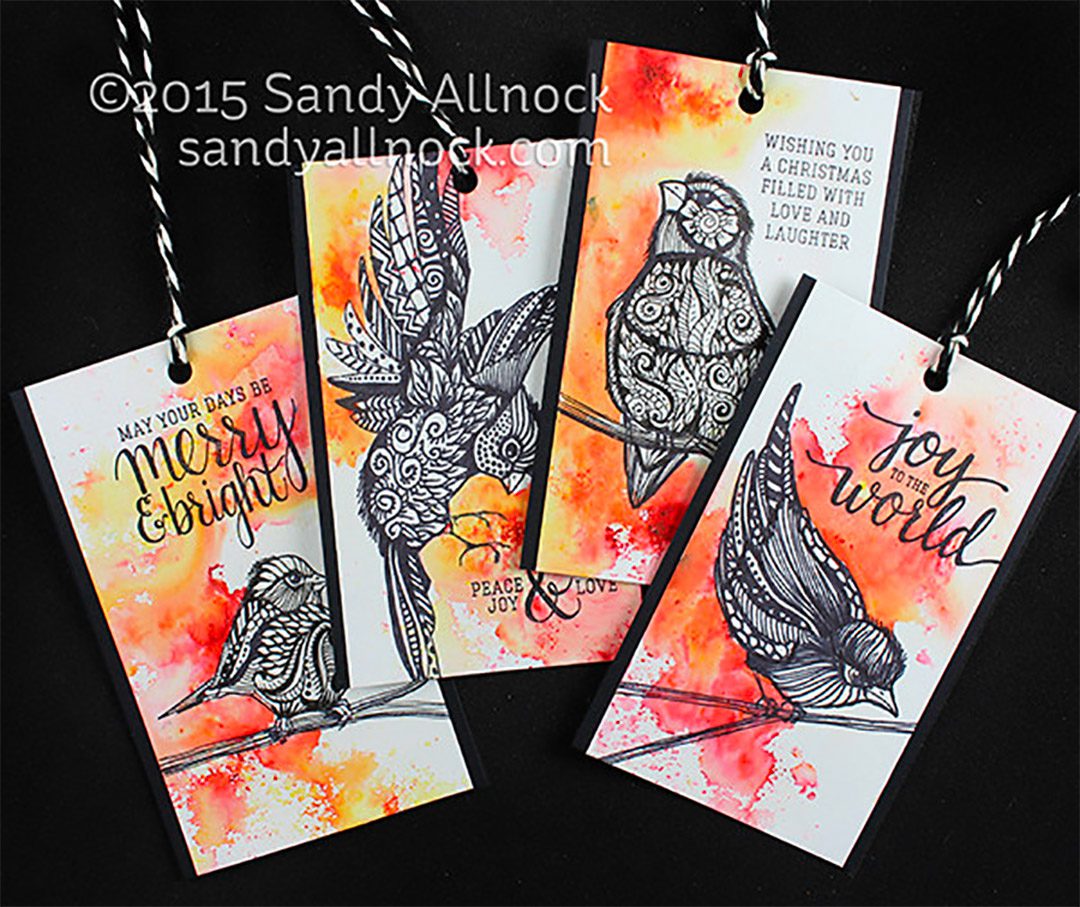
Zentangle? Me? Oh man. I’ve been watching so many artists and crafters on instagram doing it, and I just had to give it a try. These birds from Prima couldn’t have been more perfect – all they needed after the zentangle was a little color – Brusho to the rescue!
Video
Check out the video below, or click HERE to see it in HD on YouTube!
I hope you enjoyed the holiday music break! It helped me stay in the spirit as I edited….I’m so ready to tackle getting cards done next – I have soooooo many to get busy making! 🙂
Supplies
Some product may be provided by manufacturers for review and use. Compensated affiliate links are here at no cost to you. If you choose to shop using my EH (Ellen Hutson) links, please accept cookies on that site in order to retain the link to my blog, or that compensation does not happen for me. I appreciate your support of my work with your purchases! Full affiliate and product disclosure | My trusted partners in art
My Faithbook art journal pages might not be your typical art journal pages…but I. am. having. fun!
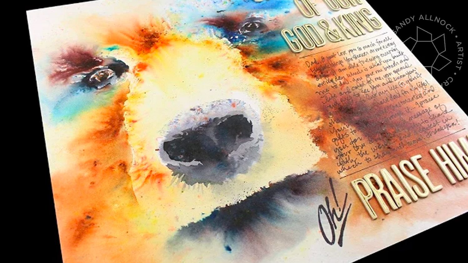
Ever since I started playing with Brusho a while back (see THIS POST if you need more product info), I knew there were amazing things to be done with it. Just seeing the Brusho Secrets website was enough to get me excited! I finally had to get this page underway, late one night when I couldn’t sleep; the hymn and the bear wouldn’t leave me alone til I completed it!
Fortunately I remembered to turn the camera on…because, you know, yeah. The number of times that I try something and didn’t expect it to turn out and it did? Hmm. Well, we all got lucky here!
And for anyone who’s upset that I added the lettering and journalling on top of my bear – remember that now I know how to paint a bear. I can go get a giant sheet of watercolor paper and paint a huge bear! Wouldn’t that be amazing!?
Supplies
Some product may be provided by manufacturers for review and use. Compensated affiliate links are here at no cost to you. If you choose to shop using my EH (Ellen Hutson) links, please accept cookies on that site in order to retain the link to my blog, or that compensation does not happen for me. I appreciate your support of my work with your purchases! Full affiliate and product disclosure | My trusted partners in art
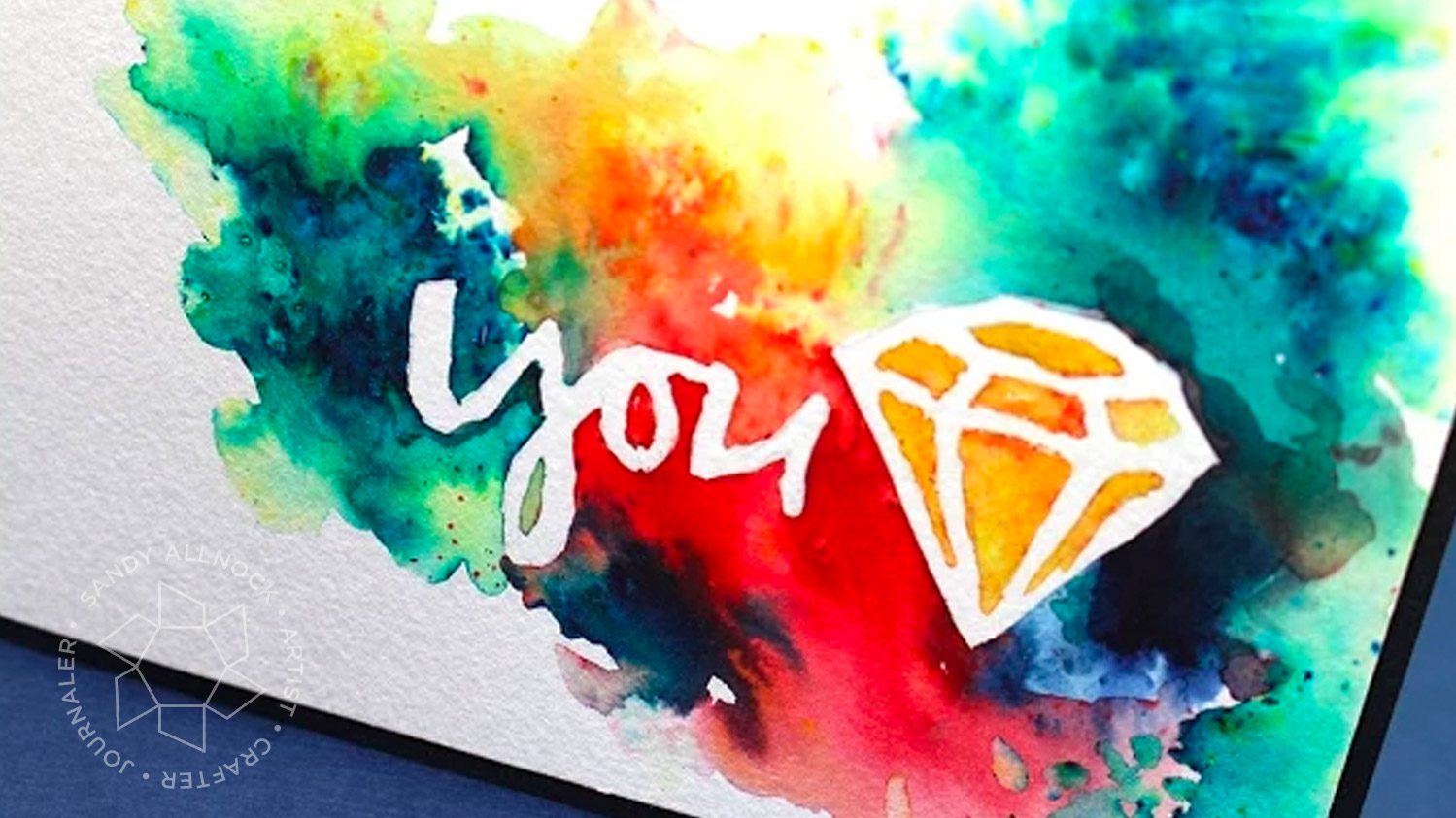
I promised you more Brusho…here’s another idea! I was asked to provide a sample for this month’s Pinsights challenge at my friend Ellen’s blog, and here’s what I came up with!
One of the special features of watercolor powder is that it doesn’t actually turn into paint until it’s wet. I decided to use that property intentionally to create a one-layer card by just painting with water – it worked beautifully!
Wasn’t that just fun to watch the Brusho move within the watery areas – and leave the unpainted areas alone?
Supplies
Some product may be provided by manufacturers for review and use. Compensated affiliate links are here at no cost to you. If you choose to shop using my EH (Ellen Hutson) links, please accept cookies on that site in order to retain the link to my blog, or that compensation does not happen for me. I appreciate your support of my work with your purchases! Full affiliate and product disclosure | My trusted partners in art
I’m obsessed. Someone stop me! It’s just brusho brusho brusho around here. I know, I know. I’ll get back to other stuff, I swear! But this week, stay tuned for it, coz…well I just can’t stop. LOL!
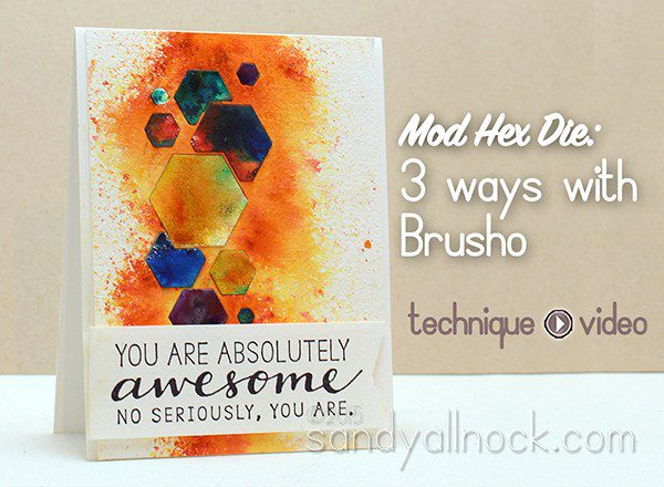
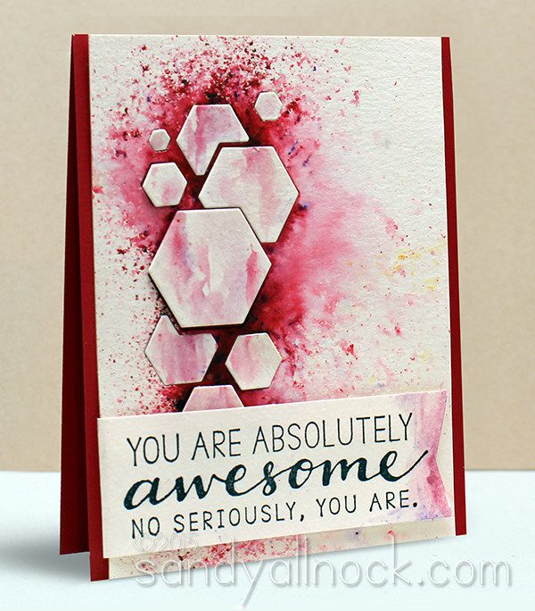
This Hex die (no longer available) went awol on me before shooting this video – I took it out of its stamp pocket and whoops! But it finally resurfaced, and I was able to get these cards out of my system….I was surprised that when I posted the die recently, people hadn’t seen it before – I’m glad to bring it to light for ya! I knew I wanted to sprinkle Brusho for a beautiful contrast with the hex shapes, and so I did!
I played with a Wink of Stella pen on the one with the vermillion brusho – originally just to add a slight shimmer to the hexagons, but they turned into “marble” when I accidentally touched the brusho with it – cool accident!
I also created a shaker with the same die and the black brusho – there’s some of this silvery glittery paper behind the glitter, and it looks soooooo pretty!
Some product may be provided by manufacturers for review and use. Compensated affiliate links are here at no cost to you. If you choose to shop using my EH (Ellen Hutson) links, please accept cookies on that site in order to retain the link to my blog, or that compensation does not happen for me. I appreciate your support of my work with your purchases! Full affiliate and product disclosure | My trusted partners in art
Add your own in comments….I’m ready for some chuckles!
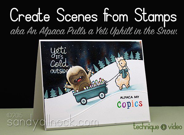
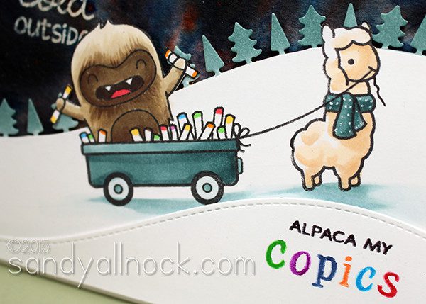
Oh there are so many things in this video. And that ALPACA! Oh man. As soon as I saw Winter Alpaca by Lawn Fawn, I knew it would HAVE to be part of my stamp collection….and that I’d be swapping out that sentiment for Copics, and more!
I think the part that might interest folks most will be how I go about creating scenes. This card, featuring Winter Alpaca (squeeee!) and Yeti Set Go (a previous release) is one that needed some tweaks as I went along, and I show you some snapshots I took as I worked. Often the piece comes together all at once, but this one was an uphill battle for a bit at the start. (#icrackmyselfup)
Additionally…there are tips for using one color of Brusho for that cool aurora borealis; Copic coloring tips; simplifying fussycutting by adding a sloped hillside; coloring delicate dies; getting a multicolor sentiment. Oh man. I think you got three videos worth of tips today, do I get a vacation? LOL!
Video
Get busy watching the video below, or click HERE to see it in HD on YouTube.
For the secondary sentiment where I changed out the word “SCARF” for “COPICS,” I set up the stamps on my MISTI (you could do so on an acrylic block), then colored each letter with a Clean Color Marker. That made it easy to get a multicolor stamped word without having to ink up each letter on a pad.
Supplies
Some product may be provided by manufacturers for review and use. Compensated affiliate links are here at no cost to you. If you choose to shop using my EH (Ellen Hutson) links, please accept cookies on that site in order to retain the link to my blog, or that compensation does not happen for me. I appreciate your support of my work with your purchases! Full affiliate and product disclosure | My trusted partners in art
If you’ve been wondering about the watercolor powders seen popping up lately, and have been asking me to tackle them – well today’s your day! Thanks for the encouragement to get ‘er done! It helped that the products are more available now in the stores we shop in….my first set had to come from the UK and took over 8 weeks to ship, and I don’t like to suggest that anyone else go through that nailbiting!
Oh and remember – if I didn’t cover something, it might have been deliberate! There’s already plenty of info here, more will come in the future.
This post has THREE sections in it.
First up are product basics for Brusho and Colorburst; there are more brands out there, but I’m limited to what I can afford to go get, so for now you get these two!
Second will be a flower painting video – it’s done in real time and will help you know that we can do more than just sprinkle! Stay tuned for more videos to come, too. My mind is reeling!
Last but not least, I share how I labeled and my Brusho bottles, plus all the swatches I created, with a free download for you. Hexchart to the rescue!
Note that MOST supplies used throughout these videos are in text links within the text in that section, but card supplies will be listed at the end of the post in their captions. Confusing, I know! Leave a comment if I left out something you can’t find; I’m travelling right now, but will get to edits asap.
1: Product Basics
First I wanted to begin by looking at the products themselves, colors, bottle sizes, etc.
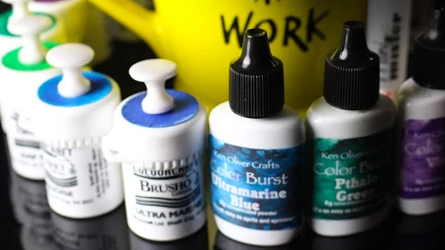
The brands:
Brusho has been made in England for 35 years. It’s available in 32 colors, and the bottles are 15g each. They do NOT come with the color labels or handles shown in the picture above; you can pop open the top (risking powder everywhere!) or just poke a hole in it to shake out a bit of color. They’ve been hard to get until recently; I heard there’s a new US distributor, so I hope that makes it easier to keep them in stock. Powder colors don’t always match what it will paint like.
Colorburst are made in the USA, and just began in 2015….I’m guessing that’ll mean more colors are to come! They are very very bright and instense colors, and the color of the powder is generally what it will look like when wet.
The techniques:
Dry then wet: Sprinkle powder onto watercolor cardstock, then spritz with a mini mister!
Wet then dry: Spritz the paper first, then sprinkle powder.
Pickup Painting: Use leftover color on your work surface to create swooshy backgrounds.
Direct Painting: Sprinkle powder into a palette or on a work surface, and wet with a brush to paint with.
Spritzed Diecuts: Sprinkle powder over a sheet of watercolor diecuts to create washy shapes!
Tidy Tips:
These are as fine as baby powder – so consider everything on your work surface nearby. Colored dust will get everywhere!
Clean often. Work on a washable surface that you can wipe down regularly. I’ve used a craft sheet, but lately have been using my Craft Assistant instead since it stays flatter.
2: Painting Flowers
While most people in craftyland are using watercolor powders for sprinkly backgrounds – you know I want to do more! Watch this early trial at painting flowers for a card background…and be sure to come back for more as time goes on. This is only scratching the surface!
3: Labelling and Swatching
I usually don’t succumb to all the organizing that everyone else does; I’d much rather use a product than sort it and find the best storage etc. (I’ve heard from so many of you that you’ve got (random product) all sorted, swatched, and categorized, but you haven’t made anything with it yet! That makes me sad!) But for the Brusho especially, I had to channel my inner guru. The white bottles come with NO indication of the color inside, and even the powder color isn’t helpful in many cases. Watch the video below to see how I created my cute little color swatch toppers for my bottles, as well as the process for swatching – and read more below the video about that!
Labelling Tips:
Brusho has no color indication on the bottles. To make mine, I cut strips of 1-3/4″ watercolor paper, added doublesided tape to the back to turn it into “stickers,” and punched 1″ circles to paint with a brush.
You could leave the bottles without a tack in the top – it shouldn’t spill, and wouldn’t be a huge disaster if a few flakes fell out. But I picked up a couple mixed packs of oversized tacks, and used just the clear; if anyone wants a bunch of red or black, you can have mine! I used white ones for my first set of 12, they were cute too.
Be sure to get a little powder out to paint with BEFORE adding the circle onto the top of the bottle. Otherwise you’ll have to pop open that top. Believe me, you don’t want to do that….and I’m not going to tell how long my mess took to clean up when I found that out!
While the paint may look like it’s pooling unevenly on the circles, it should even out pretty well.
Wait til the paint swatch is really dry before re-punching a hole. The watercolor paper fibers will try to “fill in” that hole while soft and wet, and might even let water into the bottle.
Swatching Tips
Download my free Color Swatch Charts These show each set I’ve mentioned. Remember you can also get them individually too, so pick out what you’d actually use. As you’re looking through them, note that I tried to make it easy if you want to go find that set; click on the blue title on that page of the pdf. (I hope the hyperlinks work, let me know if they do!)
Note that colors get weird from being photographed, photoshopped, pdf’d, downloaded, and printed. So results may vary!
Download my BW Swatch Charts Print on cardstock, then glue your hexes (cut from watercolor paper) in place on the chart. You might want to print the chart a second time on acetate so you can tape it over the chart as an overlay with color names. When I get a new printer I plan on doing that!
I created my hex chart using this Hexagon Die Set; there are smaller hex dies out there, but I wanted a nice big one so I could really see what the sprinkled and spritzed color would look like. A tiny hex wouldn’t really show much. And by the way I just noticed while typing this up that those Hex dies are on sale, woohoo! I’ll be using that die set on upcoming cards too, so don’t feel like you can’t use that set for much else….just stay tuned. (#ilovehexagons)
When cutting out your hex shapes, use whatever watercolor paper you USUALLY use. If you’re an Arches gal, use Arches, because colors seem to go a little darker on that. (Did you see the poinsettia card in video 1? Rich color! That was because it was on Arches.)
Buying Tips
So which brand did I like best? Both! Which brand you buy is your call. I found they both give good results, just different, and here’s why.
I like the Brusho best for a few reasons because it’s more of my style – softer colors, more of the detail can be held.
If you just want to try out some in a set, I’d go for the set of 8, or a few within that set. Why? Because if you buy the 12 or 24 later, you won’t duplicate; and because it has reds, yellows, and greens which would be awesome for holiday cards. Yellow Ochre, Rose Red, Terra Cotta, Lime Green, Olive Green, Burnt Sienna, Sandstone, Moss Green.
If you are only going for a limited investment but want the most bang for your buck – go for the set of 12. It’s a good rounded collection of colors. And has the awesome black that I love. lol. If I were buying just for my personal use and not because I’m teaching you – I’d get this one only.
Or buy them individually as you desire. The full collection, when all together, has a LOT of reds – and most folks wouldn’t know the difference between them. So you may find that choosing your own colors from my Color Swatch Charts would actually work best in the long run!
Try out just TWO. Get the Rose Red and Olive Green for holiday cards. If you love them, you haven’t duplicated anything in the big sets, only in that set of 8. And you can do crazy awesome Christmas card backgrounds! I’ll be showing you how in a couple weeks, I have ideas coming up and will use those two colors, in case that helps.
The colors are so intense. And I’m betting they’ll have more. Hopefully at next winter CHA? Who knows.
They blend really softly – leave them to dry naturally and it just keeps moving across the paper and you can get a very cool smooth look.
A con of these: They are way more expensive, since it’s half the bottle size.
Cards!
Your reward for making it to the end of this post is cards cards cards!
Below: Brusho on the left, using Orange, Brilliant Red, Dark Brown, and Lemon. ColorBurst on the right, using Lemon Yellow, Orange, Alizarin Crimson, and Phthalo Green. Sentiment and heart from Fancy Thanks – stamped in Delicata Gold and Versafine Black, then embossed with clear powder. I attached the panels with StickIt since they were a little on the curling side since I hadn’t taped them down!\
My “reject” cards – I don’t remember the colors, but the die is Say Hello – what a FUN coverup! It’s easiest to put StickIt on the back before diecutting to make the thin letters a sticker.
Spritzed Diecuts! These were so fun and will make a lot of cards. Brusho on the left, using Orange, Brilliant Red, Dark Brown, and Lemon. ColorBurst on the right, using Lemon Yellow, Orange, Alizarin Crimson, and Phthalo Green. Sentiment from Fancy Thanks – stamped in Delicata Gold – and I edged the right side of the card base with the gold ink too!
I created the background and poinsettias both using Brusho on Arches watercolor paper – the colors were much richer on that paper! Stamp set is Mondo Poinsettia by Julie Ebersole. Background is Ultramarine, Leaf Green, and Emerald; flowers are Brilliant Red, Scarlet, and Leaf Green. Peace die by Impression Obsession. The card is cut a little smaller than A2 so the flowers can hang off the edge.
You know I had to end with yellow! Brusho using Lemon Yellow and Dark Brown. Delicata Gold and Versafine ink for the sentiment, embossed with clear powder.
WHEW!
I think these “Getting Started” posts nearly do me in! Thanks for reading to the end 🙂
Supplies
Some product may be provided by manufacturers for review and use. Compensated affiliate links are here at no cost to you. If you choose to shop using my EH (Ellen Hutson) links, please accept cookies on that site in order to retain the link to my blog, or that compensation does not happen for me. I appreciate your support of my work with your purchases! Full affiliate and product disclosure | My trusted partners in art