In this little watercolor pencil card, I’m providing some tips to choose colors – especially when coloring multiple of the same animals….Hoggy Holidays!
Watch the video below or click HERE to watch it on YouTube.
I could have just stamped three piggies, but a party of five seemed much better! I stamped the center, left, and right first, masked them with Eclipse tape masks, then stamped the other two, being careful their faces werent hidden.
I used Albrecht Durer Watercolor Pencils – I chose a warm pink (dark flesh) and a cool shadow pink (madder), and a grey and reddish brown for the barn. To make sure the hats and scarves pop, I chose colors that were very different – blue and green.
The last little tidbit was adding the hearts overhead – the colors in the background were light enough that coloring with the dark red right overtop worked fine. And of course….SNOW!
Supplies
Some product may be provided by manufacturers for review and use. Compensated affiliate links are here at no cost to you. If you choose to shop using my EH (Ellen Hutson) links, please accept cookies on that site in order to retain the link to my blog, or that compensation does not happen for me. I appreciate your support of my work with your purchases! Full affiliate and product disclosure | My trusted partners in art
We’re past halfway in the 24 Tags of Christmas of 2019 – so it’s time for Santa’s Face to make an appearance! It’s a brand new stamp from Colorado Craft Company and it’s hyooooooge! I am stoked to color it a bunch of times for my Christmas cards in all kinds of mediums – here I tackle it in watercolor pencils!
Did you know? Santa is a painter!
And I’m pretty sure I haven’t told anyone this, but…I’ve been painting with Santa this year. And he looks just like this stamp! He’s a rather famous Seattle Santa, and he happens to be a plein air painter; I met him at a Toastmasters group on the peninsula, and he invited me to join them, so once in a while I drive out there at oh-dark-thirty to paint! Go see his viral video HERE.
This stamp is such a great looking Santa! Gonna make tons of cards with these this year….
Four tags, ready for the tag prize stash!
Giveaway
Be sure to comment on this post as well as over on the YT video by November 16 to qualify for the tag giveaway – winners will be announced on November 17!
And last but not least – for Holiday Scene Week #5, 6, & 7: I have THREE videos! Two are guest videos – you’ll never guess where, right? (LOL) My regular monthly guest spot for My Favorite Things and Ellen Hutson are TODAY! I’ll be using watercolor pencils in all three of the videos.
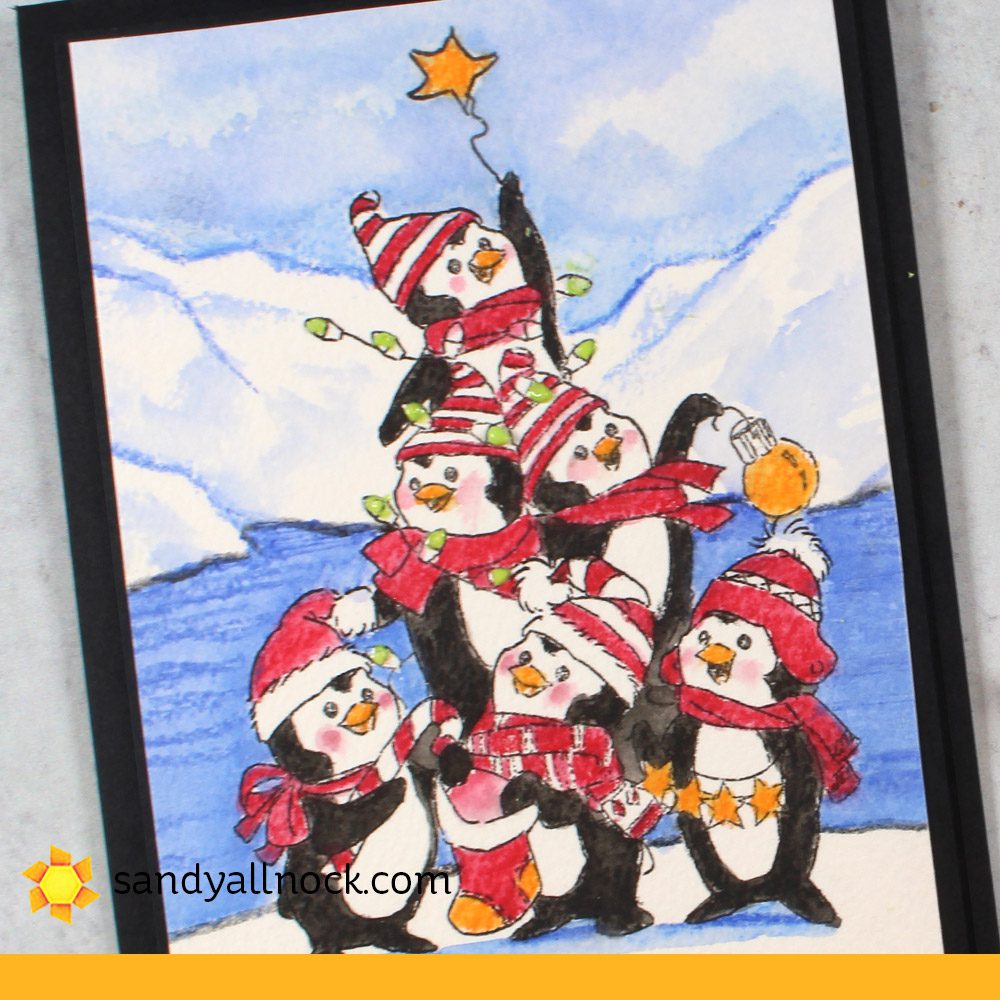
But right here on my blog it’s day 5 and we’re floating off on an iceberg away from the glaciers! Hopefully there’s a paddle somewhere off-camera so the penguins can get themselves back…they can swim but then they’d get their scarves and hats all wet, right? LOL!
Some product may be provided by manufacturers for review and use. Compensated affiliate links are here at no cost to you. If you choose to shop using my EH (Ellen Hutson) links, please accept cookies on that site in order to retain the link to my blog, or that compensation does not happen for me. I appreciate your support of my work with your purchases! Full affiliate and product disclosure | My trusted partners in art
Video #5
Watch the video below or click HERE to watch it on YouTube.
All three of my cards today use Albrecht Durer watercolors – and are hopefully serving as inspiration to the students in Watercolor Pencil Jumpstart class!
I love that lil guy up on top with the star. I might have to color this again sometime and put a tree behind them!
Video #6!
Yes I’m counting my guest video over at Ellen Hutson as #6 in the series. On social media someone had suggested decorating an ice cave as the scene for these sasquatches (sasqutachii?)—so go over to Ellen’s blog or directly to Ellen’s YouTube see it!
Video #7
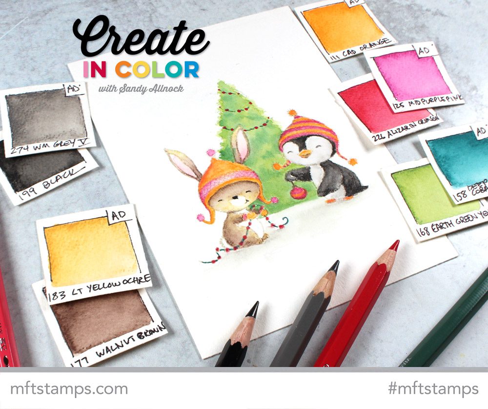
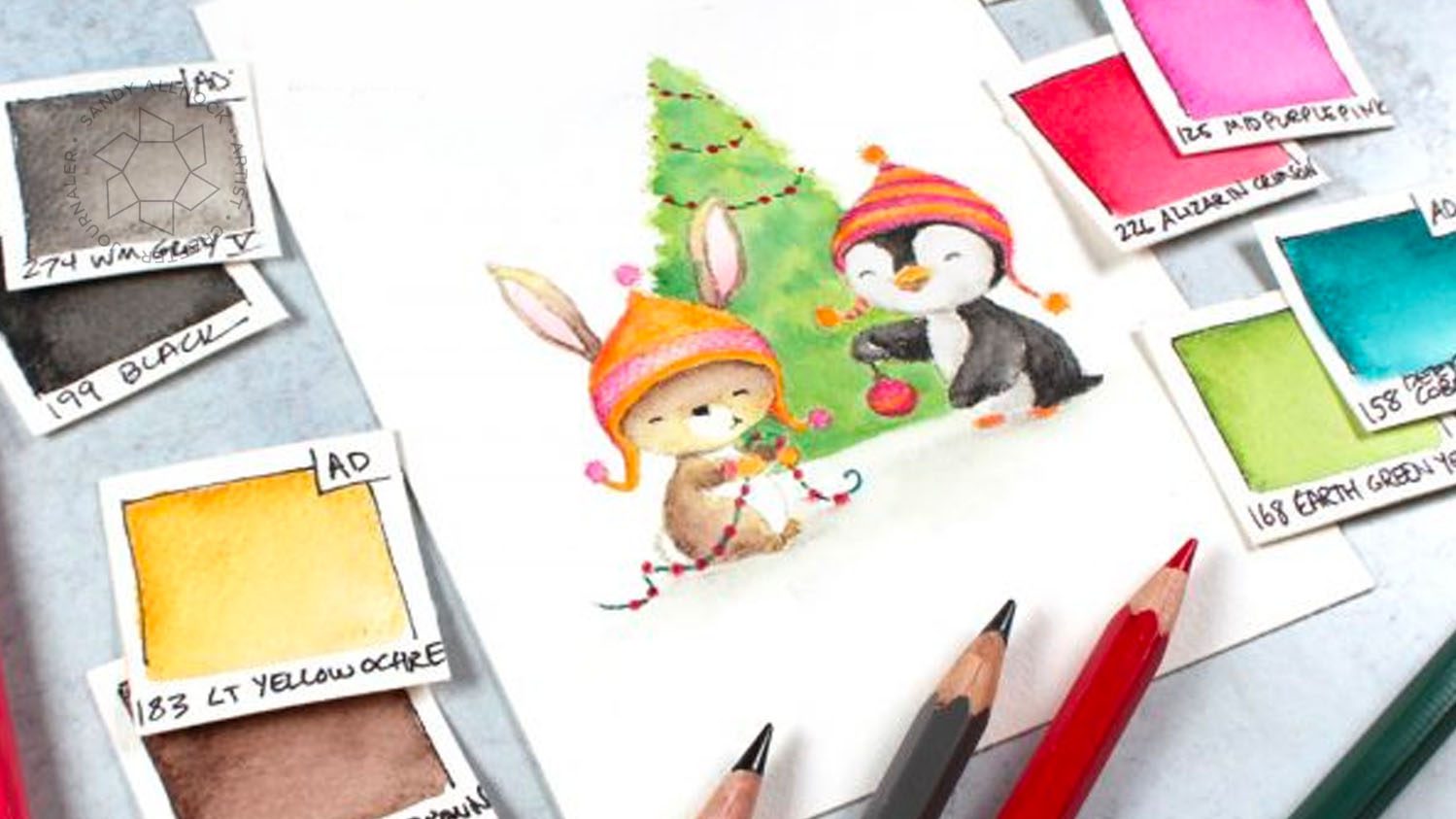
And then today is *also* my guest day at MFT, so that’s #8 for the week. Can I take a nap now? LOL! I’m using Merry Wishes – another bit of cuteness from Stacey Yacula!
Supplies
Some product may be provided by manufacturers for review and use. Compensated affiliate links are here at no cost to you. If you choose to shop using my EH (Ellen Hutson) links, please accept cookies on that site in order to retain the link to my blog, or that compensation does not happen for me. I appreciate your support of my work with your purchases! Full affiliate and product disclosure | My trusted partners in art
Some product may be provided by manufacturers for review and use. Compensated affiliate links are here at no cost to you. If you choose to shop using my EH (Ellen Hutson) links, please accept cookies on that site in order to retain the link to my blog, or that compensation does not happen for me. I appreciate your support of my work with your purchases! Full affiliate and product disclosure | My trusted partners in art
My post today over at Ellen Hutson is a rather epic one – it was created for people who don’t color at all, but have an inkling they might like to try – the supplies for each are different, and choosing which one and knowing what to get can be overwhelming!
I thought I would create a “partner” post for it here, for more advanced folks who may already have a few of those art supplies, and are wondering which kinds of projects are best suited for which medium.
This video is also the first of a series that I’m creating for a class coming up – some of the videos will be public ones on YouTube, others will be inside the class all about art supplies. I’ve always wanted one place to put alllll the info about my favorite supplies, maintenance and care of them, tricks to fix broken things, lots of tiny tips that get lost on a giant YouTube channel like mine. I get so many questions about which direction is best to store X brand of whatever, or what’s my favorite thing for X, and this class will be epic. And free.
Which art medium is best for what?
Sometimes it’s obvious. Sometimes you just feel like using a medium. But sometimes…it might help to think through what medium is best for a particular subject matter, or a certain kind of stamp. This video includes snippets of lots of videos that I thought showcase the best uses for the mediums, and sometimes point out the challenges!
Watch the video below or click HERE to view on YouTube.
Some product may be provided by manufacturers for review and use. Compensated affiliate links are here at no cost to you. If you choose to shop using my EH (Ellen Hutson) links, please accept cookies on that site in order to retain the link to my blog, or that compensation does not happen for me. I appreciate your support of my work with your purchases! Full affiliate and product disclosure | My trusted partners in art
What are Copic markers best for?
While an artist can always use *whatever* medium when does it make the most sense to reach for Copics?
Smooth blending is the workspace of Copic markers (I’ve tried other brands and haven’t found others that compare favorably). Once techniques are mastered, it’s easy to create art with smooth transitions between colors that are different, depth created by blending a dark into a medium and a light.
Images with thicker outlines are easier for newer colorists to use with Copics, since the nib on a Copic isn’t pencil-thin; stamps with thin outlines can sometimes beckon the ink to bleed outside the line.
Color range is a boon for Copics, if you’re an artist with a wide collection – for someone like me who has them all, I know exactly what I can do with the colors I have. There are very subtle differences between some that are helpful in creating realism and minute color shifts.
Studio/craft room work is most typical for Copics; they can be packed up in cases/boxes/baskets for travel, but the size of the collection can cause problems for those wanting to haul supplies! I never use Copics when I go outdoors to sketch for this reason, though I may do a black and white sketch and come back to the studio to add color.
Foundations (color theory) and technique are taught in Copic Jumpstart – a class that has been loved by both crafters and artists of all levels of experience.
Choose the medium that suits your mood at the moment! Don’t think with your head. Close your eyes and picture yourself in your artistic happy place. What will make your heart happy at that moment?
When feeling loose and washy, get out the paints! I get in different moods, and that often points me to my watercolors. Paint outside the lines, let the color flow, and let yourself lose a little control. Start with some scraps, even just a corner of paper to play with, and get yourself inspired.
Playing with color is an area that watercolor excels. The mixing of color is limitless, literally – the amount of pigment vs water used affects the color mix produced. You can mix in a palette or on paper. Glaze one color over another. If you know none of your Copics will have the color you need – your watercolors can create it.
Stamps with heavier lines work a bit better for those who are worried about going outside the lines – brush control takes practice. Stamps with thinner lines can be used for loose techniques breaking out of lines.
Flat washes (large areas where color floods are needed) are easiest with watercolor, though the art of the flat wash does require practice. Use gravity to your benefit!
Water management is the hardest learning curve in watercolor, in my opinion – the Watercolor Jumpstart Class provides teaching on that topic and many others that’ll help you wrangle your paints!
If your project – or your mood – requires control, colored pencil is by far the way to go.
Tiny detail requires tiny nibs/points on pencils, pens and brushes – and pencils can be sharpened to a very very fine point. That makes them perfect for very detailed work, or for adding that detail onto a piece created with a different medium. Yes, you can combine them!
Color stays put for the most part, with colored pencil; it’s a dry medium, and won’t bleed when it touches another color next to it. It will, however, smoodge if you lay your hand across it, so be aware of that and place a protective piece of paper below your hand to protect your work.
The best controlled color mixing happens with colored pencils; adding light layers of color one over another can create not only new colors, but depth and resonance of color not achievable by any other medium!
Creating textures are fabulous with pencil, given the number of techniques that exist for blending. See the Colored Pencil Jumpstart class to learn a number of them.
Some mediums lend themselves to being a hybrid of control and loose application of color – and watercolor pencil is one that checks a lot of boxes.
Control with options – watercolor pencils are applied in the same controlled fashion as colored pencils, but with the opportunity to add some looseness as well when adding water.
Thin stamped lines lend themselves to coloring carefully up to the line with the pencil, then carefully using a brush and water to break up the pigment. But watercolor pencils can handle any stamp lines well.
Enhancing watercolor can be achieved with watercolor pencils, as well – if reaching a point in a painting that particular detail needs to be added with more control, reach for a watercolor pencil. Signs on a building, patterns on fabric on a figure—address the small details that are hard to achieve with a brush.
Sketching is great with watercolor pencils; create a sketched scene in watercolor pencil that is planned to be done in watercolor, and the outlines will melt away. If some lines need to remain, sketch those in a regular pencil so they don’t disappear.
Coming soon: a Watercolor Pencil Jumpstart class. Sign up for the newsletter (in the menu bar over at Art-Classes.com) and you’ll be first to know!
Albrecht Dürer Watercolor Pencil Tin Set of 120, Faber-Castell —- Ellen Hutson —- Blick
My Inktense pencils haven’t gotten much love lately – so today they get to come out to play! I had a question recently about what paper is best for watercolor pencils and is it the same for Inktense, so it was time to do a side by side test so you can decide for yourself!
Video
Watch the video below or click HERE to see it in HD on YouTube.
The differences become obvious to me as I’m coloring – and hopefully you were able to see them too!
I made quick swatches of some colors I selected; Inktense pencil leads often look VERY different from their color. It’s one reason I prefer my Albrecht Durer pencils, they’re more intuitive than Inktense.
This is the Canson XL. Smoother blending, but the color isn’t as rich.
On Arches Cold Press, the color is stronger, and there’s a little texture present; some of that is the paper, and a little might be pencil that didn’t break down in water, but I think most of it is water.
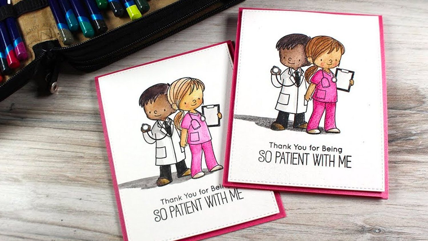
This one has a few changes: background added, doctor and nurse swapped positions left/right, and I colored it with Albrecht Durer watercolor pencils!
Supplies
Some product may be provided by manufacturers for review and use. Compensated affiliate links are here at no cost to you. If you choose to shop using my EH (Ellen Hutson) links, please accept cookies on that site in order to retain the link to my blog, or that compensation does not happen for me. I appreciate your support of my work with your purchases! Full affiliate and product disclosure | My trusted partners in art