Inktense pencil techniques (Parrot, realtime)

Inktense pencil techniques (Parrot, realtime)

Part 2 of my experiments with these new 28 colors…well, new to me. LOL.  I don’t know that anyone “needs” any colors specifically except well that Malibu is so pretty. And should be Maliblue, right?
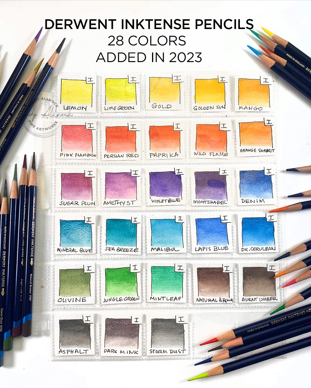
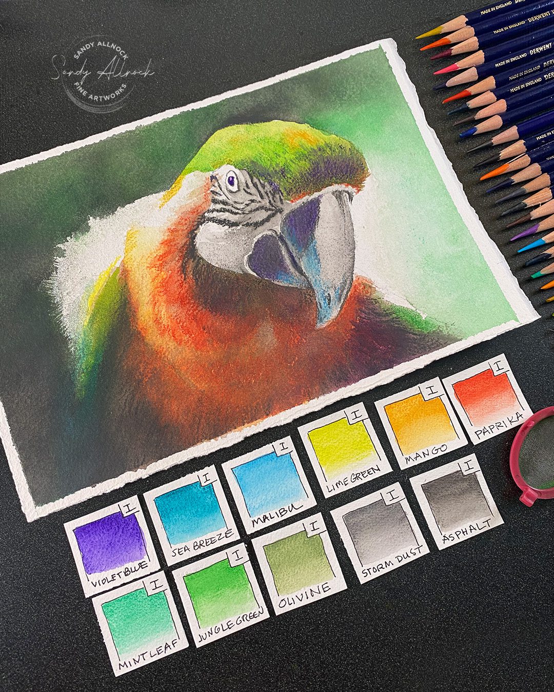
I do keep swatches of colors – mostly for use in classes so I can show colors used in a particular project. I indicate what brand in a box in the corner so I can get them back into the right pages in my book 🙂
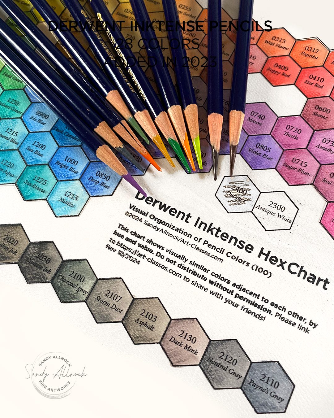
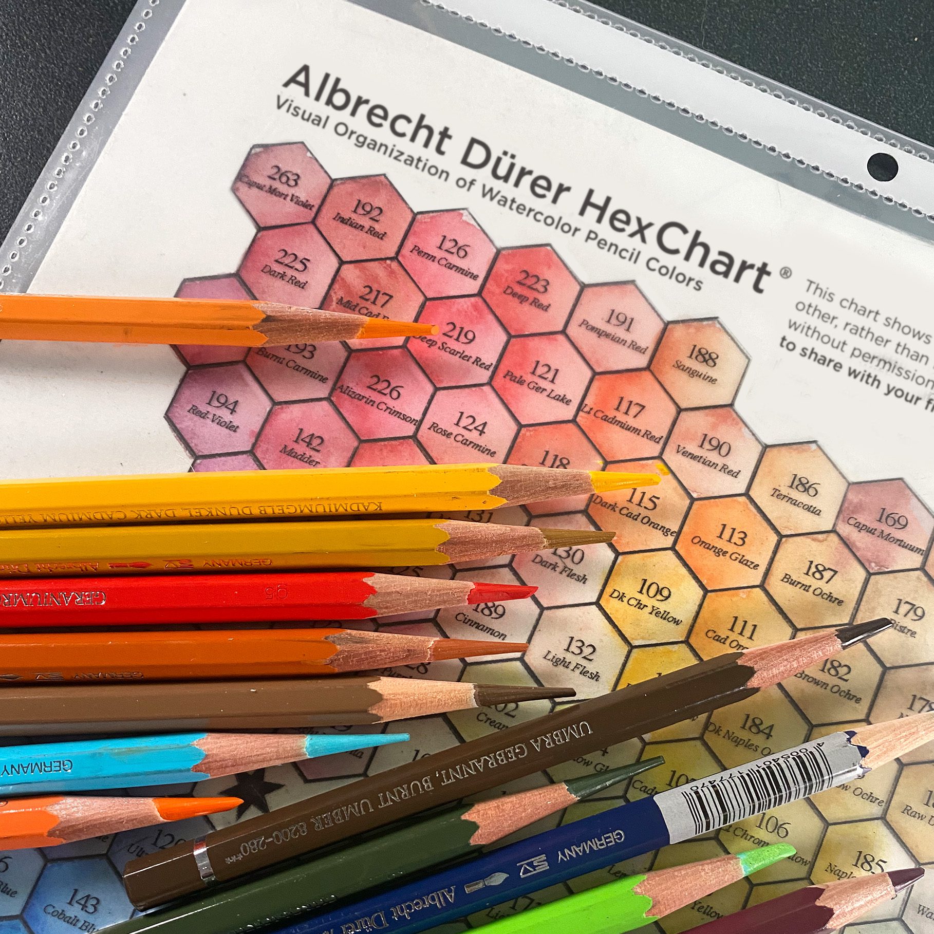
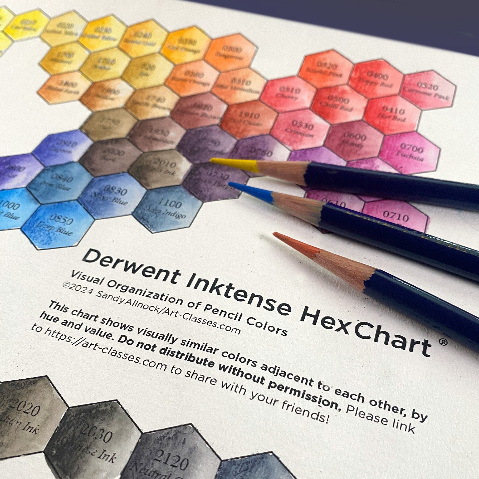
The hex chart has been updated from a 72 to a 100 chart! If you only have the 72 and don’t need the bigger one, just email me after purchasing and I’ll send you the 72 as well. If you already purchased, just re-downlaod from your account to get the full 100.

Tutorial: Inktense pencil techniques (Parrot, realtime)

Watch the video below and scroll to the end to leave comments or questions — or click HERE to watch it on YouTube and leave comments over there. I read both dutifully!

SUPPLIES

Some product may be provided by manufacturers for review and use. Compensated affiliate links are here at no cost to you. I appreciate your support of my work with your purchases! Full affiliate and product disclosure | My trusted partners in art

Underpainting:

  1. Derwent Inktense pencils
    BLICK
    AMZ
    JACKSONS
    CULT PENS in the UK (full set of 28)
  2. Arches Cold press 9×12 pad
    BLICK
    AMZ
    JACKSONS

For powdered pigment

  1. Tea strainer
  2. Inking


Parrot reference

By Irina Blok over on Unsplash…I loved not only the leaning-in curiosity, but the depth of field, and the dark-to-light in the background that, as discussed in the video, makes the figure POP.

Parrot painting

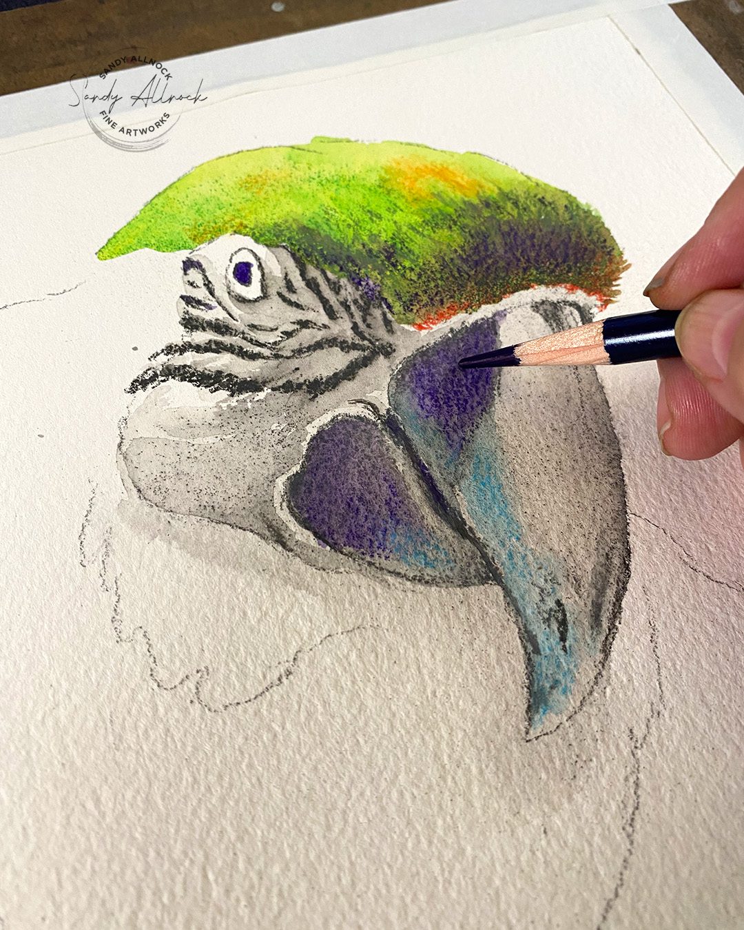
It’s always a challenge thinnking of pencils as making a painting, but I think this one might be the most painting-like of my pencil works? I didn’t apply the pencil direct to the paper terribly often!
Colors used

My swatches, showing the way…
 

Subscribe to receive blog posts by email:

Use your Inktense pencils

I’ve got a class specifically demonstrated in Inktense pencils – the first 72 colors, though there’s nothing stopping you from breaking out new colors too! Beautiful gardens from all over the world – you’ll learn to draw plants in pen and ink, adding lovely color….a great project for a cold and dreary winter ahead!

How to draw a robot (wash and ink)

How to draw a robot (wash and ink)

I finally have the 28 new colors in my hot little hands! Last year when I heard they had new ones, I couldn’t find anywhere in the US to buy all 28 easily; sure I could pick ’em out pencil by pencil, but I figured it would eventually happen. Uh, NOPE! I googled and eventually found a coupon code I could use at Cult Pens, which got the price down, even with overseas shipping. So now they’re here! 

I do keep swatches of colors – mostly for use in classes so I can show colors used in a particular project. I indicate what brand in a box in the corner so I can get them back into the right pages in my book 🙂

The hex chart has been updated from a 72 to a 100 chart! If you only have the 72 and don’t need the bigger one, just email me after purchasing and I’ll send you the 72 as well. If you already purchased, just re-downlaod from your account to get the full 100.

Tutorial: How to Draw a Robot

Watch the video below and scroll to the end to leave comments or questions — or click HERE to watch it on YouTube and leave comments over there. I read both dutifully!

SUPPLIES

Some product may be provided by manufacturers for review and use. Compensated affiliate links are here at no cost to you. I appreciate your support of my work with your purchases! Full affiliate and product disclosure | My trusted partners in art

Underpainting:

  1. Derwent Inktense pencils
    BLICK 
    AMZ 
    JACKSONS 
    CULT PENS in the UK (full set of 28) 
  2. Arches Cold press 9×12 pad
    BLICK 
    AMZ 
    JACKSONS 

For powdered pigment

  1. Tea strainer =
  2. Nail file 

Inking

TWSBI Eco fountain pen, medium nib

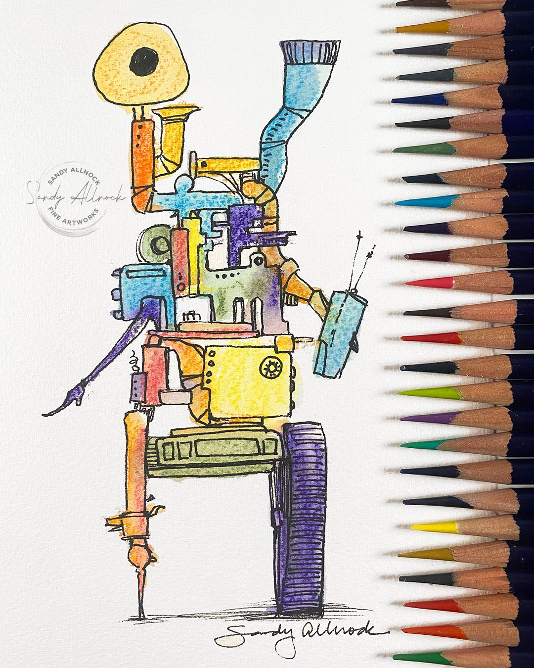
Draw a robot the easy way

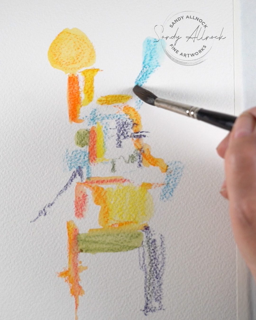
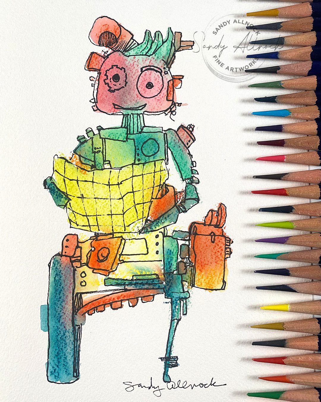
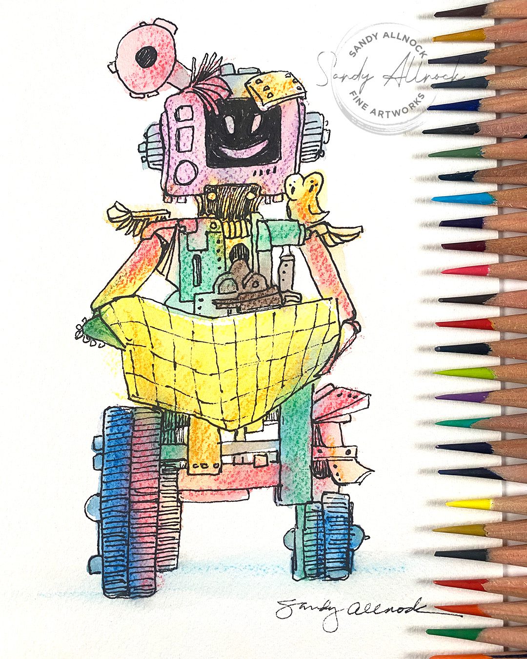
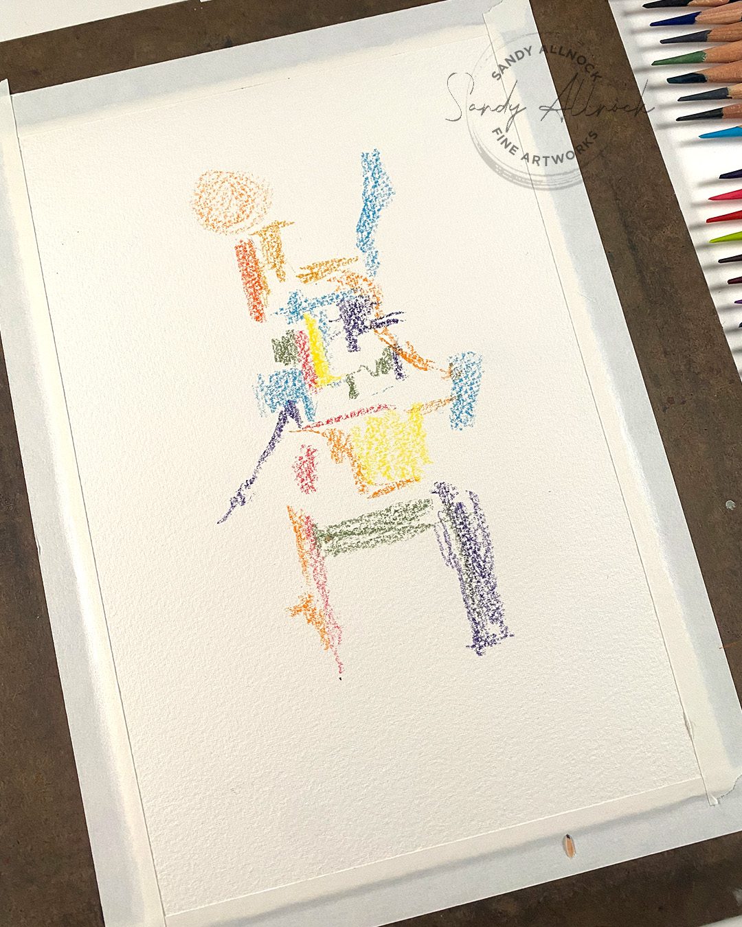
Create blobs of color on the paper – stack them in a way to give yourself legs or wheels, body sections, and as many arms, legs or tentacles desired! 

If using watercolor pencils, then add water generously. To keep colors from running into each other, dry in between.

Or use watercolors to do the same thing. Or marker blobs. Anything at all!

Then use the shapes created to design your robot – break shapes up, add lots of nuts and bolts, gears, buttons…get as crazy as you want!

Tap on a picture to make it larger: 

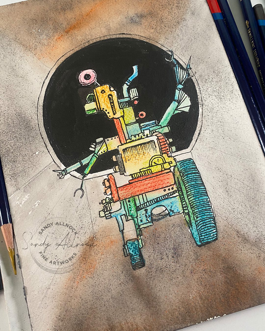
Draw a robot the hard way

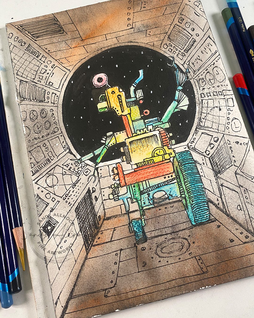
Follow the same process as above for the robot. Remember, he’s facing the dials, most likely, so you can think about what you’d add to the BACK of him. Does he have a backpack on?

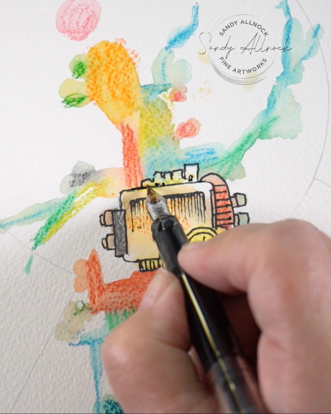
To create the scene, draw a circle in the middle of the page, and lines radiating out from the middle. 

Use powdered pigment with watercolor pencils – or traditional watercolor – to the scene.

With ink, follow the lines generally to keep buttons aligned with the perspective of the picture. Have fun imagining what pressing all those buttons would do!

Tap on a picture to make it larger:


Make more robots!

These two are also “navigator” robots, but the kind you can hire to take on a car trip. They can look at a traditional map and get you to grandma’s house for Thanksgiving!

Subscribe to receive blog posts by email:

Use your Inktense pencils

I’ve got a class specifically demonstrated in Inktense pencils – the first 72 colors, though there’s nothing stopping you from breaking out new colors too! Beautiful gardens from all over the world – you’ll learn to draw plants in pen and ink, adding lovely color….a great project for a cold and dreary winter ahead!
Coming up Saturday

I’ll be doing a rare-ish realtime video – painting this parrot! The reference photo is on the left, so tap on it to make it larger/download to create your sketch, then come create with me. My painting is an eighth sheet – about 7 x 10 inches.

Watercolor Pencil Hex Charts: Q&A plus tips

Watercolor Pencil Hex Charts: Q&A plus tips

After much sturm and drang….I’ve decided to give watercolor pencil hex charts a go. It’s possible I’ll pull them out of the shop if they generate a TON of problems, but….as you’ll hear in the video, at least now I have a video to point folks to rather than having to individually address worries – so I’m hoping this video answers a lot of questions that might come in about watercolor pencil hex charts! 🙂 

Tutorial: Watercolor Pencil Hex Charts: Q&A plus tips

Watch the video below and scroll to the end to leave comments or questions — or click HERE to watch it on YouTube and leave comments over there. I read both dutifully!

SUPPLIES

Some product may be provided by manufacturers for review and use. Compensated affiliate links are here at no cost to you. I appreciate your support of my work with your purchases! Full affiliate and product disclosure | My trusted partners in art

Watercolor pencils

  1. Faber Castell Albrecht Durer Watercolor Pencils BLICK  AMZ  JACKSONS
  2. Caran d’Ache Supracolor Watercolor pencils BLICK  AMZ  JACKSONS
  3. Derwent Inktense pencils BLICK  AMZ  JACKSONS

Other

  1. My donated printer
  2. Bienfang Watercolor Paper cold press 90lb
  3. 100 Sheets Laser Transparency Film

Bonus coloring tip

I save myself from the work of sharpening watercolor pencils while drawing the color into a hex – it needn’t be “perfect” coloring, so making it look nice is irrelevant. I’ll save the sharpening efforts for colored pencil work!

Avoiding dragging around printer ink

Add a little water to the white side, pulling in a tidge of color. Then move the brush around to the colored-in side, and then meet the text in the middle. If you’re gentle with it you can achieve this with a “waterproofISH” print like mine. And if anything disappears? Just print out an acetate version to lay over it. Problem solved!

Subscribe to receive blog posts by email:

Watercolor Pencil Hex Charts

I’ll have a video with tips soon for printing, paper, and coloring these in when your printer is like mine – only semi-waterproof.

Let me know your tips

If you’ve got more ideas for coloring in a water media chart on printed ink, I’d love to hear what your thoughts are. Leave them here, on the YouTube video, or even as a comment in the “review” section of the products, which will be right where folks might need to learn about how to use these. Thank you!

Livestream replay: Inventing new techniques in watercolor pencil – on the fly!

Livestream replay: Inventing new techniques in watercolor pencil – on the fly!

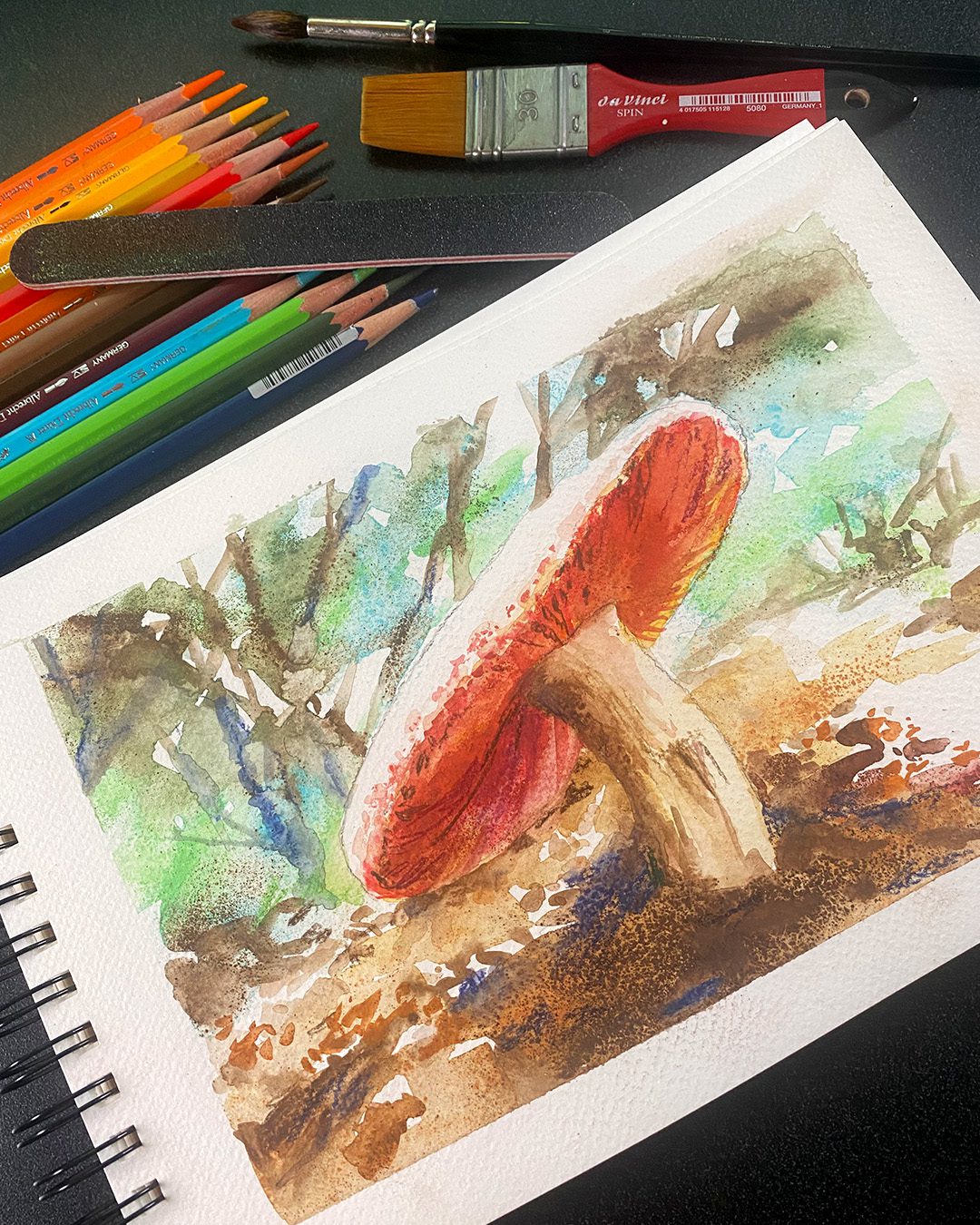
Today is party day! Join me for a livestream in which we’ll create a lovely piece of art together. I created this small study, and I’ll be working on a larger format so I can get into juicy details under that mushroom!

Livestream replay: Inventing new techniques in watercolor pencil…on the fly!

Watch the video below and scroll to the end to leave comments or questions — or click HERE to watch it on YouTube and leave comments over there. I read both dutifully!

SUPPLIES

Some product may be provided by manufacturers for review and use. Compensated affiliate links are here at no cost to you. I appreciate your support of my work with your purchases! Full affiliate and product disclosure | My trusted partners in art

Watercolor pencils

  1. Faber Castell Albrecht Durer Watercolor Pencils (or other brand)
    BLICK  AMZ  JACKSONS 

3 Brushes:

  1. Da Vinci Cosmotop Spin Brush (Mottler) – Flat Wash, Short Handle, Size 30
    BLICK  AMZ  JACKSONS
  2. Da Vinci Maestro Kolinsky Sable Round 4
    BLICK  AMZ  (*round 5) JACKSONS
  3. Winsor Newton Kolinsky Sable Series 7 Round #8
    BLICK  AMZ

Other

  1. Tea strainer 
  2. Emory board 
  3. Hair dryer or Wow Dual Speed Heat Tool 

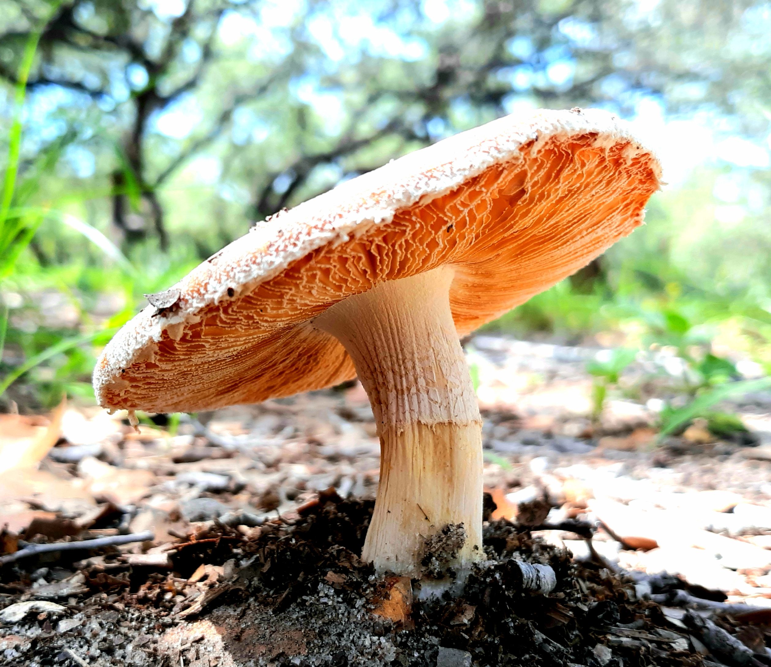
      Reference photo

      This one is by Nitamph on Paint My Photo.

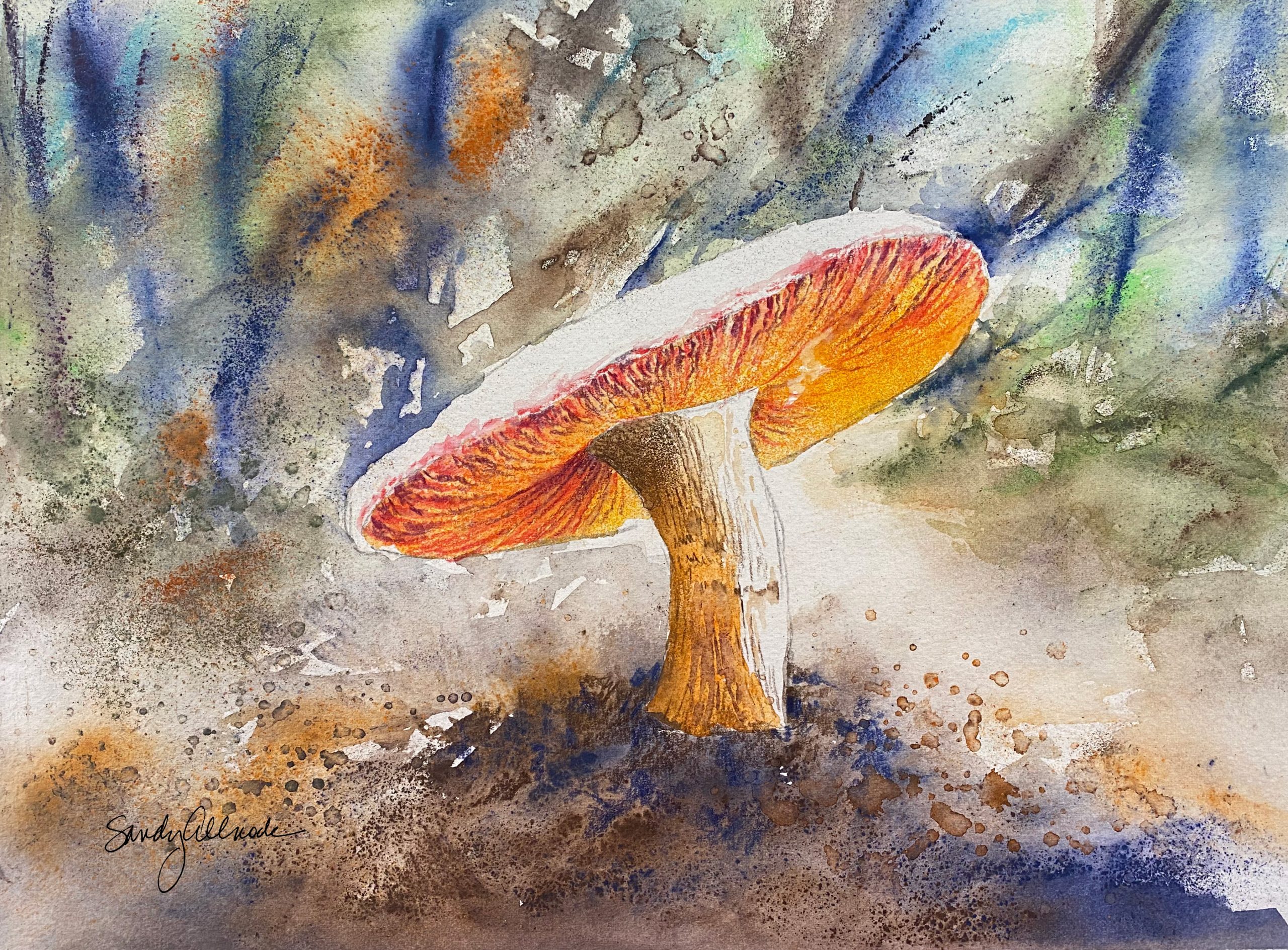
      Finished piece

      I absolutely loved the techniques that happened throughout this piece! This is how my process normally goes – lots of accidents, thinking I figured them out, then trying something else to achieve the same result. 

      If you’d like this piece to frame for your wall, it’s in my shop here.

      Watercolor Pencil Hex Charts

      I’ll have a video with tips soon for printing, paper, and coloring these in when your printer is like mine – only semi-waterproof.

      Subscribe to receive blog posts by email:

      Thank you!

      I appreciate all of you for following along on my journey. You’re a blessing!

      Blending Trios “+” (Alcohol Markers)

      Blending Trios “+” (Alcohol Markers)

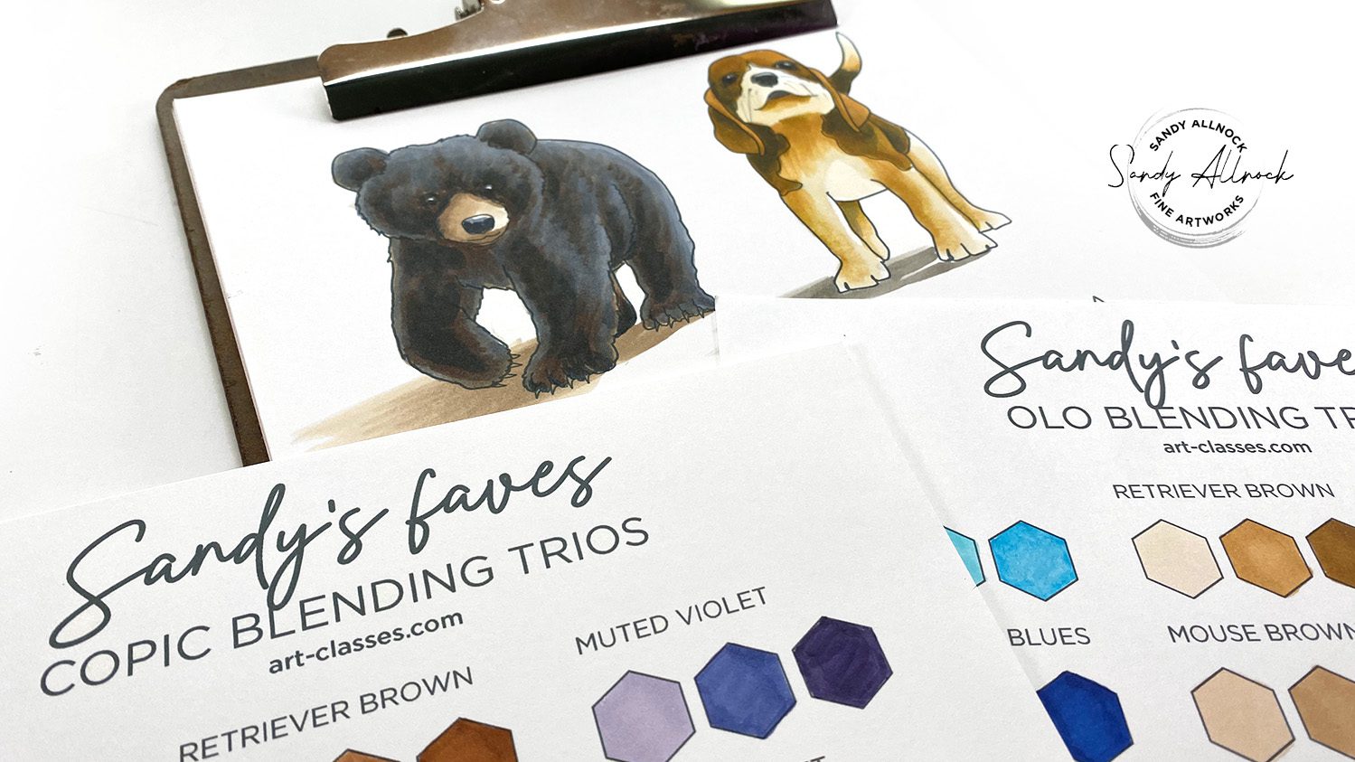
      Most alcohol marker colorists have heard of blending trios…those are groups of light/medium/dark colors that blend nicely.  

      There are “natural” groups that share the letter code (the color family) and first digit – at least in some brands! (Some have no rhyme or reason, or an inverted version of the Copic model.) I’ll be dealing with Copic and Olo markers here, which are similar in their numbering system.

      (Olo’s numbers aren’t the equivalent of Copic’s, but the first digit before the “.” is still saturation level, and the part after the period is the value–just like Copic.)

      If you understand some basics of color theory, you can add to a trio in a way you can create expected results – though practicing to see what the results will be is important when getting started!

      Tutorial: Blending Groups “+”

      Watch the video below and scroll to the end to leave comments or questions — or click HERE to watch it on YouTube and leave comments over there. I read both dutifully!

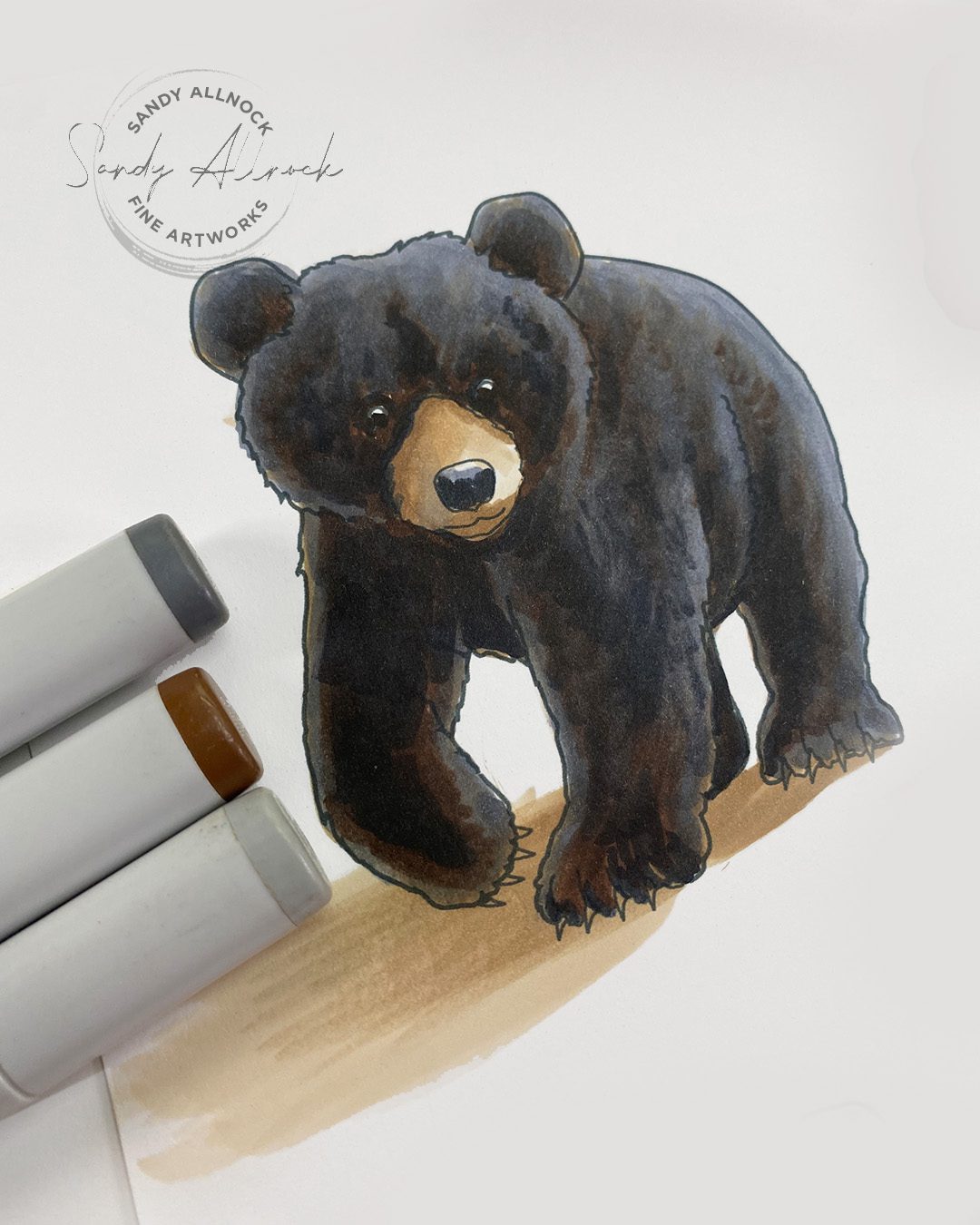
      Black Bear – with underpainting

      Using a blending group underneath with greys on top helps to bring that black “alive”–greys can look so dead! Experiment with lighter vs darker greys; each situation will be a little different. If you use too light of a color, it can pull color OUT from underneath, so the value needs to be a little darker than the underpainted color. 

      On the left is the example using browns (E42 E44 E49 Copic), and on the right are purples (V12, BV08) with some of the grey shading added with greys. 

      White vs Cream in animals

      Each animal will have a different flavor to its white – some feel more creamy, some more greyish, some more bluish – if the cream shown on the left is what you want but lighter or more desaturated, try a pale grey over it; that will lift out some of the color as well as value. On the right is what greys alone look like. 

      CLASS REVAMP!

      A while back I had changed the class title from Copic Jumpstart to Alcohol Marker Jumpstart. I always meant to go back and add more to it and refres things, and all this, plus finding my notebook, made me do a little more!

      If you’ve purchased the course already you can just log in and go to the Light and Shadow lesson. There’s individual jpgs you can resize, or use the PDF version with all of them on one page!

      In September I’ll be going through class “as a student” and adding more written content – I want to redo the pdfs at the end of each lesson, but not til I review everything to see what was missed. 2016 was a long time ago and I learned a ton since then!

      Subscribe to receive blog posts by email:

      Sandy’s Favorite Blending Trios

      As I was working on all of this, I also put together a trios chart with 21 combos each in Copic and Olo….it’s really cheap but if you want to get it, this PDF comes with a color version but I recommend printing the black and white one and creating your own samples; scanning marker color translates so poorly when printed!

      Stay tuned for Saturday’s fun!

      Not only is it new-class day, but it’s also giveaway day as I wrangled a partner…and I’ll show you how to make a SIMPLE hexagonal sketchbook because the big one I made was silly-hard. ha! Sign up for my newsletter if you want to be first to hear!

      Supplies

      Some product may be provided by manufacturers for review and use. Compensated affiliate links are here at no cost to you. I appreciate your support of my work with your purchases! Full affiliate and product disclosure | My trusted partners in art

      Draw simple tulip gardens in Water Soluble Markers

      Draw simple tulip gardens in Water Soluble Markers

      It’s tulip week in my world – yesterday was colored pencil tulips, and today I got out some liquid markers (for lack of a better term) to compare to “regular” water-based markers. So I’m calling it a water soluble markers tulip fiesta to encompass both!

       My studio was FLOODED with sunshine the morning I worked on these, so even though it’s not optimal for a video, I just sat and enjoyed the warmth streaming in. We still haven’t reached any consistent nice or warm weather – so I’m celebrating what we DO have!

      Tutorial: Draw simple tulip gardens in Water Soluble Markers

      Watch the video below and scroll to the end to leave comments or questions — or click HERE to watch it on YouTube and leave comments over there. I read both dutifully!

      Start with practice

      The back of an old painting is a great place to just play around with making tulip shapes, mess around with colors – and if you’re using Arches like I am, practice drybrush edges and decide if you like that or a more pure shape. I tested out three brands of pens – Altenew’s brush markers, which are more like a traditional “ink” inside, vs artist-grade Faber Castell which won’t fade in sunlight, and the crafty Sketchmarkers that have the Copic-style nib on them.

      Tear up some paper

      I tore 3″ x 4″ rectangles from my scrap sheet to turn into tiny practice paintings that are perfect for cards. I got to test out alll the colors in the marker sets.

      The differences between these pens

      The Altenew crafty liquid markers seemed to perform more like an ink – they did stain my fingers pretty badly, but oh the color! I only needed a tiny drop of that liquid to make a whole tulip. (Note: these are not artist quality, no matter what the company says. That doesn’t mean they’re bad, I just can’t find any actual evidence that their products have been tested for lightfastness, color consistency, etc. They also give colors names that don’t correspond to names in the art industry – they’re more craft-friendly.) (But I do love these pens, I’m glad I found them and got them out again!)

      Second-strongest in color were the Faber Castell; which is to be expected, they’re an artist-grade pen. My only complaint? Not enough colors for me. lol.

      Then the most affordable option that I actually LIKE is the crafty Sketchmarker Aqua. 72 colors is a better range, eh? They’re not as pigmented as the other two but still very nice.

      Acetate cards

      These packs of Hero Arts acetate cards have been in my stash for a while – and it was time to get them out! I was making these for a final meeting of my Toastmasters club, and with all this happy color they’d make great “table decorations” to cheer us all up.

      It did work! Our meeting did go quite well. One of our club members delivered a “Demonstration Speech” teaching us how to do a line dance – and oh how hilarious that was! We had great table topics, which is impromptu speaking…answering a question on-the-fly. The taco Tuesday potluck after went on for hours as we all visited.

      Closing remarks I made at the meeting

      I’d been stressing out all day wondering WHAT I could say at the end before the final bang of the gavel. I didn’t want to cry, but wanted to leave everyone with some encouragement and an admonition to keep growing even if we’re not together weekly.

      The inspiration came just hours before I left; I was listening to an interview of Erykah Badu, one of my fave musicians. She’s a completely unique person – musically, her style, her dress, her attitude. (She was wearing a hat during the interview in which half the brim was removed. Yes, only half.)

      The interviewer asked her how she came to be the unique person she is. Her answer: I don’t have I choice. I’m me.

      So my commendation to my club was to continue being who they are. During our years together we got to know each person’s quirks, habits, passions, pet peeves, and in many cases deep dark secrets. Our unpopular opinions and the places we are in need of grace. All that makes each of us what and who we are – and if we’re using our authentic voice, which is what Toastmasters teaches us to do, we have no choice but to be who we were created to be.

      That’s the same message I deliver to you today. Be unashamedly you. No one else can do that. 

      Supplies

      Some product may be provided by manufacturers for review and use. Compensated affiliate links are here at no cost to you. I appreciate your support of my work with your purchases! Full affiliate and product disclosure | My trusted partners in art

      1. Altenew Watercolor Brush Markers, Spring Garden Set 
      2. All other Altenew marker sets 
      3. Sketchmarker Aqua 
      4. Faber Castell Albrecht Durer Watercolor Markers  Blick • AMZ 
      5. Arches Cold Press Pad
      6. Arches Cold Press sheets

      Subscribe to receive blog posts by email: