Perspective in Nature: Roads and Paths part 1

Perspective in Nature: Roads and Paths part 1

Perspective is hard. I get that! Thinking about how to make the angles right, finding the horizon line and vanishing point and knowing which objects align with which – it can be mind boggling for those who haven’t studied perspective.

But I have GOOD NEWS for you! To draw in perspective, you don’t HAVE to know about vanishing points etcetera. Especially with nature.

That does not mean you shouldn’t study perspective. (I’ve got some drawing classes on sale this month that could help if you want to.) 

But instead, you have to learn to SEE. I mean really really see. Not just think about what the object looks like that you’re drawing, which is usually where the mistakes come from. We assume we’ve seen that object for our whole lives so obviously we know whwat it looks like. 

I would daresay seeing accurately is a much harder thing to learn, but for those who really don’t want to study perspective, that’s your out!  Learning to see in addition to understanding perspective is the best option, since the latter helps you know what to look for in the former.

But let’s just start by looking at some photos and compare the original with some perspective mistakes I see quite consistently.

Tutorial: Perspective in Nature: Puffy Clouds, part 1

Watch the video below and scroll to the end to leave comments or questions — or click HERE to watch it on YouTube and leave comments over there. I read both dutifully!

In each example, tab through the sliders to see each photo.

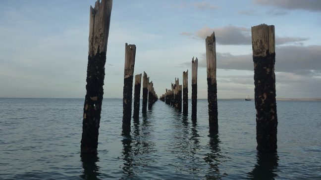
While not a path, this photo illustrates what we often think of as one point perspective even if we don’t know what it’s called. Things are bigger in front, and get successively smaller in the distance.

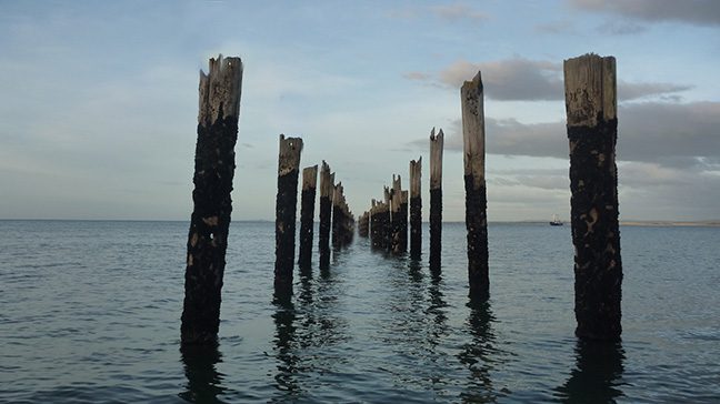
In the 2nd photo, the perspective is off – shortening a front piling. as well as the distant pilings being too low in the wate.r
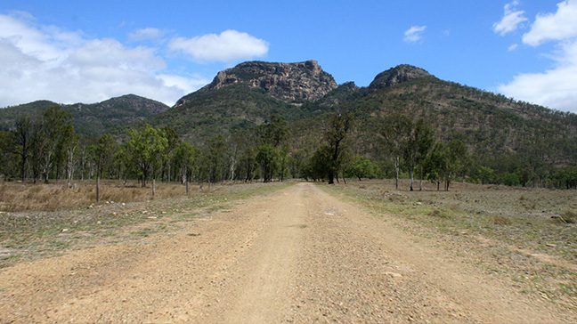
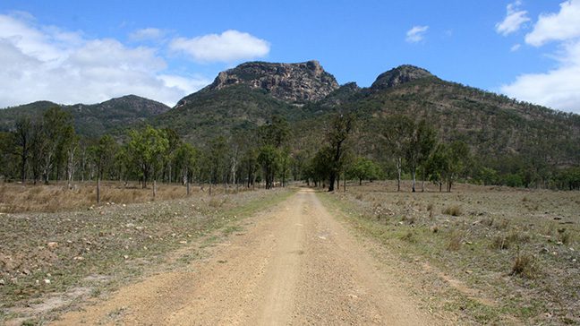
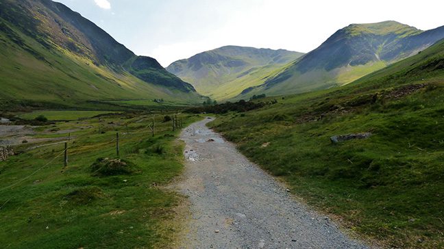
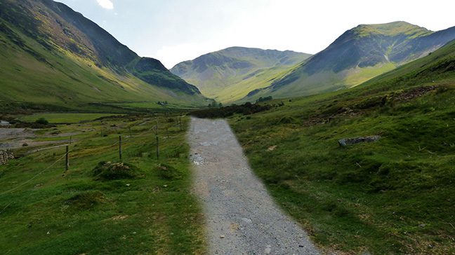
The road in this photo is wider in the foreground than in the distance. Making those two closer to each other in the 2nd photo lengthens the distance of the road. But in photo 3, making it extra wide may be more engaging as it brings the foreground closer, even if it’s less accurate.
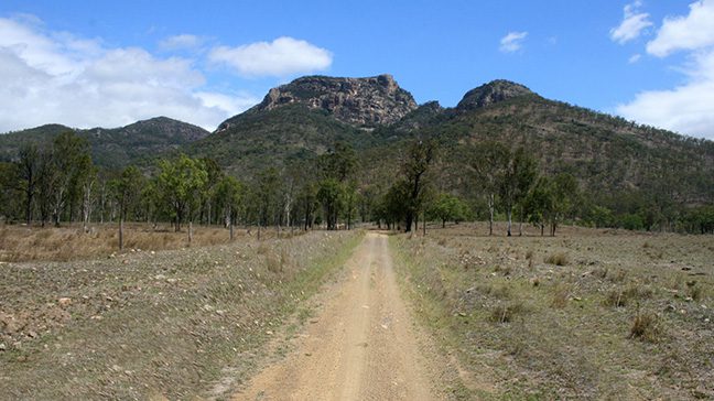
Including some of the interesting details along a road tends to make it look more embedded into the landscape. Simplifying and changing the width of the road in photo 2 creates additional challenges, as the end of the road looks like a change in the formation of the land. A good change one could consider is placement and width of the near side of the road to take it out of center and bring it closer to the viewer.
Subscribe to receive blog posts by email:

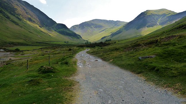
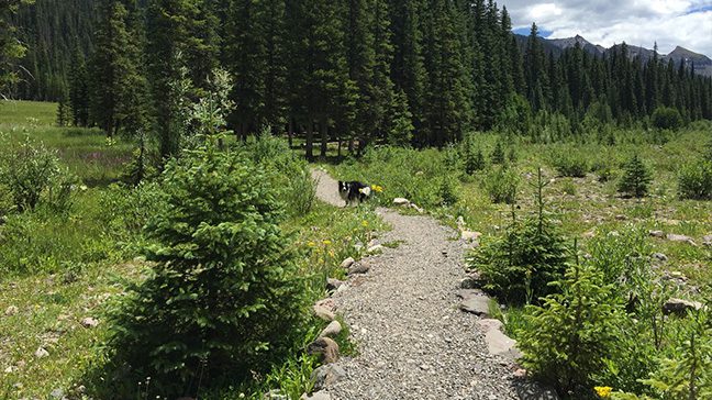
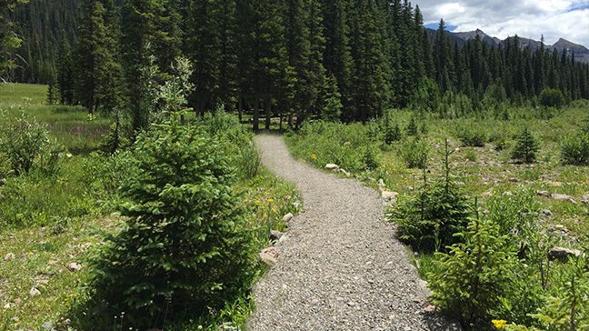
If we start sketching or painting while only thinking about a path in our head – we can really go off track! Photo 2 shows how the knowledge of reality – that it’s a paved path consistent in width – leads to a wacky looking road. But paying attention to where it gets thinner indicating hills, and the angle and shape of the point in the distance where it ends –that helps get us on the right path. Ha. I’m so punny!


Not looking at the actual angles of different parts of your drawing can lead to a scene that feels more like a funhouse in photo 2!

Try holding your pencil out in front of you, measureing how farr off of horizontal or vertical that a particular shape or edge is. Then translate that to your paper, constantly checking back with your reference.
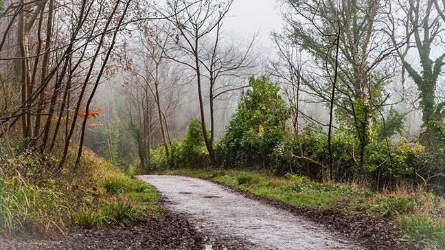
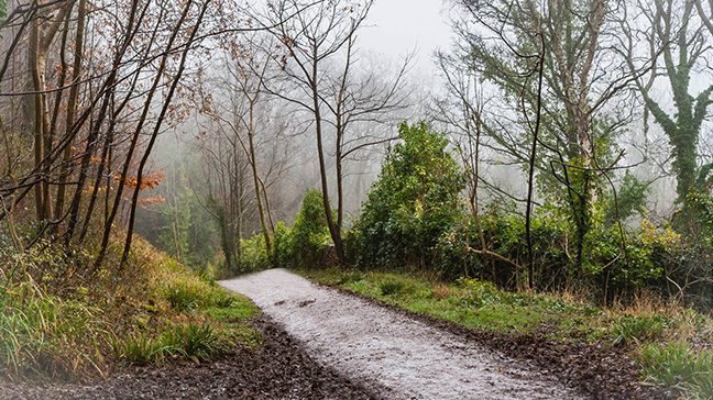
When looking at a road or path, look for objects that DISRUPT that path. Are there bushes cutting off part of it or intruding into it? Does the path disappear behind an element in the scene? Those elements can take a flat looking road or path and turn it into one that fits in with the nature elements around it.
In part 2….

I’ll be talking about those times when you don’t have a reference and are trying to make a scene up from your head. Click here to go see it!

What’s the right way to hold a pencil?

What’s the right way to hold a pencil?

It’s time for real talk. I saw a meme online and can’t find it again.

Am I the only one whose feed loses the stuff that I want to see, and keeps sending the stuff I don’t???

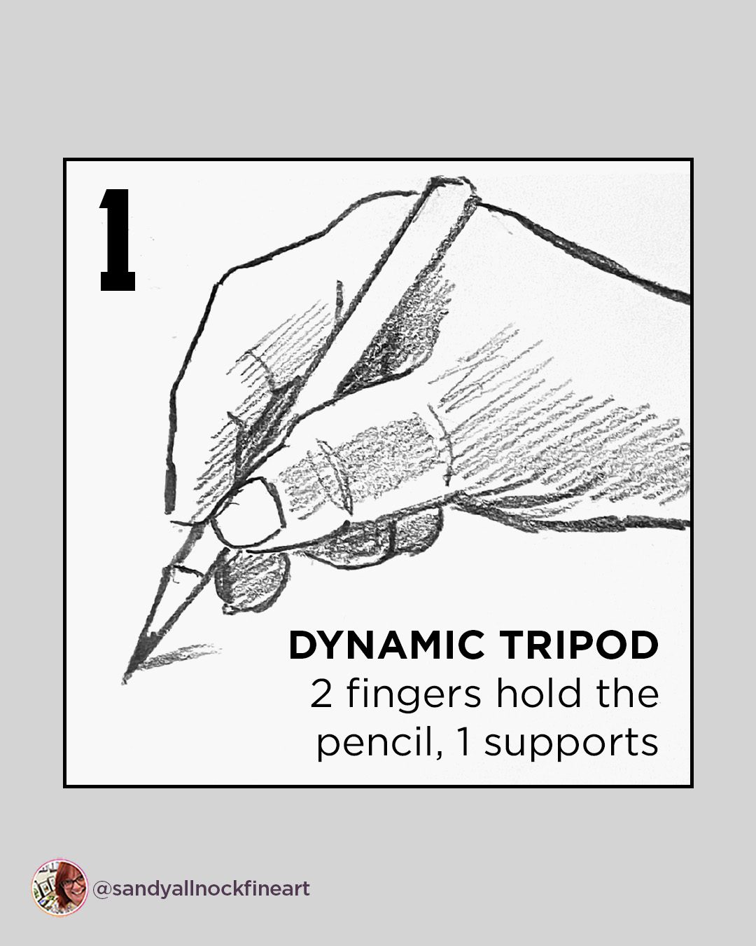
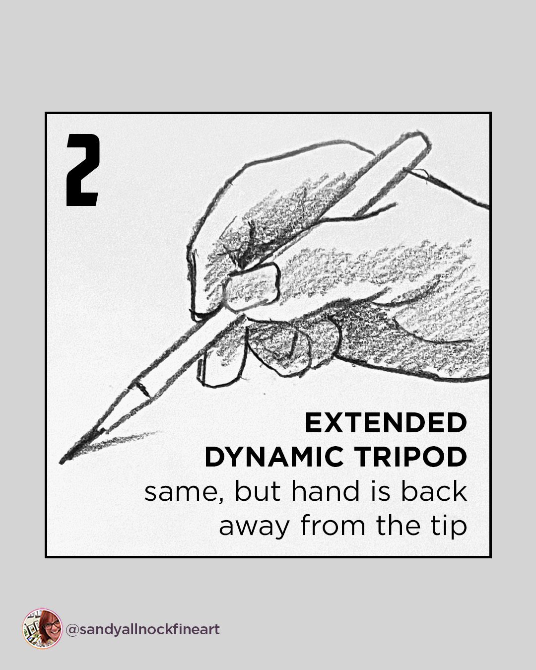
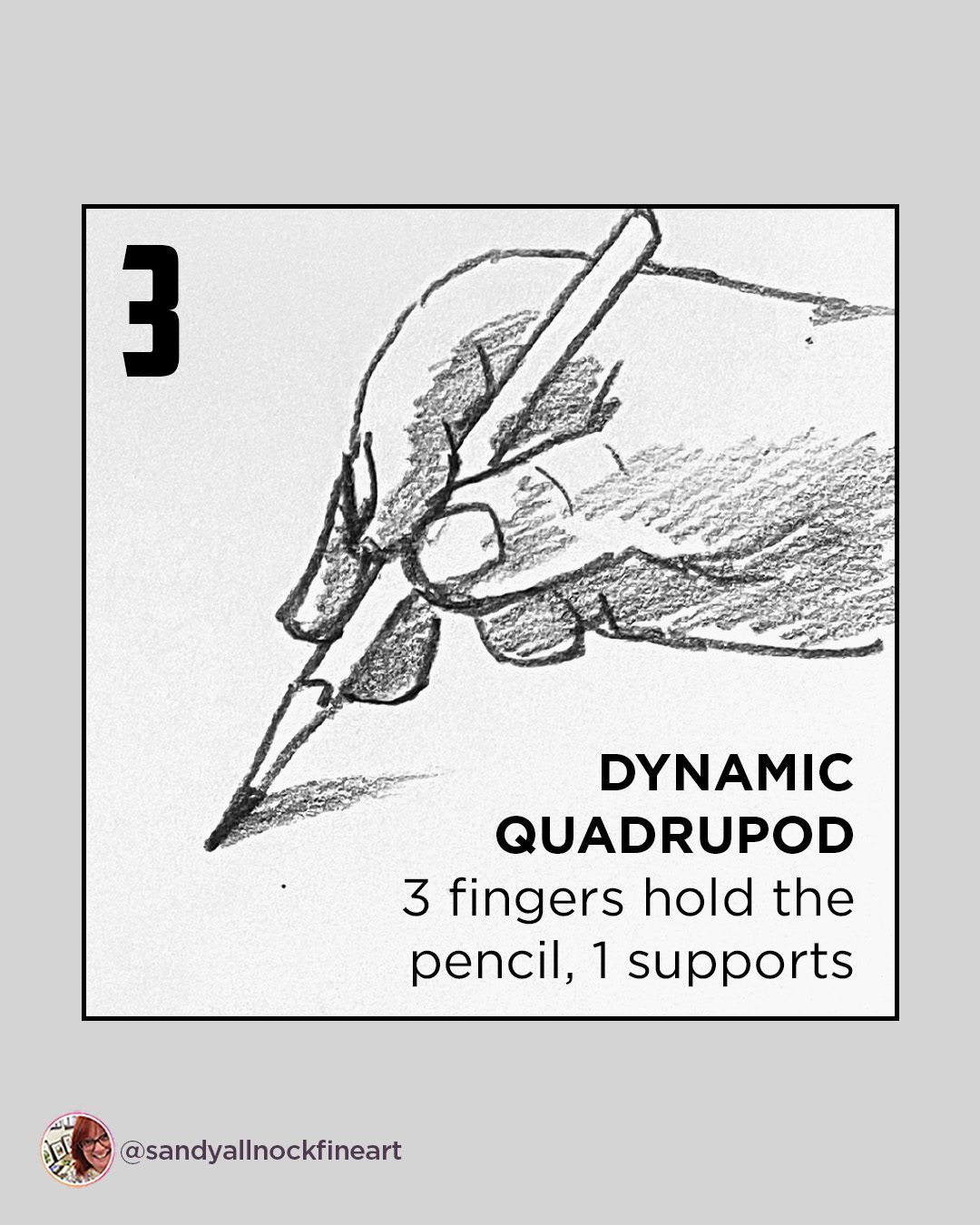
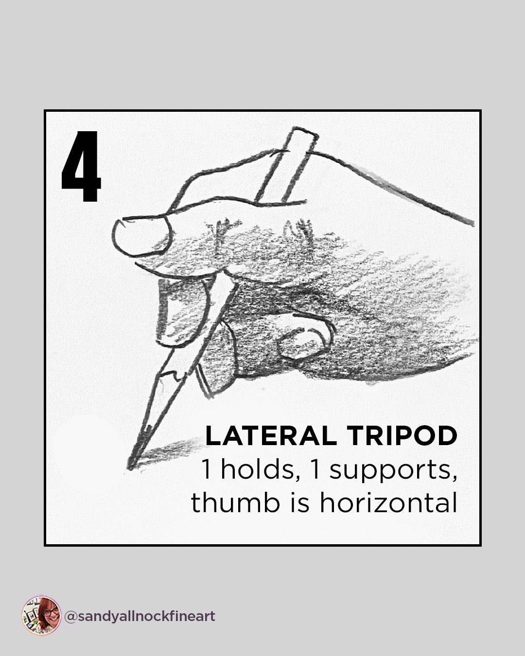
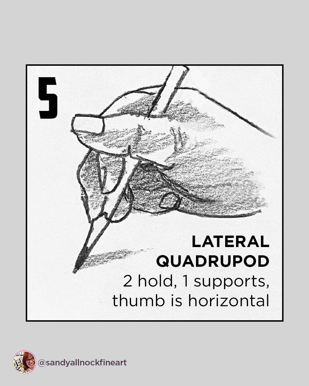
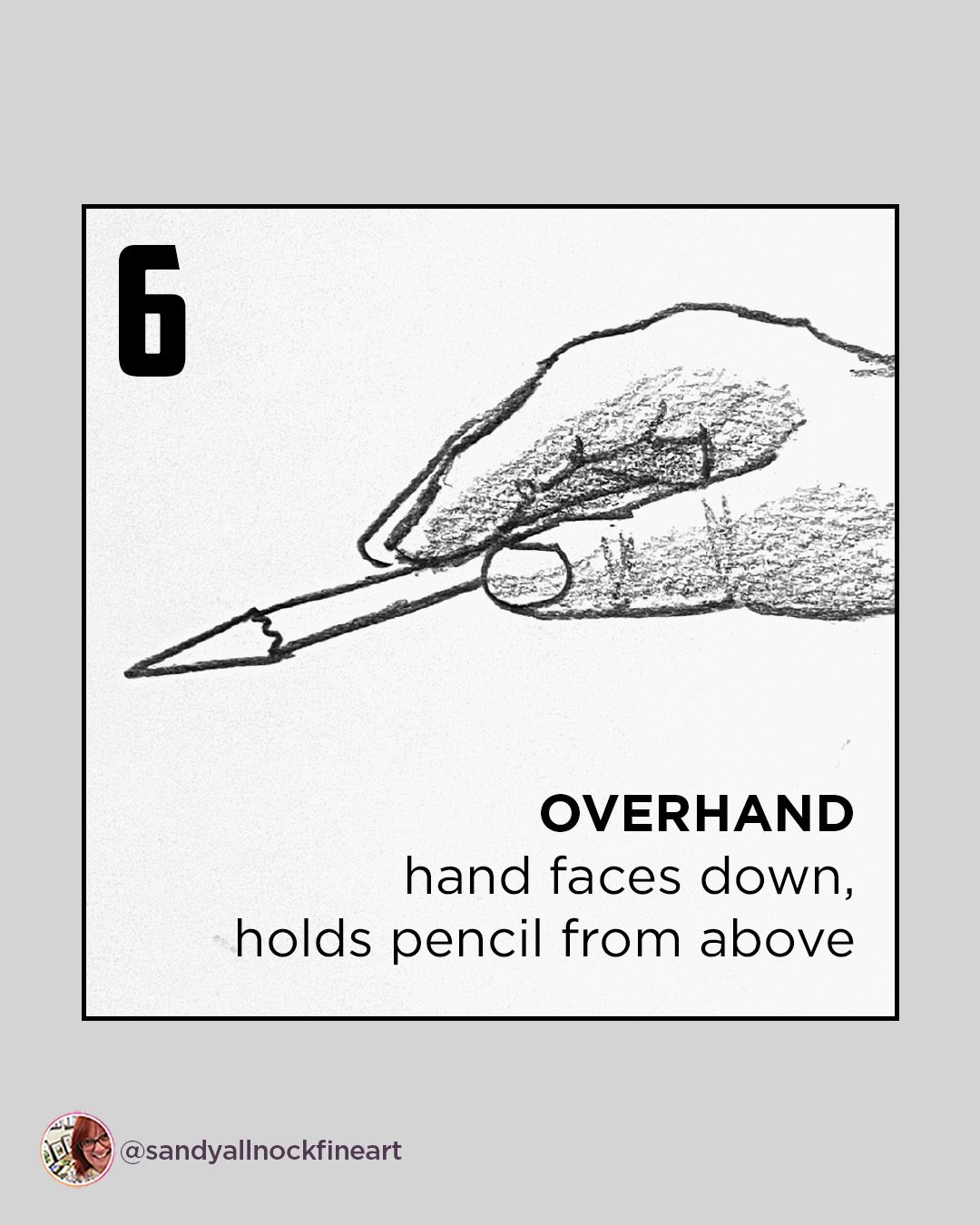
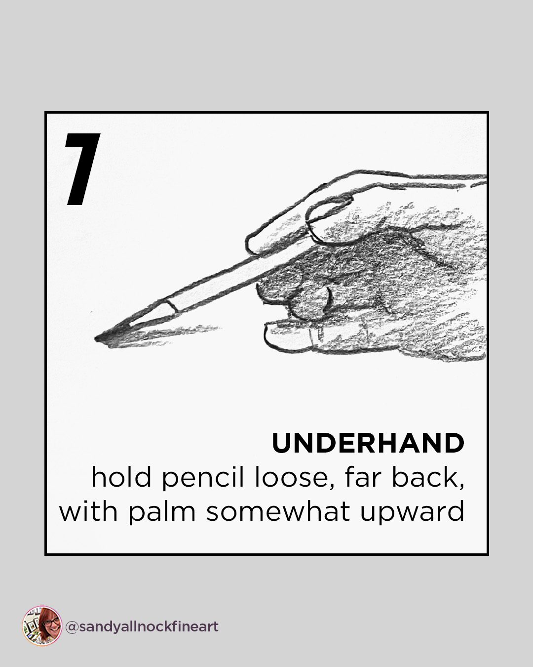
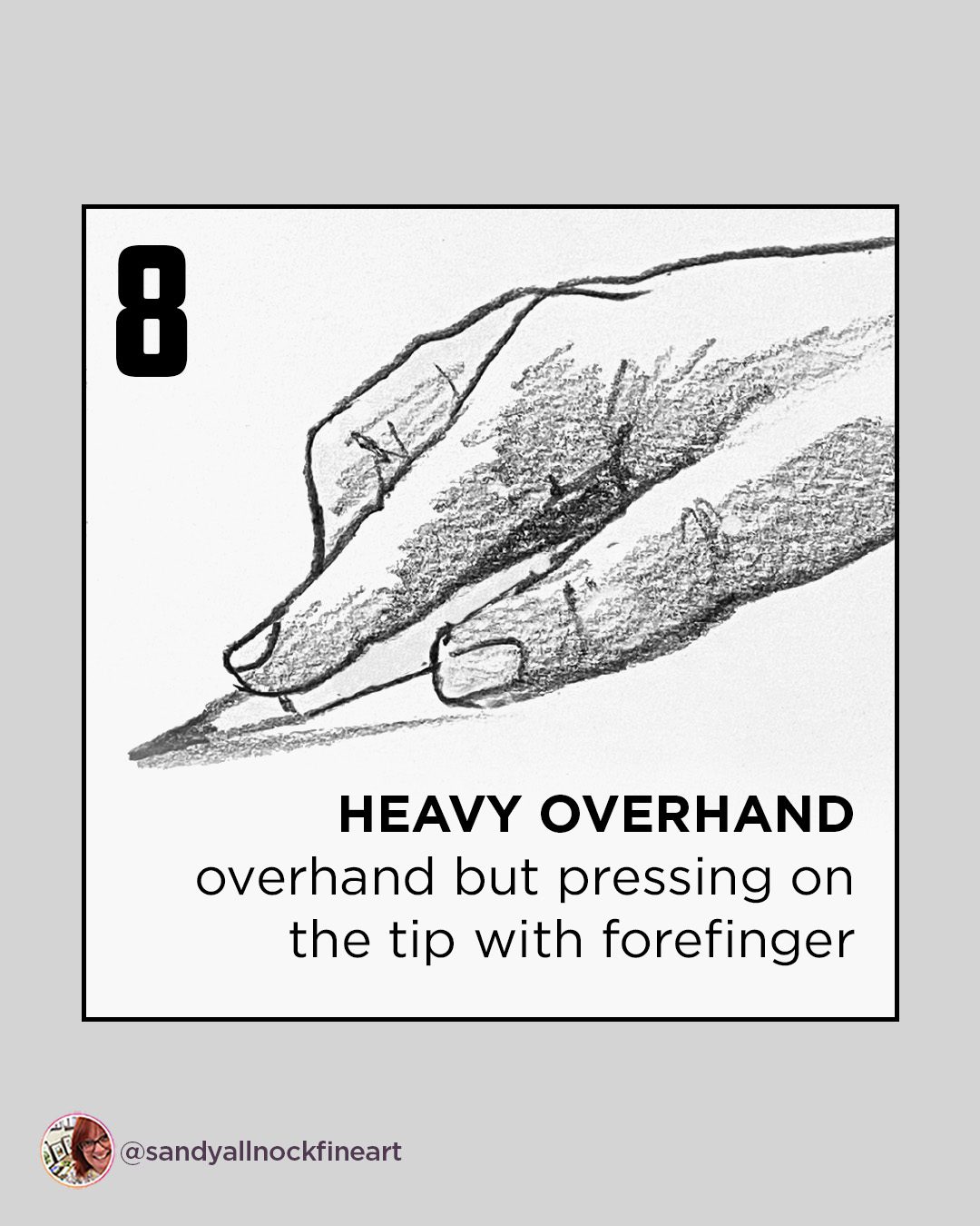
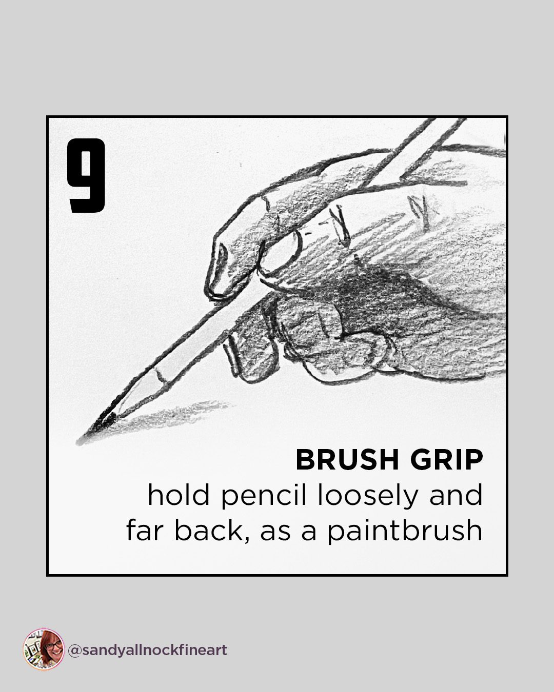
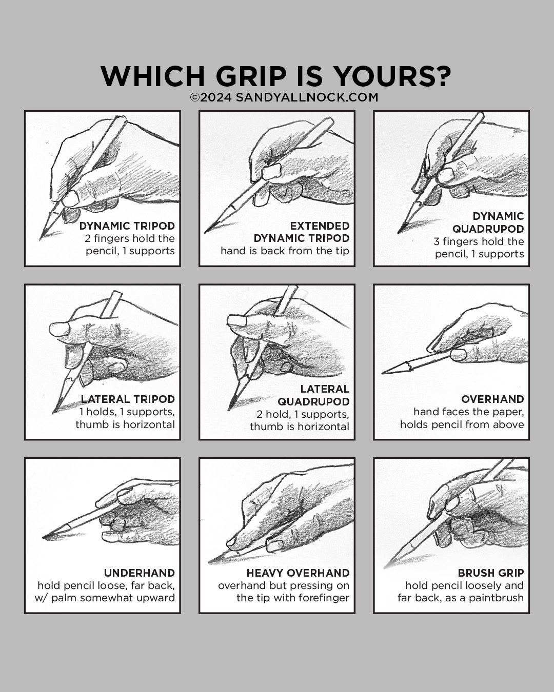
The meme had 4 doodles of hands and each had a pencil – different ways to grip a pencil – and each one had labels.  What? There are names?? It was gone before I had time to stick it in my brain or screenshot it, so had to wait til I had a few minutes for research…..and thus I bring you…..NINE that I found.  Even more than the meme!

Video: What’s the right way to hold a pencil?

Watch the video below and scroll to the end to leave comments or questions — or click HERE to watch it on YouTube and leave comments over there. I read both dutifully!

I still don’t know…

….if there’s a rhyme or reason behind my pinking and ring finger moving around at will. If I find out, I’ll let you know! The question will likely haunt my upcoming art for the next month or two, won’t it…

Subscribe to receive blog posts by email:

I made my own memes

This one is a carousel-style, and will live over in the Tiny Tutorials class – where all my carousels are collected. It’s got about 150 of them, addressing all kinds of topics and mediums. And in there I’ve also collected videos that apply to the same! Sign up today. 

Which grip is yours?

I also made my own one-image meme that, aside from some weird finger drawings, has the more complete info I wish I had been able to find in the other meme. ;0)

Am I the only one who varies?

Do you swap around your tool-holding techniques? Within one piece, or do you swap it out based on the tool? Inquiring minds want to know…

Supplies

Some product may be provided by manufacturers for review and use. Compensated affiliate links are here at no cost to you. I appreciate your support of my work with your purchases! Full affiliate and product disclosure | My trusted partners in art

How to work with shimmery inks + community storytime

How to work with shimmery inks + community storytime

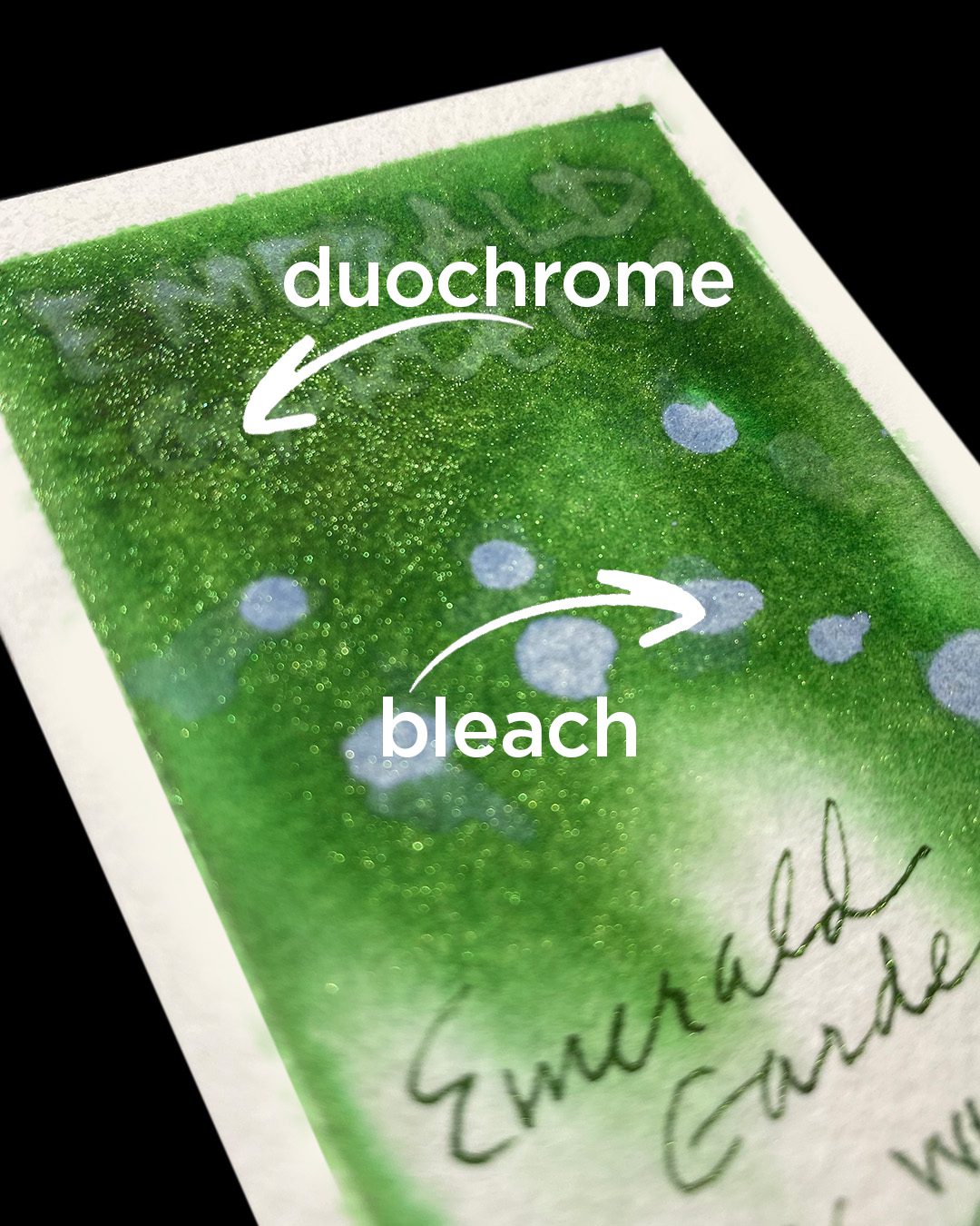
Have you ever found shimmery duochrome inks to be a little disappointing in real life action? Like, your written lines don’t shimmer, your painted wash doesn’t glisten? I’ve avoided these inks a while, because it just seemed some didn’t deliver what was promised.

Spoiler alert: USER ERROR. LOL!

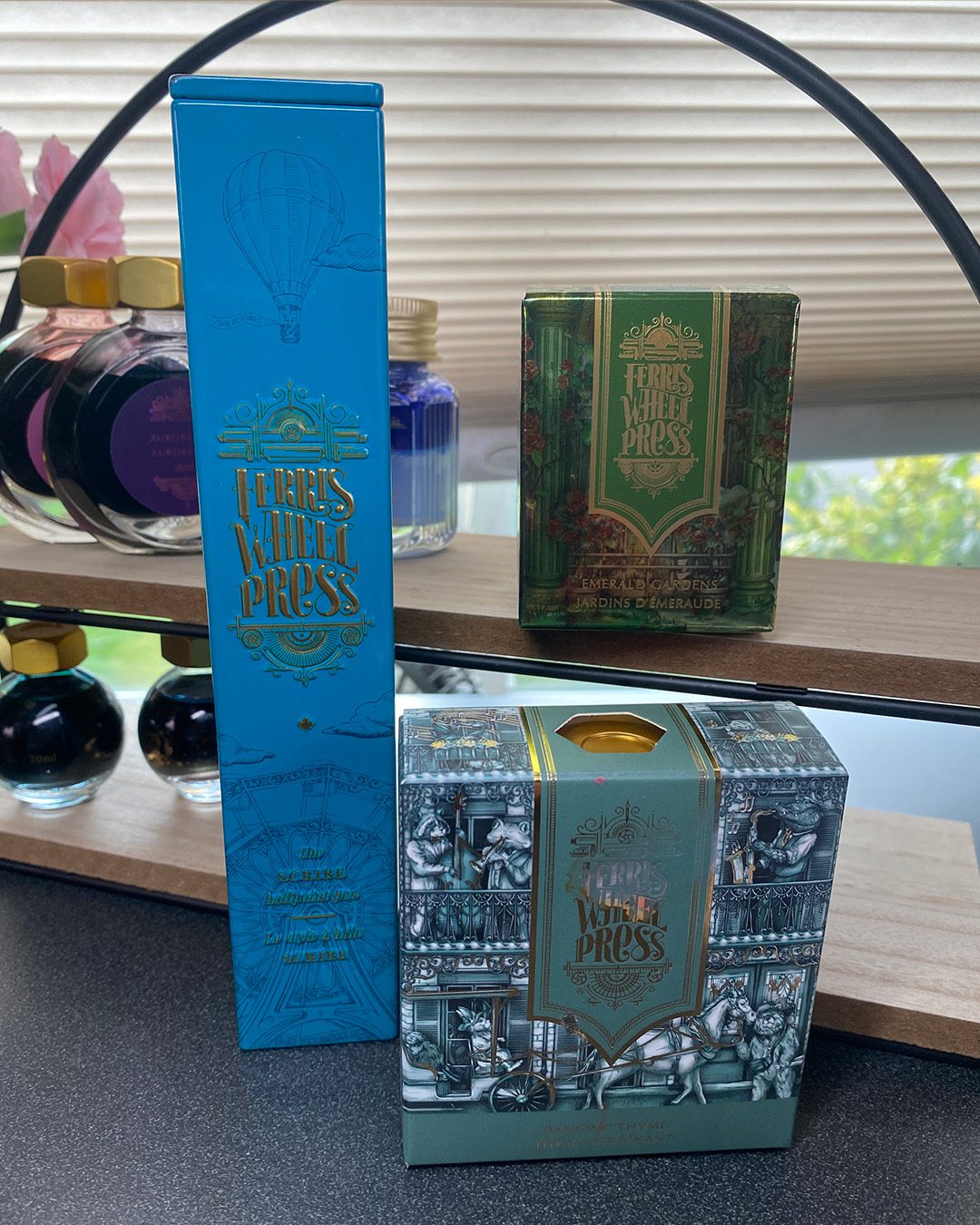
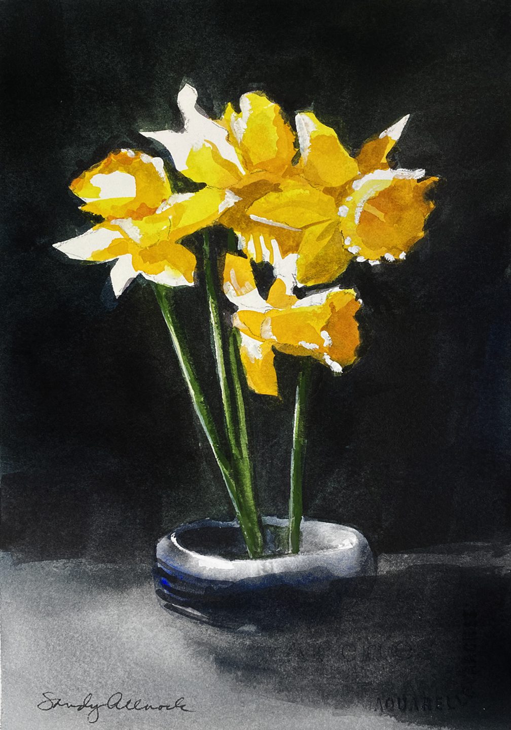
I received another lovely package from Ferris Wheel Press – and one of the inks, Emerald Gardens, has a lovely shimmer to its duochrome. There’s also a more subtle, desaturated green called Dancing Thyme and – a ballpoint pen with waterproof ink!

DISCOUNT FOR YOU!

Use code ALLNOCK at checkout to
receive 10% off on your entire order!

Tutorial: How to work with shimmery inks

Watch the video below and scroll to the end to leave comments or questions — or click HERE to watch it on YouTube and leave comments over there. I read both dutifully!

Duochrome, shimmery inks

The word duochrome literally means “two colors.” But it’s not always easy to get all the second color – the gold or other-colored shimmer – to show up.

  1. Mix the ink well – and if not having good results, check that the bottle gets swirled between each dip of a pen or brush.
  2. If putting the ink into a fountain pen, stir it just before drawing ink into the pen. Also – don’t leave a duochrome in your pen for a long time unused; the mica could clog things up.
  3. The ink needs to be applied heavily enough for the mica to show up. Use a fountain pen that pours out enough ink onto the paper; some pens are stingy, some are more generous.
  4. Pro tip: if working on a big project and dipping a brush into water, use a SMALL water jar. Any excess micah could collect at the bottom of that jar! Let it settle, pour off a bunch of the excess on top. You can use that for adding shimmer to other projects – paint it like a glaze!

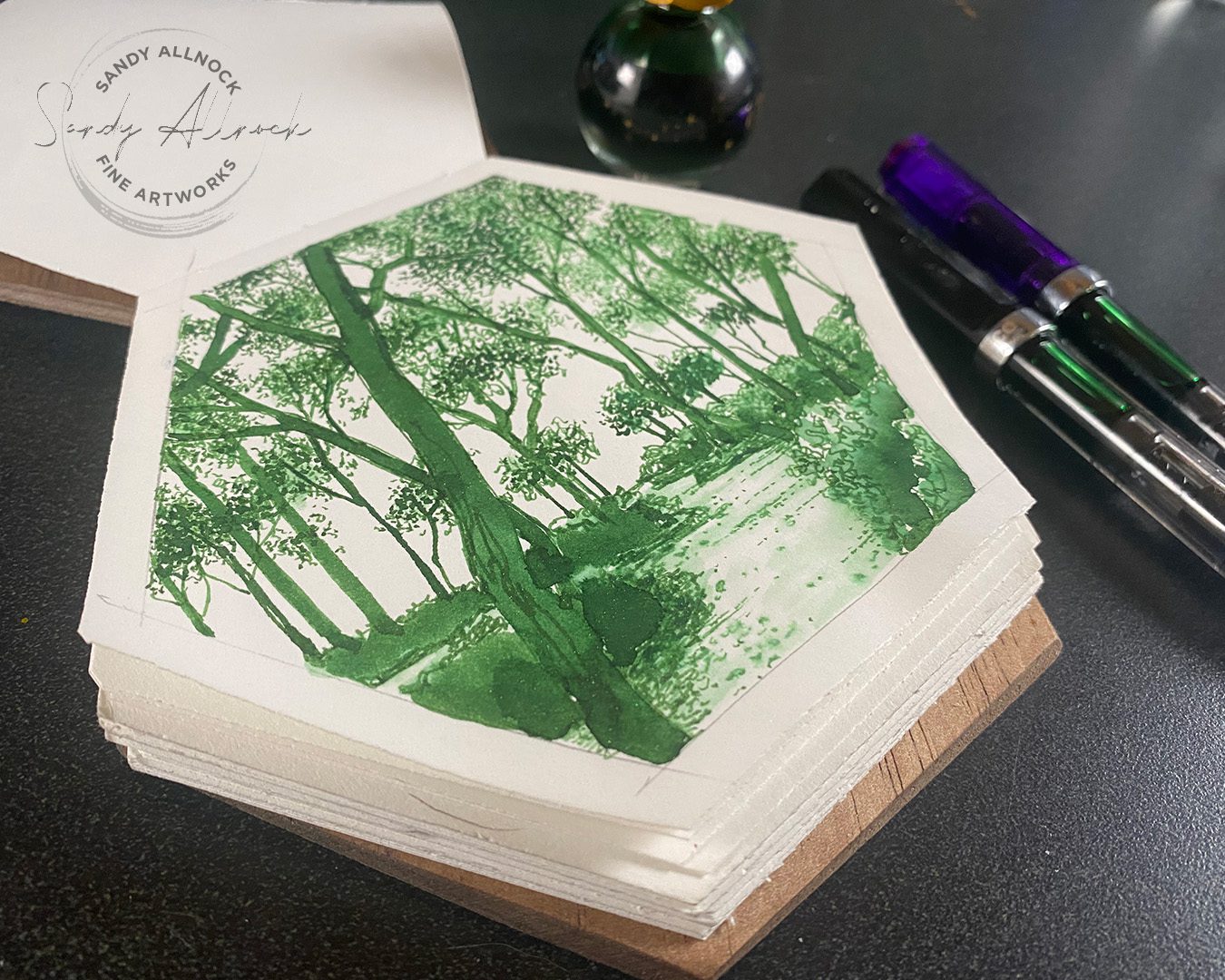
When creating a drawing that you want to shimmer, plan out which areas will be dark enough to have enough ink to shine. Then when adding ink with a brush, stir it as you load the brush each time, to be sure you get the mica moving and onto the brush!

Subscribe to my weekly newsletter, Creativity In Your Inbox

* indicates required

About community

My little story might have stirred up a desire in your own artist’s heart for an art community, too. It can be lonely working alone in our studios or at our kitchen tables! You’re not the only one having those feelings.

Being WITH others can make a huge difference. January and February, two months of 2024 when we had the most activity at Artventure because a bunch of us were taking the Whimsical Sketching and 30 Days to More Confident Sketching classes together. Not everyone posted on “the” day and that’s just fine – but seeing all the work at once, and everyone being refreshed on what was in that lesson…all that made our feedback incredibly helpful and specific for each other.

(Note: you can participate in Artventure whether or not you join us for one of those courses!)

Friday night is a great chance to come join us for a good time. Set up your art, whatever you’d like to work on, grab something to drink (safely so you don’t spill!) and log onto zoom to join us for a little while or the whole two hours! I always come away from those days being encouraged and feeling stronger.RSVP at Artventure in the Events tab, or if you just can’t do Artventure, email me and I’ll send you the zoom link. It’s free!

Supplies

Some product may be provided by manufacturers for review and use. Compensated affiliate links are here at no cost to you. I appreciate your support of my work with your purchases! Full affiliate and product disclosure | My trusted partners in art

  1. Ferris Wheel Press – use coupon code ALLNOCK for 10% storewide -inks:
    1. Emerald Gardens
    2. Dancing Thyme
    3. Ball point penScribe (comes in various colors)
  2. Swatches:
    1. Arches Cold Press Pad: 
    2. Plastic sheets for swatches
    3. Fountain Pens:
      1. TWSBI Eco Fountain Pen EF
      2. TWSBI Eco Fountain Pen F
      3. TWSBI Eco Fountain Pen M
    4. Hexagonal sketchbook no longer available
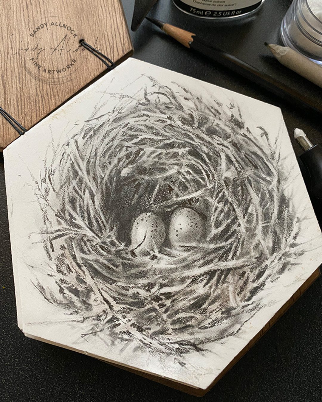
How to draw a bird nest

How to draw a bird nest

It’s Good Friday. I’ll apologize now for the video voiceover….it was recorded before we knew about Mom, so it’s not me being callous.

I think a nest with a couple yet-to-be-born eggs in it is probably one of the best subjects to honor Mom. She had me and my older sis on Good Friday of 1964. A third egg was added years later, but the bird sitting on this nest would have been…my mama.

But I’d like to tell you my Mom/Good Friday story, so keep reading…..and enjoy the video as if the world hadn’t just crashed around me. 


Tutorial: How to draw a bird’s nest

Watch the video below and scroll to the end to leave comments or questions — or click HERE to watch it on YouTube and leave comments over there. I read both dutifully!

A little story

Good Friday every year of my life was spent the same way. Hearing the story of the day I was born.

Every year on my phone call with Mom, she’d remind me that I was born on Good Friday – and she knew the pain of Jesus! We would laugh about it, year after year. 

Oh what I wouldn’t give to have one more year of laughing with her.


Fine Art Sale

Use coupon code HBD60 to buy something from the shop – my mom would have loved it if you bought something for your mom for Mother’s Day. I’ll take care of shipping things when I return.

Subscribe to my weekly newsletter, Creativity In Your Inbox

* indicates required

Supplies

Some product may be provided by manufacturers for review and use. Compensated affiliate links are here at no cost to you. I appreciate your support of my work with your purchases! Full affiliate and product disclosure | My trusted partners in art

  1. The sketchbook is no longer on Etsy – it’s by HandStitchedbyEllen who seems to have emptied her shop since I bought the sketchbook – a lot of creators are doing that nowadays, I’m so sad.
  2. Caran d’Ache Grafwood Pencils 
  3. Electric Eraser, Mont Marte
  4. Kneaded Eraser 

Subscribe to receive blog posts by email:

Drawing Plants part 2: graphite vs marker

Drawing Plants part 2: graphite vs marker

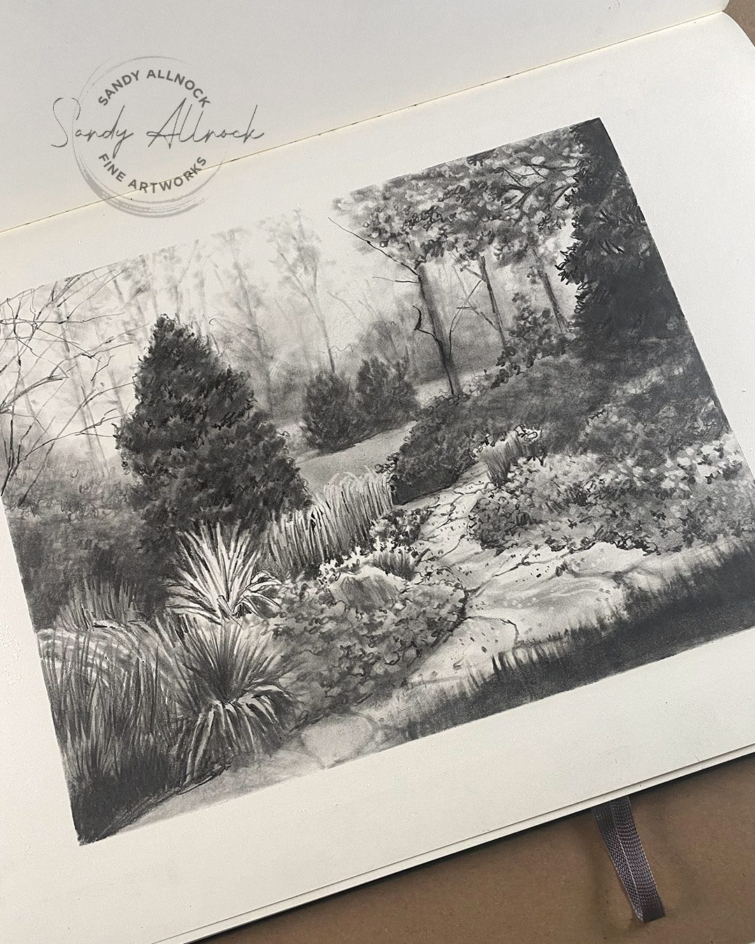
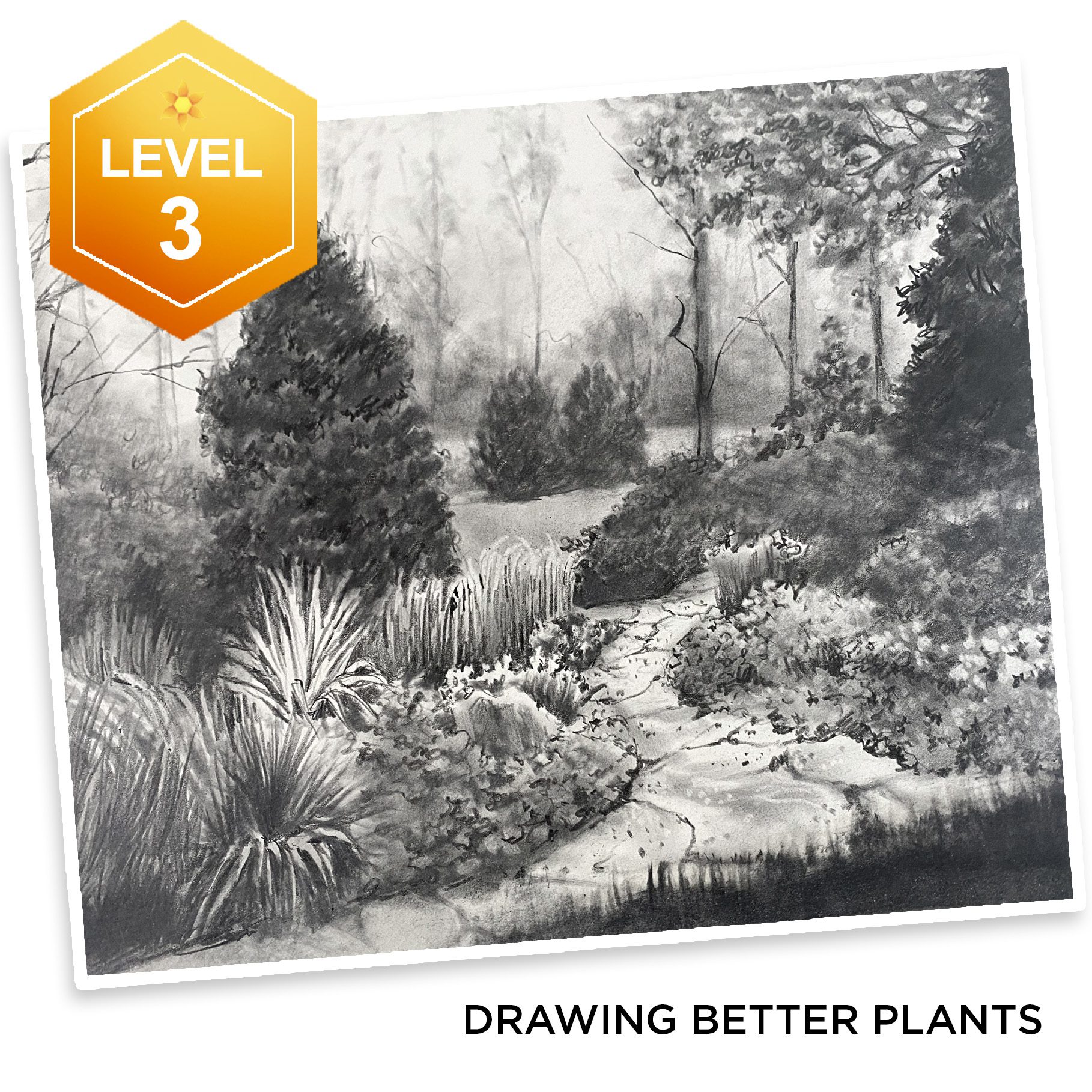
A few weeks ago I posted a graphite drawing I had created. And today – I’ve taken that same landscape and turned it into an alcohol marker drawing! Not an excellent one due to my color challenges, but I think I can say I rocked it nonetheless…..I’ll let you weigh in on that!

Tutorial: Drawing Plants part 2: graphite vs marker

Watch the video below and scroll to the end to leave comments or questions — or click HERE to watch it on YouTube and leave comments over there. I read both dutifully!

What I didn’t like….and what I loved

I had mentioned I had some mixed feelings. The color choices here are fairly atrocious – not because they’re bad colors, but because there are so few greens, I had to deploy every last bit of color theory knowledge to try to make different greens! (I can’t wait til Olo’s new colors come out!)

But what I loved here – the values ROCK! A watercolor mentor of mine has said to me for years that colors don’t matter one bit if the values are spot on. You can paint an entire landscape in pink and purple and it’ll read right if the farks and lights are correct. And that’s what this drawing proved to me – and since I had done a detailed value study, I was able to really rock this marker version! 

You can do the same – try a value study first before your next drawing or painting, and see if it helps!

Story behind the class

Sometimes a piece I work on makes NO sense as a video, sometimes only as a YT tutorial, sometimes it needs to be a class. It depends on how much I have to say about it! There were overwhelming numbers of techniques and textures involved here, and I considered making it a class right away, but thought, after a couple classes have bombed, maybe I should ask first. (I end up doubting my ability to know what people might want to learn!)
In this case I did ask – and a bunch of YT commenters said they DID want a class. Now we’ll find out if that’s true, LOL! I’ll be messaging the commenters, so I hope they are ok with that. 🙂 If you’re interested, class sign up is here…..and the other classes I mentioned in this video are linked later in this post!

Subscribe to my weekly newsletter, Creativity In Your Inbox

* indicates required

Classes recommended in this video

These are on sale through the end of March…

Tutorial: 14 Tips to draw better plants (part 1)

The aforementioned part 1 video!

Watch the video below and scroll to the end to leave comments or questions — or click HERE to watch it on YouTube and leave comments over there. I read both dutifully!

Supplies

EASY! Draw a Celtic Trinity Knot

EASY! Draw a Celtic Trinity Knot

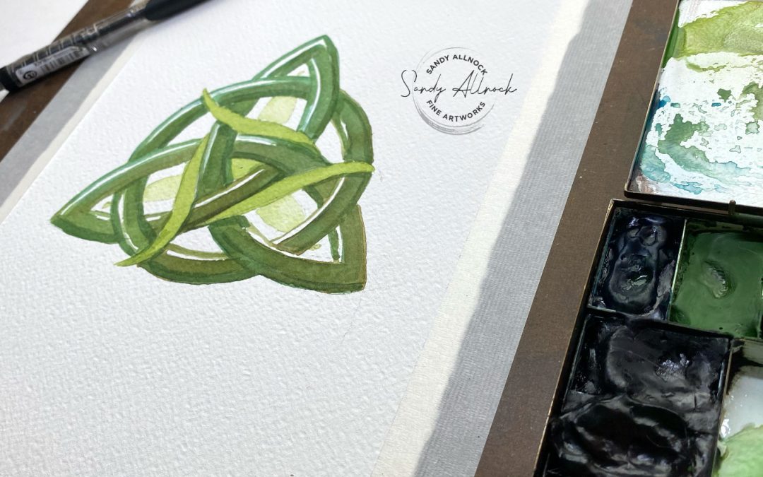
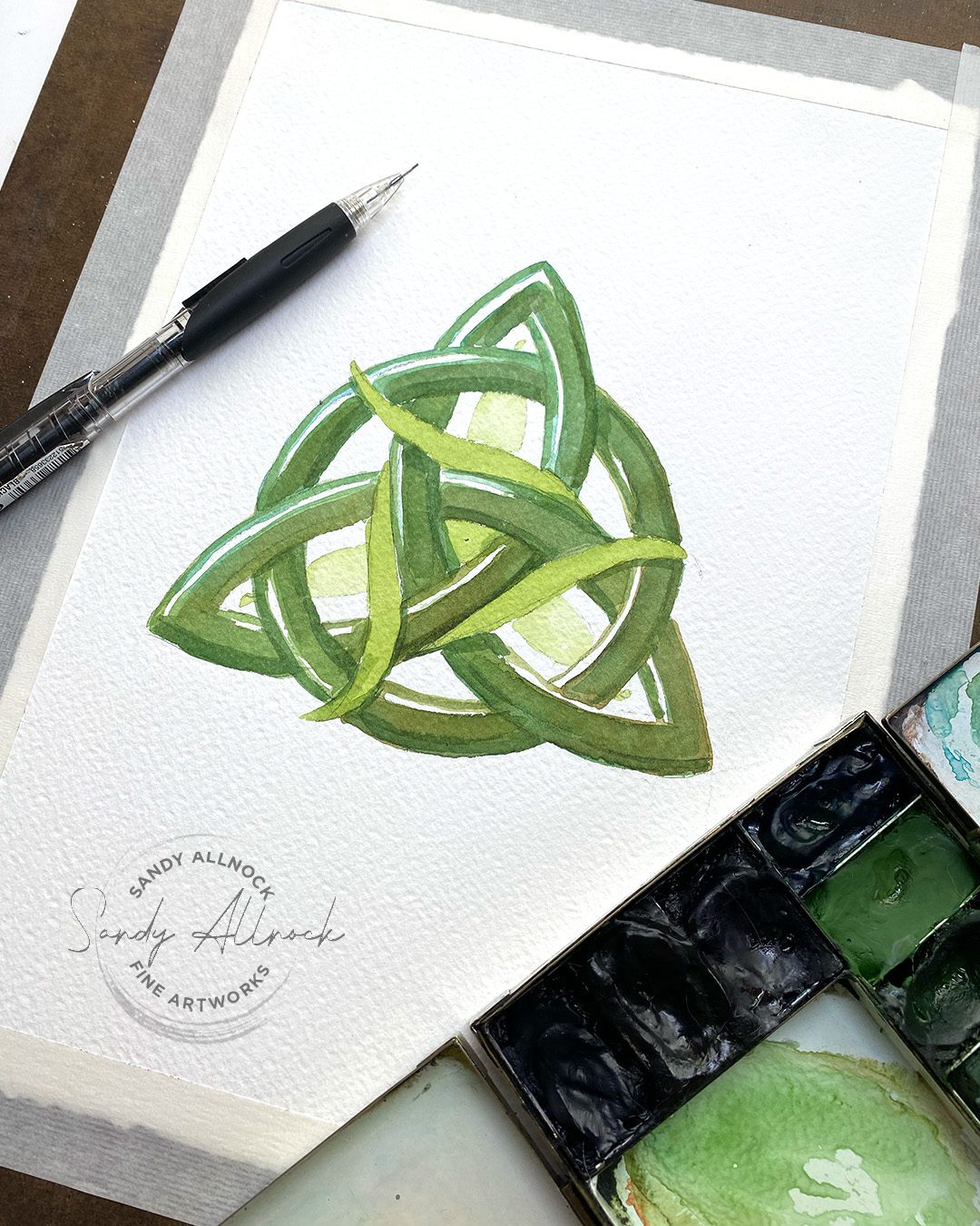
St. Patrick’s Day is around the corner – and making art for holidays can be just for fun or perfect for a card to send good wishes to an Irish friend! Today’s project is easier than you might think it is – give it a try!

What’s a Celtic Trinity Knot anyway?

Celtic knots have a variety of stories associated with them – including Christian!

The three points of the knot are symbols like the divine trinity of Father, Son and Holy Spirit;  love, friendship, and strength; and so many more you’ll find listed all over the web. The interweaving lines, without beginning or end, symbolize eternity.

Tutorial: Celtic Trinity Knot

Watch the video below and scroll to the end to leave comments or questions — or click HERE to watch it on YouTube and leave comments over there. I read both dutifully!

How easy is this?

I know some of you may think this looks hard. But I made it easy! There’s a PDF you can get for free HERE – and it has the basic math *SIMPLE MATH* and instructions.

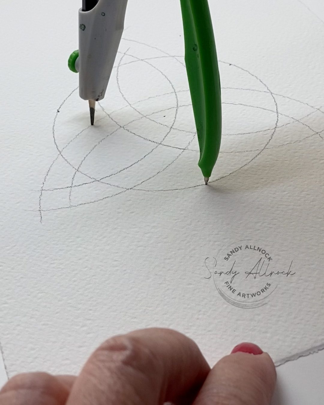
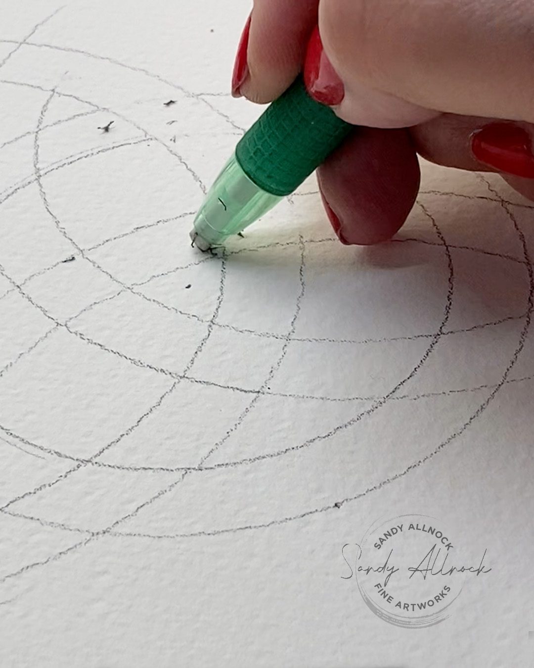
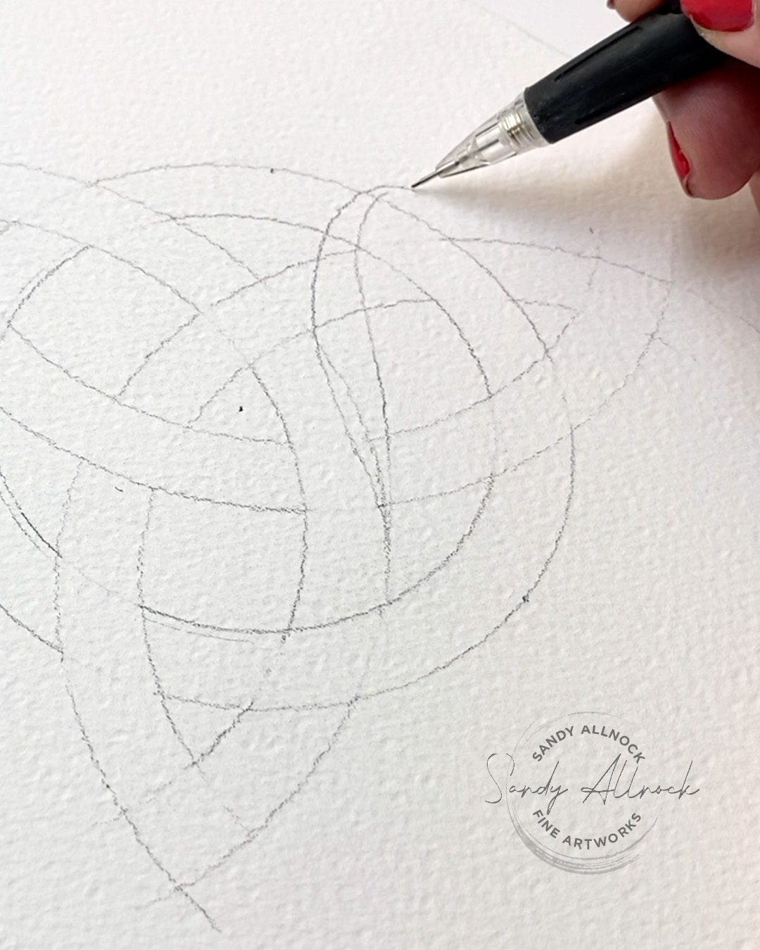
First is making the “trefoil” – the three interwoven “leaves” of the design. If you can measure a SQUARE, then you can locate the three points on the outside of the circle and the center of it. Then let the compass do its work!

Interweave the lines

Make them look like they weave in and out by erasing either the vertical or horizontal lines from each section.  Just remember that each trefoil has a “left” and “right” side – once I kept that in my head it was something I could follow. (Don’t do all three leaves at once; focus on one so you don’t get lost.)

Subscribe to my weekly newsletter, Creativity In Your Inbox

* indicates required

Embellish – or not!

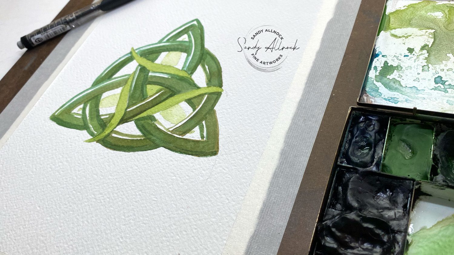
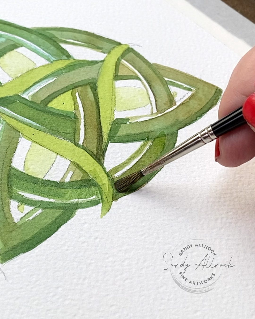
Knots can be very basic, or extremely fancy! Google the knot and you’ll see many examples for inspiration. I decided on one simple leaf repeated three times. Placing your repeating object in a way that it starts/ends in a location you can easily find is helpful. Tracing paper can help too – trace that thing three times and lay it over the page to arrange them and see where you want to start/end.

Add color!

Not all Celtic Trinity Knots are green, but many are – I did see some lovely purple ones, rainbow ones – so basically you can do whatever you like! Mine’s in watercolor, with glazes of watercolor that helped me shift the color as I went.

Give it a try!

The free PDF is available to help you out! I’ll be posting a few more of these this week on social, so keep your eyes open for those in different mediums!

New Zooms Scheduled!

Head over to Artventure to RSVP in the Events tab.

EduZoom Color-along

The pot of gold image will be provided for those who sign up, so get yourself registered. Free!

Birthday Open Studio

Last year I had to work at my party, but this year we’ll just do a normal open studio. Bring your own birthday snack! Also free.

Supplies

Some product may be provided by manufacturers for review and use. Compensated affiliate links are here at no cost to you. I appreciate your support of my work with your purchases! Full affiliate and product disclosure | My trusted partners in art

Subscribe to receive blog posts by email: