Pairing hatching and crosshatching (Pen and ink technique series #2)

Pairing hatching and crosshatching (Pen and ink technique series #2)

How do you pair hatching with crosshatching? Is there a method to the madness? What direction should you go? How many crisscrosses can you use? Oh the questions! In this post I’ll talk about four differences you can achieve by using one technique or the other:


  1. Value
  2. Texture
  3. Pen Angle
  4. Line density

A few weeks ago I shared #1 in this Pen and Ink Technique series – that one was all about hatching. The kind without a crosshatch applied. (See When and How To Use Hatching)

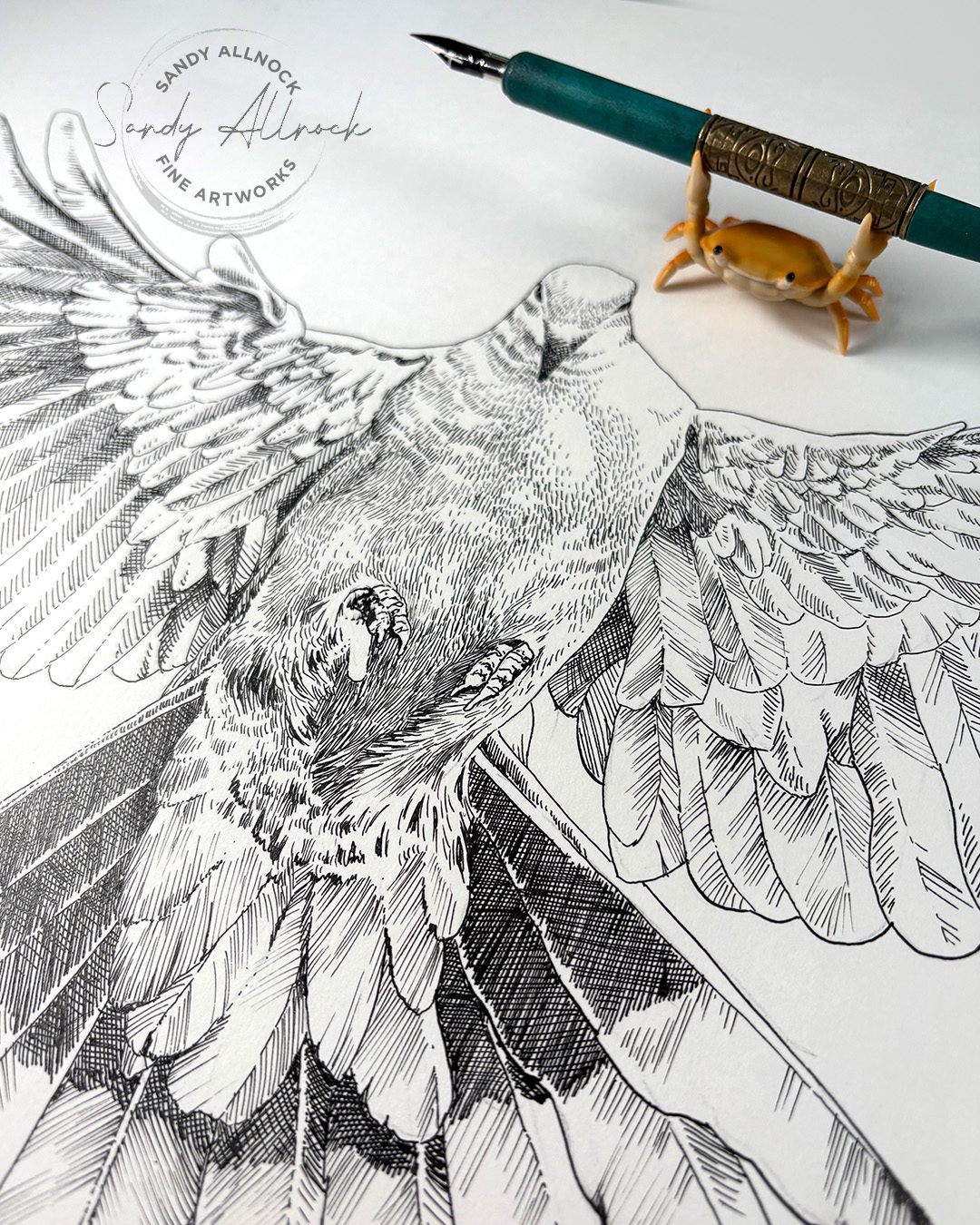
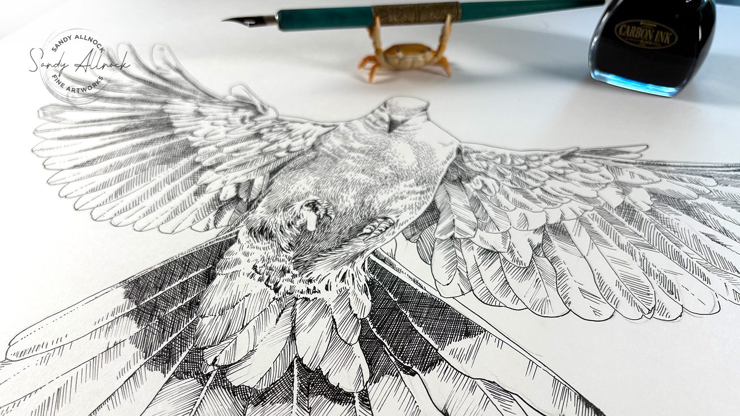
Sometimes subject matter will dictate that. Or the texture of objects in the drawing. Or, ….well how you’re feeling that day. In the first in the series, I drew a bird using just hatching (plus outlines) – so I figured I’d do another flying friend and use both hatching and crosshatching together. Since it’s Easter weekend, I picked a bird with a spiritual association, a dove.
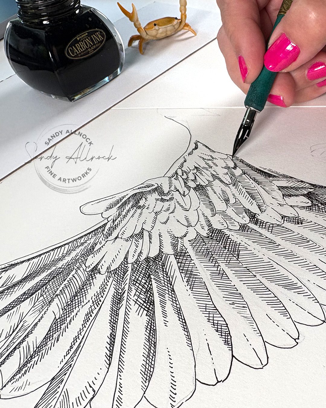
 

Difference in value

Above you can see some areas with just one set of lines, others with two sets – and when there’s one set, it’s a lighter “value” – the scale of black to greys to white. Squint at the drawing and you can see some of that difference.

Tutorial: Pairing hatching and crosshatching 

Watch the video below and scroll to the end to leave comments or questions — or click HERE to watch it on YouTube and leave comments over there. I read both dutifully!

SUPPLIES

Some product may be provided by manufacturers for review and use. Compensated affiliate links are here at no cost to you. I appreciate your support of my work with your purchases! Full affiliate and product disclosure | My trusted partners in art

Difference in texture

The wings have very distinct lines for the rachis (down the center of a feather) and the barb (pointing away from the rachis). Those can create almost graphical shapes as the feathers overlap and create darker shadowed shapes.

The body, though, has smaller, softer feathers, sleekly outlining the body. (Anyone else glad WE don’t have those?) 

So the difference between them can be handled with hatching for the soft feathered body, and crosshatching to create the darker, larger feathers of the wings.
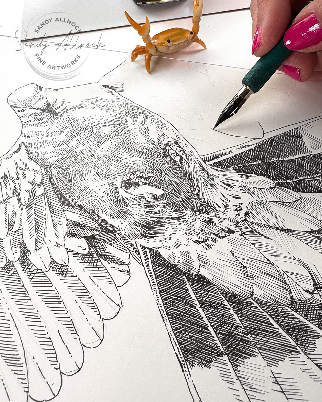
Difference in pen angle

Many pen nibs – dip pens as well as fountain pens – can be used with the tip facing the normal direction or flipped upside down. Some will make the same width of line no matter the angle, but some will make a thinner line upside down. The NikkoG nib performs slightly different each way, so I can use that line weight to my advantage.
Subscribe to receive blog posts by email:

Difference in line density

If lines are close together, you’ll get a darker value – but spread them out and get the appearance of a lighter grey. And if you need to fade it out to white, then slowly increase the distance between lines and watch the fade happen.
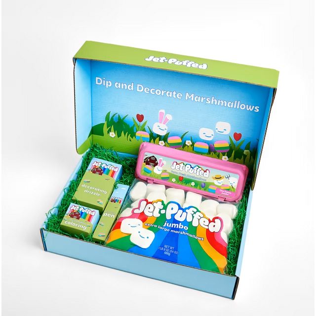
In utter silliness…Jet-Puffed jumped the shark?

I saw a news piece about people decorating marshmallows instead of expensive eggs this year…yikes! You can get this kit at Walmart though if the kids or grandkids need to do some art…
A tale of three watercolor brushes (latest art faves!)

A tale of three watercolor brushes (latest art faves!)

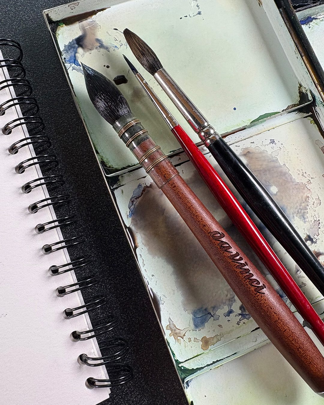
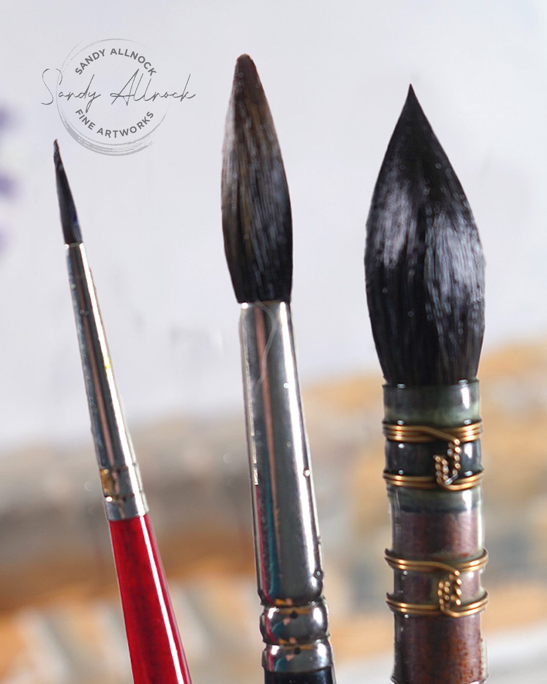
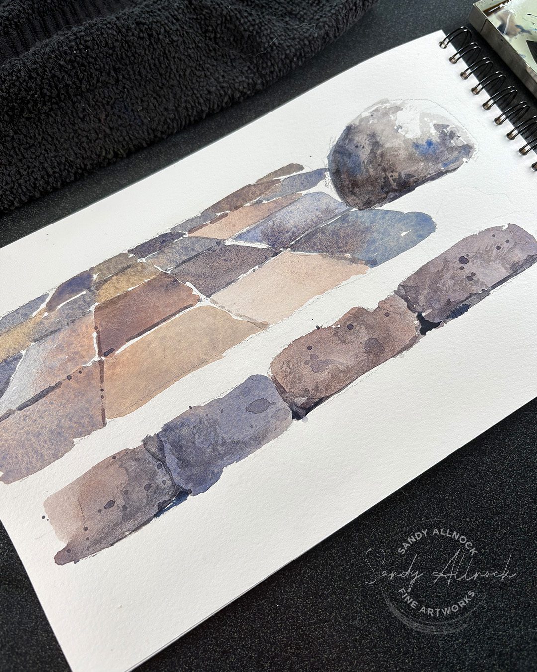
This is a tale of three brushes for watercolor – my current favorites, and how I use them. I may have dozens of brushes — but these keep bubbling up the most, so I thought I’d use them for a short demo on creating a tile floor! It’s from a painting seen in my 30 Days to More Confident Sketching class.

Tutorial: A tale of three watercolor brushes  

Watch the video below and scroll to the end to leave comments or questions — or click HERE to watch it on YouTube and leave comments over there. I read both dutifully!

SUPPLIES

Some product may be provided by manufacturers for review and use. Compensated affiliate links are here at no cost to you. I appreciate your support of my work with your purchases! Full affiliate and product disclosure | My trusted partners in art

PAPER

  1. Arches Watercolor Travel Sketchbook BLICK  AMZ

BRUSHES

  1. DaVinci Silverpoint Quill Brush
  2. Winsor & Newton Kolinsky Sable Series 7 Round #8: BLICK AMZ  JACKSONS
  3. Da Vinci Cosmotop Spin Brush Round 2 BLICK  AMZ JACKSONS

DANIEL SMITH WATERCOLORS

  1.  Transparent Red Oxide BLICK  AMZ  JACKSONS
  2. French Ultramarine BLICK  AMZ  JACKSONS 

The brushes – and what they’re used for

Every brush has its sweet spot, and I do end up skipping around to different brushes than these….but lately I’ve found I could be quite happy with just these in the studio:

  1. DaVinci Silverpoint brush (mop or quill, natural hair) – you don’t need THIS one necessarily, the silverpoint end isn’t a necessity. But having a nice big brush that points well is a huge help in covering large areas and getting big juicy washes. I find a lot of watercolorists just struggle to use that much paint or water – but that’s what makes nice loose watercolor work!
  2. Winsor & Newton Kolinsky Round #8 – I didn’t use it in this demo for middle level details but sometimes do if the big brush is totally too big. But a soft natural hair brush is fabulous for splattering, as well as small wash areas.
  3. DaVinci Cosmotop #2 – this is a synthetic little brush with lots of snap to it – which means “drawing” lines with it is more possible than my soft natural brushes. Depending on the size of details, I’ll also use a #4 Kolinsky if I need softer edges and broader coverage, or a #4 synthetic in the Cosmotop line if snap is needed. 

Know that I’m still looking for great substitutes for my expensive favorites. Really, I keep spending money on the synthetics, but performance still isn’t where I need it to be. At NAMTA I visited a few brush booths to hear their latest pitch, and since a lot of the natural hair comes from Russia, they’re making more efforts to create better substitutes, but the samples I came home with didn’t meet my hopes. I’ve ordered some bigger ones so maybe it’s just the smaller ones that aren’t great….so I dumped a crazy amount of money on brushes that are on the way to me as maybe a last pre-tariff purchase before everything skyrockets! I’ll let ya know.

Painting rock surface

The tiles, boulder, and bricks follow nearly the same process – mixing blue and brown to create various browns and greys, and using the big brush to apply color that just barely touches another rock or tile next to it so they do some bleeding. It leads to a lovely free-flowing, fresh look to the painting style and can really set off whatever else is in your painting.

Subscribe to receive blog posts by email:

Never too late to join in!

A bunch of us are painting together through the month of April using the 30 Days class lessons – though as I said in the video some started on April 1 and aren’t caught up to today…which is just fine! It’s a do-it-at-your-own pace class, and you can start any time of year. 

Fresh watercolor discoveries — just this month

Fresh watercolor discoveries — just this month

If you’re someone who thinks professional artists don’t have their own struggles or “aha” moments – you’d be wrong! All artists go through the same thing. Sometimes it’s learning a new subject, technique, tool, or color – just like you. We’ve all got areas to grow – and we all need some fresh watercolor discoveries to keep us energized and growing.

Loosening up

Sometimes we think of getting loose as just being splashy. But I find my definition leaning more toward “less detail.” Bigger marks, simpler brushstrokes, and being much less fussy over pushing for realism. Often if we can get loose with brush work, it provides a sense of movement we’ll never get if we’re trying to “replicate reality” with all that detail. Watch the video to see some of my paintings from April – some successful, some not – and a demo of painting some daisies!

Tutorial: Fresh watercolor discoveries

Watch the video below and scroll to the end to leave comments or questions — or click HERE to watch it on YouTube and leave comments over there. I read both dutifully!

SUPPLIES

Some product may be provided by manufacturers for review and use. Compensated affiliate links are here at no cost to you. I appreciate your support of my work with your purchases! Full affiliate and product disclosure | My trusted partners in art

PAPER

  1. Arches Watercolor Travel Sketchbook BLICK  AMZ

BRUSHES

  1. DaVinci Silverpoint Quill Brush
  2. Winsor & Newton Kolinsky Sable Series 7 Round #8 BLICK  AMZ   JACKSONS
  3. Da Vinci Maestro Kolinsky Sable Round 4 BLICK AMZ  JACKSONS
  4. Da Vinci Cosmotop Spin Brush Round 2 BLICK AMZ  JACKSONS 

DANIEL SMITH WATERCOLORS

  1. Hansa Yellow Light BLICK  AMZ  JACKSONS
  2. Ultramarine Turquoise BLICK  AMZ  JACKSONS
  3. New Gamboge BLICK  AMZ  JACKSONS
  4. Sap Green BLICK  AMZ  JACKSONS 
  5. Paynes Blue Gray BLICK  AMZ  JACKSONS 
  6. French Ultramarine BLICK  AMZ  JACKSONS 

Practice!

I know I struggle with little flowers – not itty bitty ones but small ones. So I’ve been sketching little patches of daisies like this on the backs of old paintings destined for the circular file! I start with lightest color first using a nice big brush to keep loose, then switch to smaller brushes and thicker pigment in each layer. I’ve got to hold myself back from treating the smallest brush like a pencil – that #2 is only for the finest wispy grasses and tiny leaves, not for outlining anything.

Play with color

Each time I’ve painted these little daisies, I’ve tried a different color mix – what a great way to practice a technique and study your own paints too. I’ve tried different colors for the shadows too, and I like the French Ultramarine best.

Subscribe to receive blog posts by email:

Work larger

Trying to paint tiny is sometimes the biggest problem in trying to loosen up. I’ve done so for a variety of reasons:

  1. “to save paper” – to paint more things without ‘wasting’ it
  2. “I’m not worth more paper” – until I get better I shouldn’t use it up
  3. “I can’t do big brush marks” – because mine looked blobby

As for #1, it’s just paper. They keep making more. Use both sides, sure, but the more you paint, the better you’ll get, and you can always trim out sections you DO like and make a card from them, so don’t stress over the parts that didn’t work out.

Oh #2, we all have thought this – we bought cheapo paper “until we get better” but we’ll never get better using cruddy paper! It’s worth it to get the good stuff, believe me.

And #3 will never happen til you start practicing those big brushstrokes. No one’s good at it out of the womb, except maybe Joseph Z. Big beautiful brushes help you get loose by giving you plenty of water and paint to spread around; tiny brushes won’t cover much real estate.

These are just two of the bigger paintings with the daisies – you can see the rest of my April paintings here.


Never too late to join in!

A bunch of us are painting together through the month of April using the 30 Days class lessons – though as I said in the video some started on April 1 and aren’t caught up to today…which is just fine! It’s a do-it-at-your-own pace class, and you can start any time of year. 

Next video…

I’ll be sharing the technique for the brick floor, maybe some rocks – it’s another very loose one. See you Tuesday!

Create EASY sea creature bookmarks

Create EASY sea creature bookmarks

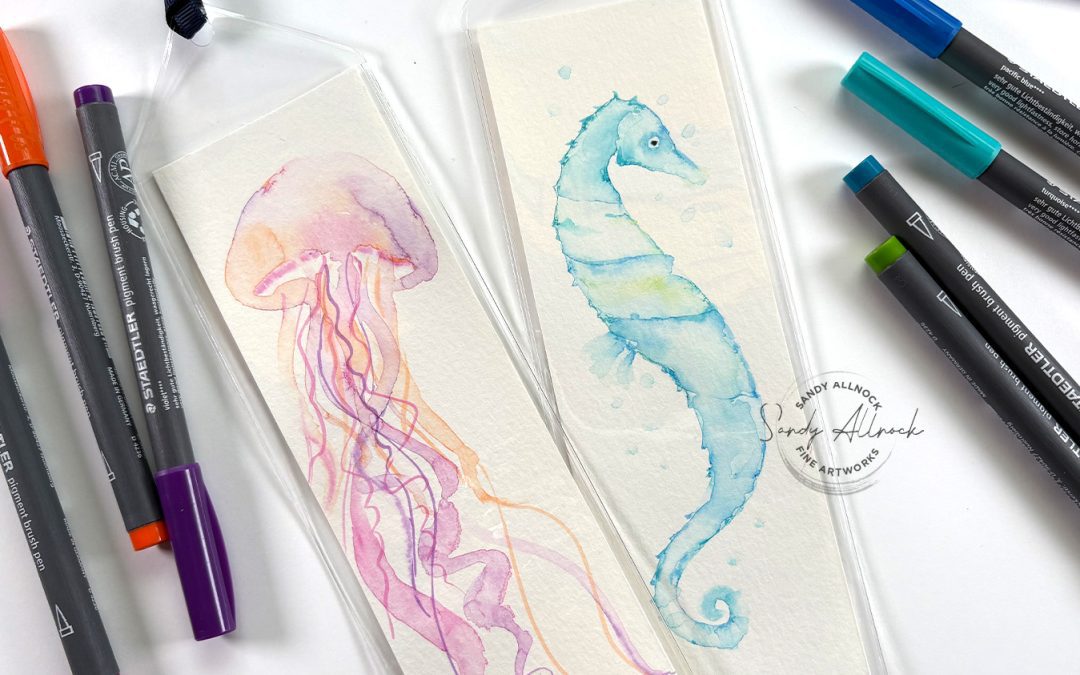
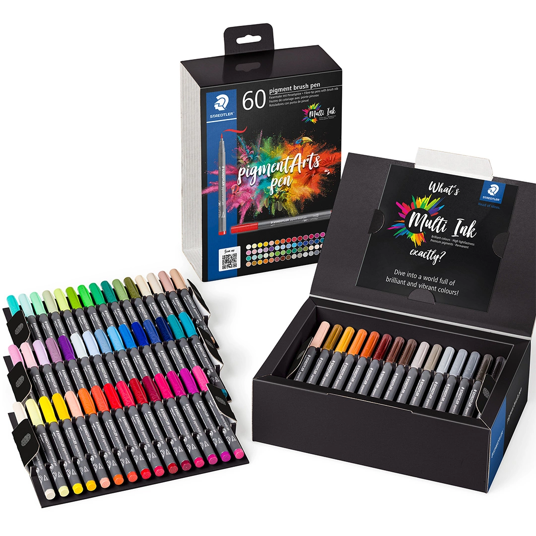
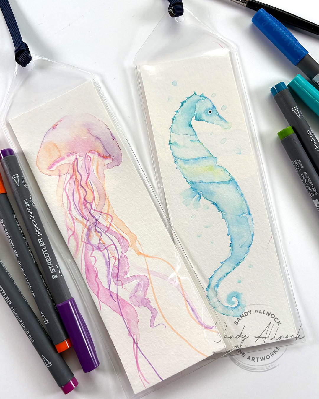
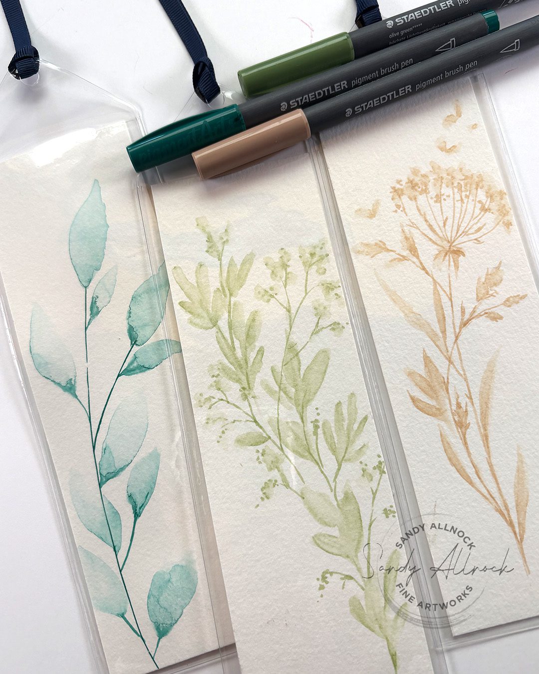
I’m back with another watercolor pen project! Most pens can create this way, but not all will do it in the same way….some brands are more pigmented or less, etc. But more than that, these Staedtler piment brush pens have some properties that can make layering especially easy, because this brand dries permanent. So it won’t pull up and rewet layers underneath and create messes. 

At NAMTA in Seattle this past weekend, I was demonstrating with these pens, and wanted to show you just one of the projects there. (If I met you, leave a comment and say hey!)

Tutorial: Create EASY sea creatures in markers

Watch the video below and scroll to the end to leave comments or questions — or click HERE to watch it on YouTube and leave comments over there. I read both dutifully!

SUPPLIES

Some product may be provided by manufacturers for review and use. Compensated affiliate links are here at no cost to you. I appreciate your support of my work with your purchases! Full affiliate and product disclosure | My trusted partners in art

Markers

  1. Staedtler Mars Pigment Arts Pen BLICK AMZ

Paper

  1. Canson XL watercolor pad 9×12 BLICK  AMZ  JACKSONS

Bookmarks

  1. Bookmark sleeves

Sea creatures: Jellyfish and Seahorse

The easier of the two, in my mind, is the jelly fish:

  1. Create the bell of the jellyfish with an arc at the bottom – paint it with water, drop in color by touching a marker to the water.
  2. Make long irregular squiggly tentacles that vary in thickness, and apply color.
  3. Make more. Note that criscrossing them will make them bleed, so dry it once you’re out of space.
  4. Layer over a few more – keeping them coming from the center of the bell.
  5. Draw in some stringy style tentacles.

A little more difficult is the seahorse:

  1. Create an S curve in clean water, thick in the center and pointed at the outside points. Drop in color.
  2. Paint a triangle that thins out at the point for a nose, add color.
  3. Join the two with water.
  4. Create the tail with a spiral to it.
  5. Dry, and layer over more color/texture/segments as desired.
  6. Add bubbles by painting drops and touching color to them.

Other subjects

Try your hand at other subjects too! Plants are really fun, especially with these Pigment Brush Pens – you can draw the stems and add leaves coming off them without the stems melting away.

Other ideas:

  1. Flowers
  2. Butterflies
  3. Trees
  4. Long skirts
  5. Abstract art

Subscribe to receive blog posts by email:

Multicolor leaves

This is the other video mentioned with multiple colored leaves….

Store owners

Feel free to use these ideas as a demo make and take with your customers! Just do me a favor and give me credit, let folks know where they can get more art help 🙂 

Deferred art supply maintenance: GAHHHHHHH

Deferred art supply maintenance: GAHHHHHHH

In the past week I finally finished getting everything shot, voiced, written, and uploaded – WHEEE! – for the new Colored Pencil Hex Art class. Sometimes *I* learn lessons myself that aren’t related to the class…and this one did just that.


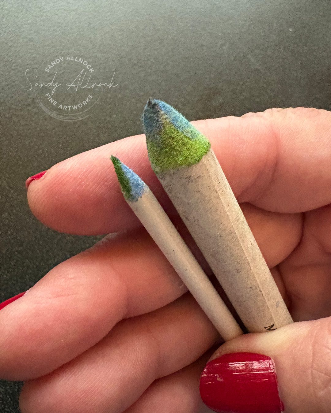
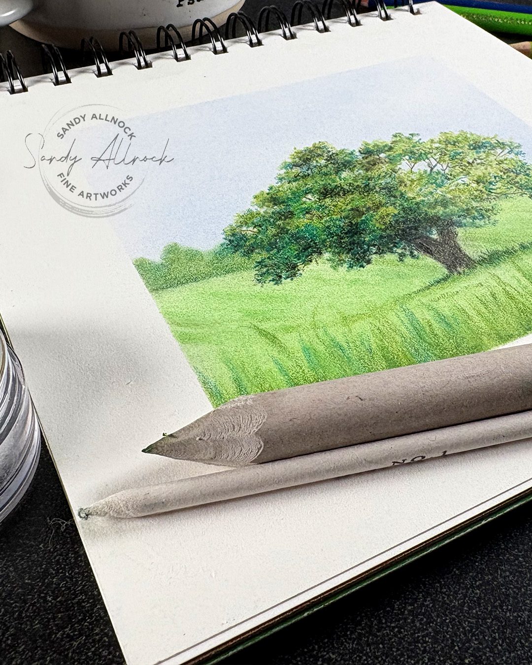
I was muddling along with the few blending stumps (also called stomps!) that were clean. I have DOZENS but they were all in bad need of repair, so I thought, “Hey, I can defer that, no biggie!”

But when the grey rocks in one of the lessons went green because I thought the mess on the end was all grey and not green….well, that was my sign.

(No it wasn’t this one but I forgot to get a pic of it, so this fuzzy little bugger will stand in its place!)


Tutorial: Deferred art supply maintenance: GAHHHHHHH

Watch the video below and scroll to the end to leave comments or questions — or click HERE to watch it on YouTube and leave comments over there. I read both dutifully!

SUPPLIES

Some product may be provided by manufacturers for review and use. Compensated affiliate links are here at no cost to you. I appreciate your support of my work with your purchases! Full affiliate and product disclosure | My trusted partners in art

Pencils & sharpener

  1. Faber Castell Polychromos Colored Pencils BLICK   AMZ   JACKSONS 
  2. Afmat Long Point Pencil Sharpener USB rechargeable

Paper

  1. Legion Stonehenge 7×7 pad BLICK  AMZ   JACKSONS 

Blending stumps and tools

  1. Richeson Blending Stumps BLICK   AMZ   JACKSONS
  2. Xacto Sur Grip Utility Knife
  3. Gamblin Gamsol Blending solution BLICK  AMZ
  4. Jars for solvents

    The point…and the paper rubble

    If you’re doing more small drawing with the stump/stomp then you’ll want the tip sharper. If you use it more for blending wide areas using the side, then sand it down and make it soft like in the first photo in this post.

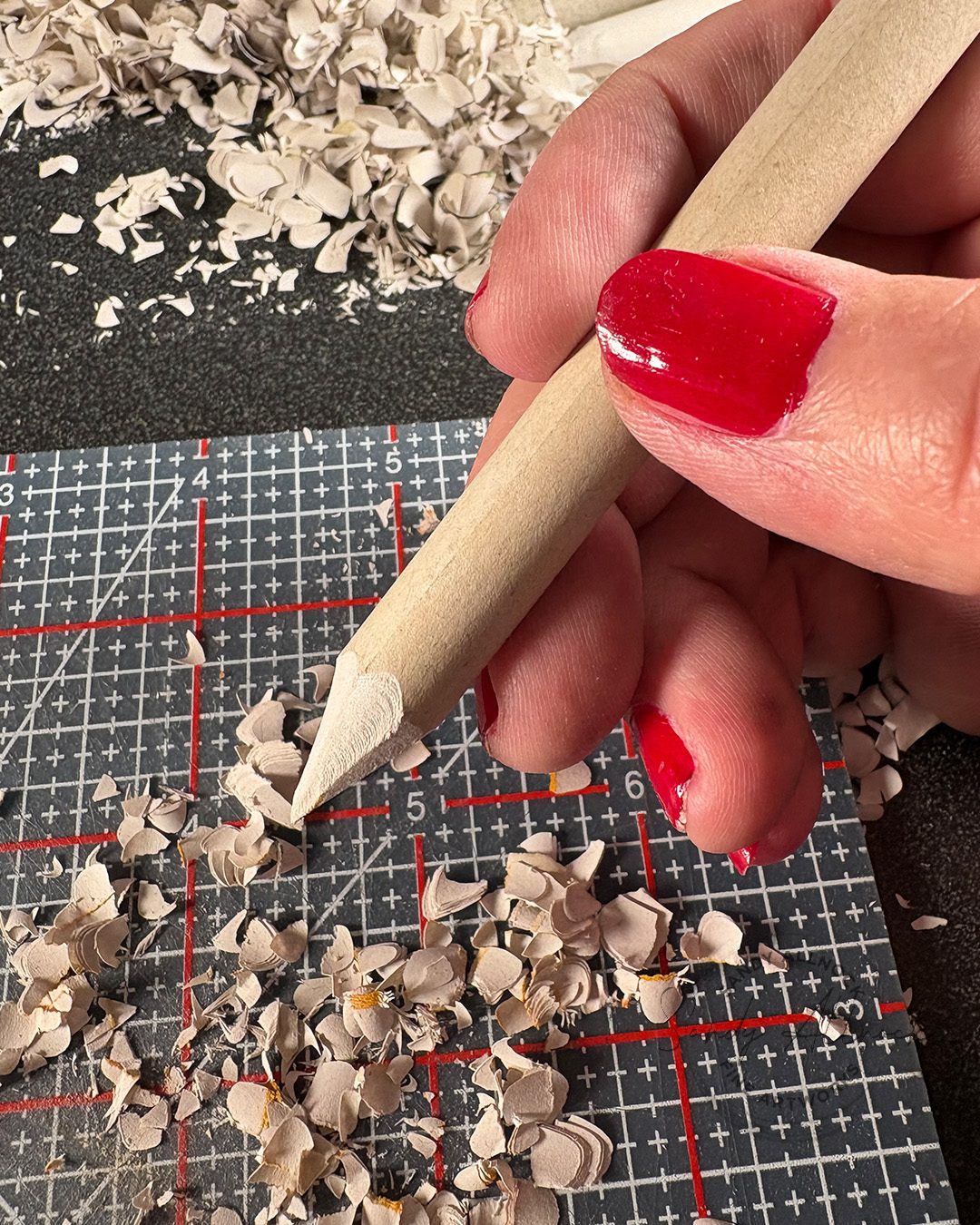
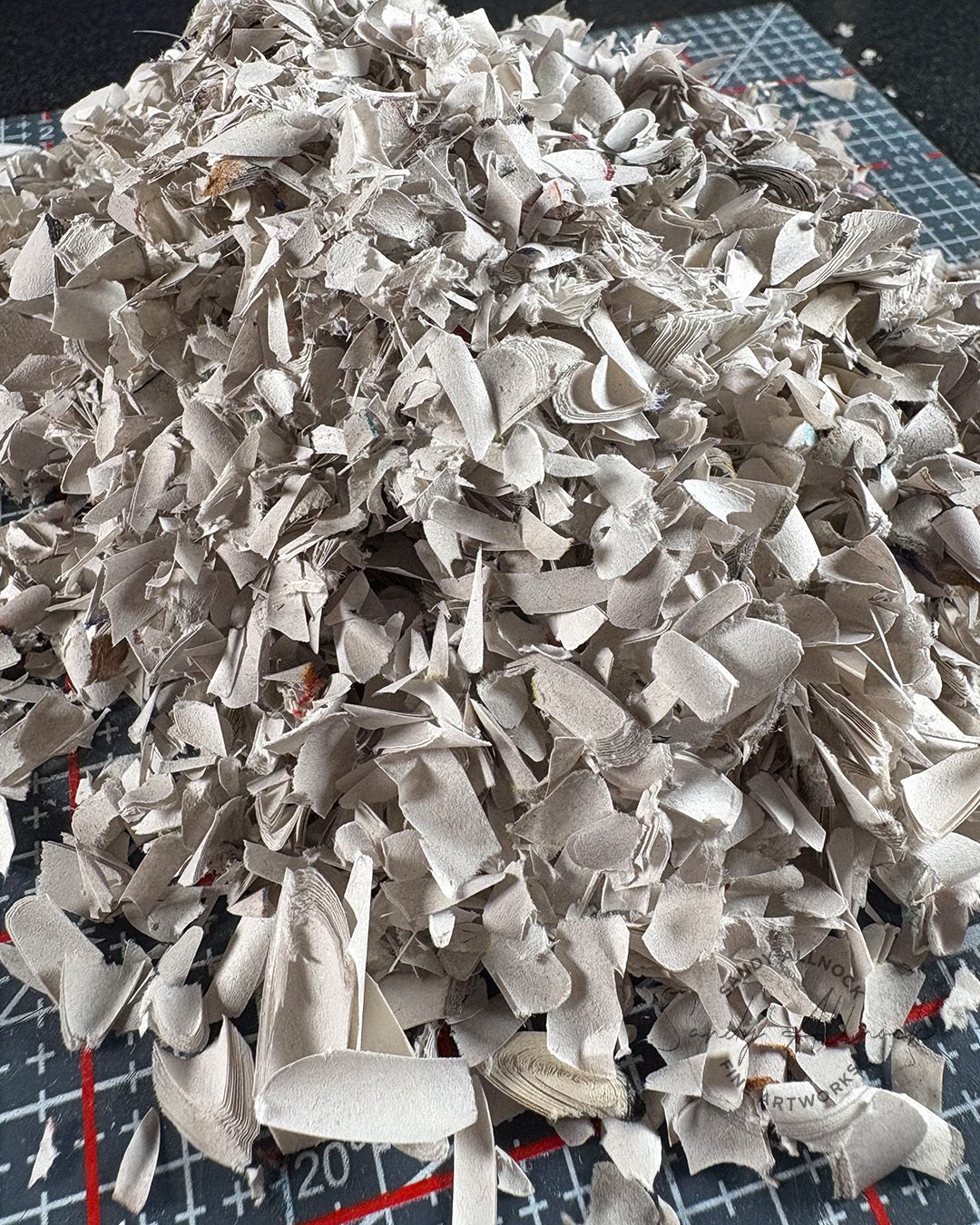
    But be prepared for rubble galore if you wait and do a ton of them at the same time!

    Usually I have my detail scissors at hand and cut the tip to the shape I need right at that moment, but in this case I used the knife for everything, then if I need them softer for a project, I can file the size I need at that time.

    Half and half

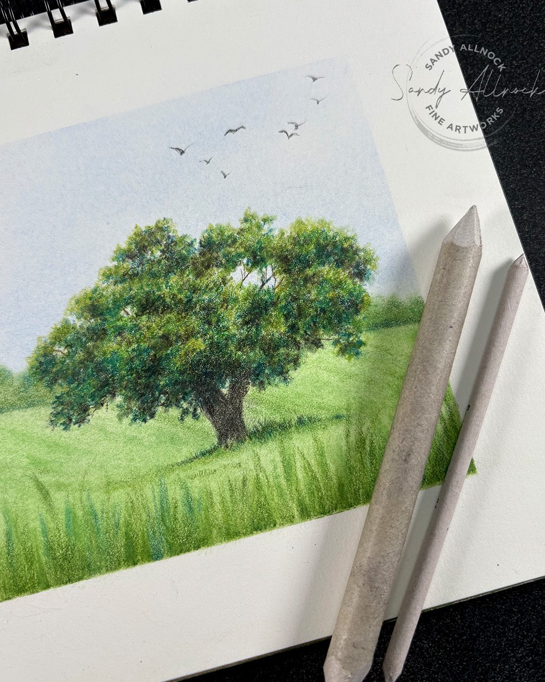
    The tree is half blended with gamsol, half isn’t done yet. So you can see what a nice job it’ll do! The background – grasses, distant trees, and sky – is all blended with various dry blending techniques including cotton balls and qtips as well as a stomp.

    Subscribe to receive blog posts by email:

    Variety in your colored pencil drawing

    Having a lot of techniques at your fingertips can really help you to include great variety in whatever art you make with pencils – and I gathered a ton of them together in the new class. This tree is one of them, it’s approximately in the middle of the hex art page; with all of those drawings they were very small, and many times I found myself thinking, “I want to draw this photo reference again, larger so I can get into the details!”

    As I do so, I’ll add them to the lessons in class. Not as video, but to show students what it can look like when created in a larger setting.


    Colored Pencil Hex Art Class

    Dive in and learn how to use different pencil techniques to advance your art skills! You’ll learn 42 techniques, taught in a systematic way so the ideas build upon each other. The finished product is a beautiful piece of Hex Art suitable for framing and displaying in the studio!