Perspective in Nature: Roads and Paths part 2

Perspective in Nature: Roads and Paths part 2

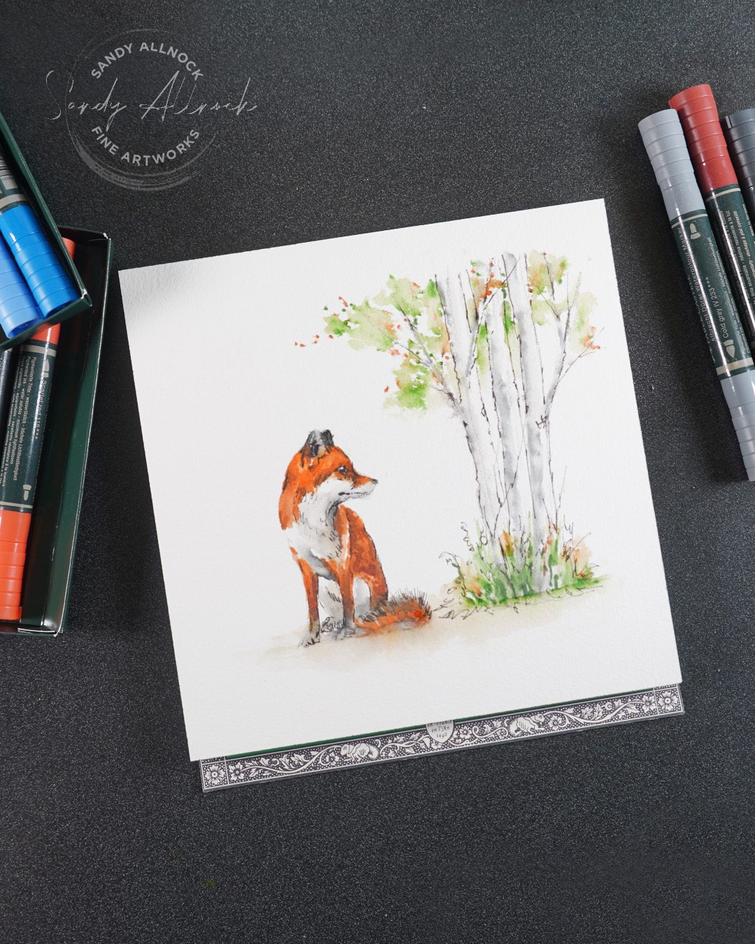
Today I bring you part 2! In the previous helpful discussion I showed photos of various paths in landscapes, and why some can be challenging when we don’t get the perspective right. In today’s project I’ll show you via a little fox how you can plan a scene when you don’t have any reference photo!
Tutorial: Perspective in Nature: Roads and Paths part 2

Watch the video below and scroll to the end to leave comments or questions — or click HERE to watch it on YouTube and leave comments over there. I read both dutifully!

Foreground elements & perspective

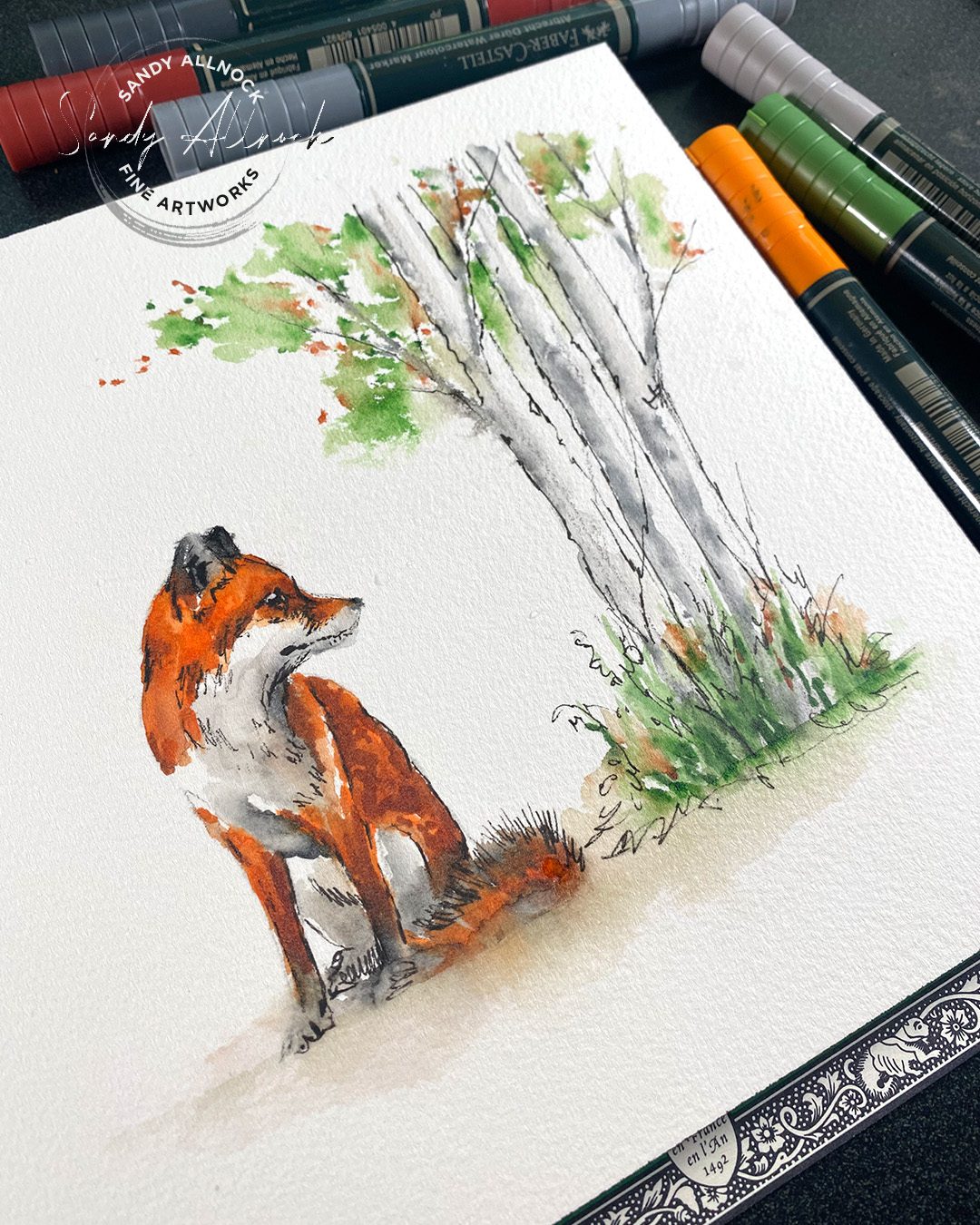
Whether a drawing of a fox like this one, or a stamped image – if the subject is seen at ground level, then the perspective will be low to the ground. The horizon will most often be within the subject itself – that way the subject’s head is above the horizon line.

That means if you do put a road high up in the scene with the horizon line high, it will look like a big hillside swooping upward, or else will just feel wrong. While you might think about having taken a picture of your dog and the horizon is high up – remember you’re usually looking down at your dog – and that changes the perspective.
An easy tool to develop ideas

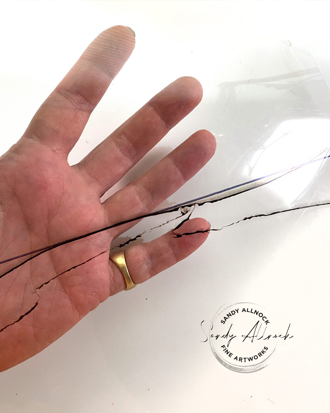
If not using a reference, sketching an idea first can be a big help! Grab a piece of acetate (it can even be old packaging or a page protector) and dedicate it to being your horizon-finder. With a permanent sharpie draw a horizon on one side. Then use a water-soluble pen or marker to sketch possible scenes. 

Place it over your initial drawing and see if a high horizon is what you need – or if you need to fight what you “know” and use a low perspective like this fox cried out for.
Subscribe to receive blog posts by email:

The Background Scene

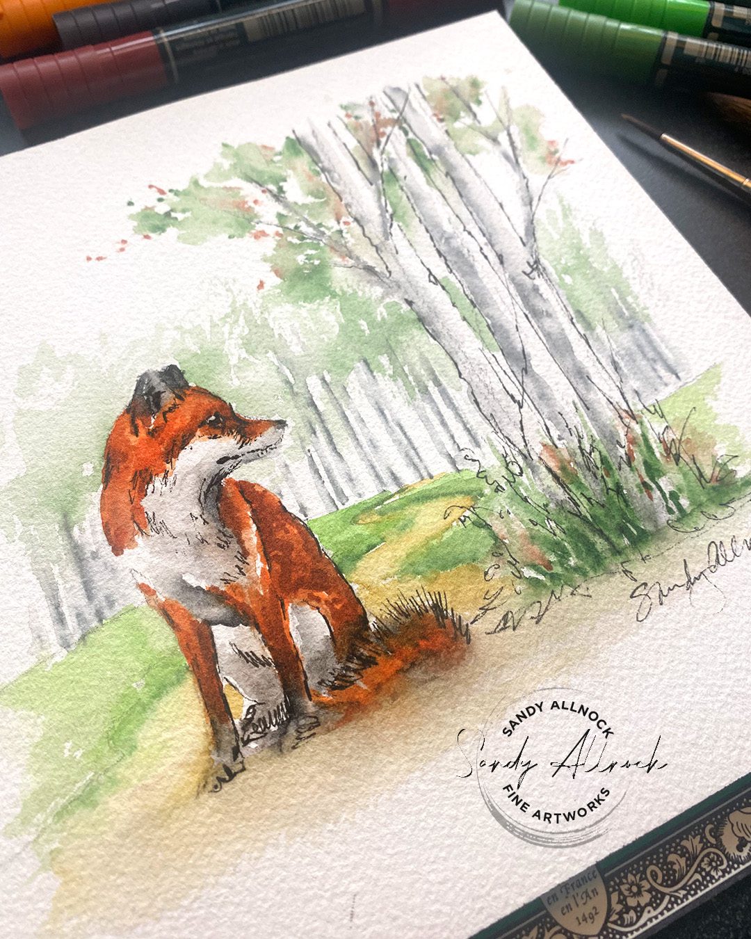
Once you make a decision about where the focus of the scene will be on your acetate, then it’s time to sketch it onto the piece itself. 

In this image I was thinking not only of the perspective, but in keeping sccene colors light….and denser color would just be in the ground in the low section. That means the fox remains the star – and the perspective looks nice and dramatic too!
Make life easier on yourself…

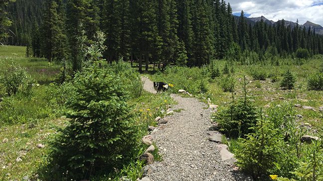
If you want perspective to be simpler, find a reference! If you’re using stamps, find a scene at the same height the stamp is shown – generally low to the ground. So scenes to pick are ones that the photographer might have been seated in a chair.

That will at least help you develop the size range between elements in the scene as well as the way a pathway appears at that angle.

Supplies

Some product may be provided by manufacturers for review and use. Compensated affiliate links are here at no cost to you. I appreciate your support of my work with your purchases! Full affiliate and product disclosure | My trusted partners in art
  1. Faber Castell Albrecht Durer Watercolor Markers BLICK – AMZ 
  2. Arches Cold Press 8×8 Block BLICK – AMZ 
  3. Da Vinci Cosmotop Spin Brush Round 4 BLICK– AMZ 
  4. Winsor Newton Kolinsky Sable Series 7 Round #8 BLICK – AMZ 
  5. Sakura Micron Pigma Pens BLICK – AMZ 

Perspective in Nature: Roads and Paths part 1

Perspective in Nature: Roads and Paths part 1

Perspective is hard. I get that! Thinking about how to make the angles right, finding the horizon line and vanishing point and knowing which objects align with which – it can be mind boggling for those who haven’t studied perspective.

But I have GOOD NEWS for you! To draw in perspective, you don’t HAVE to know about vanishing points etcetera. Especially with nature.

That does not mean you shouldn’t study perspective. (I’ve got some drawing classes on sale this month that could help if you want to.) 

But instead, you have to learn to SEE. I mean really really see. Not just think about what the object looks like that you’re drawing, which is usually where the mistakes come from. We assume we’ve seen that object for our whole lives so obviously we know whwat it looks like. 

I would daresay seeing accurately is a much harder thing to learn, but for those who really don’t want to study perspective, that’s your out!  Learning to see in addition to understanding perspective is the best option, since the latter helps you know what to look for in the former.

But let’s just start by looking at some photos and compare the original with some perspective mistakes I see quite consistently.

Tutorial: Perspective in Nature: Puffy Clouds, part 1

Watch the video below and scroll to the end to leave comments or questions — or click HERE to watch it on YouTube and leave comments over there. I read both dutifully!

In each example, tab through the sliders to see each photo.

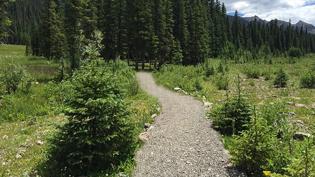
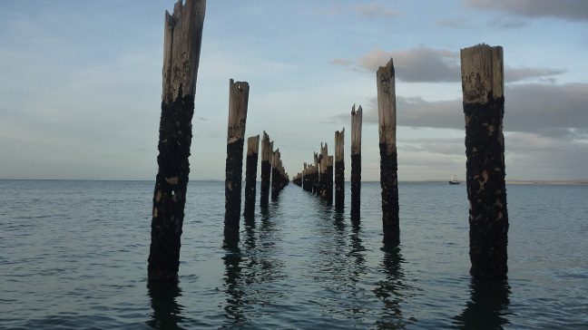
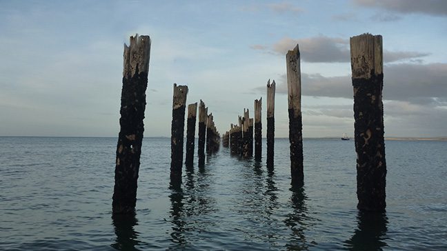
While not a path, this photo illustrates what we often think of as one point perspective even if we don’t know what it’s called. Things are bigger in front, and get successively smaller in the distance.

In the 2nd photo, the perspective is off – shortening a front piling. as well as the distant pilings being too low in the wate.r

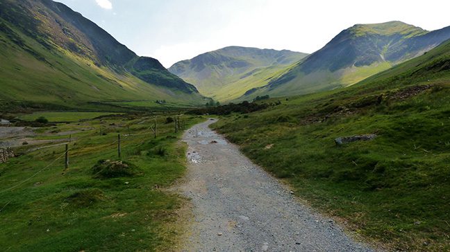
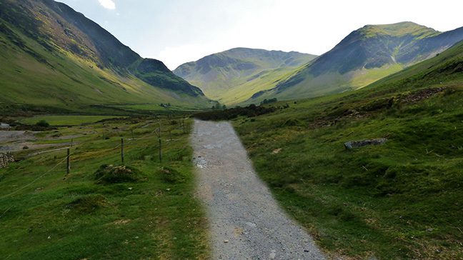
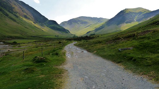
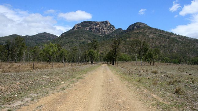
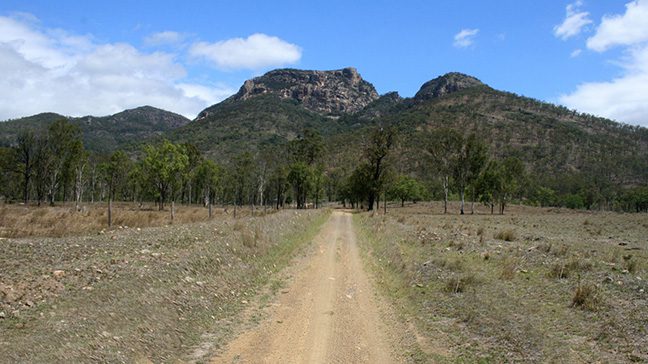
The road in this photo is wider in the foreground than in the distance. Making those two closer to each other in the 2nd photo lengthens the distance of the road. But in photo 3, making it extra wide may be more engaging as it brings the foreground closer, even if it’s less accurate.

Including some of the interesting details along a road tends to make it look more embedded into the landscape. Simplifying and changing the width of the road in photo 2 creates additional challenges, as the end of the road looks like a change in the formation of the land. A good change one could consider is placement and width of the near side of the road to take it out of center and bring it closer to the viewer.

Subscribe to receive blog posts by email:

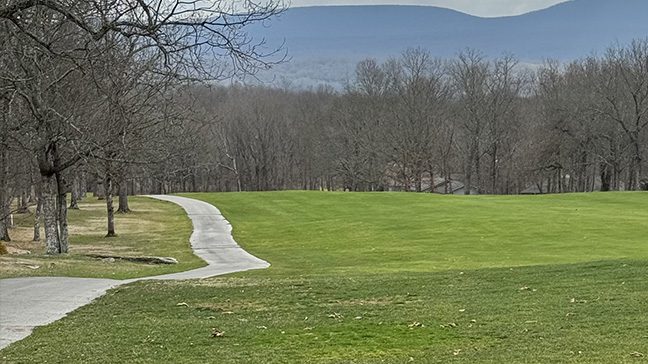
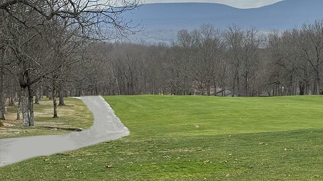
If we start sketching or painting while only thinking about a path in our head – we can really go off track! Photo 2 shows how the knowledge of reality – that it’s a paved path consistent in width – leads to a wacky looking road. But paying attention to where it gets thinner indicating hills, and the angle and shape of the point in the distance where it ends –that helps get us on the right path. Ha. I’m so punny!

Not looking at the actual angles of different parts of your drawing can lead to a scene that feels more like a funhouse in photo 2!

Try holding your pencil out in front of you, measureing how farr off of horizontal or vertical that a particular shape or edge is. Then translate that to your paper, constantly checking back with your reference.

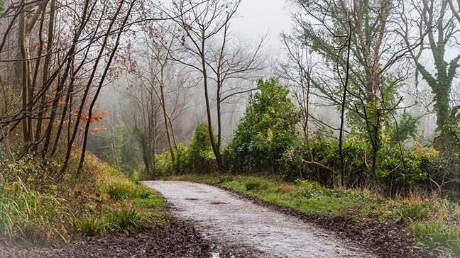
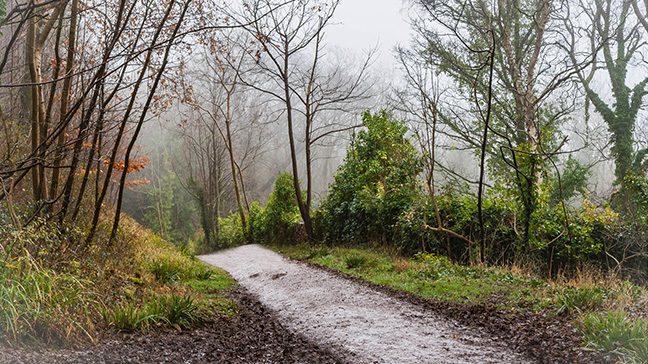
When looking at a road or path, look for objects that DISRUPT that path. Are there bushes cutting off part of it or intruding into it? Does the path disappear behind an element in the scene? Those elements can take a flat looking road or path and turn it into one that fits in with the nature elements around it.

In part 2….

I’ll be talking about those times when you don’t have a reference and are trying to make a scene up from your head. Click here to go see it!

Blending Colored Pencils & a new sharpener – Coconut Palm Tree

Blending Colored Pencils & a new sharpener – Coconut Palm Tree

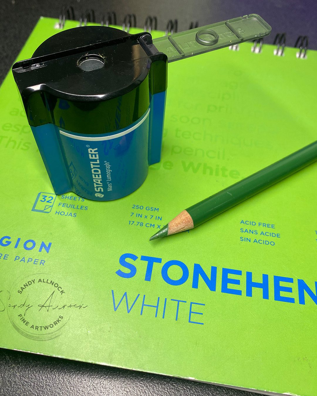
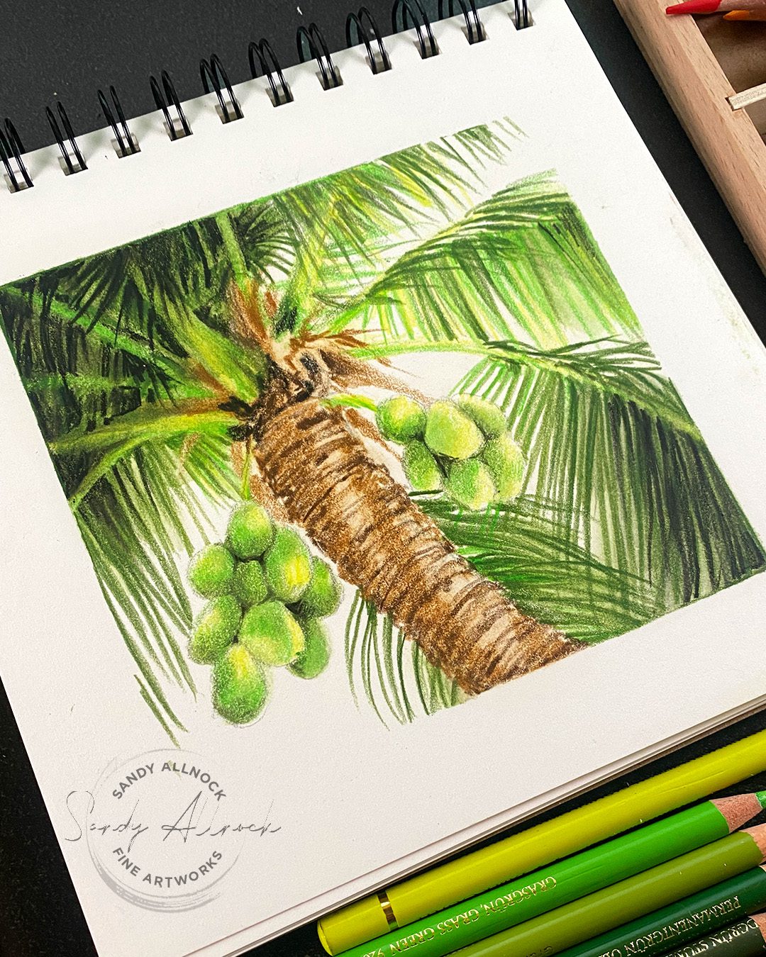
New pencil sharpener in the house! This one-hole sharpener from Staedtler arrived and I had just been bemoaning that my other handhelds were losing their edge; it’s very normal for handhalds to do that, but fortunately they aren’t expensive to replace. This one’s quite nice! And if you like a 2-hole sharpener there’s a two-hole version as well.


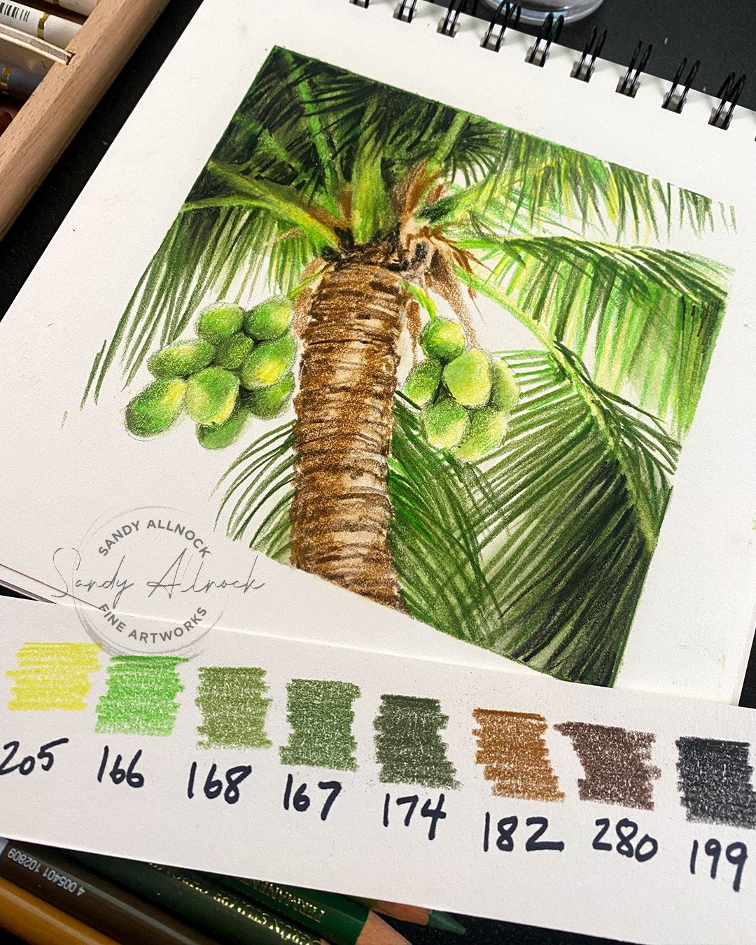
After a month of almost-only painting in watercolor, I was tickled to get out the sharpener and give it a try, and I’m quite pleased! I got out my Stonehenge pad and decided to look through something summery to draw – my pics from Puerto Rico are the last ones I’ve taken. I can hardly believe that 2017 was my last real vacation! 🙁 

Tutorial: Blending Colored Pencil & new sharpener – Coconut Palm Tree

Watch the video below and scroll to the end to leave comments or questions — or click HERE to watch it on YouTube and leave comments over there. I read both dutifully!

Blending tools

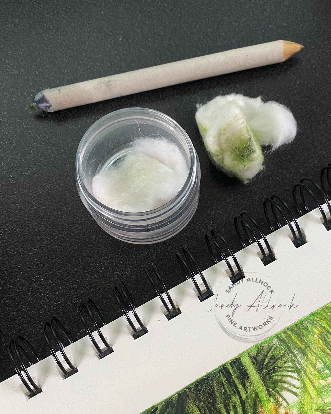
I used a few methods of wet or liquid blending; a stump to apply the blending solution, as well as a cotton ball. Sometimes I use the wet blending early in the process, sometimes as a finishing touch; when drawing on TOP of the solvent area, it really makes the pencil pop nicely on that primed surface.

Here I used the Winsor and Newton SansOdor which is technically not without odor. But it’s nice and works the same as gamsol from all I can tell. I put someon a cotton ball in a covered jar — that keeps me from spilling on my art.

Colored pencils

This is completed with Faber Castell Polychromos pencils – love their vibrance, and the greens work nicely together when you balance out warms and cools. I just wish my local store would get a cream pencil in stock – I keep forgetting when I place a Blick order, since it’s just one pencil! But I might have to resort to that, since my store isn’t playing nice with restocking…ha.

Subscribe to receive blog posts by email:

Coconut Palm Tree tidbit

In case you’re just reading and not watching the video: I figured out something WEIRD when looking at my Puerto Rico photos: the palm trees on the island have a curve to the tree trunks as if they’re reaching out to sea. Which is a little odd in the first place since most trees lean away from the wind. But the weirder part is they ALL lean outward from the island toward the sea. What’s up with that?? They don’t care about where the wind is?

A little googling told me that coconut palm trees try to get as close to the sea as they can, because they propagate by dropping coconuts into the water, which then travel to other islands to plant themselves and grow. How cool is that?

So next time you see a palm tree leaning – give it a round of applause for its dedication to progeny! 

Supplies

Some product may be provided by manufacturers for review and use. Compensated affiliate links are here at no cost to you. I appreciate your support of my work with your purchases! Full affiliate and product disclosure | My trusted partners in art
The whitest watercolor paper? And 5 paintings!

The whitest watercolor paper? And 5 paintings!

What’s the whitest of the quality watercolor papers? Lots of folks want to use the brightest white at all times; there’s good reason for that sometimes, but at others – maybe not. 

As I’ve been working on some painting ideas for a project that is coming up (I can’t wait to tell you!), I thought sharing the four papers I use most would help me get my ideas on paper, and help YOU see which papers might be best for you!


While the Saunders Waterford high white is clearly the brightest – let me show you some things about these papers in context with full paintings. You might know that I don’t judge anything without using it for a full art piece, since swatching or just looking doesn’t tell me all I need to know….so let’s look at 5 paintings on these four papers and see what we can learn.

Tutorial: The whitest watercolor paper – And 5 paintings!

Watch the video below and scroll to the end to leave comments or questions — or click HERE to watch it on YouTube and leave comments over there. I read both dutifully!

Saunders Waterford High White

This is the whitest paper that I use, and I pull it out when I have objects that are really white-white, or if there are pale colors I want to keep bright. In this case, the yellows in the sky, the color of the sand and the foreground wave, as well as the blues and greens were helped to be brighter. 

Saunders Waterford White

The standard white is the darkest of the four papers, but that doesn’t mean “don’t use it!” I often pull it out when I want to have a softer, more vintage watercolor feel to a piece, or if there are rich darks that I don’t want to be super saturated. In this painting the sun and its reflection feel creamier, and the whites of the waves still feel like cool whites because of the colors surrounding them. The sky, however, didn’t do well; this brand of paper isn’t as friendly to scrubbing, lifting, masking, etcetera. If only I were cleaner with my washes this might be my favorite because I love its lower price!

I did rework the sky in this piece – you can see that finished painting here where all 5 paintingas are available.


Saunders Waterford White

This is the same paper – and the whites of the bubbly areas still looks very white – so any paper can appear more white simply by the colors nearest to the whites.

Subscribe to receive blog posts by email:

Arches Natural White

Both the Arches are very close to each other, but I tend to use the natural white more often than the Bright White. This color lets my paintings have a softer feel to them.

Arches Bright White

The brighter white was selected for this painting because the crisp bottles were going to look great against a whiter paper. 

End of World Watercolor Month

A few tidbits:

  1. These five paintings are for sale on my fine art site – as well as some other new ones folks have been asking about! I’ve decided nothing will be uploaded for prints until the original sells, as prints sometimes devalue the original painting.
  2. The sale is still on over at Art-Classes – go to this page to get the coupon code and see the offerings! Let’s finish strong in our fundraising for kids and art!
  3. Tomorrow is the last free Zoom call – we’ll be working on glass and metal, so I hope you’ll join in. Go to Artventure and become a member (free) then look in the Events tab to rsvp.

Supplies

Some product may be provided by manufacturers for review and use. Compensated affiliate links are here at no cost to you. I appreciate your support of my work with your purchases! Full affiliate and product disclosure | My trusted partners in art
Arches Cold Press Natural White sheets: Blick \ Jacksons 

Arches Cold Press Bright White sheets: Blick \ Jacksons 

Arches Rough Natural White sheets: Blick \ Jacksons 

Arches Rough Bright White sheets: Blick \ Jacksons

Saunders Waterford White Cold Press Sheets Blick \ Jacksons 

Saunders Waterford High White Cold Press Sheets Blick \ Jacksons 

Saunders Waterford White Rough Sheets Blick \ Jacksons

Saunders Waterford High White Rough Sheets Blick \ Jacksons

Saunders Waterford High White Cold Press Block Blick \ Jacksons

Underwater Gouache + 60-pg sketchbook flipthrough

Underwater Gouache + 60-pg sketchbook flipthrough

A bit over a week ago I was on Instagram live for the first time in ages – and almost 200 people came to visit! It was so much fun to finally “see” some folks there; it’s been so dead lately. 


I was finishing up this jellyfish painting, and asked what undersea creature should I paint for YouTube. A few were mentioned but one fish that I love to paint caught my attention….an angler fish!


Tutorial: Gouache underwater painting  

Watch the video below and scroll to the end to leave comments or questions — or click HERE to watch it on YouTube and leave comments over there. I read both dutifully!

Angler Fish

This guy was fun to “invent”! I looked through enough photos that I familiarized myself with the favorite parts of different kinds of these fish, and made up my own – including colors – and played with the lighting and values. Note that you might be seeing this WAY bigger if you’re on a laptop than it is in real life so you can see the mess that it is – yet stepping back, it looks pretty awesome. Next time you go to an art gallery, get close up to a painting and see how areas that appear blended from a distance often are not — it’s just a matter of the size of the strokes and the progression of their values and colors.

Birds of Harmony Hill

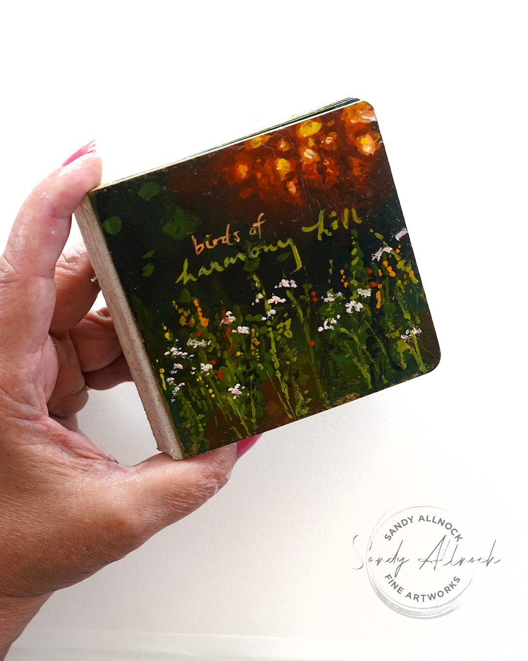
60 bird paintings paintings in a little sketchbook, all in gouache! Last year I started the epic adventure, shared some paintings on the daily sketches site so some of you saw them as I began….but the last 3/4 of the book hasn’t been seen til the flipthrough in the video! My sister LOVED it.

Subscribe to receive blog posts by email:

New gouache class

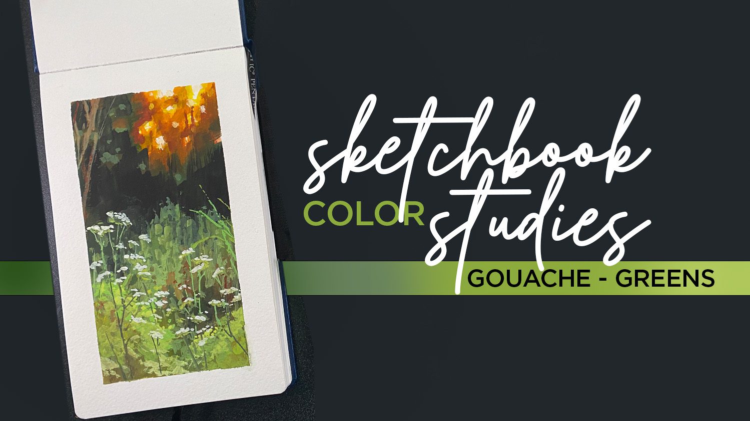
In this intermediate course you’ll work through three lovely nature scenes – and you have permission to be tidy if you like, or messy like me! We’ll talk through all kinds of layering issues, and I’ve even included some oopses and how I fixed them. See the Sketchbook Color Studies Class here.

World Watercolor Month is almost over!

If you thought about picking up a watercolor or gouache course, get on it! The coupon code on the WWCM page runs out on the 31st, so don’t miss a chance to help fundraise to help kids make art through International Child Art Foundation!

Supplies

Some product may be provided by manufacturers for review and use. Compensated affiliate links are here at no cost to you. I appreciate your support of my work with your purchases! Full affiliate and product disclosure | My trusted partners in art
  1. Daniel Smith Gouache
    1. Indanthrone Blue 
    2. Phthalo Blue Turquoise 
    3. Prussian Blue 
    4. Cadmium Orange Hue 
    5. Cadmium Yellow Light Hue 
    6. Opera Pink 
    7. Titanium White 
  2. Jack Richeson travel brush set Blick Amazon
  3. Pentalic Sketchbooks 5″ x 8″ Blick Amazon 
  4. Square sketchbook  for birds
  5. Dorlands Wax Medium 4oz • Blick • Amazon 
  6. Dorlands Wax Medium 16oz • Blick • Amazon