Learn to critique your art…gently! Assessing 30 of my own pieces

Learn to critique your art…gently! Assessing 30 of my own pieces

Followers of my blog might recall that I was painting daily through April, going through the lessons in the 30 Days to More Confident Watercolor Sketching course I created in 2022. Well, mostly April. I didn’t finish til midMay! 

I approached it with a few goals – and some of those changed as I worked through each painting:

  1. Paint larger – instead of postcards, paint 1/8th sheet size, about 7.5×11. 
  2. Discover what it’s like to paint mid-sized flowers – not small sketches, not flower-focused large works…but flower elements at a middle-ish size.
  3. Play with new brushes.
  4. Where possible practice large background washes.
  5. Add bonus content to lessons. Not video, but as much as possible, at least a few steps along the way. 

Going through all the paintings together at the end was a great exercise – and the lonnnnnng video below is the result! Pull up a  cuppa something delicious and visit with me – apologies for the length but if you figure 30 paintings – lots of them did need more than just 1 minute, so it grew long!
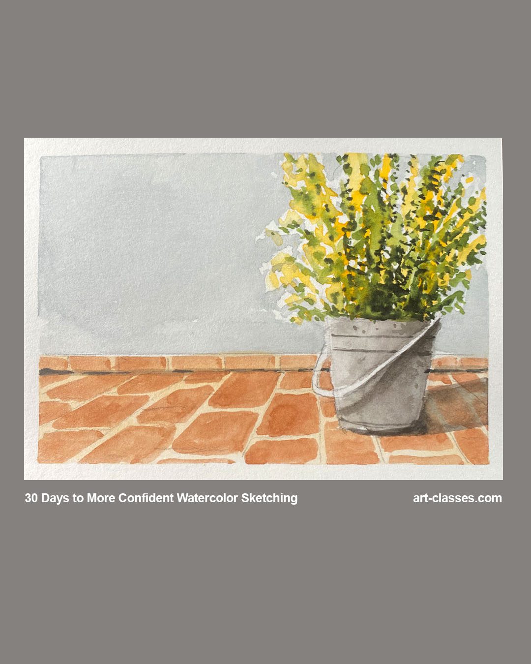
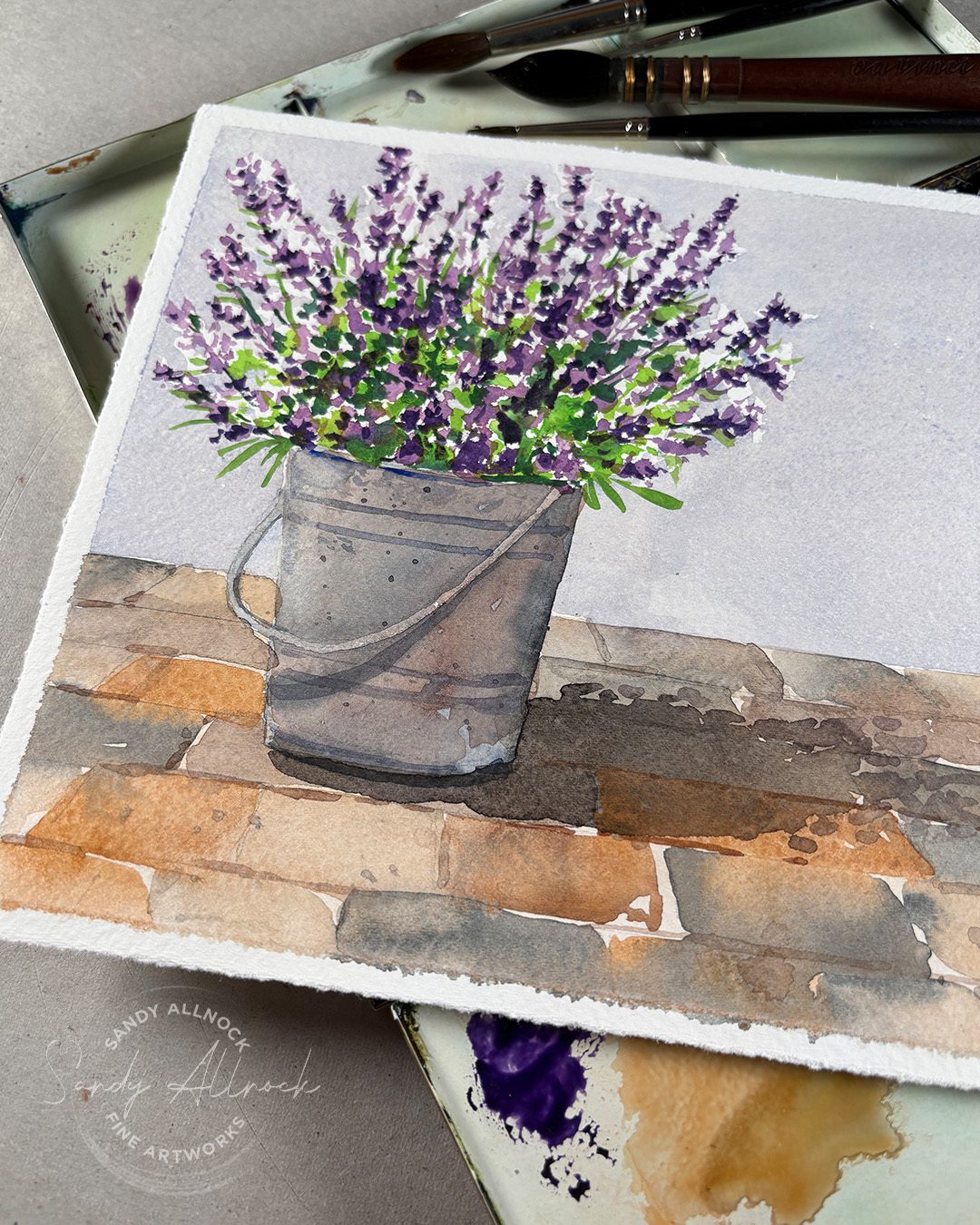
Tutorial: Learn to critique your art…gently! Assessing 30 of my own pieces

Watch the video below and scroll to the end to leave comments or questions — or click HERE to watch it on YouTube and leave comments over there. I read both dutifully!

Tips for self critiques

Artists can be our own worst critics – and learning to assess your work from an independent viewpoint is the one thing that can change that.

  1.  Step outside yourself. Look at your work as if you’ve not seen it before – as if you just walked into a gallery. What works? Where is your eye drawn to? 
  2. Be honest. That means both honest about what isn’t working well, AND what is. Some of us are overly cheerful about our work when we need to see areas to work on; and some of us are just down on all of it. In reality we’ve all got a mix, so see if you can find both successes AND areas for improvement in each work.
  3. Give distance. Don’t do a serious critique til you’ve slept on it. Not on the art of course! But create some distance from the work. Put it away for a little while, a day or three at least. Pull it out and pin it up in an area of your home or studio where you’ll “stumble” on it when walking in. That can give you some distance from what it took to create.
  4. Only compare to yourself. If you get into a habit of critiquing your work over time, this gets easier – because it becomes very clear where you were in your skills six months ago, six years ago. You’ll have a better idea of the things you’ve been working on and if you’ve made progress. Without regular critiques and goal-setting, it’ll be harder to get an accurate look back and therefore harder to track progress.
  5. Write down things to learn. As you finish a work and find an area you want to improve, don’t just say that and move on to something else. Write it down – whether in a journal, diary, or a sticky note to post nearby. See if there’s a book on the topic that’s available, or an artist you follow online who’s great at that thing. Do they have a book, a YouTube channel, or live or real-life classes? Set a goal to find a way to learn what’s on your list.

What other tips do you have? I’d love to hear your experience in the comments!


Sale!

I’ve put this category of paintings on sale, and they already started out at quite the deal…snag yourself something for your own wall, or to save for a gift for a birthday, anniversary, wedding…maybe even for Christmas (HINT: you can frame it now, and enjoy it for months til you wrap it up for Christmas, eh?)

Note these are each approximately 7.5″ x 11″ which is not a standard size mat. I’d recommend trimming the painting to 7″ x 9″ (these have a little space to trim up) and “float” it in an 8×10 mat. You could also take it to a framer if you’ve got some money to spend on it.


Want to dive into this class?

Give yourself 30 days of improvement in your painting! Paint small postcard sketches that you can send out to friends and family this summer (note: postage increases in July so keep that in mind!).

You can go through the course at your own pace, but I highly recommend as close to daily as possible. Getting into a regular habit of painting is what really makes a difference!
 

Subscribe to receive blog posts by email:

Tips

Give them more tips

Closing thoughts and question

text

How to draw complex subjects — freehand!

How to draw complex subjects — freehand!

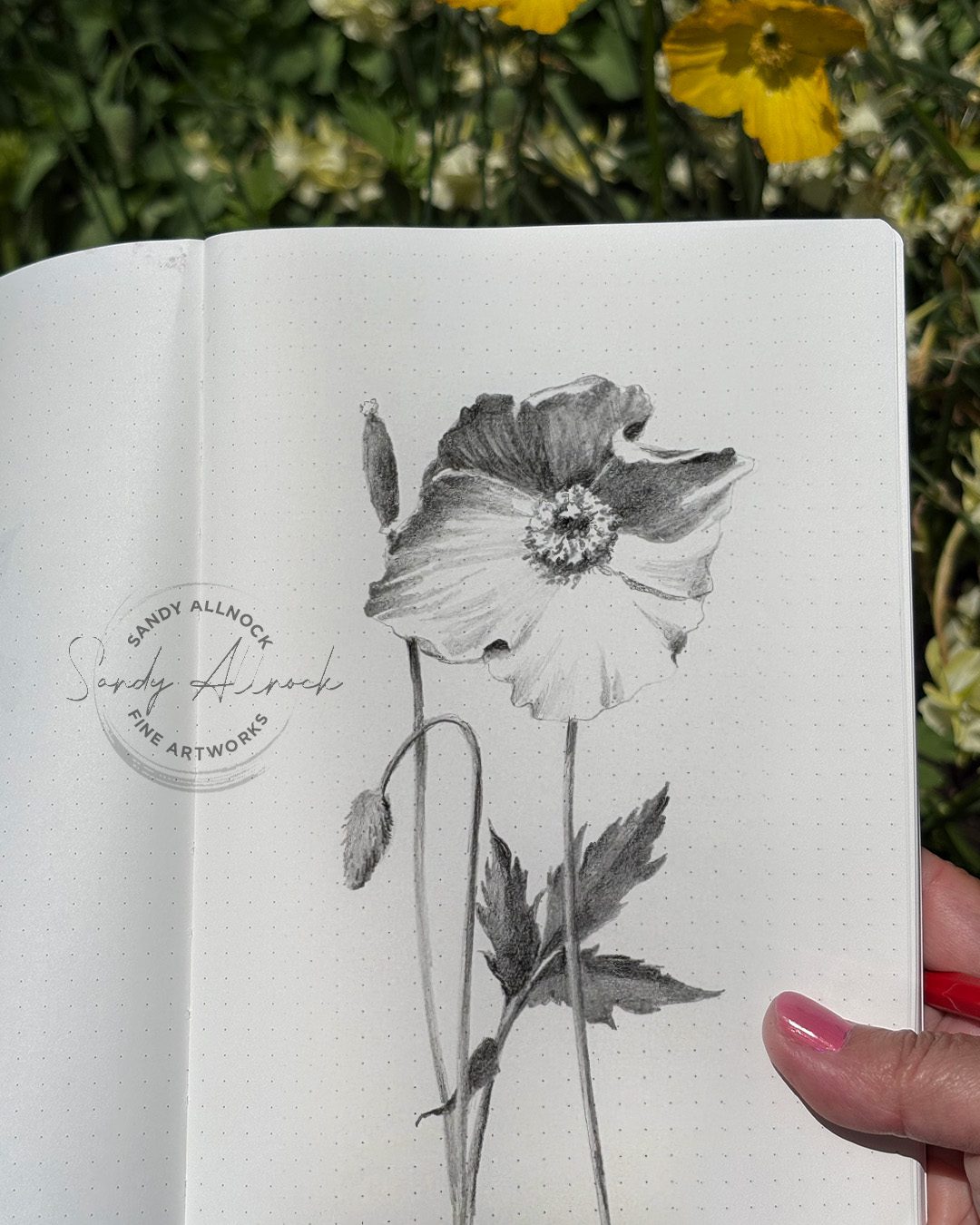
This is part two of a freehand drawing series – and this will be a much more complicated subject, using the same process! (See the first part here. Bring pencil and paper to draw along!)

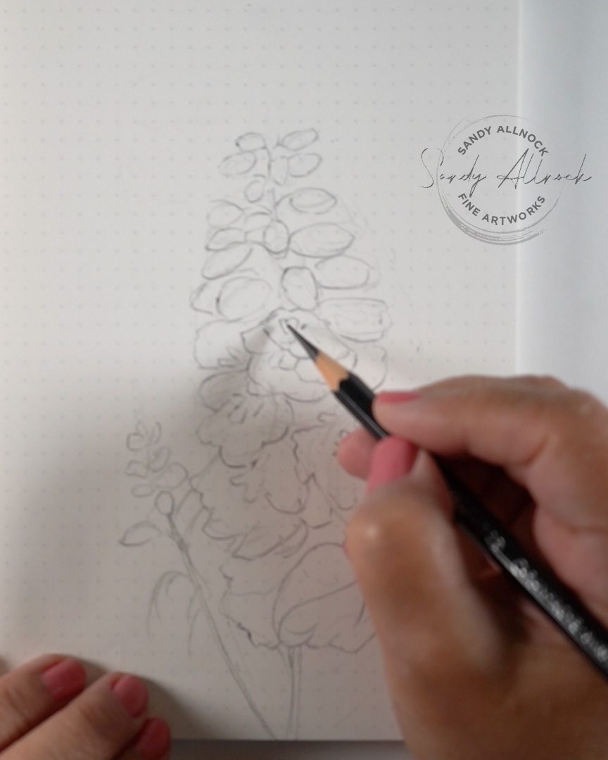
In part 1 we talked a lot about blocking in, and did more chatting on the Zoom call that followed it. So today – I chose a complex flower with a lot of blossoms, just to see how hard creating those shapes would be. And the technique worked out great!

Get out some paper and a pencil, and a kneaded eraser if you have one – and we’ll make a drawing during the video. You can draw the inital blocked in portion with me in realtime then I’ll speed it up – but give you lots of tips along the way so you can finish up your drawing!

Tutorial: How to draw complex subjects FREEHAND

Watch the video below and scroll to the end to leave comments or questions — or click HERE to watch it on YouTube and leave comments over there. I read both dutifully!

SUPPLIES

Some product may be provided by manufacturers for review and use. Compensated affiliate links are here at no cost to you. I appreciate your support of my work with your purchases! Full affiliate and product disclosure | My trusted partners in art

Paper

  1. JetPens Kanso Noto notebook (52gsm white with dot grid) 

Pencil

  1. Caran d’Ache Grafwood pencils 9B: BLICK  AMZ  JACKSONS 

Eraser

  1. Faber Castell Kneaded Eraser: BLICK  AMZ  JACKSONS 

Blocked-in sketch

Create the overall shape of the whole stem, a bit of a lava lamp shape (ha!) sketch in a couple of the biggest flowers, then once you’ve got the scale of the big ones set, it’s easier to get the smaller buds to scale. 

Don’t stress out about detail yet – this is all about getting the shapes in place!


Subscribe to receive blog posts by email:

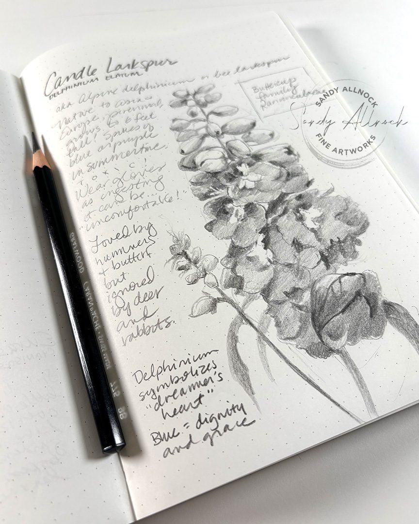
Completed sketch

Now that the shapes are in place, take another look to be sure nothing looks awry – then you can start in on creating some of the more specific shapes.

When it’s a very complicated subject, I often look for the standout elements – here the dark centers were important for setting the first of the big flowers in place.

You can jump around to draw all the darks in first, but you can also work from one end of the drawing to another–because the overall shapes and their scale are already in place from blocking in!


Other pencil nature sketches

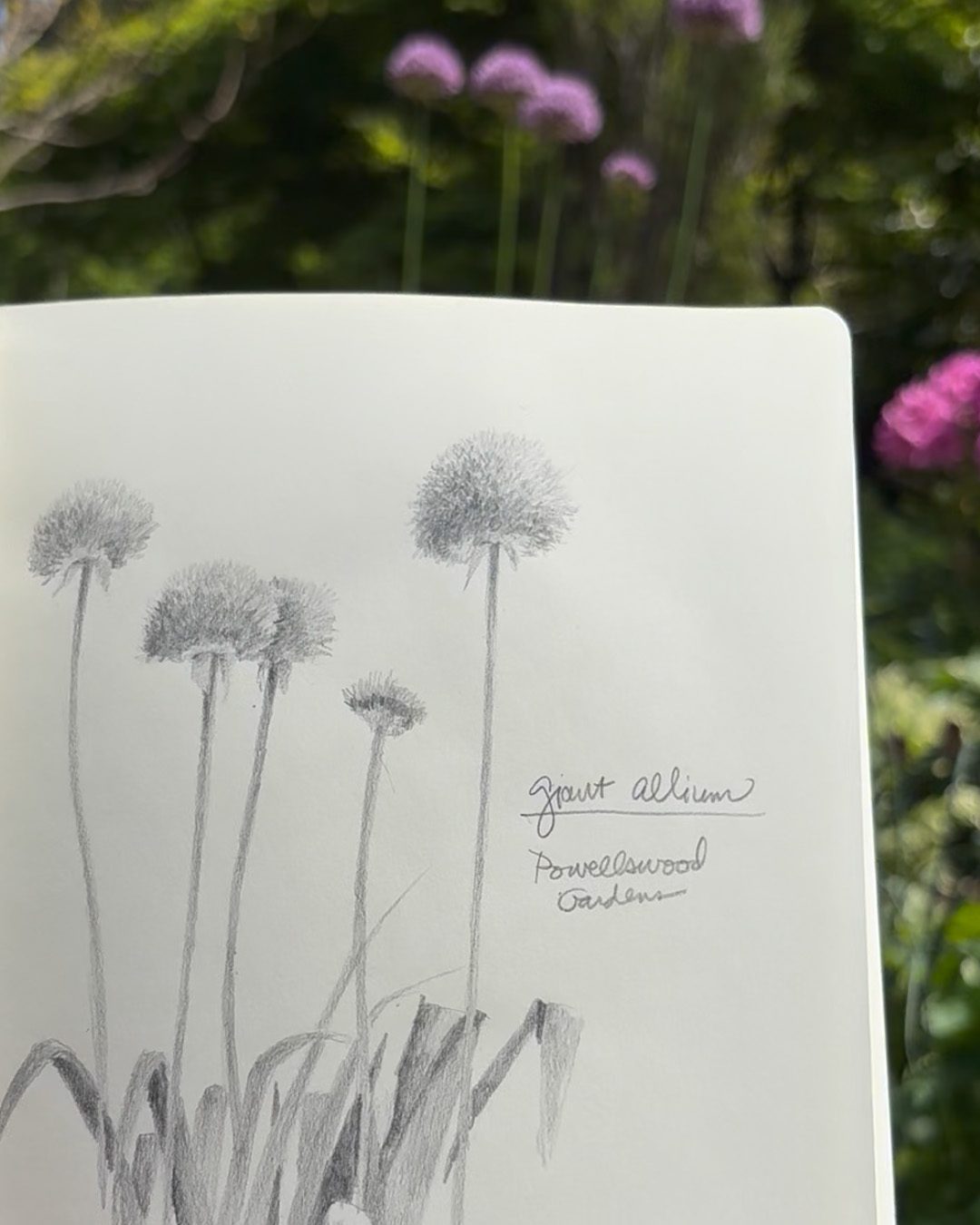
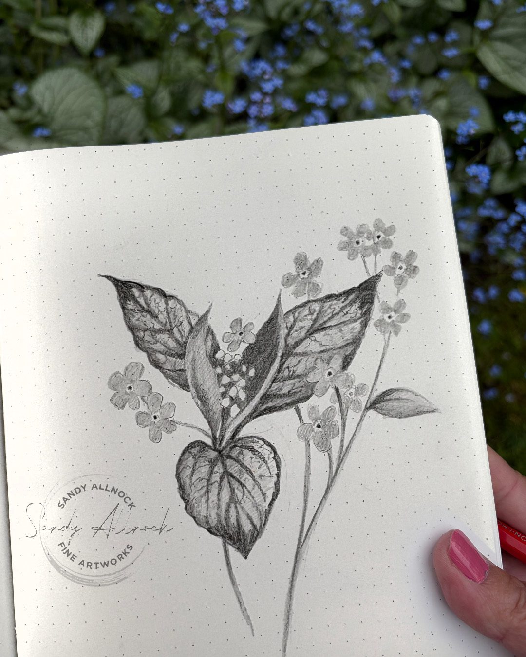
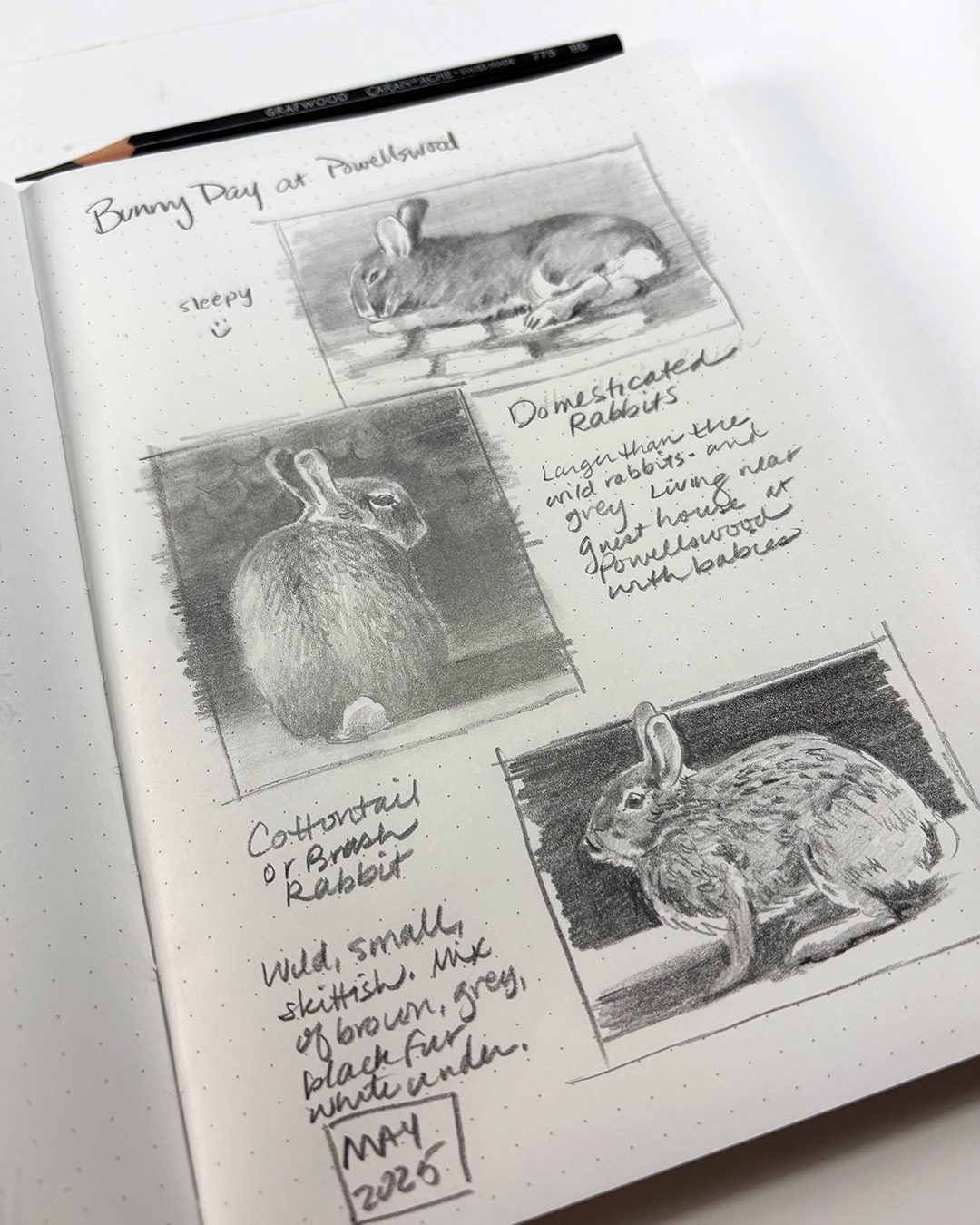
The allium in the first pic is in another book – cream paper, no dotted lines. The others are in the Kanso Noto with white paper and dotted grid.


Try THIS SECRET to learn to draw ANYTHING freehand

Try THIS SECRET to learn to draw ANYTHING freehand

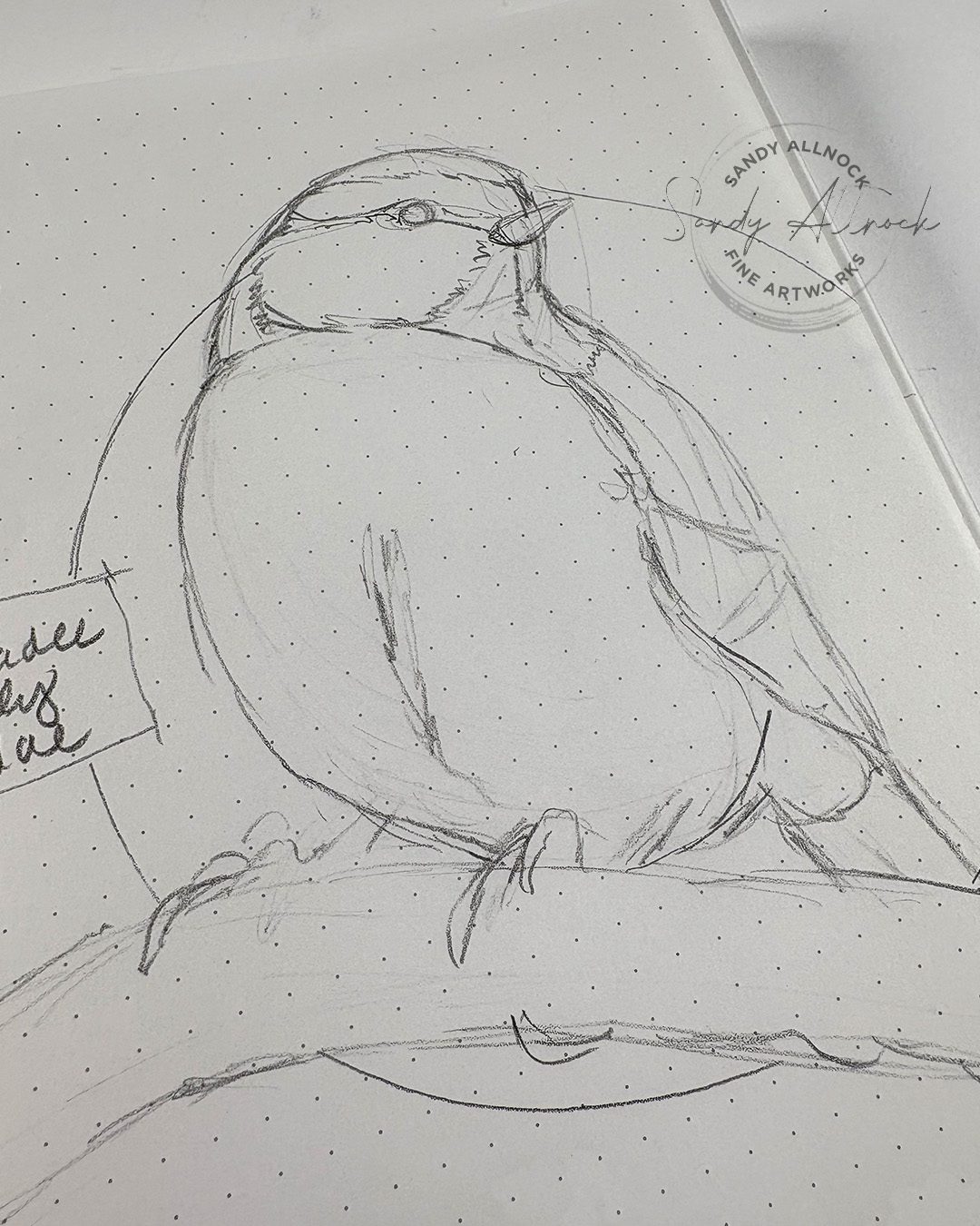
Does drawing freehand scare you? Let’s talk about the best approach to get a good start to the drawing so the rest will go much more easily! Draw along with me, then we’ll go to Zoom with our blocked-in rough sketch and learn to add all the fun detail.

Get out some paper and a pencil, and a kneaded eraser if you have one – and we’ll make a drawing during the video. You’ll need the photo reference of the bird….and a link to Zoom. It starts at 8:30am Pacific today, May 17 2025!

Tutorial: Try THIS SECRET to learn to draw ANYTHING freehand

Watch the video below and scroll to the end to leave comments or questions — or click HERE to watch it on YouTube and leave comments over there. I read both dutifully!

SUPPLIES

Some product may be provided by manufacturers for review and use. Compensated affiliate links are here at no cost to you. I appreciate your support of my work with your purchases! Full affiliate and product disclosure | My trusted partners in art

Paper

  1. JetPens Kanso Noto notebook (52gsm white with dot grid) 

Pencil

  1. Caran d’Ache Grafwood pencils 9B: BLICK  AMZ  JACKSONS 

Eraser

  1. Faber Castell Kneaded Eraser: BLICK  AMZ  JACKSONS 

Blocked-in sketch

The loose sketch is just that….loose! Use light pencil marks to jot down the major shapes, and divide those into the smaller shapes. 

After the zoom call I’ll add a picture of the final bird to this post – as well as a link to the replay!

Subscribe to receive blog posts by email:

Zoom replay

I don’t always plug the replays or make them “public” on my YouTube channel – they’re less formal, and not always the vibe I want out there. But since this one is part 2 of a drawing….here you go!

Patch hatching, a tiny studio visitor, and a DISASTER (Pen and ink technique series #3)

Patch hatching, a tiny studio visitor, and a DISASTER (Pen and ink technique series #3)

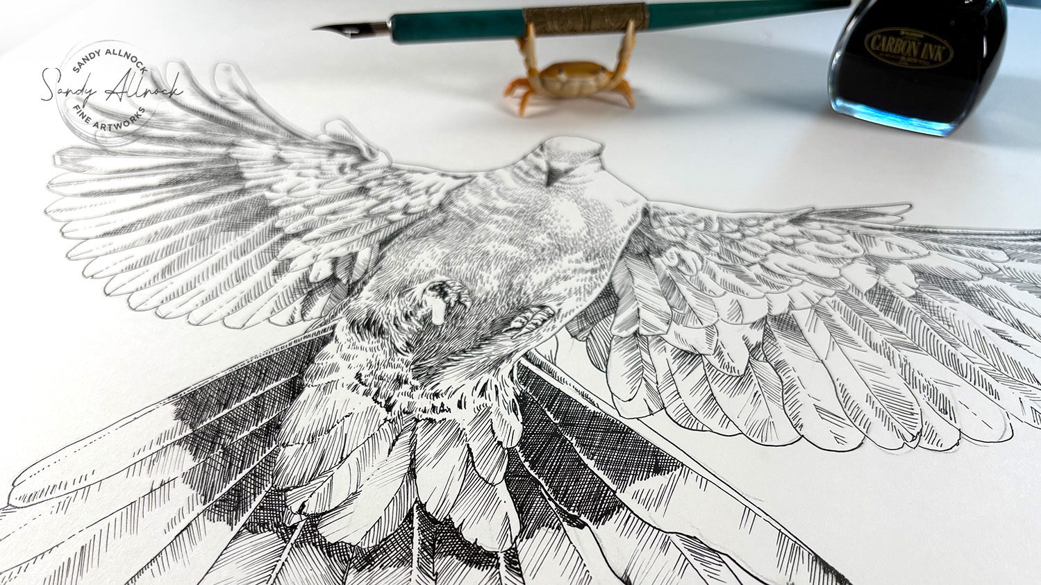
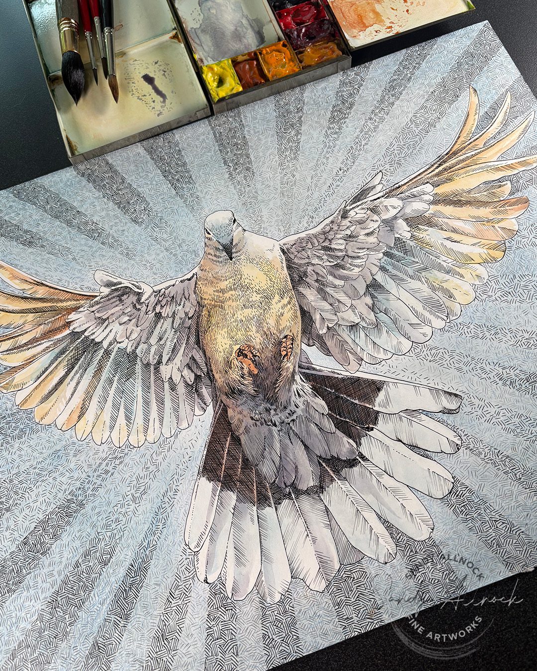
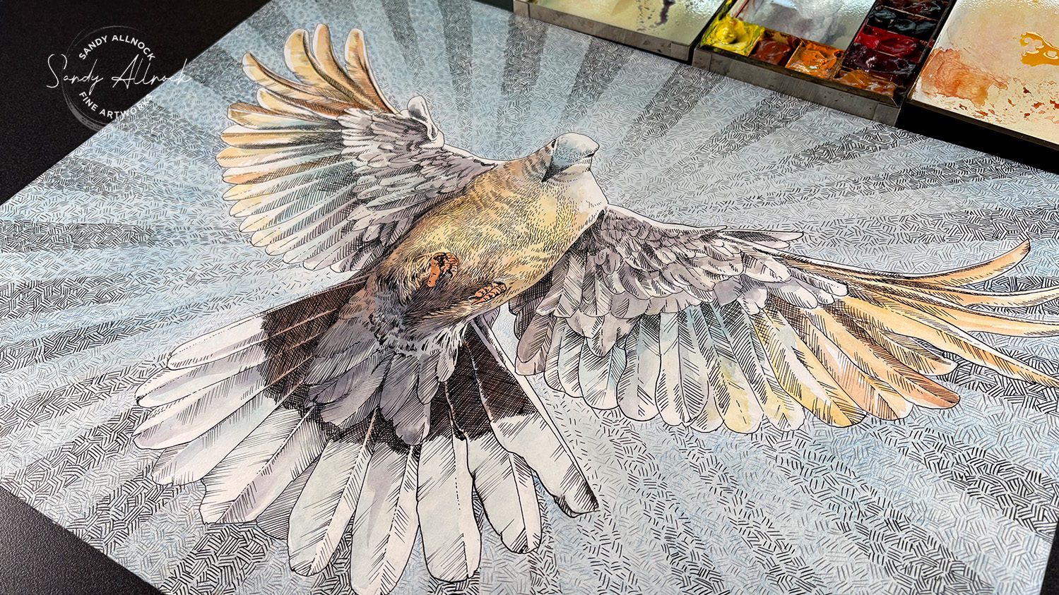
You might remember this drawing that I posted back on Easter weekend….I was so tickled with it, and wanted to find time to work on the rest of it. Well, I’ve been hard at it! Probably about 30 hours worth. My problem was….I forgot what I had planned to do with it, and started winging it. Things did not go well.

Tutorial: Patch hatching, a tiny studio visitor, and a DISASTER (Pen and ink technique series #2)

Watch the video below and scroll to the end to leave comments or questions — or click HERE to watch it on YouTube and leave comments over there. I read both dutifully!

SUPPLIES

Some product may be provided by manufacturers for review and use. Compensated affiliate links are here at no cost to you. I appreciate your support of my work with your purchases! Full affiliate and product disclosure | My trusted partners in art

Paper

  1. Crescent Hot press illustration board 

Dip Pen

  1. J Herbin Belle Epoque pen set 
  2. Nikko G nibs 
  3. Bombay Pen Cleaner: BLICK  AMZ 
  4. UK: Artisto Pen Cleaner 

Ink

  1. Platinum Carbon Fountain Pen Ink   AMZ

The problem

That border! Ugh. It began by not planning a border that would fit the character of the subject. I’m not certain I had a style in mind back at Eastertime – but I definitely don’t remember it now! I do know I had planned on using another inking technique, but that didn’t really happen – I was just doodling swirlies…with a totally different pen width, and that made the border significantly darker than the main image. And then I also had made the vertical borders on the sides a different value than the horizontals on top and bottom. Watercolor couldn’t fix that – and once I had tried, it was clear the border was NOT working. I had to get out an xacto knife and just remove it all!

The result

Not everything went badly – fortunately just that border this time. Once I lightened the load, watercoloring the bird was a joy! The background blue is all colored pencil. Want to try it yourself? Here’s the reference photo!

Subscribe to receive blog posts by email:

The takeaways

  1. Stay present with your art. Don’t let deadlines or speed or anything else interrupt the process you’ve honed.
  2. Be willing to part with what’s not working. Letting a random idea (“a few weeks ago I had an idea that I forgot…”) take you off the rails isn’t worth chasing. It’ll come back.
  3. Learn everything you can from every piece of paper. Even if tossing it, use the empty space to practice the techniques you’ll need to repaint/redraw it. You’ll be better prepared!
Relative Color Study: unexpected hues

Relative Color Study: unexpected hues

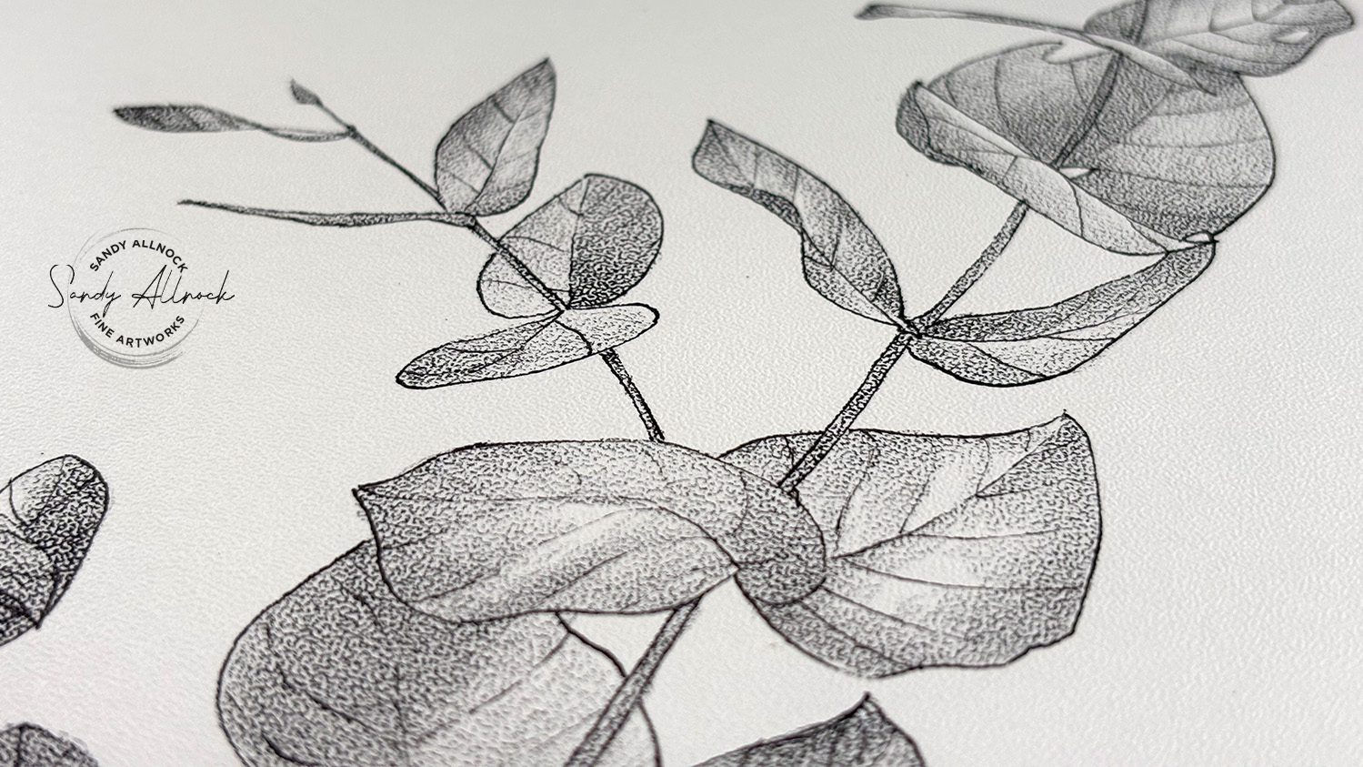
About two weeks ago, I shared some new Stipple Texture paper and a simple black and white drawing – and it was so quick and easy in one color! I highly recommend this paper for such a technique – here’s a look at it, and you can see the whole video on this post:

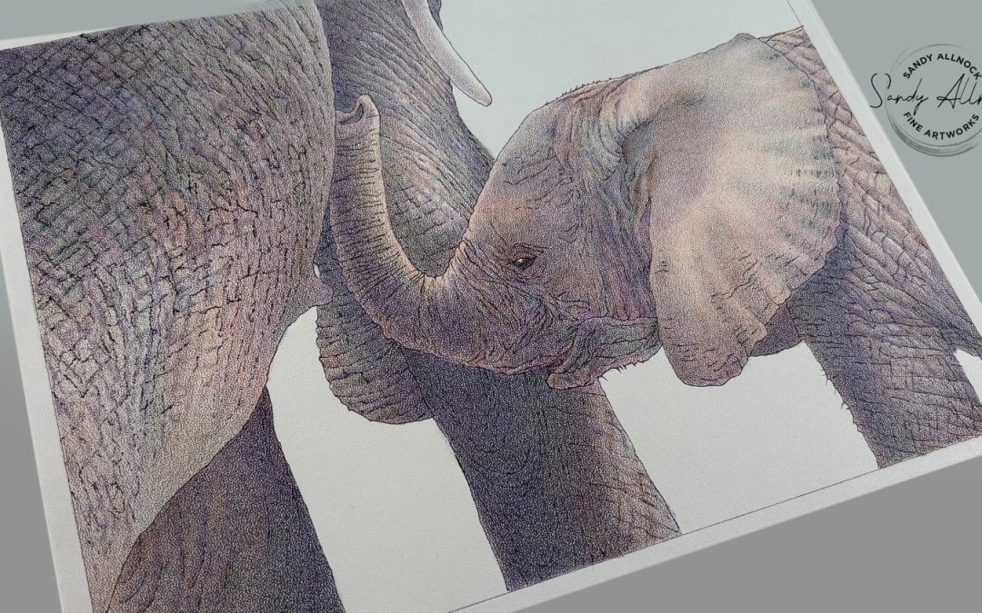
I was very excited to then try it in color – and found some hitches in my giddyup! First was that the paper, without special treatment (read on for other things to try), is not quick at mixing colors in a dense drawing. Whoops! I picked a poor subject for this, but since this piece is in honor of my Mom (who I spent a ton of “time” with in my heart as I worked on this!) – I decided that she’d be proud of her artist daughter for going wild on colors.

Read on in this post for my thoughts on the pros and cons, and my verdict on stipple paper!


Tutorial: Relative Color Study: unexpected hues

Watch the video below and scroll to the end to leave comments or questions — or click HERE to watch it on YouTube and leave comments over there. I read both dutifully!

SUPPLIES

Some product may be provided by manufacturers for review and use. Compensated affiliate links are here at no cost to you. I appreciate your support of my work with your purchases! Full affiliate and product disclosure | My trusted partners in art

Paper

  1. Bee Paper, Stipple Texture paper 9×12: BLICK  AMZ 

Prismacolor Pencils:

  1. Pumpkin Orange 
  2. Peacock Green 
  3. Violet 

Pens

  1. Micron Pigma Pens BLICK AMZ  JACKSONS 

Tips

Give them more tips

Challenges: contrast

This paper has such a texture that filling in the “white spots” between the stipple dots is tough; there are things you can try to overcome them but for this first drawing I wanted to just stick with layering color. 

  1. You might try drawing any real “black” areas with a pen first – that could be what was done on the tiger drawing on the pad’s cover.
  2. You might try blending solution – but I didn’t want to go there simply because the transition when stopping the blending solution into an area that should take on the stipple texture could be very hard.

I found my 1 color drawing with a dark pencil gave me a wider range than this drawing – my dense subject made life hard, but that just meant more time with mom. 🙂

Subscribe to receive blog posts by email:

My happy place!

I absolutely LOVE how colors layer and play with each other on this stipple texture! It might not be the easiest surface, but it comes out with a lovely evenness that lets the colors take turns popping to the top rather than dragging each other around like it can do on some of the other colored pencil papers I’ve used.

The verdict

While this is only two drawings done on this paper, I DO like it. For those without a lot of time I’d suggest simpler images and one color – that’s quick! Anything that has a lot of open space could be nice too….but if you decide on a dense drawing like this – be prepared to spend some time. 

However – pick some strange colors! The orange, purple, and green I selected are the secondary colors in the color wheel – and boy were they fun to play with!