
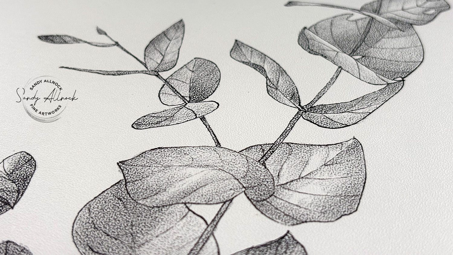
About two weeks ago, I shared some new Stipple Texture paper and a simple black and white drawing – and it was so quick and easy in one color! I highly recommend this paper for such a technique – here’s a look at it, and you can see the whole video on this post:
I was very excited to then try it in color – and found some hitches in my giddyup! First was that the paper, without special treatment (read on for other things to try), is not quick at mixing colors in a dense drawing. Whoops! I picked a poor subject for this, but since this piece is in honor of my Mom (who I spent a ton of “time” with in my heart as I worked on this!) – I decided that she’d be proud of her artist daughter for going wild on colors.
Read on in this post for my thoughts on the pros and cons, and my verdict on stipple paper!
Tutorial: Relative Color Study: unexpected hues
Watch the video below and scroll to the end to leave comments or questions — or click HERE to watch it on YouTube and leave comments over there. I read both dutifully!
SUPPLIES
Some product may be provided by manufacturers for review and use. Compensated affiliate links are here at no cost to you. I appreciate your support of my work with your purchases! Full affiliate and product disclosure | My trusted partners in art

Paper
Prismacolor Pencils:
Pens
Tips
Give them more tips

Challenges: contrast
This paper has such a texture that filling in the “white spots” between the stipple dots is tough; there are things you can try to overcome them but for this first drawing I wanted to just stick with layering color.
- You might try drawing any real “black” areas with a pen first – that could be what was done on the tiger drawing on the pad’s cover.
- You might try blending solution – but I didn’t want to go there simply because the transition when stopping the blending solution into an area that should take on the stipple texture could be very hard.
I found my 1 color drawing with a dark pencil gave me a wider range than this drawing – my dense subject made life hard, but that just meant more time with mom. 🙂

Subscribe to receive blog posts by email:
My happy place!
I absolutely LOVE how colors layer and play with each other on this stipple texture! It might not be the easiest surface, but it comes out with a lovely evenness that lets the colors take turns popping to the top rather than dragging each other around like it can do on some of the other colored pencil papers I’ve used.
The verdict
While this is only two drawings done on this paper, I DO like it. For those without a lot of time I’d suggest simpler images and one color – that’s quick! Anything that has a lot of open space could be nice too….but if you decide on a dense drawing like this – be prepared to spend some time.
However – pick some strange colors! The orange, purple, and green I selected are the secondary colors in the color wheel – and boy were they fun to play with!





0 Comments