Peek inside a class!

Peek inside a class!

Ohhhhh goodness what a week it has been! busy month as well…since we’ve been planning a large event at my church. One part of it, my part, is teaching some watercolor—so I’ve been busy planning the project, working out the supplies and ordering it all, managing how I’ll do my presentation with talking and painting at once (more on that in a minute!) and as of this week, setting up. Yeesh! I could have done without any work to get done aside from this volunteer project, but….that wasn’t to be.
I wanted to do something different for today’s video but…..with the time i had left this week, that just wasn’t possible. I attempted it, but needed more time for research and ‘mulling” before something was going to come of my idea. So I decided I’d turn the extra work I did for the new Imaginary Creatures class into a video and share a tip or two from class with you – and invite you to join me for the course!

Tutorial: Peek inside class

Watch the video below and scroll to the end to leave comments or questions — or click HERE to watch it on YouTube and leave comments over there. I read both dutifully!

Today’s teaching…..comin’ up!

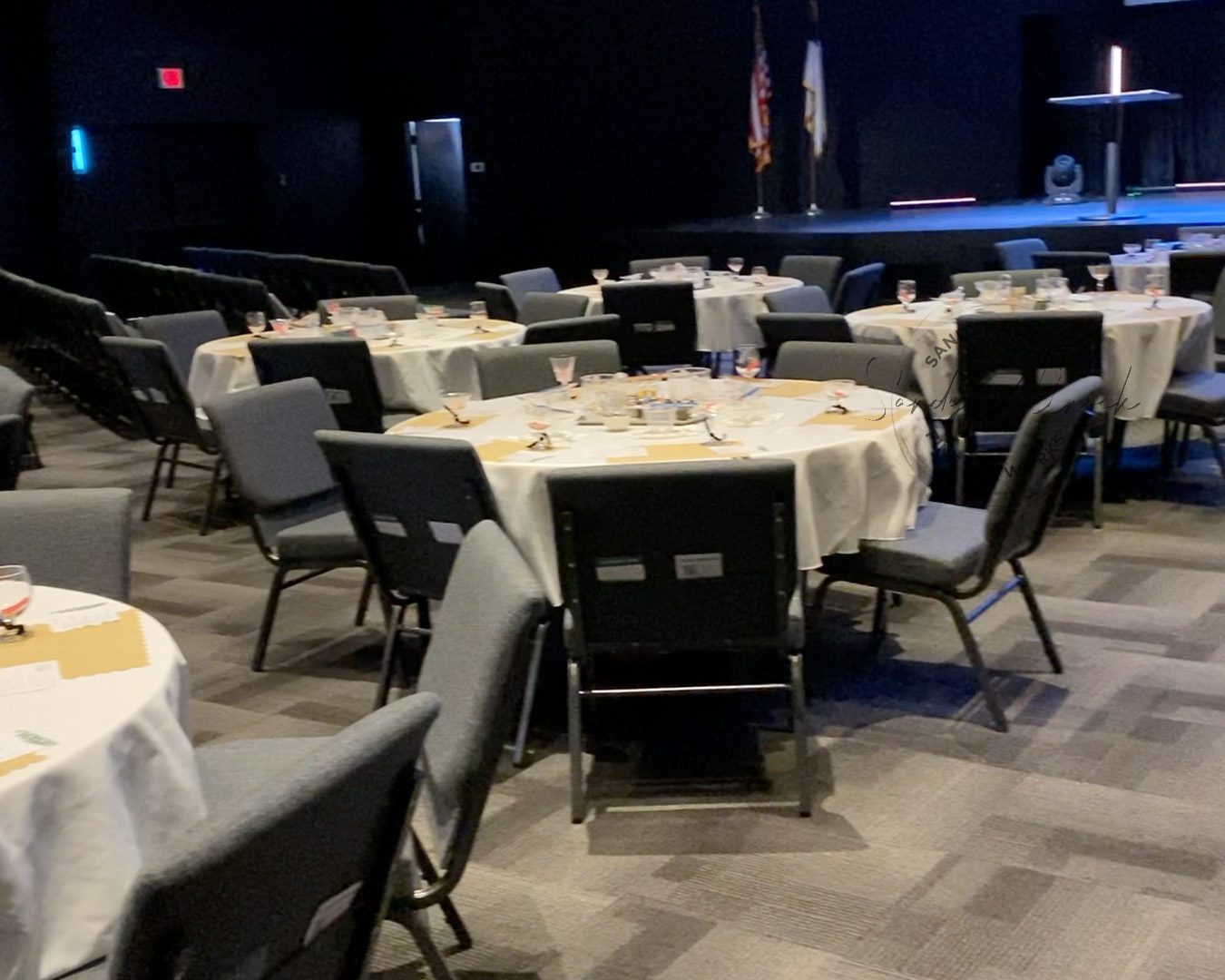
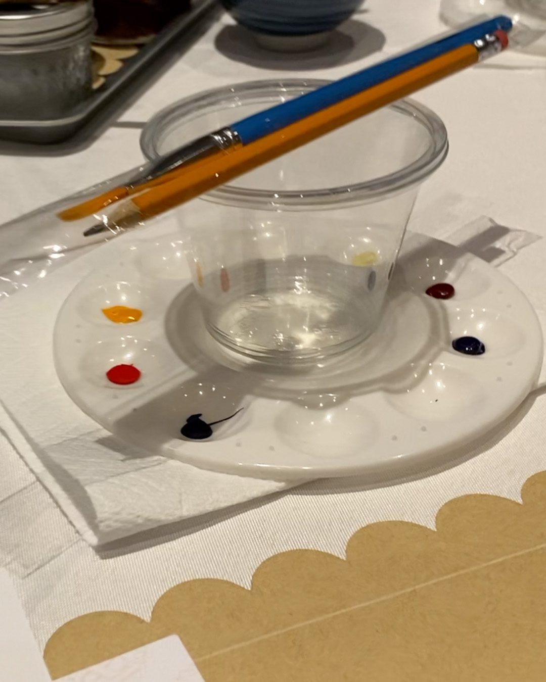
The tables are filled with other supplies than mine; we’ll have someone teaching how to make fancy mocktails, someone else a charcuterie board, and someone else scones! It’s a hospitality theme. And then….ME! Gah. Me and some watercoloring a Bible journaling page. 

The project is an easy one, but I only have 45 minutes to talk about what Bible journaling is, how to paint it, give them time to paint it, and explain trimming it out and gluing it as a tip-in. Yeeep! I tried writing down all my remarks to see how long just talking through it would take – I was over an hour. I edited ruthlessly. Got it to 45 minutes but with no painting time. We planned originally on having me live on stage with a camera on my hands – and I KNEW there was no way I was going to keep pace talking while also painting!

So this week I shot videos for each step, and I hope that me introducing the videos won’t be too weird/awkward without painting it – but the videos do explain it well, and guess what?

NOTE: I’ll be turning this and the pages for a followup series of four weeks at the  meetup I’m hosting into a little class, too! Why not since I have all this video?  Keep an eye out for it soon!

And wish me luck – we’ll kick the event off about 6 hours from when this post goes live, and I’ll be so happy to be on the other side of it. Ha!
Imaginary Creatures

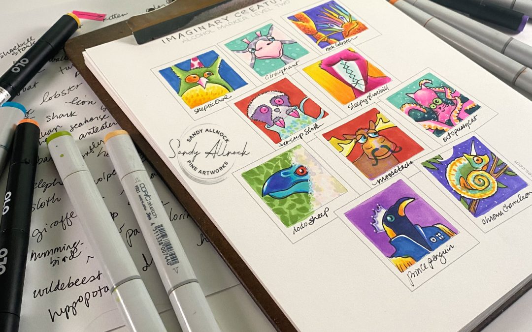
The one-pager for Imaginary Creatures is doable – but for my old and failing eyeballs, tough! In the class I teach each lesson on images about twice the size of those on this sheet, and in Olo markers. But you have lots of options: either size image, a blank template for  you to draw the shapes along with me in the lesson, or print the one with sketches and use that for a guideline. Make it as easy or challenging as you’re ready for!

Pssst there’s a colored pencil version too, that came out in 2021!

Subscribe to receive blog posts by email:

And a little fun

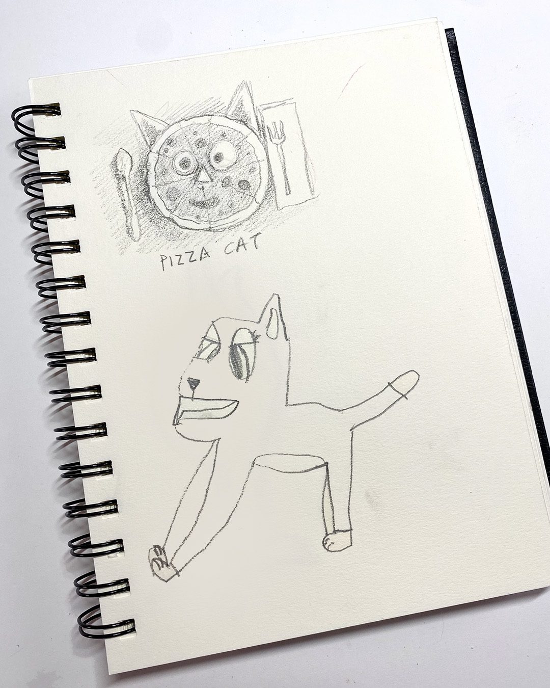
My friend Alyse and I sketched together last weekend. And we drew in each others sketchbooks. Which one do you think is mine? 🙂
I’ll have my brain back next week!

I just need some rest! 🙂

Supplies

Some product may be provided by manufacturers for review and use. Compensated affiliate links are here at no cost to you. I appreciate your support of my work with your purchases! Full affiliate and product disclosure | My trusted partners in art

  1. Copic Markers 
  2. Copic Hex Chart 
  3. Neenah Cardstock, Solar White 250pk 
  4. Olo markers Use coupon code “sandy” if asked!
  5. Olo marker hex chart 
  6. White gel pen
    1. White Signo Uni-ball Gel Pen:  AMZ – BLICK
  7. Black alcohol-marker friendly pen:
    1. Copic Multiliner
    2. Copic Multiliner SP

Galaxy painting – with baby wipes

Galaxy painting – with baby wipes

Long story short: I had an incident with a tortilla bag that left a big greasy stain on my new Bible! I bought it just for a meetup I’ll be hosting this summer at my church, and was devastated by this accident. But have no fear…art is here to save the day!

Tutorial: Galaxy painting with baby wipes

Watch the video below and scroll to the end to leave comments or questions — or click HERE to watch it on YouTube and leave comments over there. I read both dutifully!

Mentions: 

  1. Classes:
    1. Galactic Watercolor Class
    2. BRAND NEW! Alcohol marker Imaginary Creatures class
  2. Disco Chicken Videos:
    1. The Chicken
    2. The Disco
    3. The contest
  3. Check out the “Find a class” tab in the menu !
  4. Visit my Bible Journaling channel

The process

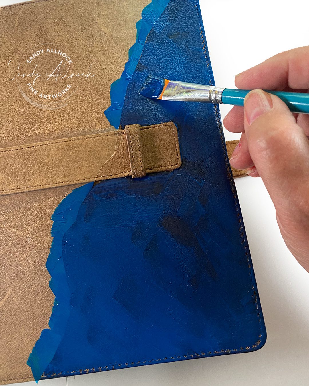
As I carefully applied the blue paint onto the section masked with Frisket Film, I observed with anticipation as the color deepened upon contact with the supple suede material. The rich hue seeped into the fibers, creating a beautifully desaturated effect that exceeded my expectations. Combined with a baby wipe to create the texture most suitable for this book cover art, I decided I’d paint the rest with the same “tool,” inelegant as it may seem.

I gradually added additional layers to create a sense of depth, allowing each one to dry before applying the next. The soft and textured effect achieved with a baby wipe was simply perfect for the desired outcome.

Subscribe to receive blog posts by email:

Eventually, I progressed to using white to explode some light and then incorporated additional hues, creating splatters with a toothbrush for added dimension. The final step involved contemplating a suitable title on the piece.

The word “Bible” seemed just a little too obvi, if you know what I mean! I did a short study on heaven, stars, creation….and settled on the simple word GOOD. If anyone asks me about it I could tell them so much about that word:

When God had completed the steps of creation, He said it was GOOD.

He’s been nothing but GOOD to me.

This book is called the GOOD book. Which is also a misnomer since it’s a great one, but ya know. Tradition, I guess?

So much more about goodness 🙂


A little bonus!

This past weekend I was asked if I’d do the annoucement video at church, since I’ll be teaching this coming Saturday. And they wanted a bit of my story about how I got into Bible journaling. This video is forwarded just to my bit:


More galaxies?

Join me for a course all about watercoloring galaxies! You’ll have fun watching the paint move around, we’ll explore when to push it where you want it to go and when to let  it go, and creating depth, planets, and design of your own imaginative galaxies. Great for cards, illustrations, and bookmarks!

Supplies

Some product may be provided by manufacturers for review and use. Compensated affiliate links are here at no cost to you. I appreciate your support of my work with your purchases! Full affiliate and product disclosure | My trusted partners in art

Feeling out of control about color? (ft Poppies, Imaginary Creatures)

Feeling out of control about color? (ft Poppies, Imaginary Creatures)

Get ready for SILLY! I’ve been in a mode of late, and today’s no different…so brace yourself. I don’t want anyone coming at me for causing you to snort orange juice out of your nose! 🙂

But this isn’t ALL silly – I’ve been chatting with Lorie on Instagram DMs, and wanted to explain some things for her as a new artist. I figured there are others who could also benefit – so let’s get to it, shall we?

Administrative note: I’m testing something with ads on this blog – so if you’re suddenly seeing them pop up, there’s nothing wrong! You needn’t click on the ads for them to do me a little good; but if you see something to shop for, have at it. I have no idea what products will be here, I’m checking to see what Google does on its own. LMK if it’s anything offensive! I think I can block particular ones. Thanks!

My “Fishenstein Monster” aka Frankenfish – he’s a little dude who made it to my social media this week to show just what I did with the GINORMOUS list of ideas generated by my followers. Big thanks for all the contributions! See the video for how I ended up picking from them all.

Tutorial: Feeling out of control about color? (ft Poppies, Imaginary Creatures)

Watch the video below and scroll to the end to leave comments or questions — or click HERE to watch it on YouTube and leave comments over there. I read both dutifully!

The source of some color challenges

This is by no means an exhaustive list but let’s capture them here; they’re discussed in the video above in more detail:

  1. Brand quality – the manufacturer themselves. Not all are equal!
  2. Line quality – Artist grade are better than student grade, so beware substituting.
  3. No global standards – we can’t rely on Scarlet Red always being the same Scarlet Red regardless of medium or grade. Bummer!
  4. Swatches = good, use = bad – there are some companies whose swatches may photograph beautifully but colors become mud upon use on a project.
  5. Fading – long term this is called “lightfastness,” and some mediums (alcohol marker particularly) are simply not lightfast. Then there’s mediums like watercolor and alcohol marker that also fade a bit when the paper dries.
  6. Techniques – slow, overlapping strokes leave more ink on the paper than light, sketchy, quick markes with a pen
  7. Statues of markers – Juicy? Dry? It can make a difference!
  8. Flow – different brands release pigment at different rates.
  9. Amount of color – the pecentage covered by the shadow, midtone, or light colors. If not the same, the image can change a lot.
  10. Colored pencil – techniques for burnishing and blending can change the color a lot!

What’s more important: Value or hue?

If you get the value correct (light, dark, midtone) then even if the hue (color) is off by a bit, it”ll still have dimension and form!

In the conversion charts I make, I try to find a match for both value AND hue, but it’s not always possible. If you find a mismatch, ask yourself which is off – and figure out what to do to that color to adjust it!

Subscribe to receive blog posts by email:

Adapt color by layering

I can’t say enough that learning to layer colors – and to find out what happens when you do – is one of the best things you can do as a colorist! Each medium performs differently; alcohol markers lift colors underneath them. Pencils don’t. Each has its benefit!

Imaginary Creatures courses!

The colored pencil version has been around since 2021 – but I’ve had the Alcohol Marker version on my to-do list since then!

The alcohol marker class needs to be finished up, but the preclass lesson as well as lesson 1 are ready to roll. I’ll be working the holiday weekend to get ‘er done – I figure wanting some time off might get me to work extra hard Saturday so I get some time off for part of Sunday and Monday!


Imaginary Creatures (Alcohol Marker)

This Level 2 Alcohol Marker class teaches basics of coloring and line work in alcohol markers! Students will create imaginary creatures while learning coloring techniques, shading, and color mixing. Taught in Olo markers but all alcohol markers are welcome!

Imaginary Creatures (Colored Pencil)

This Level 2 Colored Pencil class focuses on shading, specifically in a “no-line” or “implied” line technique. Students will learn to create imaginary creatures with dimension, texture, and moving parts of an image forward or backward by the way shading is applied1

Got questions?

I love answering YOUR questions in emails, DMs, and yes in videos! If it’s a question I think visuals will help with, and that others might also like to know, I’m happy to add it to my list. Drop a note if you’ve got wonderings!

Supplies

Some product may be provided by manufacturers for review and use. Compensated affiliate links are here at no cost to you. I appreciate your support of my work with your purchases! Full affiliate and product disclosure | My trusted partners in art

Getting started with Olo Alcohol Markers

Getting started with Olo Alcohol Markers

A number of years ago, I was on a mission to try finding alternate brands to Copic; though I purchased my full set long before the changes at Copic/Too, I knew it was going to go from bad to worse. And I tested out all the brands as they kept cropping up on the market for alcohol marker users.


One of those brands was Olo, and I first tried them in 2022. They were kind enough to send me a set, I think they realized I was in testing mode and it would be a good opportunity for them if I liked them.

My review was mixed. But hopeful!

If you got here from my Weekly Newsletter and found the link for the next video about color didn’t work from that email…. here’s a good link for ya!  It has the discussion of color that was mentioned in the video on this post. One day I’ll remember to check links before clicking ‘send,’ huh? 🙂 

While a lot of people looked for “cheap” as their highest priority, I was looking for quality of product AND innovation. I’ve never liked when ANY company – art supply or otherwise – just replicates something that’s already out there, not putting any creativity into it! (I know I own a lot of products that have done this, but….I don’t review makers of my pajamas.)

Olo markers were immediately innovative: customizable markers, realizing that artists may or may NOT like a chisel nib, whereas other pens were automatically shoving both at us. While I use my Copic chisel nibs for airbrush, I don’t draw with them, and having the ability to only have to buy the brush marker end? That was very appealing.

The quality of the pens was good, the nibs were fantastic, the caps seated really well (in some cases too well; I’ve heard some people have trouble getting the caps ON, which hasn’t been an issue for me). The biggest drawback? Colors.

They had 128 colors, which back 30 years ago would have sounded fantastic, but I wanted a lot of colors that were missing; the greens only had a few color options and not great ones, and there weren’t good natural blending groups for hardly any colors to make it easy for newbies to color. 

But I remained hopeful, because that kind of innovation isn’t cheap. I’d much rather have a company work at expanding their line to fill out their vision than do what a lot of other fly-by-night manufacturers did—rushing out with 300+ colors and failing miserably to deliver on quality.

And so I waited. When Olo announced new colors would be coming, and let affiliats pre-order them, I squeezed the money out of my budget for a half-marker of each new color. And that brings us to today: new colors are finally here!


Tutorial: Getting started with Olo Alcohol Markers

Watch the video below and scroll to the end to leave comments or questions — or click HERE to watch it on YouTube and leave comments over there. I read both dutifully!

32 new colors

This release has a good number of colors in it, thankfully; when companies come out with 3 or 6 colors, it’s stressful to even consider putting out a new hex chart to include them for just a few pencils. It takes me a lot in my process to alter a chart, and 32 colors is plenty to be worth it!

Out of these colors, a lot are neutrals for skin, hair, animals. Most interesting to me are 2 natural blending groups in the pink and purple (Natural groups have a light, medium, and dark in markers that all share the same first digit, making them easy to blend well). But a thrill? All the new greens! It’s almost as if they heard me, though honestly I don’t think anyone hears me cry into the wilderness. But I’ll take it!

Order markers here.

Alcohol Marker Jumpstart Class

I decided, on advice of a lot of folks on Facebook, to change some wording – instead of using “Copic” in class and video titles, I’ll be trying to make things apply to more people with the term “Alcohol Markers.” Which means I’ve changed the name of my most popular class: Copic Jumpstart is now Alcohol Marker Jumpstart! It’s the same course, but hopefully more inviting to users of other mediums.

The hand-drawn chart will be added to the class for students to download and color as a reminder of what the letters and number codes mean.

Subscribe to receive blog posts by email:

Revised conversion charts

The two charts in this free set, Olo to Copic and Copic to Olo, will help you use a tutorial for Copics while using Olos, or vice versa! I’ll have more to say about the chart in my next view this coming weekend.

Get the free chart here.

A word (or 500) about other marker brands

Every brand of an art supply handles the naming and numbering of its product in its own way!

The cheaper craft companies often use random numbering/naming conventions; maybe it means something to them, but there’s no artist on staff making a color wheel of their colors and understanding why anything exists in their line. I find those extremely frustrating, and figuring out a company’s rhyme/reason for color codes tells me whether or not they have a colorist on staff. LOL.

Then there’s traditional art companies like Faber Castell who use traditional art names for colors and it’s the identical numbering system and colors across allllll their products.

In general, knowing some fo that info can help tell you whether an art supply is “good” —well thought out, quality, etc—or if it’s one that’s just put out there to make money. The latter companies are often not interested in pressing quality, just in cutting expenses to keep their product cheap and able to undercut the others in the industry. 

That doesn’t mean those supplies can’t be used. It probably means they won’t last as long as good supplies, might fade faster or other problems could happen down the road. Some of the companies I ttested over the years were this kind of flash in the pan; they didn’t last, and anyone who bought their inexpensive line of markers (me!) can’t get refills or nib replacements. Thus why I like that Olo is taking its time and pacing its growth.

Supplies

Some product may be provided by manufacturers for review and use. Compensated affiliate links are here at no cost to you. I appreciate your support of my work with your purchases! Full affiliate and product disclosure | My trusted partners in art

How to draw a Copic Disco Ball (Disco Chicken Part 2)

How to draw a Copic Disco Ball (Disco Chicken Part 2)

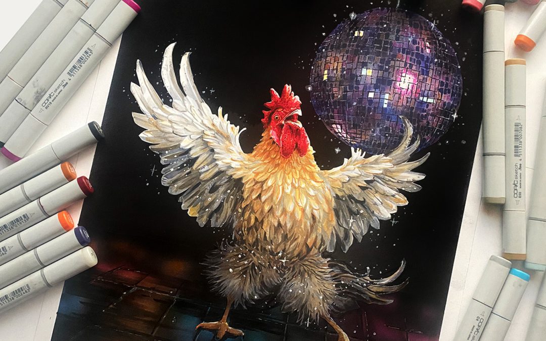
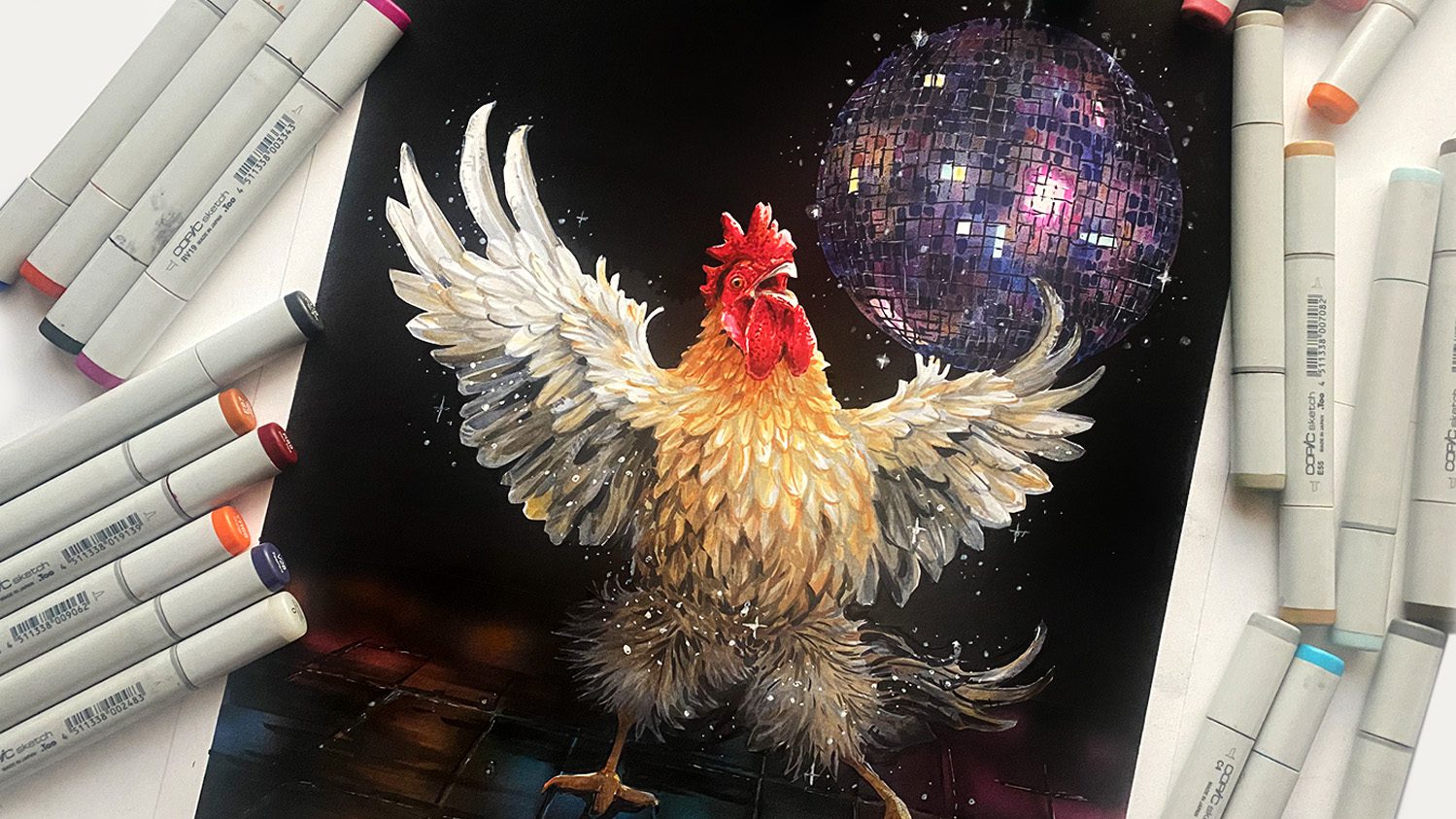
I THINK I DID IT! Oh man. This one was just a little more bitten off than I might have been ready for….it was days of work and study, and that doesn’t even count the chicken dancing! 🙂

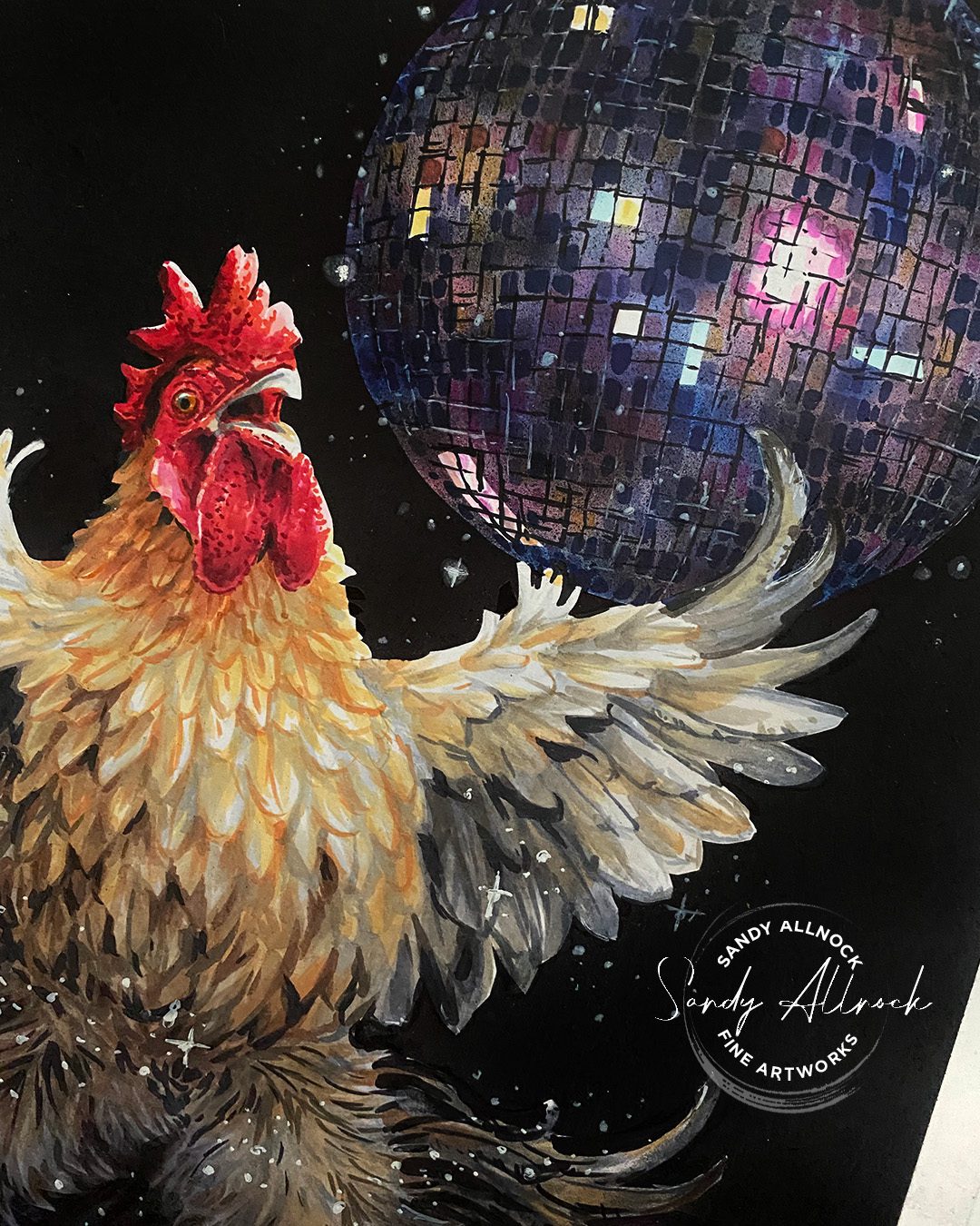
I asked AI to give me a description of my disco chicken to post on the Copic Award page….it did pretty well!

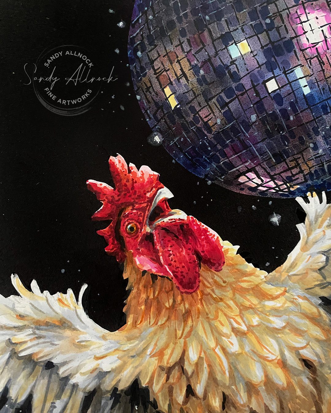
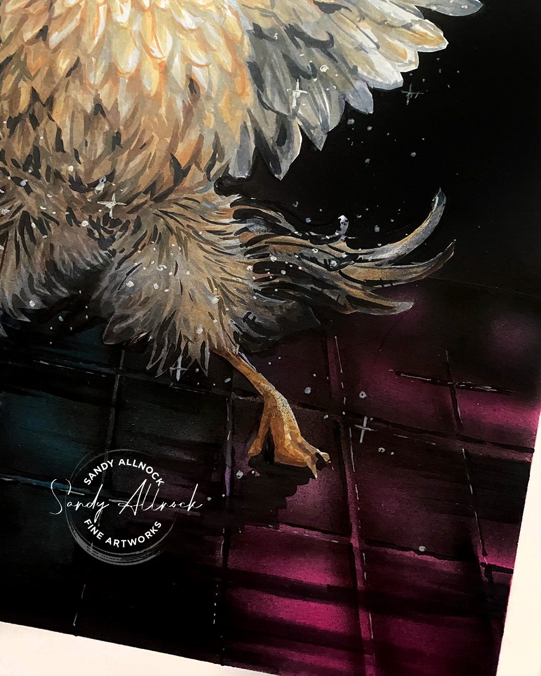
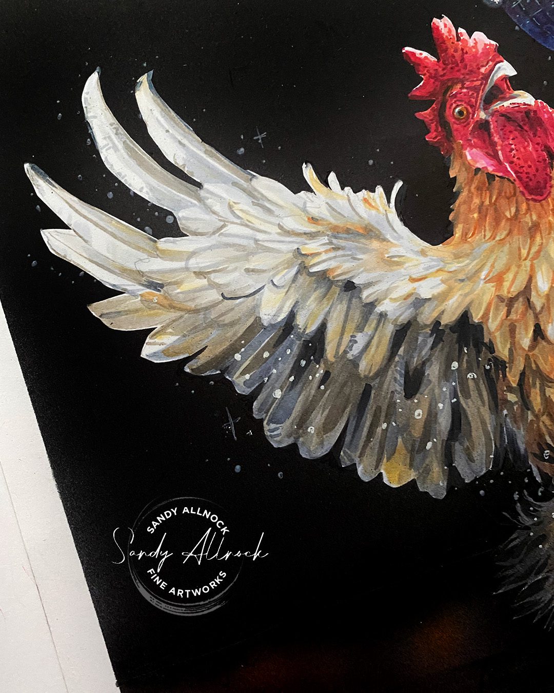
A flamboyant rooster is captured mid-dance on a reflective dance floor, a shining disco ball overhead casting light around the room. The rooster’s wings are spread wide in a dramatic pose, evoking the sense of movement and dance.

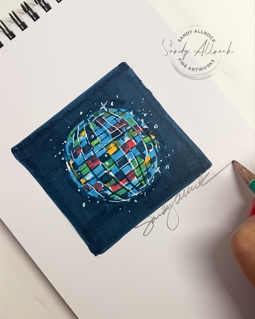
Before we get underway with the video…..I posted a reel on instagram and a short on YouTube showing a much simpler disco ball than you’ll see in today’s main video. check it out to see how simple it CAN be! 🙂

Tutorial: How to draw a Copic Disco Ball

Watch the video below and scroll to the end to leave comments or questions — or click HERE to watch it on YouTube and leave comments over there. I read both dutifully!

Drawing a disco ball

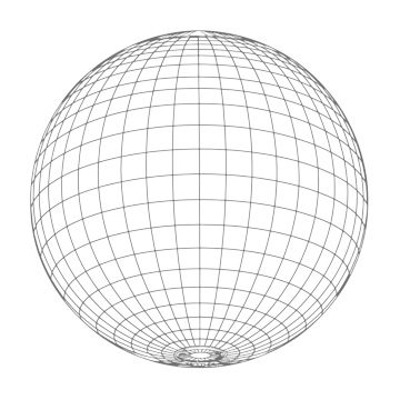
You can use any earth modell with longitude and latitude lines as a model – the above pic is looking upward at the globe, and you can see how the lines curl around on the left/right and top/bottom.

Mine is far more complex than it needs to be – you could make one with significantly smaller mirror pieces, and without the airbrushing too.  But the principle is the same.

  1. Place blocks of color on the disco ball, lighter where you want highlights.
  2. Mask out a few of those blocks so they remain bright and sharp.
  3. Color OVER all that initial color – airbrush works, but how about distress inks with a very soft brush? Powdered colored pencil or charcoal? A watercolor wash? Whatever you use, let some color show through and some get covered.
  4. Draw in some of the lines between mirror panels: in the light areas use about an 80% dark color (a grey blue or purple) and in light areas, drop in a few dashed highlights.
  5. Stand back and admire!

Draw a disco floor

Basic perspective lines will really help here – with all the lines leading back to a vanishing point in the middle, on the side, wherever.

  1. Draw the underlying color in any pattern.
  2. Add tje perspective grid on top, with the tiles being dark with glowing light parts, and light popping up through the grout.
  3. Add a little bit of line work but only if needed.

Subscribe to receive blog posts by email:

Make it *sparkle*

To create a feeling of magic — throw in some pixie dust! Not only will this add the feeling of magic to your drawing, but it can cover any messes made. I used a colorless blender for some of the lighter dots, and a gel pen on top as well.

Copic Award Entry

I sent it to the Copic Award contest – wish me luck and go add my drawing to your favorites!

Supplies

Some product may be provided by manufacturers for review and use. Compensated affiliate links are here at no cost to you. I appreciate your support of my work with your purchases! Full affiliate and product disclosure | My trusted partners in art

  1. Copic Markers – https://bit.ly/31g1FYN
  2. Copic Hex Chart – https://bit.ly/3rq3AEX
  3. White Uni-ball Gel Pen AMZ  • BLICK 
  4. Masking:
    1. Frisket Film roll 
    2. Frisket Film sheets
  5. Fingertip Knife
  6. Paper:
  7. Neenah Cardstock, Solar White; I found a 12″x18″ pack of the 110lb at my local Kelly Paper but it’s the same as this smaller size that’s more affordable/available: Neenah
  8. My normal fave paper is the 80#