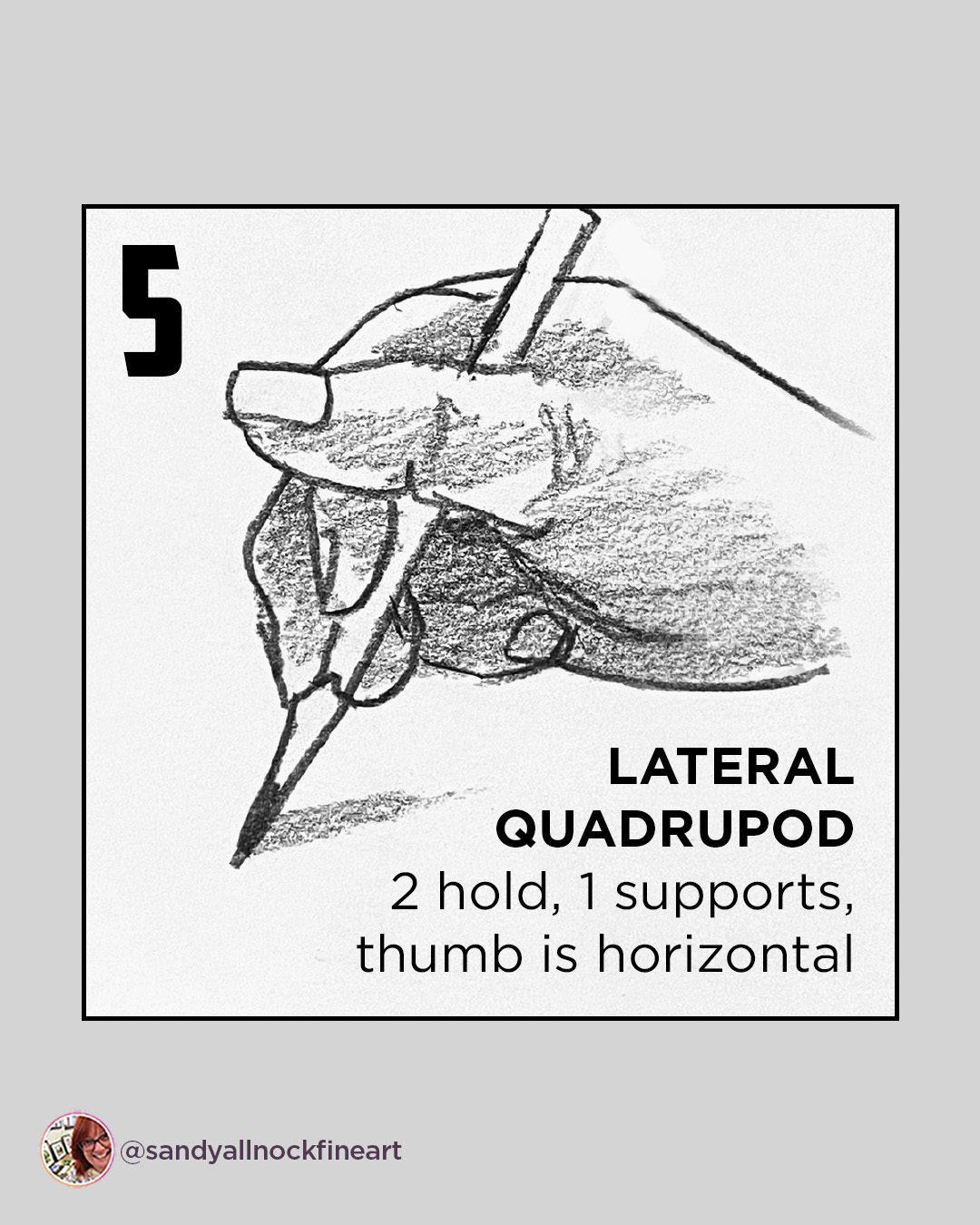
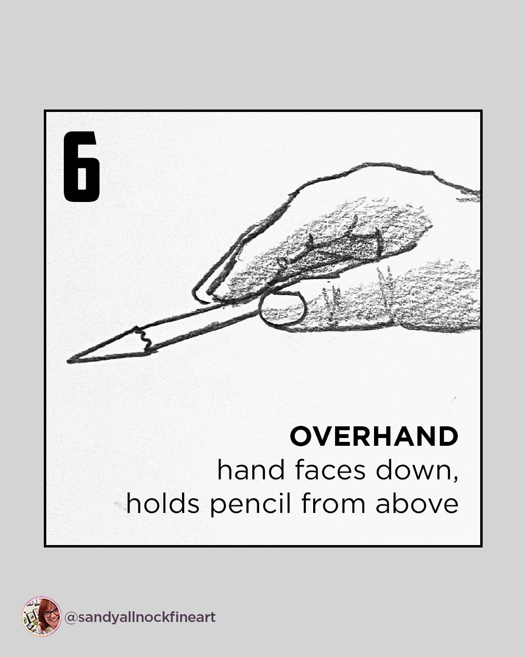
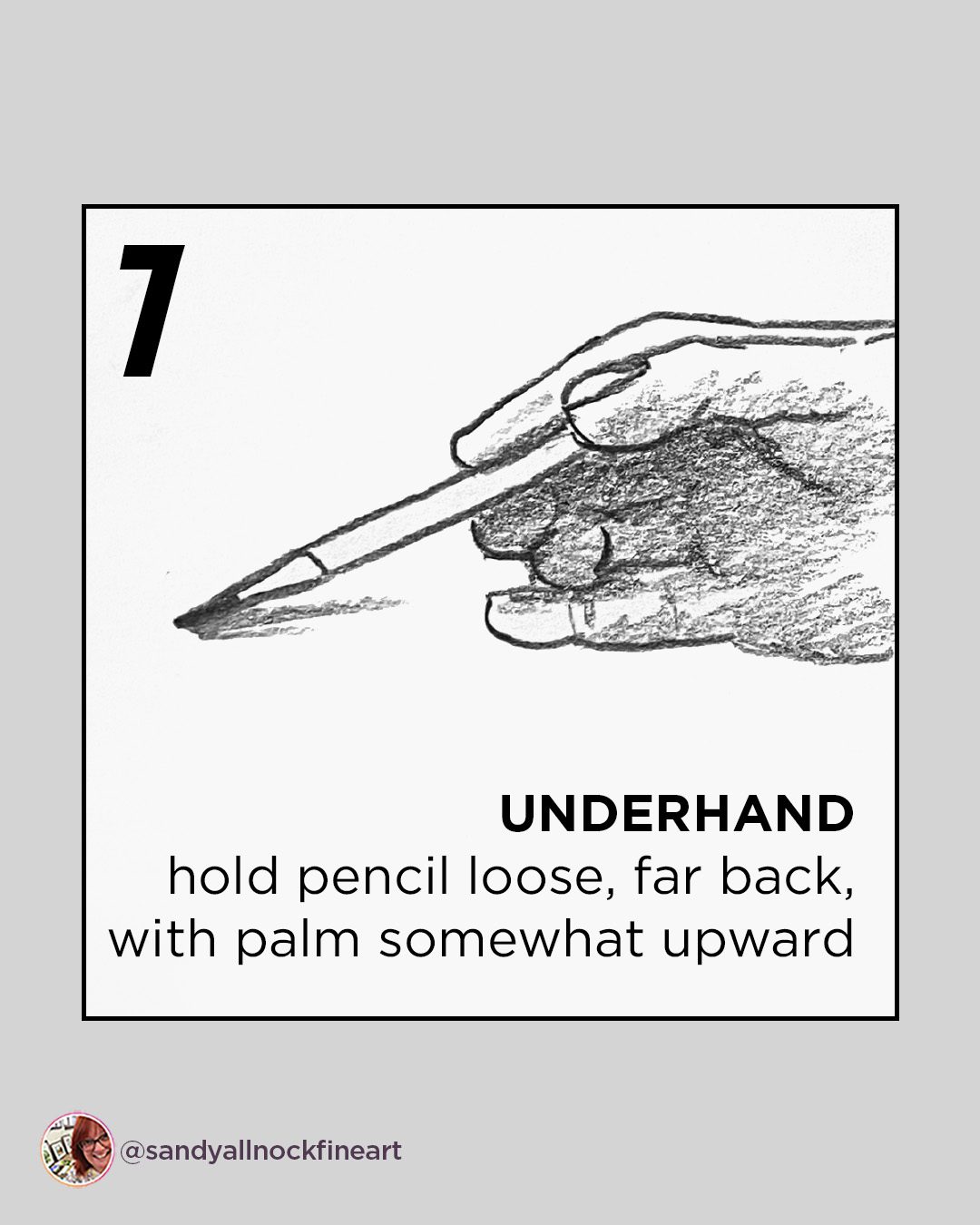
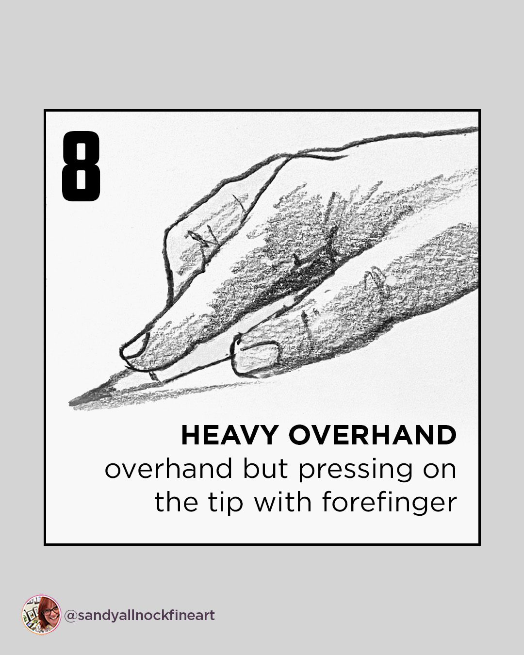
What’s the right way to hold a pencil?

What’s the right way to hold a pencil?

It’s time for real talk. I saw a meme online and can’t find it again.

Am I the only one whose feed loses the stuff that I want to see, and keeps sending the stuff I don’t???

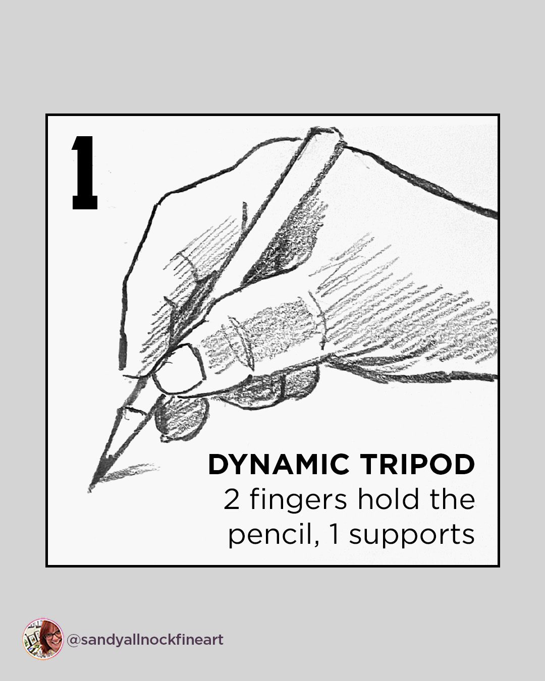
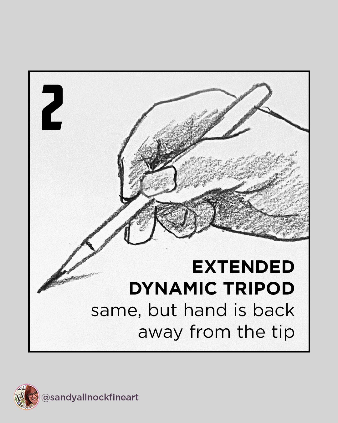
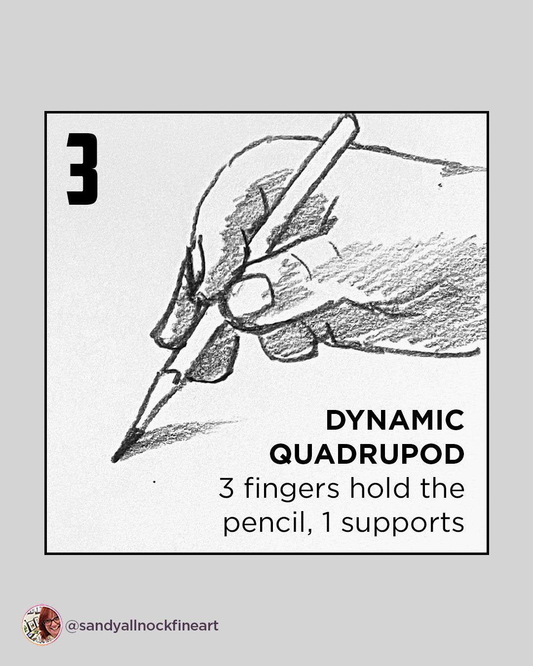
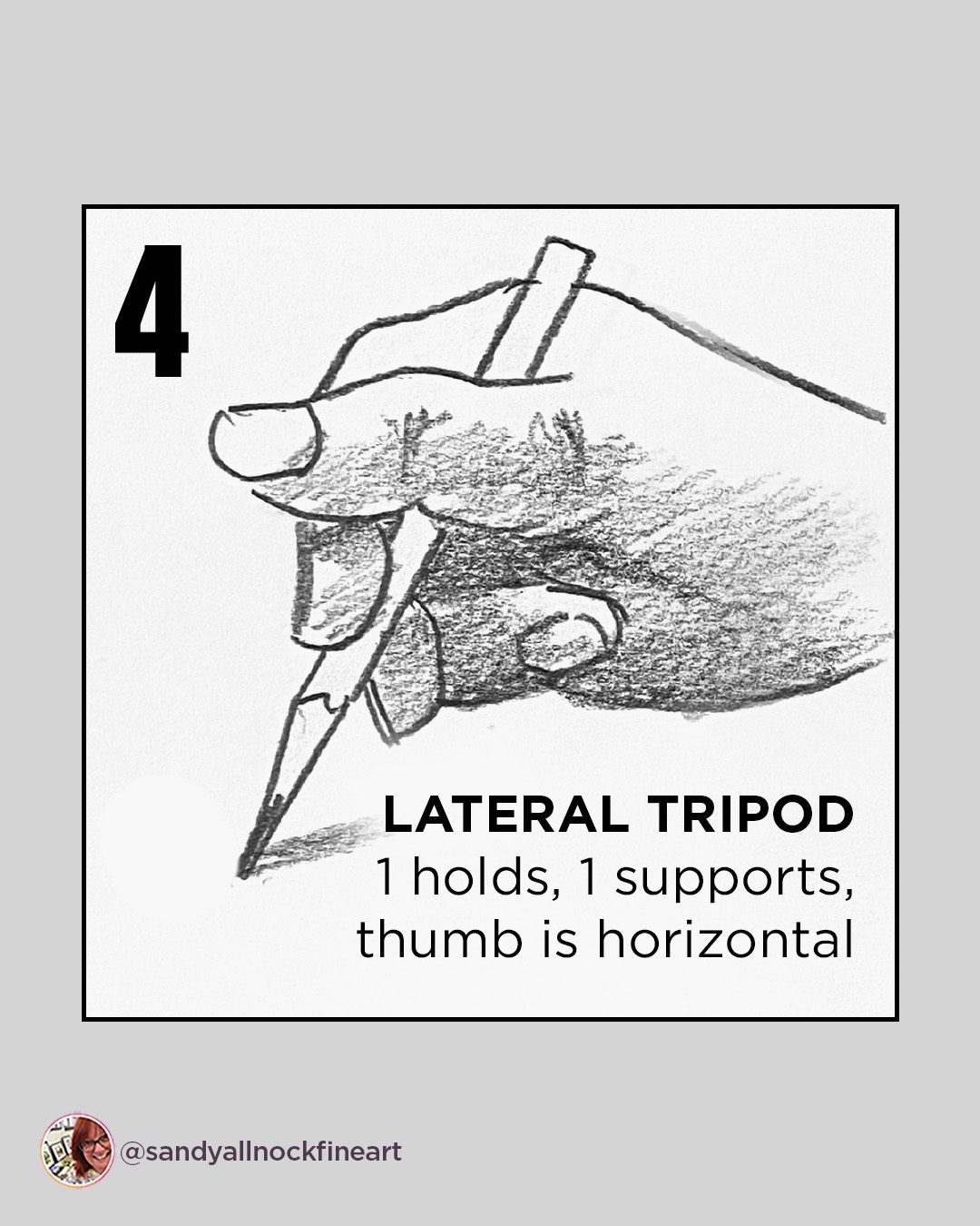
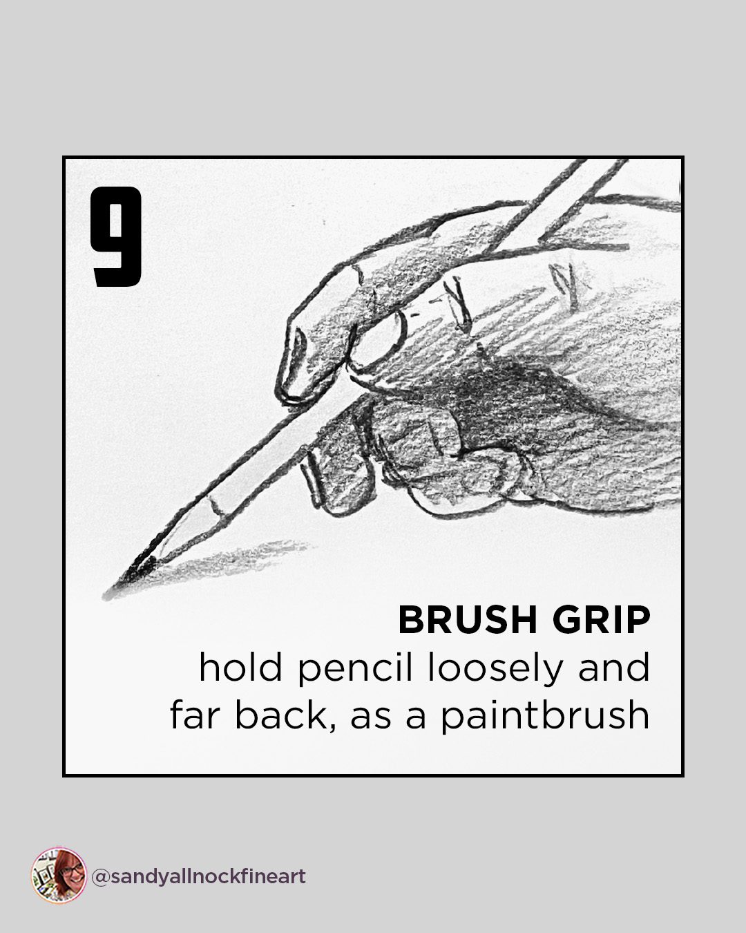
The meme had 4 doodles of hands and each had a pencil – different ways to grip a pencil – and each one had labels.  What? There are names?? It was gone before I had time to stick it in my brain or screenshot it, so had to wait til I had a few minutes for research…..and thus I bring you…..NINE that I found.  Even more than the meme!

Video: What’s the right way to hold a pencil?

Watch the video below and scroll to the end to leave comments or questions — or click HERE to watch it on YouTube and leave comments over there. I read both dutifully!

I still don’t know…

….if there’s a rhyme or reason behind my pinking and ring finger moving around at will. If I find out, I’ll let you know! The question will likely haunt my upcoming art for the next month or two, won’t it…

Subscribe to receive blog posts by email:

I made my own memes

This one is a carousel-style, and will live over in the Tiny Tutorials class – where all my carousels are collected. It’s got about 150 of them, addressing all kinds of topics and mediums. And in there I’ve also collected videos that apply to the same! Sign up today. 
Which grip is yours?

I also made my own one-image meme that, aside from some weird finger drawings, has the more complete info I wish I had been able to find in the other meme. ;0)
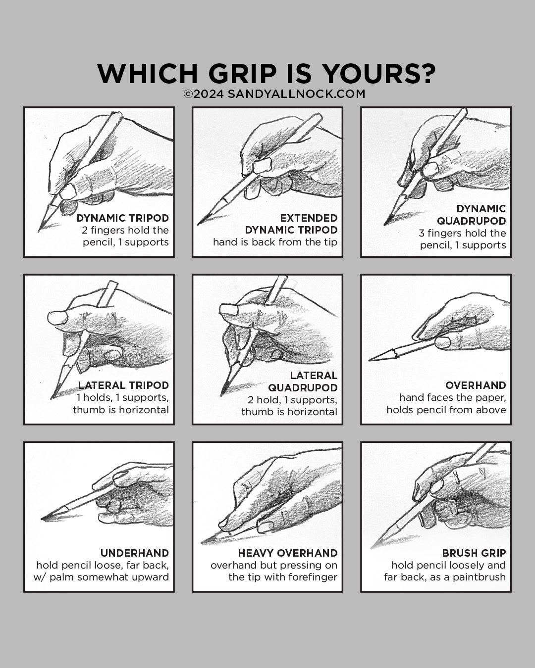
Am I the only one who varies?

Do you swap around your tool-holding techniques? Within one piece, or do you swap it out based on the tool? Inquiring minds want to know…

Supplies

Some product may be provided by manufacturers for review and use. Compensated affiliate links are here at no cost to you. I appreciate your support of my work with your purchases! Full affiliate and product disclosure | My trusted partners in art

How to Approach a Night Drawing | Screech owl

How to Approach a Night Drawing | Screech owl

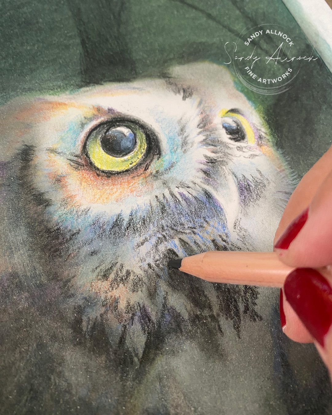
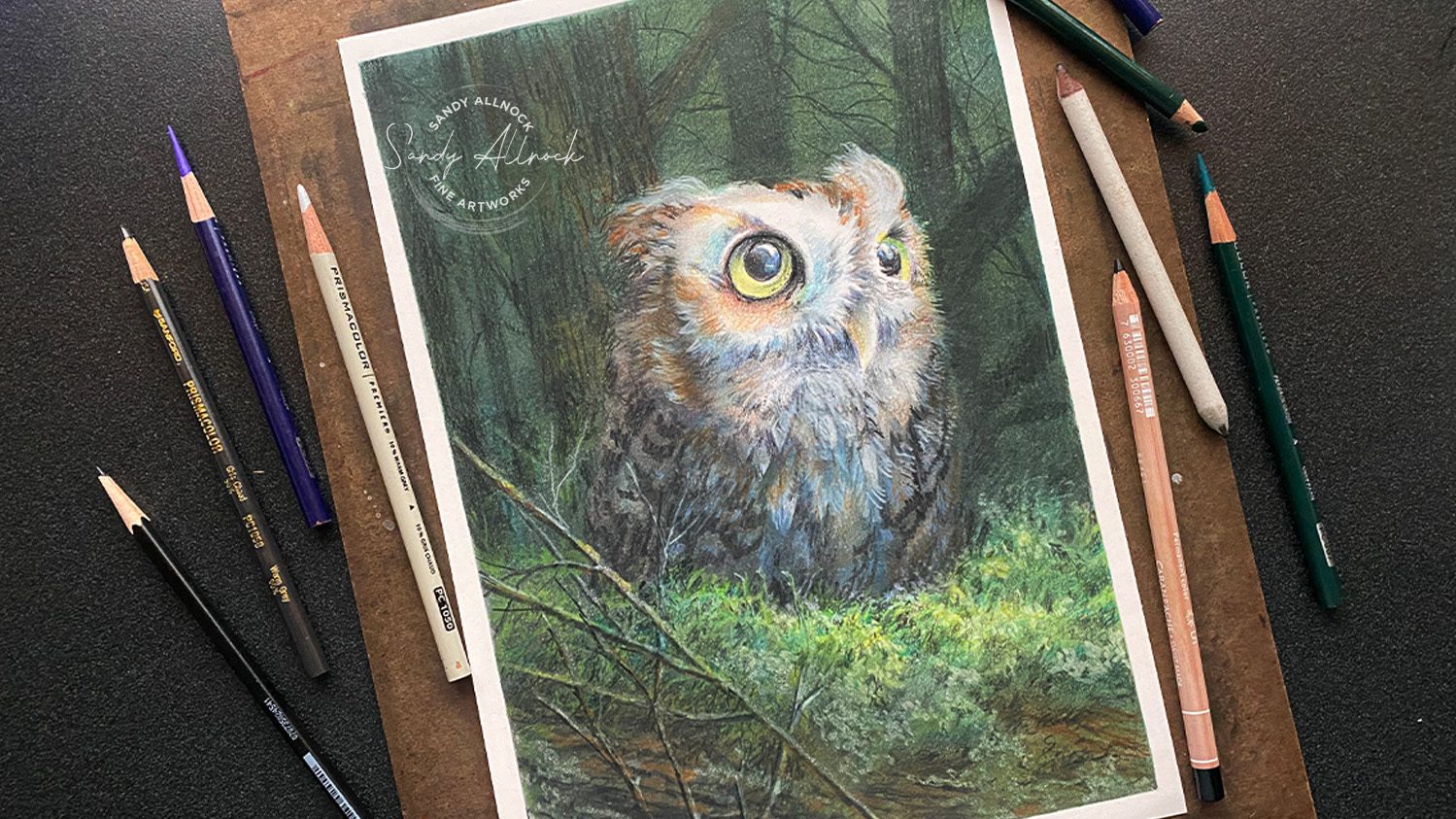
This night drawing of a screech owl tried to KICK MY BUTT.

It didn’t even wait til it was a night drawing. It started right away.

Why? THE PAPER.

In my previous post, Comparing 4 Colored Pencil Papers, I tried out some different ones in full drawings, and this one was SUPPOSED to be the one for Daler Rowney Smooth Heavyweight. 
Cutest little photo of a screech owl! The drawings were going to be just the birds for all these, so I could finish the project at some point, but that I could at least test out the paper enough to figure out what I thought of it.

Right away this paper fought me. It doesn’t like getting dark very quickly at all. Also, note that you’re looking at these photos from very close up, and all pencil can look kinda messy with your nose pressed against the paper….don’t judge your drawing til you look at it from a few feet away asi if hanging on a wall.

I worked on this during this month’s Open Studio Zoom, and the attendees got to hear my constant griping about the paper fight. LOL! Yeah, Zoom is where things get real, and it’s why I rarely do live streams anywhere, nobody needs to know how grumpy I get if art supplies don’t work! I went the powdered-pencil-plus-blending-solution route and darkened it for a night scene but….it was going to need far more work than I had time for before the video was to go live.

This drawing was set aside and I drew some happy little baby birds…..less real estate to cover, lighter values to render. However – I wasn’t about to let this owl get away and tell me it defeated me.

Nuh uh. 

No way.

You are not kicking my butt!

Tutorial: How to Approach a Night Drawing (Screech owl)

Watch the video below and scroll to the end to leave comments or questions — or click HERE to watch it on YouTube and leave comments over there. I read both dutifully!

Feathers n fronds

The owl’s feathers needed to go much darker; when going powdered pencil crazy I softened all of it, and had to dive in deep with some blacks; some because markings were black, some because the grey was dark enough I needed a more absolute black with more pigment than my scrap of a Prismacolor had to offer. Luminance to the rescue. 

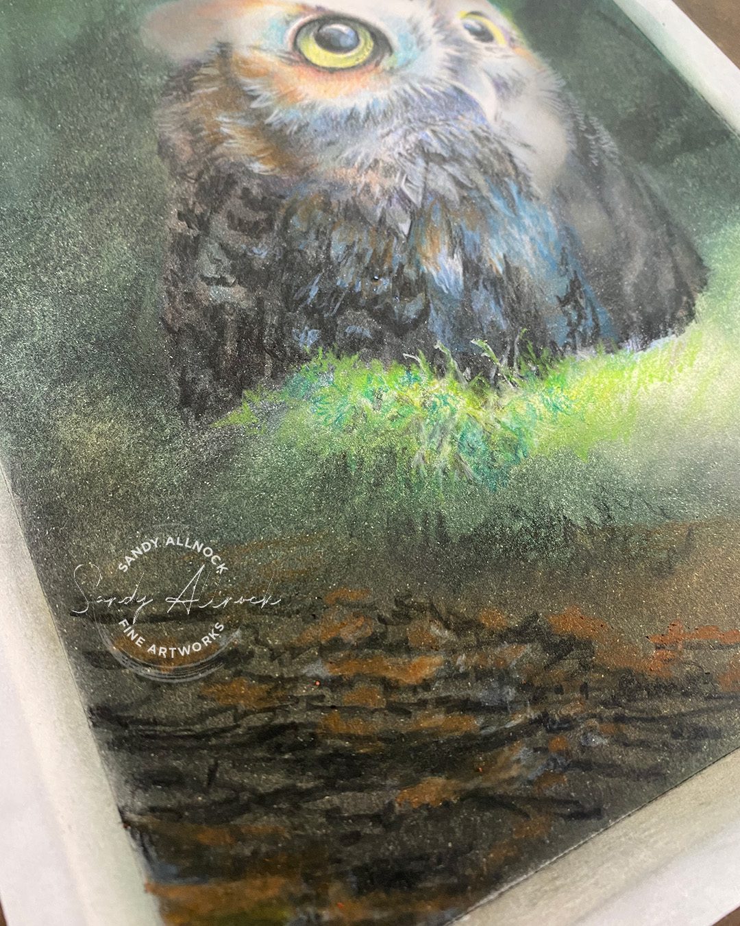
The moss was something I’ve never tried before in colored pencil, and honstly I want to try it again after all I’ve learned from this experiment. It needed more preplanning than I had done here, clearly, and a paper that would allow me to put the darks down then pop lights on the tips. Nonetheless, even thought it looks messy close up, I was liking the distant view.

Both areas could handle a little light pencil on top of those layers, but nothing had a real pop of white, which would have been nice. (Looking at you with love, Pastelmat…) Remember when creating a night scene that you want to be dramatic, make the moonbeam limited–let it go from really bright light to midtones and darks quickly, so in an area like the chest, which is white, it went to blues fast to keep the focus up on the face.

Partially lit twigs

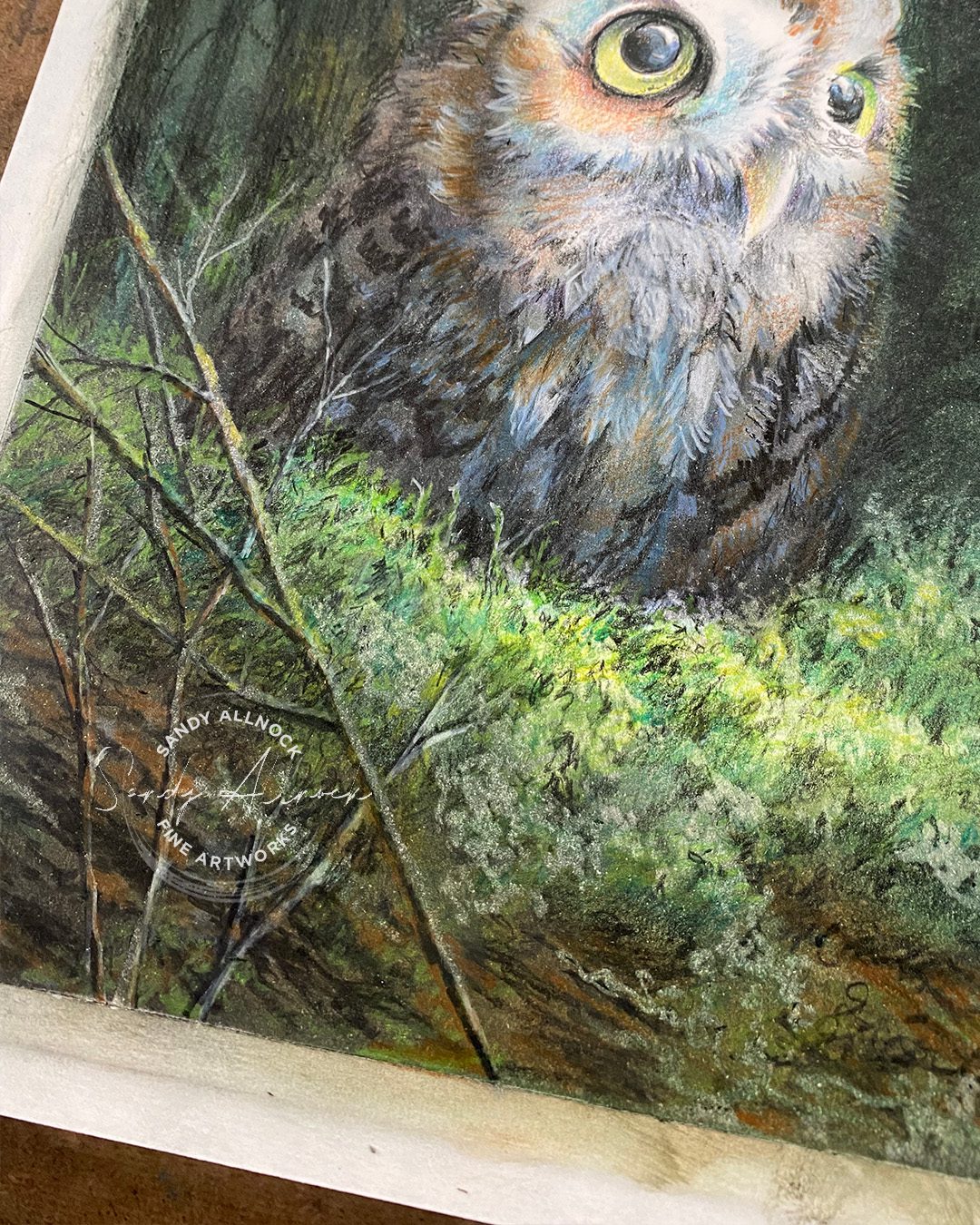
When light bounces around, it’ll add highlights to things like nearby twigs, but they aren’t as brightly lit as the main beam of moonlight – so the highlights are less, and usually picking up colors in the scene nearby. These twigs were far too sharp and were trying to steal attentin, along with the mosses behind them – and I ended up cotton-balling them so they softened and darkened.


Subscribe to receive blog posts by email:

Photographing pencil is hard

lest you think it’s just you – it’s not easy to take photos of pencil. Graphite or colored pencil, same same. The surface is reflective, and if you have enough light around to see by, you get a shine on the surface, whether with a phone or camera. Since my phone is also dying, add that to the troubles!

This drawing is much more elegant in the transitions of value and softness….here’s one view on my desk from overhead…it amps up the colors and sharpens edges on my phone. Bleh. 

And then on the other side of the room away from sunlight, and though color is more accurate it doesn’t capture the softness of the branches. 

In my shop

I posted all my birds in the shop yesterday and sent an email to the suscribers over there on my fine art site….if they’re still available, snag one quick if you want it. The Kingfisher  sold within just a few hours last weekend!

Get your World Watercolor 
Month swag before it runs out!

Supplies

Some product may be provided by manufacturers for review and use. Compensated affiliate links are here at no cost to you. I appreciate your support of my work with your purchases! Full affiliate and product disclosure | My trusted partners in art
Comparison: 4 colored pencil papers

Comparison: 4 colored pencil papers

My adventure with colored pencils continues! In my previous post I said I was trying out some drawings with the new “set” of colors in my Colored Pencil Conversion Chart – not that it’s a set, but it’s a grouping that I can now use in teaching! Before I was always testing every time I made a new class, hoping to locate colors that would have a match in both Polychromos and Prismacolor. And now that’s settled – though it required making a real test with a real drawing that you can see here. 


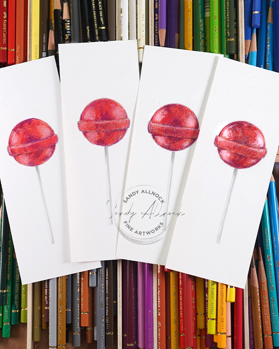
That left me thinking about much more – like, have I ever tested the newer papers in the studio in a head-to-head test? Nope. I had done that with some papers years back, and drawn with what I have….but not in a side by side test. So I finally did – with lollipops! You can watch the magic in the video, and see the full scale drawings later in this post.


All the rawings on this page are made with Polychromos penccils. Papers left to right above: Strathmore bristol, Daler Rowney heavyweight, Legion Stonehenge, and Clairefintaine pastelmat

Tutorial: Comparison – 4 colored pencil papers

Watch the video below and scroll to the end to leave comments or questions — or click HERE to watch it on YouTube and leave comments over there. I read both dutifully!

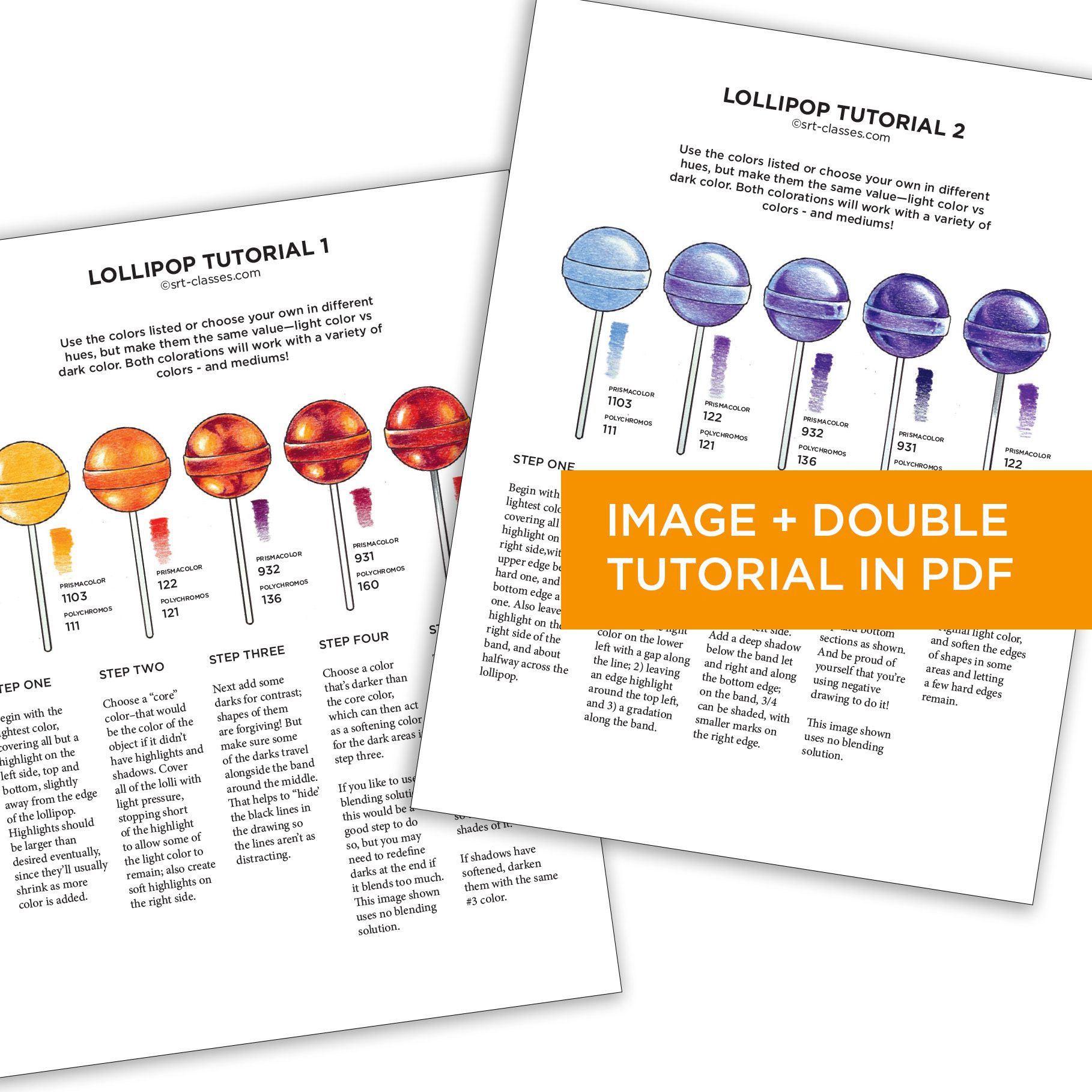
Want to color lollipops?

While some will want to engage with the bird drawings on offer in this post – some might be at the stage of creating a realistic looking lollipop! Got you covered. You can get this PDF tutorial along with the image to print on your favorite paper.

Strathmore Bristol, vellum finish

Back in college I had used a bristol, though that one isn’t made any more. I knew crafters who swore by this Strathmore, and had gotten some to try it out. 

While it can have a good result, it’s….well, it’s hard to work with, in that it takes a lot of layers and demands blending solution! I love me some contrast, and this made me work for it. Perhaps if there was more time on the clock, more hours in the day, I might have been willing to sit with it longer, but it frustrated me. 

The drawing experience isn’t great either; resorting to heavy pressure just makes it difficult to want to use the paper for colored pencil. But for 45cents for a 9×12 sheet, you can’t ask much, can you?

Daler Rowney smooth heavyweight

Another inexpensive paper clocking in around 75cents a sheet, this one was the favorite of a wildlife illustrator. She dows lovely work, but also the patience of Job, I think! I did like the texture it created, but the time factor with so many layers was crazy. No blending solution here, just layer after layer, using complementary colors to create shadow hues.

Subscribe to receive blog posts by email:

Legion Stonehenge drawing paper

Now we’re talking! This paper entered my life years ago and has been a go-to, and side by side with the others it was easy to see why….it’s quite soft and gathers up a lot of pigment on the paper! I prefer a paper that doesn’t make me use blending solutions, and there’s none used here. Again, complementary colors throughout – and a floofy bunch of feathers!

The one problemwith birds and this paper is that it’s tough to deal with adding white on top of other colors when the pencil has already been built up; it only gets to be a grey color. Because of that I added negative coloring for the darkest areas, adding shadows around feathers to let those determine the shapes of the lightest bits

Clairefontaine pastelmat

Made spevigivally for pastel, this paper also works quite nicely with colored pencil. It holds a lot of pigment like the Stonehenge,  but also allows enough layers that you can get a pretty decent (though still imperfect) white on top of other color.

If you have an area that needs to be white-white, leave the white of the paper OR make sure white is the first layer of color in that area. Thats what i did with the kinggfisher in my previous video–the white water, white highlights in the bird, and the white sky opening all went in as the base white.

Two drawbacks to pastelmat;

  1. the cost. At almost $4 a sheet in a 9×12 pad, it’s kinda crazy. You can try a single sheet for just over $5 if you want to see if you like it. (links at the end of this post0
  2. the white attracts dirt! whether dirt from the air, fingerprints, dust……..it all sticks to the paper. Develop tidy habits, cover your work overnight, and be  careful of any stray marks.

Two new classes

Both are level 4 classes; the drawings are traced so don’t worry about having to know enough about drawings to get the proportions right.

Nuthatch

This drawing is on white, and includes a lot about complementary colors blue and orange. Only five pencils made this entire drawing – it’s pretty amazing. 

Blue Tit

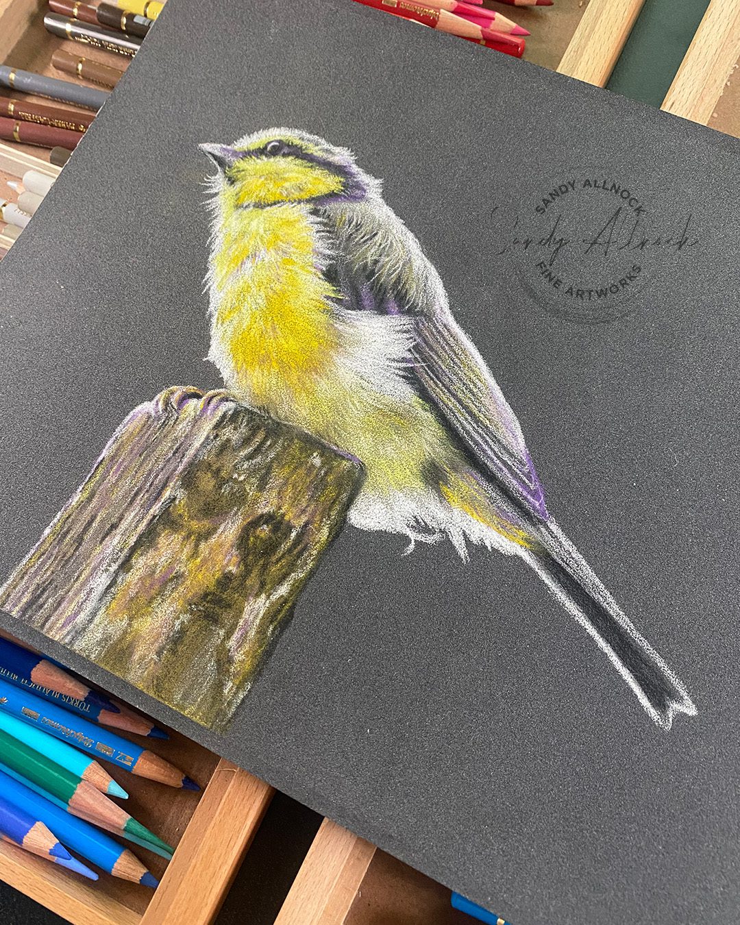
This yellow bird with a blue back (that you can’t see) is also level 4, and is on charcoal grey. It’s more forgiving as far as messiness1 and lots of fun to work with.

Closing thoughts 

I won’t be doing a 100% switch to pastelmat for colored pencil work, but if I hit the lottery i might, ha! Stonehenge still works well for me and gets nicely pigmented. 

Supplies

Some product may be provided by manufacturers for review and use. Compensated affiliate links are here at no cost to you. I appreciate your support of my work with your purchases! Full affiliate and product disclosure | My trusted partners in art
Clairefontaine Pastelmat by the pad…no 2 is what I’ve been working with.

  1. Palette No 1 Maize, Buttercup, Dark Grey, Light Grey  BLICK • AMZ 
  2. Palette No 2 Sienna,White, Brown, Charcoal Grey   BLICK • AMZ 
  3. Palette No 4 Dark Blue, Light Blue, Wine, Sand  BLICK • AMZ
  4. Palette No 5 Dark Green, Light Green, White, Dark Blue BLICK • AMZ
  5. Palette No 7 BLICK

Clairefontaine Single color pads:

  1. Charcoal grey only Pad BLICK
  2. White only Pad BLICK

Clairefontaine Pastelmat by the sheet:

Charcoal grey Sheet BLICK (for Bluetit)

White Sheet BLICK (for Nuthatch)

Try this blending tool with colored pencils

Try this blending tool with colored pencils

Blending with colored pencils is a skill we can spend our artistic lives on  – and a small fortune on as well! Fortunately the tools to try aren’t expensive – like blending stumps, cotton balls, qtips, brushes, and even a very clean finger! (Be careful, oils from your finger can wreak havoc on your artwork.)

I hadn’t thought of trying the tool I want to show you today – but my cup of pastel tools was right there beside me just begging to be tried out. Since colored pencils and pastels are dry pigment, it was sure worth a try!

Tutorial: Try this blending tool with colored pencils

Watch the video below and scroll to the end to leave comments or questions — or click HERE to watch it on YouTube and leave comments over there. I read both dutifully!

Bokeh on dark vs light

Soft blends are what makes bohek work – and I think colored pencil is 2nd easiest to create it with (pastel being #1). The color if the paper makes a real difference in the techniques applied.  

When working on light paper, the ‘valleys’ , or low spots between peaks, are what causes the speckled look…the white paper shows through, and filling those spaces in with pigment in a variety of techniques can smooth that out. I happen to love that texture when I can get it to be evenly distributed!

It’s easier to make those spots less visible when the pigment color is close to the paper color, so on white, the lightest colors don’t need as much blending.

On dark paper, though, the valleys show up as dark spots in between the peaks of the paper. That means more pressure to apply more pigment is needed to increase the brightness as well as filling in those gaps.

If drawing a pale bokeh, a lighter paper would be more helpful; for primarily dark bokeh, select a darker paper.

Tips for bokeh

Layer colors atop each other as they touch, so that in thoe areas where they cross you’ll get 50% of each color, letting both trail off in the direction of the other color. From this experiment, I can say it doesn’t matter whether they’re analagous colors (adjacent on the color wheel) in colored pencil, since this technique works great. Other mediums are more likely going to be helped by using colors close to each other.

Make the bokeh dots different sizes, and watch the scale of them compared to the focal image. In this case, the dots needed to NOT be more important than the bird; the kingfisher is to be the star, so I had to watch my colors, values, and sizes so the bird remained most important. Study a lot of images on google to get an idea what the scale might be to go with your subject.

In a forest like this one, add trees that remain SOFT by surrounding any black lines with a light color so the trunk and breanches seem to feather out.

One of the last changes I made on this image was to turn some of the dots into partial hexagons, leaving some of the edges trailing off into each other to keep them looking like they were floating and mixing together. I squinted to make sure the backgound didn’t have areas that were as detailed as the bird and water.

Subscribe to receive blog posts by email:

Kingfisher for sale….

If you’d like a kingfisher to display on your wall…

Get the conversion chart

Today’s project came about because of the conversion chart so go grab yourself one!

Supplies

Some product may be provided by manufacturers for review and use. Compensated affiliate links are here at no cost to you. I appreciate your support of my work with your purchases! Full affiliate and product disclosure | My trusted partners in art
Don’t quit on your painting too soon! (Tigress watercolor)

Don’t quit on your painting too soon! (Tigress watercolor)

I’ve talked for YEARS about not quitting on your art too soon. i’m often tempted to as well – “oh dang, this one’s dead!” But sometimes I’m reminded that just continuing can make a big difference. Once in a while, the painting is saved, too! 


Tutorial: Don’t quit on your painting too soon!

Watch the video below and scroll to the end to leave comments or questions — or click HERE to watch it on YouTube and leave comments over there. I read both dutifully!

The good, the bad, and the ugly

Things had started well. The tigress came along, colors and fur textures were working. I had decided to scrap the masking fluid as I could see it was simply going to look clunky and need repaired anyway. But the rest was good….just in need of a background.

I won’t say I didn’t let out a huge yell when things went sideways with the background. I was trying to balance the values; in the photo reference there was a highly contrasting and complex jumble of forest, but I wanted something simpler that would lead to putting the focus solidly on the tigress. 

Yes the temptation to give up was palpable. Nothing would have made me feel better than to shred the paper into pieces! But I resisted, and decided to see just what would happenif if more layers were added over the failed bokeh. Then the idea of tree silhouettes popped into my head. Had I given up early, I’d have missed out on even having that idea! Normally if there were not so many layers, that option wouldn’t come up.

Subscribe to receive blog posts by email:

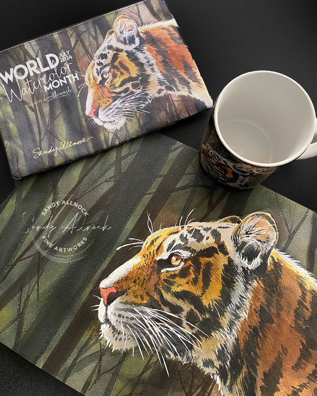
Swag for World Watercolor Month!

WWCM doesn’t start until July, but the swag is available now – and moves quickly! Get your order in quickly; I don’t make anything from this but would LOVE to be top seller this year! Give some as gifts – and help us raise money for International Child Art Foundation!

Prefer a print?

These are not part of the fundraiser, but for those who’d like a print to hang on your wall, it’s for sale in my shop.