Myrtle Falls (Custom brush pen test part 2)

Myrtle Falls (Custom brush pen test part 2)

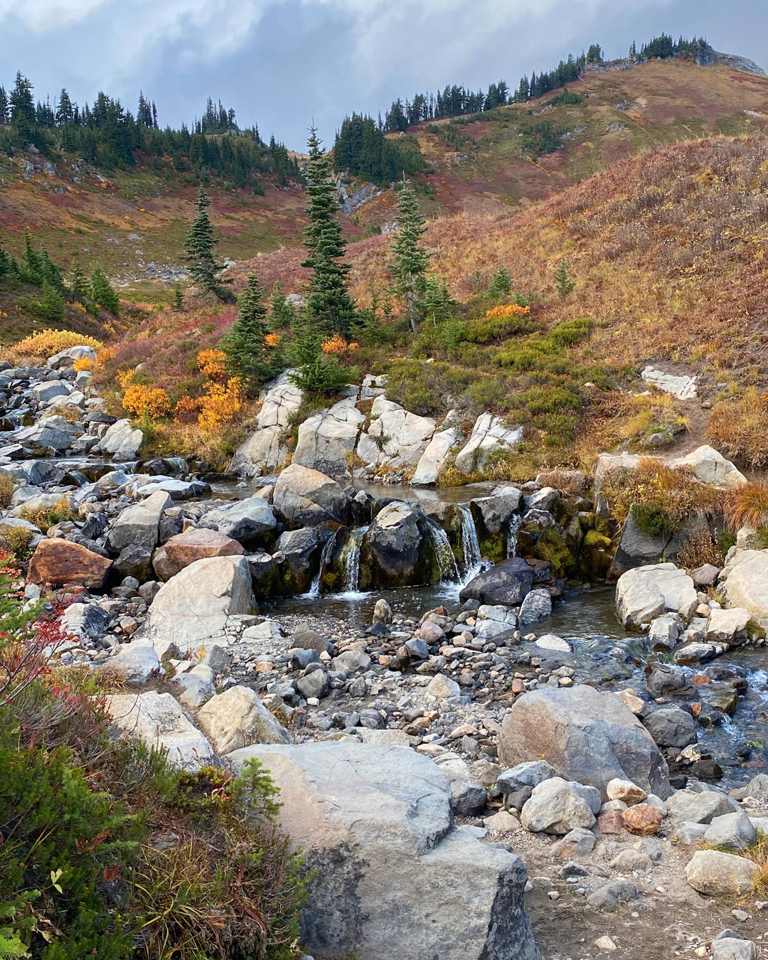
The colors on an iphone don’t do a beautiful fall scene justice, especially on a cloudy cloudy day….but what was so memorable for me this past Monday about my adventure up to Mount Rainier, it was my cousin’s visit! I haven’t seen her since she was a little girl, and now she’s a grownup 21 year old, traveling on her own and being all kinds of amazing!

On our trip she taught me about the science of the adaptations trees make as you get higher and higher up….and I taught her the differences in the branch formations, which she’d never noticed – and they’re something I see as an artist. A great back and forth for both of us!
After my last video and realizing I hadn’t mentioned some important things about these pens (read the last post to find out more), I also decided to try something that the folks in chat during the Premiere were asking about these brush pens – can you use watercolor in them? Let’s give it a try!

Tutorial: Myrtle Falls (Custom brush pen test part 2)

Watch the video below and scroll to the end to leave comments or questions — or click HERE to watch it on YouTube and leave comments over there. I read both dutifully!

SUPPLIES

Some product may be provided by manufacturers for review and use. Compensated affiliate links are here at no cost to you. I appreciate your support of my work with your purchases! Full affiliate and product disclosure | My trusted partners in art

Sketchbook

  1. Hahnemule ZigZag Sketchbook:
    BLICK 
    AMZ 
    JACKSONS 

Pens

  1. Nuobesty Empty Brush Pens (3)
  2. TWSBI Eco fountain pen medium nib

Inks/watercolor

  1. Platinum Carbon Black Ink
  2. Jacques Herbin Amethyst de L’Oural ink  
  3. Platinum Forest Black Ink 
  4. Daniel Smith Moonglow:
    BLICK 
    AMZ 
    JACKSONS 
  5. PhMartins Liquid Watercolor, Blue Aqua
     BLICK 
    AMZ 

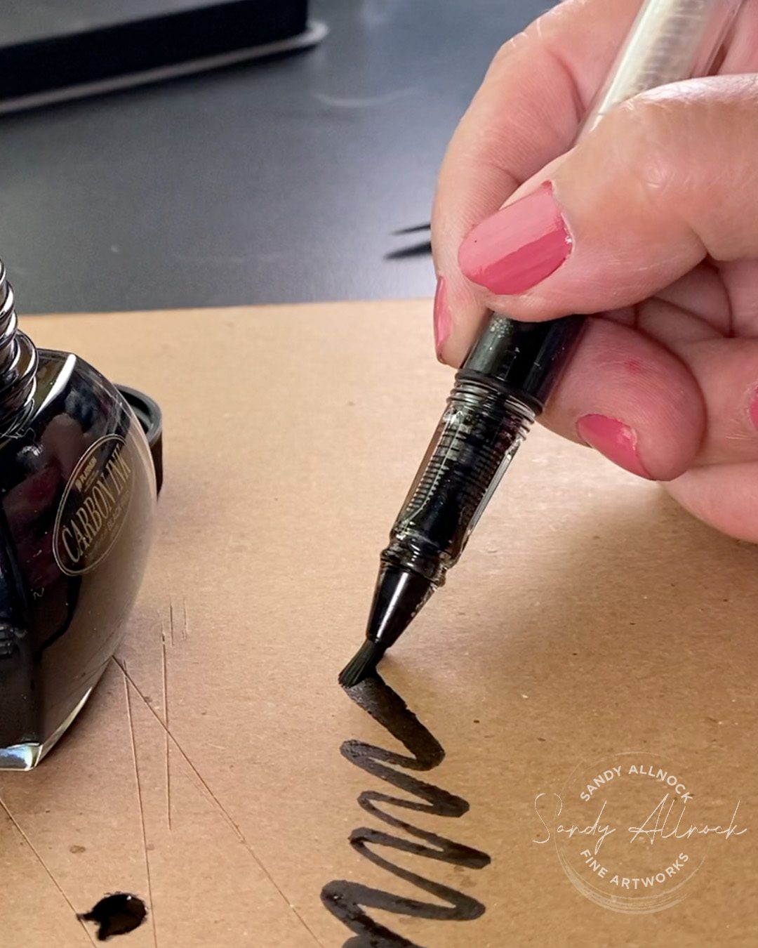
The brush pens

These are fairly generic pen bodies – an inexpensive acrylic – but feel more like a fountain pen than any aqua brush pen. The nib is of course brush-like, and is more in the style of a Zig clean color brush point than, say, a felt type marker nib.

I don’t know at all how long these will last, will they dry out, etc; if you end up finding out, do let me know if yours dry out, and what was in them! The caps aren’t super-fancy or anything and it’s possible they’ll leak air in; I’ll be checking these periodically to see how it goes.

Ink vs watercolor

This was another lesson for me in the difference between ink and watercolor; watercolors are meant to be more transparent in use, which would be why it was hard to get a “thick” mixture of the Moonglow that would have enough flow to be sucked up into a pen like this. Inks seem to work better. Just be sure to get the brush–and the plastic it fits into– covered by the liquid so that whatever science magic of air and moisture happens, it’ll keep pulling liquid into the pen.

Subscribe to receive blog posts by email:

Cleaning these pens

I couldn’t work out taking them apart without possibly damaging the piston by taking THAT end out; I know you can do that with fancy pens, I just didn’t trust these to go back together since they’re not solidly built! So I just went to the art sink and under running water, pulled in clean water, expelled colored water for about 5 minutes til it was mostly clear, then refilled with similar colors in each pen.

What was  your last national park adventure?

And have you sketched it yet? What are you waiting for?

Composition in doodling – with custom brush pen

Composition in doodling – with custom brush pen

Before today’s tutorial…

BREAKING NEWS: I cleaned the studio Friday in advance of Saturday’s zoom call…not that anyone sees my space but ya know, company in the house and all. 🙂 When I walked in Saturday morning I was SO EXCITED to get working! The counter and desk had both been so covered in rubble from past projects….I was working on so many hex charts lately that ALL the pencils were still out, the charts had to go into my binders, stray supplies were just all over. IT FELT SO GOOD to walk in to a clean space. Not that it’ll last long, but hey, it’s a good feeling!

While cleaning I found a bunch of pens that have been here for eons! A number were dried out since they sat so long, which was sad. We had a wake.

But a three-pack of brush pens caught my attention. I think I got them in an art store, from my recollection, but did find pens that look just like it on Amazon -stay tuned for more assessment of this pen vs other aqua brushes you might know.

Tutorial: Composition in doodling – with custom brush pen

Watch the video below and scroll to the end to leave comments or questions — or click HERE to watch it on YouTube and leave comments over there. I read both dutifully!

SUPPLIES

Some product may be provided by manufacturers for review and use. Compensated affiliate links are here at no cost to you. I appreciate your support of my work with your purchases! Full affiliate and product disclosure | My trusted partners in art

SKETCHBOOK SUPPLIES

  1. Canson XL watercolor pad 9×12:
    BLICK   AMZ   JACKSONS
  2. We R Memory Keepers Large Score Board 

INK AND PENS

  1. Nuobesty (3) Empty Brush Pens 
  2. TWSBI Eco fountain pen medium nib
  3. Platinum Carbon Ink 
  4. Pipettes (100) 

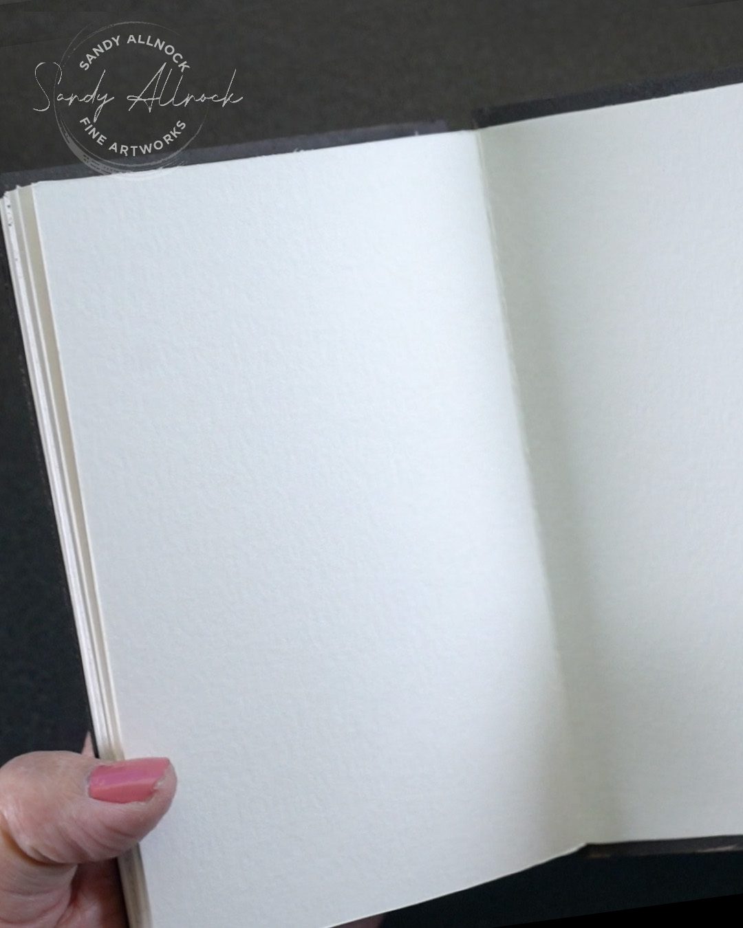
DIY accordion sketchbook

I paired the brush pen exploration with making a new sketchbook (I need one like I need a hole in my head!) but thought it’d be good to remind people you can make your own book if the one you love isn’t available. I scored 9×12 Canson XL paper at 4″, and made a few zigzag pieces that then were attached to each other. You can glue a front and back together, or tape them on the back. (I’ll draw out one side, then put clear tape on the drawn side and remove the white tape from the back and be able to draw unimpeded.)


What this brush pen can’t do

You might be well familiar with aqua brushes/water brushes. Those are generally the soft plastic into which you can put water, paint, or ink, right?

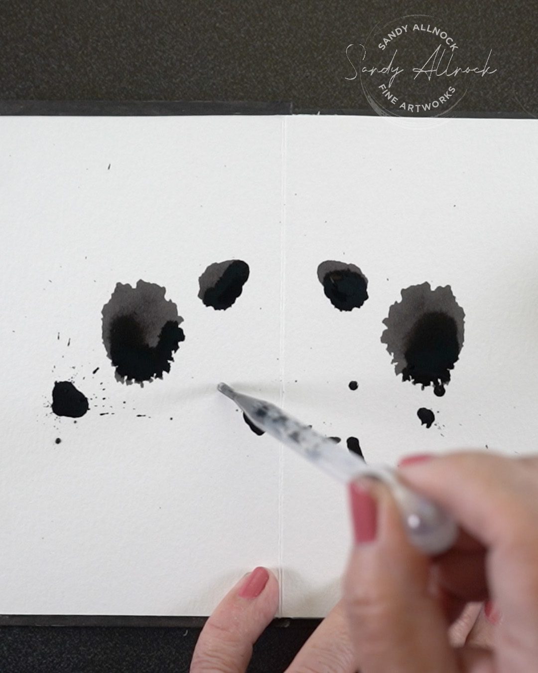
Well these brush pens FEEL like a fountain pen The casing is more of a hard acrylic like those are. Which means I switched to a pipette to drop the ink onto the paper; you can’t squeeze it to expel a blob of liquid like an aqua brush.

What this brush pen can do

The hard acrylic shell also means you won’t accidentally expel a LOT of liquid when you least expect it. That accidental overflow is one reason I don’t like aqua brushes, because they bloop, but this one doesn’t do that. It also means you can get some drybrush with it, which I’m excited to explore in another drawing sometime.

Subscribe to receive blog posts by email:

Composition

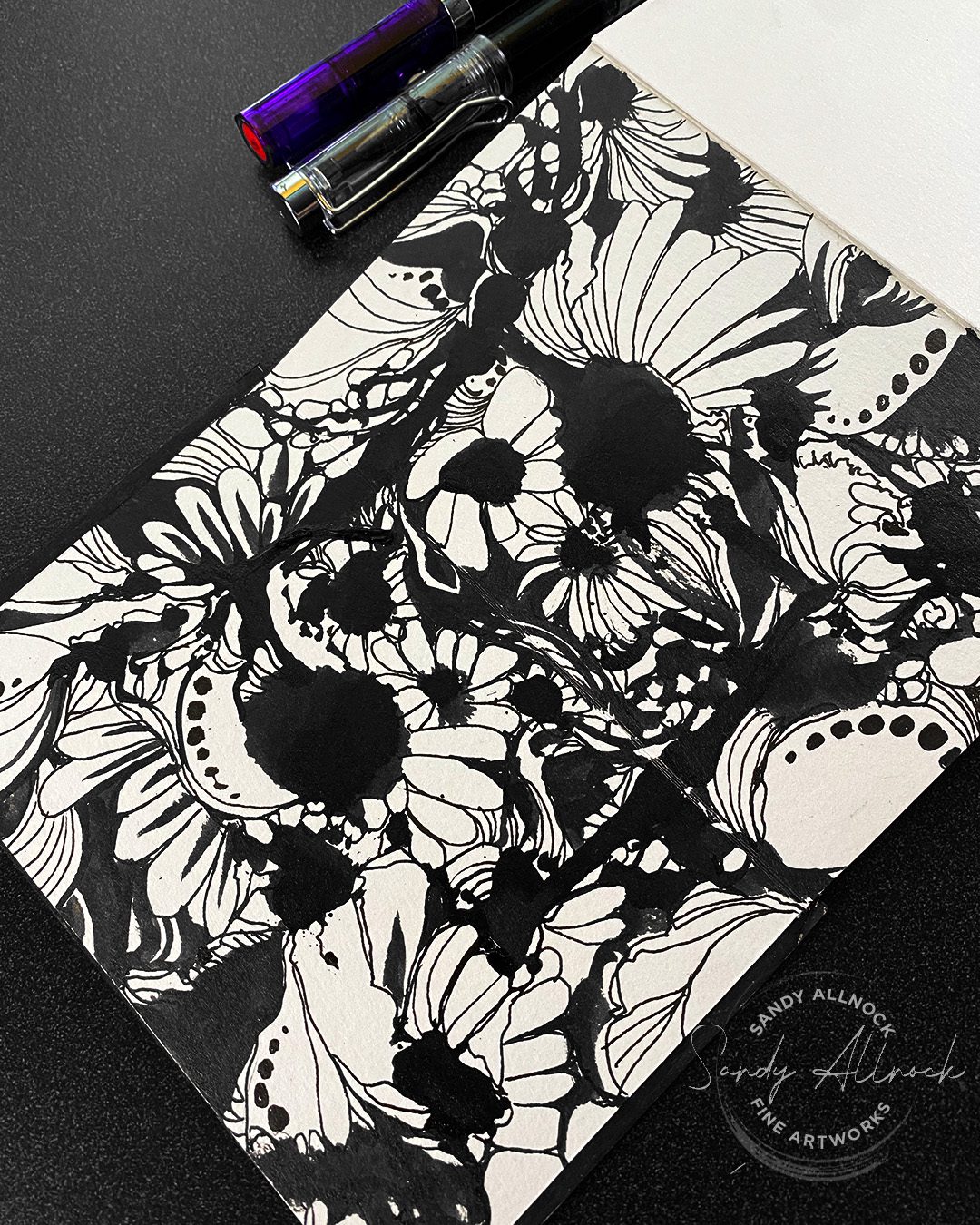
I’ll be thinking more deeply about how to talk about composition – ways to use white and dark space to create direction, directional lines in the art, and more. But for this one–flowers unified the design first. Much of the rest of the work was trying to join the dark blobs that were there from the start so they seemed more like chosen areas of darks rather than accidental blobs.

I wasn’t particularly articulate about it all, but lots is just in the beginnings of my thinking at the moment; when it occurred to me that you might like a course on creating these kinds of beautiful abstract doodles, I realized I need to start paying more attention to the thoughts running through my head while I’m working! Filling this sketchbook should help.

Is this a course you’d be interested in?

And are there specific questions you’d like answered? I can keep those in mind while playing in this sketchbook and developing a class. What are the moments you find yourself challenged in creating this kind of drawing?

Tips for ink lines that “flow” over watercolor (ScareCrow)

Tips for ink lines that “flow” over watercolor (ScareCrow)

Which comes first, the paint or the ink? While you can work in either direction, I love to paint in watercolor first, for a few reasons:


  1. The ability to work on paper with a color “sketch” that I can adjust as I add the ink
  2. The painting stays looser as I’m not trying to stay between the lines
  3. The pen and ink gets looser too

What’s that? The pen and ink is looser? I do like an “organized” pen and ink drawing, but I also like when the lines flow and move a bit. This post will talk about that as well as include a video on the topic!

The underpainting

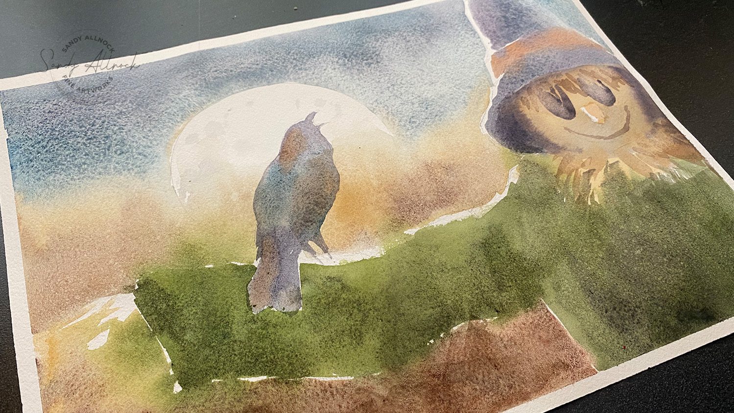
A watercolor underpainting is usually the first pass and other layers would clarify details – but in the case of wash and ink, it serves as a color “sketch” to ink on.

This watercolor is in a video on Patreon (my patrons at the green level and higher get a realtime painting tutorial each month of 2024, including access to the previous ones.) 

Sign up for patreon / watch a video about my new patreon project

The underpainting became this in its finished iteration:

Tutorial: ink drawings that “flow” over watercolor 

Watch the video below and scroll to the end to leave comments or questions — or click HERE to watch it on YouTube and leave comments over there. I read both dutifully!

SUPPLIES

Some product may be provided by manufacturers for review and use. Compensated affiliate links are here at no cost to you. I appreciate your support of my work with your purchases! Full affiliate and product disclosure | My trusted partners in art

Black and white original drawing:

    1. TWSBI Eco fountain pen medium nib 
    2. Hahnemule Hand lettering pads
    3. Platinum Carbon Fountain Pen Ink

Color drawing, printed in a tint:

    1. Legion Stonehenge Drawing Paper, 9×12 pad
    2. Derwent Lightfast Colored Pencils (12pencil set used here)
    3. Dahle Dual-hole sharpener

Flowing lines create movement

While drawing in every single feather and creating each barb carefull on every one of them — that can end up feeling a little clinical. It’s very beautiful and I do love art that’s got that kind of realism, but unless I’m in that mood, it’s not quite my vibe.

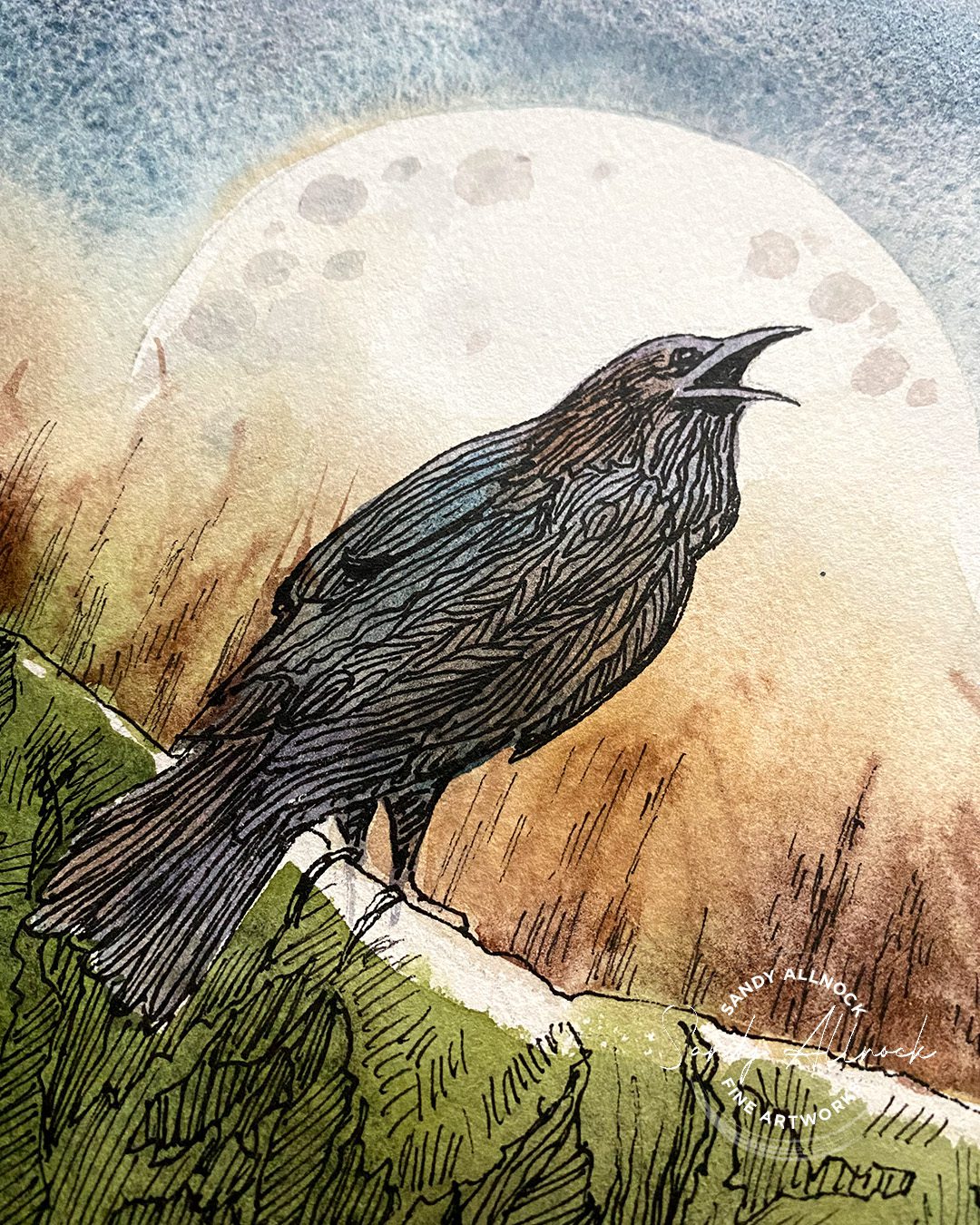
I love lines that flow, not only in the compositions I create but even in the line work! On this crow, I let my pen help define the outside edges of the bird – fixing the beak, puffing out the neck feathers missed in the watercoloring.

But once the main shapes were in, I broke the mass of the bird into shapes by tracing the shapes seen in the watercolor – hue (color) and value (dark/light) shifts. Then lines within them in different directions create that feel of movement, as if the bird is adjusting himself as he turns to laugh at the scarevrow.

If I’d done those sections out of my “thinking” brain, I might have created very regularized, repeating groups of feathers and lines. 

Flowing lines for shape and continuity

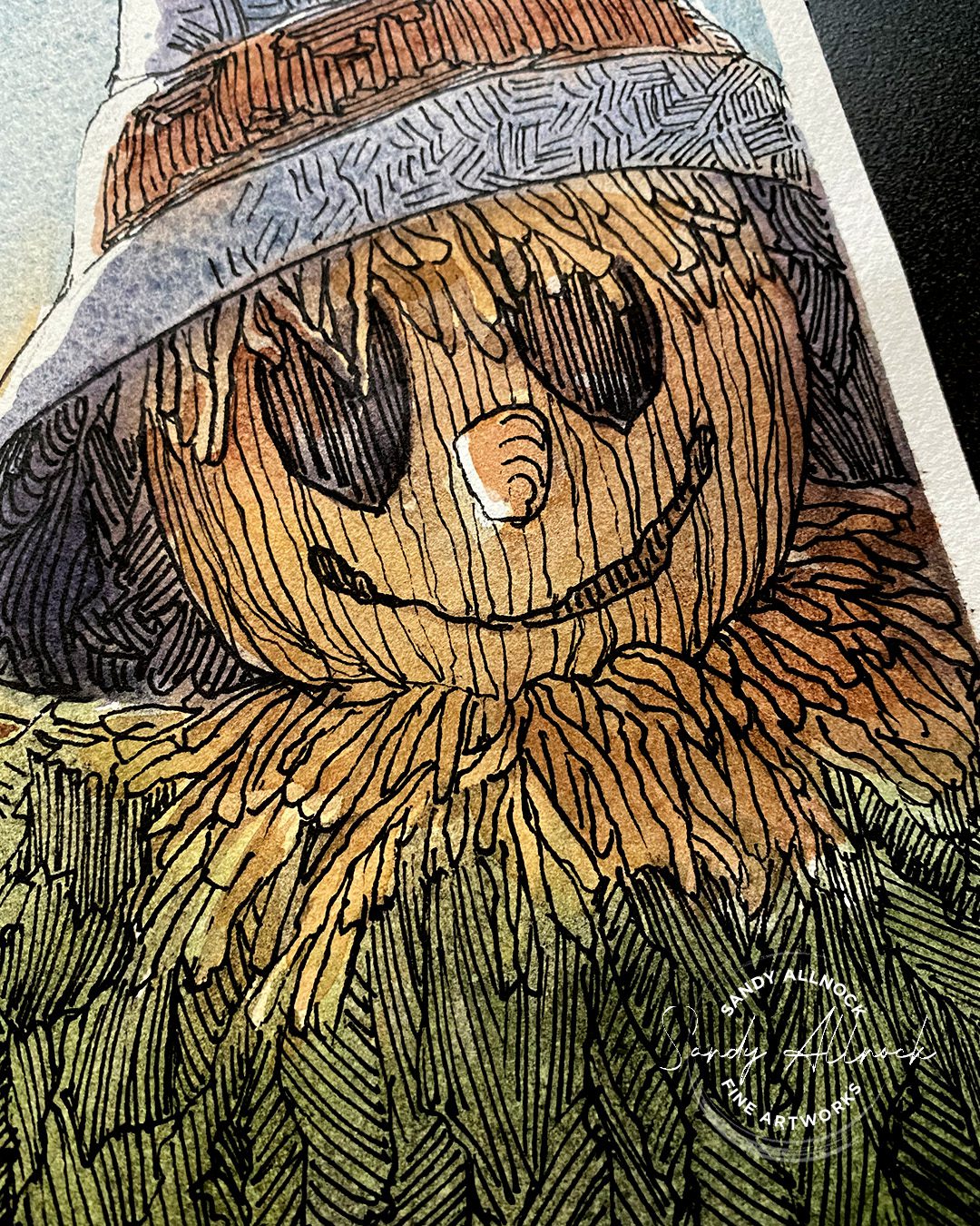
Switching to a thinner pen for some lines really helped! For the lines in the face, they’re a little bit rounded as well as thinner – creating a difference with lines nearby, and also contouring the round head shape. 

Vertical lines in the eyes are straight by comparison – and continue up in the hat in the same direction, creating a connection between those areas of the drawing that flow from one to the other.

And finally the hat contains quadruplets of lines -vertical. horizontal, and angled left and right. The lines can be closer together in shadow areas, further apart and even trailing off in highlights. The lines go with others in the drawing but indicate a different kind of texture in the hat.

Flowing lines for variety

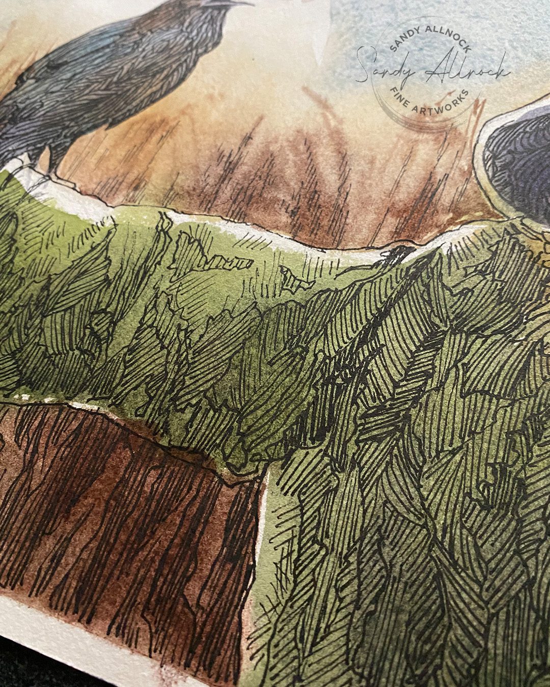
In a drawing, especially a large one like this, large areas with the same line pattern could easily become boring – for the viewer but also for the artist! 

I could have created lines flowing around the fabric folds, and that’s certainly possible. I wasn’t working from a photo to be able to do that though. Instead I let the hue and value changes in the watercolor indicate sections that can contain lines in various directions, making it all more interesting than just very long long lines. 

Subscribe to receive blog posts by email:

Need wash and ink help?

I have a whole page full of courses using pen and ink HERE – but I’ve picked out a few classes below, too.

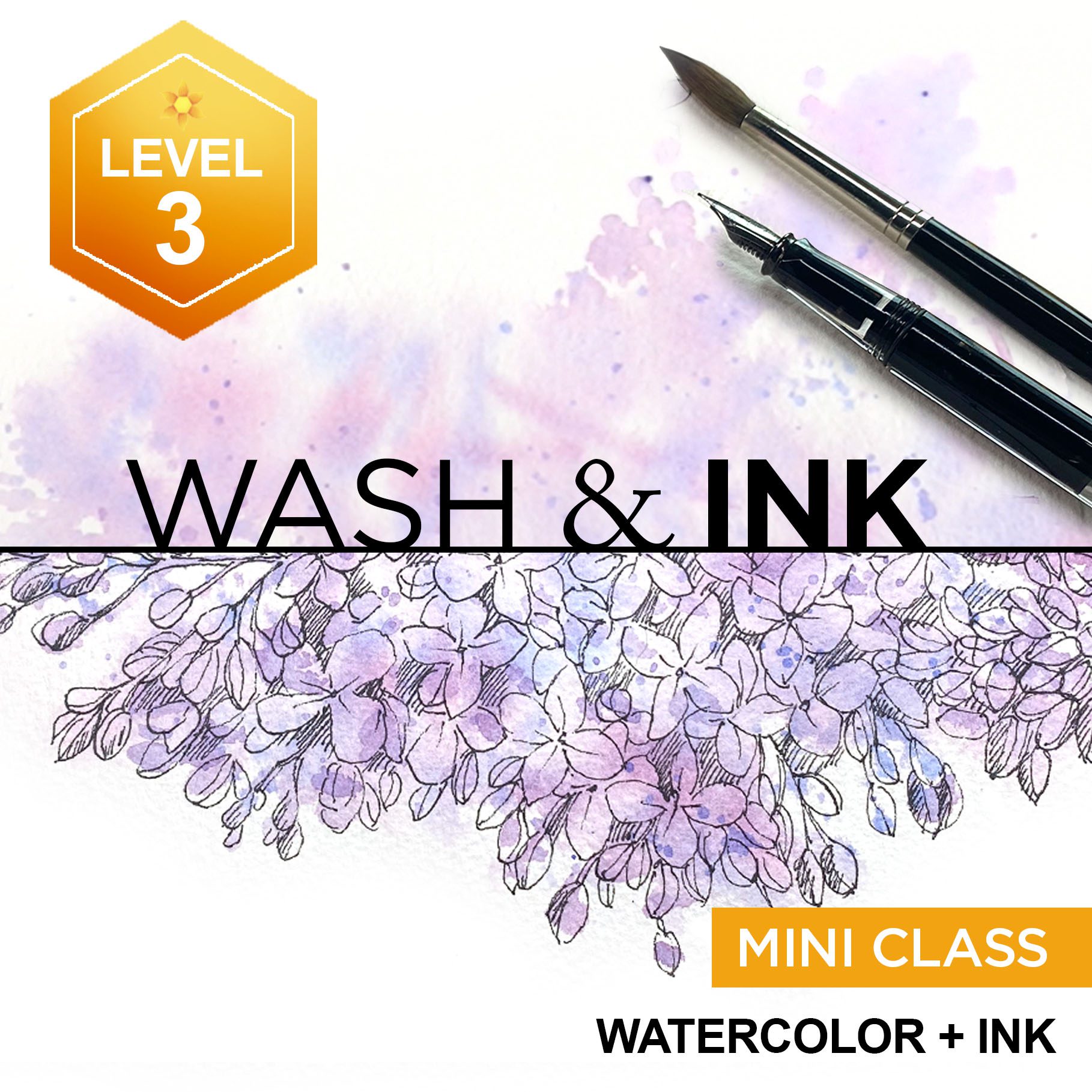
First, two classes that apply the wash first then the ink. The first uses splashy kind of painting techniques, the winter version uses photography to create paintings to add pen and ink in the strategic parts of the piece. (Great for Christmas cards!)

TAP ON THE PHOTOS TO READ MORE ABOUT EACH CLASS

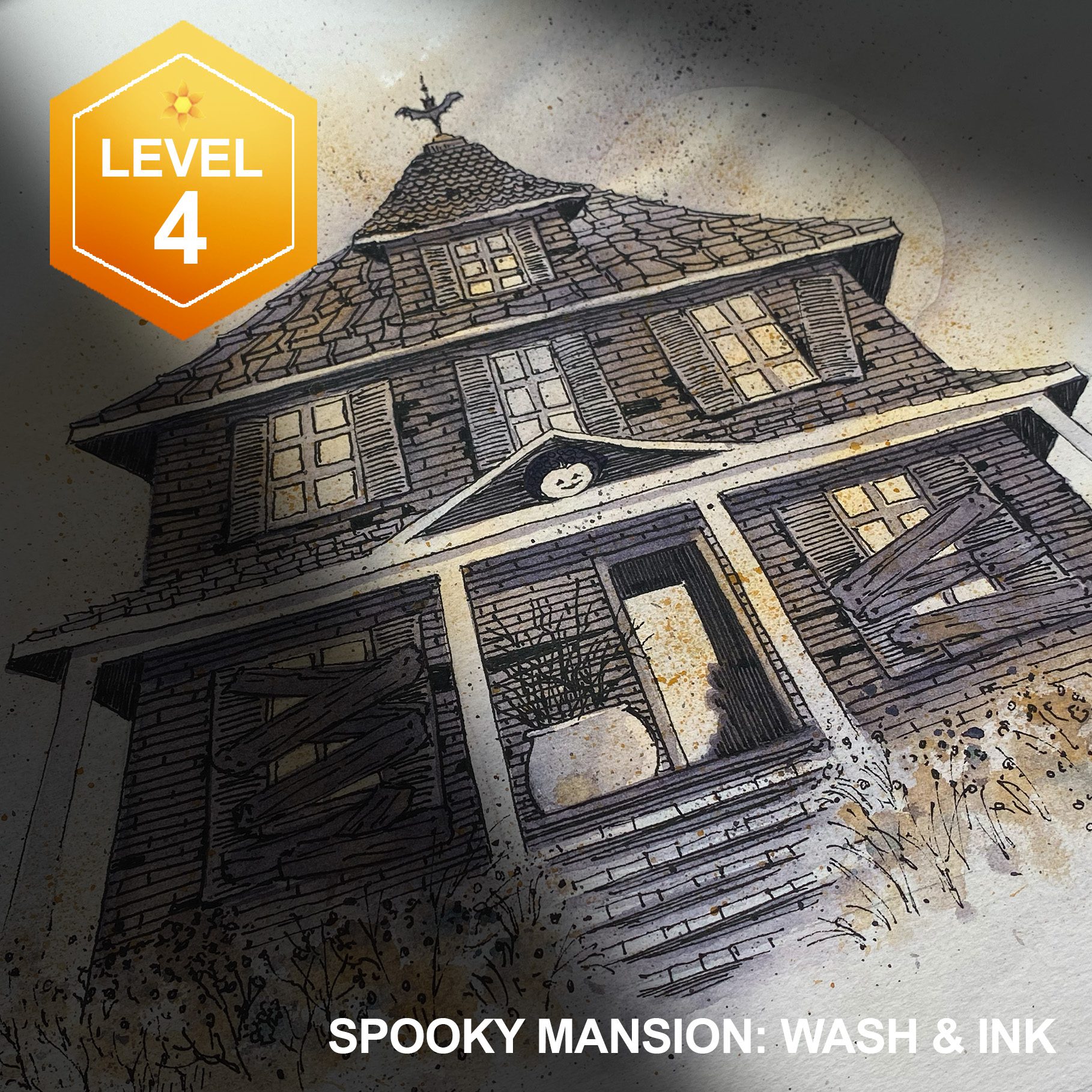
By contrast, this Spooky Mansion is created by drawing in pen and ink first – then adding the color later for a great Haunted House! 


What’s your favorite order – paint or ink first?

Neither is “correct” nor “incorrect” …for me it can make a difference by what the project is! 

Does an artist need EXPERIENCE or EXPERIMENTS more?

Does an artist need EXPERIENCE or EXPERIMENTS more?

I had some art thoughts stemming from an inktober drawing’s questions…. They multiplied while I had insomnia. And to be honest, this drawing happened just yesterday, with the voiceover late last night, so I was a bit wiped out. Hopefully it’s a helpful discussion for you that can encourage you on your journey!

Video: Does an artist need EXPERIENCE or EXPERIMENTS more?

Watch the video below and scroll to the end to leave comments or questions — or click HERE to watch it on YouTube and leave comments over there. I read both dutifully!

SUPPLIES

Some product may be provided by manufacturers for review and use. Compensated affiliate links are here at no cost to you. I appreciate your support of my work with your purchases! Full affiliate and product disclosure | My trusted partners in art

SKETCHBOOK

  1. Etched Stone paper sketchbook (use code SANDY10 for 10% off)

SKETCHBOOK

  1. TWSBI Eco fountain pen
    1. Extra Fine
    2. Fine
    3. Medium

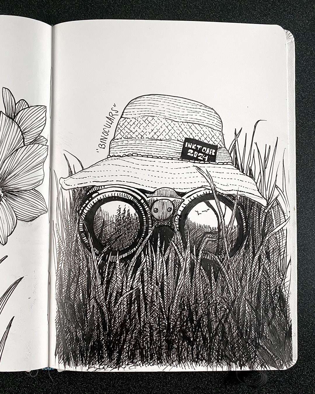
“Binoculars” prompt

This drawing started with a unique perspective (I often think about what the world would look like from my dogs’ perspective!) Thinking about what the back of the binoculars would look like, I suddenly realized a hat would cover that so I could avoid it and get the drawing down quicker with a hat.

Quicker didn’t end up happening, due to the crazy grass issues described in the video! But i did like the ZZ Top outcome….what a beard!

“Hike” prompt

My goal for this drawing was to create rocks and plants with different line work – straight/hatched lines for planes of the rocks, and more squigglies for the plants.  Photo reference is here.

Subscribe to receive blog posts by email:

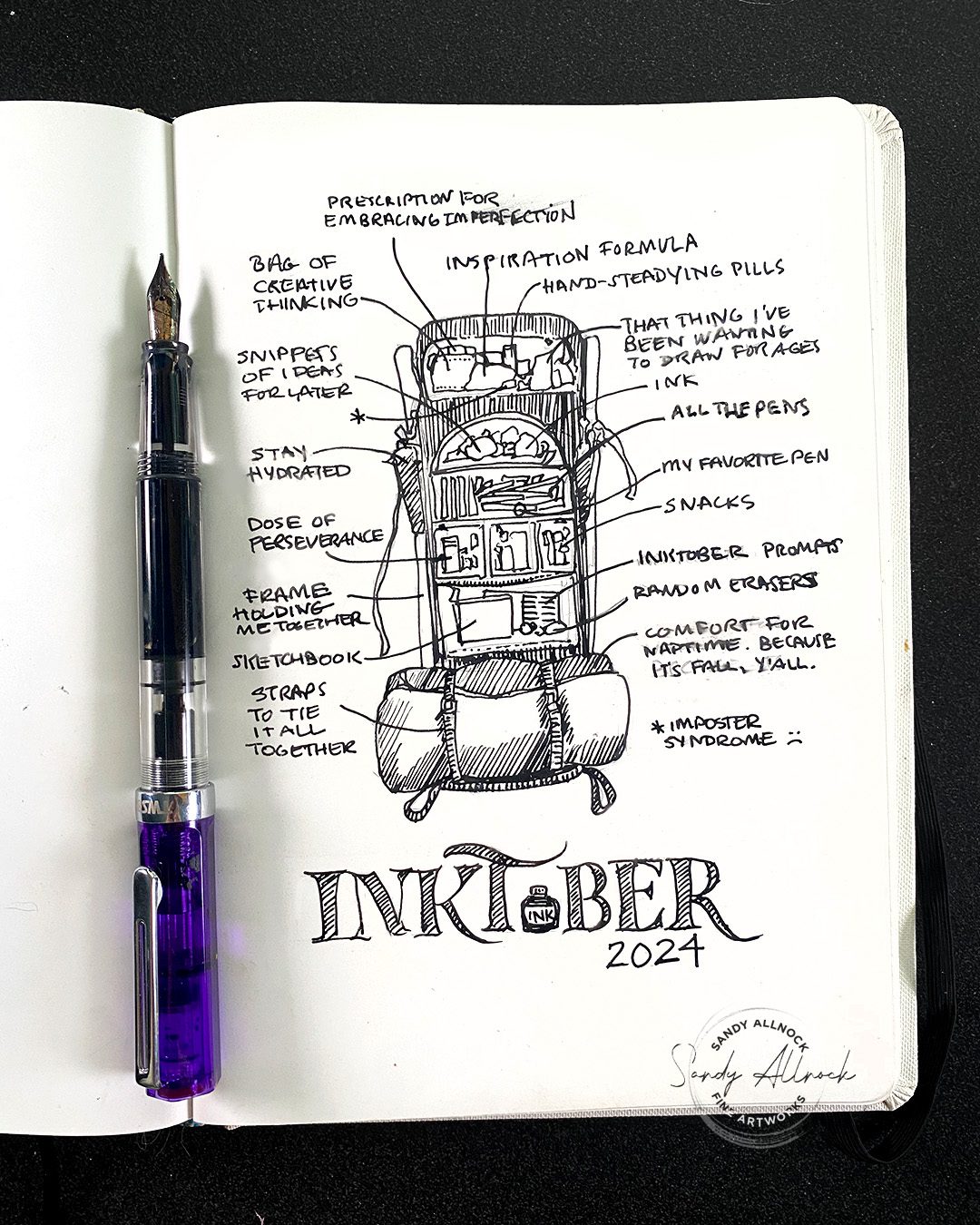
BACKPACK – the items I’d take with me, both physical and mental for inktober

DISCOVER – Dis cover not dat cover! Perspective trouble but the idea was great.

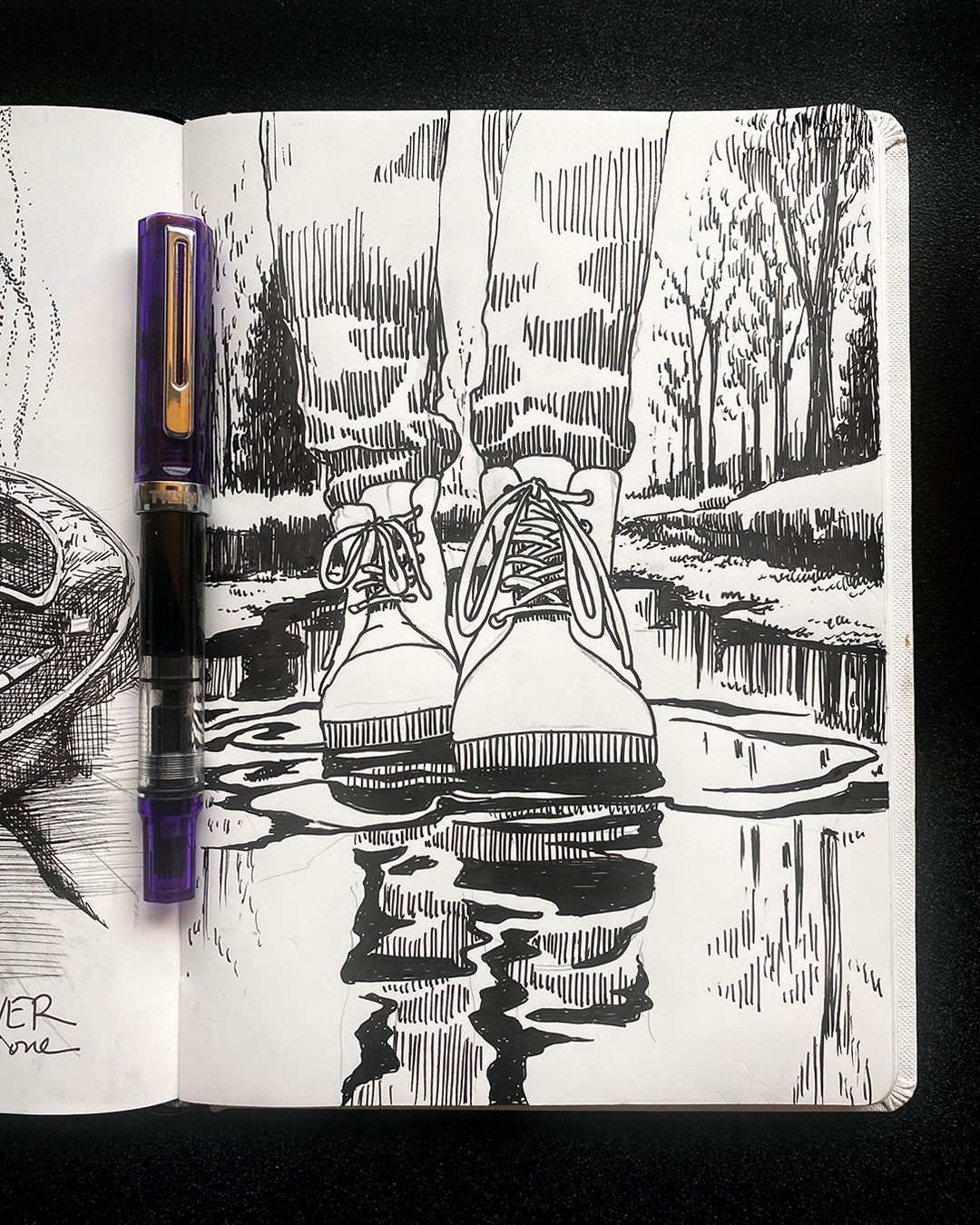
BOOTS from a dog’s low perspective

EXOTIC – Amaryllis  – see the short video tutorial on shading here.

TREK – I’m sure the folks making the list intended a travel theme, as all the prompts are on that theme. But I went Star Trek and drew Vasquez Rocks, a filming location for 10 episodes of Star Trek over many years.

Are colored pencils opaque? (and why would it matter?)

Are colored pencils opaque? (and why would it matter?)

What’s opacity, you might ask? It’s one end of a scale from opacity to transparency.

An opaque color will cover what’s beneath it, if it’s at full strength; whereas with a transparent one, the underlying color will show through. In between the two are various levels of semi-opaque (same as semi-transparent). 

You might think about that particularly with paints, but pencils can have opaque properties too; if you’re using a very opaque color to mix with one that’s transparent, you’ll get a very different result from one being on top vs the other.

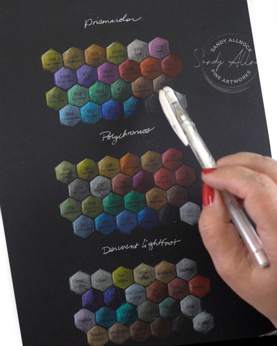
In this post, I’ll be focusing on black paper primarily – and we’ll look at how to test pencils to see how opaque each color is; note that every brand is different, and within that, every color is different. 

Tutorial: Are colored pencils opaque? (and why would it matter?)

Watch the video below and scroll to the end to leave comments or questions — or click HERE to watch it on YouTube and leave comments over there. I read both dutifully!

SUPPLIES

Some product may be provided by manufacturers for review and use. Compensated affiliate links are here at no cost to you. I appreciate your support of my work with your purchases! Full affiliate and product disclosure | My trusted partners in art

PAPER

Fabriano Black Black 9×12 pad    BLICK    AMZ   JACKSONS

COLORED PENCILS

  1. Prismacolor
    1. Premier Colored Pencils
    2. Prismacolor 24 set
    3. Prismacolor Hex Chart
  2. Faber Castell
    1. Faber Castell Polychromos Colored Pencils
    2. Polychromos Hex Chart 
  3. Derwent
    1. Lightfast Colored Pencils BLICK  JACKSONS
    2. Derwent Lightfast Hex Chart 

MISC

  1. Afmat Long Point Pencil Sharpener 
  2. Mont Marte Electric Eraser

    A simpler chart

    Rather than swatching every color, you might pick some colors for your own specific project, and swatch them – that way you can tell what the properties are of those colors first, and make decisions that will work well.

    I created this little 24-color chart for the Prismacolor 24 set; the PDF is located in the Winter Pencil Enchantment preclass lesson if you need it – and on the same page as this strip, there’s also a blank one you can write your own colors into. Trim out the strip and glue it onto your black paper, then swatch over various amounts of white.

    Managing pencil opacity

    Layering colors on top of an opaque white can really make your colors show up and look dimensional on a piece of art. Thick white pencil can sometimes get so thick and built up that no color will go over it, so try light layers as you start. Then layer the colors on top.

    If the color on top is transparent, it’ll nearly disappear (ie will be very dark) on black paper; so your white underpainting can drop off til it’s lighter, lighter lighter, then black – and you’ll get a nic eblend.

    If the color on top is opaque and you need it to disappear into darkness, managing the amount of pigment will be needed. Or covering it with a darker color. It’s a lot of testing and learning, but just remember: layers, layers, layers.

    Subscribe to receive blog posts by email:

    Endless techniques

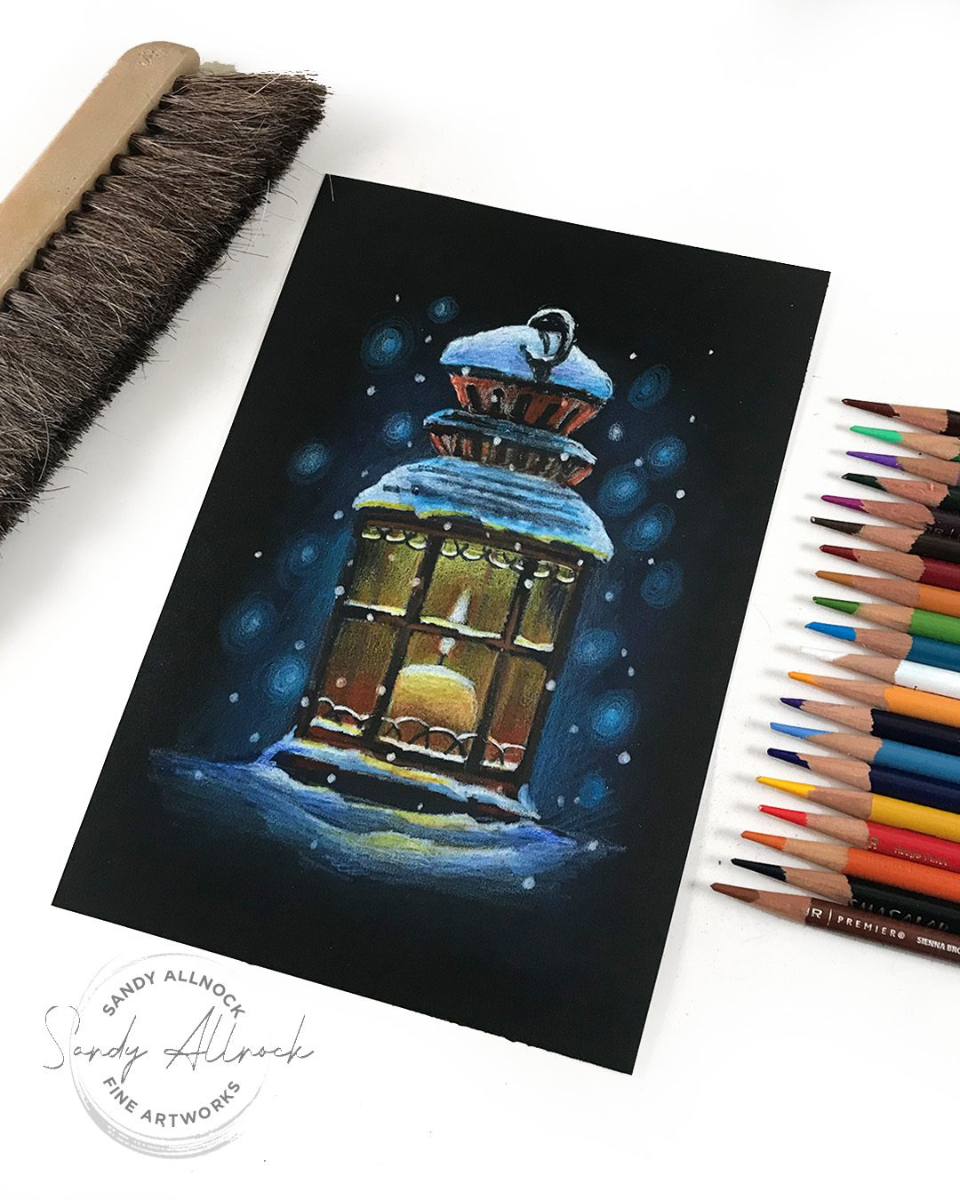
    As you play with pencils on dark papers, and experiment with a variety of ways of applying the pencil pigment, you’ll find pencils are one of the most flexible mediums as well as one that is great for those who don’t want the pigment to move, dry, or create its own edges or blooms like other mediums. In this drawing I used many techniques that are taught in the new Winter Enchantment class.

    Happy World Cardmaking Day!

    In honor of this auspicious holiday…..there’s a page full of just the fall and winter holiday classes gathered up, and a bunch are on sale:

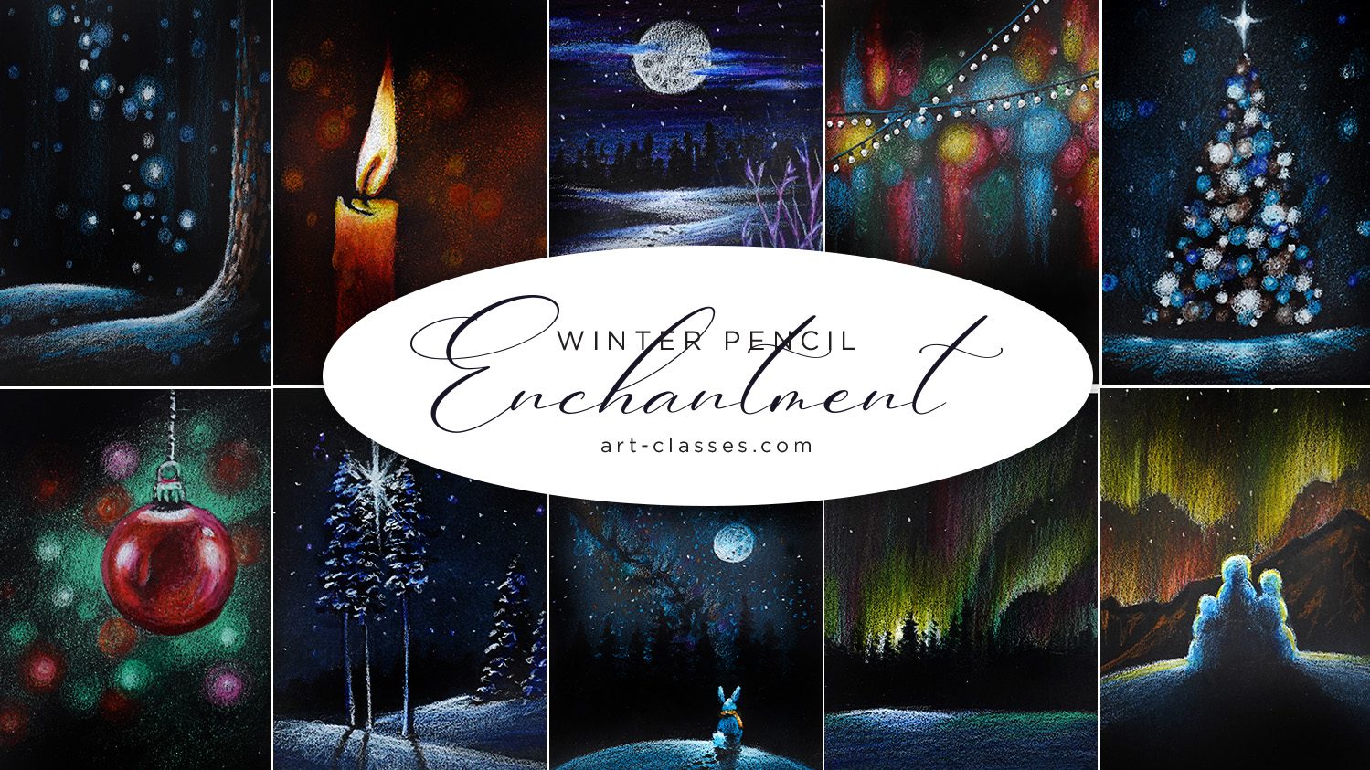
    Winter Enchantment (Colored Pencil)

    Happy World Cardmaking Day! I’m hoping you’ll be as excited by the new Winter Enchantment class as I was to create it! Ten gorgeous images, perfect for cards (see them in the promotional video on the linked page)…in the bonus lesson I even share the card sketches and sentiments you can use!

    The class is listed as a level 4 – it’s kind of a level 3 because the drawing part is very limited – very easy to draw images. But there’s no tracing since it’s black paper, so you do need to be able to draw a candle flame and a tree — don’t worry, videos are in realtime and I’ll walk you through it all.