
Which comes first, the paint or the ink? While you can work in either direction, I love to paint in watercolor first, for a few reasons:
- The ability to work on paper with a color “sketch” that I can adjust as I add the ink
- The painting stays looser as I’m not trying to stay between the lines
- The pen and ink gets looser too
What’s that? The pen and ink is looser? I do like an “organized” pen and ink drawing, but I also like when the lines flow and move a bit. This post will talk about that as well as include a video on the topic!
The underpainting
A watercolor underpainting is usually the first pass and other layers would clarify details – but in the case of wash and ink, it serves as a color “sketch” to ink on.
This watercolor is in a video on Patreon (my patrons at the green level and higher get a realtime painting tutorial each month of 2024, including access to the previous ones.)
Sign up for patreon / watch a video about my new patreon project
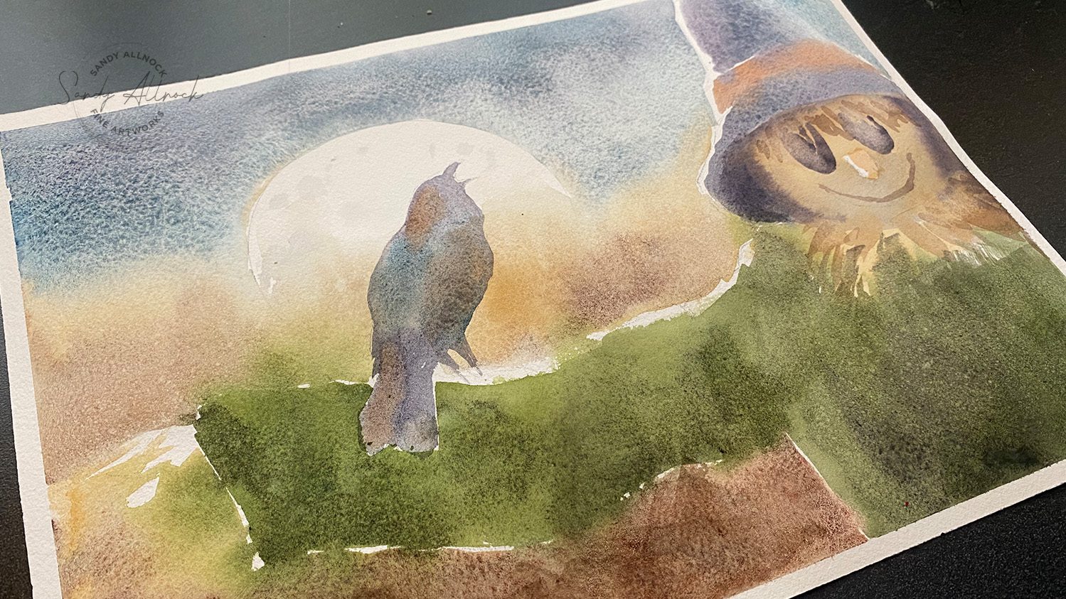
The underpainting became this in its finished iteration:

Tutorial: ink drawings that “flow” over watercolor
Watch the video below and scroll to the end to leave comments or questions — or click HERE to watch it on YouTube and leave comments over there. I read both dutifully!
SUPPLIES
Some product may be provided by manufacturers for review and use. Compensated affiliate links are here at no cost to you. I appreciate your support of my work with your purchases! Full affiliate and product disclosure | My trusted partners in art

Black and white original drawing:
-
- TWSBI Eco fountain pen medium nib
- Hahnemule Hand lettering pads
- Platinum Carbon Fountain Pen Ink
Color drawing, printed in a tint:
Flowing lines create movement
While drawing in every single feather and creating each barb carefull on every one of them — that can end up feeling a little clinical. It’s very beautiful and I do love art that’s got that kind of realism, but unless I’m in that mood, it’s not quite my vibe.
I love lines that flow, not only in the compositions I create but even in the line work! On this crow, I let my pen help define the outside edges of the bird – fixing the beak, puffing out the neck feathers missed in the watercoloring.
But once the main shapes were in, I broke the mass of the bird into shapes by tracing the shapes seen in the watercolor – hue (color) and value (dark/light) shifts. Then lines within them in different directions create that feel of movement, as if the bird is adjusting himself as he turns to laugh at the scarevrow.
If I’d done those sections out of my “thinking” brain, I might have created very regularized, repeating groups of feathers and lines.
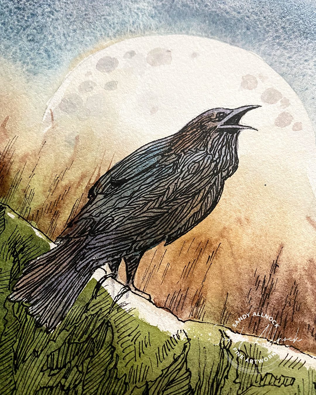
Flowing lines for shape and continuity
Switching to a thinner pen for some lines really helped! For the lines in the face, they’re a little bit rounded as well as thinner – creating a difference with lines nearby, and also contouring the round head shape.
Vertical lines in the eyes are straight by comparison – and continue up in the hat in the same direction, creating a connection between those areas of the drawing that flow from one to the other.
And finally the hat contains quadruplets of lines -vertical. horizontal, and angled left and right. The lines can be closer together in shadow areas, further apart and even trailing off in highlights. The lines go with others in the drawing but indicate a different kind of texture in the hat.
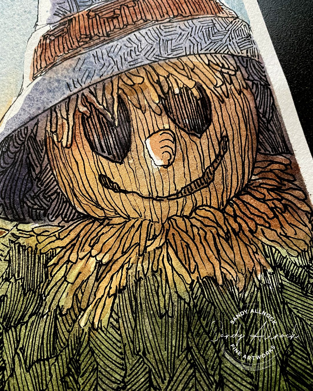
Flowing lines for variety
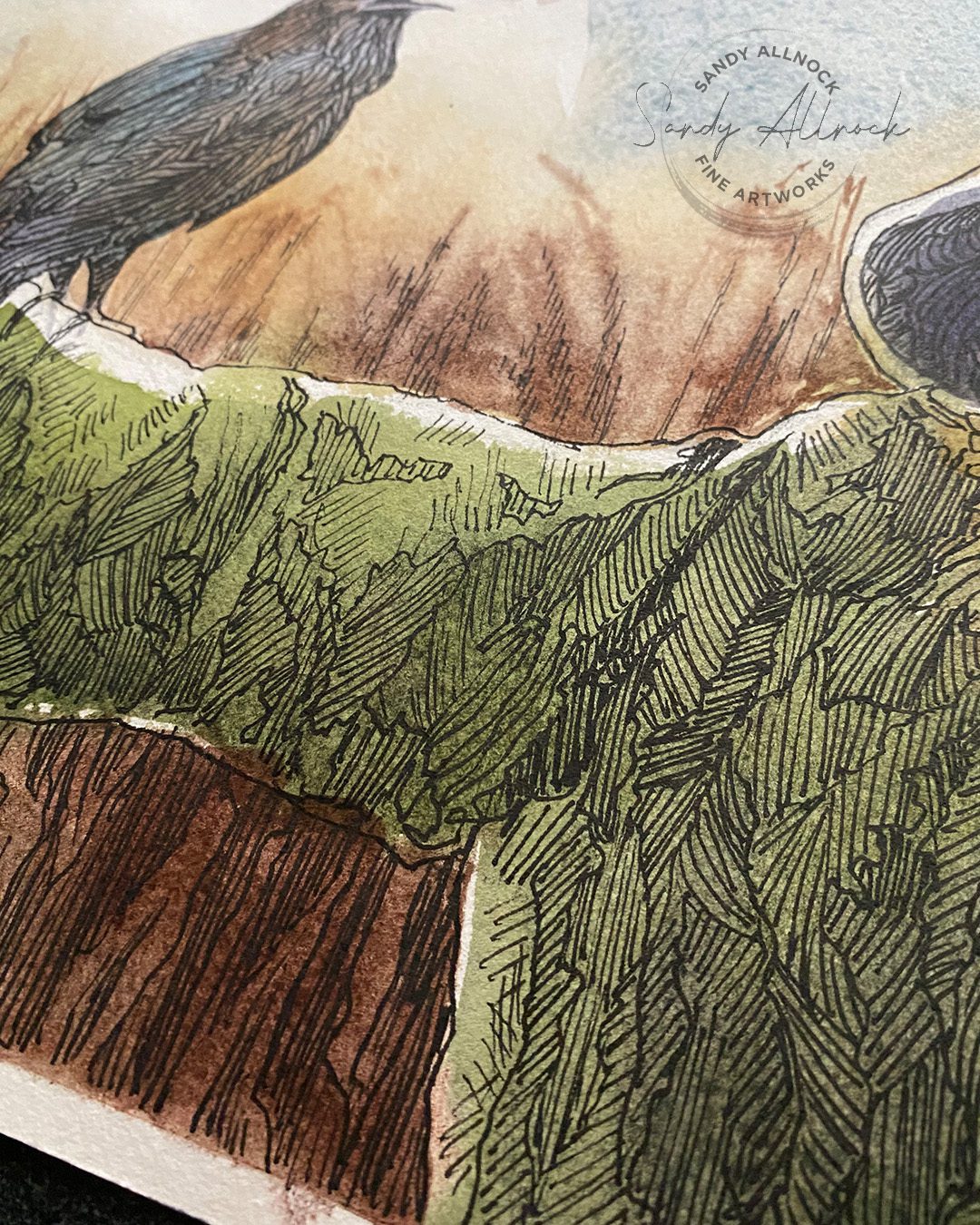
In a drawing, especially a large one like this, large areas with the same line pattern could easily become boring – for the viewer but also for the artist!
I could have created lines flowing around the fabric folds, and that’s certainly possible. I wasn’t working from a photo to be able to do that though. Instead I let the hue and value changes in the watercolor indicate sections that can contain lines in various directions, making it all more interesting than just very long long lines.
Subscribe to receive blog posts by email:
Need wash and ink help?
I have a whole page full of courses using pen and ink HERE – but I’ve picked out a few classes below, too.
First, two classes that apply the wash first then the ink. The first uses splashy kind of painting techniques, the winter version uses photography to create paintings to add pen and ink in the strategic parts of the piece. (Great for Christmas cards!)
TAP ON THE PHOTOS TO READ MORE ABOUT EACH CLASS
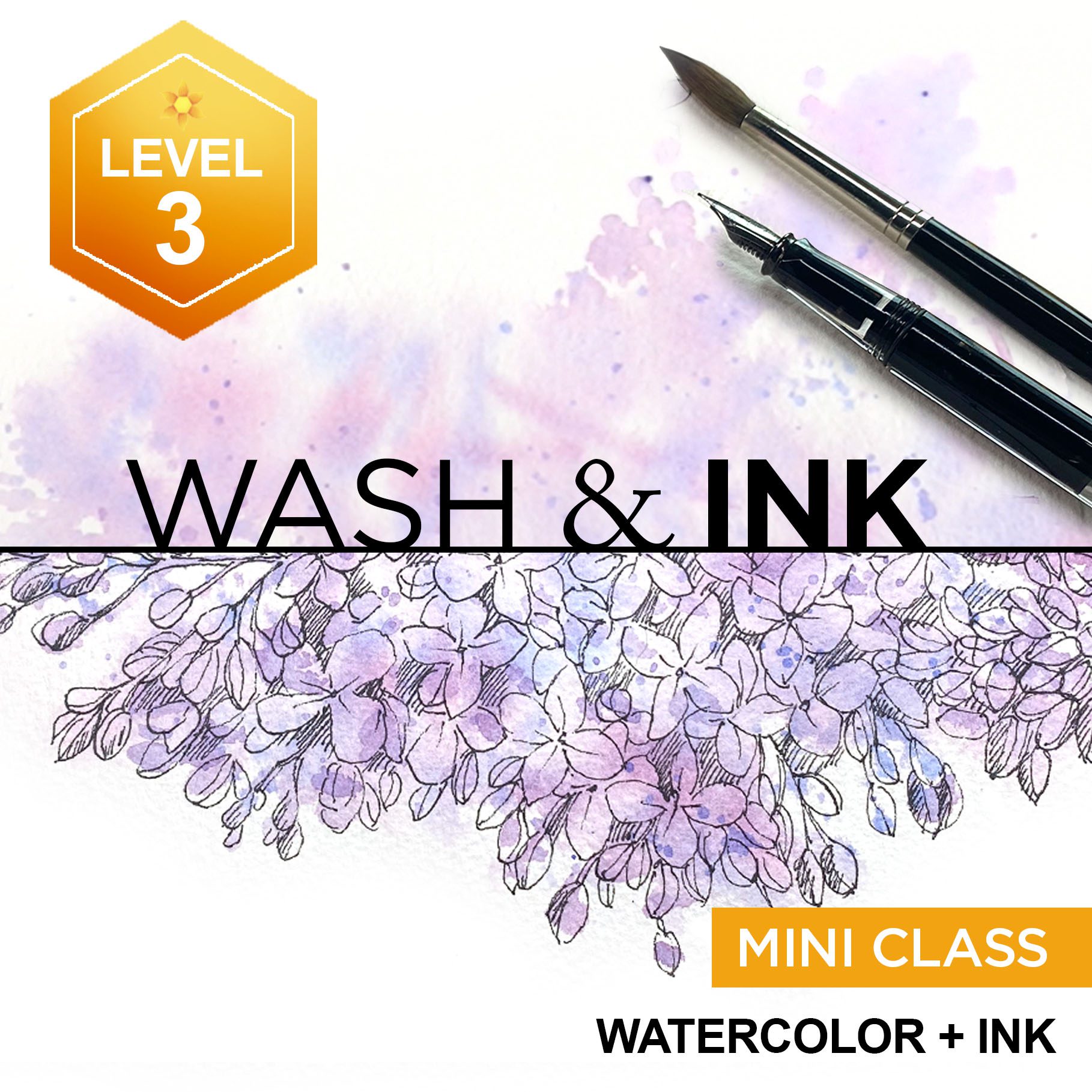

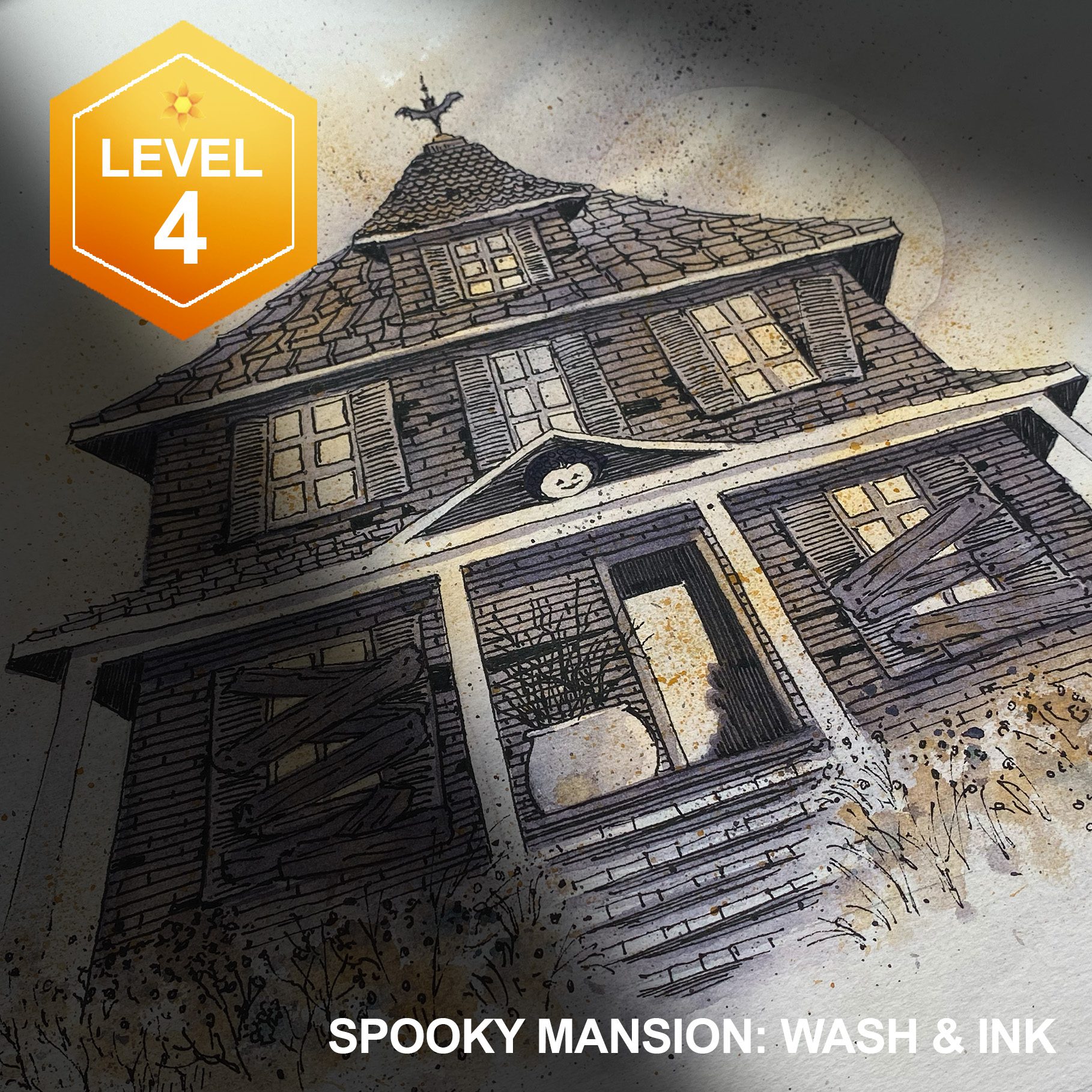
By contrast, this Spooky Mansion is created by drawing in pen and ink first – then adding the color later for a great Haunted House!
What’s your favorite order – paint or ink first?
Neither is “correct” nor “incorrect” …for me it can make a difference by what the project is!





0 Comments