Ways to Use a Cardmaking Sketchbook

Ways to Use a Cardmaking Sketchbook

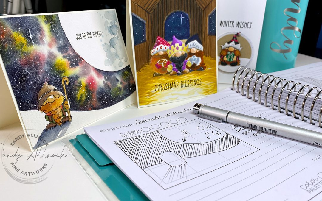
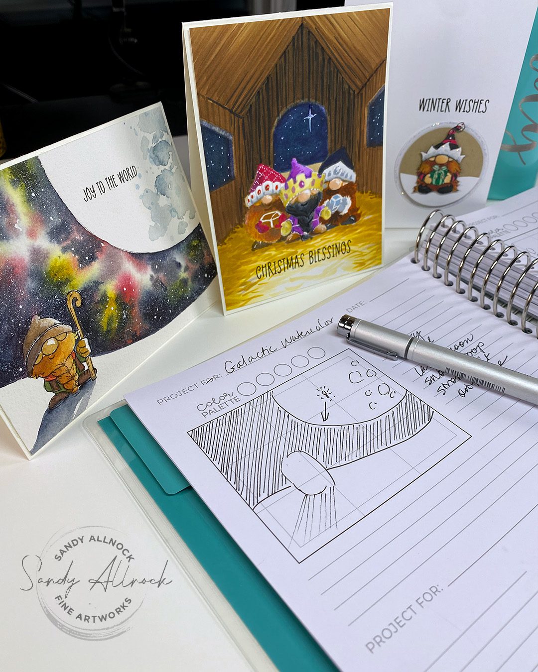
I received a lovely care package from Trinity Stamps (they take such good care of me!) with the new Card Making Sketchbook in it, along with a few gnomies to color up. I played around with the book and thought of some ways it might help you. Let’s take a look!
Video: Ways to use a Cardmaking Sketchbook

Big thanks to Trinity Stamps for sharing this sketchbook with me!

Watch the video below and scroll to the end to leave comments or questions — or click HERE to watch it on YouTube and leave comments over there. I read both dutifully!

Sketching

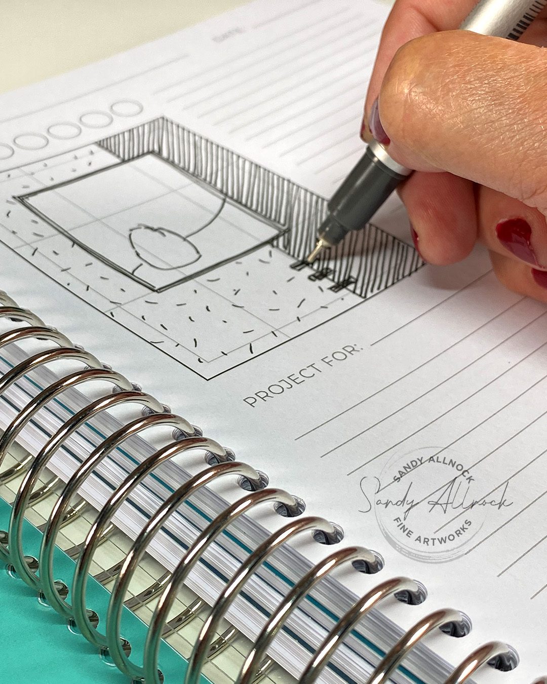
Obviously sketching is the thing to do, right? I created loose sketches in the boxes; there are several sizes in the book and each box is divvied into thirds horizontally and vertically. Some card designs fit with that but others might need you to “ignore” the lines if it’s in quarters.

I used a Copic friendly pen which didn’t bleed through at all. For the various patterns of paper I just used some lines in different ways; if you’re jotting down ideas from something you’ve seen, it can help you to remember whether it’s a dark pattern or light, detailed or graphic, etc. But you can also just shade with pencil too to get the value (light vs dark) in place.

For the image, which I thought of as a small stamp of a character (if you’re indicating a larger stamped image you’d scale up the ‘blob’). Sometimes marked with an I for image, but often not.

And a scribbled sentiment can indicate where to place that. Don’t forget to indicate embellishments!

But overall, the things to jot down are the things YOU liked. Sometimes a card is great except for [that one thing] and it’s perfectly fine to just sketch out what you DO want to use on your design.
Notetaking

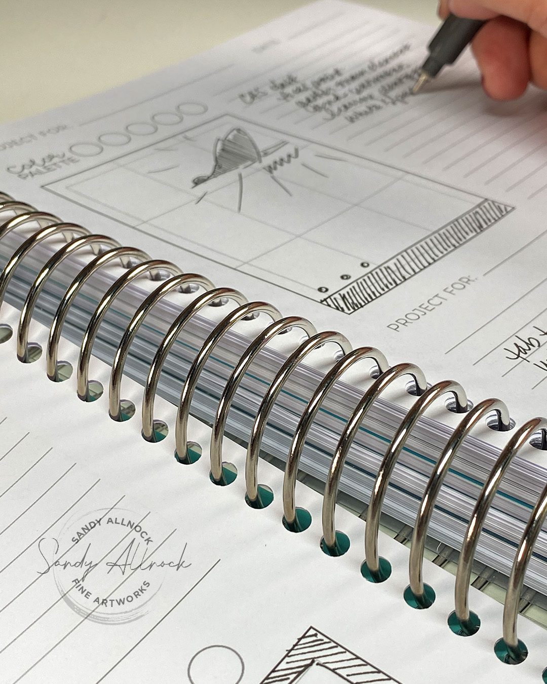
There are some indicated lines for things like “Project for” — which I assume is for Design Team members to track what designs they’ve used for a manufacturer assignment. There’s also a date listed. But you could also write WHO you made it for –  your recipient.

There are empty circles for a color palette; Copics won’t work on this paper but a few colored pencils could be handy, or if you know color names or numbers write those down.

There are blank lines for more notes – and that’s pretty valuable in remembering what you started sketching for.

  1. Where was the original? (a blog? YT? What was the title of it so you can go find it again if you want it?
  2. Were there interactive features you couldn’t adequately indicate in the sketch? (does something flip or move? have dimension?)
  3. Product ideas – if there’s a stamp you need to order, what was the name of it and who makes it? 
More ideas

I started sketching the lessons from classes; it’s often hard to remember which class something was in, so a quick doodle can remind you of something you learned that you’ll want to try again without digging through the list in your account to guess what it was. Remember to write down which website it was, and which lesson number.

You can also sketch other non-card ideas that you want to try out on a card! See a ketchup bottle label that has potential? A billboard with an idea for laying out a slimline card? Don’t forget to look all over for inspiration. Having them all in one sketchbook is a handy place not to lose them so the next time you’re in need, you have a ton of ideas.

Is this sketchbook for you?

Maybe. I’m not you so I really can’t say! But it’s not a cheap book, as helpful as it is; consider what your crafting budget is, and if the price makes sense. You can do the same with a cheap sketchbook; to create a small proportioned box for A2s or slimlines, just trim one out of cardstock that you can trace around to get the horizontal x vertical correct.

But if you like teal (who doesn’t?) and having a nicely organized book that’ll fit right in with your crafty stuff, all those boxes and lines already printed out, it’s a nice book to have.

A warning: DO NOT SPEND ALL YOUR TIME COPYING YOUR ENTIRE PINTEREST INTO THE SKETCHBOOK. You could literally spend weeks filling the book and getting NO cards made. I spent 3 days on my book, but also came out with a whole bunch of cards that I used as samples in this video, so it wasn’t awful. But if you’re being careful and using rulers, etc, it can take a long time to get these completed. Manage your time well, grasshopper. 🙂


Where are the cards?

They’re each posted as inspiration in the courses they are from. Each of which are on sale til October 13! Tap on the image to go see more about the class.
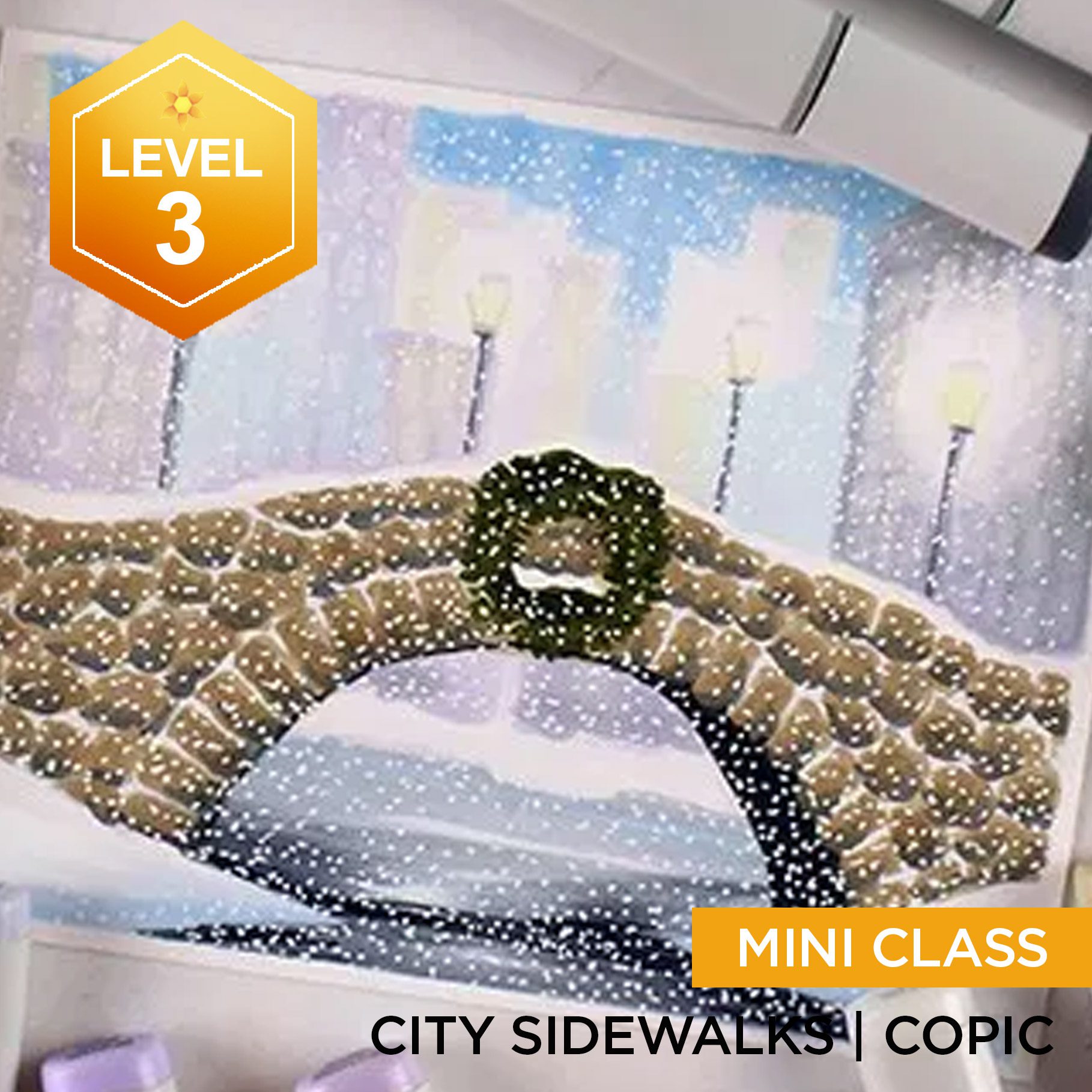
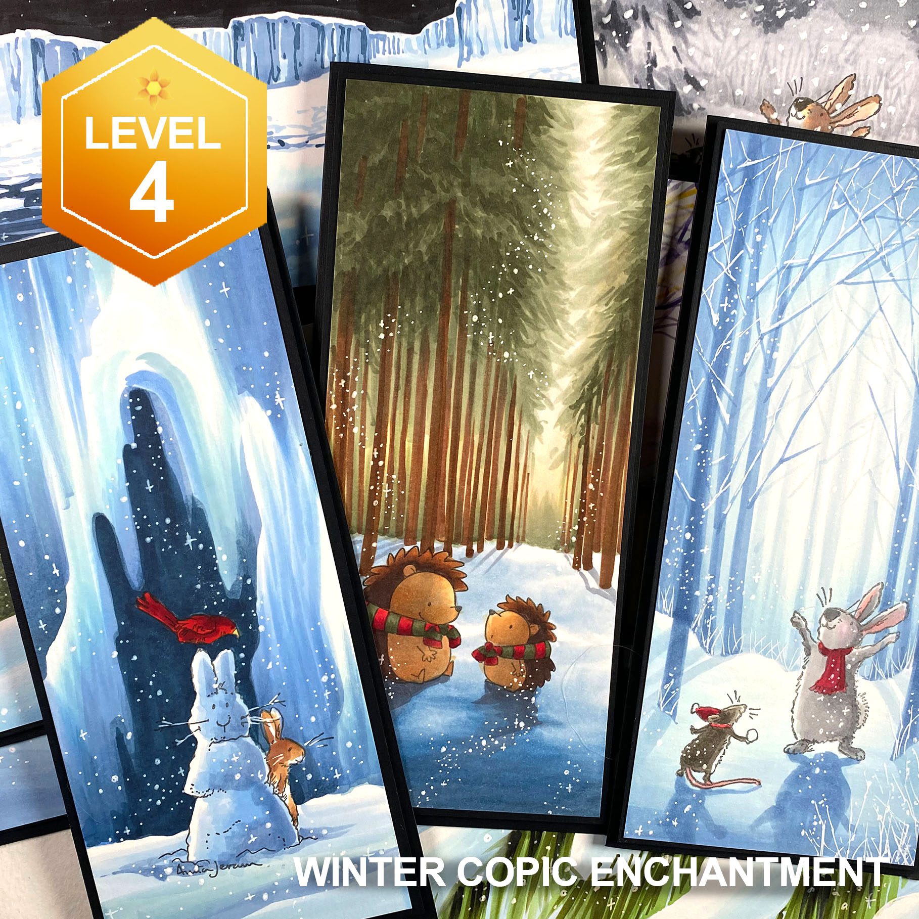
 

Need more holiday inspiration? Try the new Holiday page to see what is available!
Supplies

Some product may be provided by manufacturers for review and use. Compensated affiliate links are here at no cost to you. I appreciate your support of my work with your purchases! Full affiliate and product disclosure | My trusted partners in art

Subscribe to receive blog posts by email:

10 Tips for detailed pen and ink drawings

10 Tips for detailed pen and ink drawings

I probably should have gotten this one done earlier in the month to help inktober participants get through their drawings…..better late than never, right? Have you been drawing in October?

Tutorial: 10 Tips for detailed pen and ink drawings

Watch the video below and scroll to the end to leave comments or questions — or click HERE to watch it on YouTube and leave comments over there. I read both dutifully!

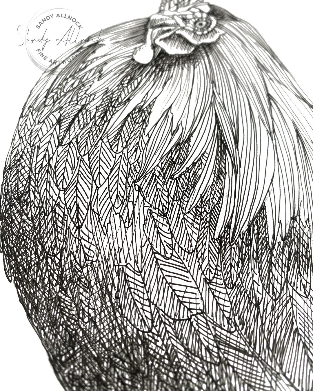
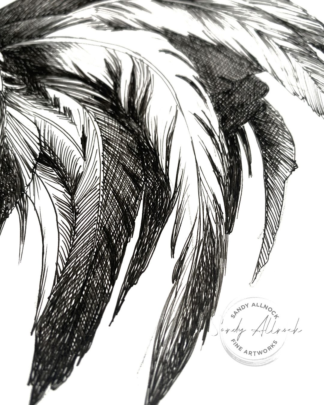
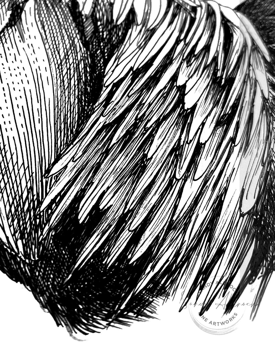
Below are the 10 tips with a little more about each than in the video. Note something I saw in the photos….when zoomed in on a section, they look like abstract art, huh?

1 Correct supplies for the task

Think about your goal. If you want a piece with really crisp lines, the Lettering pad is great for lots of pens I’ve tried. No feathering! It’s smooth without being shiny, which is nice, and the writing experience is great. But note that you can create other drawings that have a looser feel on any papers— I do that all the time. Note this kitten drawing that was on very rough paper and allowed for entirely different subtle techniques.

In this drawing I used Copic multiliners because I’d already wrecked one drawing by laying my hand in wet ink, so sometimes it’s just practicality that forces a choice!

2 Choose a suitable style

Relaxed or tight? Detailed or just the essentials? Playful or technical? All are just great, it depends on what you want. Sometimes the subject matter will even dictate what you choose.

3 Draw to the destination

A great tip from John Muir Laws – when making a line, keep your eyes on the destination of that line. Don’t watch the pen. You’ll find you reach your destination with a better looking line as well as ending in the right spot! This works for both straight and curved lines, in my experience, though it takes a while to retrain your brain.

4 Vary line length

Different parts of your drawing can be delineated by the kinds of lines used. Short lines for small details and longer lines for flowing sections. Choppy in some cases, dashed in others. A good combination can add a lot of interest in your drawing too!

5 Consider value

Value is the amount of light vs dark – and having changes in values adds so much to the depth! Lines that are closer together or have overlapping crosshatch layers will be darker, and leaving more space between lines or making them dashed will add more light.

*a caveat on the photos in this post: some of the areas look like a blurry grrey or blown out highlights; that’s because the photos had some depth of field going on, and when I brightened them to make the paper white, it did weird things. I did not have grey areas in the drawing! 🙂

6 Draw attention

Where would you like your viewer to look? Find ways to make some of the sections start to take the stage. In this drawing each cluster of feathers had a different level of interest and the ones that drew the most attention had lighter values to them and some of the darkest shadows. The focal point of most any art is where the lightest lights are next to the darkest darks, pulling attention to themselves.

7 Follow directions

Not that there’s directions to follow in art – but this is all about letting lines follow along with the direction of the subject matter, which contributes to the flow.

There are styles where ALL lines are the same direction, even ones that are perpendicular to subject matter elements. But in general following the directono of the subject is a great choice.

8 Bump contrast

Amp up the difference between lights and darks to increase visual interest overall. Where do shapes need a little separation? Make sure the value is darker on one side or the other to increase the difference in the implied line between them.

9 Highlight favorite part

For every drawing you do, think about your favorite bits of it. “Everything” can lead to a cacophony of elements arguing about who’s at center stage, so you need to assess a hierarchy of your interest! Then figure out what you’ll use to draw the viewer to see what you see. Is it contrast? Amount of detail? Lighting? Composition? 

The audience might not resonate with what you resonated with—that’s an audience for you. But that doesn’t mean that having a point to make isn’t a desirable part of the process.

10 Finish well

My last step is always to squint and see what I see. Are the darks nice and dark? Or are the darkest spots in the right places I want them to be? Is there good roundness? Definition of shapes? Don’t let the “Whew! I’m done!” but bite you before you put in the final tweaks!

Need a rooster?

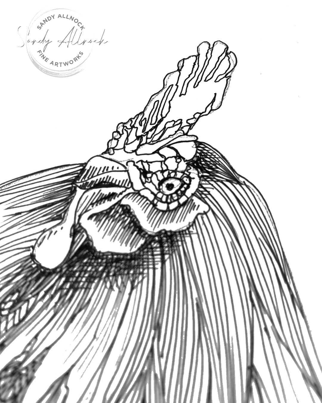
A few people I previewed this image to asked me if I’d be offering it up as a printable…..so here you go! Color it and use it for your art projects, or study it and try to create your own rooster!

Color up this gorgeous rooster! Match the colors from the reference photo provided when you purchase this printable image, or make up your own rainbow of beauty to splash on this noble fellow!

Supplies

Some product may be provided by manufacturers for review and use. Compensated affiliate links are here at no cost to you. I appreciate your support of my work with your purchases! Full affiliate and product disclosure | My trusted partners in art
Subscribe to receive blog posts by email:

Zeke’s Tree Farm: Storytelling in art

Zeke’s Tree Farm: Storytelling in art

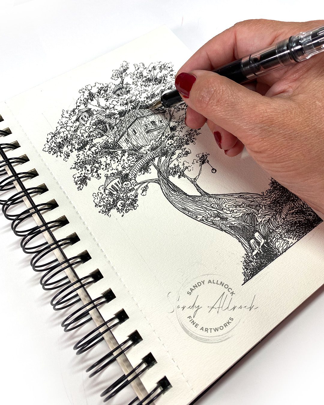
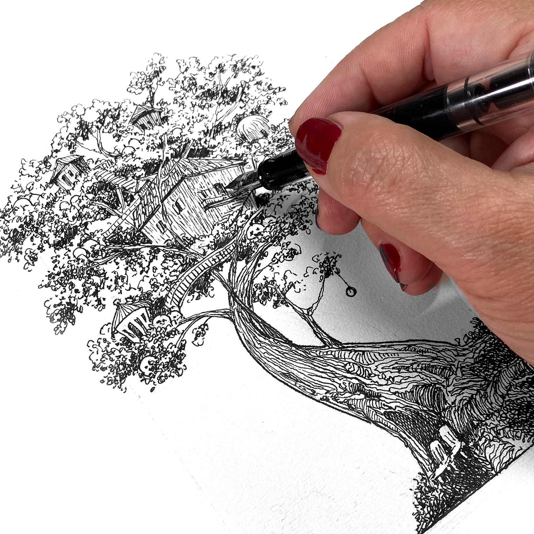
Have you ever had a drawing literally tell you a story? I’ve had storytelling experiences before – when I didn’t know what I would be drawing, I thought about the characters and gave them personalities, etc. But I’d never had the drawing, which was loosely penciled in, start to tell ME a story. Fleshed out with details! Kinda crazy. 


I wrote it up on my Substack and wasn’t thinking about putting it in the YT video, but when I was wondering what I should ‘teach’ in this video, I realized…..that story needs to go with the drawing. So…I bring you Zeke! 


Video: Zeke’s Tree Farm

Watch the video below and scroll to the end to leave comments or questions — or click HERE to watch it on YouTube and leave comments over there. I read both dutifully!

Zeke and Frannie

The names weren’t provided by the drawing; Zeke came to me right away, as that was my grandpa’s nickname. His wife was Frances. He wasn’t a pumpkin farmer, nor a tree farmer…. so the rest was all made up. By the drawing.

The drawing

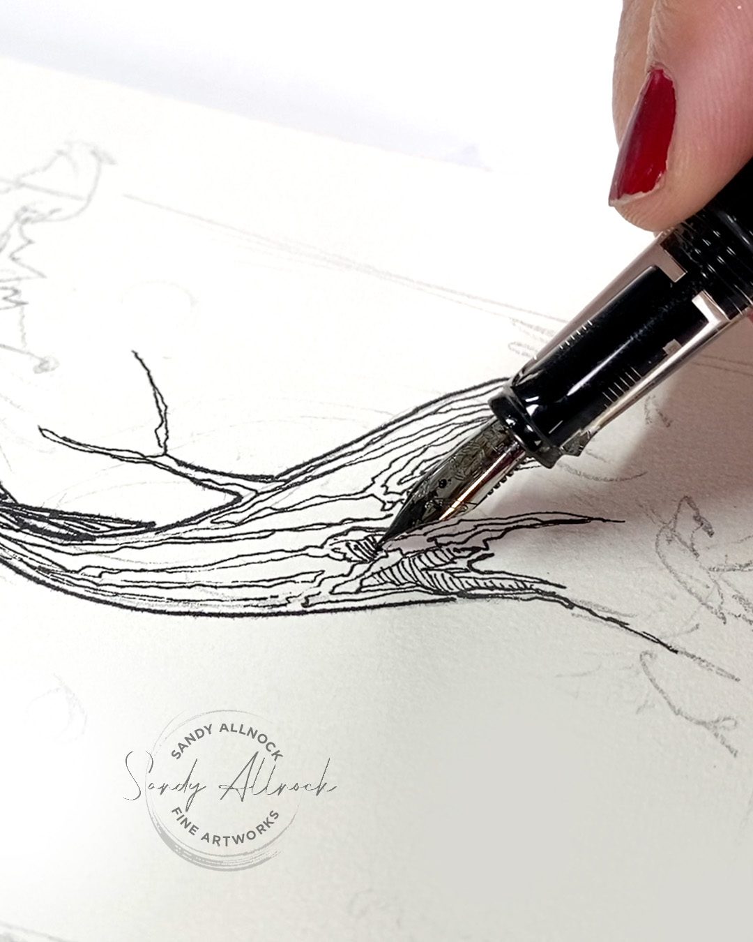
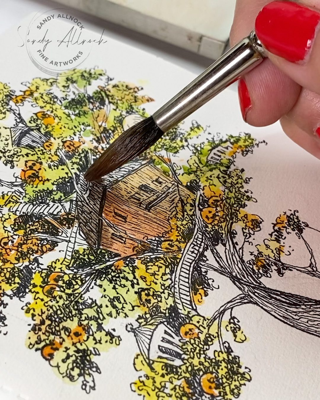
I loosely pencilled in the tree; I wanted to draw one that had my swoopy shape, and while sketching it I doodled buildings in, not sure if they’d be birdhouses or whatnot. This is in a cheapie no-name sketchbook, drawn with an Eco pen by TWSBI with Carbon Black ink by Platinum, and the watercolors are Daniel Smith.

Want Zeke’s tree?

I had messaged with a friend about my story, and she encouraged me to post it on Substack, which is a great platform for me to practice my writing and storytelling skills. She then said she wanted to print it out from Substack and read it to her grandkids, and print out the drawing so they could color it while they listened. So…..it’s available for you, too, if you want to try that

Download this pumpkin-farm-in-a-tree to color for your art projects, or sit down with your grandkids and ask them to fill in more of Zeke’s story.  

Zoom call tomorrow!

I’ve been wanting to get back to hosting more art Zooms….I had stopped because the few I did got carried away and too long! But if I have it in my head I’ll be doing it a lot, maybe I’ll just get ‘er done and move on, right?

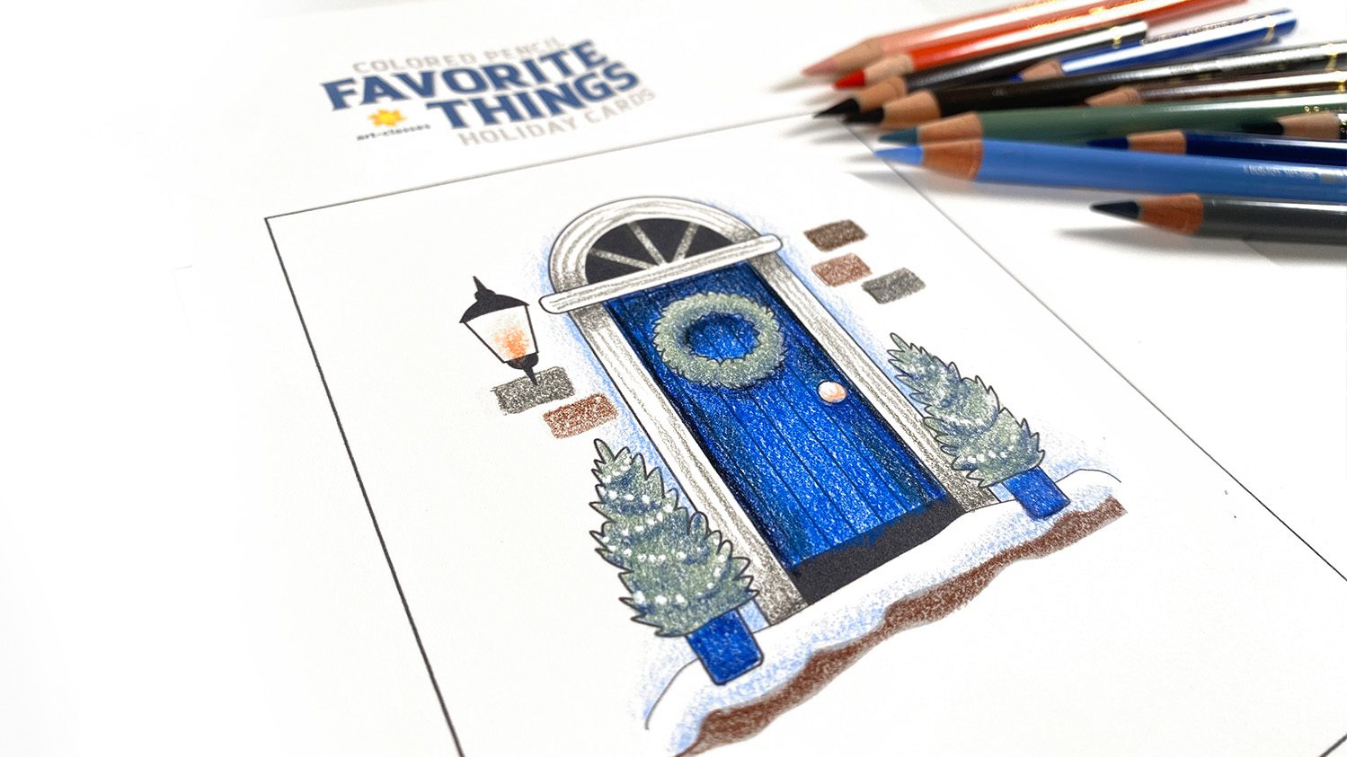
So I’m starting a series of livestreams on Zoom to color images from the new Favorite Things courses in a medium other than the class it came from. Like this lovely door, I’ll do in either alcohol marker or watercolor! Folks are voting over at Artventure, which is also where the Zoom calls will be. 

This one is set for Weds 9am Pacific, but I’ll vary the times and dates to allow for more folks to join in on the series. Replays will be available in the app for a week, then will be moved to a course that’ll cost a few dollars, just to help support the cost of the platform. 🙂

ATC swap, anyone?

At Artventure we’re having a fall ATC swap – I wrote up all the details over there!

WHEW!

That was a lot, I know. Thanks for reading to the end! Leave a comment and let me know if you’ve ever had a seed of an idea dropped on you while drawing. Was it a story? Idea for another art piece? A solution to an entirely unrelated thing? My brain just lets loose, and I never know what’s coming!

Supplies

Some product may be provided by manufacturers for review and use. Compensated affiliate links are here at no cost to you. I appreciate your support of my work with your purchases! Full affiliate and product disclosure | My trusted partners in art
  1. Sketchbook (no-name, terrible paper, lol)
  2. TWSBI Eco Medium nib fountain pen


Subscribe to receive blog posts by email:

I learned to draw from a 1972 puzzle book! (watercolor dog portrait)

I learned to draw from a 1972 puzzle book! (watercolor dog portrait)

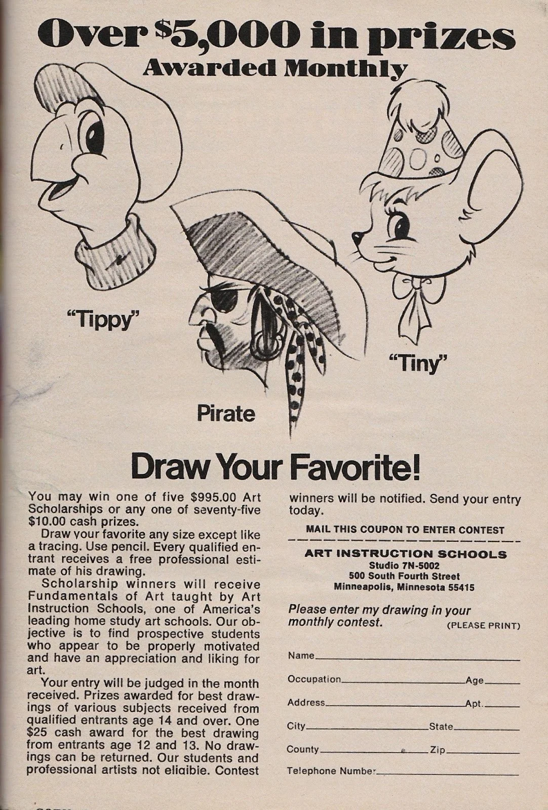
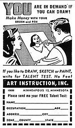
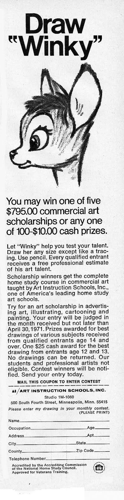
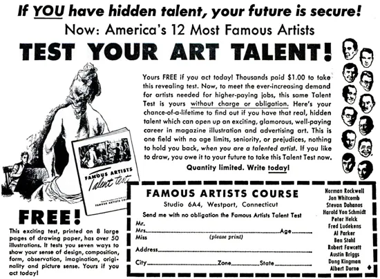
Let’s see how many readers have been around the block a few times….do you remember those ads in the backs of comic books and puzzle books? The ones touting art instruction scholarships or talent assessments?

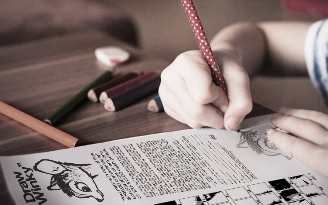
This is not me, it’s a photoshopped image. But I kinda needed this little walk down memory lane!

Do you remember these kinds of ads? Did you ever “apply” to see if you had talent? I definitely remember Winky for sure, laboring to get that eye just right in drawing after drawing so I could be “seen” by all the right famous artists! ha!

I am STILL waiting for America’s 12 Most Famous Artists to get back to me and tell me I have piles and piles of natural talent….alas…..

Well I wasn’t discovered back then. But I still read those ads, and sent in to a bunch. I had hope! But the thing that I now realize as a mature artist that I didn’t know as a kid—there was an art puzzle that totally taught me a ton about drawing without realizing it. 

Tutorial: I learned to draw from a 1972 puzzle book! (watercolor dog portrait)

I packed a ton of info in a 12 minute video. The best bit comes at the end so stick around!

Watch the video below and scroll to the end to leave comments or questions — or click HERE to watch it on YouTube and leave comments over there. I read both dutifully!

Happy Gotcha Day, G and V!

My babies arrived in 2016….hard to believe it’s been so long!

And now….classes!

I do hope these are worth the wait, some of you have been asking for years and years for this! I have a folder with over 30 more dog pics, and if these classes are popular I’ll get to them sooner – if you have a request for a breed, let me know!

Canine Companions I

Graphite & Watercolor Dog Portraits

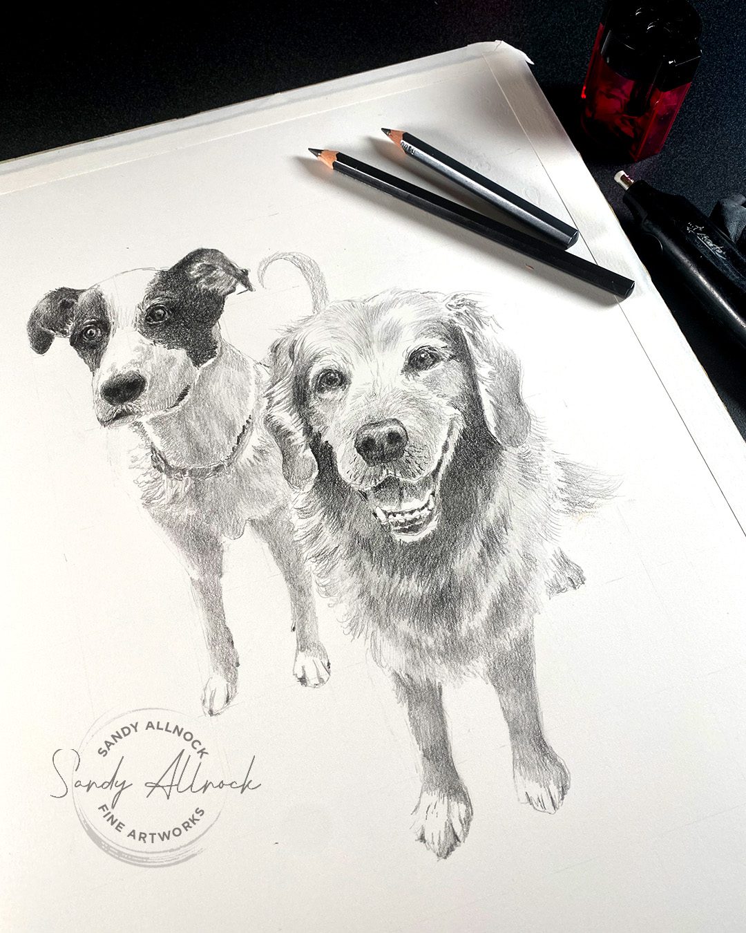
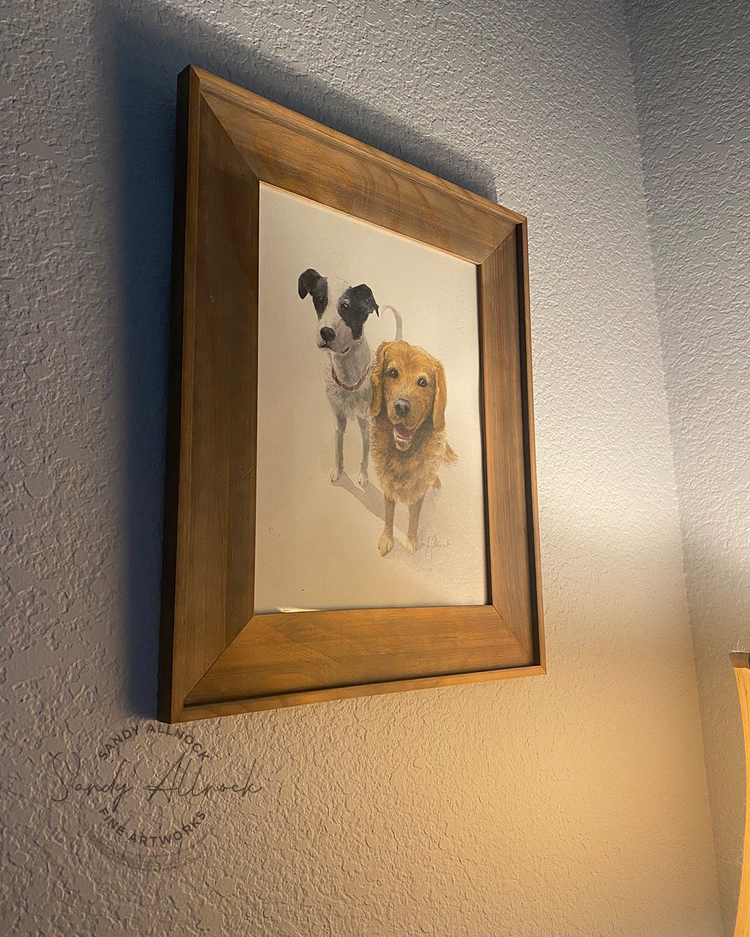
Learn to draw three dog breeds first, then watercolor them to end up with lovely portraits of a Jack Russel Terrier, a Silver Lab, and a Yorkie! Gain sketching and painting skills that apply to all your art.

$39.99

*if purchasing 2 Canine Companions classes at the same time, you’ll receive 5% off both!

Canine Companions II

Graphite & Watercolor Dog Portraits

Learn to draw three dog breeds first, then watercolor them to end up with lovely portraits of a Basset Hound, a Boxer pup, and a Cattle dog! Gain sketching and painting skills that apply to all your art.

$39.99

*if purchasing 2 Pencil Pups classes at the same time, you’ll receive 5% off both!

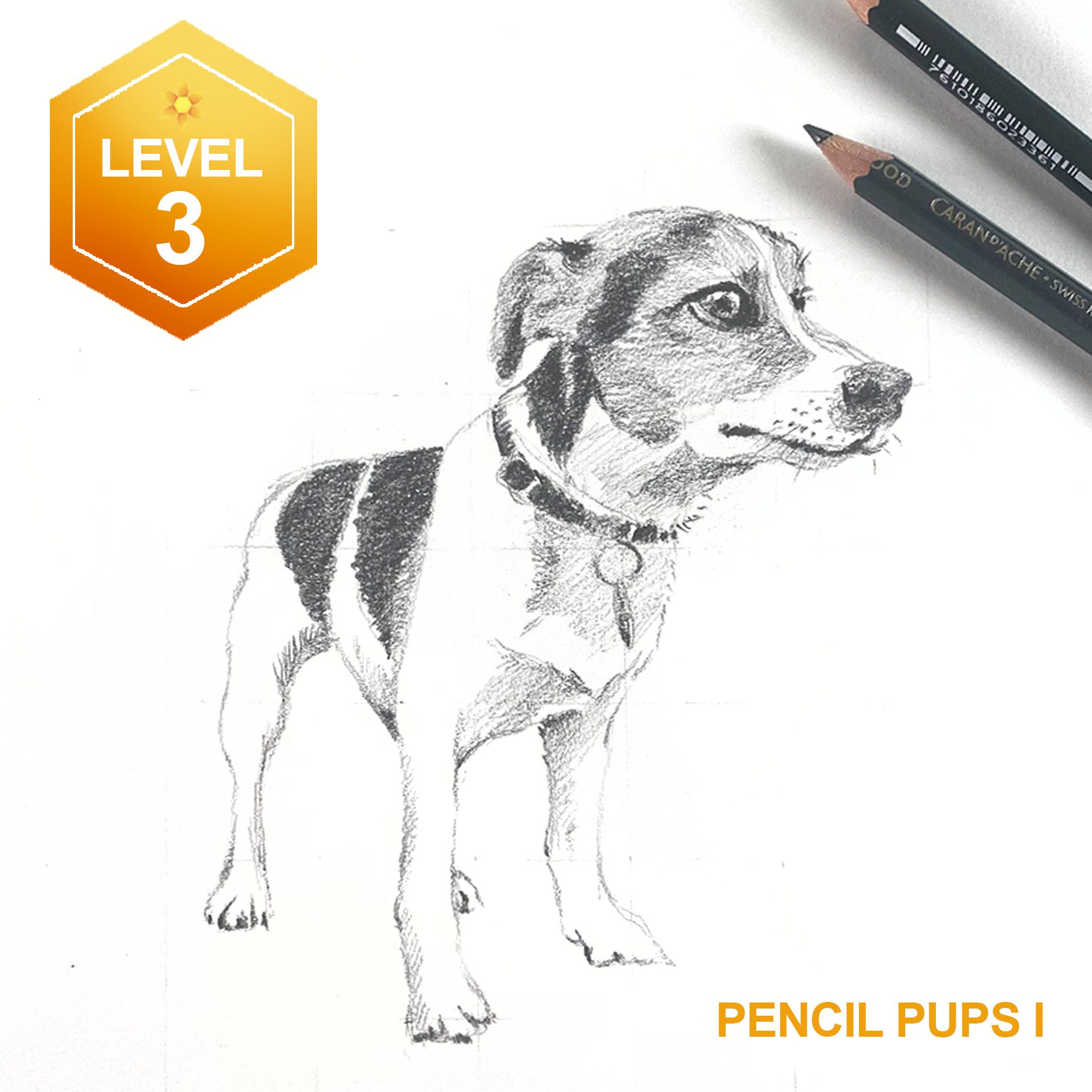
Pencil Pups I

Graphite Dog Portraits

Learn to draw three dog breeds in graphite pencil: a Jack Russel Terrier, a Silver Lab, and a Yorkie! The course teaches sketching each dog, discussing how to render shapes, shadows, muscles, fur, and more.

$25.99

*if purchasing 2 Pencil Pups classes at the same time, you’ll receive 5% off both!

Pencil Pups II

Graphite Dog Portraits

Learn to draw three dog breeds in graphite pencil: a Basset Hound, a Boxer pup, and a Cattle dog! The course teaches sketching each dog, discussing how to render shapes, shadows, muscles, fur, and more.

$25.99

*if purchasing 2 Canine Companions classes at the same time, you’ll receive 5% off both!

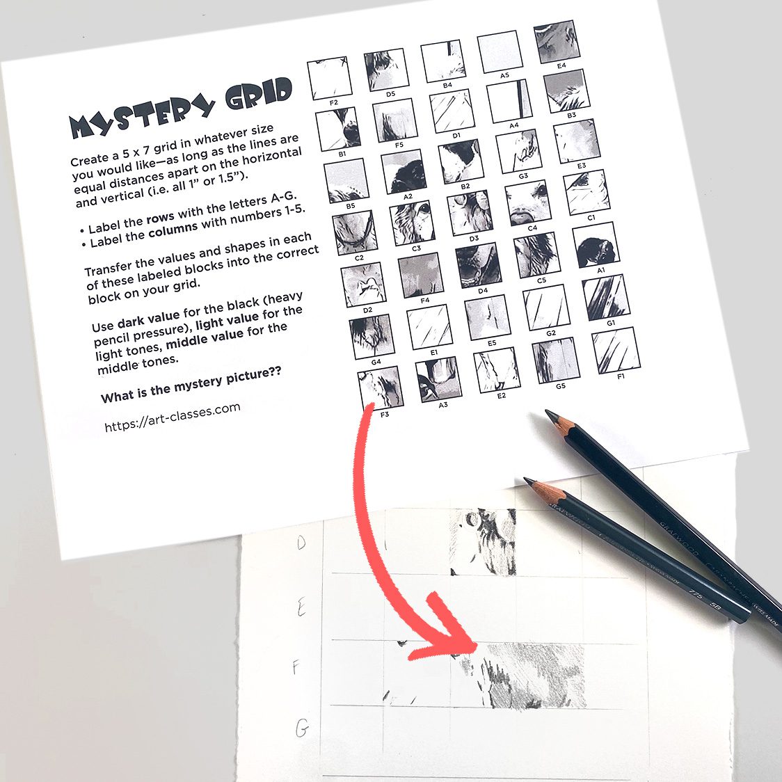
Mystery Grid

This Mystery Grid is a throwback to my childhood when I loved puzzle books and got a thrill when one of these “grids” showed up in one. It’s how I grew to understand how the grid method works for transferring a photo or sketch into a larger size on a piece of paper—and you can download this one to try out! Instructions are in the PDF. Great project for young artists, too!

$00.00

WHEW!

It felt like a marathon getting all this ready before my upcoming trip – I hope my dog peeps are ready to have some fun!

Supplies

Some product may be provided by manufacturers for review and use. Compensated affiliate links are here at no cost to you. I appreciate your support of my work with your purchases! Full affiliate and product disclosure | My trusted partners in art
  1. Caran d’Ache Grafwood Pencils
  2. Pencil Extender
  3. Faber Castell Kneaded Eraser 
  4. Electric Eraser, Mont Marte
  5. Arches Hot Press Sheet
  6. Daniel Smith Watercolors
  7. Winsor Newton Kolinsky Sable Series 7 Round #8
  8. Da Vinci Maestro Kolinsky Sable Round 4

Subscribe to receive blog posts by email:

How to never run out of space on your drawing pape—

How to never run out of space on your drawing pape—

I’m sure most of us have had the problem of getting into a drawing just to realize that, well, we ran into the side of the page before finishing the main subject. Today – let’s talk about how to never run out of space! 

Tutorial: How to never run out of space on your drawing pape–

Part one of two videos: in this one, we’ll do thumbnails, and the full painting will be in the next video on Saturday!

Watch the video below and scroll to the end to leave comments or questions — or click HERE to watch it on YouTube and leave comments over there. I read both dutifully!

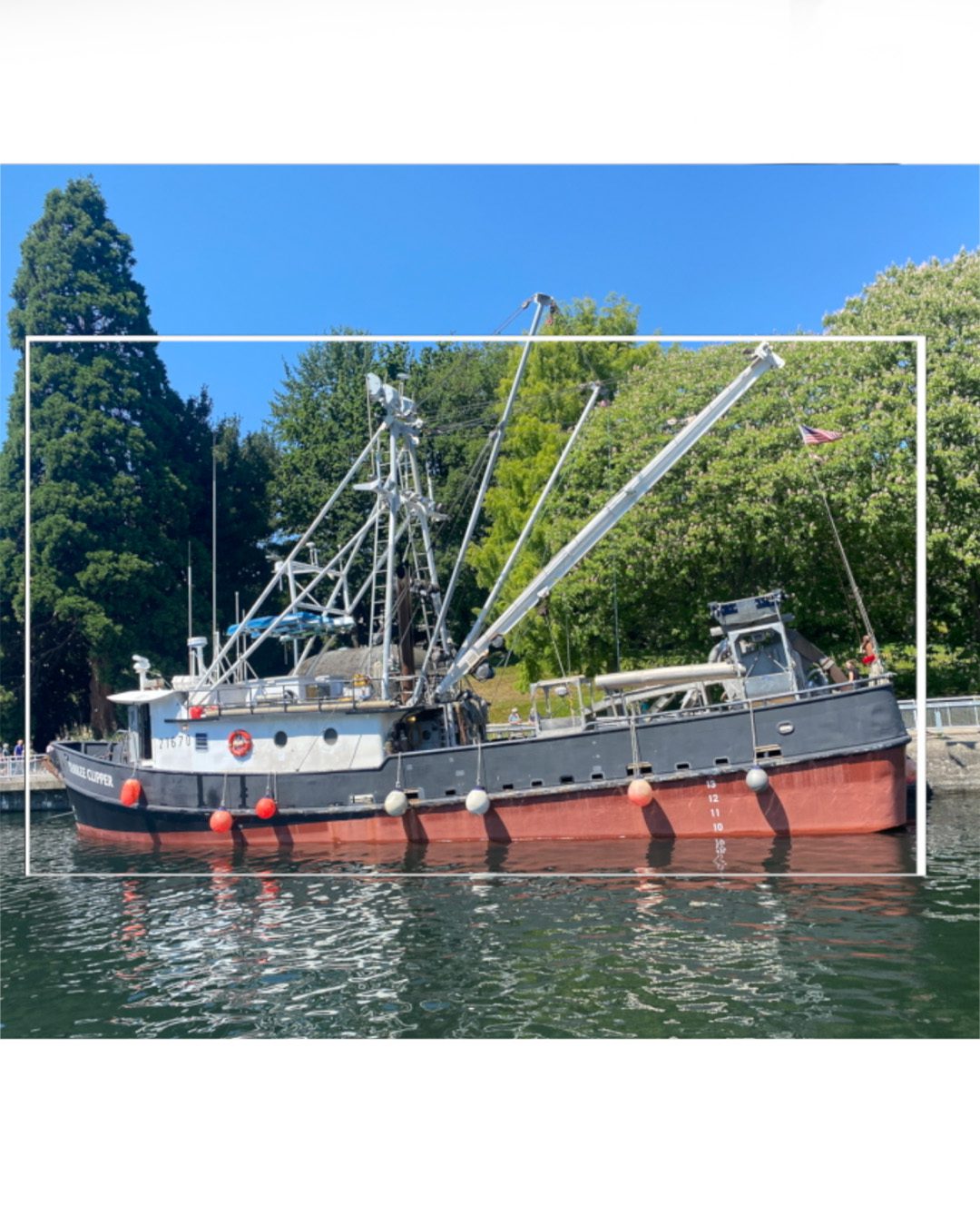
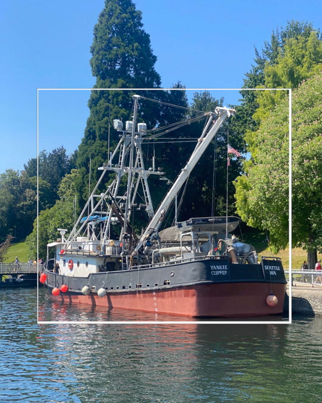
Draw a mental “box” around the main subject

Use your hand, pencil, or something else to get a GENERAL measurement around the object – no rulers, but just an overall sense of whether the subject is 2x taller than it is wide, or square, etc.

Draw that shape of box on your sketch lightly in pencil, so you have an inner frame to get the whole thing in.

Then sketch in the BIGGEST shapes into that box. Don’t get lost in any details til the big shape is in place!

Then go bonkers on detail as much as you like.

Perfect for thumbnails especially

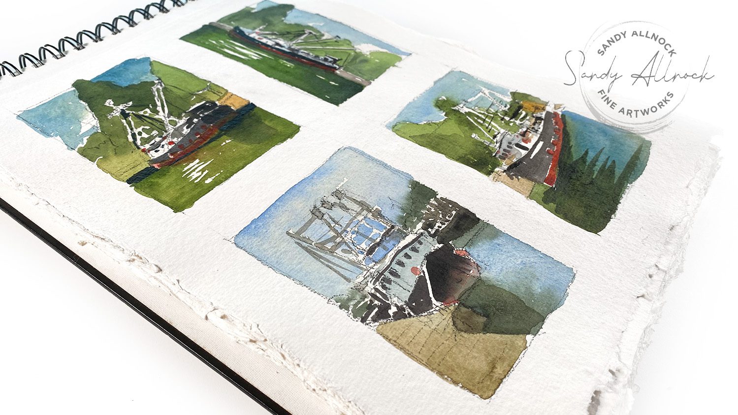
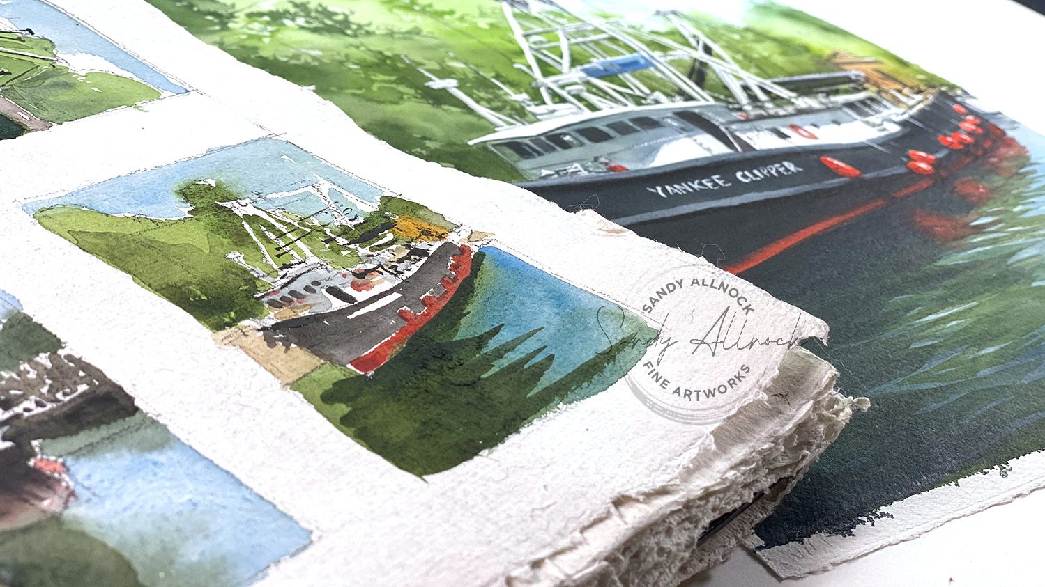
One of the complaints on a recent Thread I posted about thumbnails was the amount of TIME it takes to create thumbnails. We want to get into the finished art, not delay that with sketches! Well, this quickie technique meant I could sketch AND paint these rough little thumnails in all of 30 minutes! That time is well spent to avoid lots of problems in the finished painting.

Join in the July 2023 challenge at Artventure!

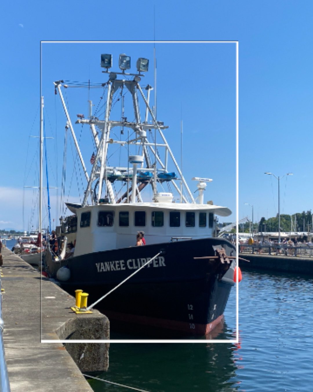
Little sketches like these qualify – or just create something with a boat. Or fish. Or water. We’re pretty loosey goosey, the rule is just that it’s new mojo! Pop over and get the original photos or post your submission!

Coming Saturday: the full painting!

Supplies

Some product may be provided by manufacturers for review and use. Compensated affiliate links are here at no cost to you. I appreciate your support of my work with your purchases! Full affiliate and product disclosure | My trusted partners in art

  1. Caran d’Ache Grafwood Pencil 9B
  2. Handmade sketchbook, no longer available
  3. Daniel Smith Watercolors

Subscribe to receive blog posts by email:

Harry Potter and the Kneaded Eraser Wars: Which brand is best?

Harry Potter and the Kneaded Eraser Wars: Which brand is best?

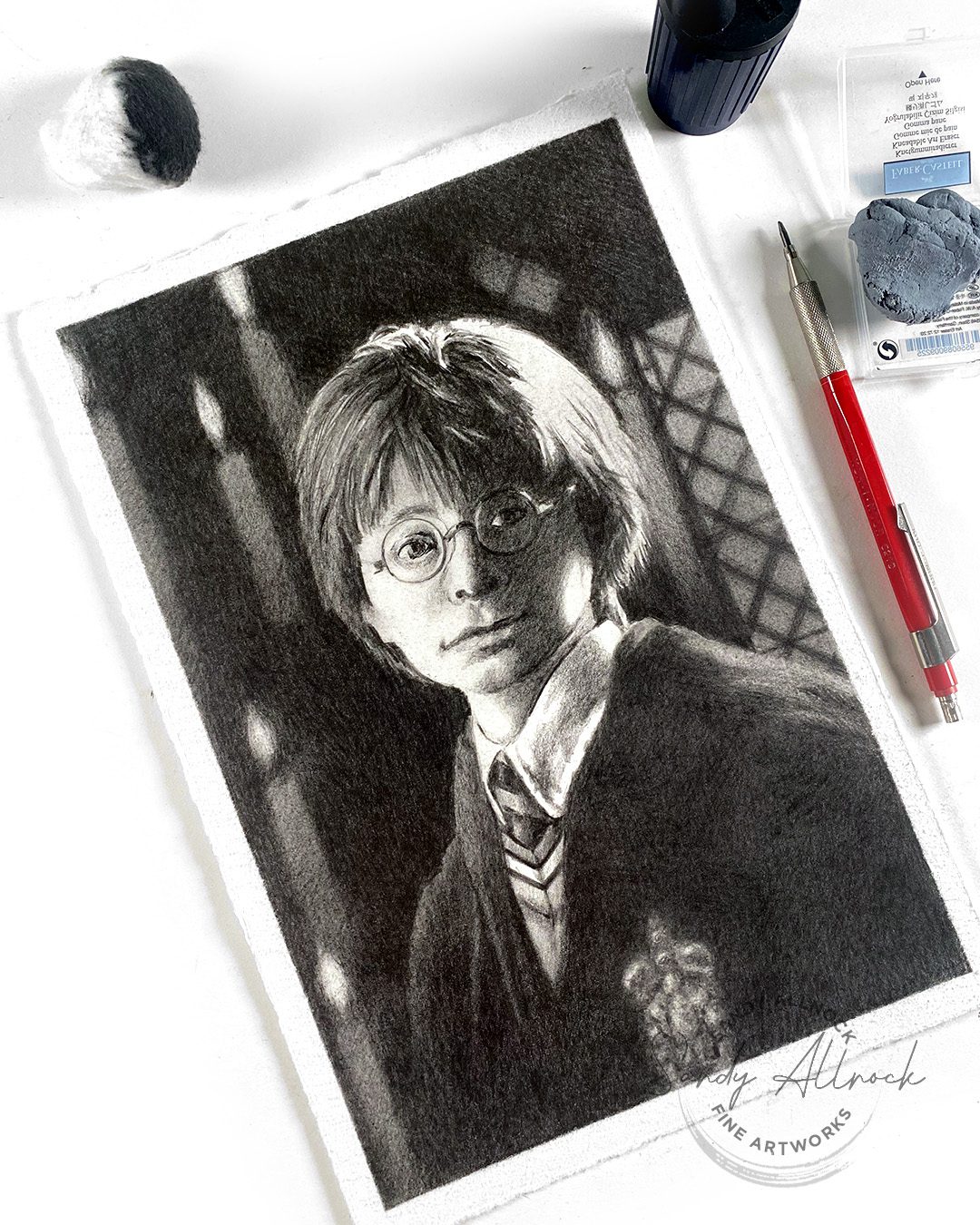
Today, May 2, is the day we celebrate that the great Battle of Hogwarts was fought — and Lord Voldemort was finally defeated! And since I needed a project to demonstrate the topic of the day (Which kneaded eraser is Best?) I’ll be creating a portrait of Harry Potter and show a few spots where a kneaded eraser is needed. (pun intended!)

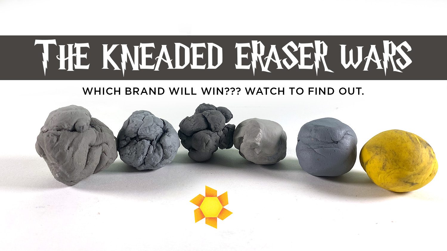
I’ll be comparing some brands of these erasers – finally something affordable to buy from a number of manufacturers! (much easier than “can you do a comparison of the full line of (X) marker or paints?”) There’ll be six contestants in what I shall call the great “Kneaded Eraser Wars”! 

I started off the video with the history of erasers – after looking up what people did BEFORE we had erasers. (I tried it and, uh, I AM SO GLAD WE HAVE ERASERS!)

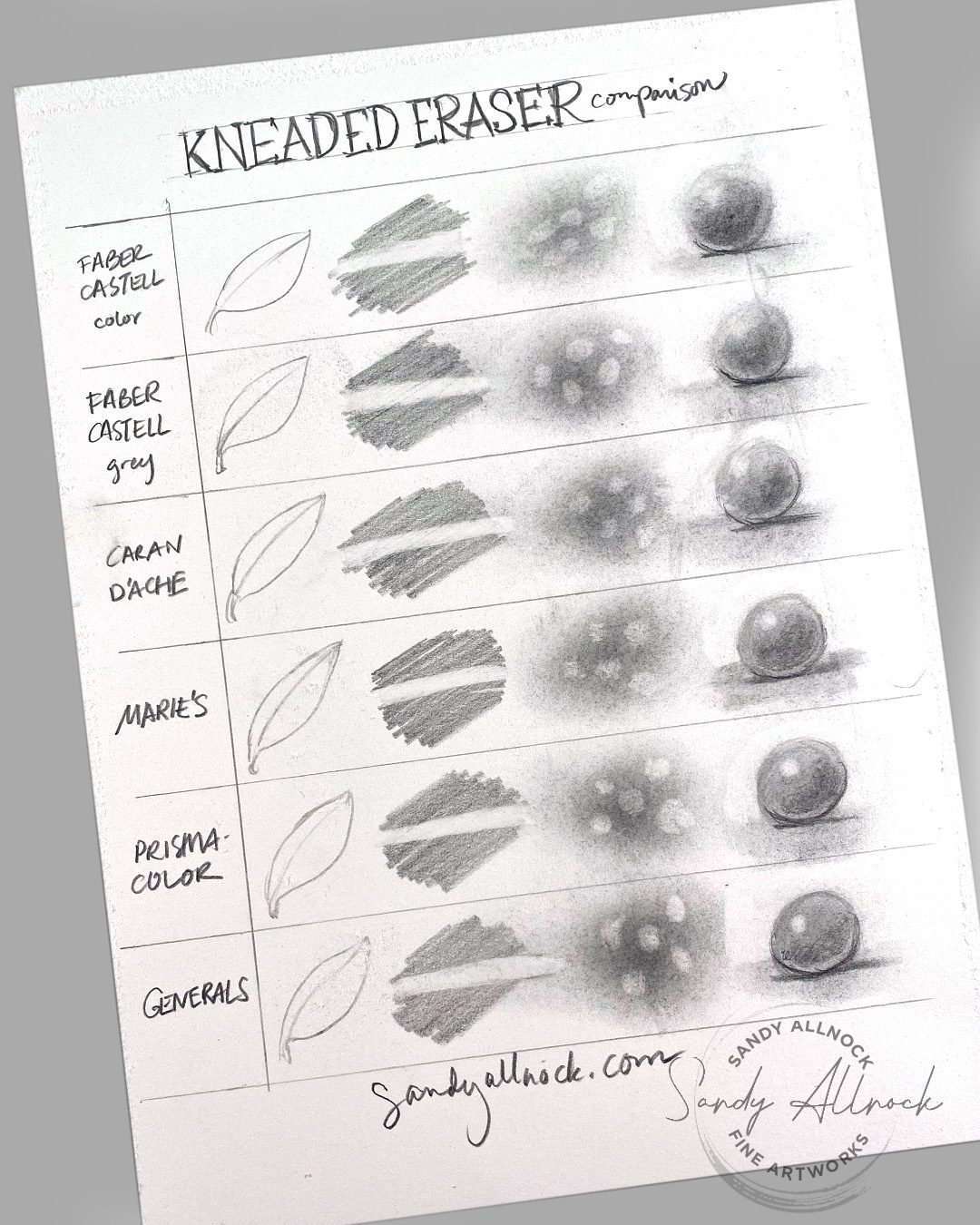
Next I got busy opening all my new erasers and creating this comparison chart with erasure techniques – including one I realized wasn’t a fair test of the eraser but rather the pencil-wielder. LOL! Watch the video to see what these tests were all about.

Tutorial: Kneaded Eraser Wars: Which is Best? 

Watch the video below and scroll to the end to leave comments or questions — or click HERE to watch it on YouTube and leave comments over there. I read both dutifully!

Marie’s (?)

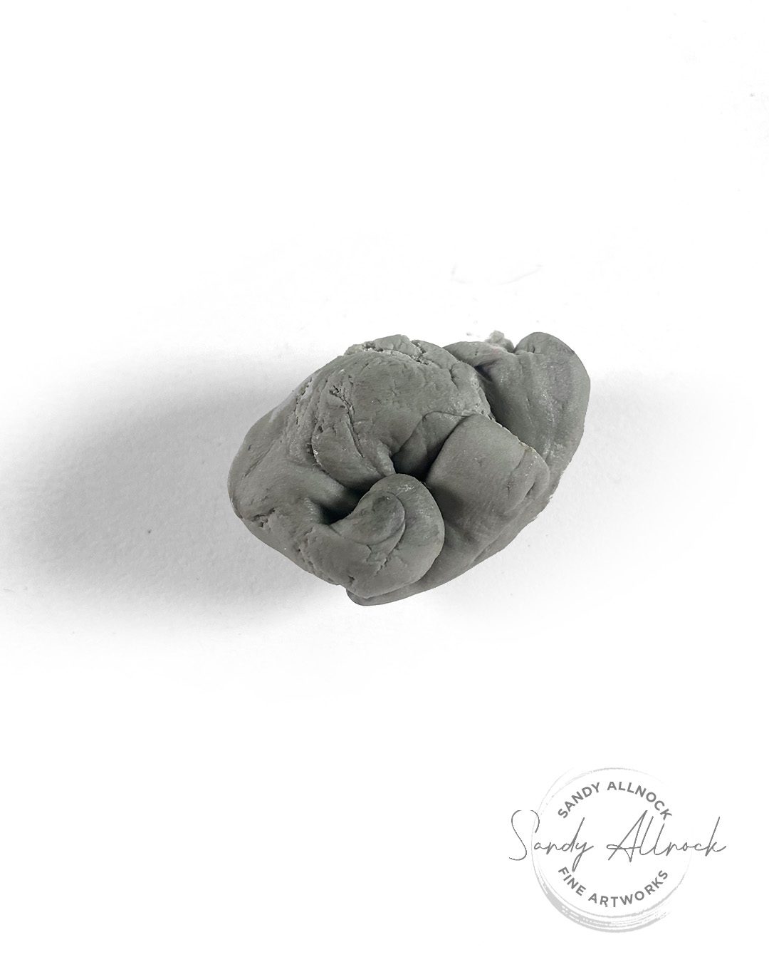
I’m starting with the lowest-ranked one….and it’s not a surprise to me. It came with a kit of some kind a long while back, and it’s pretty cheap. (I rarely look to kits to give me the best in supplies, they try to optimize amount-of-stuff over quality-of-stuff.) The writing except for “Marie’s” (I guess it’s the company name?) was all in Chinese. This one was dry, didn’t want to stretch after even excessive time trying to knead it. Stay away from this one.

General’s

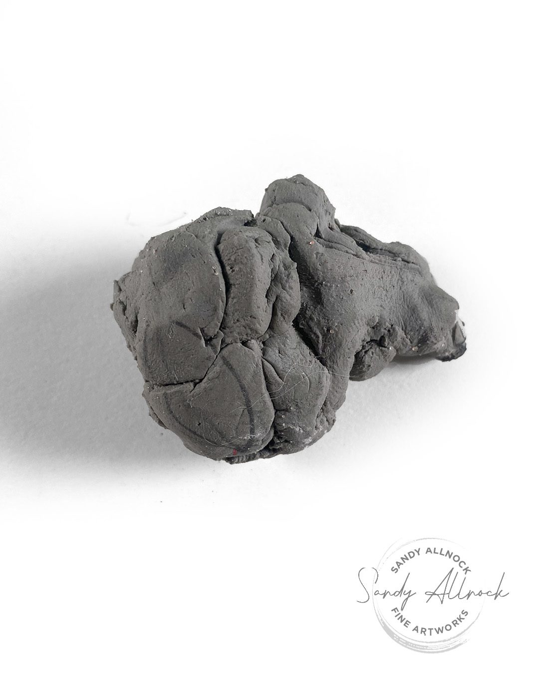
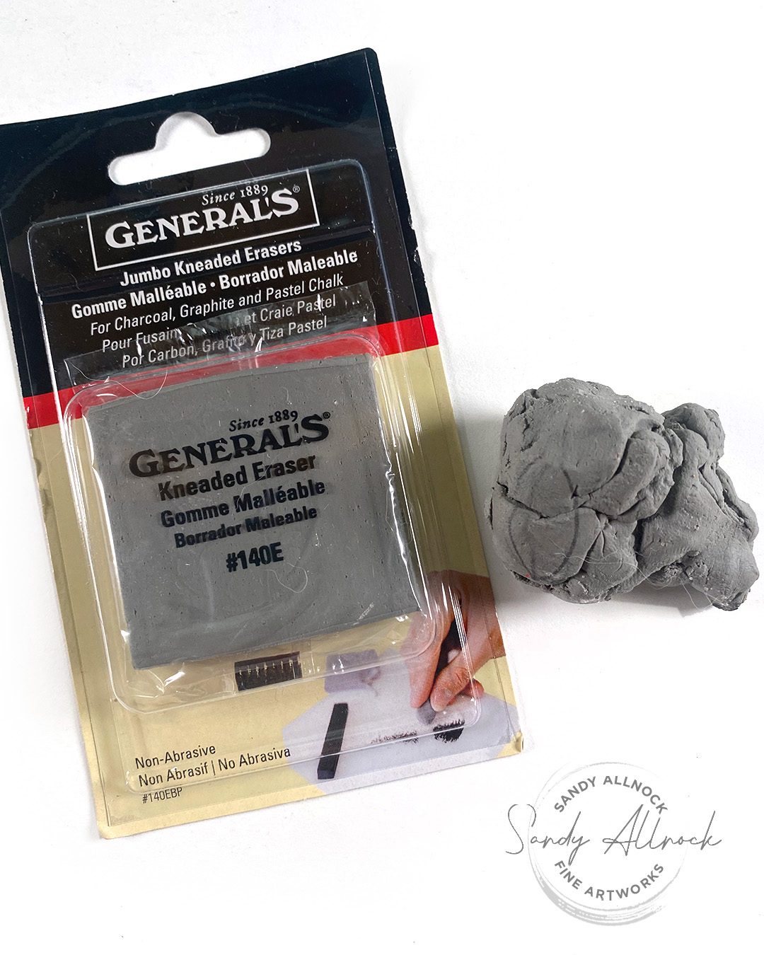
I’ve got some supplies from General’s, and it’s mixed quality – but this falls in the mixed side. I wasn’t able to really get it stretchy and pliable. Though I did love the size! One eraser doesn’t tell the whole story though, so if you have one in your stash, see if it’s more maleable than this one was. I’ll try the other pack soon and see if it’s just one eraser that had a problem. 

Prismacolor

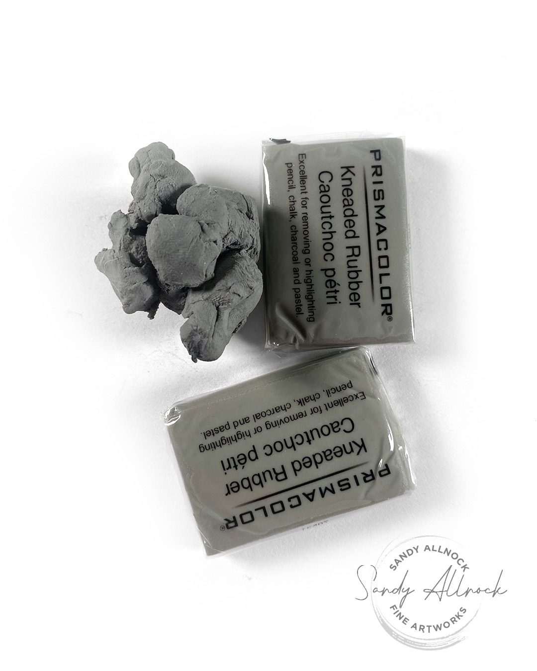
Sad to report this one moved down in the rankings after being my fave for decades. However – I’ve had some that have lasted me ten years! I know lots of companies are cutting costs where they can, and Prismacolor isn’t immune from price pressures, so maybe that’s the issue here. Or could be a bad batch. I was able to get it to be more pliable, just not what I’m used to.

Caran d’Ache

This one took a little more kneading than I’m used to but did perform okay; I have to say I was surprised! They’ve always totally overdelivered on all the art supplies I’ve had from them. I was able to get the crumblies to stop crumbling after another hour of playing with it while trying to nap in the back yard. However this will be in my stash for a specific reason: having a drier eraser is handy at times! A really squishy eraser is sometimes not “stiff” enough to get a sharp edge where needed, and this one will totally do the trick in a pinch for certain.

Faber-Castell Color

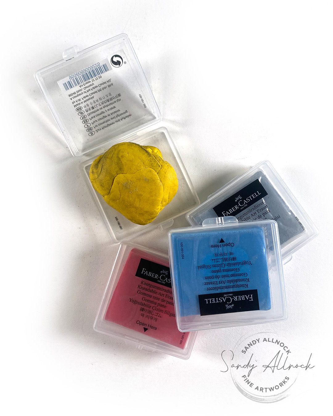
I don’t know the specific reason for colored erasers, given they all get dirty and grey – but these performed very nicely. The yellow will be very sad when it’s no longer yellow…however if you work in a group setting and want to get YOUR eraser back if someone borrows it – this is totally perfect! Plus the set of 4 comes with a grey that can be the workhorse while the others just look pretty in their cases? heehee!

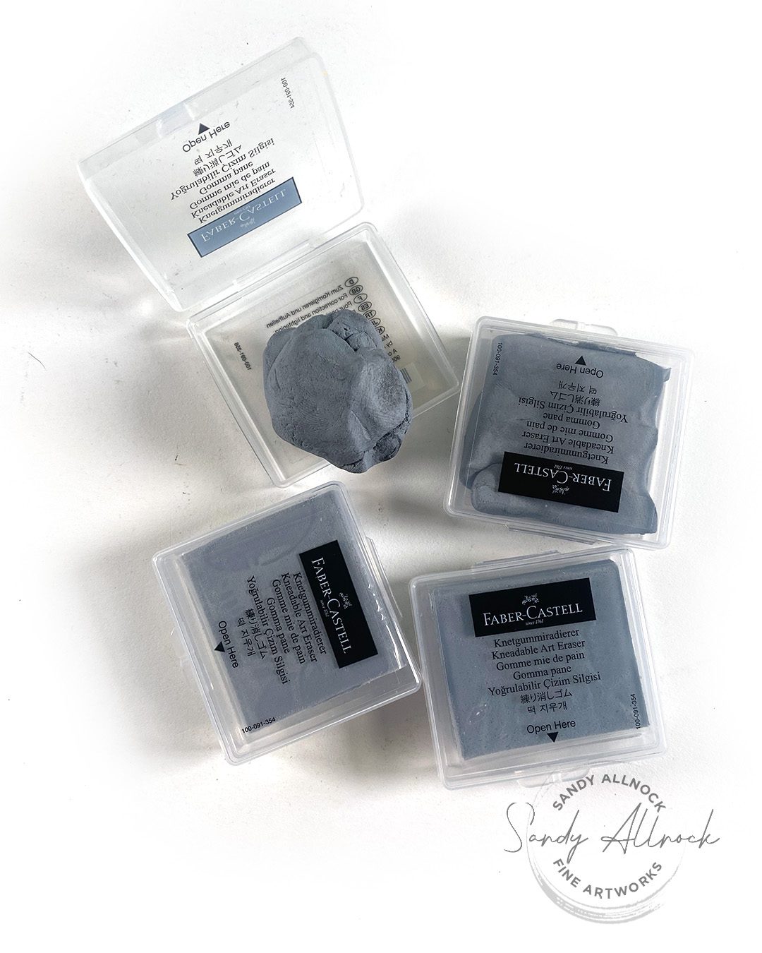
Faber-Castell Grey

The winner hands-down! Soft and pliable out of the gate. Clean erasures. Excellent performance.

The case is a huge deal for me; my sad little eraser that travels in my storage kit for my weekly charcoal drawing group, plus the little one in my urban sketching kit – both get filthy so now they both have cases to keep them tidy.

Victory Lap for the winner!

Our FCGrey victor got to help in my #harrypotterday sketch! As of 2012, May 2nd is “International Harry Potter Day”! The official statement by Prime Minister David Cameron that year:

“There is no doubt in anyone’s mind that Ms. Rowling’s work has had a huge and undeniable impact on the literary world as we know it. In order to fully commemorate and immortalize her work, we have to decided to officially declare May 2nd as an official international holiday, in honor of the date that protagonist Harry Potter conquered the main antagonist of the series, Lord Voldemort. We hope that children and adults alike will be reminded of Harry Potter’s strong and courageous character on this day, as well as of the true credit that Ms. Rowling has made to society.”

While creating my drawing, I watched allllll the HP movies! in a row! I’d only really watched them a little in the past – typically while doing something else and just having sound on in the background. So this was the first time I got fully inundated with all things Hogwarts. Might need to read the books next!

Lead Holder (pencil)

I always have my lead holders handy in the cup on my desk – so it’s seen in a ton of other videos that I do. One of them has been with me since college! The other two I got so I could have 3 leads going at any point. The sharpener from my college days is still here, but you can’t find them to purchase – though there’s one that was on Ebay for a small fortune and made me almost part with mine! The little handheld one works a little better, as the softer 6B doesn’t break as readily in that one, but….there’s something about having art supplies from college lasting til I’m in my grave that makes me never part with it. Ha!

Supplies

Some product may be provided by manufacturers for review and use. Compensated affiliate links are here at no cost to you. I appreciate your support of my work with your purchases! Full affiliate and product disclosure | My trusted partners in art

Subscribe to receive blog posts by email: