How to DELIGHT in your art

How to DELIGHT in your art

Do you know how to delight in your art? That’s something I’m embarking on in 2023. I’ve got some ideas to get started, but will be focusing on DELIGHT throughout the year. 
Tutorial: How to delight in your art

For the audio portion of this video, I wasn’t watching the screen – I just sat with the mic and told stories. Read on below for more info on the colors and supplies, as well as some ideas I have to learn how to delight in your art!

Watch the video below and scroll to the end to leave comments or questions — or click HERE to watch it on YouTube and leave comments over there. I read both dutifully!

How to delight in your art

While I’ll be exploring delighting in my art, my business, and my life through 2023, I’ve got a few ideas to start with! (And I’ll be looking back on this list periodically to keep myself in check!)

  1. Stop comparing.
    Don’t look at others’ work and compare your numbers of likes/views to theirs. 
  2. Celebrate your success with others.
    Remember that those who ARE seeing your work are the ones who love what you do. Even if it’s five of them. Appreciate them and cheer them on too!
  3. Note your favorite creative moments.
    Is it the blank page? First color stroke? The sound of the pen on the paper? Figure out which parts bring you delight! Pay close attention to each step in your process if you don’t know the answer to this question.
  4. Share anyway.
    Even if you’re feeling unsure – maybe ESPECIALLY if you’re feeling unsure – share your work. You can find a safe place like Artventure if you feel uncomfortable on large public sites. But find someone to share work with who can be your cheerleader.
  5. Become a cheerleader.
    On your most “down” days, create a cheerleader post that speaks to where you are. If you’re feeling discouraged, write a post to lift up others who are downtrodden. Are you feeling like a failure? Find a quote or meme about success coming from failure and let that encourage others like you. 
  6. No dwelling.
    If you’ve found yourself for weeks, months, or years complaining of a comment/action/illness/job problem/etc that holds you down, turn it around. The more it’s repeated, the more hold it has on you. Declare aloud that you’re not a victim – and seek friends who will remind you of that truth. This isn’t about ignoring your pain, it’s about not letting it rule you.

Need some DELIGHT in your home?

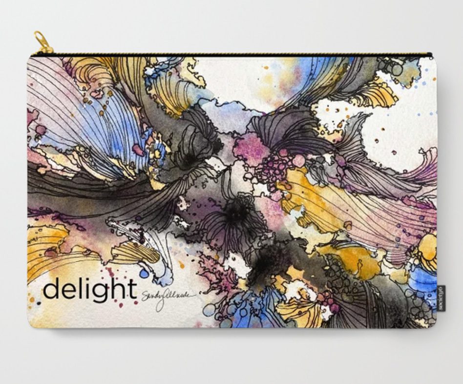
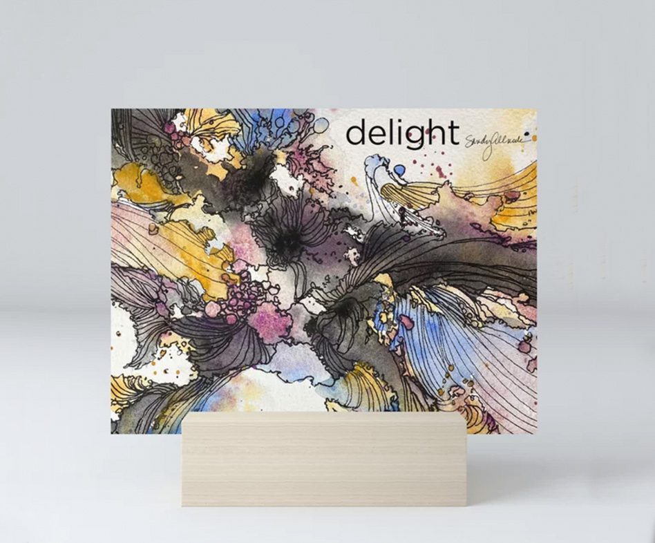
Purchase the original piece HERE, or order a full size or miniprint from Society6  – or maybe even a zipper pouch! (Be careful on the pouches, check the placement of “delight” in the preview images; I could only upload one option for all of them and it seems to get cut off on some sizes.)

The new Daniel Smith colors

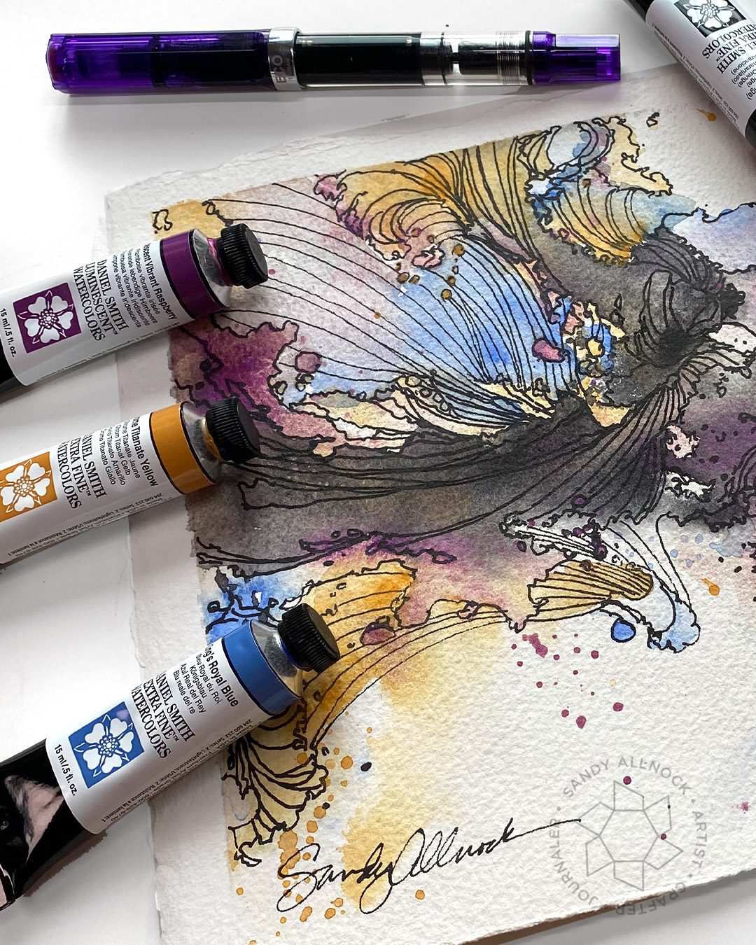
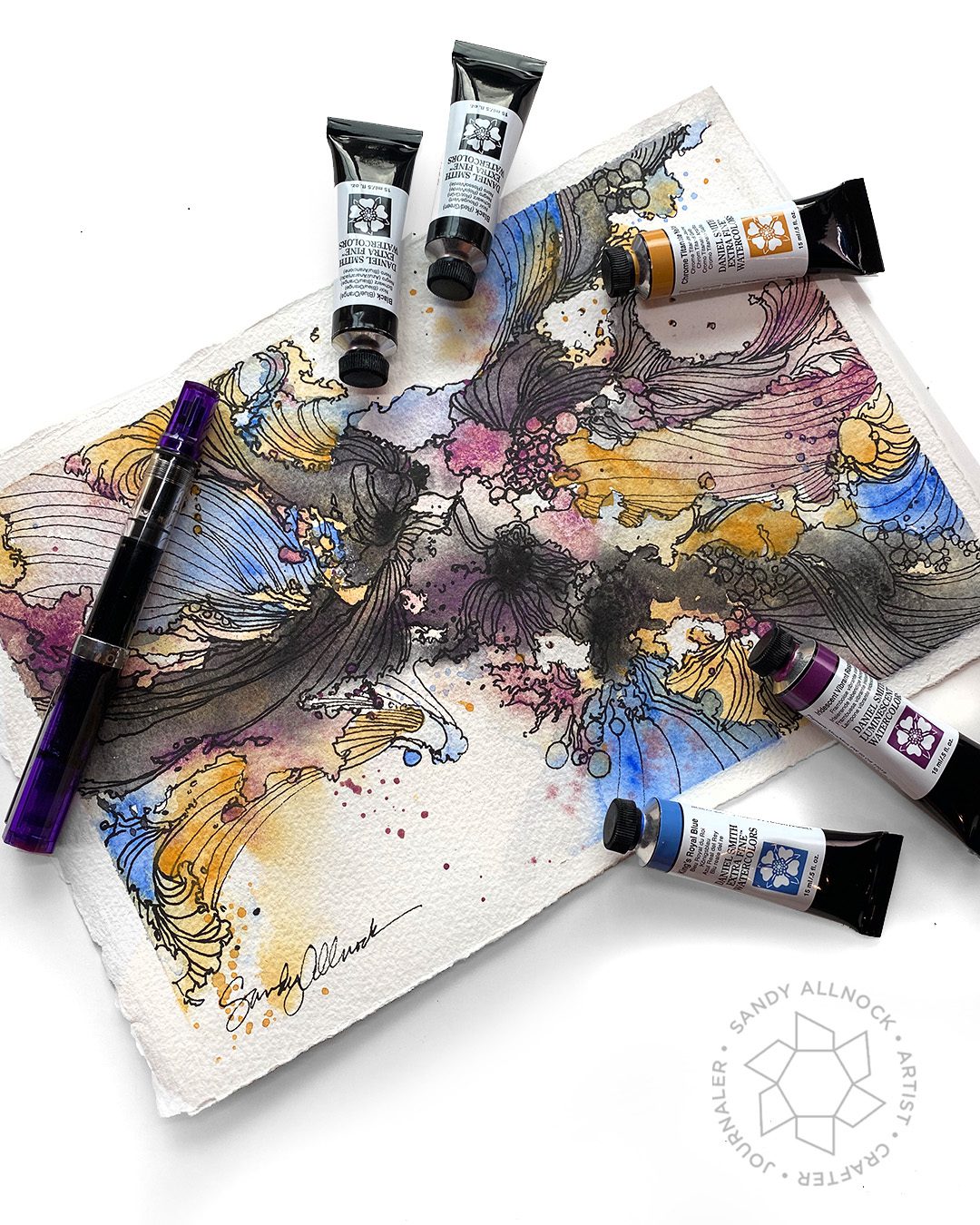
These won’t tell you how to delight in your art – but they might help you MAKE delightful art! I’m curious if any of these will try to nudge into my palette…see my notes about what intrigues me about each.

Kings Royal Blue | Chrome Titanate Yellow |  Iridescent Vibrant Raspberry  | Janes Black Red/Green  | Janes Black Blue/Orange 

King’s Royal Blue

Pigment: PB 29, PB 15, PW 4 / Series: 2
Lightfastness: I – Excellent
Transparency: Semi-transparent
Staining: 2 – Low-staining
Granulation: Granulating

This blue is a perfect sky blue – though my skies tend to be moody ones rather than representational of actual color, so I’m not certain this belongs in my palette. But I’ll play with it and see.

Chrome Titanate Yellow

Pigment: PBR24 / Series: 2
Lightfastness: I – Excellent
Transparency: Semi-opaque
Staining: 2 – Low-staining
Granulation: Granulating

A very nice yellow for flower gardens, with a little opacity – great for yellow flowers on the shaded side. I’ve been staring at my Aureolin to decide if it stays or goes, so I’ll see.
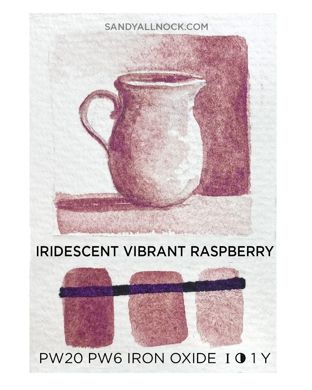
Iridescent Vibrant Raspberry

Pigment: PW 20, PW 6, Iron Oxide / Series: 3
Lightfastness: I – Excellent
Transparency: Transparent
Staining: 1 – Non-Staining
Granulation: Granulating

Like Iridescent Electric Blue – the shimmer was evident when used thickly. Same with this one. But the granulation is a bit off the charts for me, I don’t picture using it necessarily.

Jane’s Black (Blue/Orange)

Pigment: PB 15:6, PR 188, PO 71 / Series: 2
Lightfastness: I – Excellent
Transparency: Semi-Transparent
Staining: 2 – Low-staining
Granulation: Non-granulating

I trust Jane Blundell with color ideas – and these two blacks are piquing my interest. They’re mixed with pigments I already use to make black – so I wouldn’t have to mix that anymore. (I’ve struggled with whether to have a black in the palette at all….I keep trying different ones and prefer my mixes to those ready made colors. The DS site says these can become deep blues  by adding Phthalo Blue (Red Shade) tor by adding Transparent Pyrrol Orange to create rich orange-browns. Going to try these combos with colors in my palette currently.

Jane’s Black (Red/Green)

Pigment: PG 7, PR 264 / Series: 2
Lightfastness: I – Excellent
Transparency: Semi-Transparent
Staining: 3 – Medium-staining
Granulation: Non-granulating

This is another neutral black – transparent and non-granulating. It dilutes to beautiful neutral grays, or according to the DS website, it can be turneed into a range of rich greens by adding Phthalo Green (Blue Shade), which I want to play with – or to a range of aubergine, plum and maroon with the addition of Pyrrol Crimson. Not sure I’ll be adding multiple colors to the palette but maybe this’ll work with other reds and greens that I have.

Thoughts on these colors

As noted in the text with each of these – I may consider some, but will paint with them a while before making decisions. The blacks have me intrigued so I might have to play with them in mixes and see how that goes before choosing! In good news for Jane’s colors – I’m not sold on any of the blacks I’ve been trying, so these stand a chance.

Supplies

Some product may be provided by manufacturers for review and use. Compensated affiliate links are here at no cost to you. I appreciate your support of my work with your purchases! Full affiliate and product disclosure | My trusted partners in art

Subscribe to receive blog posts by email:

Game-Changer Fountain Pen Tip: 1 nib, 2 line weights (ft Ellington Pens)

Game-Changer Fountain Pen Tip: 1 nib, 2 line weights (ft Ellington Pens)

I wish I could have made the title even longer to include And There’s A Cute Downloadable To Try For Your Christmas Cards and a Real Time Video Available Too! But I think the Googles would have my head. Ha! So even if you’re  not a pen and ink person, there’s fun for you too.

Today I’ve got a great tip for you that I think I’ve talked about a little bit before – but I don’t know that I focused on it much. So let’s do that today! Note there are a couple projects here:

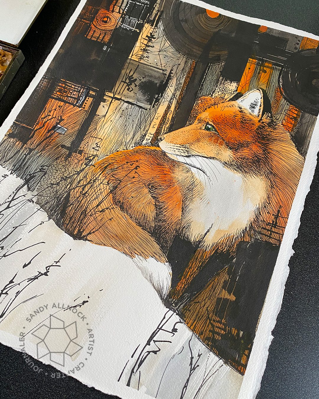
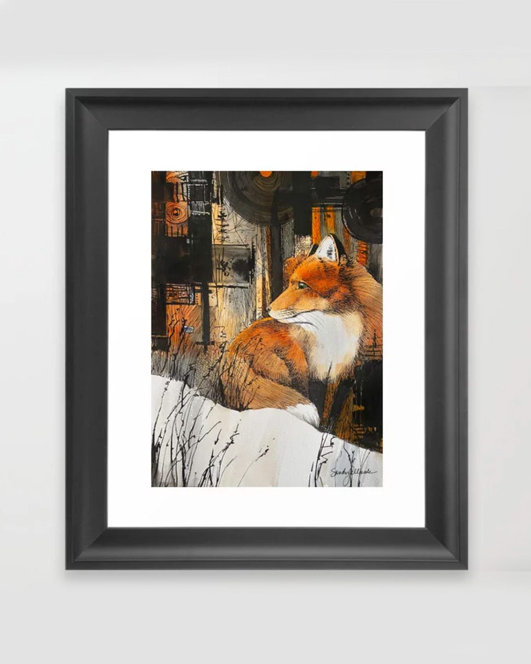
  1. A large fox piece with watercolor + ink, kinda crazy background. Available for purchase here.
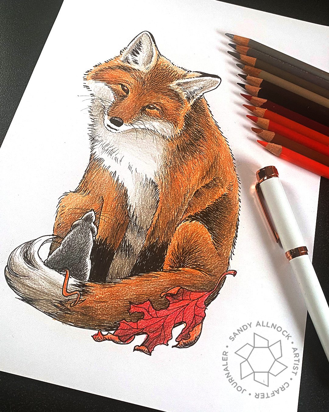
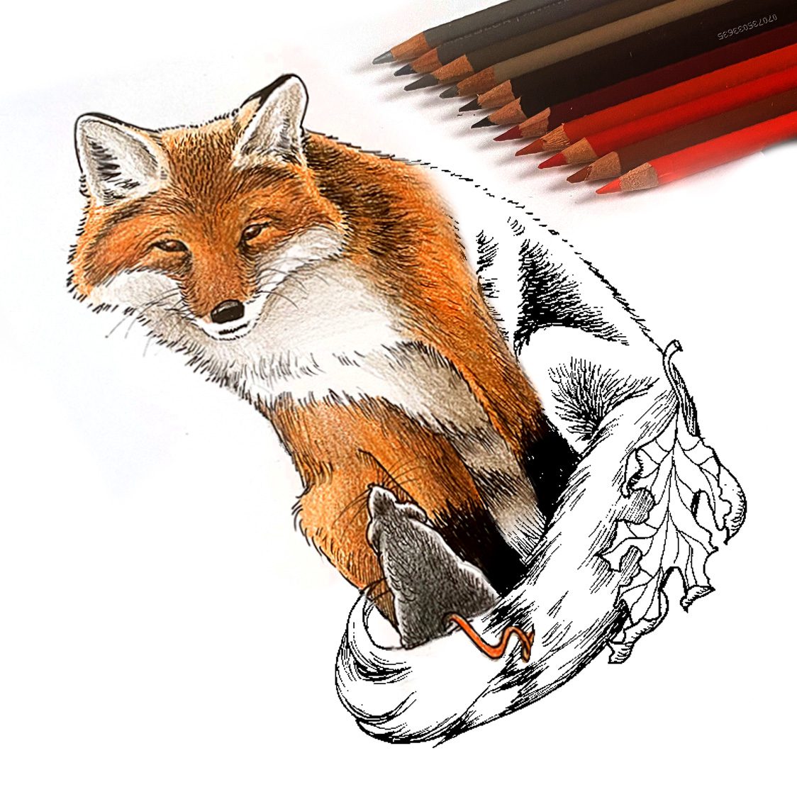
  2. Smaller pen and ink only fox with mouse. Also a digistamp printable here.
  3. Drawing #2 is a realtime video at Artventure. Find it in the Pen and Ink Students group.

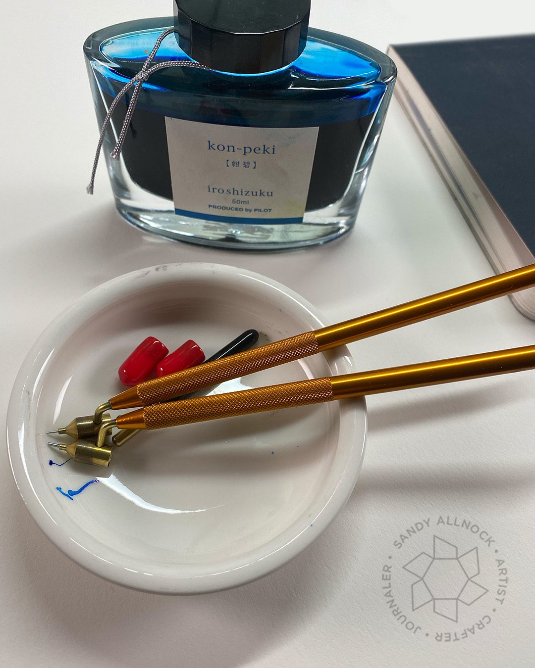
First in the video is a deeper dive on the Ellington pens I showed last week. The only negative (minor) that I saw was that after using the pen for a couple days or carting it around to a sketch event, the nib section came ever so slightly loose and needed to be screwed back in a little. I mean a little. That’s no reason in my book to dislike a pen, it only happened after big usage.

Tutorial: Game-Changer Fountain Pen Tip

Testing your pens to see if they create two line weights is what I expect fountain pen peeps to go do after watching this. And that’s ok. Leave me a comment and tell me if you did! ha!

Watch the video below and scroll to the end to leave comments or questions — or click HERE to watch it on YouTube and leave comments over there. I read both dutifully!

A rather crazy idea

I wanted to try something new. A realistic image for part of a wash-and-ink piece, but leaving the background not realistic….with a mix of linear, graphical elements and loose and flowy ones. You’ll have to let me know if you think I succeeded!

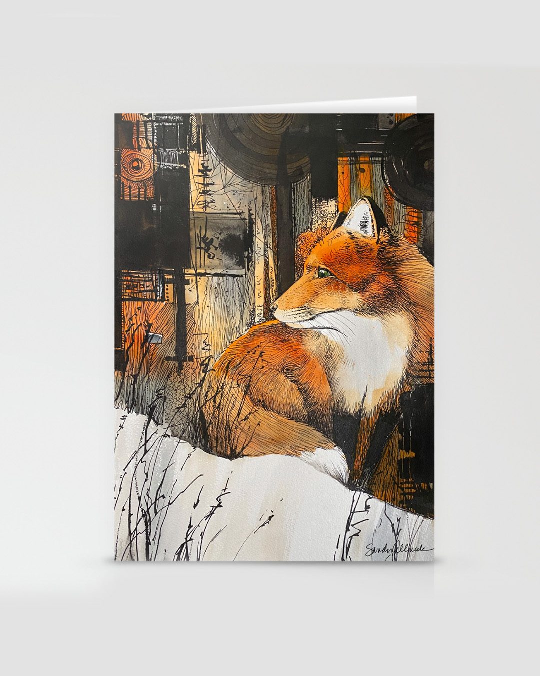
I’ve posted the original over on my fine art site…or you can get prints (with or without frames), or cards over at Society6!

Sweet fox

This pretty little fox was drawn in pen and ink and colored afterwards–the opposite of my preference! But I wanted it to be available for folks to cover if desired, so I was lucky that the pencil wasn’t opaque enough to cover it – so be careful if using pencils with it. Some will give the detail a really cloudy look. However – this one pictured was colored on the Hanehmule paper, which is smooth and nice for pen and ink, but quite terrible for colored pencil! It’ll be easier to work with on a paper with more tooth. 🙂

Draw your own…

If you want to draw your own fox, head over to Artventure where the realtime video is inside the Pen and Ink Students group. It’s just got music in it – but the outline is there so you can try your hand at drawing fur.

Or color one up!

If you just want to color up this cute fox and mouse, head to Art-Classes to purchase the printable!

Which one might you do?

Are you fancying a coloring session with the printable, or maybe being brave enough to draw a fox yourself? Or perhaps you’ve got some holiday shopping in mind – you can get the Winter Fox as prints or cards….or buy the original if you’re the lucky first one to shop!

Supplies

Some product may be provided by manufacturers for review and use. Compensated affiliate links are here at no cost to you. I appreciate your support of my work with your purchases! Full affiliate and product disclosure | My trusted partners in art

Doodling v Sketching v Journaling: What’s the difference?

Doodling v Sketching v Journaling: What’s the difference?

There are MANY types of art, but today I’m focusing on three areas of drawing and comparing what they do for me….and I’d be interested to hear what they do for you!


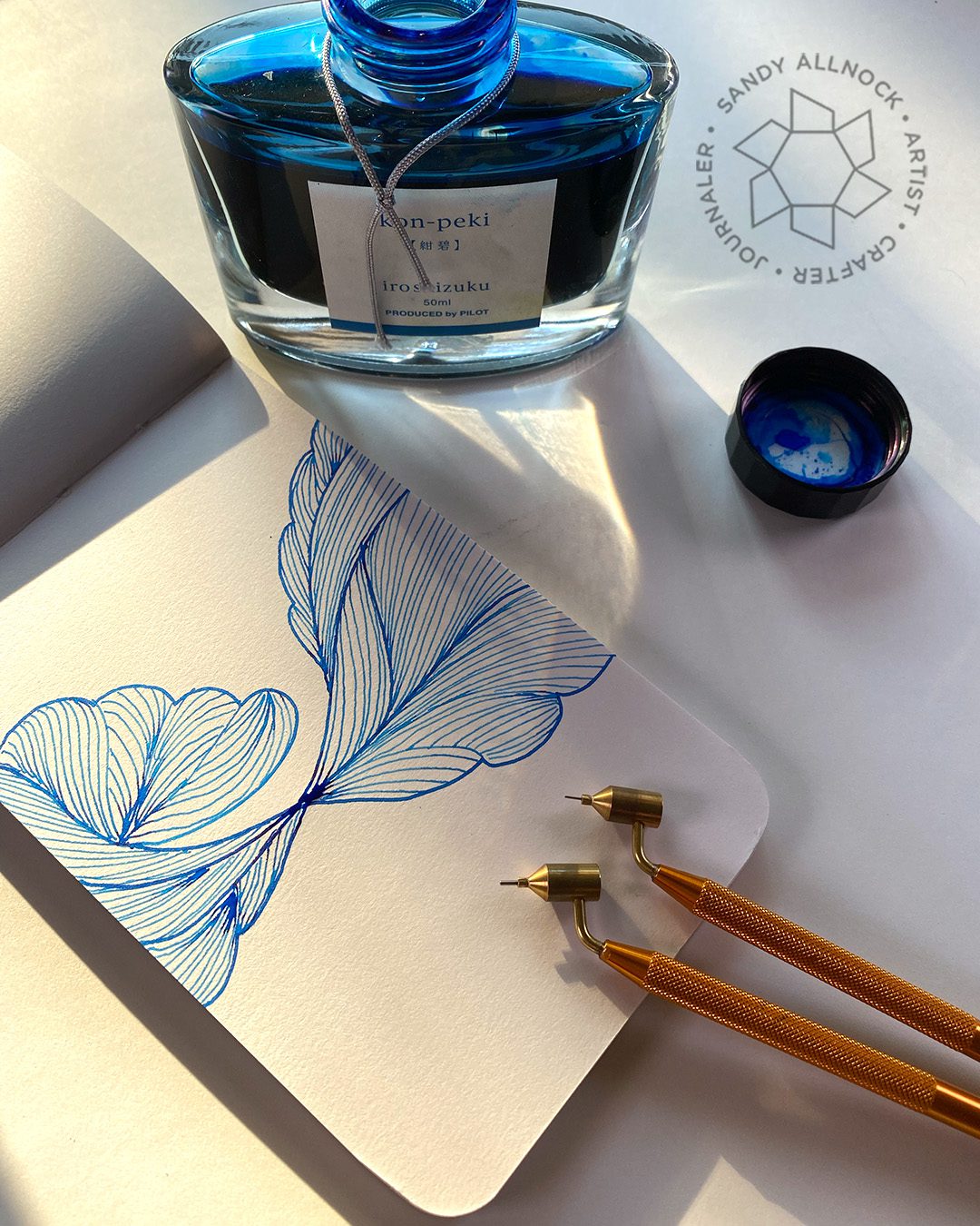
I’ll be using a Fluid Writer – it’s a “pen” that has a well on top and thin nib below. My old one is hidden somewhere with my Pysanky supplies – but I also remember trying it with ink after using it for the eggs, and it didn’t work so well after being heated. So….I treated myself to a new one – and found a PAIR of them – a fine AND extrafine nib! It doesn’t seem that you can order JUST the extrafine, you need to get it along with the fine, but they aren’t expensive.


You might wonder why you’d want one – should you even get one!? No one “needs” one. But what I find it helpful for is to use a little bit of an ink on a project when I don’t really want to clean out a pen to change inks; that process uses a lot of ink between washing out the old and putting enough in the pen that you can use it, then flushing that again. You can also use a glass pen but I do find those a bit scratchy – the fluid writer doesn’t have that problem.

What’s the difference? Doodling vs Sketching vs Art Journaling

In this video, I’ll show you some snippets of the three projects that follow, as I talk about my own experience with these three drawing styles. Yours may differ and I’d love to hear how they affect you!

Watch the video below and scroll to the end to leave comments or questions — or click HERE to watch it on YouTube and leave comments over there. I read both dutifully!

Doodling

The benefits of doodling are vast, in my opinion!

  • Relaxation. I can just turn off my brain and make lines!
  • Explore style variation. When it’s just lines, it’s easy to play with lines – shape, width, interaction, crossover…..so many options. My style of drawing has begun to develop more as I’ve been doodling longer.
  • No subject matter. While I might be inspired by something (a map, a flower, a line style), it’s not supposed to look like anything.
  • Although…Some folks DO doodle by drawing a subject – and that’s ok too!

Sketching

Making a sketch has a different set of benefits in my mind – and sometimes the borders of doodling bleed over into sketching as well.

  • Practice subject matter. Practice drawing a specific item – a landscape, trees, people.
  • Practice foundations. Perspective, value, color, line – anything you put on paper is excellent practice!
  • Use your brain. Sketching engages the brain and hand-eye coordination as you look at a subject and replicate it.

Art Journaling and Bible Journaling

Sometimes doodling or sketching crossover into journaling turf! I do find some people think art journaling is only 1) trying techniques and 2) using up all the junk around your studio that you haven’t found another use for.

That’s limited thinking, in my humble opinion! Art journaling can do so much more if you change your perspective….and let your mind travel while you create.

  • What’s going on in your life? What challenges need a creative solution? Often getting your mind busy on other creative ventures results in another solution popping up.
  • What are you grateful for? What are the things that make your life happy or successful? Pondering those things can lead to a heart that’s got a better outlook than it had before you started creating.
  • What is your spiritual journey like? What have you been learning? Capturing that as a Bible journaler can be a celebration of your faith in a creative way.

Last year I taught in but also participated in the November Gratitude Junk Journal class. And I’ve been invited back this year….and jumped at the chance. Last year was soooo good for my heart and attitude!

If you’d like to join in, class starts November 1 – and you can get 20% off by using my oupon code JOY when you click HERE.

How do these types of art help you?

I’d love to know how you are changed by doodling, sketching, or journaling – how do you feel after spending time creating? What’s life like when you don’t spend time in your studio?

Supplies

Some product may be provided by manufacturers for review and use. Compensated affiliate links are here at no cost to you. I appreciate your support of my work with your purchases! Full affiliate and product disclosure | My trusted partners in art

Make custom wedding gift wrap and card (forest themed)

Make custom wedding gift wrap and card (forest themed)

My niece just got married – and of course my gift for her and her sweetheart was handmade. But I went the extra mile for handmade wrapping and card too! Not entirely by choice…I wasted an awful lot of time looking around for the right gift wrapping and found nothing. A day before I left – I realized I had to get on it and make something!

Tutorial: Custom wedding gift wrap and card (forest themed)

The wedding was to be in a forest, and the couple loves the outdoors and tall trees….and the gift I wrapped up hopefully pressed all the buttons. (I’m still traveling so I’m writing this ahead!) 

Watch the video below and scroll to the end to leave comments or questions — or click HERE to watch it on YouTube and leave comments over there. I read both dutifully!

The card

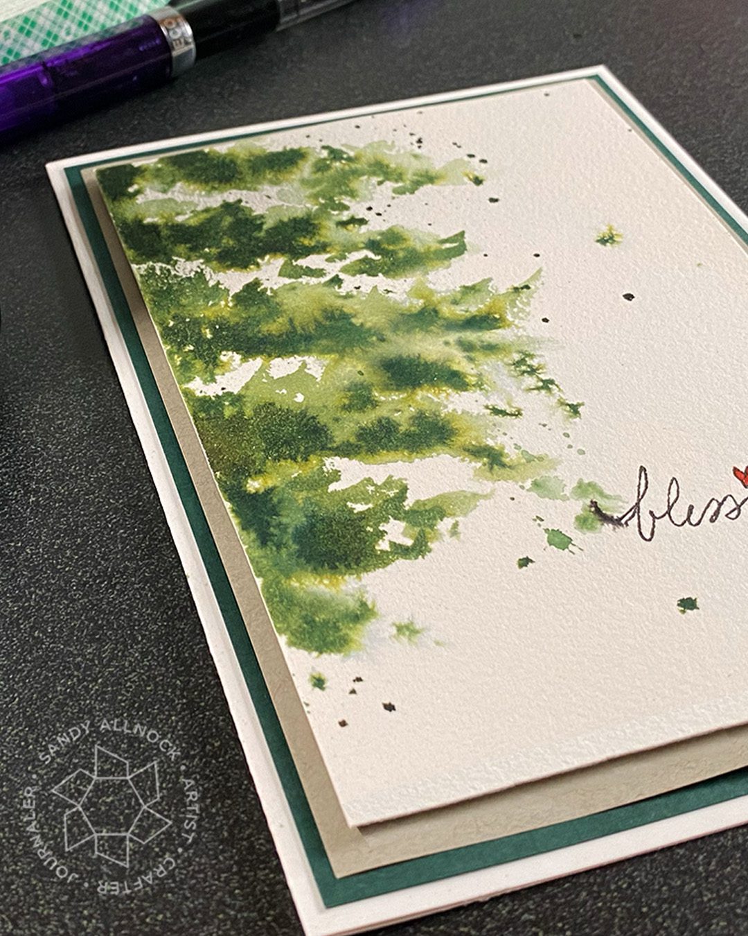
I used a simple rendition of the tree branches that I used on the wrapping – and look how pretty the ink blooms! For some reason when ink does that I don’t mind like I sometimes do with watercolor. I added a layer of the grey paper on a layer of dark green, and the painted panel is popped up on dimensional adhesive.

The wrapping

Grey paper was what I had to work with, and while I’d have preferred it white – I’m pretty sure I’ll have had an easier time transporting it! White could get so messy on a long road trip, so I think this is likely all good.

Have you ever made custom giftwrapping – and did it match the card?

Sometimes I wonder if I’m just a complete, utter overachiever. Maybe I am! ha!

Supplies

Some product may be provided by manufacturers for review and use. Compensated affiliate links are here at no cost to you. I appreciate your support of my work with your purchases! Full affiliate and product disclosure | My trusted partners in art

Draw a retro Christmas cat (card and a painting)

Draw a retro Christmas cat (card and a painting)

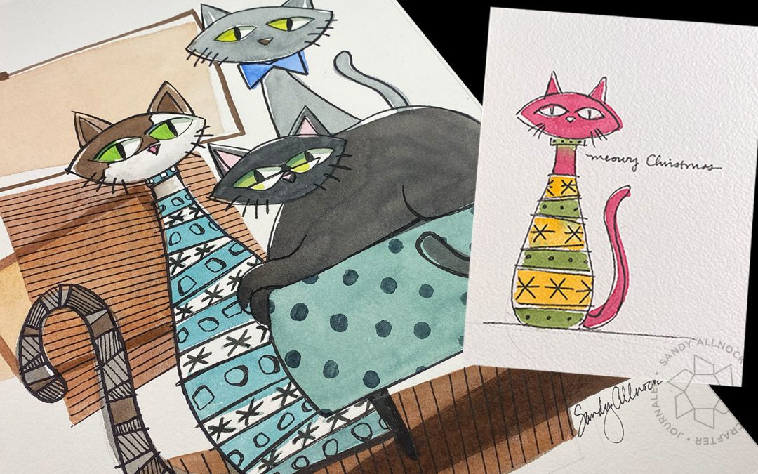
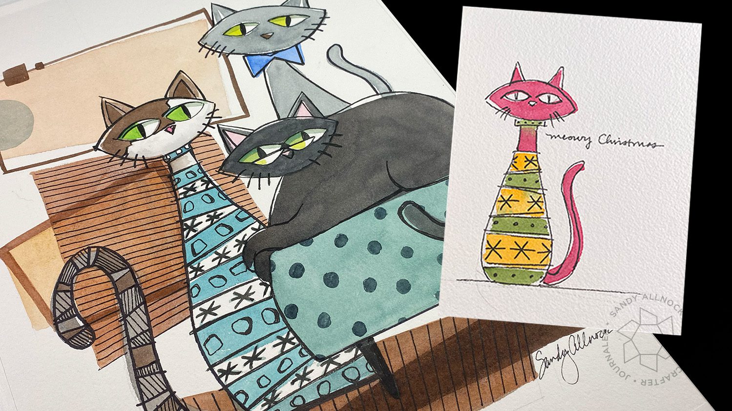
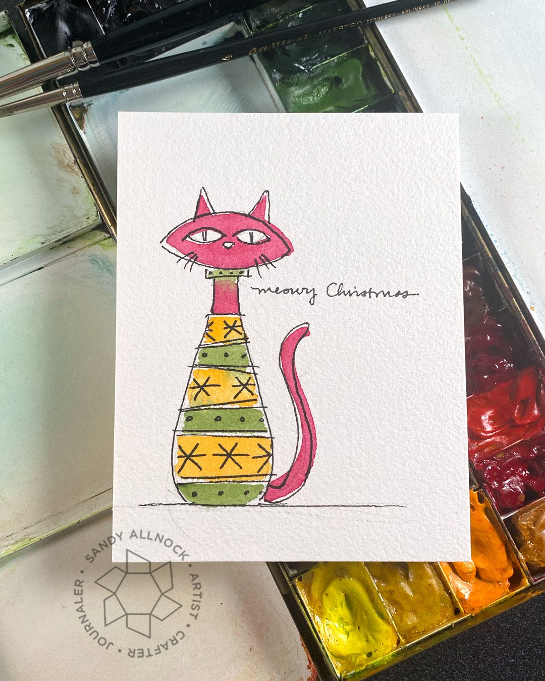
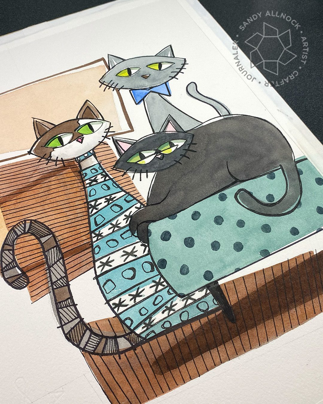
In my ongoing study of 1950s era design….I’ve fallen in love with what was a ubiquitous image: an “atomic cat”! Generally they’re black – but the shapes and drawing style is just simple. But I decided to use the shape and add Christmas colors, bow ties, a sweater…..and then made a bunch of my former kitties into atomic ones in a painting for my bedroom!

Tutorial: Draw a retro (Christmas) cat

A stylized illustration like this is very easy to customize. The cat need not be recognizable as your specific cat…just include a feature or two that YOU love about your feline friend. Your cousin won’t necessarily know that’s your cat on their card, but that’s alright. They’ll just be delighted to get a card with an original drawing on it!

Watch the video below and scroll to the end to leave comments or questions — or click HERE to watch it on YouTube and leave comments over there. I read both dutifully!

The sketch

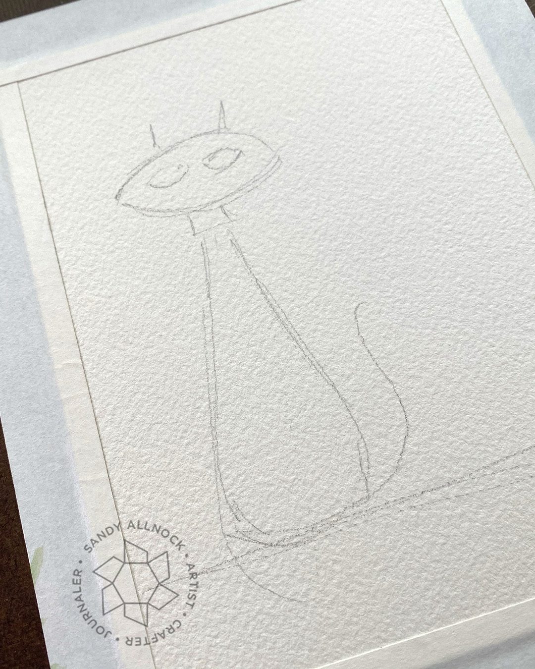
Here’s how simple the sketch is…a saucer shaped head, some eyes and ears, a long body and tail. Boom!

The key is to keep the painting loose; just shapes. If there’s a wonky edge or if color bleeds, you can draw over it, but when adding the lines, make them enough of a NON traced, NON perfect outline that it’s clear you meant to. (If you only do it in one spot, it’ll look like you just made a mistake.) This is an illustrative style, and I’m here for it! 🙂

I did the same thing large – an 11″ x 15″ painting of three of the cats I’ve had over the years! Oliver, the tall grey boy, was always quite dapper….a respectable boy who acted quite dignified. If he ever oopsed and fell off a chair or something he’d recover with a prance to tell you that you didn’t see what you just saw. LOL

Punchinello passed last fall, and he was my snuggly boy. And if you’ve had cats you know that’s not always common! But that was his game, finding me sitting down and getting between me and a book, a drawing, or my phone – for a petting session. (Until he was done, then he would vehemently let me know it’s over. ha!)

Tsuki is the one who passed just recently….my chubby girl who lived to an extremely old age. She’s seen a lot around here, she was good friends with my last golden retriever Ciara, so I hope Ciara greeted her over at that rainbow bridge.

Clean and Simple Trees class

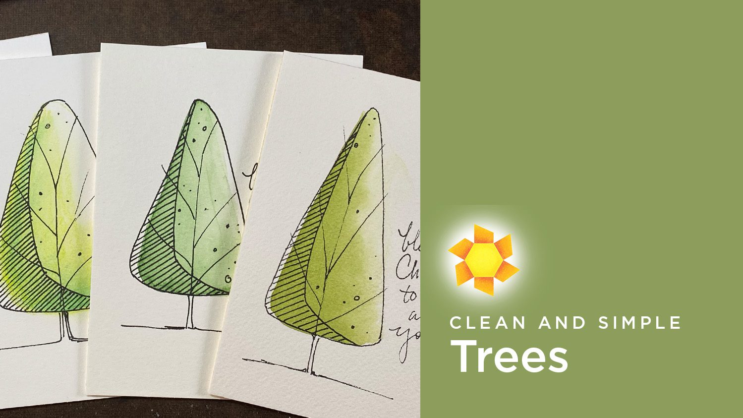
If this cat looks doable to you, then the Clean and Simple Trees class is entirely doable! (and if not, the trees might show you the cat’s not hard once you get the hang of it!)

Class is underway already but you can join in anytime – learn to make trees in a variety of styles, then see if you can adapt a simple cat like this one to the same styles taught in class! Head over to the Artventure community (free to join) and tap on COURSES in the menu. The trees class is only $7.99, and lots of folks are already enjoying it – and getting their Christmas cards done!

Try a retro cat in any medium!

Use the sketch to create a cat in whatever medium you like. Coloring shapes is simple to do, then add pen. Just make sure if you use colored pencil that the pen can draw atop any waxy buildup that you might get if you use heavy coverage. Otherwise with most mediums you can use any pen at all!

Supplies

Some product may be provided by manufacturers for review and use. Compensated affiliate links are here at no cost to you. I appreciate your support of my work with your purchases! Full affiliate and product disclosure | My trusted partners in art

CLEAN and SIMPLE Holiday Trees – in 4 mediums!

CLEAN and SIMPLE Holiday Trees – in 4 mediums!

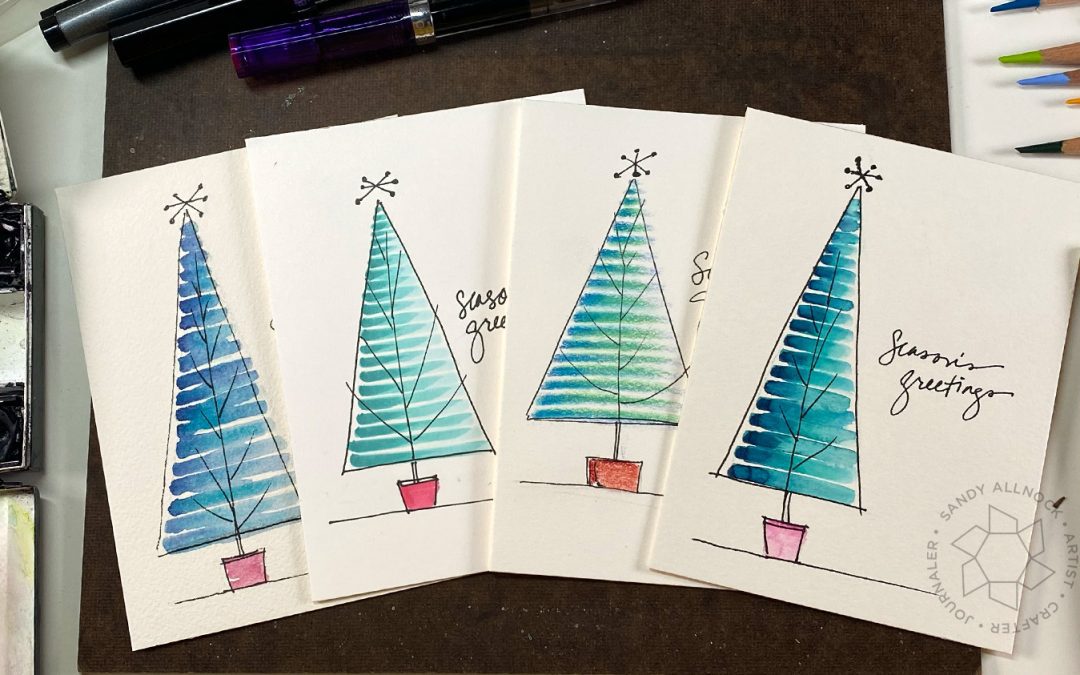
Clean and simple is quite popular among cardmakers at this upcoming time of year…with a lot of cards to make and other projects vying for attention, getting beautiful cards made that express your love for your recipients can be tough if each one takes a long time! So I’ve got a potential solution to get a bunch of yours done quickly – and the awesome part? You likely already have all the supplies you need! 

Tutorial: Clean and simple Christmas tree cards

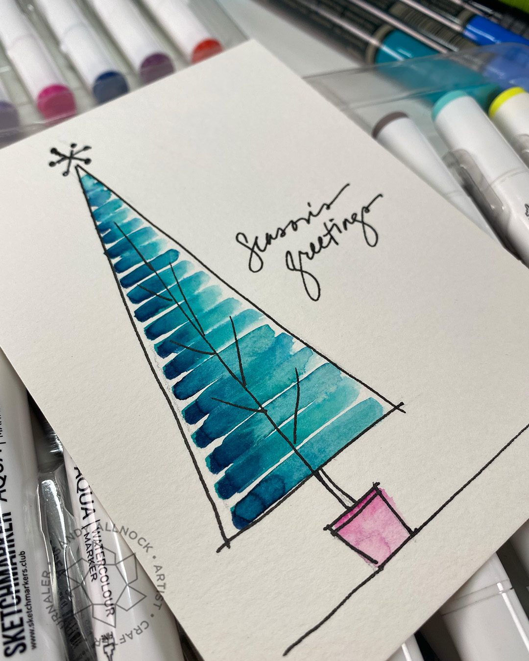
This is the first lesson in the CAS Trees class over at Artventure (click on Courses in the menu over there) ….. more on the class in a minute, but enjoy the simplicity of this pretty tree first:

Watch the video below and scroll to the end to leave comments or questions — or click HERE to watch it on YouTube and leave comments over there. I read both dutifully!

A word about black pens

For all versions, pretty much any pens you have should work since the line work goes on TOP of the color. If you’re not adding extra color after, it won’t matter if it bleeds or not, the pen should stay put.

That said, some pens on some papers on top of some mediums CAN give you a little surprise. What you’re used to at a particular thickness may feather out a little once it’s on top of color or on a new paper. Always test out a little bit on a scrap so you know what you’re getting.

For fountain pens, I like a TWSBI Eco; for projects like this usually the Medium nib is best (but I keep a Fine and Extra Fine in the studio just in case.)  Don’t overlook the Sharpie Ultra Fine that’s sitting in the kitchen pencil cup though! Or a Copic Multiliner works great too.

Water-based markers

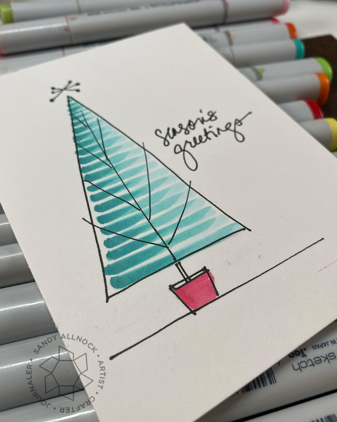
Watercolor markers can be a challenge to blend in large areas so this tree with its stripes is a simple one to get a blend in each line, just using a brush to push the color back to the shadow side. For supplies – any water-soluble markers will work here, even kids Crayola!

SUPPLIES: My favorite crafty set is Sketchmarker Aqua, and fo2r fine art: Faber Castell Albrecht Durer (Blick AMZ) (these dont fade in the light). I recommend CansonXL (Blick AMZ)  for paper with these pens, it moves the color nicely even for beginners! A good crafty brush would be a Silver Brush Black Velvet Round #8:(Blick AMZ) and.or Round #4 (Blick)

Traditional Watercolor

While I say “traditional” watercolor that doesn’t mean it’s got to be fine art watercolor. Kids watercolor paints could do well here too – though they might not be as pigmented as fine art paints. But a pastel watercolor tree can be gorgeous, so don’t overlook supplies you have on hand! You’ll create stripes with a midtone, drop a dark on the left side for the shadow, then use a damp brush to push the color leftward to create that highlight.

SUPPLIES: I’ve used Daniel Smith watercolors here: Cobalt Teal Blue with Indanthrone. And a little Quin Rose for the pot! But there are so many colors to use! Try a pink tree or a purple one, or go traditional with greens. Anything will do! For paper I love Arches Cold Press, but with areas this small, the inexpensive CansonXL (Blick AMZ)  will also do; there’s no fancy edges to worry about, and the XL might be easier for your pen work.

Copic markers

Copic users, you can join in this fun too – just pick a set of three blending colors, a light, medium, and dark, and create some stripes! 

SUPPLIES: I used three Copic Markers – BG47 BG13 BG000 Copic and an RV14 for th epot.  Use your favorite paper to color on, I like me some Neenah Cardstock, Solar White.

Colored Pencil

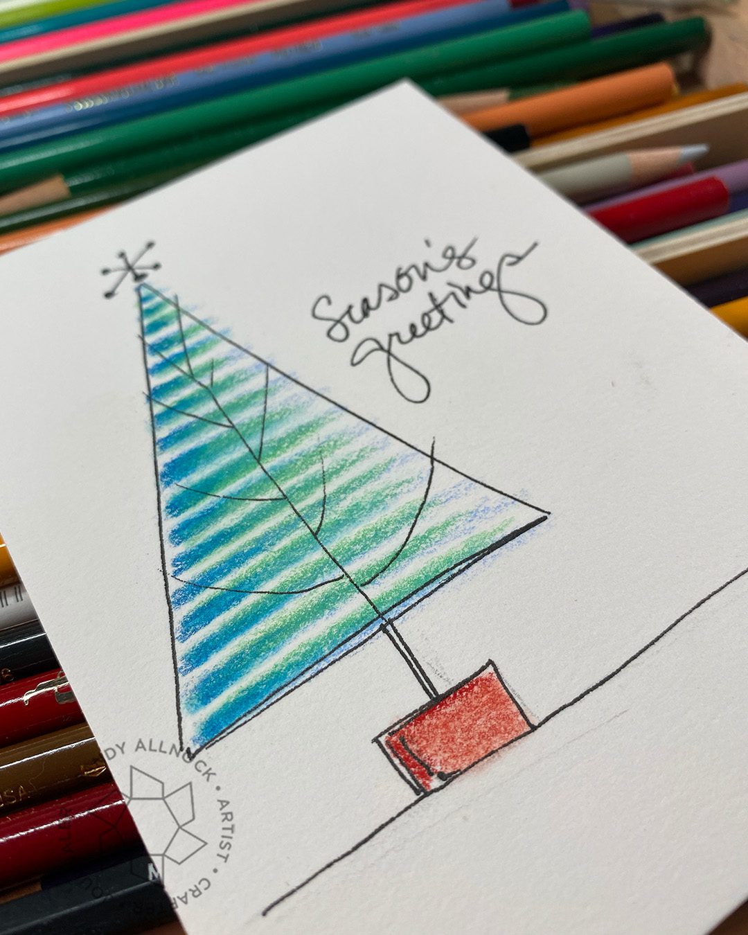
Your pencils can come out to play with these trees, too! A dark, medium and light in whatever combo you want …I was trying to mimic the colors in the other versions and didn’t have a single pencil group that would work so tried a more bluish dark, a greenish midtone, and bluish light color (sorry I forgot to write down color names!) since I was blending with gamsol. The three then kinda average out to an overall bluegreen color.

SUPPLIES: I recommend either Prismacolor (Blick AMZ) or Polychromos (Blick AMZ) Pencils; colored pencil is one medium where the cheaper pencils just aren’t able to put out enough pigment. My favorite paper to use with pencil is Stonehenge (Blick AMZ) …it’s got the best tooth I’ve found that pulls enough pigment off the pencil tips, and works great with blending stumps and Gamsol Blending solution.

A new little type of class!

As you may well know, I offer almost 100 classes at art-classes….those range from the basics in each medium (Jumpstart classes) to intermediate smaller courses (mini classes) and all sorts of advanced ones too. But….each one is a deeper class, thought out over months and prepared to convey specific techniques and ideas. 

But….I also wanted a way to teach students to just PLAY.

This year I’ve given myself the space to play. A week on each theme, and creating social media content on that theme, has helped me take time to explore an idea and push it….and I think that’s a super valuable exercise! And I think I may have a way to help YOU do the same kind of thing in a special, smaller, “snackable” class.

These will have shorter videos, a concentrated subject, and explore a variety of techniques around that smaller idea. A few weeks back I offered a free Watercolor Pencil Leaves class, and wanted to see how popular that might be. So many people signed up! Yay! So now ….it’s time for a new class in that genre….

Clean and Simple Trees class

With the holidays approaching, trees are a perfect topic for a CAS class….trees are such a focal point for Christmas cards, they can hold their own as a solo image! And with so many techniques in so many mediums, there’s a ton to play with. As students work through the 6 lessons, more ideas should start popping up (and more are added in class!) for other subjects that would be easily rendered in that style! 

To sign up for this $7.99 class, pop over to the Artventure community and look in the Courses tab. I’m hoping by the time you read this, that the class is available on web, android, and iOs but Apple’s been slow at approving things so far! If it’s not listed as an option in your Courses tab, then you’d need to go to the web version (https://artventure.mn.co/) and access it there until Apple gets its act together.

Supplies

Some product may be provided by manufacturers for review and use. Compensated affiliate links are here at no cost to you. I appreciate your support of my work with your purchases! Full affiliate and product disclosure | My trusted partners in art