Hawaii Fundraiser Color Wheels + new Hex Chart Class

Hawaii Fundraiser Color Wheels + new Hex Chart Class

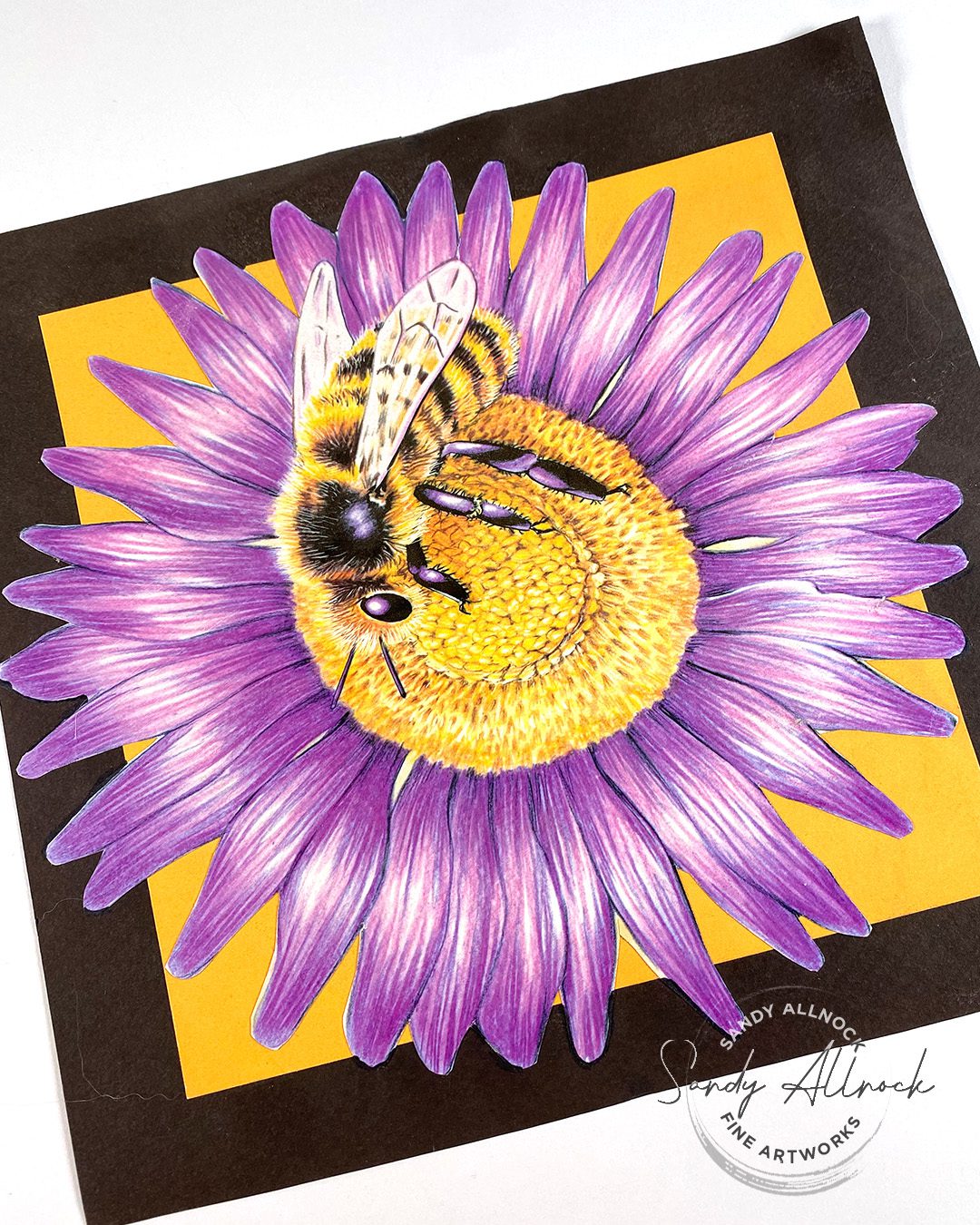
Shall we join hands for a Hawaii Fundraiser? It’s been heartbreaking watching so many lives disrupted – and ended! This story absolutely broke me.

I can’t do anything to stop climate change. I can’t build back homes. I can’t bring back those who perished. But I can use my art and platform to do a little something along with the art community, and I hope you’ll participate in one of the two ways I talk about in today’s video. THANK YOU in advance for your help!

Video: Hawaii Fundraiser Color Wheels + new Hex Chart Class

Watch the video below and scroll to the end to leave comments or questions — or click HERE to watch it on YouTube and leave comments over there. I read both dutifully!

“Perpetual” fundraising

I plan to keep giving through the sale of this printable; the beneficiary will change, because, sadly we know there’ll be a new hurricane, landslide, flood, earthquake…..it seems there’s something new once a month, sometimes only a week or days apart.

Each week I’ll be making the donation to whichever situation is in the most dire need at that time. So if you want to help, color the image up again and share it with your online friends so we can keep generating income for those who need it!

If you want to keep giving through this method, you can just repurchase when there’s a cause that touches your heart; 100% of the money goes to the charity, I’m eating the Paypal fees myself, and knowing me, I’ll round up the donation. 🙂

Purchase yours today!

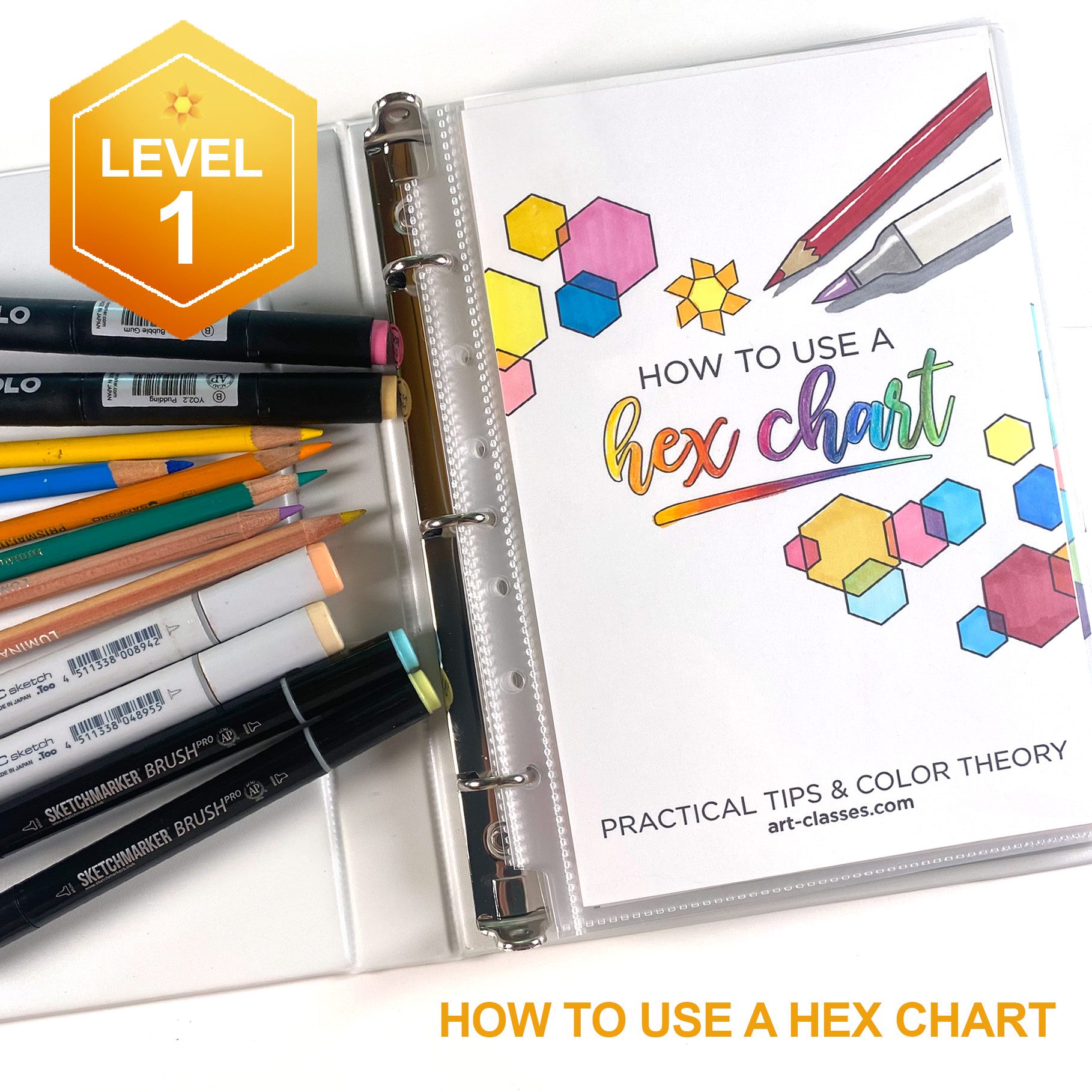
How to Use a Hex Chart class

For quite some time (to be honest, YEARS), new colorists have asked how to use the hex chart. Uhm, I just thought, hey you can see colors near each other so pick some out, right? I’d done a few YT videos using the chart, but I hadn’t done a deep enough dive to help folks. Until now!

This is an inexpensive class, so while the samples are pretty spectacular, please don’t get your hopes inflated! It’s primarily about color, and helping people to see the differences between colors by looking at photos, then a drawing of them. Sometimes that can help show what desaturation IS, and the power it has to change your art. So there are 10 lessons like that; little clips of coloring, some sample color chart tests, but I think it’ll be well worth it for those who want some help with their hex charts!
Thank you!

I appreciate your support of this fundraiser…..please share widely!

Supplies

Some product may be provided by manufacturers for review and use. Compensated affiliate links are here at no cost to you. I appreciate your support of my work with your purchases! Full affiliate and product disclosure | My trusted partners in art

  1. Alcohol markers:
  2. Colored pencils:
  3. Papers:
    • Stonehenge Drawing Paper AMZ – BLICK 
    • Neenah Cardstock, Solar White 250pk 

Subscribe to receive blog posts by email:

4 Art Tips That Have Aged Well (Children’s book illustrator Gay Holland)

4 Art Tips That Have Aged Well (Children’s book illustrator Gay Holland)

Not all ideas or instruction pass the test of time, but I have 4 art tips that have aged well that I am excited to share with you!

For today’s Artiversary project, I’m returning to two places:

  1. My series honoring the stylings of favorite children’s illustrators
  2. A drawing I made while in high school

Tutorial: 4 Art tips that have aged well
Watch a re-draw of a high school piece of art, inspired by the technique used most excellently by my professor!

Watch the video below and scroll to the end to leave comments or questions — or click HERE to watch it on YouTube and leave comments over there. I read both dutifully!

The Illustrator Series

This has been an on-and-off series for some time, so today adds to the list! Here’s the rest:

  1. Isabelle Arsenault
  2. Maurice Sendak
  3. Eric Carle 
  4. Jon Klassen
  5. Charles Schulz

1. Adapt from reality

Gay disabused me of the notion that my work needed to be hyper-realistic or photorealistic. That’s for photographers; artists have the ability to improve on reality. We can deepen shadows for contrast, or pull in some midtones so the shadows aren’t giant blocky areas. We can cast the light onto our subjects to change the mood to our liking. We can edit extraneous detail that’s not helpful. Photographers can do some digital manipulation, but not by the same way that an artist can. Don’t try to be a camera. Be better than a camera.

2. Incorporate Color Theory

If you’ve not yet studied color theory, it’s a great thing to do! (All my Jumpstart classes in color media have color theory basics.)  It’s not just “knowing” what colors are on the wheel, and how to mix secondaries, etc. If you learn what can happen if you mix or layer complementary colors, it’ll give you many options for colors to shade with, hues to change the temperature or saturation of a color. It’s practical even if sometimes “color theory” sounds scary.

3. Embrace your art supplies

Let your medium sing! Many people try to create “perfect” blends in mediums that make it hard to do so; if you’re using something that wants to be loose and splashy, it’ll fight you on being tight and detailed. And vice versa! It’s not as if you can’t make a medium do something else; but explore what your art supplies do best before trying to push them. You might be missing out on something that’ll be much more natural! 

Also, don’t use computer graphics as a standard for art mediums to blend completely smoothly; humans aren’t computers. And in a world where AI is taking over so much, the more valuable a hand-touch on a piece of art will start to matter. AI can’t make a brushstroke like a human hand, so celebrate your art’s humanity!

4. Art takes as long as it takes

Speed isn’t the point of art. Or at least shouldn’t be. If your time is limited, yes it can seem to be the better part of valor to choose a speedy medium or style. However, if you’re always speeding through projects, you’re missing out on the biggest benefits of art: it’s healing, it’s conducive to peace, it helps you disengage from the problems of the world so you’re ready to return there later. If you skip the restful benefits of taking your time, then you’re not doing yourself any favors.

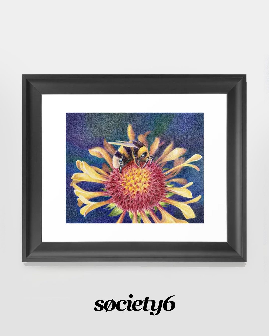
Need this little bee?

The original is for sale HERE (everything in the shop is 10% off through August!) and you can also order prints HERE.

Artiversary party

We’ll be gathering on Zoom over at Artventure for our big party! Join us for games, lots and lots of prizes, and a piece of art I’ll create on the fly based on audience input! You can RSVP on the Event page inside Artventure, and add your own photo suggestions in the comments and maybe one of yours will get picked to be used. See  you there Saturday August 12 at 10am Pacitic/1pm Eastern!

Supplies

Some product may be provided by manufacturers for review and use. Compensated affiliate links are here at no cost to you. I appreciate your support of my work with your purchases! Full affiliate and product disclosure | My trusted partners in art

  1. Luminance Pencils 
  2. Luminance Hex Chart
  3. Stonehenge Drawing Paper Pads:  AMZ • BLICK
  4. lassine sheets – (for protecting art under my hand)

Subscribe to receive blog posts by email:

Bringing animal images to life with color (tips for newbie artists) – CCC New Release

Bringing animal images to life with color (tips for newbie artists) – CCC New Release

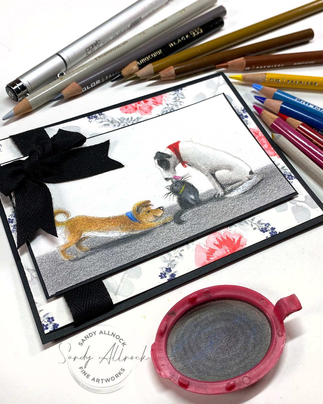
In a Facebook message. a new colorist asked me which medium is best for coloring animals like dogs and cats. (And of course, it depends!)

The new Anita Jeram designs from Colorado Craft Company were too perfect a chance to show the comparison. They are SO DANG CUTE. #justsaying

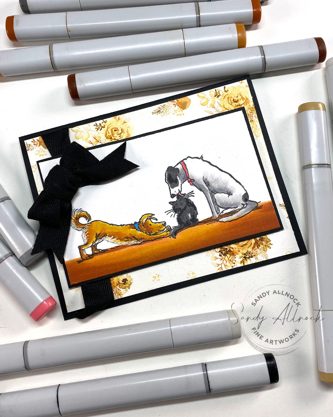
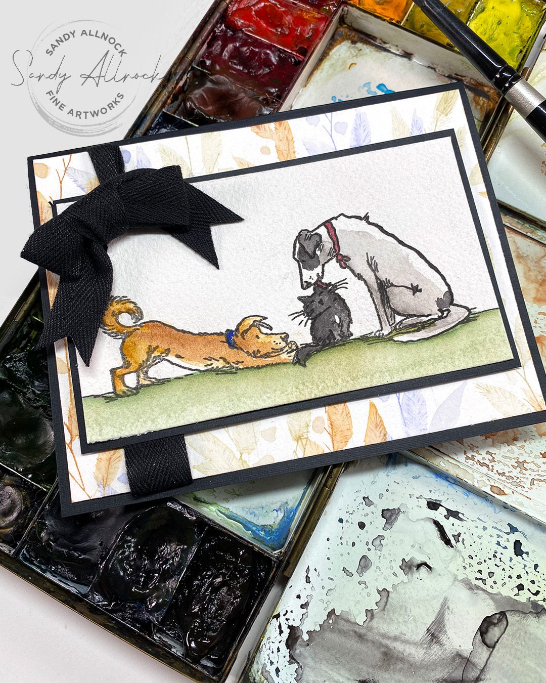
So in today’s hop, I’ll show you three ways to color the same stamps, and you can decide what YOUR priority is!

BLOG HOP PRIZE INFO IS LATER IN THIS POST

Tutorial: Advice for new artists – coloring mediums for dogs and cats

Watch the video below and scroll to the end to leave comments or questions — or click HERE to watch it on YouTube and leave comments over there. I read both dutifully!

Alcohol marker

Not high on my recommendation list for new colorists, because, well, they’re expensive, and it takes getting a few trios or pairs before much can be accomplished. By the time you spend on that, you might decide that maybe you didn’t really like the look or the process anyway. But if you’re totally attracted to the look and you have a budget? Go for it! I have a few free charts with suggested colors to start with here.

Then get yourself some Neenah cardstock and either stamps with a Copic friendly stamping ink or a multiliner (Copic friendly) pen, and get busy making art! Then there’s always a Copic Jumpstart class that might help out too. A hex chart is a help too!

Watercolor

Though it’s a favorite medium for me, it’s tough to learn if you’re trying for realism; loose splashy color is fine but once it comes to mixing, water management, etc, it can be rough going. Don’t go buying a gajillion tubes to get started though – folks who have palettes with 36 or 48 colors paint no better than someone with 6! Learn to mix from the start and you’ll save yourself hundreds of dollars in $10+ paint tubes. Daniel Smith has an excellent set of 6 essentials colors – 3 warm, 3 cool. Simple. In the Watercolor Jumpstart class you’ll learn some basics of mixing colors and make charts to show yourself  how to achieve colors without buying lots of tubes. (Later you may want particular colors for ease of painting or techniques – but don’t start out buying them all!) 

Also start with good paper. I know it feels counter intuitive and you want to save money. But honestly, it’ll make a difference in your practicing. Decent brushes for beginners are the Silver Brush Black Velvet line, try a round 4, round 8, round 12.

#1 recommendation: Colored Pencil

The new artist wanted to know about dogs and cats — and realism. So this is one of several reasons this is my best recommendation. The subtlety you can get, the fine points with a good sharpener (handheld or electric)  – much to be said about them!

Pencils are something we’ve all used since we were children, so holding a pencil requires no special training. You can get a lot of colors without spending a ton (I recommend Prismacolor – a good artist brand, and has the best neutral range for animals). Colored pencils are also adaptable – trying out blending solutions and powdered pigments can give you lots of options inexpensively to achieve a lot of effects.

The Colored Pencil Jumpstart class is another that teaches color theory at the start so you get a good footing. You’ll learn about solutions and stumps and powdering your pencils – lots of techniques that’ll send you off on a coloring adventure. Pick up a hex chart here.

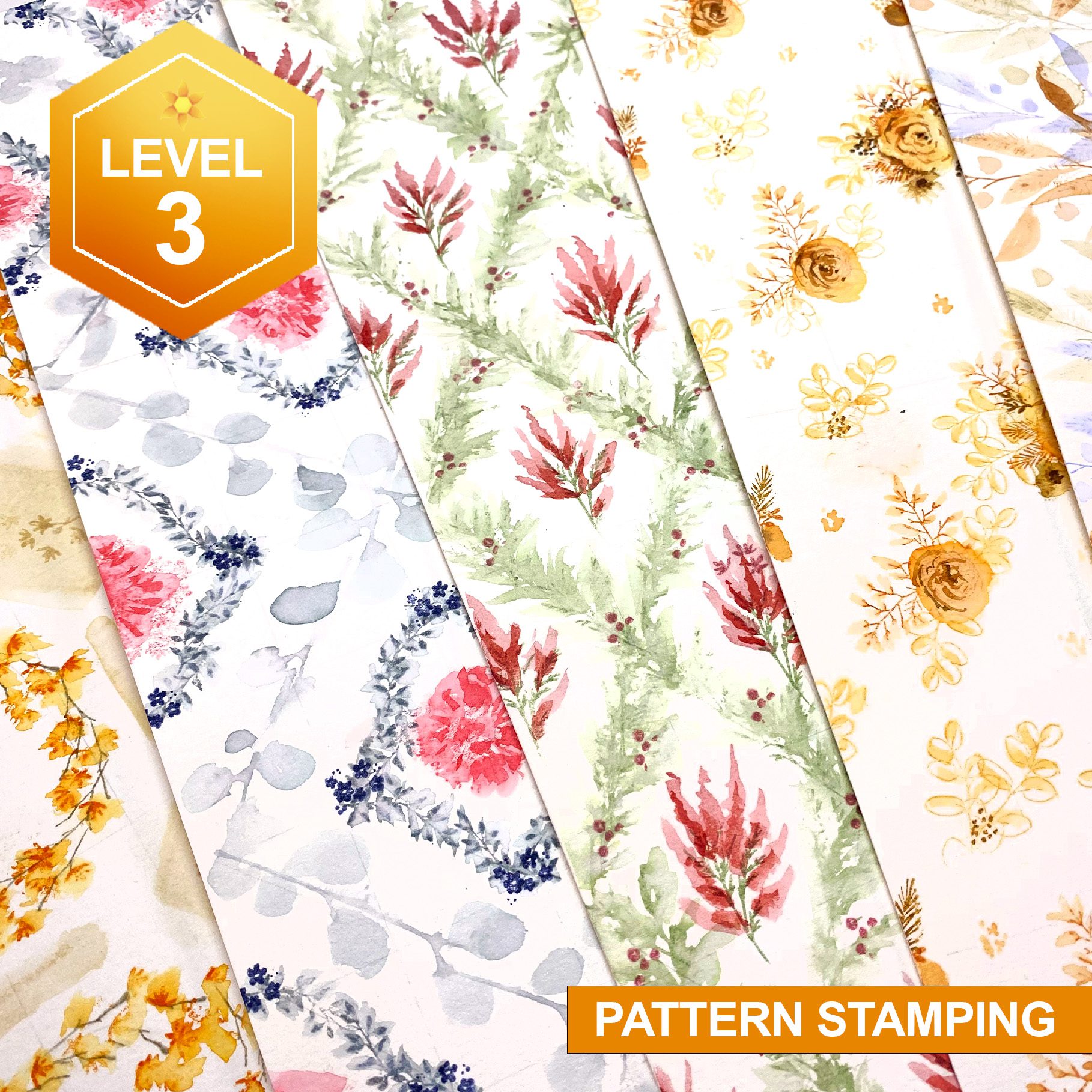
Pattern Stamping Class

The class I talked about that teaches how to make stamped patterned paper with Art Impressions Watercolor stamps…..it’s so much fun! Distress inks and stamping in the Pattern Stampinc Class. 

The rest of the CCC release!

I didn’t have time to fully develop cards, due to lots of unforeseen things coming at me this week (watch the Superpower or Thanks videos for more on all that. Remember that purchasing using my affiliate links also helps with the goal I’m working on, I appreciate your help in meeting it!)…..but I did find a little time to at least color up the images! Tap on any of them to enbiggen.

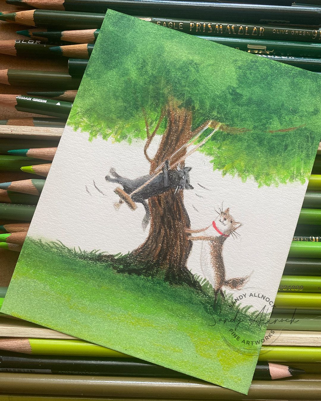
LIFT HIGHER

I expanded the tree, there’s just something about not “finishing” a scene that makes me crazy 🙂

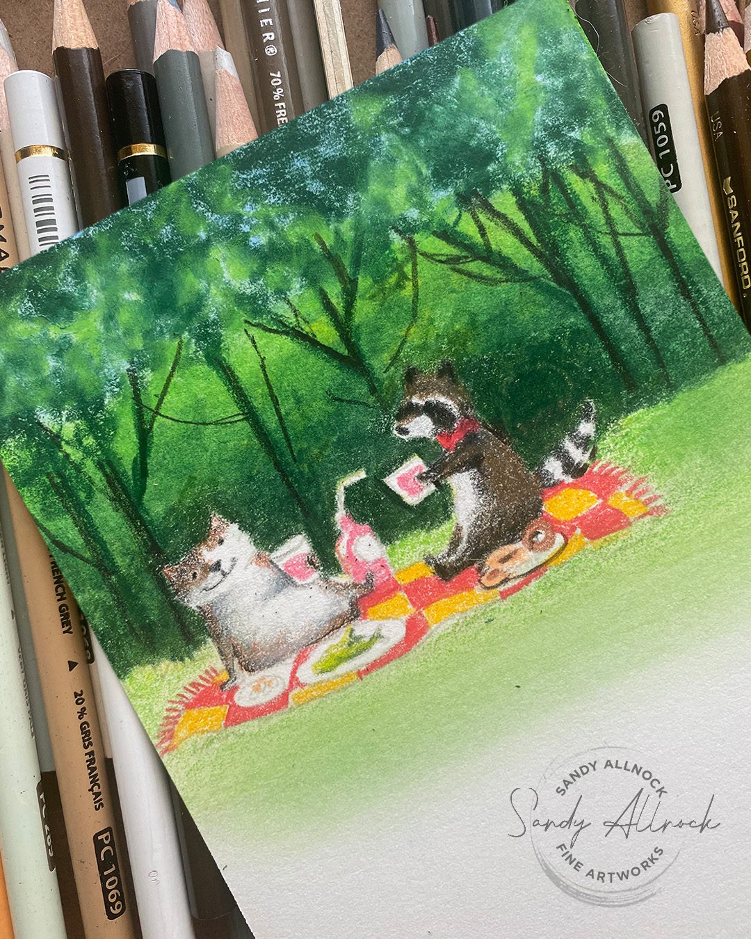
PICNIC CATS

Again, expanded the background. Also changed a cat into a raccoon, eliminated the picnic basket.

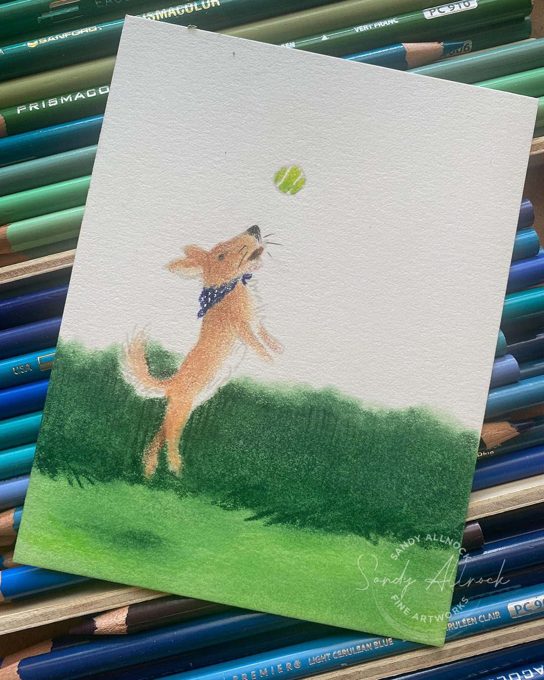
PLAY BALL

A simple scene – note that putting a shadow WAY under the dog’s feet makes him look like a real leap-er!

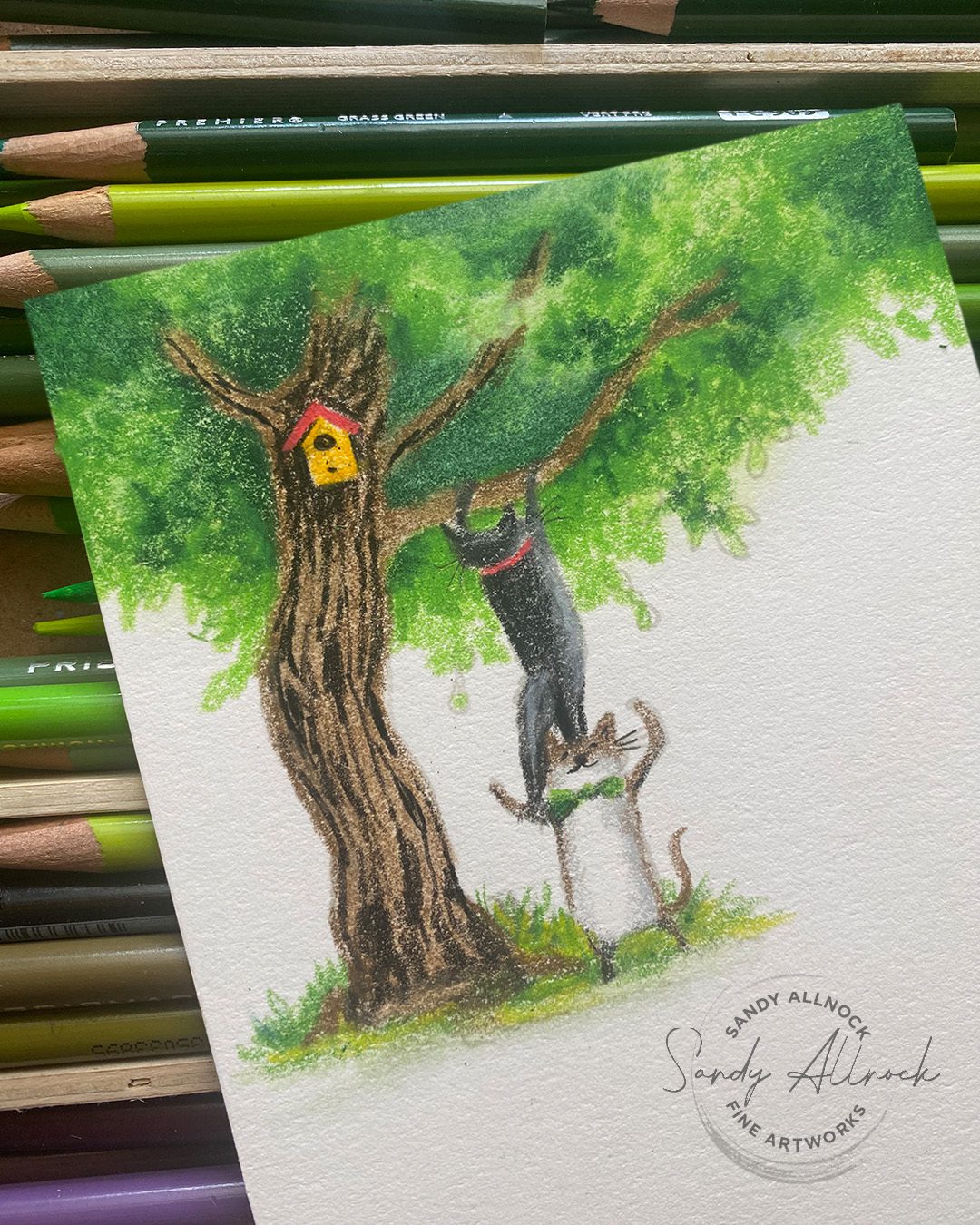
TEAM CATS

This tree NEEDED to be bigger, and darker, so the birdhouse took the stage. Imagine Pink Panther theme music!

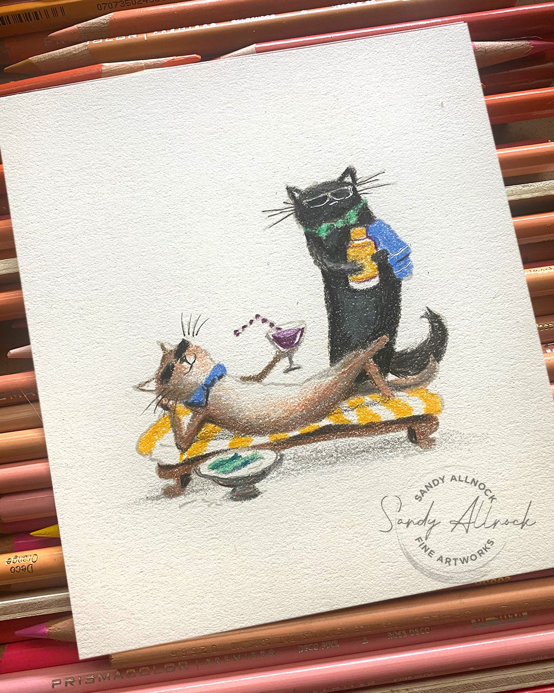
WELL LOVED CATS

Here I pictured Tsuki and Punch out by the pool, chilling out! I may need to add a scene to this one before mailing it.

TINY BIRDS

These are the ittybittiest! What would be your sentiment recommendation for this card?

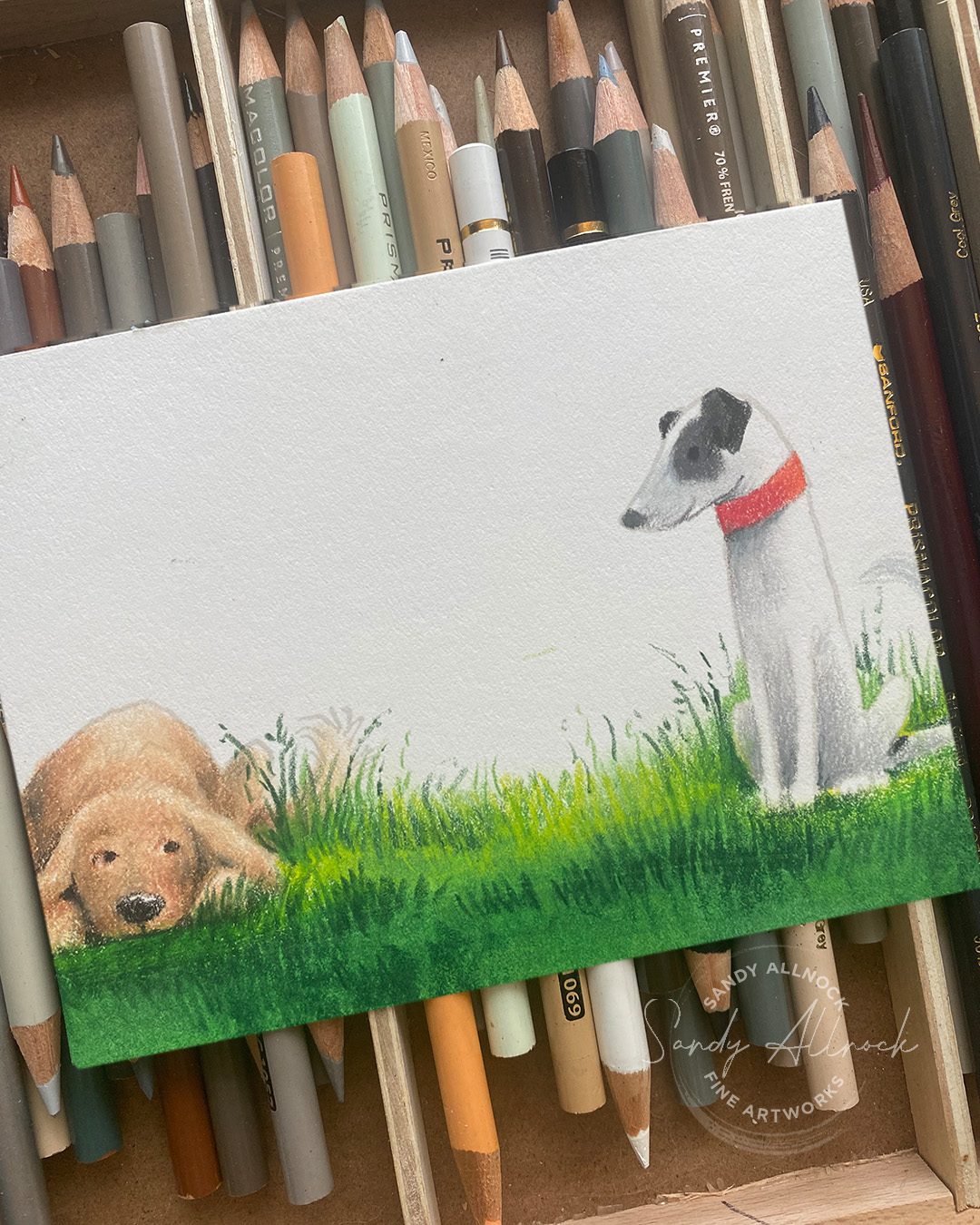
BEST IN ME DOG + STAY PAWSITIVE

I combined two stamp sets, with the dogs stamped partway off the page.

You can imagine their conversation! They often are chasing and wrestling – then suddenly they’re both sitting very very still catching their breath, giving each other the stinkeye. It’s so hilarious!

Something to note on the grasses: I colored the mass of greens first, and the greens stopped a bit low—the grass in my back yard is in desperate need of mowing, so I added some tall and going-to-seed blades of grass to bring the level up higher. Which looks more like what my puppers are doing when out in the grass!

Shop the new CCC release

Bloghop!

Check out all the creations in the hop…..with 2 giveaways! The commenting for the contest will end July 12th at Midnight eastern time and will be announced July 14th on the CCC blog.

  1. One complete bundle or equal value gift card to one winner. The winner will be randomly drawn from orders placed that use a designer’s affiliate link.
  2. Giving away one stamp set on MY blog. CCC will randomly select the winners from the comments and will notify winner.

The bloghop list:

  1. Adrienne Kennedy CCC
  2. Amy Tsuruta
  3. Amy Young
  4. Daniel West
  5. Emily Midgett
  6. Jenn Shurkus
  7. Jennifer Kotas
  8. Jessica Frost-Ballas
  9. Kassi Hulet
  10. Kelly Griglione
  11. Kelly Taylor
  12. Nancy Sheads
  13. Sandy Allnock <— that’s me!
  14. IG:
  15. Adam Karle
  16. Jenn Gross
  17. Joe Sysavath
  18. Laura Inguz
  19. Mansi Bhatia

What would YOUR best recommendation be for a new colorist?

Think about someone brand new – needing to buy everything AND learn everything. Do you agree with me? Disagree? Why or why not? Leave me your feedback, I’d love to hear your answer!

Supplies

Some product may be provided by manufacturers for review and use. Compensated affiliate links are here at no cost to you. I appreciate your support of my work with your purchases! Full affiliate and product disclosure | My trusted partners in art

Subscribe to receive blog posts by email:

Choosing pencil colors to use on top of alcohol marker (Trinity Stamps Hop)

Choosing pencil colors to use on top of alcohol marker (Trinity Stamps Hop)

I’ve used pencils WITH  alcohol marker for many years now – but after a question was left recently on YouTube, I realized there are times when I’ve shown you which colors *I* used on a project…but never really talked about what YOU might think about when choosing a pencil color. Let’s do that today!

Congratulations to my friends at Trinity Stamps!! Five years in business is nothing to sneeze at….so many never last that long, and Trinity doesn’t seem to be going anywhere but up! 🙂


Two days of bloghop, videohop, facebook, and instagram hops offers you lots of chances to see ideas with each stamp and die set and decide what may need to come home with you; when I peeked at the release and got to choose, the walrus with donuts had my heart. So you’ll get to see that today!


Tutorial: Choosing pencil colors to use atop alcohol marker

Watch the video below and scroll to the end to leave comments or questions — or click HERE to watch it on YouTube and leave comments over there. I read both dutifully!

Choosing colors

When trying to smooth out a blend, the best way to choose a color is finding something in between the dark and the light you’re trying to blend; cover part of the dark with the semi-opaque pencil, then part of the light with a lighter touch of the pencil. The effect will be to flatten the overall dimension – since you’re averaging out the two marker colors. But have no fear! It’s easy to use a dark, in this case black, to restore the darks. With the ability to lighten pressure slowly, it’ll be easier to recreate the flattened blend.

Donut Shop Scene!

I’ve created a fun donut shop scene with the hopes of helping those struggling with perspective to find their way through; if this is helpful I may do more of these in the future; these will likely be in Artventure for the time being, because that’s where I’m keeping the card-centric ones; the ‘big’ website has the classes that aren’t, for the most part, reliant on stamps that’ll go out of production at some point.

So if you’d like to learn this background, join Artventure; the app stores can be abysmally sloooooow at approving classes, but you can still purchase in the web version of the site no matter which app store you normally use. Here’s the link. https://artventure.mn.co/

Hop along!

Trinity has things going on across platforms….YouTube, blog, instagram, facebook…..wherever you like to hang out go find them and see what’s shaking! And have a donut for me 🙂

Instagram hop:

@trinitystamps
@carrierhoades
@jennshurkus
@starofmay
@kellytaylorcards
@cassietcards
@sandyallnock  MEEEE 🙂
@kelleykohout
@scrapbooking_swe
@lauren.taylor.made
@tanyaboser
@caffeinated.craftiness
@lisacisneros1
@insideoutjeans
@bromerocards

YouTube hop: (I didn’t make the cut but here’s the rest)

  1. Carrie Rhoades:    • Shaker Pouches an…  
  2. Ricky Burton:    • Tardy Turtle feat…  
  3. Cassie Trask:    • Trinity Stamps 5t…  
  4. Lauren Taylor:    • Party Snake Birth…  
  5. Emelie Heskett:    • Trinity Stamps Ju…  
  6. Shanna Slater:    • Trinity 5th Birth…  
  7. Jeannie Lieu:    • Rainbow Coloring …  

Supplies

Some product may be provided by manufacturers for review and use. Compensated affiliate links are here at no cost to you. I appreciate your support of my work with your purchases! Full affiliate and product disclosure | My trusted partners in art

  1. Entire new release, Trinity Stamps 
    1. Used here;  Fan-tusk-tic Stamp Set –  Die Set 
  2. Copic Markers 
  3. Copic Hex Chart 
  4. Neenah Cardstock, Solar White 250pk
  5. Prismacolor pencils 
  6. Prismacolor Hex Chart
  7. White Signo Uni-ball Gel Pen: AMZ – • BLICK 
  8. Presto Jumbo White

Subscribe to receive blog posts by email:

Underpainting in Colored Pencil (Drawing Tulip Baskets)

Underpainting in Colored Pencil (Drawing Tulip Baskets)

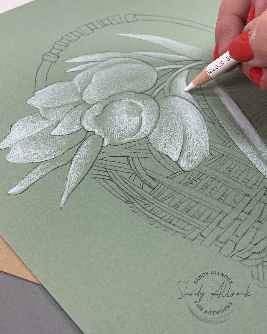
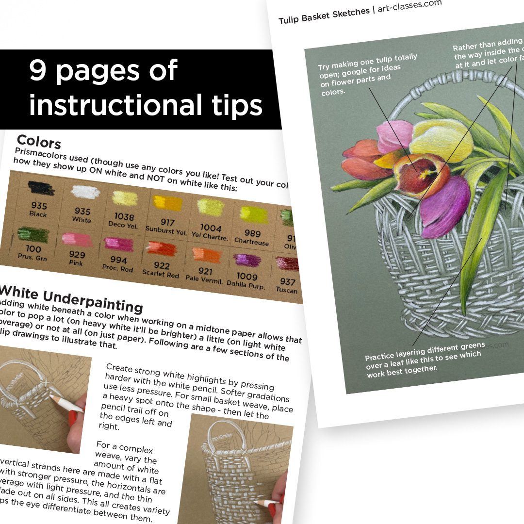
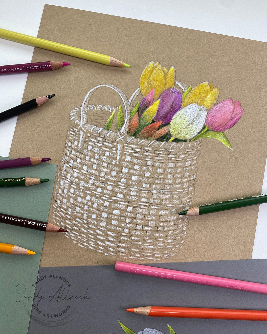
Let’s talk about underpainting in colored pencil – yes painting can be used with non-liquid mediums! When working on a colored base, an underpainting can make the shading easier by providing a varied surface underneath – as well as make the colors POP!

I love visiting the tulip fields in the Skagit Valley north of me! It’s worth the long drive, as you’ll see in the video – the color is stunning! I’m anxiously awaiting the full bloom so I can make my annual pilgrimage up there. The daffodils are out now so it shouldn’t be long!

Tutorial: Underpainting in Colored Pencil (Tulip Baskets)

This demonstration is linked within the PDF for the Tulip Basket Sketches, so it’ll be easy to find if you decide to color these up later!

Watch the video below and scroll to the end to leave comments or questions — or click HERE to watch it on YouTube and leave comments over there. I read both dutifully!

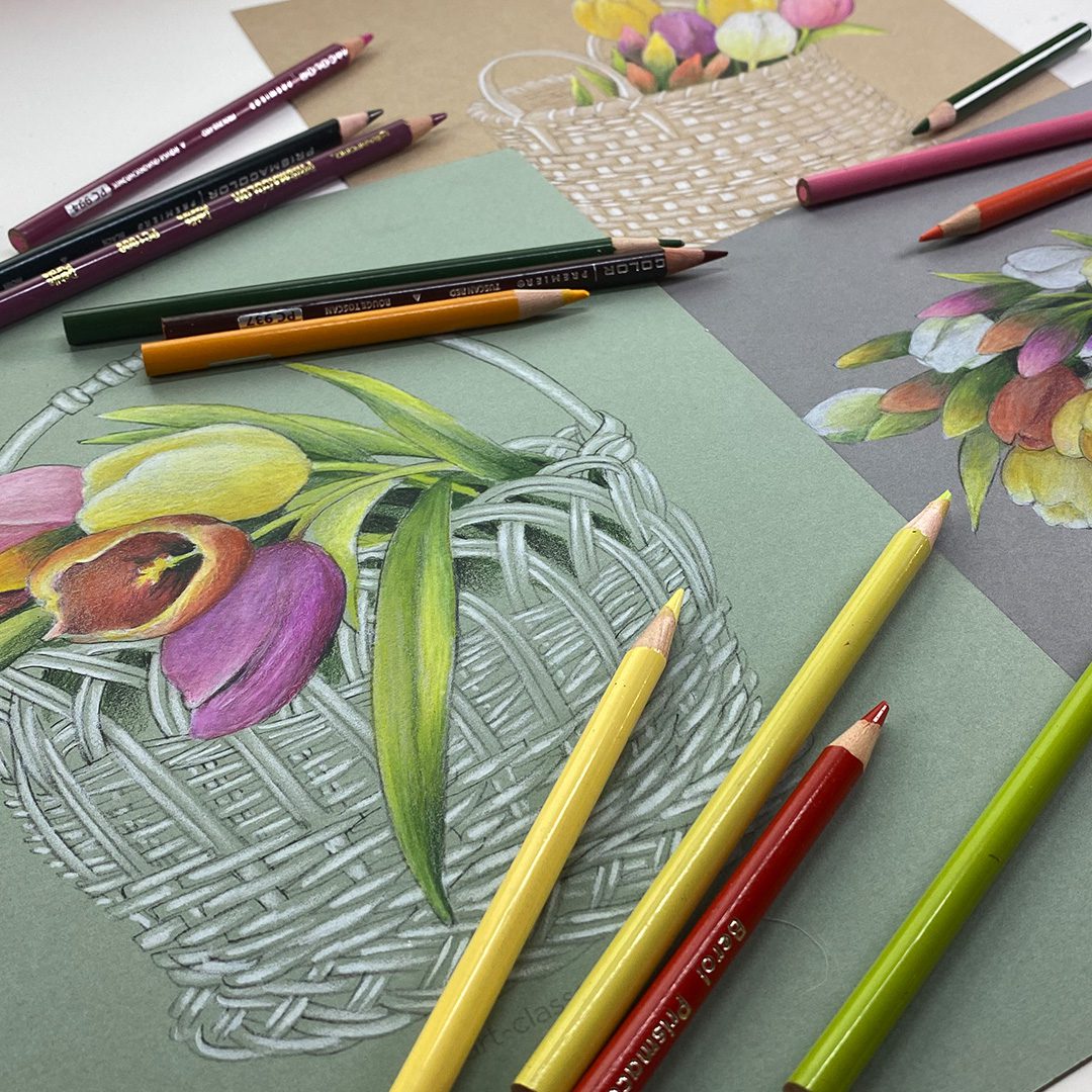
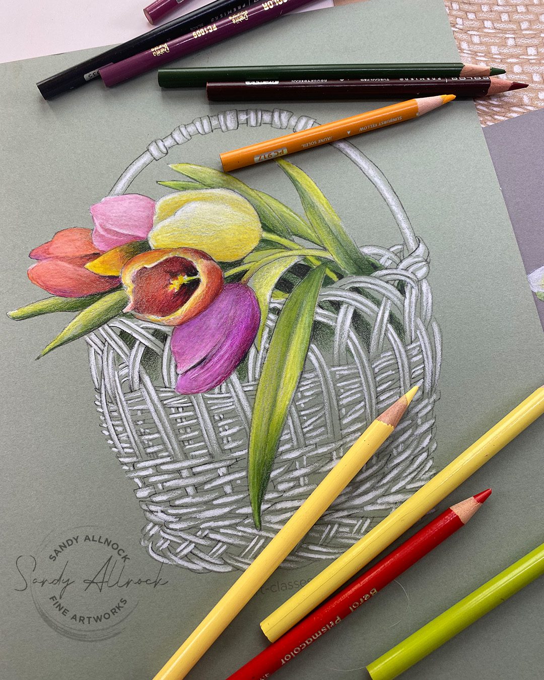
Three Tulip Baskets

As I worked on one tulip basket that wasn’t really going to be anything but a single video, I decided to try another….then got thinking that you might like to try these too. That turned these drawings into a kind of a mini-class via PDF, paired with the above video….so all of my tulip lovers can enjoy this kind of drawing too!

On kraft

Stonehenge Kraft paper was my first try – I have a pad that’s been crying out to be used. It’s got that Stonehenge drawing paper surface I love, but this rich deep color that the white really shows up on well, and that white makes the tulips pop!

On grey cardstock

I also had some Narwhal Cardstock by Lawn Fawn that had a nice surface to it, so I tried that too. 

Unknown green cardstock

That got me digging around in the stash for other papers that had a nice surface to try, which led me to a green – I have no idea what brand it is!

Tulip Basket Sketches: get yours!

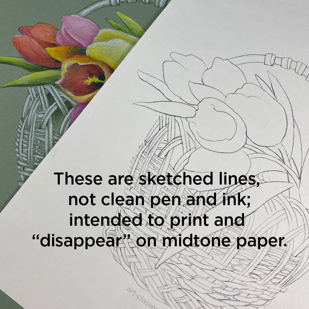
I put together a PDF with a BUNCH of resources in it – hopefully that makes these easy sketches to work with! First, note that they are SKETCHES, not finished, polished line drawings. They’re meant to print on these midtone papers and just kind of disappear into the color on the page.

And then there’s pages and pages of tips, color lists, and more.

Embedded into the PDF is a link to today’s YT video – so once you purchase the PDF you can reference the video from there anytime, instead of just looking at your printouts and wondering where the heck that video was at. 🙂

I hope some of you try these, it was such a relaxing process to draw this way! And you may well even have some great midtone papers and colored pencils, so all you need is the file!  Tap here to go get yours!

Tulip gardens coming tomorrow!

To stay away from posting on the holiday weekend, my second big video this week will be manana. Waterbased marker tulips on cards – very very easy ones! And those can be created in other mediums as well.

Supplies

Some product may be provided by manufacturers for review and use. Compensated affiliate links are here at no cost to you. I appreciate your support of my work with your purchases! Full affiliate and product disclosure | My trusted partners in art

Subscribe to receive blog posts by email:

15 ideas to spice up your card scenes! (CCC release)

15 ideas to spice up your card scenes! (CCC release)

Can you handle one more Anita Jeram release in 2022? I hope so –  because that’s what I’ve got for ya today! But there’s no coloring tutorial….I’ll be walking through 6 cards I made and sharing my thought process as the seenes developed – and giving you a list of 14 ideas to consider when creating scenes for your cards!

Tutorial: 14 ideas to spice up your card scenes

Let’s talk DESIGN!

Watch the video below and scroll to the end to leave comments or questions — or click HERE to watch it on YouTube and leave comments over there. I read both dutifully!

15 Tips to try!

STAMP IN LIGHT COLORED INK

Anything like a tan, grey, or pale color that goes with what you’re expecting to color (light red to use for a rose, browsn for animals, etc). That way you can make adaptations without having to deal with a big black outline.

CHANGE A SPECIES

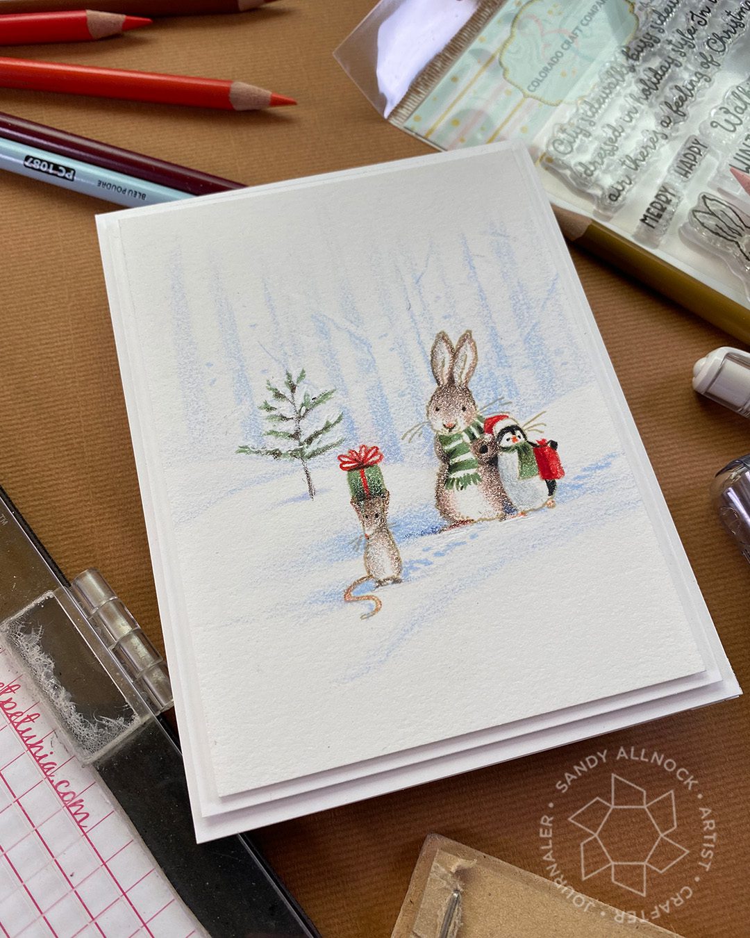
Penguins are super easy! Just give them two white areas around the eyes, a beak, and black “paws”……making an animal into a bear is also easy since it’s just big blobby fuzzy shapes!

TRY A SOFT BACKGROUND FIRST

You can always change to a dark one later on top of the light one – but sometimes the light background can make the images stand out more.

BE OPEN TO RETHINKING IDEA #1

The first idea is not always the best idea! I had a boss who made us show 15 ideas every time, just so we’d get all the “expected” ones out of the way first.

CHANGE PERSPECTIVE!

Try stamping in a different place on the page – does that encourage you to wonder how or why the images are there? What story can that tell?

TAKE INDOOR IMAGES OUTSIDE!

Or outdoors inside. See what happens if you imagine the characters in the opposite setting!


 TEST STAMPS ON POST iT NOTES

Sometimes a quick stamping on a sticky note and moving images around can inspire you to think of the characters as move-able – what happens to their relationship if they’re close together vs far apart?

MOVE DISTRACTION AWAY FROM FIGURES

Unless a background is a large, simple type of image, like a big night sky, it can often detract from the figures in front of it. In this design, a low line of trees would just make the heads of the characters disappear.

VARY THE VALUES – LIGHTEST FAR AWAY

If a mountain is in the distance, make it REALLY far by making it super light. This works great also for making your figures appear larger since they’re darker.

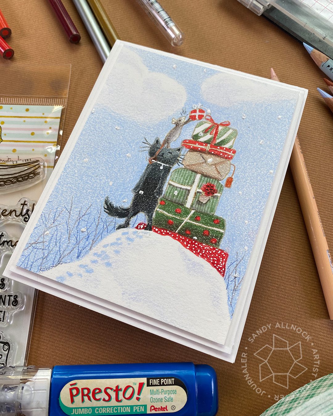
SINK OBJECTS DOWN INTO SNOW

The rails of the sled are partly covered by snow so they seem to sink into it. Try that with feet, the bottoms of buildings, car tires…..

USE SMALL FIGURES IN THE DISTANCE

Size can convey how close an image is – a tiny mouse looks automatically far away!

TELL A STORY BY CONNECTING IMAGES

Create a pathway or trail between characters so they become related.

AGAIN, TAKE THE INDOORS OUTSIDE

Stockings in the stamp are probably “stolen” from a fireplace mantel, but when outside, they tell the story that Santa visits even the woodland critters!

USE A STAMP SIDEWAYS!

Just because it was intended for one use doesn’t mean you can’t change that up!

CREATE PERSPECTIVE

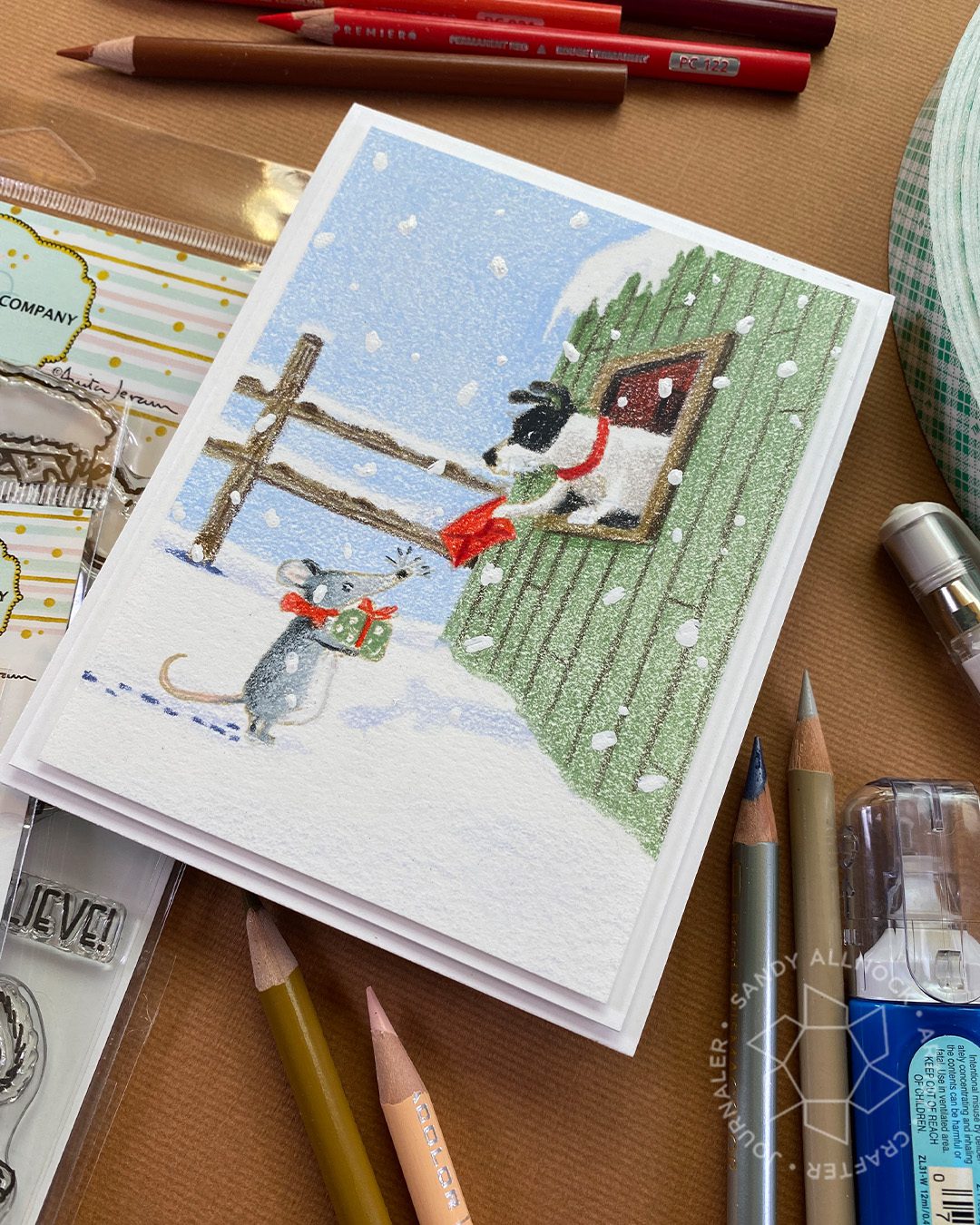
Don’t sweat over math or rulers – but give a little perspective to a building/window like this one. It doesn’t have to be perfect – just believable!

SOLVE A PROBLEM!

If you caome across a stamp that seems like it doesn’t belong – or the character might have some challenges…..solve it for them by adapting a scene.

Which scene did you like most?

Over at CCC you’ll find all these stamps for your creating pleasure – which one is first on your list?

Did you learn something?

I hope so! It was a fun challenge to find ideas from scenes made with these stamps that I could share with you to encourage stepping outside the box!

GIVEAWAY

I get to give away stamp sets! I’m giving away one each of the stamp sets to 6 people…6 winners! Just leave a comment with which is your favorite card idea, I’d love to know!

Supplies

Some product may be provided by manufacturers for review and use. Compensated affiliate links are here at no cost to you. I appreciate your support of my work with your purchases! Full affiliate and product disclosure | My trusted partners in art