
Sympathy cards are SO hard to make. They just hurt the heart, even though you know they’re going to ease someone’s pain just a little.

But… I think this stamp I used has taught me my new favorite word. “Agapanthus.” Just say it out loud. “Agapanthus.” Isn’t it wonderful?
I decided to stamp the image on Desert Storm; I thought it might be an interesting exploration to try doing flowers on a darker paper – I’ve colored other images on it, but not florals. I also show it on white, so you can see the color comparison between doing so on darker and lighter paper. Very interesting, at least to me – the coloring nerd!
Video
Watch the video below, or click HERE to watch in HD on YouTube..
I do like it on the white, but there’s something very unique and quite relazing about the desert storm color!
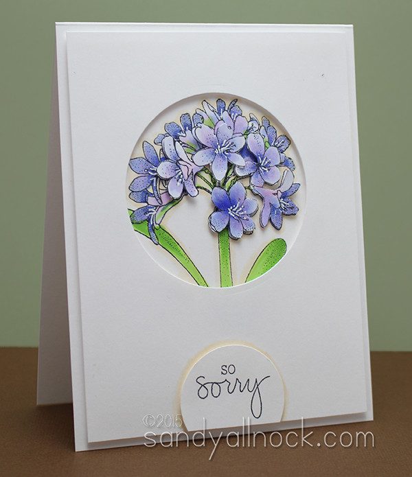
Which do you prefer – the Desert Storm or the White? Maybe it depends on who it’s for….not really sure! 🙂
Supplies
Some product may be provided by manufacturers for review and use. Compensated affiliate links are here at no cost to you. If you choose to shop using my EH (Ellen Hutson) links, please accept cookies on that site in order to retain the link to my blog, or that compensation does not happen for me. I appreciate your support of my work with your purchases! Full affiliate and product disclosure | My trusted partners in art
- Technique Tuesday, Agapanthus
- Copic Markers: EH – Blick
- Jet Black Lawn Fawn Ink Pad
- Neenah Environment Desert Storm Cardstock, 25 pk
- White Prismacolor Pencil





Technique Tuesday does such a nice job on their flower stamps. I have a couple of others that I go to for this kind of a card. I’m glad to see that I’m not the only one who has trouble with sympathy cards – all the more reason to take some time to make something extra nice. Thanks for the tips on using choosing colors to use on kraft-colored paper.
Beautiful coloring, beautiful stamp and two beautiful cards!
As you say, the desert storm is more soothing but they still look so life-like on both!
Thanks for sharing about the stamps at TT. I never knew about the monthly stamp program but I am going to check it out. I love flower stamps. I love the card.
Lovely! Sympathy cards are tricky and this one is just perfect.
Hard to say which cardstock I prefer with this image so I’m saying both are beautifully executed. Really like the dimensions and the window on the card, as well.
I prefer the white cardstock. I guess I just love the bolder colors, but I also think the desert storm card is beautiful.
Beautiful cards!
I love, love, love desert storm over the white for this card. I wear these colors in summer. Can’t wait to play with these colors as sometimes I forget them. Thanks for jogging my brain !
I like both cards but the Desert storm is softer which seems to go along with the sentiment better.
Thank you for showing us the side by side comparison. It’s fun to see how Copics react with different papers and colors. Now I want to see this on a cream/vanilla background. hint hint
Don’t know which one of your cards I loved the best–both beautiful. Always your coloring and
style blow me away! Thanks for sharing.
Love both of the cards, but that desert storm paper is really a beautiful look, definitely serene.
I had never heard of Agapanthus until you mentioned it in class last weekend. Your cards are GORGEOUS, but I agree that there’s just something about it on the Desert Storm that is so appealing. I definitely need to try this!
Loved both
Thanks for a chance to win this lovely stamp. I have just started following your videos and you are an amazing artist!!
Totally love this flower stamp set (and have a few of these from a couple of years ago), but I really love this new one. And thanks for introducing me to the Neenah Desert Storm card stock. What a difference the color makes. Stunning card! I love it and would love to have this stamp set! Hugs!
I too really like the look on the desert storm cardstock. It is very lovely!
Beautiful card. I do love the color on the Desert Storm paper. Thanks for sharing both versions. Melanie
The cards are simply gorgeous! I love the Desert Storm paper and how the lighter colors “pop” as a result of the hue of the paper. I love your artistry and love the way you inspire the soul. Thank you for sharing and sharing this monthly program. I believe a new collection may be born. ~M~
Both are beautiful! I especially like what the white does to the desert storm. It pops! Thanks for sharing & leading me to Technique Tuesday.
I love them both! Watching you color, always makes me want to go color something too, and that is what you call true inspiration.
Gorgeous! I really love the kraft / desert storm version. I think it adds such a complexity to the project. Thanks for sharing!
Beautiful card, beautiful stamp
So soft and beautiful! I love the desert storm for sympathy and the white for anything else.
Beautiful card Sandy, as always. Thank you for sharing your talents.
Pretty and very pretty! Hard to choose a favorite but I am going to go do a floral on desert storm because I have never done that and now I have a wonderful tutorial to guide me.
I think I prefer the Kraft one but they are both beautiful! Thanks for the giveaway.
I agree love the craft one for sympathy and the white one would be a great get well card.
The Desert Storm version just seems so soothing and appropriate for a sympathy card.
Awesome cards, I do like both- but the Desert Storm has more depth to me.
I did all the entry requirements and yet it is only showing 1 I tweeted and facebooked, and refered a friend
https://twitter.com/scrapthatDolly/status/634714852238360576
Always fascinating how you know what to do to get the results you want. Enjoyed the feline serenade!
They’re both lovely. I naturally lean towards the brighter card, but I think the desert storm is a great color for a sympathy card. I love your videos. When you explain what you’re doing and why, it makes total sense. But something happens when I try to apply the same logic and let’s just say the results are not at all comparable. Lol.
Beautiful and especially the Desert Storm version.
I like it on the desert storm.
Guess I’m old fashioned about flowers – I adore the white and blue card and when it turns out this pretty, I just don’t want to change. (The desert storm would be a better fit for a man.)
OMG SANDY YOUR CARDS TODAY ARE BEAUTIFUL. ty
Both cards are lovely. I associate the desert storm color with masculine cards, along with the more muted colors.
Thanks for giving me the most beautiful Sympathy card ever…..and just when I need it most I might add!!!! Please keep up all the best work of all time. You sure do bless me every day..
For sympathy cards, I think I like the flowers on the Desert Storm card stock, there I a something soothing about the muted colors. Lovely cards!
Gorgeous cards. I am leaning towards the Desert Storm color.
I do like both colors and I think that it would depend on the person I’m sending it to. For instance, If the person has a problem with eyesight I would pick the white or I would write on white paper the message I’m sending. I really like the Desert Storm color and the way it interacts with the blues/purples/greens. Really good choice either way. Thanks for your ideas.
I also like the look on the desert storm best. Thanks for sharing.
They’re both beautiful but I just love the muted tones on the Desert Storm paper. I don’t often think to color on colored cardstock so I must try it.
Very beautiful! The desert storm cardstock makes a lovely difference.
I am with you, I really like those pretty colors against the desert storm backdrop. I enjoy your work so much Sandy!
This is such a delicate-looking flower. The Desert Storm makes a more elegant card while the white is simpler but shows off the stamped flower a little more. I love them both and would love to win this lovely stamp!
I do really like the way the colors turned out on the Desert Storm, gives kind of a dusty appearance to the flowers, I think.
Both cards are beautiful but my favorite is the card using the desert storm paper. Thanks for the opportunity to win this beautiful stamp.
Both versions are lovely, but there’s something about the one on the desert storm paper that really grabs my attention. I’ll have to try that technique! Thanks Sandy!
Donna
Sandy, I loved the card on the desert storm paper. So appropriate for a sympathy card. The stamp is so elegant and versatile.Thank you for sharing this.