
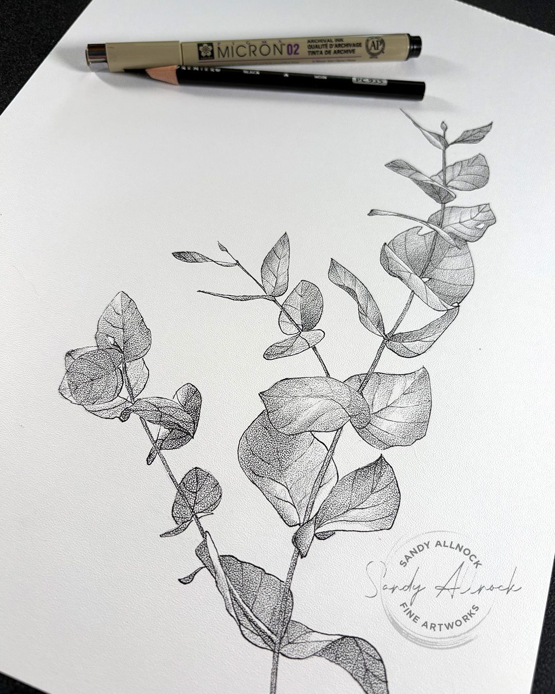
I’ve always loved stippling! Yes it’s a lot of dots – but sometimes it’s just mesmerizing to create beautiful waves of value changing from darks to lights and back again.
But it takes SO LONG. Is there something to make that process easier?
You bet! And it’s a surprising thing – the paper!
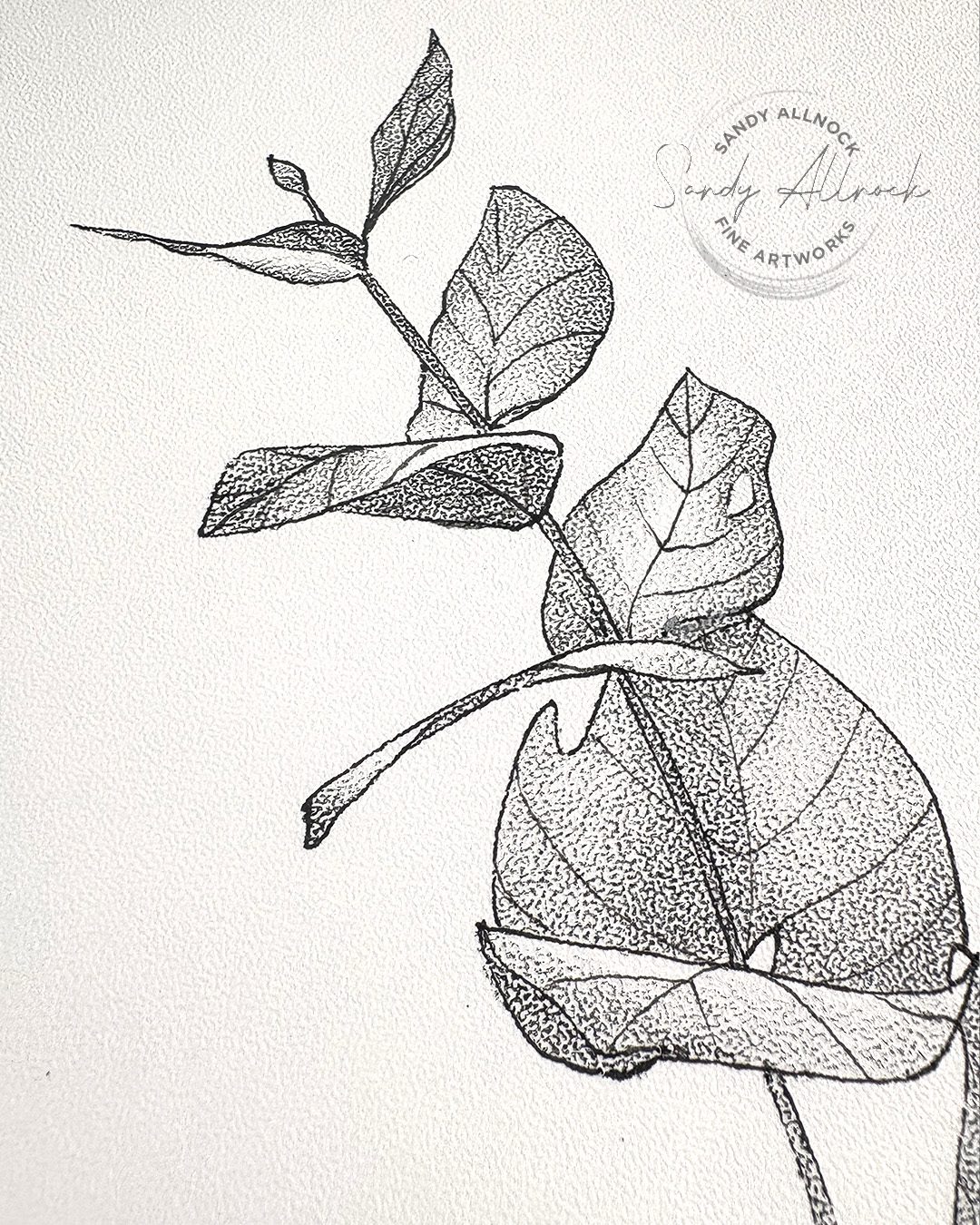
Bee Paper makes a stipple texture paper – it’s more bumpy than lots of other papers, and depositing pigment on the peaks can make it look like you’re making dots on it! I’ll show you how it works – and tell you a crazy little story about a fire that made me haul pads of paper all over the country since the 1989s!
Tutorial: Stippling has never been this easy. Or fast!
Watch the video below and scroll to the end to leave comments or questions — or click HERE to watch it on YouTube and leave comments over there. I read both dutifully!
SUPPLIES
Some product may be provided by manufacturers for review and use. Compensated affiliate links are here at no cost to you. I appreciate your support of my work with your purchases! Full affiliate and product disclosure | My trusted partners in art

Inspired by John Muir Laws
Years ago I’d seen a video about how to draw black and white images by John Muir Laws; my recollection is that people came to parks and he wanted them to go out and draw things, and he collected the drawings to print for something. A great volunteer opportunity!
But I remember he said he needed good black and white images, ones that were accurate as well as with some consistency between artists. And he recommended this paper for just those reasons. I was sold, even though I wasn’t working on his project – the stippling paper sounded fascinating!
My brain didn’t hang onto that very long; the paper arrived and, well, I looked at the it and realized I’d forgotten where I heard about it and what had inspired me to get it. The pad ended up in a box of pads of papers, and until I received the box of new goodies from Bee Paper, I’d just not gotten it out.
Fortunately JML came back to my memory – and a quick search led me to this post. Which led me to today’s little drawing!
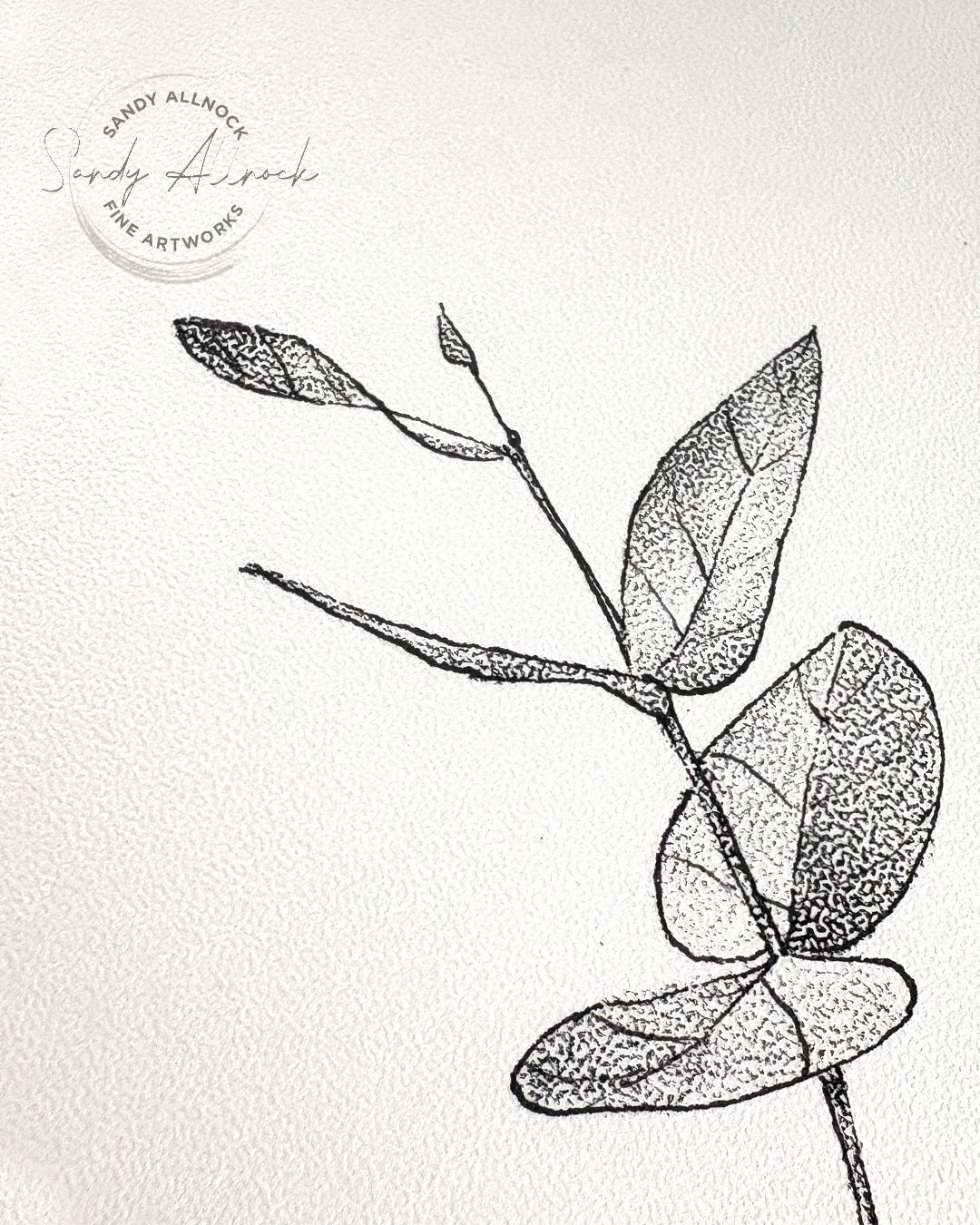
Simple Supplies
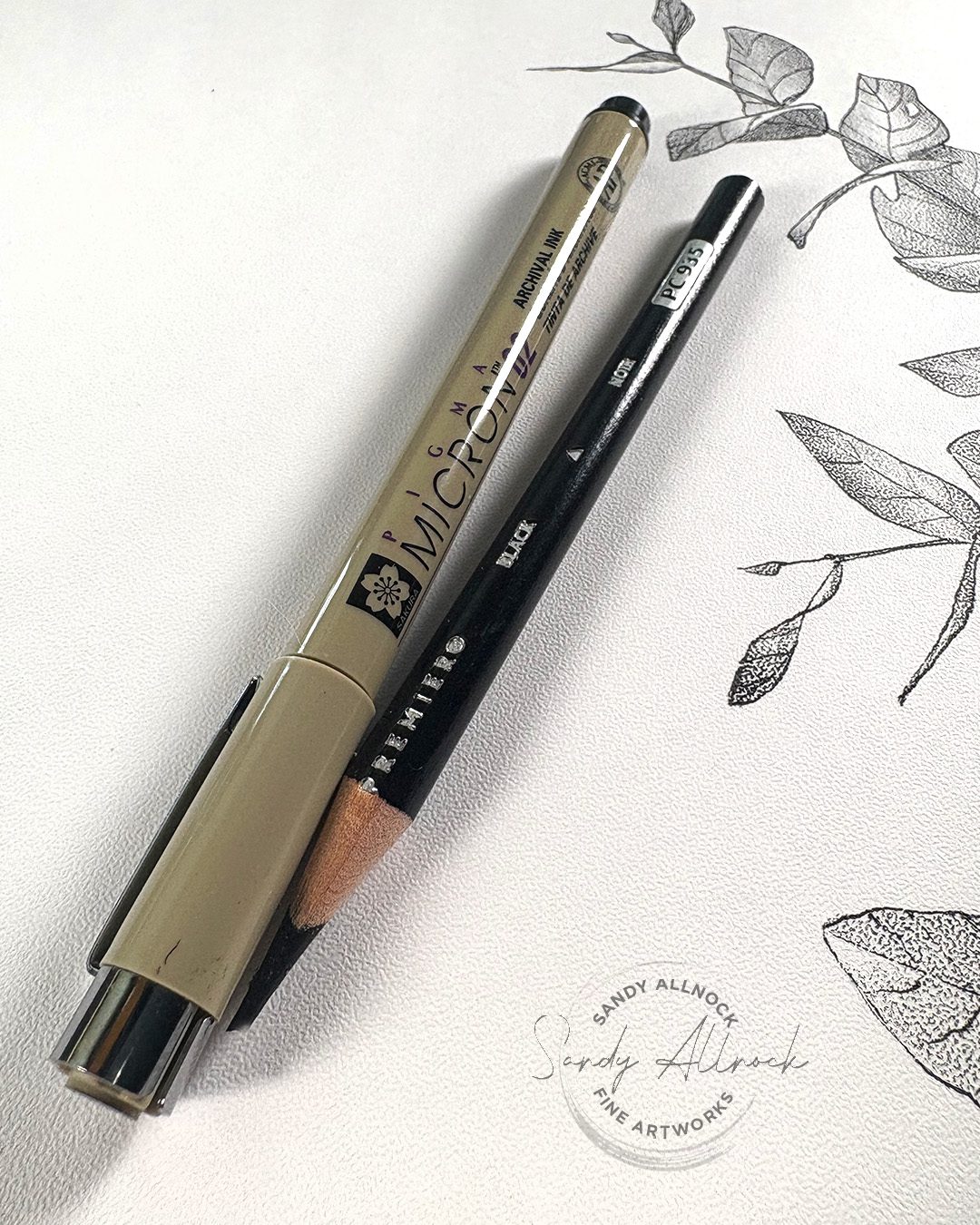
In addition to the paper, I found out from John Muir Laws’ tutorial that my gut instinct to just use a graphite pencil wasn’t necessarily great. He recommended drawing the outlines of the object in a Micron pen, then a black colored pencil for making the “wash” for the dots.
I hadn’t thought about pens, and when I just scribbled with the graphite, I could see I’d end up with fuzzy edges. That’s because of the deep valleys in the paper pattern – a crisp edge requires a line that goes up and down into the texture. A pen with “wet” ink can travel into the valleys, without moving and blending around. Makes sense!
I did find a few other tutorials out there with this paper, and they all celebrated the sketchy look without the crisp edges – a look which I’ll definitely try. But finding the JML tutorial reminded me of what I bought the paper for, and that’s making a drawing that’s a bit tighter.
Subscribe to receive blog posts by email:
Value variance
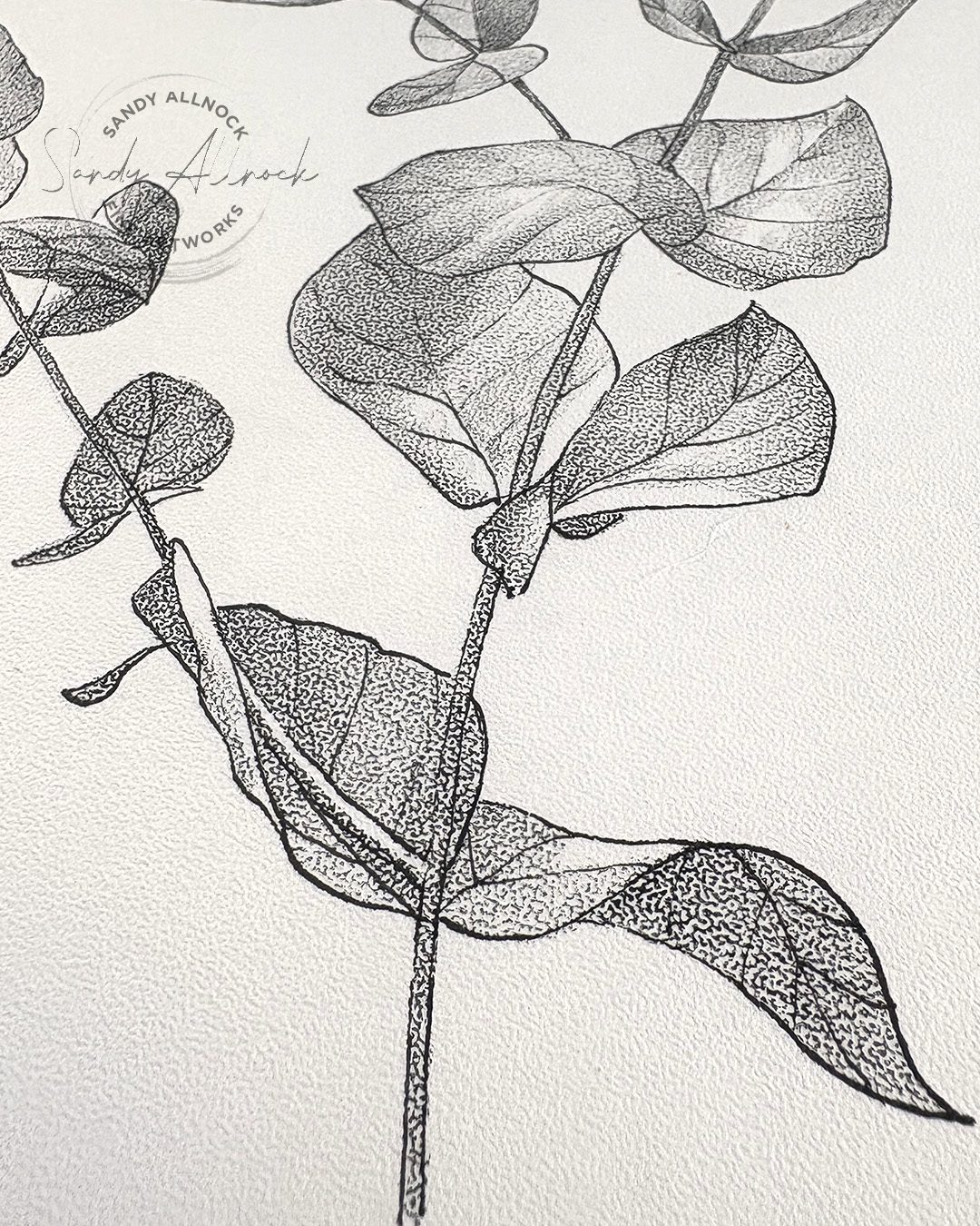
A black colored pencil gives a nice smooth, consistent value with even an imperfect application of the pencil; it even works a little BETTER if it’s not super sharp so the pencil stays on the peaks of the paper!
But to create value differences, let up on the pressure to let it get to a lighter value, and go over it a time or two in order to darken it. Lots of pressure won’t really help – but basically going over the same area again with the same pressure makes the amount of pigment on the peaks of the paper increase, making the dots appear bigger, therefore darker. While also retaining the texture.
Why might a stippled texture be helpful?
Especially if trying to print a drawing, crisp black vs white can make the very best prints; the greys that make beautiful transitions can be pushed darker or lighter by either a scan that interprets them wrongly for various reasons, or the printer that does the same. Some pigment is reflective, complicating how machines can render subtleties, and even your own phone’s camera has troubles interpreting very subtle value changes.
But a piece of art with clear blacks and whites is a lot easier for machines to interpret!
As I’m working on a book I’ll eventually be producing, I may want to have some drawings that clearly show value transitions, and some of the drawings on this paper could really help in illustrating certain concepts. I’ll be keeping it in mind for which lessons may find this helpful!
If you’re interested in following along with my drawing book process, I’ve been sharing it with Patrons – you can find out more about it here. However for the next few months I’m changing things up to share a children’s book I’ll be illustrating; I can’t share everything but hopefully posting a little peek at something each week will help keep me motivated all summer! Different levels of patronage will get different numbers of posts, just like the drawing book, so you can choose how much of my inner thoughts you want to be bombarded with, lol!
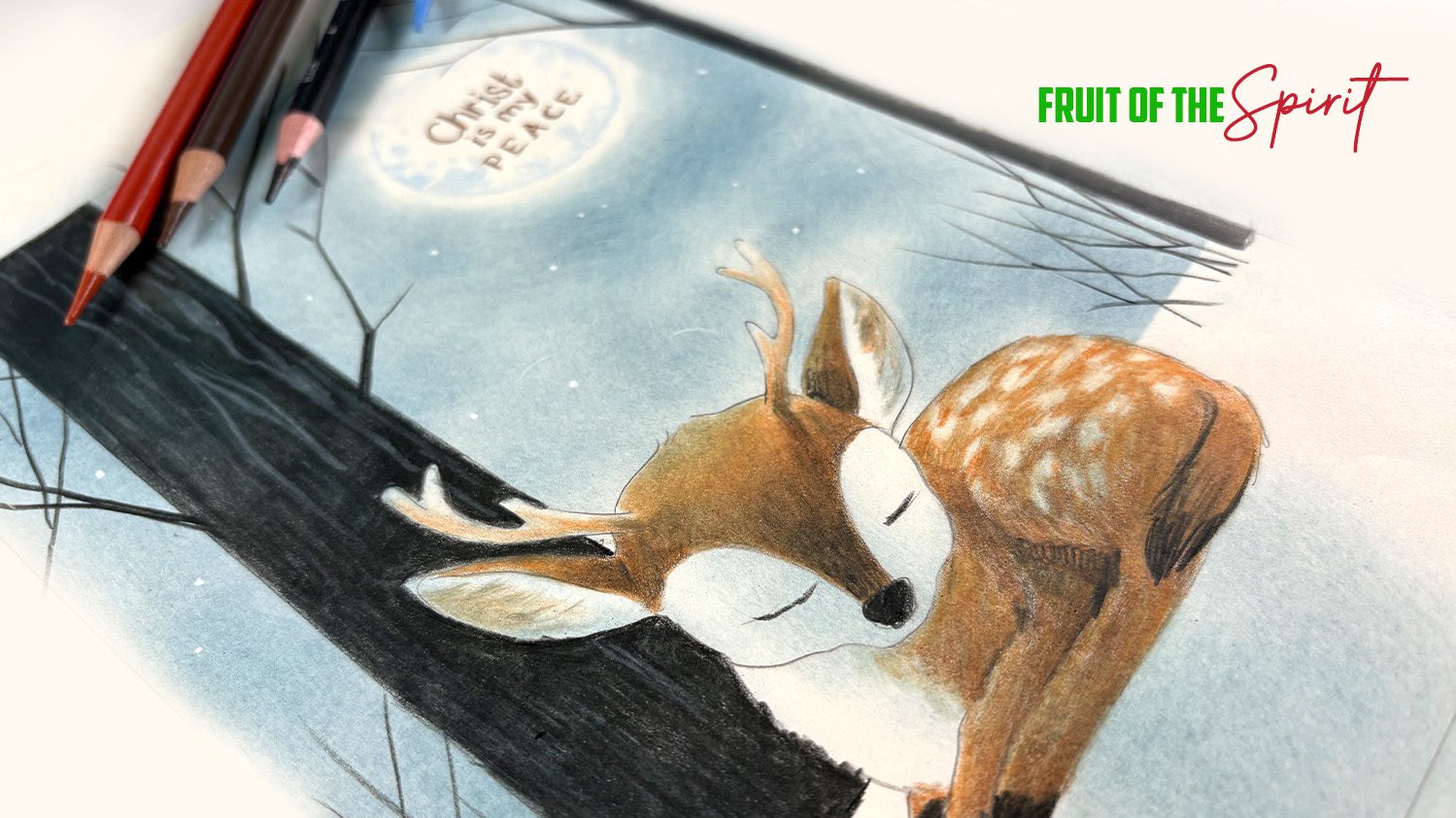
Bible journaling class
I mentioned a class – and my new Fruit of the Spirit class is the one! It’s been a long while since I had a new one for Bible journalers, and I hope this one’s worth the wait. It’ all in colored pencil, and it’s level 3—but you can trace the images, so it’s not that scary. Lots of cutesie animals are in it!





More or less interested in stippling process on Bee paper at the moment.
Have invested in dozen pads 9 x 12 after watching your
U tube video.
Had all other supplies already.
Stay Safe And
Be Happy Always
Floyd E Stockwell
2175 Bison Ct
Apt 108
Marion, Iowa
52302
stockwellfloyd@yahoo.com
81 yrs old
Been drawing since age 5
Portrait Artist
Self – Taught
Pen Name ( llewkcots )
Your Art Ability as well as talent Outstanding as well as Amazing ! ! !
A dozen pads! Woohoo lots of drawing ahead!! Have a good time!