Hello friends! Here’s a little something just for my blog peeps – I don’t have a video made just for this but I do have a bunch of older videos here!
I’m hoping that other companies will take on doing something like this – offering “trunk show” sales that get promoted by their business partners! Right now there’s one going on over at Avery Elle – and you can get 20% off by using coupon code ELLENHUTSON – how cool is that? Shopping with that code helps Ellen Hutson and Avery Elle – and of course YOU!
I’ve colored a few cards with a pandemic-related theme (yep I’m in that headspace, I’ve been locked in too long, ha!) ….. and linked you to the stamp sets at AE in case you want to try it:
This one features Peek-a-Boo Jungle, and the six foot social distancing…between cages!
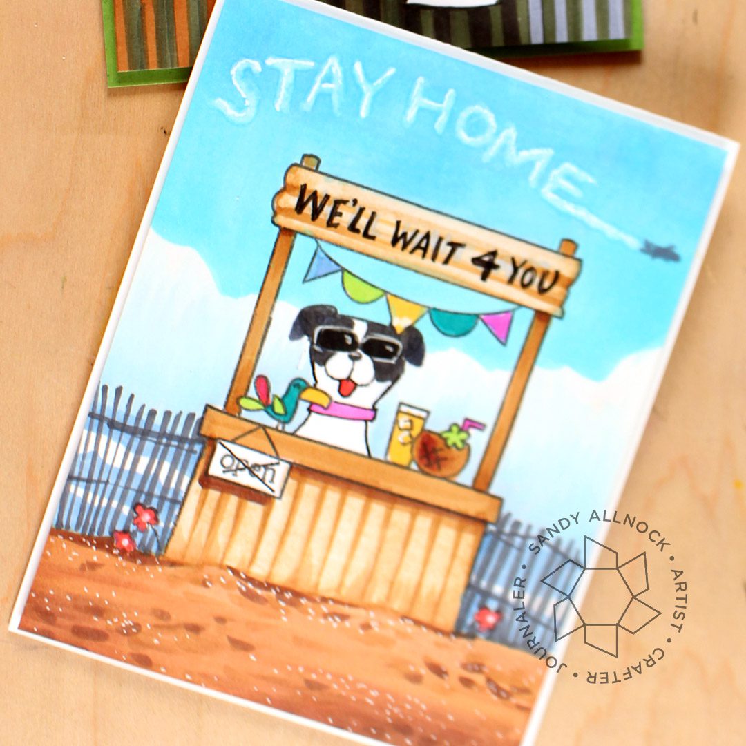
And here’s one with Market Stand…my crazy idea here was to make a card that tells people not to go to the beach, the beach will still be there later waiting. And of course my dog Vienna will always wait for you!
This card will be on IGTV later today with Floral Notes:
I’ve also pulled together videos with other AE sets:
Hellloooooo friends! It’s time for some more Copic classes … it’s been a while since I gave you any new ones so let’s do it! I’m overflowing with ideas….and since many of us are now in involuntary isolation, maybe learning something new will pour a little sunshine into a rough situation. These classes are on sale through NEXT weekend so you have a little time to sign up. (No code needed.)
Here’s my nutty video drawing on toilet paper! Peeks at classes plus a bunch of other random stuff in here too:
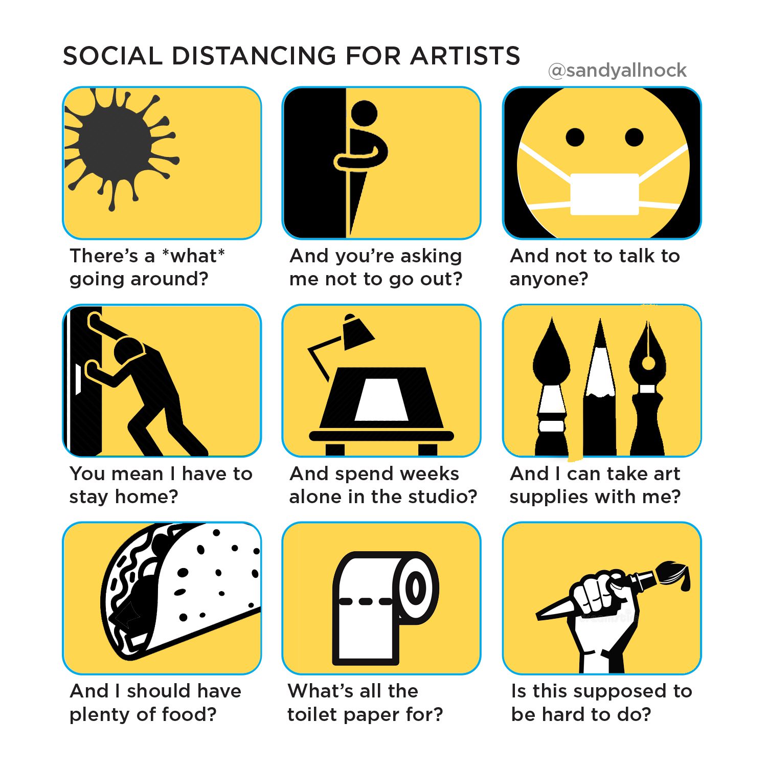
The irony in life as we know it now is that all the social distancing is just feeding into my workaholic nature; all I’m thinking is how much WORK I can get done while everything that pulls me out of the house! ha! Believe me, I do understand how lucky I am that I get to do this for a living…but I thought poking a little meme fun at myself might make you laugh:
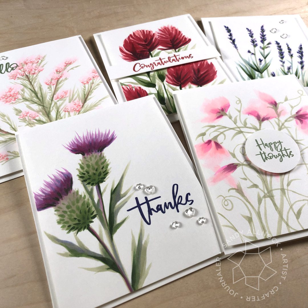
Copic Wildflowers Class
Learn to draw your own wildflower images for cards – no stamps, no lines, just you and your pens! Intermediate level class. Watch the preview below – then click HERE to sign up!
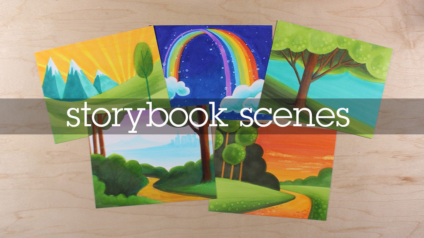
Storybook Scenes Class
EDITED: The class is done and ready! And it’s going too be So. Much. FUN! Click here to sign up!
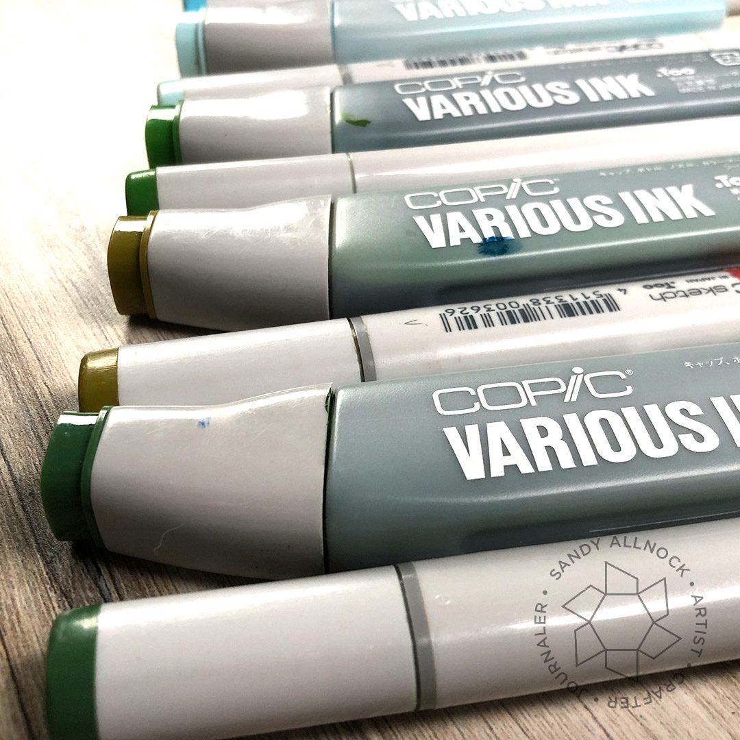
“Using up Copic Reinkers?? What are you thinking??”
I have a bunch that have just a few drops left in them; some I already bought a new one (coz I’m a panicked artist!) and some are on the order-next-time list. But it was pointed out to me that on Copic’s website, they look to be putting out totally different reinkers….they look like tiny vials? I’m hoping the prices become tiny too, but that doesn’t seem to be info I could find as yet.
Supplies for this project are linked at the end of this post. Compensated affiliate links may be used at no cost to you.
So….I thought of an idea recently while laying in bed – I wanted to use up the bottles that are in the way, and replace them before they’re gone. (NOTE: Ellen Hutson’s Copic stuff is always on sale!) I figured that’d remind me to follow through, and would alert you too!
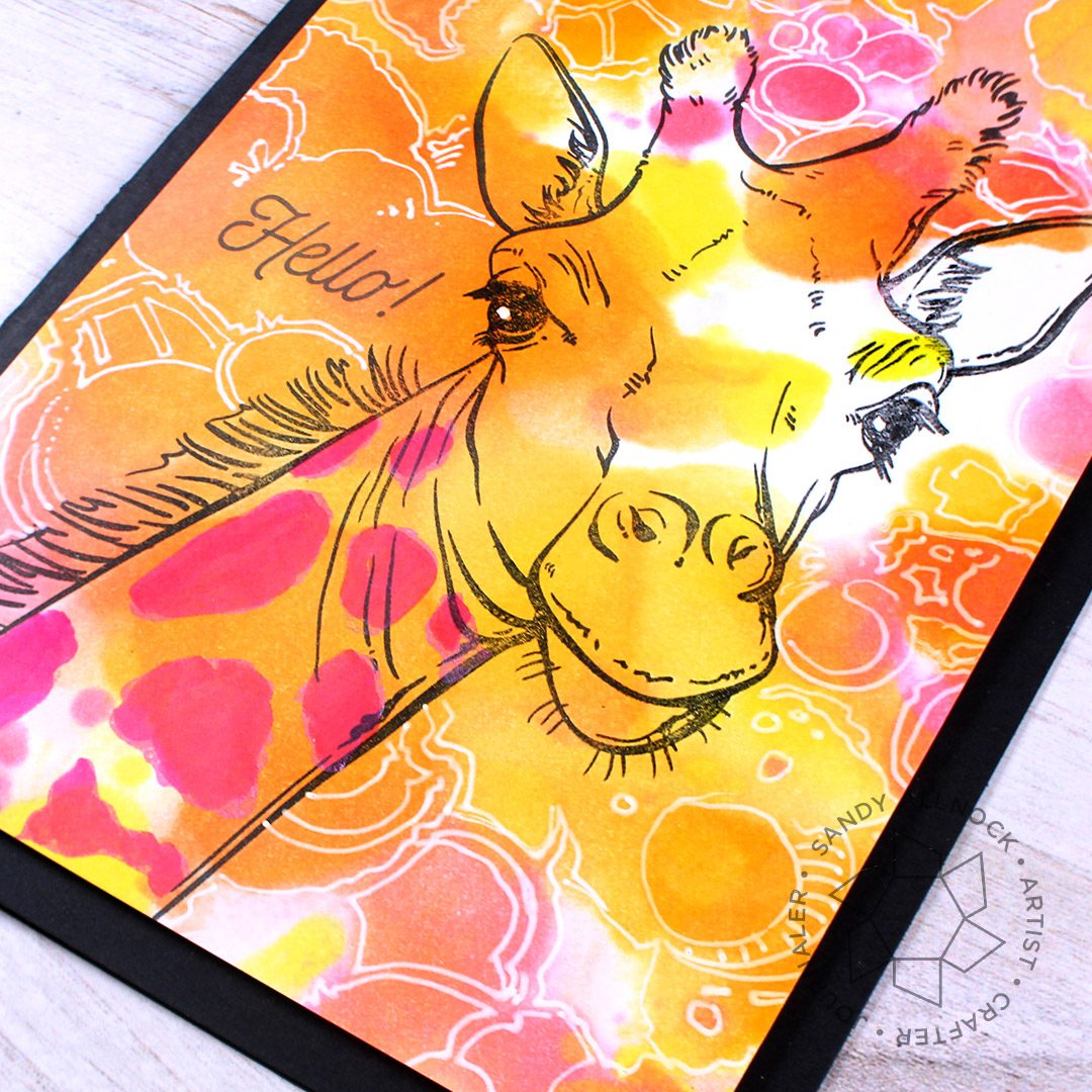
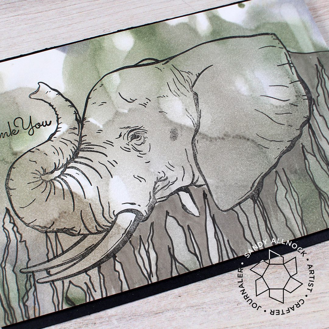
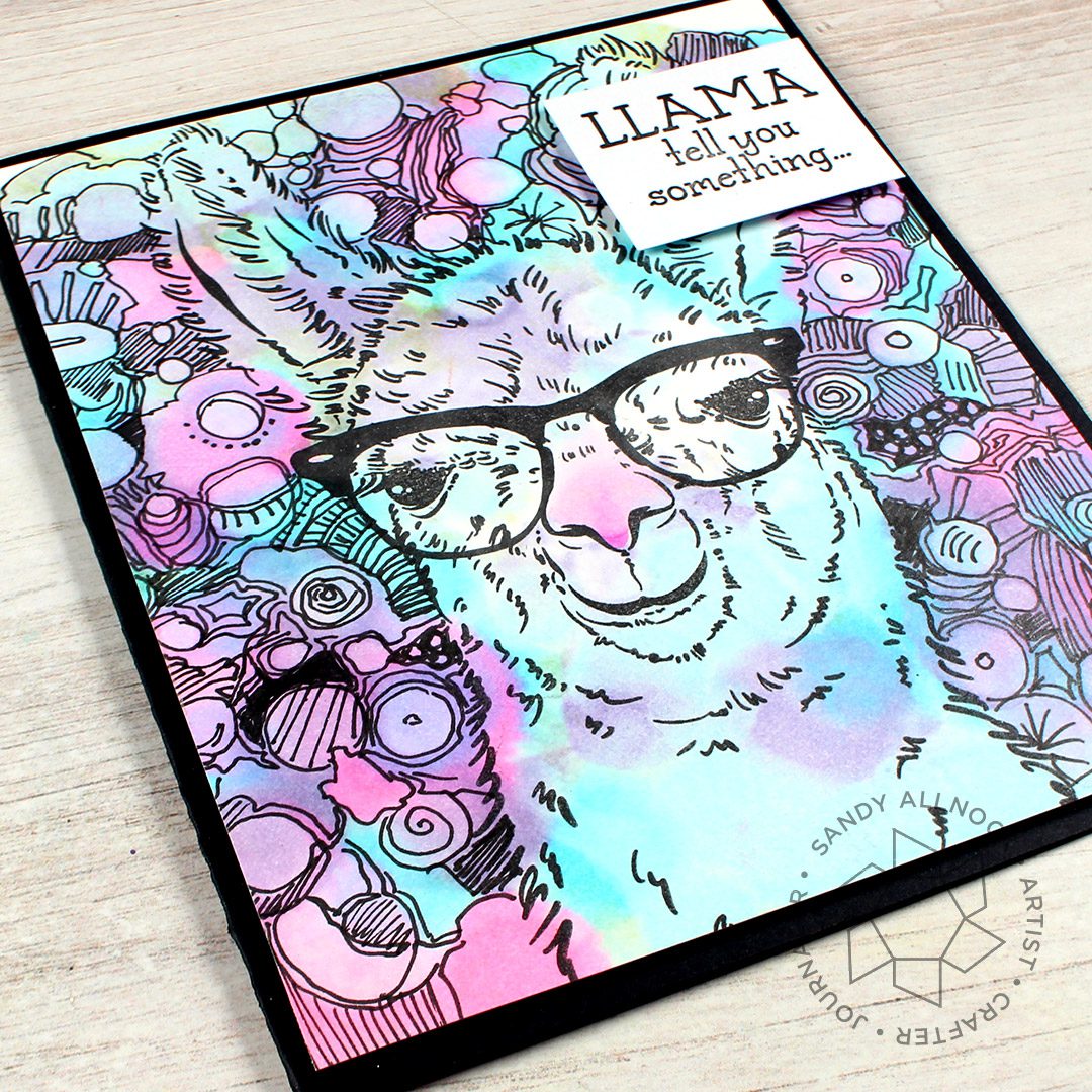
The stamps that arrived in happy mail from Colorado Craft Company are their new animals – and they would be PERFECT for my little idea! These stamps have also got me thinking of a whole OTHER idea to come – maybe a class, not sure where the idea is headed but stay tuned!
Watch the video and see what I did with my refills!
First note that these stamps are big – part of the Big and Bold collection. That means either your cards need to be a little bigger than usual, or you can trim the card down so the animal peeks in from the side! I opted for oversized cards.
When choosing colors, analagous ones are best – next to each other on the color wheel. If you mix colors that have yellow blue and red in them, you could end up with mud!
Saturate the paper in some way (pour, squeeze, spray) with 99% Alcohol . Lower % may work, I’m not sure. You can also use Copic blender solution, but as long as you’re just splooging like this, and not coming into contact with nibs, the alcohol is fine.
Remember as it dries it gets lighter and brighter – the paper turns greyish while wet.
On the giraffe version with such pretty, light colors, I opted for my Uniball Signo White Pen to create the doodles – following the splotch edges created with the background.
I used neutral colors – greys and a little desaturated green – for a more natural look. Dripping the alcohol creates streaks!
I love this llama! The background was such fun, tracing around each bloop with a Copic Multiliner, .5 – if the black pen work is the LAST part you’re working on, any black pen is fine.
SUPPLIES
Some product may be provided by manufacturers for review and use. Compensated affiliate links are here at no cost to you. If you choose to shop using my EH (Ellen Hutson) links, please accept cookies on that site in order to retain the link to my blog, or that compensation does not happen for me. I appreciate your support of my work with your purchases! Full affiliate and product disclosure | My trusted partners in art
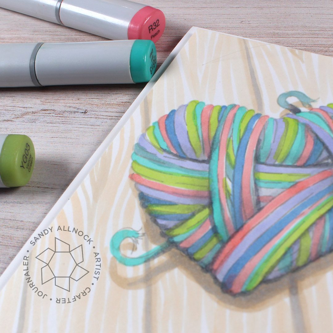
Let’s learn how to color a variegated yarn heart with Copic Markers —but first I need to ask: are you ready to start writing “2020” yet!?!? Yikes!
Supplies for this project are linked at the end of this post. Compensated affiliate links may be used at no cost to you.
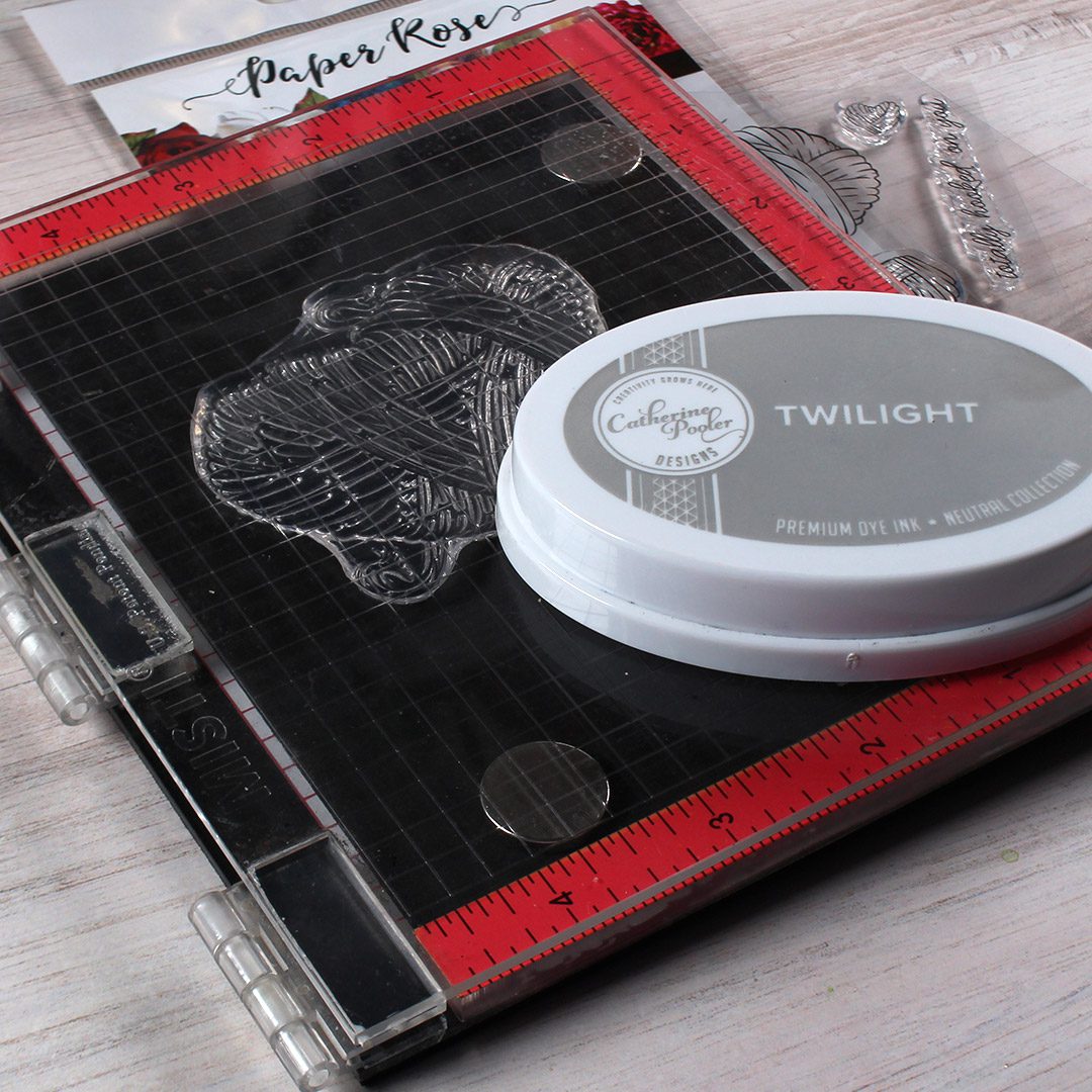
I bought the You Warm My Heart stamp set by Paper Rose what feels like eons ago – and I have so many ways I want to color it! Watch out on Instagram for a short video with another idea! (I’ll link it at the end of this post once that goes live!)
I wanted to keep this looking soft, which meant not using a black ink…so I put the stamp in my Mini Misti, and stamped it second-generation in grey ink. That means I inked the stamp, put in a scrap piece and stamped lightly, then followed that immediately by stamping on the piece of Neenah I wanted to color on; that made it lighter, which worked out great for this. I then let it DRY COMPLETELY – CP inks aren’t generally considered Copic-safe, but if you stick to a light color and let it air dry (heat setting will warp the paper so just give it an hour to dry.)
COLORING TIPS
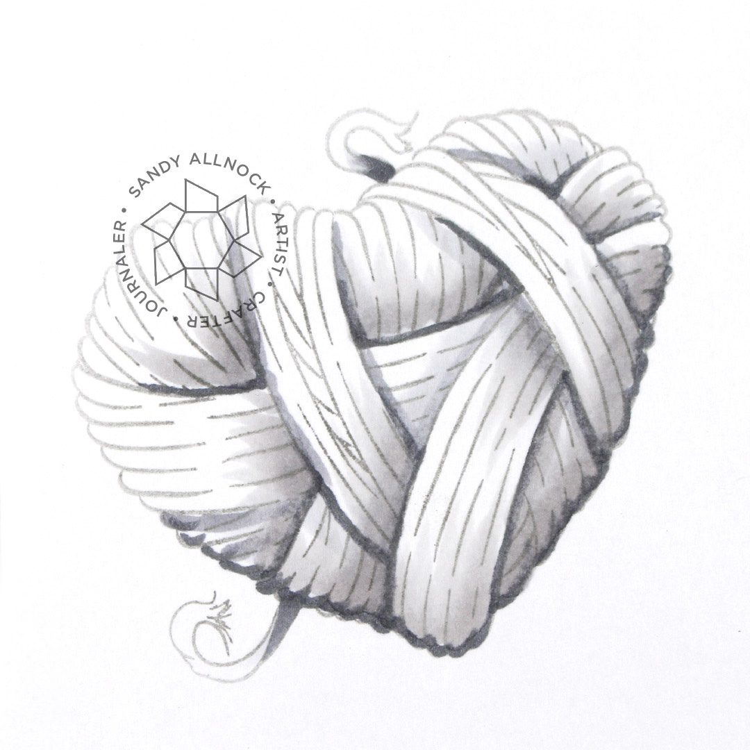
With most coloring, I put down the main color first – whatever the base color of the yarn is – then adding a dark and medium to add dimension. In this case, thought, it’s just the opposite. Since I want to have consistent shading across all the variegated colors, I put the greys down to shade FIRST – rather than trying to shade each strand of yarn individually. Here’s where I put my shading, in case you want to try it once you get the stamp set:
I used neutral grays for the shadows but in all honesty – you can use whatever you like. If you’re using all warm colors, you can even use warm greys! I used the light E colors for the wood table.
For color selection, I found I startled myself with colors that were stronger; that made sense when I realized yarn is a natural fiber, so the strong bright colors will be a little jarring.
FINISHING TIPS
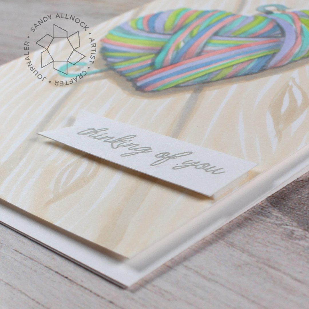
To complete my card and still keep it simple so as to feature the coloring and not embellishments – I trimmed the colored panel to 4″ x 5-1/4″ and popped it on some dimensional adhesive. I then stamped the sentiment in the same grey as I had stamped the image, and cut a banner edge with scisssors and popped it up too.
So if you were coloring yarn, how would you color it? Would it be variegated yarn or a single color? In Copic Markers or another medium? Let me know in the comments what your plans are, maybe I’ll try that sometime!
SUPPLIES
Some product may be provided by manufacturers for review and use. Compensated affiliate links are here at no cost to you. If you choose to shop using my EH (Ellen Hutson) links, please accept cookies on that site in order to retain the link to my blog, or that compensation does not happen for me. I appreciate your support of my work with your purchases! Full affiliate and product disclosure | My trusted partners in art
Today’s video isn’t so much of a coloring tutorial as a pep talk! I’ve had some recent news that’s challenged me to do as I say, so I’m doing it. Looking on the positive side!
As I said in the video – I’m taking a health challenge and turning it to my advantage. I know lots of illnesses are hard, and it can be difficult to find something positive to celebrate. But consider whatever mountain is in front of you: is it making you stronger? Giving you more time to daydream and think about new ideas to execute later? Allowing you time to sit quietly with a sketchbook even if you can’t hang out in a chair in your workspace? Find something to be grateful for – it makes you a happier person…and can likely make you feel a lot better.
COLORS USED
That YG67, by the way, is a chewed cap. Courtesy of G when he was a puppy. LOL.
AUTUMN SCENES CLASS
The intermediate class shows some basic principles for creating 5 different types of tree/forest scenes; they’re in fall colors, but just swap out for greens and you’ve got a scene you can use all summer! I also changed up the trees here to be pine branches, so you can change up all kinds of details.
Some product may be provided by manufacturers for review and use. Compensated affiliate links are here at no cost to you. If you choose to shop using my EH (Ellen Hutson) links, please accept cookies on that site in order to retain the link to my blog, or that compensation does not happen for me. I appreciate your support of my work with your purchases! Full affiliate and product disclosure | My trusted partners in art
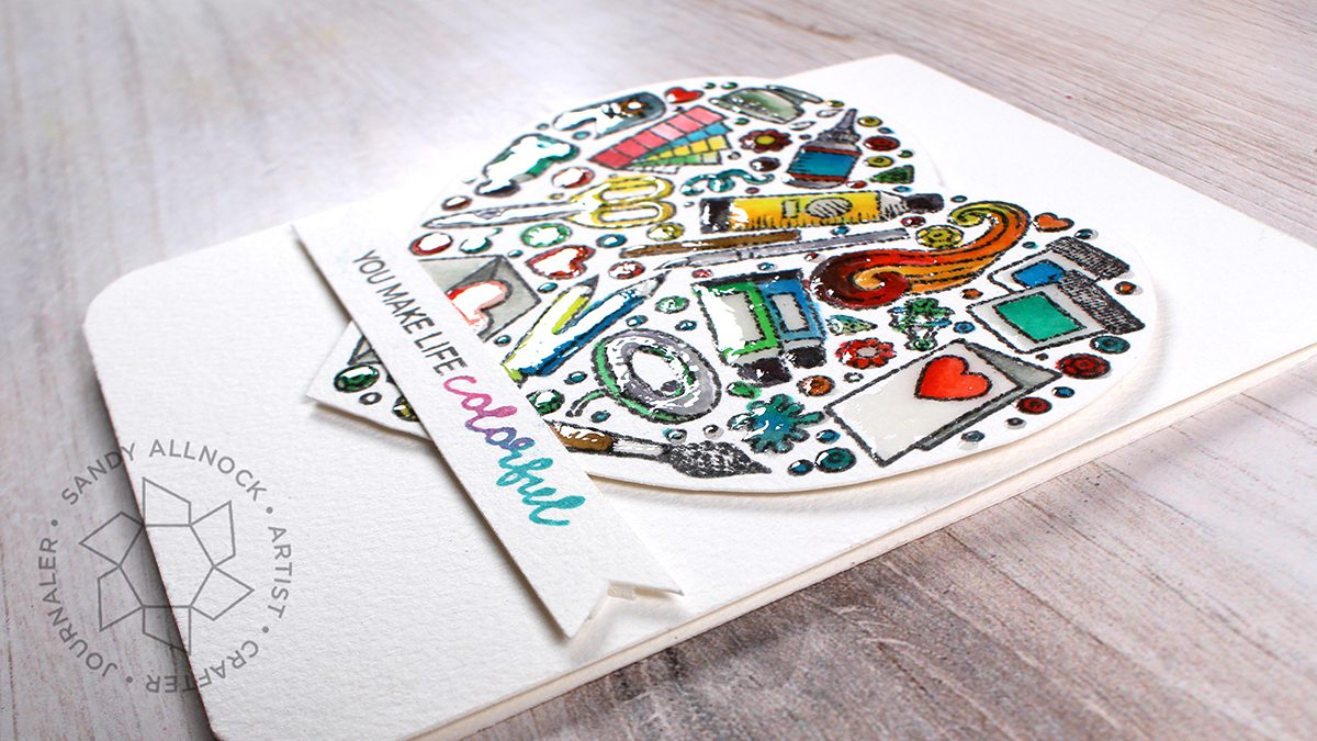
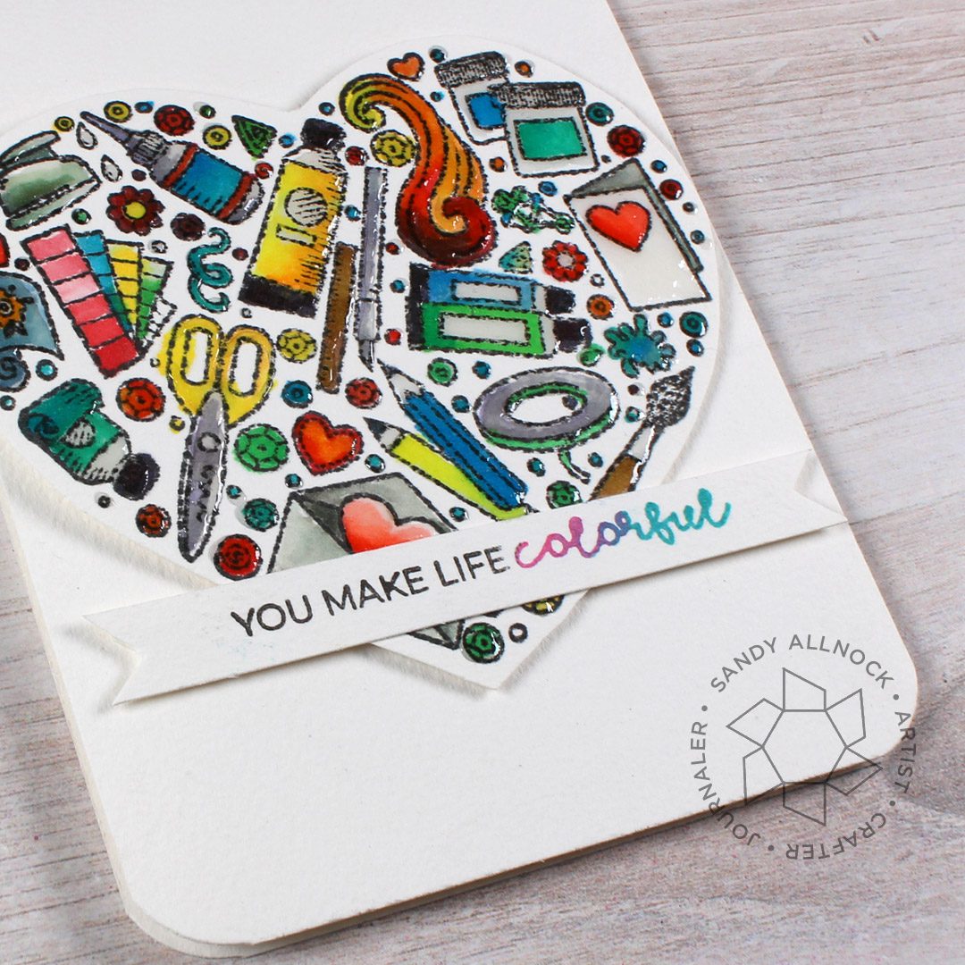
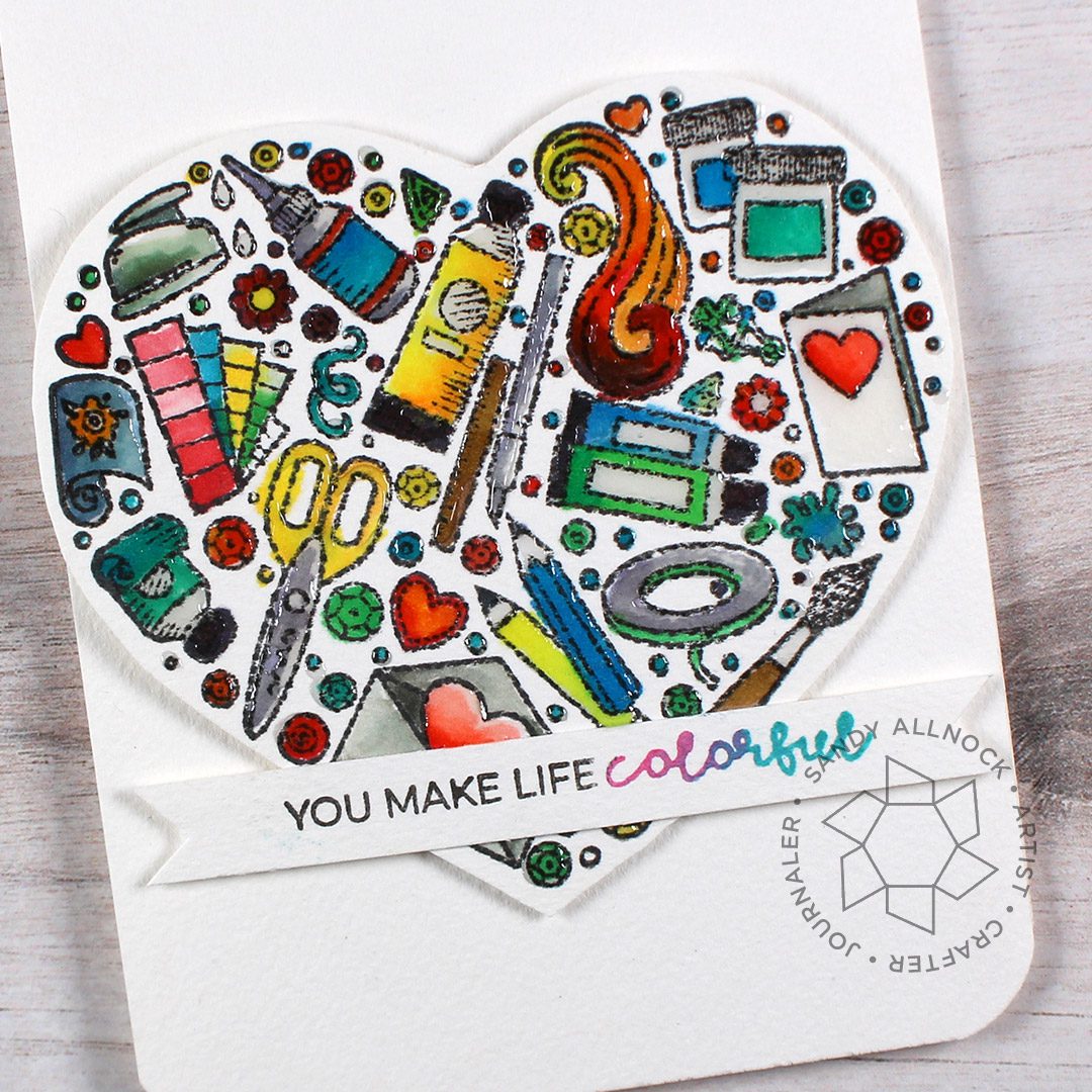
Rather than “Copic on Watercolor Paper”, this tutorial might be entitled “DO NOT TRY THIS AT HOME.” lol! But the stamp set is so cute I’m showing you my card anyway.
Supplies for this project are linked at the end of this post. Compensated affiliate links may be used at no cost to you.
Trinity Stamps hit it out of the park for us crafters with this Crafters Heart set, with *one* little exception: there are no Copics in the drawing!? ha! I know, I know, I use #allthethings so I’m mostly fine with it. But I’ve not used my Copics much lately (in the studio) and neeeded to get my jam on. Is it legal to color a stamp like this in anything that doesn’t show up in the stamp!?
My first try at this card was using alcohol inks; I only have about 5 colors, and they’re well…not nice colors. But I tried this on Neenah with them, and it bled like mad. as did Copic on Neenah when painted like this; so much fluid just makes the color go all over! My solution: switch to Arches watercolor paper!
Use Copic friendly ink, this will bleed a lot otherwise.
Use good watercolor paper (all cotton) so it absorbs the color and doesn’t spread it out.
It doesn’t bleed through, at least at the quantity of ink I used, so you could get away with a 1 layer card.
FINISHING TIPS
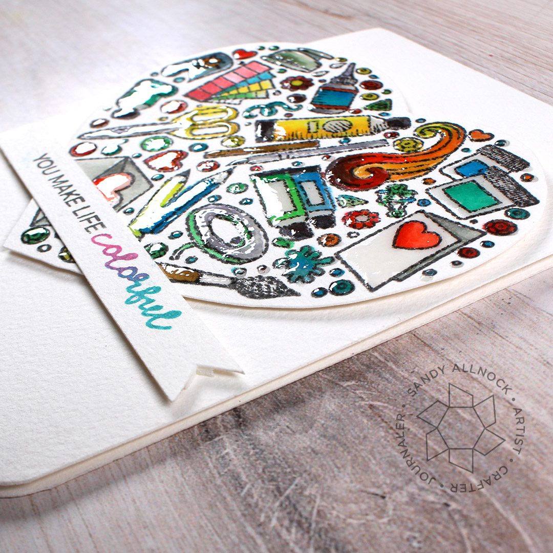
My fussy cutting isn’t what it once was, so to “hide” that fact, I used the same Arches for the card base to make that less noticeable. (It showed up horribly on a red card base which was my first try!) I also added Glossy Accents to all the little colored bits – really added some spectacular shine and a touchable element.
I also rounded the bottom corners with my Corner Chomper – is that passé nowadays? Do people still round corners?
SUPPLIES
Some product may be provided by manufacturers for review and use. Compensated affiliate links are here at no cost to you. If you choose to shop using my EH (Ellen Hutson) links, please accept cookies on that site in order to retain the link to my blog, or that compensation does not happen for me. I appreciate your support of my work with your purchases! Full affiliate and product disclosure | My trusted partners in art