Hello friends! There’s been plenty of watercolor ’round these parts latelly…are you ready for some Copic blending tips?
Supplies for this project are linked at the end of this post. Compensated affiliate links may be used at no cost to you.
Stamp selection tip
If you’re newish to Copic coloring – and especially if you have trouble with color bleeding out under the stamp lines – choose a stamp set with thicker lines. That’ll give you lots of practice at controlling how far out the ink will move.
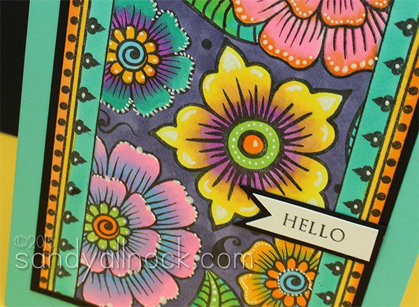
In this “DIY Stained glass” card, I stamped Altenew’s Henna Elements with nice thick lines, and made a panel out of it. There’s some masking here but mostly just along the long strips down the sides – with a MISTI and a sticky note that’s easy to cover up. (If you don’t have a stamp set with a border, doodle one! Just use a Copic friendly pen like a sharpie.)
Watch the tips in the video – and read those written out below it too!
Copic blending tips
There are about a gajillion copic blending tips out there – this card shows mostly how to mix colors that aren’t naturally going to belong together.
Practice the flick! That’s when you lay the marker down and as you push the pen across the paper, lift up to create either a finer point or lighter color.
Flicking in both directions will make it easier to figure out which is easier for you – close to you or away from you. Spend time in front of the tv just flicking on scratch paper til your hand gets the hang of it. Create muscle memory!
When blending non-similar colors, be sure to use plenty of ink. That’s probably the most common thing that causes poor blending. Be generous, but know that too much will also bleed outside the lines – that’s where this stained glass project works well. Just cover up any bloops with a background on the other side of the stamp line.
It’s harder to blend a really dark color with a really light color. Keep them within a few numbers of each other in the SECOND digit – that’s the one that indicates light/dark.
If you’re struggling, use your piece for some zentangling practice with a white pen or black pen overtop of the coloring – it’ll add some fun to it and no one will notice the marker problems underneath!
On this card I also used my W&P parallel ruler – helpful in making lines straight! The eraser I used to remove pencil lines is a kneaded eraser – super nice eraser on Neenah cardstock!
Supplies
Some product may be provided by manufacturers for review and use. Compensated affiliate links are here at no cost to you. If you choose to shop using my EH (Ellen Hutson) links, please accept cookies on that site in order to retain the link to my blog, or that compensation does not happen for me. I appreciate your support of my work with your purchases! Full affiliate and product disclosure | My trusted partners in art
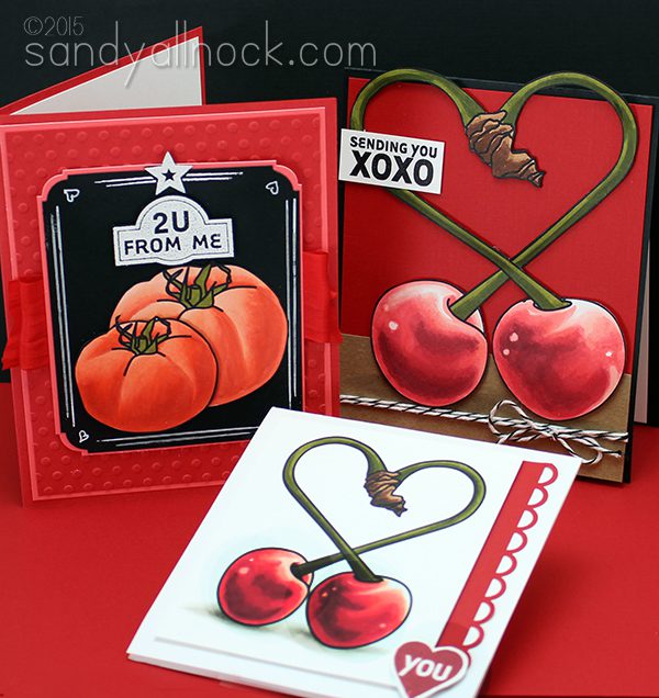
Happy Easter Weekend! I hope you’ve got plans to get to church and celebrate….it’s the best news mankind has ever gotten, and it’s cause for a party! Before we go celebrate though, let’s get on to the red cherries and tomatoes digi stamps! I’ve been excited to get to these for a while; reds are an interesting group in the Copic family, and I hope the educational info is helpful for you.
Red Cherries and Tomatoes Digi Stamp Bundle
In this digi bundle, you’ll get two stamps – a tomato and a pair of cherries – with their stems intertwined into a heart! Perfect for some loveydovey cards, right? The pdfs, as a reminder, now include solo pics of my card samples, as well as clickable supply lists just in case. Click on the image below to go pick up the digi bundle:
You can find all the EduDigis in THIS section of the store.
So there’s the red cherries and tomatoes digi stamp set – now to decide what color will be next week!
Hello everyone! And thank you so much for all the lovely birthday wishes! I’m having an amazing time on the east coast with friends…we’ve got a crafty gift swap tonight that should be a hoot! Anyway – let’s get on to the tulip digi stamp! I got this set prepped before I left…and hoping you like these pretty flowers!
Tulip Digi Stamp Bundle
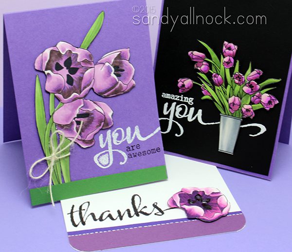
I thought that violet would be a perfect color to use for the tulip stamps I had drawn…though you of course can color them any way you want to. I suspect we’ll all pick our favorite color combos, or even multicolor tulips! I do have purple ones blooming in my own garden right now.
In this digi bundle, you’ll get THREE stamps this time. One is the solo tulip flower, since I thought that might be a fun single element for a CAS card. I put glossy accents on the stamen of my sample card, and it just really made it shine nicely! The bouquet of tulips have some special shine on them, and I tell you in the pdf how I did it.
The pdfs, as a reminder, now include solo pics of my card samples, as well as clickable supply lists just in case. Click on the image below to go pick up the tulips:
You can find all the EduDigis in THIS section of the store.
So there’s the tulip digi stamp – wonder what color might be coming next week? (Note that we’re not going in ROYGBIV order, of course!)
If you’re anything like me, you always need belated birthday cards – I am so bad about getting cards out on time! This Wplus9 stamp set is perfect for me!
In the video, I show you how I *finally* got to make a card on which I could deliberately create a tilted panel. My backgrounds never quite work with this style of card, and I think it’s so fun to combine the angles like this! But text on an angle makes me nuts, so I had to figure out how to achieve this without my stamped sentiment going wonky.
Video
The balloon here is probably the most applicable lesson for colorists- with bounced light around the edge of the shiny balloon and a highlight in the middle. I love bounced light!
Isn’t that angled card just so much fun? And so simple too. Maybe others have long-ago figured out the secret to the kittywompus panel, but I’m slow to tackling things sometimes!
Here’s a closeup of the polkadots I created with my white pen:
Supplies
Some product may be provided by manufacturers for review and use. Compensated affiliate links are here at no cost to you. If you choose to shop using my EH (Ellen Hutson) links, please accept cookies on that site in order to retain the link to my blog, or that compensation does not happen for me. I appreciate your support of my work with your purchases! Full affiliate and product disclosure | My trusted partners in art
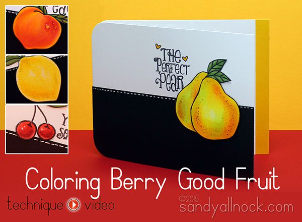
Realistic Copic coloring fruit seemed like good inspiration…and it did lead to cravings for pears! Mmmmm good!
These Avery Elle stamps in the project are no longer available but see the more recent fruit stamps…and if these too are gone, just search for fruits! Companies seem to always be coming out with lots of fruit.
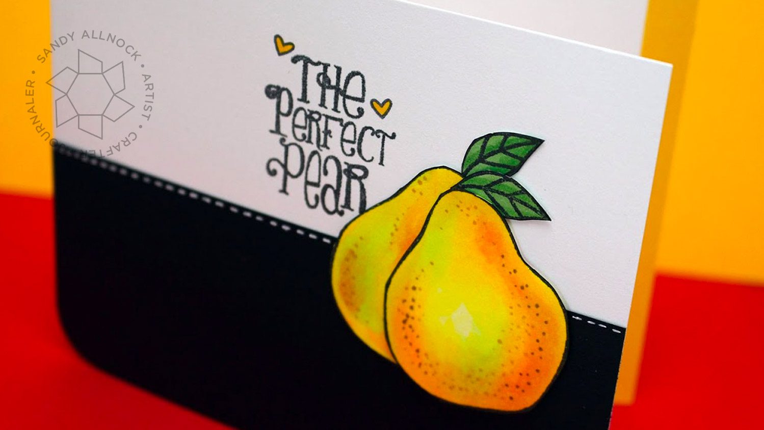
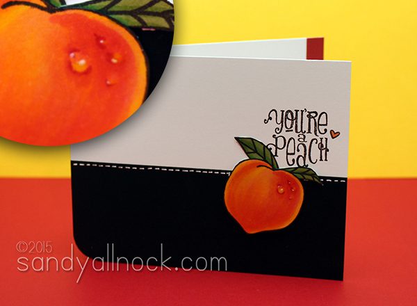
Each fruit in my photo references had a little bit of highlight (not whites) around the edges – that’s “bounced light” shining on it from the table/wall etc. It’s a subtle thing that helps people looking at your art think you’re truly a coloring guru!
The pear was one of my favorites; I love that the colors go from yellows to pinks to oranges to greens!
The water drops on the pear surprised even me – yeep! Don’t you love when something like this happens?
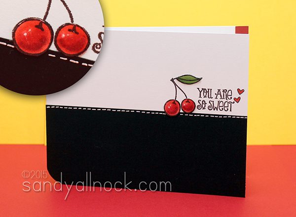
Cherries are just like any round objects we color…they just need shadows and little highlights!
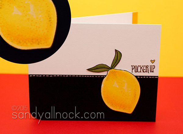
Last but not least, the lemon! The pores on lemons were a surprise to me; if I had been asked before this realistic Copic coloring exercise to describe the look of a lemon, I wouldn’t have said it has pores!A note about this stamp set – the sentiments in the set generally fit inside most of the fruits. I left them all outside, so my coloring would show. After that kind of work you don’t want to hid it!
Supplies
Some product may be provided by manufacturers for review and use. Compensated affiliate links are here at no cost to you. If you choose to shop using my EH (Ellen Hutson) links, please accept cookies on that site in order to retain the link to my blog, or that compensation does not happen for me. I appreciate your support of my work with your purchases! Full affiliate and product disclosure | My trusted partners in art
Good eeeeeevuhning. (Said in my best Alfred. Which is not very good!)
For today’s card, I wanted to compare warm and cool greys in my Copic Markers. I picked one of my videos that’s gotten the most views…Coloring White with Copic Markers. Rather than doing just a white object, I did a little mad scientist who’s wearing a white jacket, and as I got started in the planning, it led to a study on all the different greys.
It really is quite amazing how different the warm and cool greys look when side by side. And how little difference there is between them if you’re NOT looking at them side by side!
So happy to have finally compared my warm and cool greys – now I have some idea why I want to use one or another!
Supplies
Some product may be provided by manufacturers for review and use. Compensated affiliate links are here at no cost to you. If you choose to shop using my EH (Ellen Hutson) links, please accept cookies on that site in order to retain the link to my blog, or that compensation does not happen for me. I appreciate your support of my work with your purchases! Full affiliate and product disclosure | My trusted partners in art
Paper Smooches Great Chemistry —— no longer available