
I know a lot of people love making color charts….but I’m not that person. I can, however, recommend some charts—because they’re ones that really teach.
A lot of charts are just kept in notebooks and give us an excuse to waste our time looking through them again and again. Or they serve as a procrastination tool. Or a way to just have something to do when we’re stumped.
All those may be reasonable purposes sometimes. But since I rarely have much extra time on my hands, any chart I make has got to have a good reason to exist. And this chart – or shall I say, the PS added to this chart – is one that may really help those who struggle to figure out what color to use to shift a hue, or to darken or desaturate a color.

Tutorial: Color Theory—Make yourself THIS color chart!
Watch the video below and scroll to the end to leave comments or questions — or click HERE to watch it on YouTube and leave comments over there. I read both dutifully!
SUPPLIES
Some product may be provided by manufacturers for review and use. Compensated affiliate links are here at no cost to you. I appreciate your support of my work with your purchases! Full affiliate and product disclosure | My trusted partners in art

Paper
Create this on whatever paper you love to work on!
- The sample is on Bee Paper, Stipple Texture paper 9×12: BLICK https://bit.ly/3GuXorS AMZ https://amzn.to/4dap55L
Pen
Colored pencils
Use your favorite brand!
To create this chart
Choose colors; I recommend a light and medium yellow, red (pink) and blue. You can choose cools in one trio and warms in another – but in time hopefully you’ll start to learn what happens when one color is added to another and not need to find swatch charts for them.
Steps:
- For a 6 color chart, draw 6 boxes across, 6 down. (1/2″ is just fine.)
- In the horizontal rows, color the same hue all the way across. Concentrate on getting a nice consistent medium pressure every time.
- In the first column, color the first color on top of the colors already in the squares. That’ll show you what happens when this color is on TOP.
- In each column do the same.
- The second time you’re coloring the same pair of hues, it’ll show you the opposite order from #3 above.
- Then create threesome swatches with a blend into white.
- Start with one of the blues, add the light red (pink) and light yellow, adjusting to see what it takes to get them to be brown and grey. Make a block with the 2nd blue.
- Then create a pair of blends with each blue, adding the medium red (pink) and medium yellow.
The type of learnings to watch for:
- Which yellow has more or less effect on other colors?
- Does a warm or cool pink make a better purple?
- When shifting from a greenish color to a neutral, what color do you need to add?*
*hint: red + yellow + blue = neutral. Add the one that’s the least prevalent in the color that needs adjusting!

Subscribe to receive blog posts by email:
Coming by Tuesday
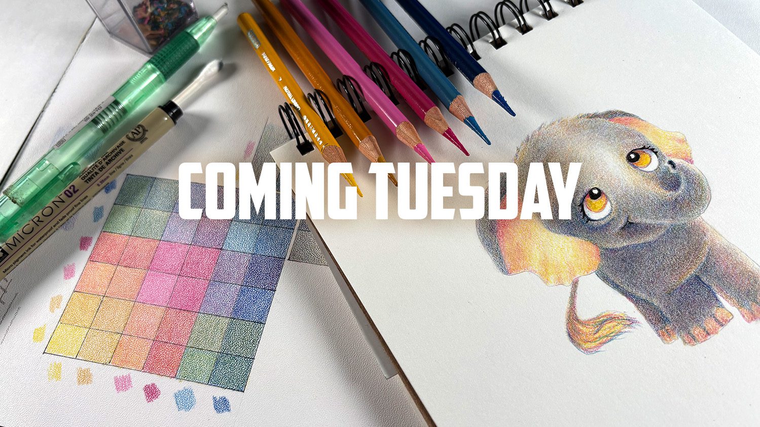
Once I finish editing, this little elephant will be available as a snack class – those are little courses that are nicely inexpensive – which is perfect for tough economic times! I’ll be trying to add more of those in the coming months as well as some of the bigger classes with deeper learning. Let me know if you think of a great name for this little course!





0 Comments