
After talking a bit about how suns are white in my previous post – it’s time to paint a white sun! And since I’m fresh off my gouache phenology wheel, this will be in gouache.
I found this photo by Vlad Patana on Unsplash and since I’m a geek for bokeh, I decuded to do a little video exploring how to get that dappled, fuzzy, out of focus look – depth of field.

Tutorial: Painting depth of field in gouache
Watch the video below and scroll to the end to leave comments or questions — or click HERE to watch it on YouTube and leave comments over there. I read both dutifully!
SUPPLIES
Some product may be provided by manufacturers for review and use. Compensated affiliate links are here at no cost to you. I appreciate your support of my work with your purchases! Full affiliate and product disclosure | My trusted partners in art

Sketchbooks
- Square sketchbook
- Long sketchbook – Pentallic Aqua Journal 5×8 BLICK AMZ
Brushes
Palette
Daniel Smith Gouache
Blurred edges
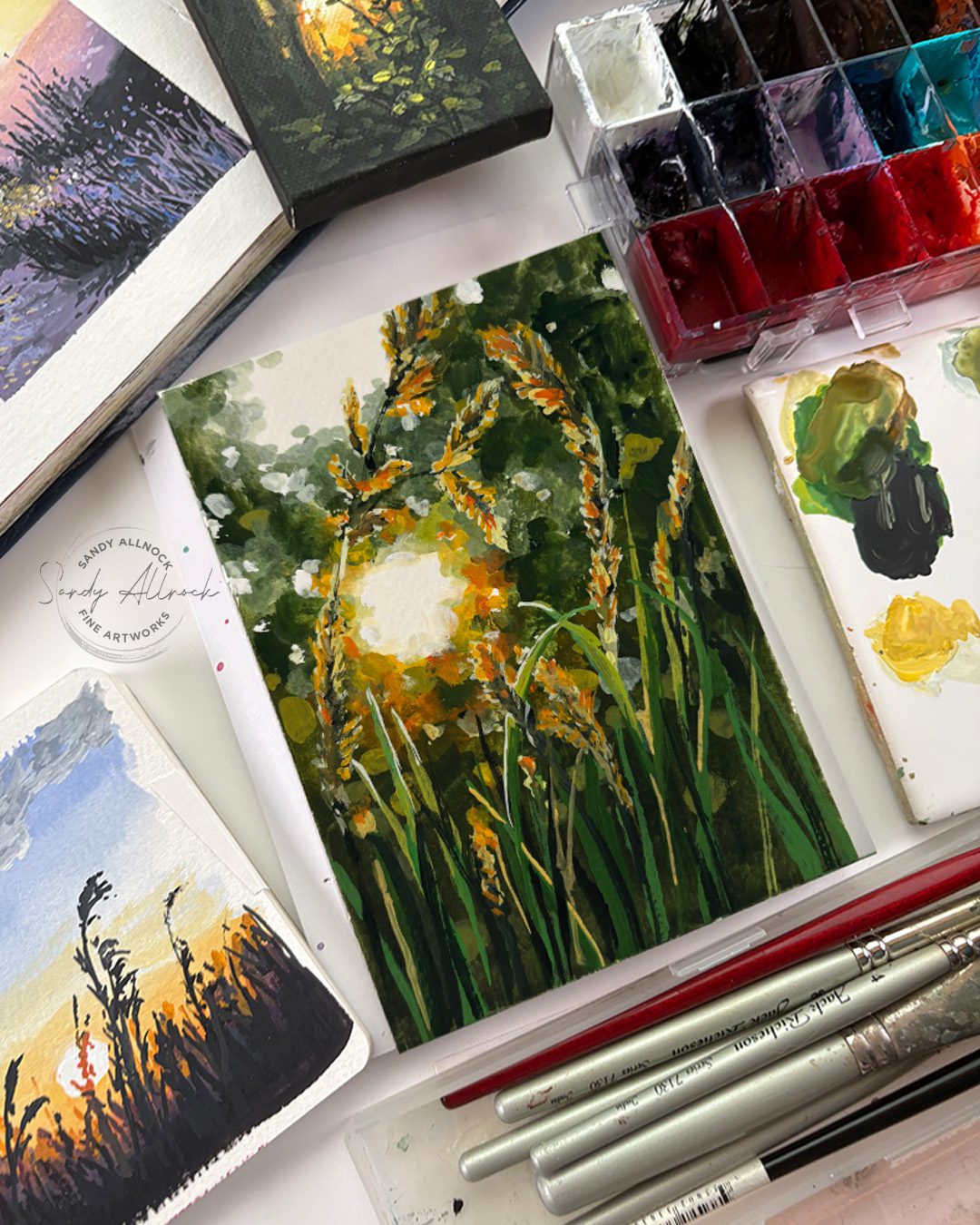
The trick to creating what looks like blurry edges without physically blending them (it’s difficult in gouache)…the idea is to really really look at the values. Around edges of a blurry object the colors of the background and the object become values of both of them – in the case of a white or light background, it’ll be a midtone color of a dark, or a light value of a midtone. In the distance they’ll often get desaturated too, which is quickly achieved in gouache with black or white. Or both.
Foreground
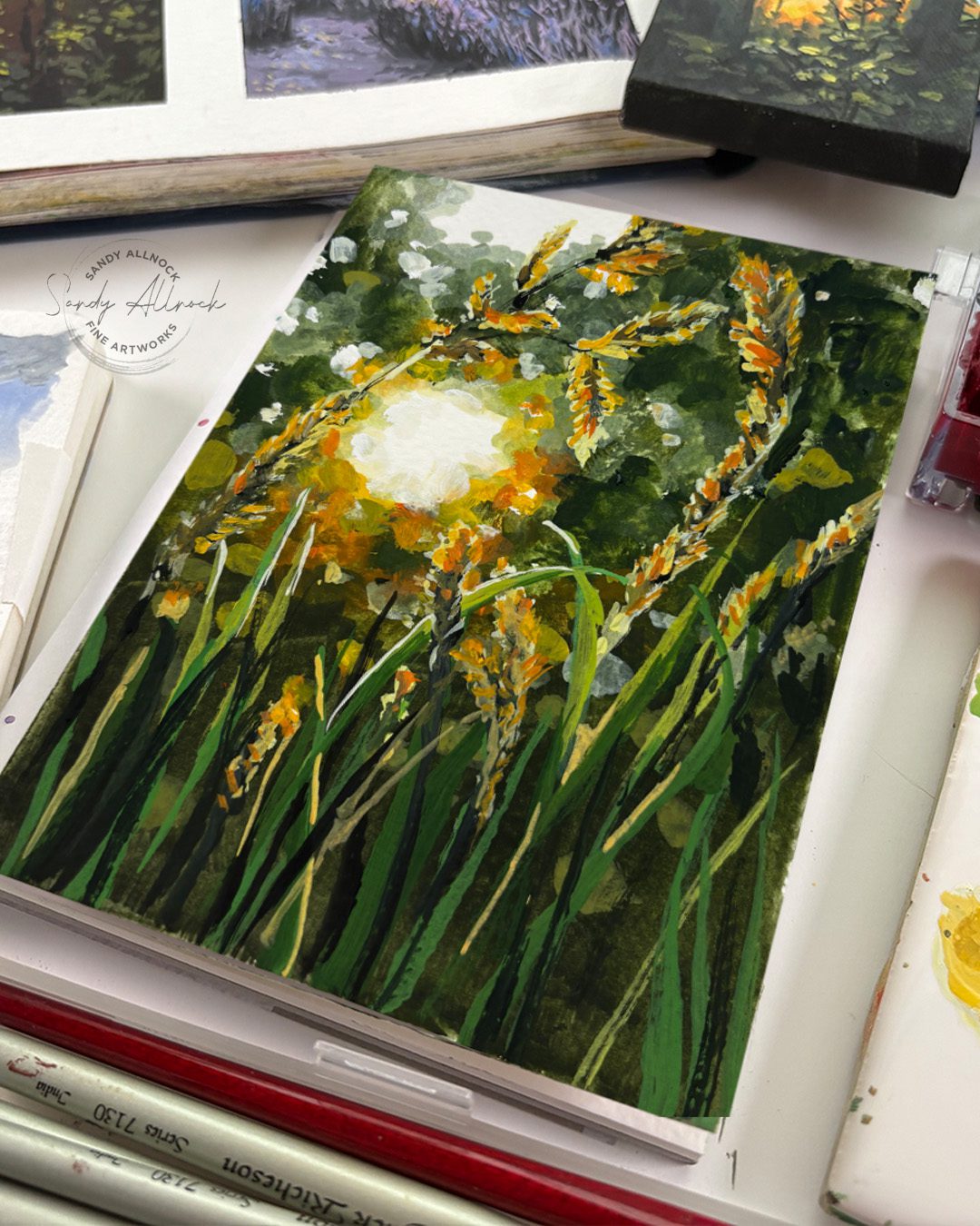
Handling the foreground depends on the image – in this case, there’s more saturated colors to pull the grasses forward. All that sunny gold and orange.
Subscribe to receive blog posts by email:
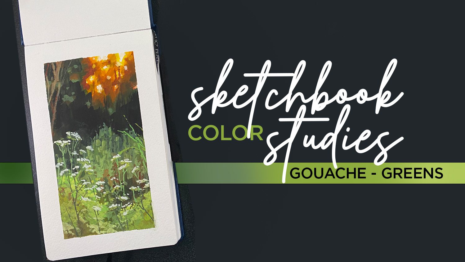
Sketchbook Color Studies in green
This course is on sale this month – perfect time to go play with your gouache paints! The video above in its uncut form is in a bonus lesson in the class.





0 Comments