
Today’s big idea: color testing, with an easy and fun way to practice mixing wet-in-wet color on the paper – and with doodles to finish it off!

Supplies for this project are linked at the end of this post. Compensated affiliate links may be used at no cost to you.
Tge backstory: I discovered a few years ago my love for Yellow Ochre with Moonglow; these two do amazing things in different combinations of pigment consistency (amount of water vs pigment)! I’ve been asked how I “knew” to try them together….I didn’t! I ended up using them together and found they made a delicious range of warm browns, and here’s just one painting where I pushed and exploited the kinds of things that these colors do together:

Video
I filmed a couple combos of Aureolin, one of my new colors I’m test driving, with a bunch of other colors in my palette. This is a relaxing and easy way to do the testing!
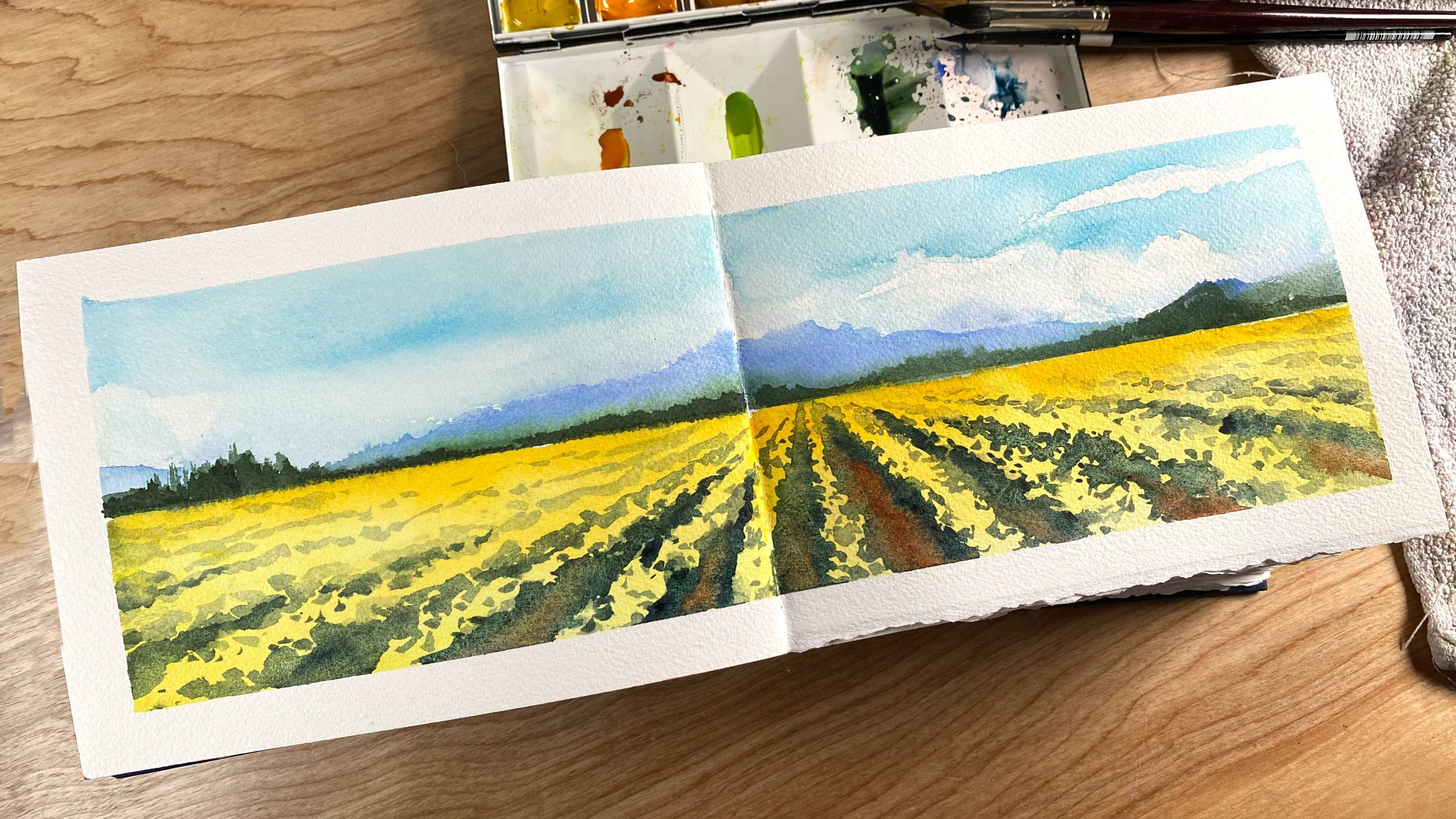
My sketchbook is a place where I practice a lot of combinations…here I played with carious blues in the sky and distant mountains, then for the daffodil field, I painted the whole section first with Aureolin, with just a little New Gamboge in the distance. I let that dry, then painted the dark areas between rows with Paynes Blue Gray; that gave me the darks I needed, and dropped a little Transparent Red Oxide in a few of them to make them a little “dirty.” This Sketch-a-Day sketchbook from Lake Michigan Book Press has Arches paper in it – 365 pages!
The swatches
(Shopping links are at the end of this post)
Neutral Tint….this color didn’t make it into my fine art palette, because I use “real” blacks rarely; I prefer to mix my own, unless it’s for a test like this – I wanted a consistent color, varied only by water, and that was easier to do with a single pigment.

Lunar Blue is a color that gets me excited to go into the studio–it’s a highly granulating (textured) color, and has some really interesting interactions with other colors. It had some spots where a bright turquoise lept out, and I’ll be playing to see what I can do to replicate that.
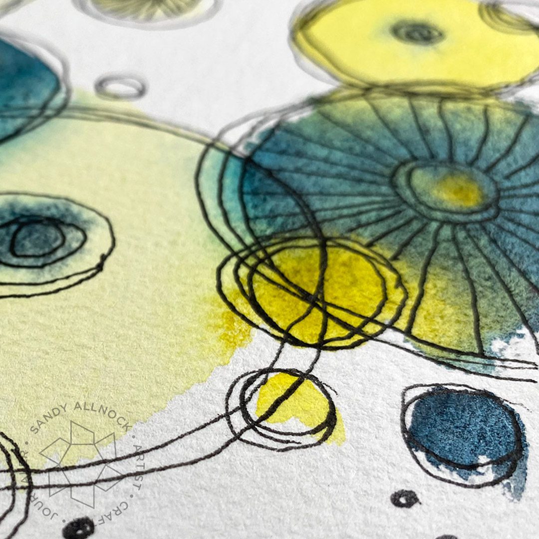
Phthalo Blue Turquoise tended toward having “fingery” edges – little vein types of rivulets of one color making its way into the other. I love having colors that do things like this that I know can create that specific texture, even though I don’t think I’ll use this too often wet in wet. However – these colors also make a nice set of greens when mixed together in a palette – a different way to use them than this wet in wet method.
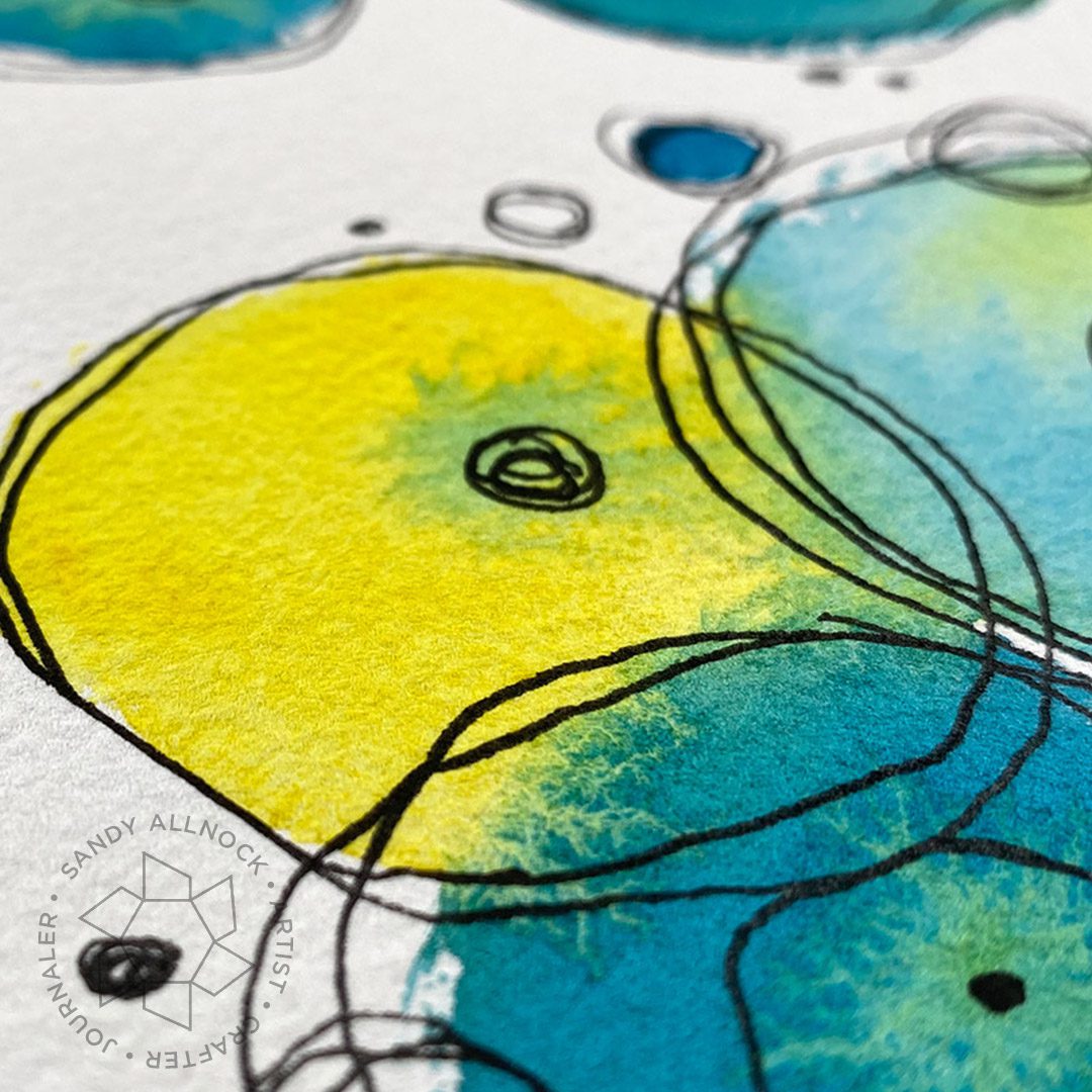
Moonglow does some similar things here as it did with Yellow Ochre, except the colors they make together aren’t as earthy; but the blue of the Moon glow mixes with the Aureolin to give it a little green tinge — which could be interesting.

Permanent Alizarin Crimson is the cool red I’m testing out….it’s not performing as I had hoped it would to excite me, but I’m going to continue working with it; so many artists keep it in their palette, I’m really curious to see what it does that’s so special.

Anthraquinoid Scarlet stuck around as my warm red in the palette change; It does create some lovely oranges,

Green Gold had few nice edges when touching the Aureolin – that isn’t so bad a thing since the colors are close enough I won’t be trying to create creative edges between them – yes they’ll make a nice graduated wash, but any edge work will be left for other pigments.
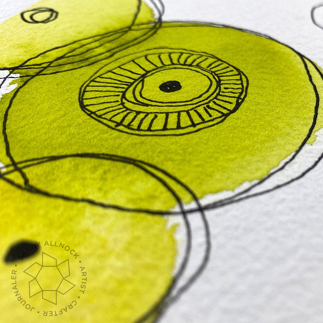
Green Apatite made a really fun super bright green when touching a good wet puddle of Aureolin – definitely will be on the list of things to try out!

Supplies
Compensated affiliate links may be used – that means if you make a purchase using my links, I receive a small commission at no extra cost to you. Thank you for your support of my work on this blog! Read more.
View my affilliate partners HERE.
- Arches Cold Press Paper EH – BLICK
- Doodling:
- Daniel Smith Watercolors
- Ampersand Hardbord, Flat 9×12
- Artist tape
- Synthetic blend watercolor brushes:
- Natural hair watercolor brushes:




