
It’s that time! It’s been two years with one palette….and I’ve been trying to plan out what I want to be using for a while – and I’m calling this my Island Palette…since I voted some older colors off, and newer colors on!

Supplies for this project are linked at the end of this post. Compensated affiliate links may be used at no cost to you.
I’ve been on the waiting list for a House of Hoffman palette for a couple years; the pandemic delayed it even more but I think it should be here by summer maybe! I want to have a good idea what I want in the palette before then so I’m ready to fill ‘n go, and this palette is my interim, so I can see if any of these colors should go, or if I miss anything that’s not here.
Video
In the video I’ll swatch out the colors and tell you a little of why I kept or added them, then show you the ones that I removed – and what mixes will create them. For most crafters, getting a big ol palette with tons of colors is awesome – but I love to go out and paint, so I want something smaller, but also with big wells for paint…thus the need to pare it down to 15!
Colors staying ON the island…
The colors who get to fight for their place for 6 months or so: Cobalt, French Ultramarine Blue, Phthalo Blue Turquoise, Green Apatite, Sap Green, Transparent Red Oxide, Yellow Ochre, New Gamboge, Aureolin, Green Gold, Permanent Alizarin Crimson, Anthraquinoid Scarlet, Moonglow, Lunar Blue, and Paynes Blue Gray,
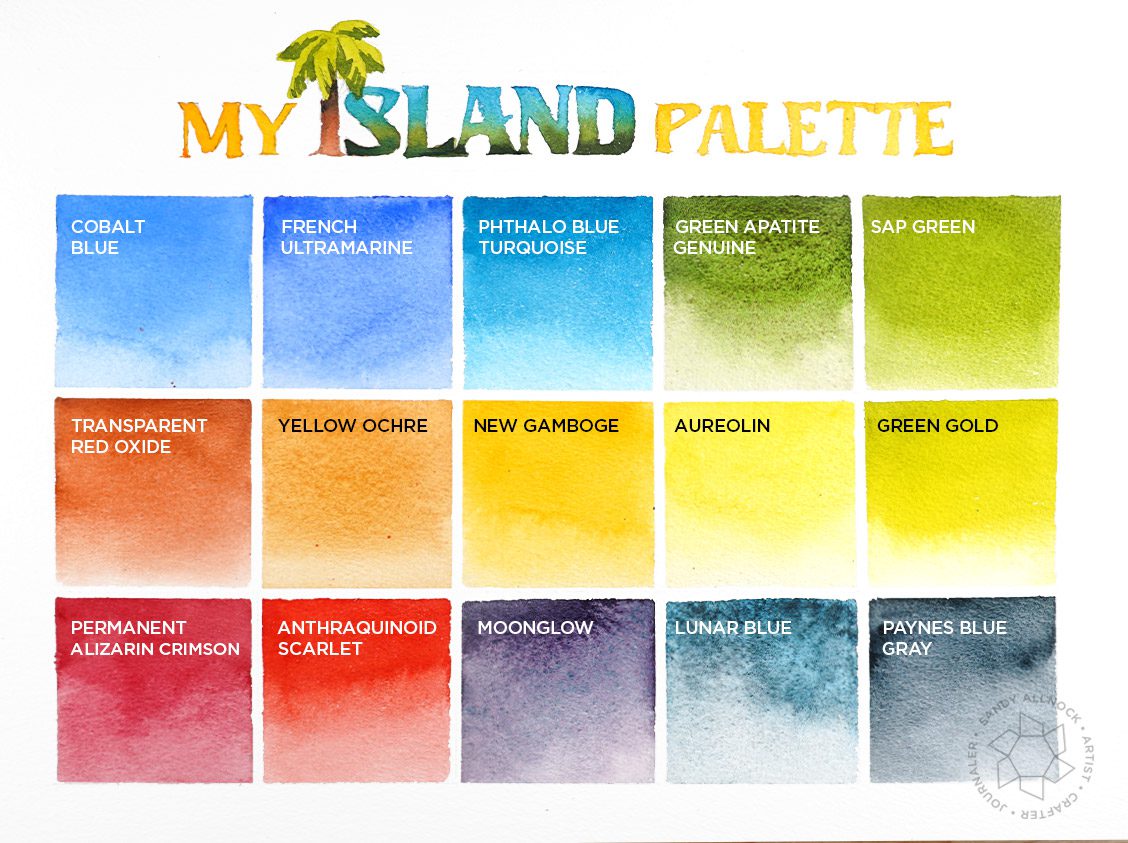
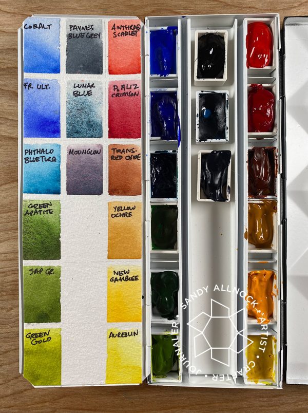
The Island Palette seteup has blues and greens on the left, reds and yellows on the right, and the more neutral and granulating colors in the center.
Voted off the island
Choosing colors always feels like picking between children! But not everyone gets to stay. Don’t feel bad! They can always come play, just not in my main palette.

- Neutral tint: Paynes Blue Gray + Transparent Red Oxide
- Perylene Green: Sap + Paynes Blue Gray
- Serpentine: replaced by Green Gold
- Indanthrone: French Ultramarine Blue + Paynes Blue Gray + Alizarin
- Phthalo Blue GS, Iridescent Electric Blue, Cobalt Teal Blue: replaced by + Paynes Blue Gray
- Nickel Azo: replaced by Aureolin
- Aussie Red Gold: New Gamboge + Anthraquinoid Scarlet
- Burnt Sienna: replaced by Anthraquinoid Scarlet
- Burnt Umber: Anthraquinoid Scarlet + Paynes Blue Gray
- Pyrrol Scarlet: replaced by Anthraquinoid Scarlet
- Quinacridone Rose: replaced by Permanent Alizarin Crimson
The mix of Cobalt Teal Blue + Nickel Azo makes a lovely grassy green but it’s really granulated due to the CTB. A mix of Green Gold + + Paynes Blue Gray creates the same color but as a non-granulating color.
Other videos mentioned:
Lunar Blue Painting:
2019 Palette setup:
Supplies
Some product may be provided by manufacturers for review and use. Compensated affiliate links are here at no cost to you. If you choose to shop using my EH (Ellen Hutson) links, please accept cookies on that site in order to retain the link to my blog, or that compensation does not happen for me. I appreciate your support of my work with your purchases! Full affiliate and product disclosure | My trusted partners in art
- Daniel Smith Watercolors, All EH – BLICK
- Daniel Smith Watercolors, individual tubes (at EH 5ml, at Blick 15ml)
- Cobalt: EH – BLICK
- French Ultramarine Blue: EH – BLICK
- Phthalo Blue Turquoise: EH – BLICK
- Green Apatite: EH – BLICK
- Sap Green: EH – BLICK
- Transparent Red Oxide: EH – BLICK
- Yellow Ochre: EH – BLICK
- New Gamboge: EH – BLICK
- Aureolin: EH – BLICK
- Green Gold: EH – BLICK
- Permanent Alizarin Crimson: EH – BLICK
- Anthraquinoid Scarlet: EH – BLICK
- Moonglow: EH – BLICK
- Lunar Blue: EH – BLICK
- Arches Cold Press watercolor paper:
- Palettes:
- Whiskey Painters Palette
- Schmincke Palette (less expensive) EH – BLICK
- Winsor Newton Kolinsky Sable Series 7 Round #8
- Synthetic blend watercolor brushes for crafters:





Love your bright palette, curious to see how this new palette will work for you.
Thank you so much for sharing, stay safe and have a wonderful weekend.
I love watching you swatch and explain all your reasons!! Can’t wait to see how this island palette works for you
Lots of great color info. Don’t use my watercolors a lot, and don’t invest in new colors, but interesting to see what I can use from what I have. Will enjoy seeing what you do with your new palette. TFS
I’ve been eagerly awaiting your new pallet decisions. Some of the Island Pallet colors were gifted to me for Christmas so I’m excited to try colors like Moonglow and Lunar Blue. You didn’t show your replacement mixes for the Imperial Purple. Is that because you don’t have the need for the purple in your fine art painting?
Yeah I realized after it all that I had just written off the purple but didn’t mention it. I chose my reds specifically so I can mix purples from them with the blues if needed.
Wow – lots to absorb from this video – can’t wait to try some of the new colors, and experiment a little more with mixing. I’ll be returning to watch this one many times. Very anxious to try the Pthalo Blue Turquoise and the Green Gold. But that Transp. Red Oxide looks luscious too… probably gonna have to have ’em all! Thanks for explaining the “why’s” and “wherefores” so well!