
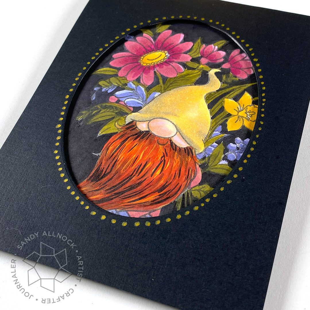
You all know how much I love contrast right? Sometimes contrast is what can totally save a piece of art that you aren’t liking! In the case of this gnome stamp, I struggled with the gnome being surrounded by too many objects that arguably are the size of his nose and cheeks – thus fighting for attention! Contrast is what can separate the gnome from his surroundings – both the white of the paper and the colors in the flowers.
Video
Watch the video below or click HERE to view it over on YouTube.
Do you think you’d ever try this? Color a background black sometime and see what happens – does it give you the courage to increase contrast in the image itself?
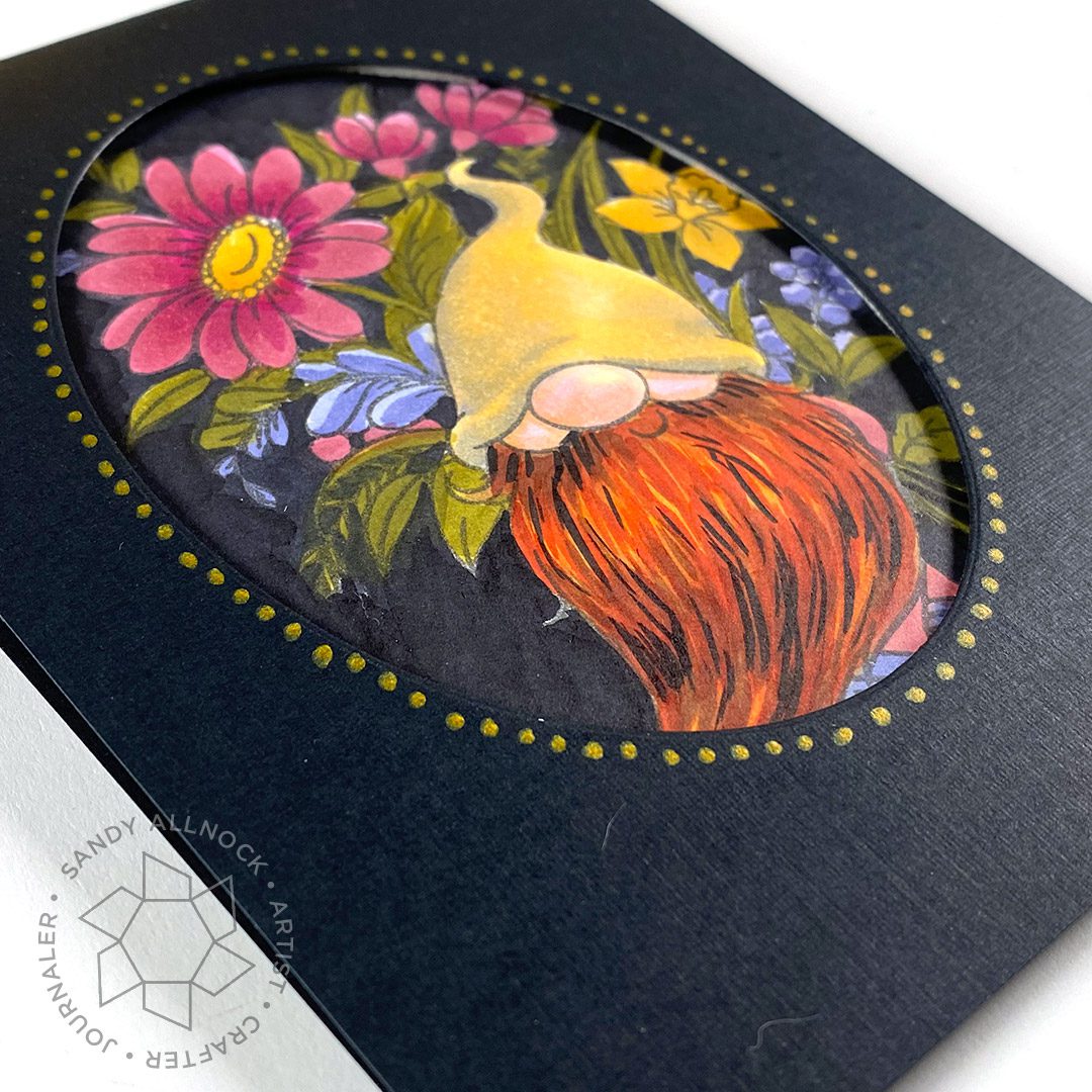
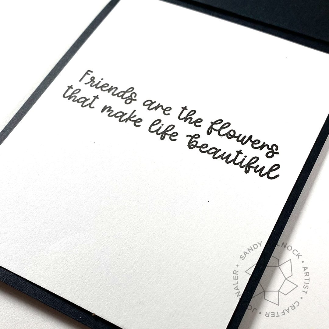
I opted to put the sentiment on a panel inside – leaving the front nearly a clean-and-simple design despite all the coloring that went on.
Supplies
Some product may be provided by manufacturers for review and use. Compensated affiliate links are here at no cost to you. If you choose to shop using my EH (Ellen Hutson) links, please accept cookies on that site in order to retain the link to my blog, or that compensation does not happen for me. I appreciate your support of my work with your purchases! Full affiliate and product disclosure | My trusted partners in art
- Friends are Flowers, Trinity Stamps Clear Stamps: EH – TS
- Friends are Flowers, Trinity Stamps Dies: EH – TS
- Copic Markers: EH – Blick
- Jet Black Lawn Fawn Ink Pad
- Neenah Cardstock, Solar White: 25pk – 250pk
- Essential Ovals, Essentials by Ellen Designer Dies





This is so cool!
I don’t know if I dare to colour my card black but it is a great challenge, perhaps I will try it.
I love this card with the awesome gnome and his stunning beard!
Thank you so much for sharing, stay safe and have a wonderful day.
Oops – guilty as charged! I’ve gotten into the habit of grabbing just 3 colors when I’m doing a card with Copics. But I really like the way your little gnome came alive – especially that beard. Great tips on doing hair in general – I will try to be braver with contrast!